-
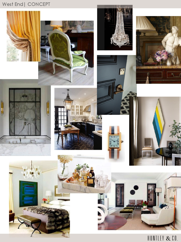
Concept Before Color
-
The Floors Beneath our Feet
Like a painter preps his canvas, a good designer attends to the bones of a room before honing in on its decorative elements. We make strategic shifts in proportion, tone, and detail, both subtle and grandiose, when thoughtfully designing a space. A beautiful wood floor is one such essential element that has the power to really make our rooms sing. We’re always told to “look up” or “look forward”, as a kind of mantra to mindfulness, happiness and all things good. Well, I say “look down” because there’s beauty and inspiration to be had at your feet!


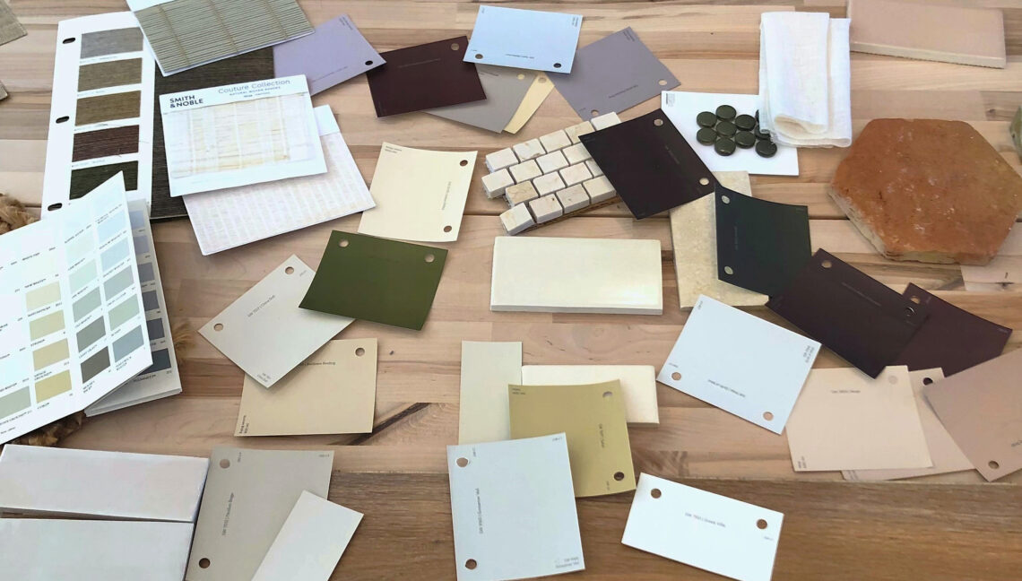
Our design studio becomes a laboratory for deep diving, where we work elbows deep in samples to determine the best tone for the wood floors. We consider location, use, and material adjacencies when making our recommendations. Ultimately, we outfitted a Georgetown residence with rich, classic patterned parquet in a deep and luxurious tone.

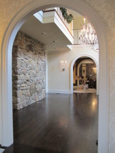

Material and tone are carefully considered for each client.
(left): We installed subtly hand hewn floor boards in soft, neutral tones to be bright but forgiving for a young family. (center): This grand PA home called for rich tones that complimented adjacent materials and the scale of the space. (right): We were inspired by sandy textures in this beachside retreat when we chose these soft, washed, waxy tones of warm brown.


(left): We gave the existing parquet flooring of a pre-war Manhattan apartment new life with a lighter stain – showing off the beautiful pattern and brightening the small space. (right): New french oak flooring in an Alexandria townhouse has been pickled, adding much needed warmth and texture to a once incohesive collection of different vinyl flooring.


Inspiration at its finest. (left): Jeffrey Bilhuber (right): Hillwood Estate (bottom): Archetypal Floors
-
Thanksgiving and the beauty of home

Like so many, I love Thanksgiving. So many wonderful things come together — decorating, family, food! — on one glorious, indulgent day. I’ve designed quite a few dining rooms for clients throughout the years and it’s always exciting to see these spaces come to life on Thanksgiving. Décor isn’t the reason for the season, but sharing beauty and joy with loved ones is.

Eclectic, tailored and dramatic is just the right vibe in a dining room.

![Huntley & Co. Interior Design // www.huntleyandcompany.com KAP_9868[1] - Copy2 cropped](https://luxeandlucidblog.com/wp-content/uploads/2015/11/KAP_98681-Copy2-cropped.jpg)


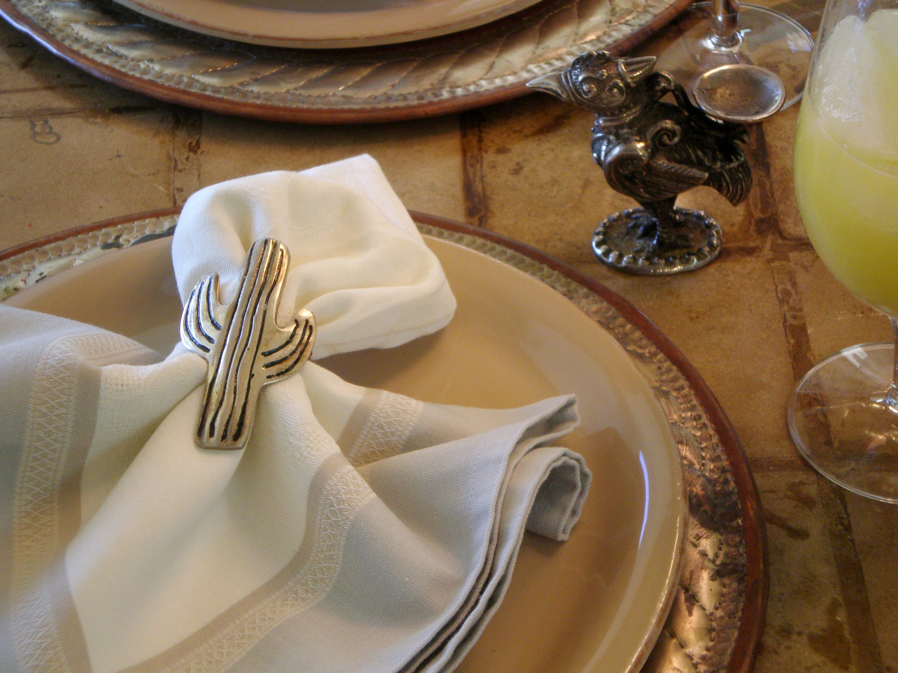
For me, design is about expression. The dining spaces below are in Maryland, DC, New York and Arizona respectively. Each is a signature of a particular home, lifestyle and client.

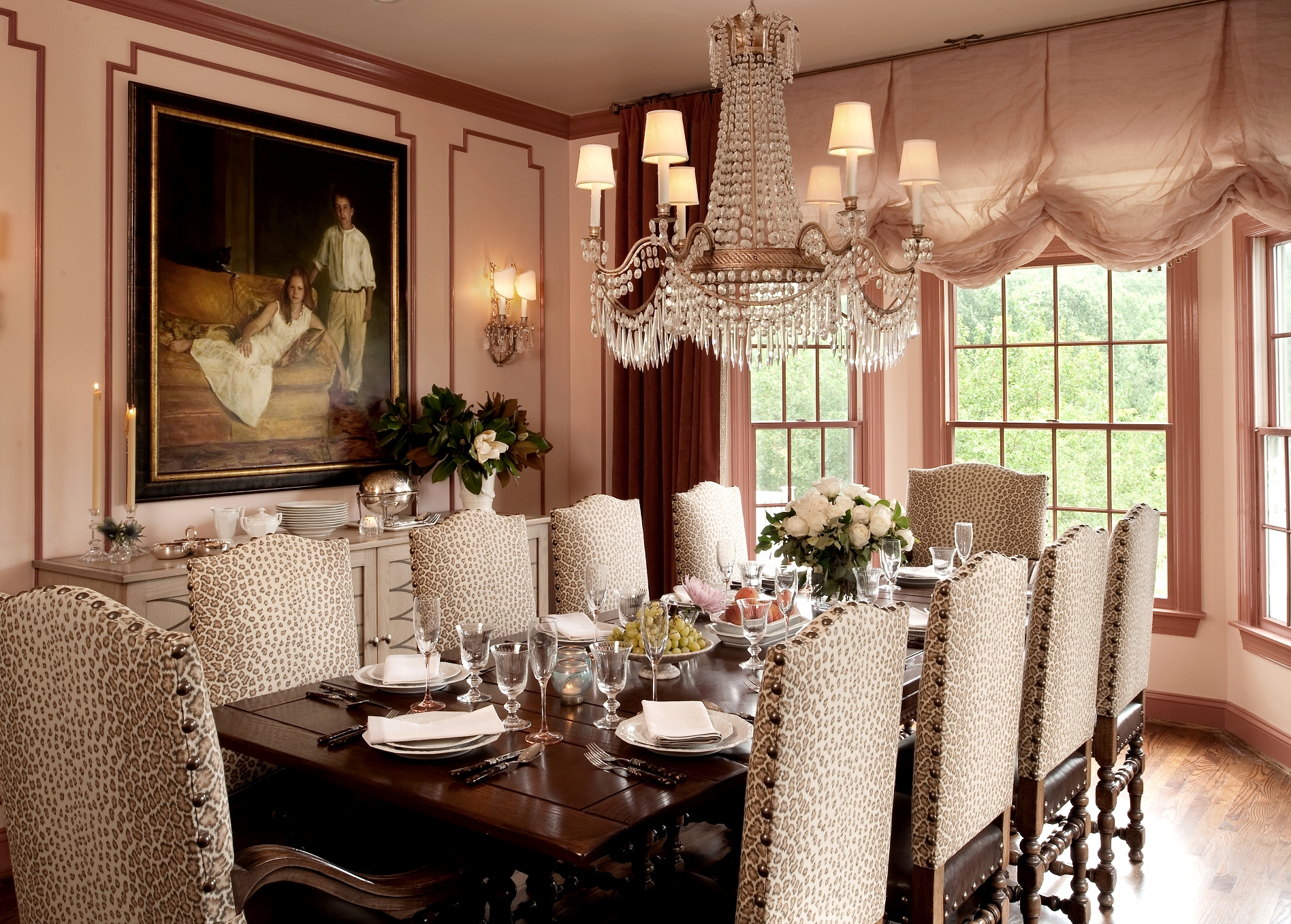


Details are a key part of the magic when entertaining for the holidays and year-round.

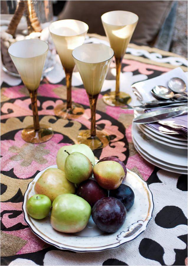



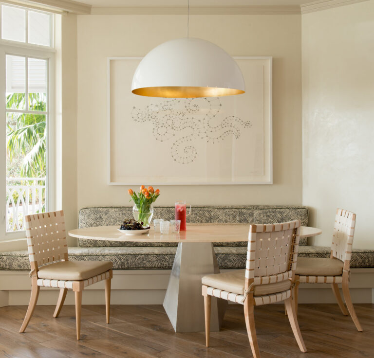
Sometimes simplicity is all the drama a space needs. Traditional in Virginia and modern in Florida.

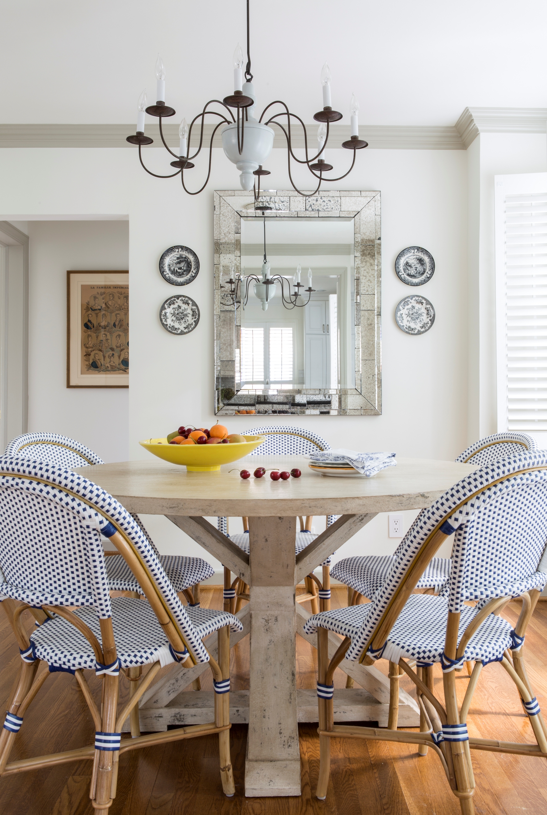


The dining room below is one of my favorites. The sophisticated color scheme creates a room that sings.


Happy Thanksgiving from Huntley & Co.
And a special thanks to our clients who make these images possible and our work lives so rich.


