-
Before There Were PDA’s
I was a holdout. I loved my daily planner and my stationary. I never thought I would do all
my writing via email and keep my schedule on a computer. But I do. To be honest, I couldn’t
live — professionally at least — without Outlook and my iphone. So although I’m highly organized,
I miss the days when embracing your type-A meant a little more beauty and a little less technology.
Remember when we used to sit at our desks and correspond?
I’m feeling so nostalgic — this is what my desk used to look like when
I was a jeune fille. Southern Accents Nov/Dec 2004.
I am IN LOVE with the new Malachite Collection from Smythson of Bond Street!
The classic stationer from London has taken a fashion-forward step and designed
a collection that looks like it just came off the Balenciaga runway.
The Hermes journal I keep at my bedside.
It’s available in several gorgeous colors. Mine is aubergine.
Two graphic, modern selections from Simplesong Design.
I picked up this notepad at Il Papiro in Florence. I like to keep it with me, so I can
jot down thoughts on the run — which is easy since it’s about as small as my eyeglass case.
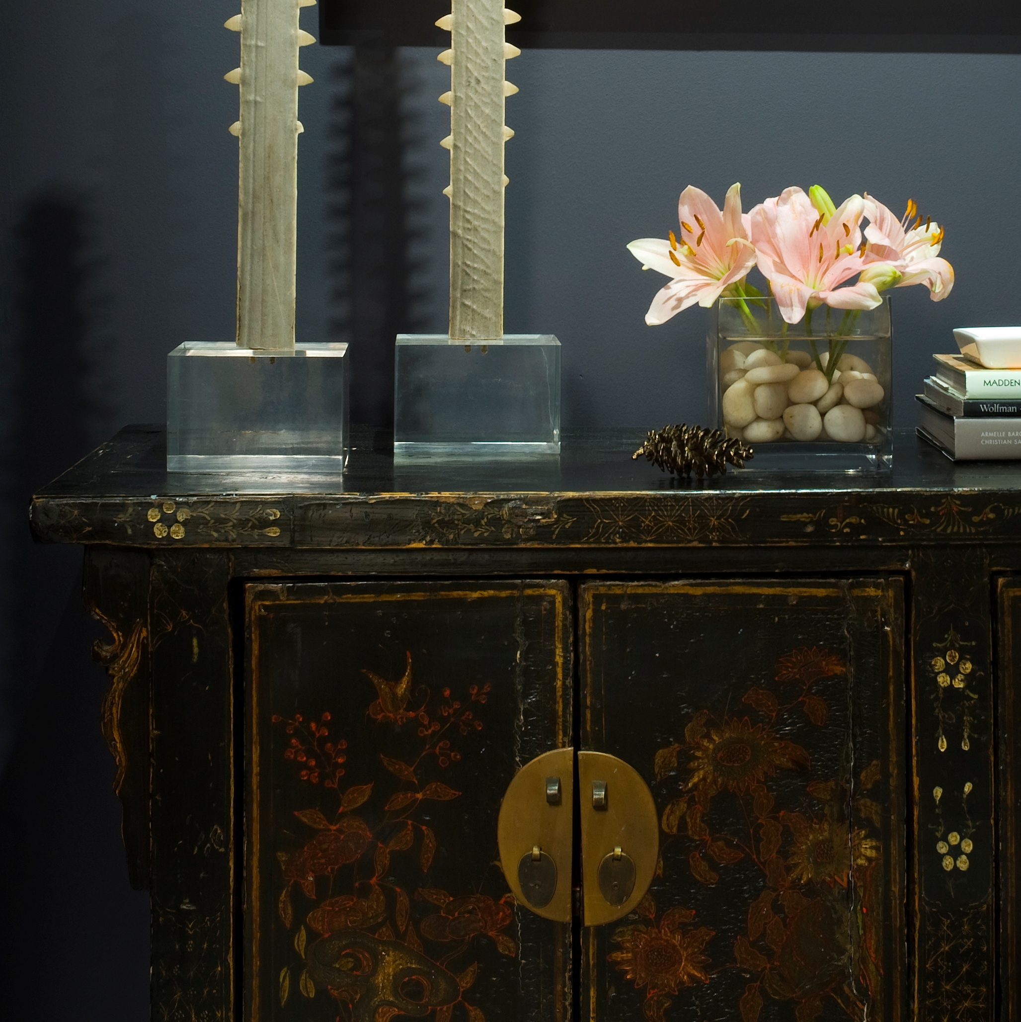
I installed this buffet at a client’s penthouse in May and discovered the inside was lined withhand-made paper! It was a magical detail and an amazing surprise.
What a great idea. Send Dempsey & Carroll your signature and they will
engrave their Classic Correspondence Card with your own personal John Hancock.
Paper goods (and memories) from my archives.
If I could, I would write long letters in calligraphy to friends and family. In another life.
The end of an era. Mrs. John L. Strong closed its doors in May after 80 years.
Nannette Brown said it best, “We don’t do trendy. We do good taste.”
A girl after my own heart.
You May Also Like
Dark and Inky
-
The Gold Standard
I'm a gold girl. Bronze, silver, not even platinum gives me the rush that gold does.
It’s warm and sexy and adds a little magic to any material. I love gold fabric, furniture, lighting
and especially jewelry and hardware. I would plate everything in gold if I could. Now for you nay-sayers
who think gold is a finish that belongs in the 80s, take a look at the images below and get ready to swoon.
A few of my current favorite gold fabrics.
A glamorous gold face in Vogue Nippon.
At the Washington Design Center's spring 2007 design house I painted the walls
India Yellow by Farrow & Ball and added gold David Iatesta sconces.
A vintage Curtis Jere wall sculpture.
I'm saving this image in my inspiration file for a future project.
The layers of gold could inform an entire color scheme.
Some of the amazing metalwork at Grand Central Station.
What artist celebrated the brilliance of gold more than Klimt?
Sooo gorgeous … LOVE this gold and citrine pin! I would wear it with a [faux]
fur vest layered over a grey cashmere sweater, jeans and a sick pair of heels.
Some of my favorite jewelry piled in a gold tray.
I get a ton of compliments on this Chloe purse.
Nancy Lorenz added graffiti-esque gold accents to Jeffrey Bilhuber's scenic
paper-covered bedroom walls. A gutsy move by the interior design genius.
I'm seriously considering switching my flatware over to gold … so much sexier!
Columbina Flatware at The Moma Store.
I love this mug! The perfect glam/punk combo.Where better to wear gold than on your toes? Louboutin heels from the 2005 collection.
Looking for a gift for the woman who has everything? Yes, there is a gold facial.
Gold paperclips – A Huntley & Co. office standard!
You May Also Like
Dark and Inky
THE MUSINGS OF DESIGNER TRICIA HUNTLEY