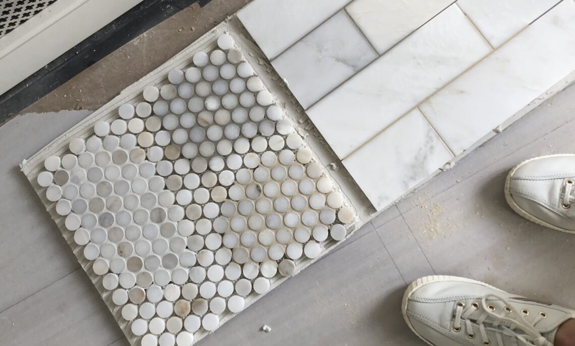
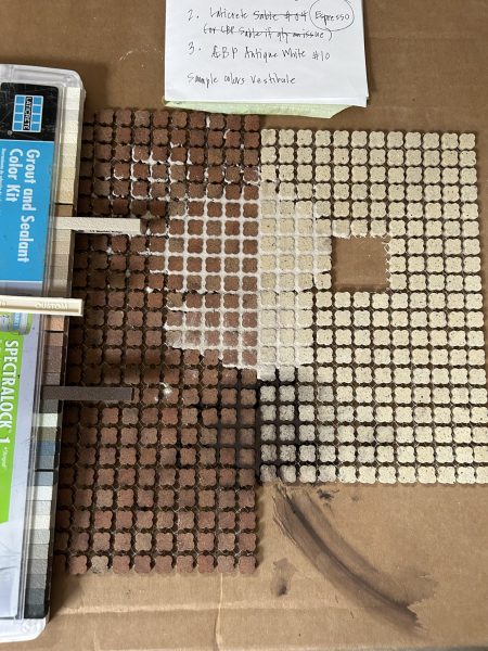
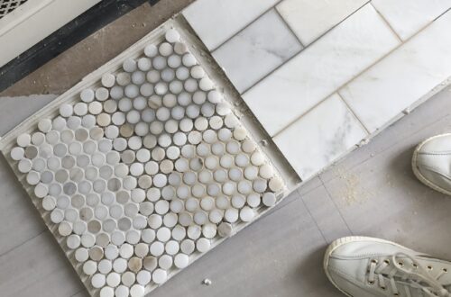
• penny and subway marble tiles on floor with varying grout colors applied as samples

    Tile Installation Aptitude (part 2)

    Layout

    If you are planning on a subway (stacked or staggered), checkerboard (straight or on the diagonal), or mosaic installation – your layout will be fairly obvious.  Sometimes all that is needed is a conversation with your installer, a floorplan, or elevation. However, other layout patterns are available – whether traditional or something born from your own creativity.  In these situations, at Huntley & Co. we generate more detailed drawings, and in some cases, even put in a bit of IRL elbow grease.

    UECo_ChaunceyBoothby-ReadMcKendree
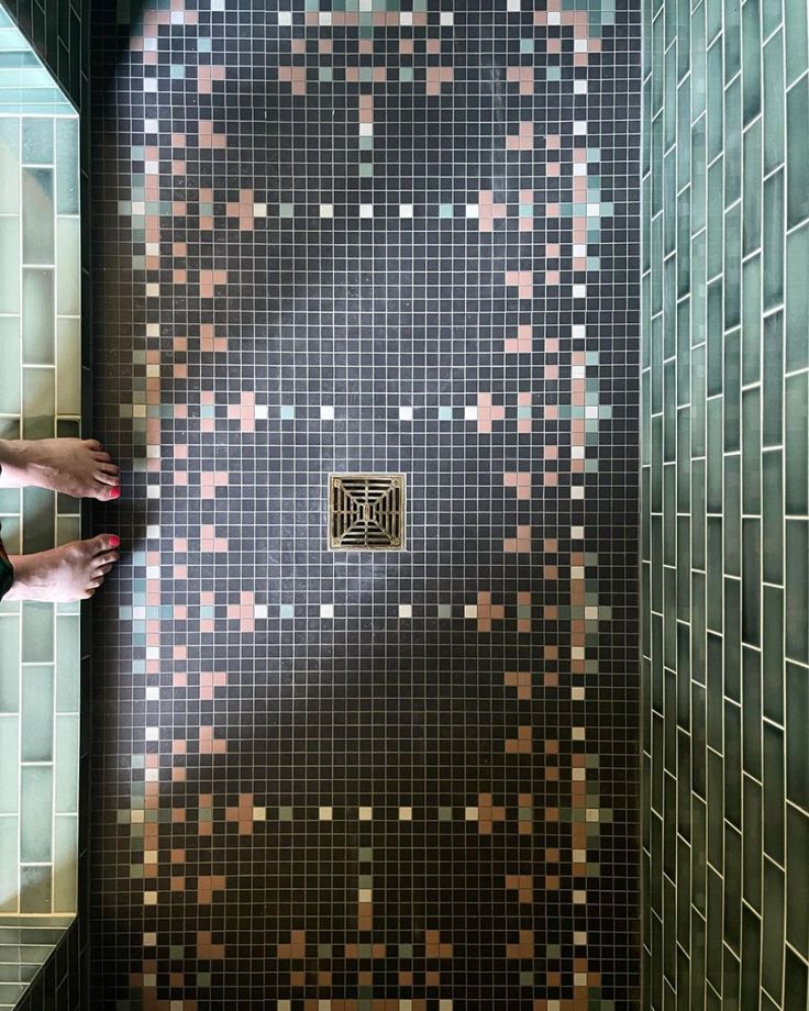
    historic-styled black mosaic floor tile installation in bath by jessica helgerson
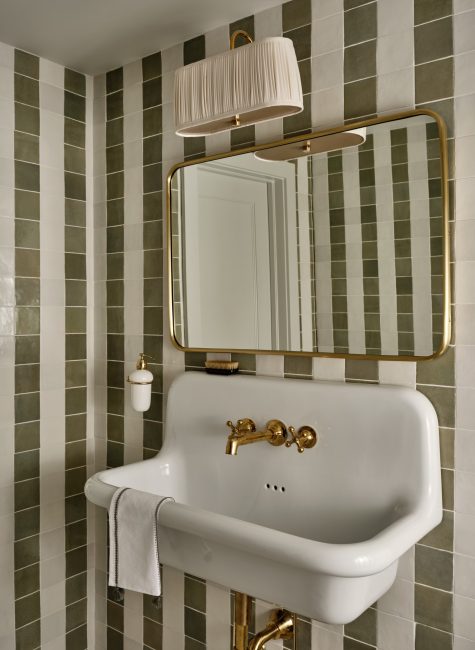
    above left: Simple white and green square tiles dressed up as stripes in a powder room by Chauncey Boothby; above right: Jessica Helgerson may be the queen of historic cum modern tile installations.
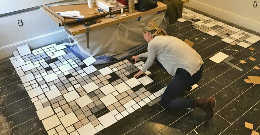
    below: Here I am laying out tiles piece by piece to create a Carlo Scarpa-inspired floor pattern. This was just the staging area; the tiles were later moved to the master bath.
    Spacing

    Spacers are available in a variety of sizes. You may choose thicker spacers for more dramatic grout lines or smaller ones for a more cohesive look. It can also be important to have greater spacing for handmade tiles that vary from piece to piece; thicker grout lines will allow space for uneven edges. Note, Clé published a fabulous and informative post called “The Art of the Grout Joint” (referenced here throughout) that I recommend bookmarking for future installations.

    above: Brick pavers in a herringbone pattern with varying grout widths of 1/8″, 3/8″, and 5/8″ from left to right.
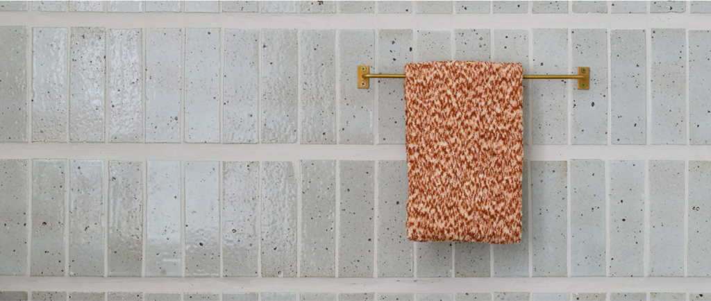
    below: A clever yet simple, modern installation with Clé tiles by Cathy Hong Interiors with narrow vertical grout joints and thick horizontal grout joints.
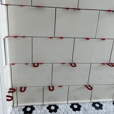
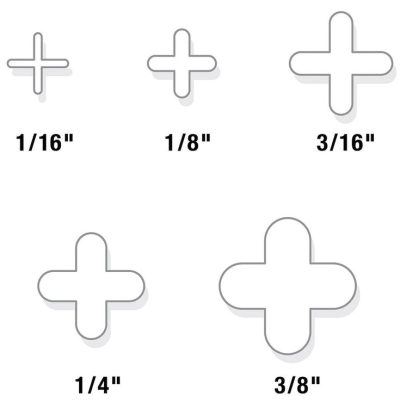
    above left: Spacers in action; above right: A diagram showing 5 different spacer sizes.

    Grout Color

    The color of grout has a huge impact on a tile installation and can totally transform a room. Whether you choose to coordinate or contrast your grout with your tile, it comes down to what kind of vibe and aesthetic you are trying to create.

    Low Contrast Tile to Grout Ratio

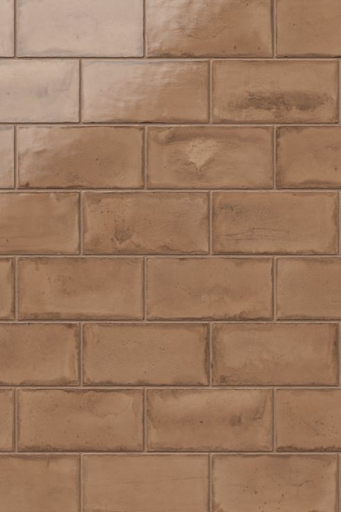
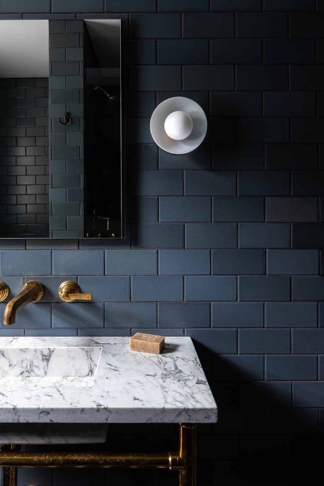
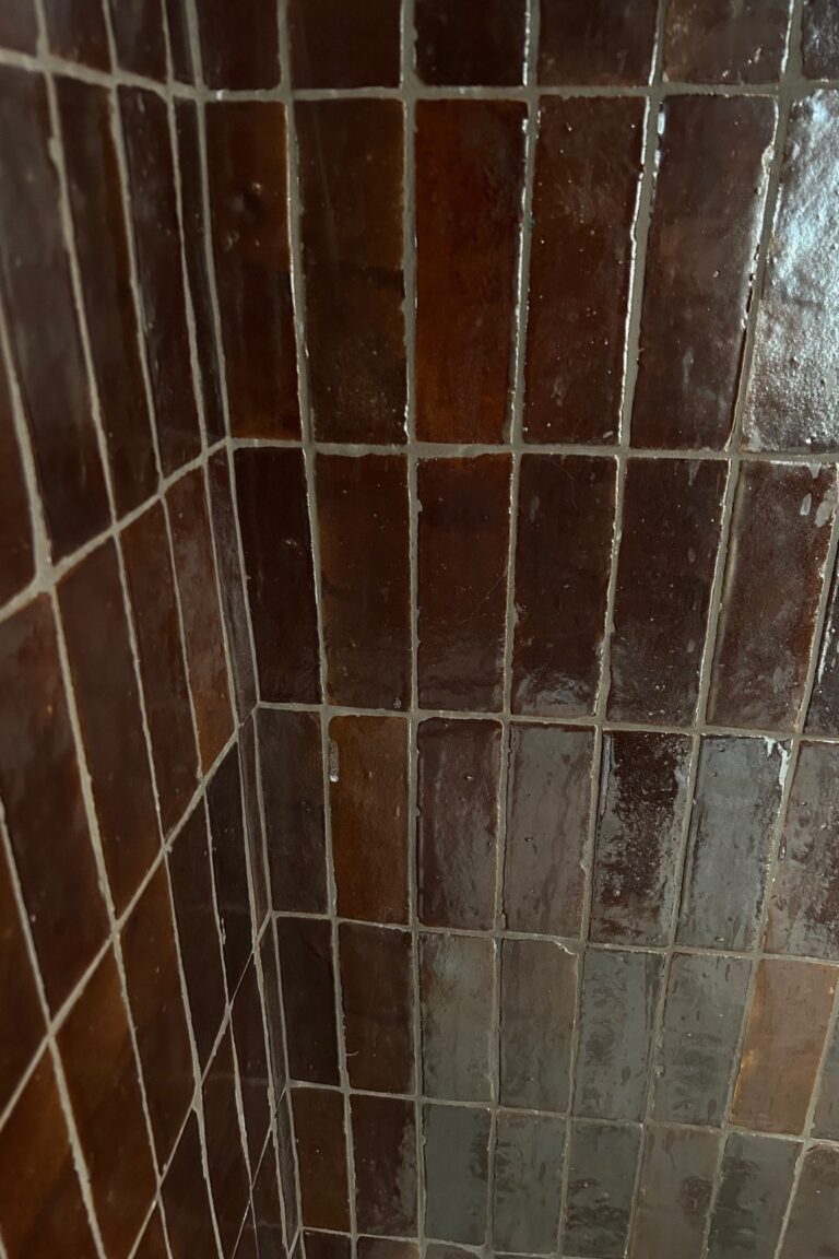
    above: (L) Edward Martin Graham glossy 3×6 ceramic tiles in color Clay (C) a darky and moody bath installation, (R) garnet-colored Zellige installed in my guest shower

    High Contrast Tile to Grout Ratio

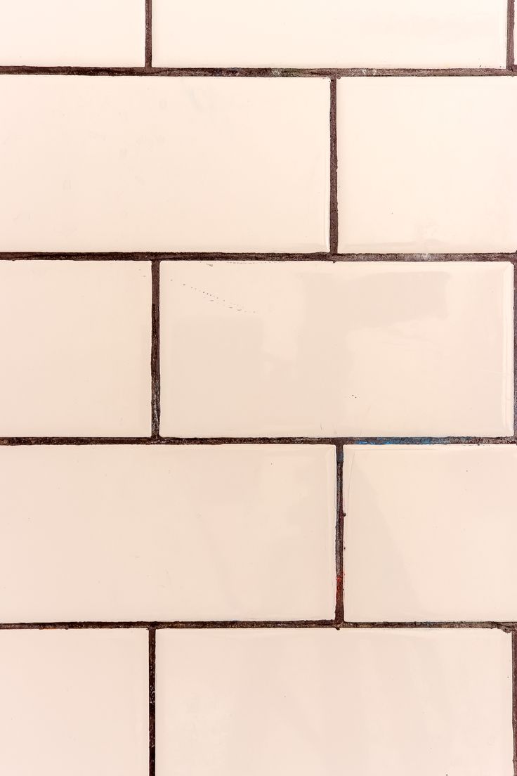
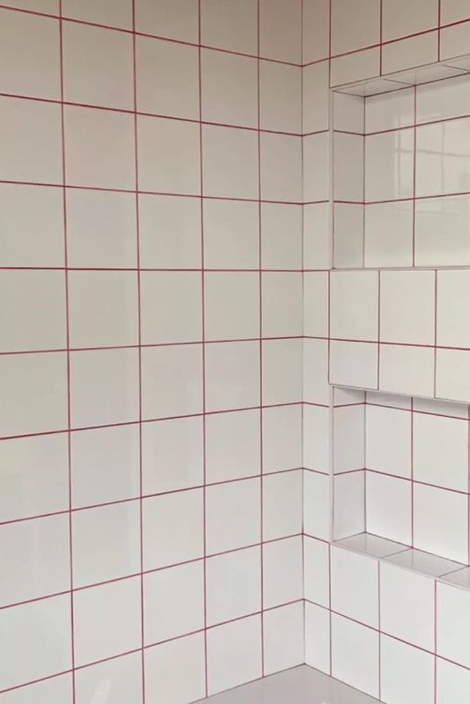
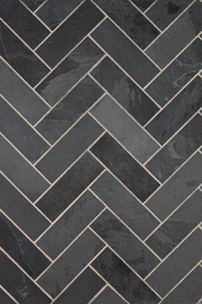
    above : (L) Yes please to pink tile with black grout; (C) Grout dyed hot pink was an adventourous choice by Good Bones in London; (R) Montauk 4×12 black slate tiles in a herringbone pattern.

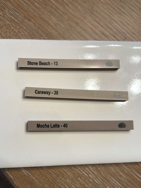
    Always view grout chips with your respective tiles before making a selection. Better yet, ask your installer to apply test samples to your tile!

    left: 3 Artex beige grout options on a creamy subway tile; right: Cream, beige, and dark brown grout sampled on tumbled Japanese mosaics. FYI, I chose the dark brown for my foyer floor ; )

    For more ideas and resources relating to tile installations, visit my Pinterest page. I have pinned additional layouts, diagrams, and eye candy for you to bookmark — and hopefully use for your own installs.  See you next week ; )

    signature of name Tricia
    { PS: The answer to last week’s questions is 8! }

    TRICIA HUNTLEY  |  HUNTLEY & CO.

    “The glamorous space where tradition and modernity collide.”

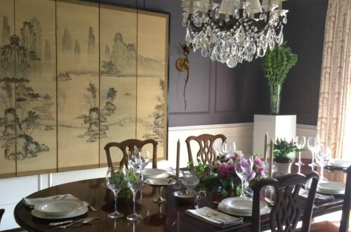
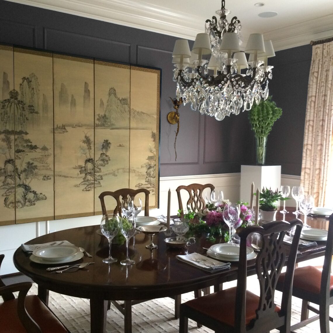
  • A dining room with deep plum walls, an antique Asian folding screen and crystal chandelier is set for a formal dinner at a log, stained wood table surrounded by English chairs.

    Screen Queen

    I don’t tend to use the same furniture, colors, or anything really from one project to the next. Creating one-of-a-kind interiors means originality has to be a priority. There is one thing, however, that makes its way into Huntley & Co. interiors more often than not … the ever-fabulous SCREEN. New, old, folding, curved, wood, upholstered, tall, short – there is a screen to fit the bill. They can fill a corner, hide a TV, hold a wall, create privacy, complement art, and even act as a secret passageway. They can be nuanced or bold, custom or exquisitely crafted. Honestly, the screen is so epic and versatile, it should be in all of our projects!

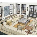
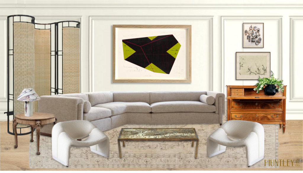
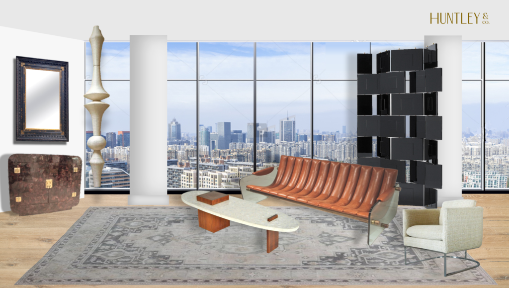
    above: A rendering of a Huntley & Co. living room with a sculptural iron and rattan screen from Cox London in the corner.
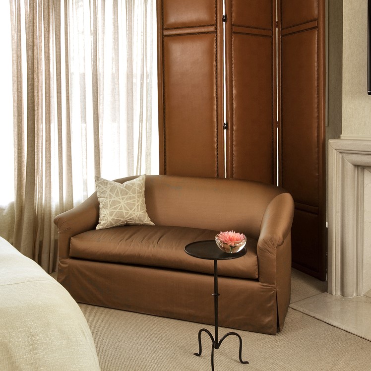
    The corner of a transitional-styled bedroom with brown, satin loveseat, tall leather folding screen, sheer drapery and a simple modern fireplace.
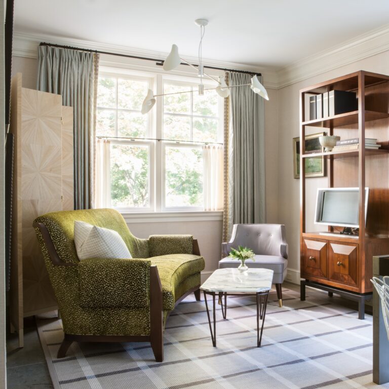
    left: I designed the custom, wood veneer folding screen for this home office seating area. right: A tall, leather upholstered screen in the corner of a transitional bedroom. 
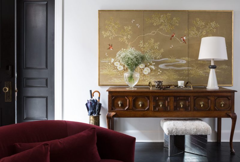
    A gold screen with hand-painted scenery over an antique sideboard helps create a “landing space” in a townhouse living area that lacks a true foyer. 
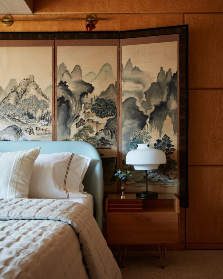
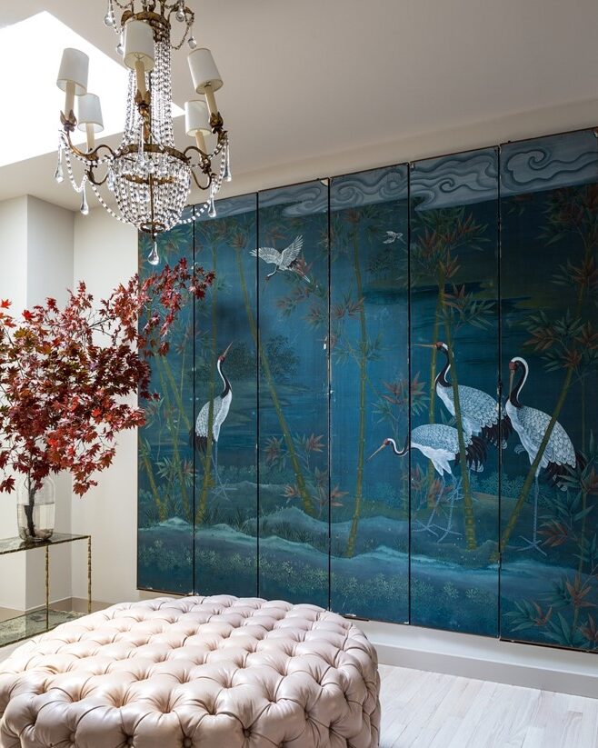
    left: A scenic mountain village is depicted on an antique screen in a bedroom. right: A sedge of cranes on a dramatic blue background helps ground this feminine dressing room.
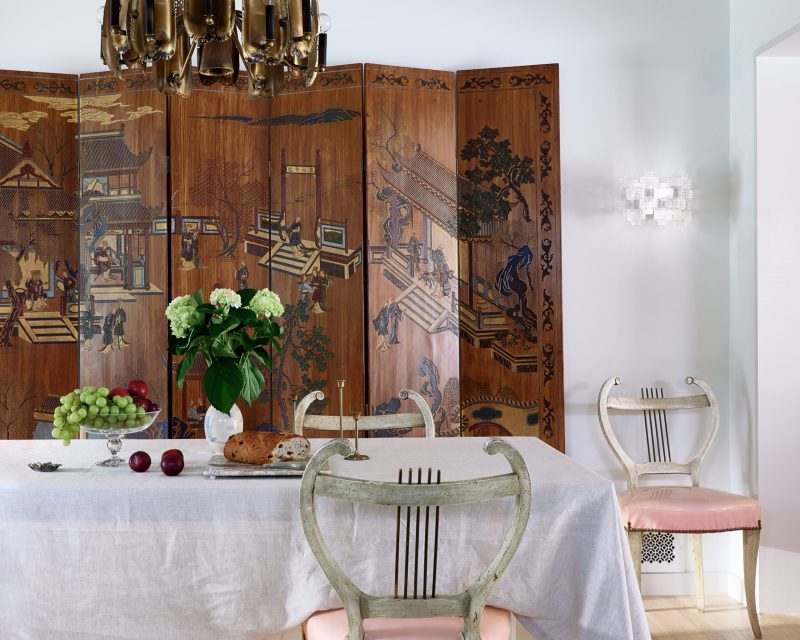
    above: A carved wood coromandel screen serves as a backdrop in a contemporary dining room.
    above: A rendering of our London penthouse project with an Eileen Grey “Brick Screen” in one corner of the living room.

    Wishing you and yours a peaceful and joy-filled Thanksgiving. If you are shopping on Black Friday, check out our Chairish store, GREATHOUSE. Some of my best vintage and antique finds from near and far are available. And in the not so distant future, I guarantee there will be a screen or two for sale as well – every home needs one!

    signature of name Tricia

    TRICIA HUNTLEY  |  HUNTLEY & CO.

    All work and projects above are by Huntley & Co.

    “The glamorous space where tradition and modernity collide.”

  • Chez Huntley – update 07/15

      After a painful start to 2011 and an arduous renovation on the Huntley & Co. office, I

    am happy to say that work has finally begun on my own home.  Phase 1 is underway!

    The millwork, the hardware, the furnishings and the fabrics have all been selected.  The

    subcontractors are on site and all is chugging along.  It’s a little bit surreal, in fact.  I’ve

     overseen dozens of renovation projects, but it feels a lot different in my own space.  I’m

    fortunate that I can document all the progress on Luxe & Lucid for posterity.  Cheers

    to progress.  Cheers to design.  And cheers to the new and improved chez Huntley!


    – The Facade –


     IMG_7108


    A little more groomed, but there’s still a lot of work to be done.


    – The Public Rooms Scheme –


     IMG_7131 


    The fabrics and finishes for the first floor rooms have a natural yet glamorous

    vibe that suit the architecture of the house as well as my own aesthetic. 

    I’m sure there will be a little tweaking, but I definitely have a scheme in place.


    – Paint Colors –


     IMG_6927


    Neutrals have countless nuances, so you have to pick the value and hue that

    complement your lighting, furnishings and softgoods.  So far I’ve settled on

    Benjamin Moore’s Vanilla Milkshake and Sherwin William’s Windfresh White.

    – Work in Progress –

     IMG_7101

    Living Room


    IMG_7095

    Living Room

    IMG_7106

    Dining Room


    IMG_7107

    Dining Room


    IMG_7098

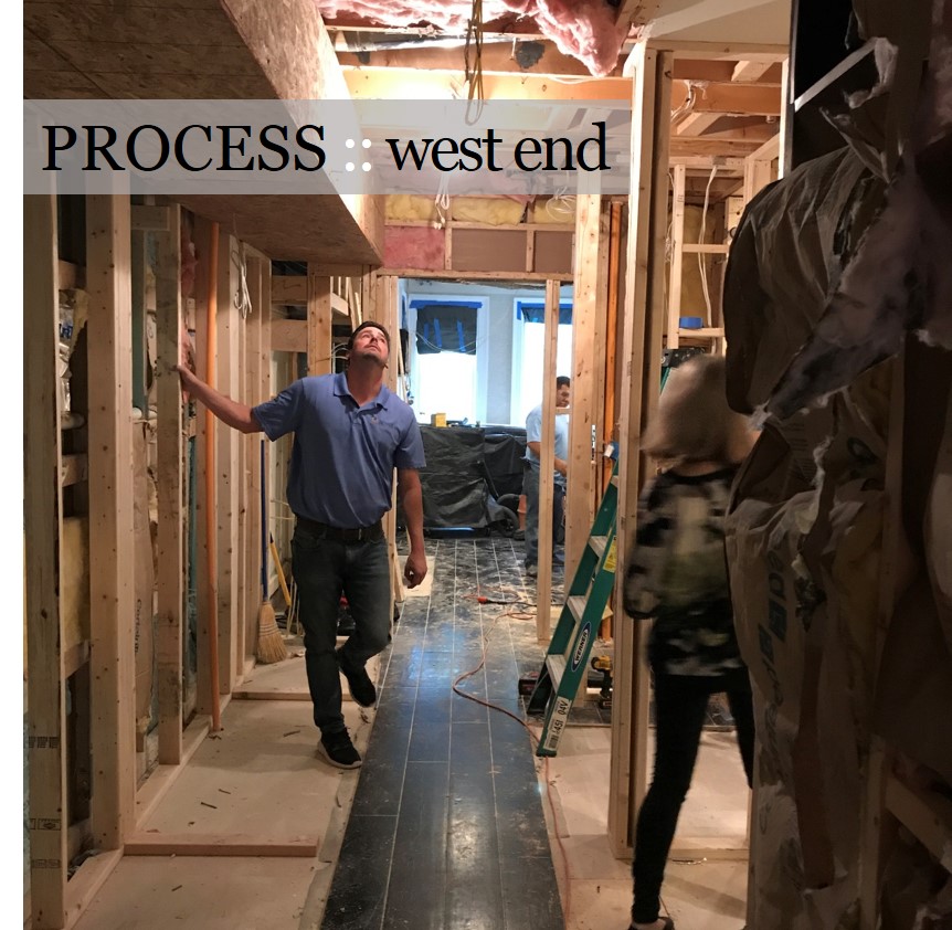
    Living Room / Dining Room / Sunroom


    IMG_7104

    Stair to Master Suite


    More to come – stay tuned!


    Tricia xo