-
Whatchu Lookin At?
Vicente Wolf published a book sometime back called ‘Learning to See’. I have always thought that was such a meaningful title. Seeing (and looking, fundamentally) is at the heart of a creative person. What drives artistic and design-minded individuals is a desire to seek out and study what’s interesting, beautiful and/or weird about the stuff of the world.
I’m no exception; I never stop culling the visual data around me. And I have no shame when it comes to capturing what I see on film. I’ll lie down on the sidewalk or crawl in the dirt if I see something worth photographing. Inspiration for my designs can be found in all kinds of places: museums, parks or city streets. It doesn’t matter if I’m looking at a Rodin sculpture or the bark of a tree. Cultivating one’s oeuvre (i.e. learning to see) means looking EVERYWHERE, even in the most unlikely of places.

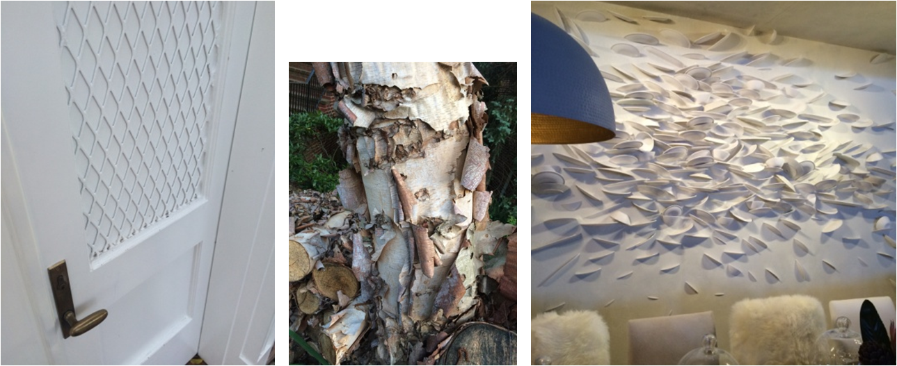
– 3 unique versions of texture –
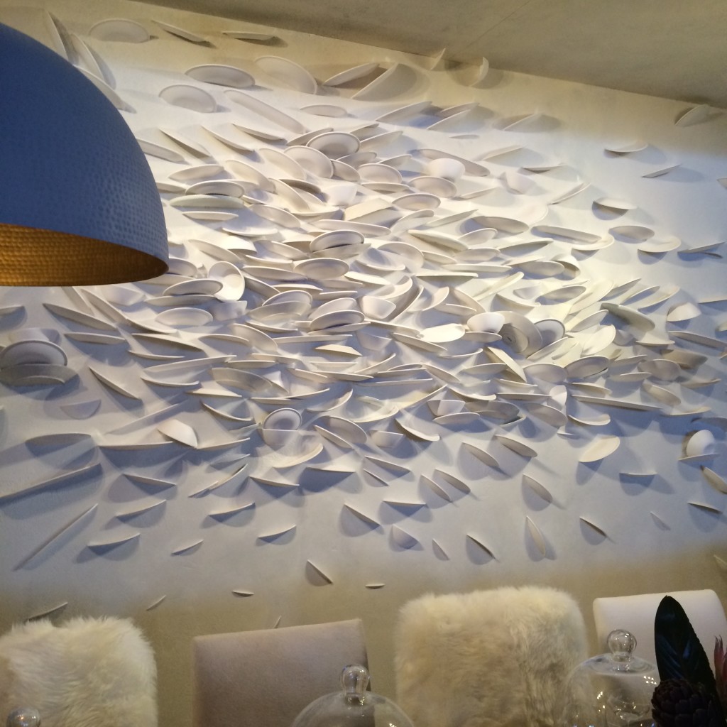
Left to right: DIY lattice on a courtyard door in LA; Crepe Myrtle bark in my neighborhood; a broken plate art installation at the 2016 AD Design Show.

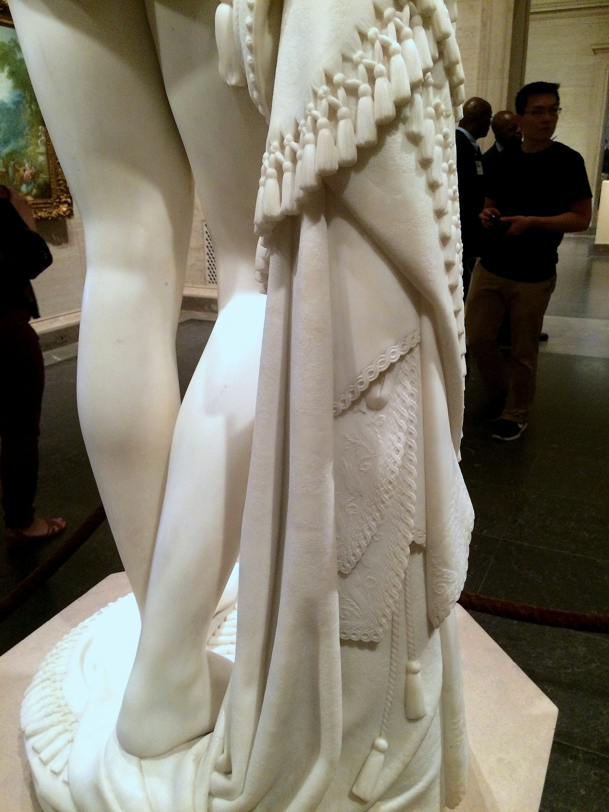
Masterfully carved tassels and lace details on a marble statue at the National Gallery of Art.

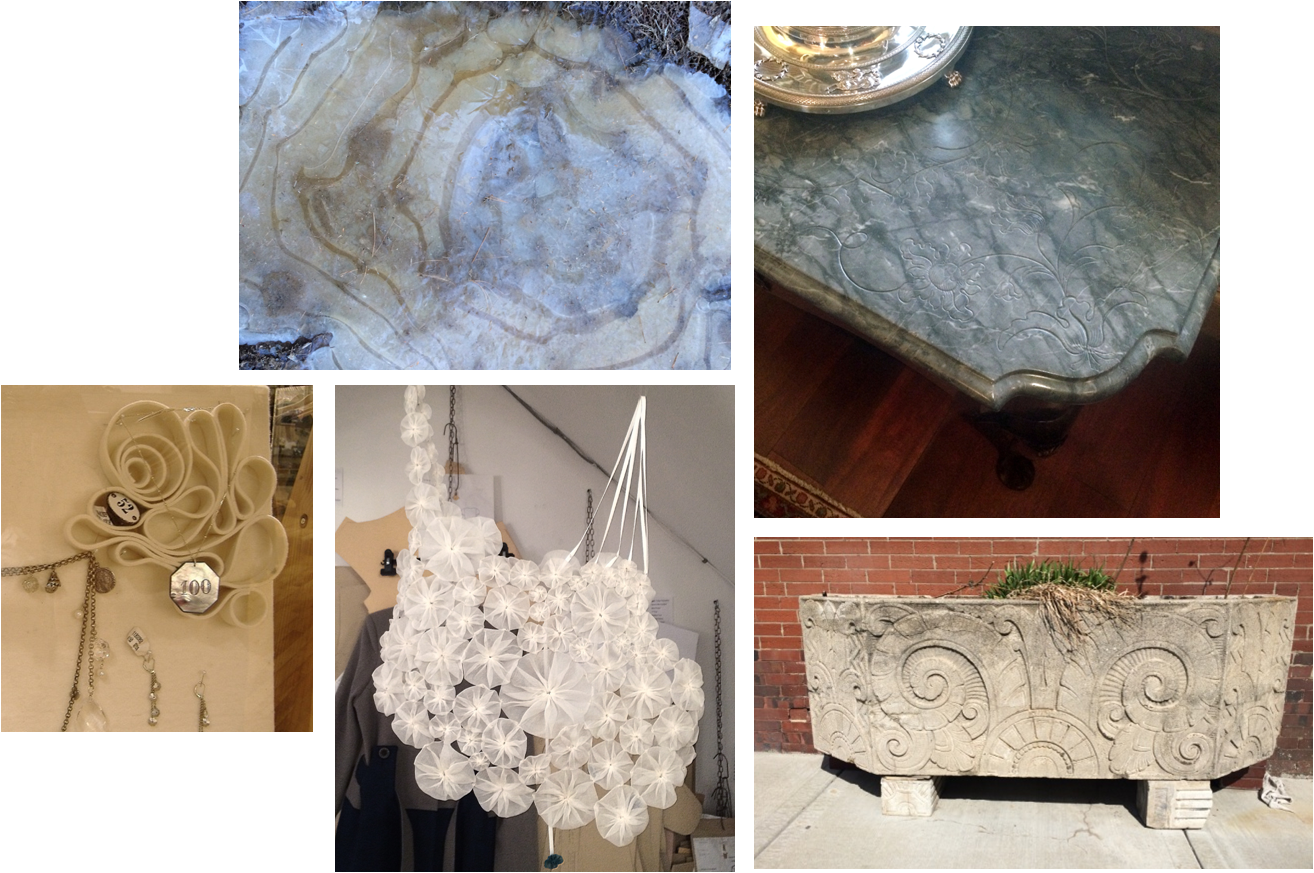
– a sophisticated collection of swirls and curlicues –
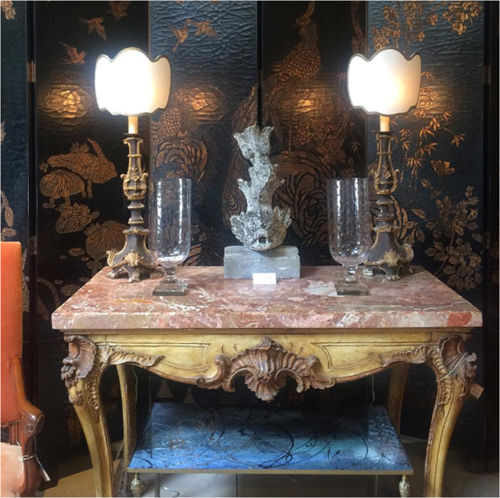
Clockwise from top left: A frozen puddle in West Virginia; an antique carved marble table top at the State Department; an Art Deco planter on a Kansas City sidewalk; an ornamental fabric necklace in a London shop; a felt jewelry display at Anthropologie.

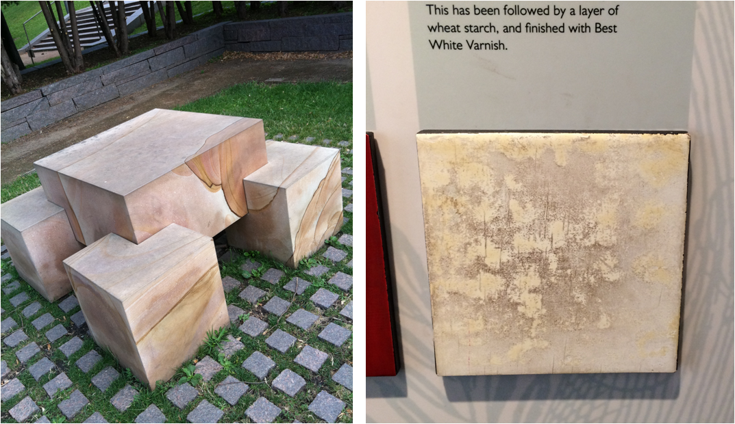
Left: Faux finish inspiration discovered at the Minneapolis Sculpture Garden. Right: A sample of Japanning at the Geffrye Museum in London.

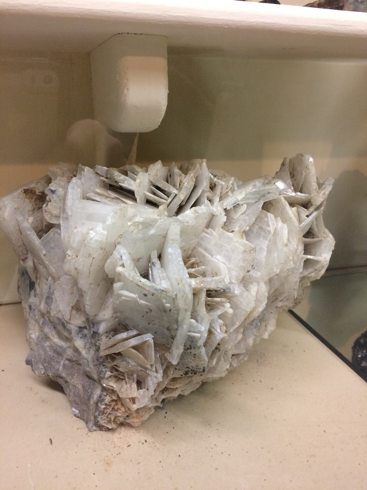
A large mineral sample on display at a mining museum in Creede, Colorado.

So many photos and so little time. This post could have been a mile long, so instead, you can expect a Part II, Part III and maybe even a Part IV of Whatchu Lookin At? Until next time — look, see and soak it all up!

Subscribe to our newsletter or find us on Bloglovin’ and you won’t miss a thing.
** all photos in this blog post are my own : )
-
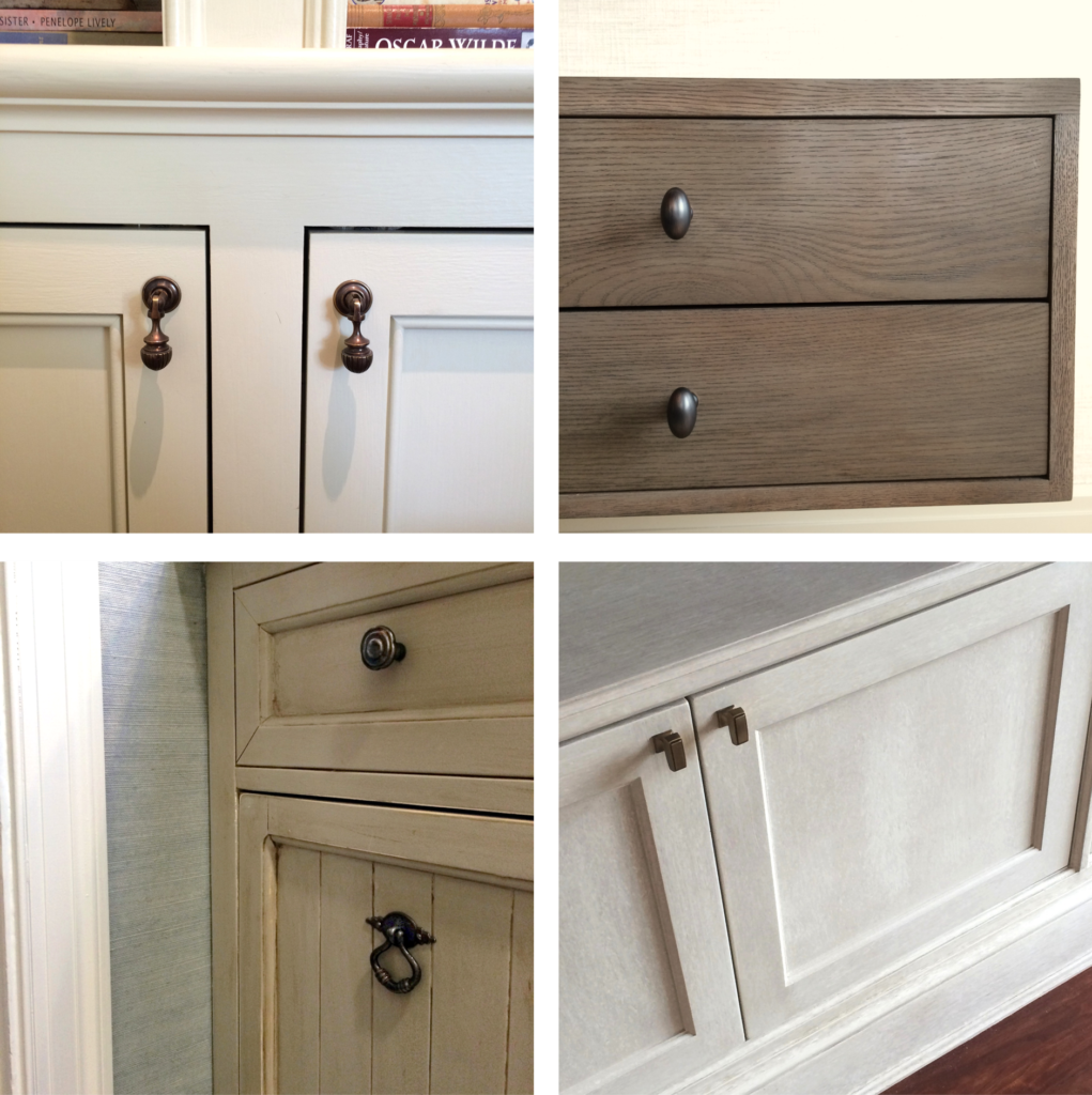
HARDWARE – THE ESSENTIAL ACCESSORY
-
THE AD DESIGN SHOW :: TRICIA’S 10
I spent the day at the Architectural Digest Design Show in New York on Friday. It’s always good to see what’s new, talk with vendors and “kick the tires” so to speak. Seeing the finish/scale/construction of products in person is integral to quality control and intelligent design. And, of course, it’s fun. I’ve shared ten best picks — whether it be a specific piece or an entire collection — and why each was worth a closer look.

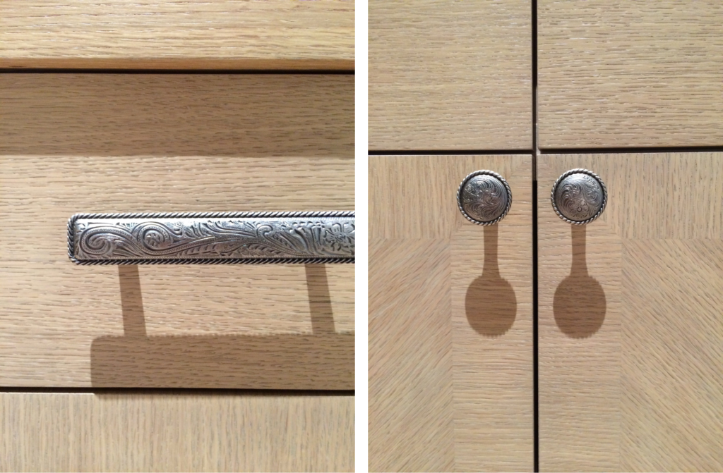
#1 Van Cronenburg
I am passionate about hardware and this company is stellar. Substance and exquisite detail in every piece.


#2 A Space Wall Sconce
All of the products from A Space – lighting, furniture, vases – are beautiful, but the Falling Star lamp was a show-stopper. It will undoubtedly make a lot of “it lists”.


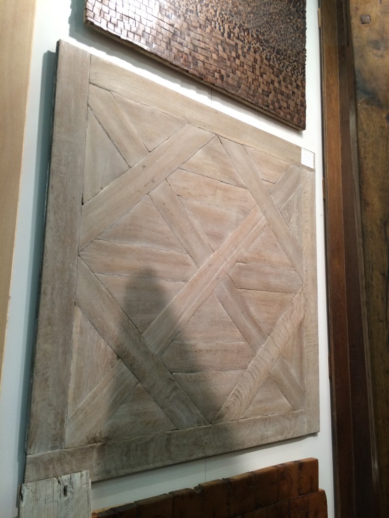
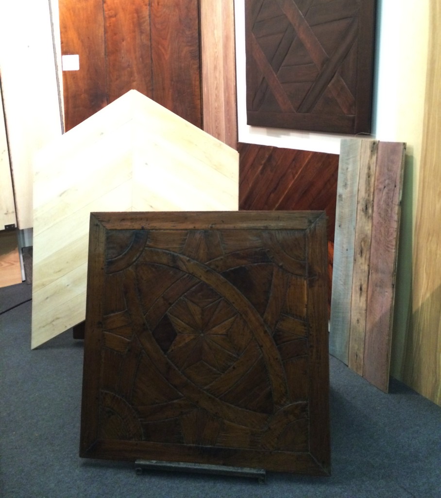
#3 Archetypal
In a perfect world, Archetypal’s work would be on the floors of every home in America. A designer can dream.


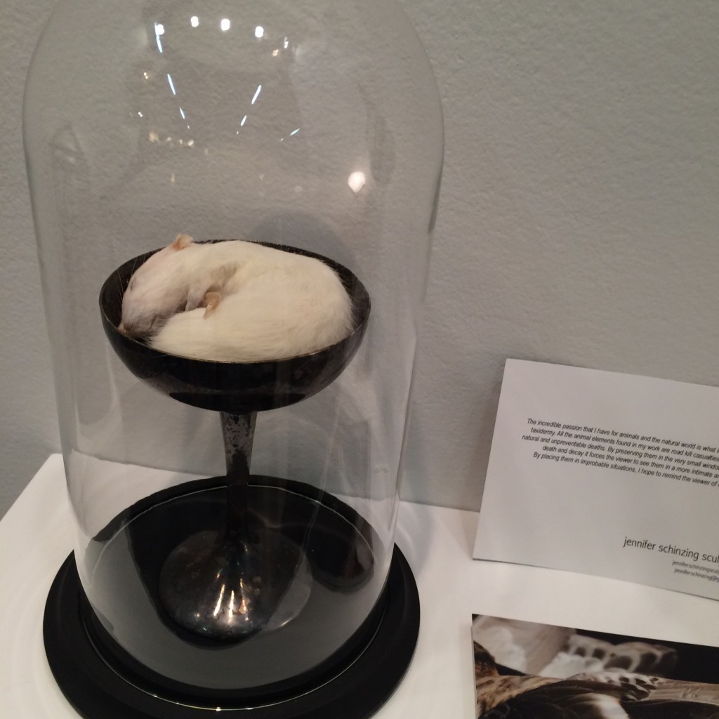
#4 Jennifer Schinzing
Jennifer’s love for the natural world inspired her to learn taxidermy. She preserves small animals (many of them road kill casualties) and transforms them into art installations. The thoughtfulness and beauty of each “memorial” was remarkable. Take note world, SHE IS ONE TO WATCH.



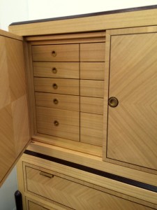
#5 Visilek
This cabinet was perfection. The veneers, the joints, the mechanics, the proportions were all flawless. Filipe Rodrigues’ work is masterful.



#6 Brizio Faucet
The Brizio Solna faucet. It’s black, it’s functional, it’s sexy … and it’s plumbing. Gotta’ love it.


#7 Jefferson Hayman Photography
I never jumped on the gallery-style art installation bandwagon in design. Perhaps because often times it’s just a bunch of crap thrown up on the wall (yes, I just wrote that). But Jefferson Hayman’s installation at the AD Design Show was simply lovely. The collection was intimate, multi-faceted and beautifully framed. Purchasing the entire installation crossed my mind … and I think that of the gentleman in the photo (yes, I was eaves-dropping).


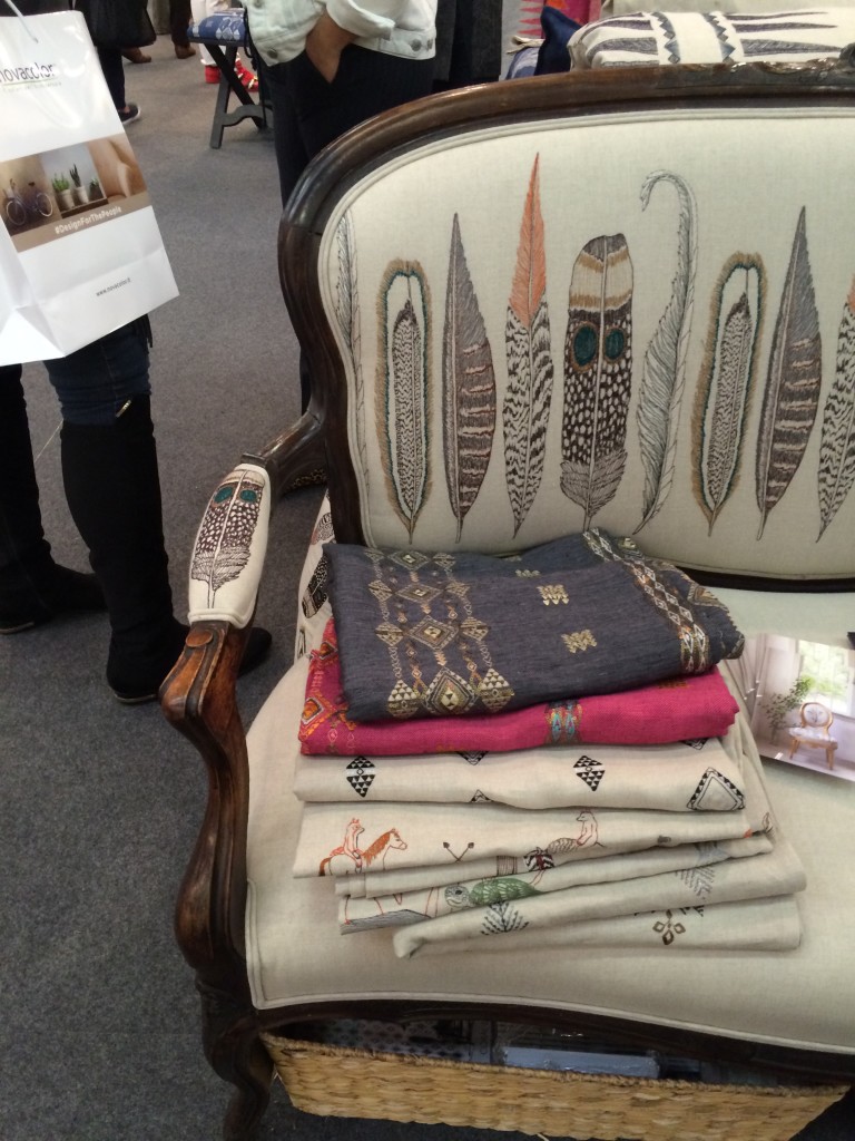
#8 Coral & Tusk
I’m a sucker for animal motifs, so naturally I was drawn to Coral & Tusk’s display. But what’s lovely about these goods is that the patterns are cute without being saccharine. The imagery is grounded by the quality and authenticity of the textiles. Moreover, Stephanie Housley was delightful; her enthusiasm and love for her work was evident.


#9 Joya’s F vs. S Candles
These candles may seem simple, but something about them caught my eye. They whispered [vs. shouted] sexy and luxurious — my personal sweet spot without a doubt. I inquired about an order at the show and pretty much want to purchase the whole collection of fragrances upon seeing the website.


#10 C&B at Dining by Design
Believe it or not, I am including Crate & Barrell in this list. Their dining room for DIFFA included a brilliant wall “art” installation. How many plates were broken to create this I don’t know. But what fun and how tongue-in-cheek. Kudos C&B.

*All photos are my own save the two that are hyperlinked. Thank you for sharing your beautiful images with our readers.









![porcelain-joya[1]](https://luxeandlucidblog.com/wp-content/uploads/2016/03/porcelain-joya11-1024x808.jpg)
