-
HARDWARE – THE ESSENTIAL ACCESSORY
-
Tableaux
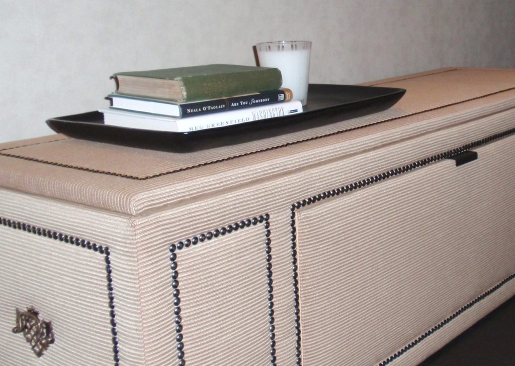
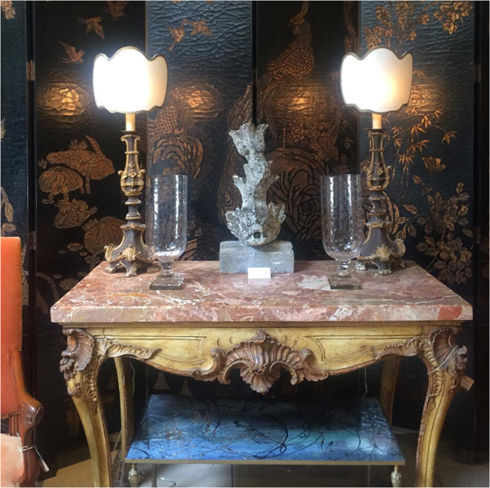
There are only two things in this world of which I will never tire. One, cute animals. And two, vignettes. It’s true, nothing snaps me out of a bad mood faster than a cleverly styled tabletop or an otter eating lettuce on Youtube. Vignettes I love because they can be pulled together in minutes. I love them because everyday things – a branch from the yard, a child’s toy, a vintage teacup – always make them more interesting. I love them because they have personality. I love them because they’re artistic and inspirational. I love them because they make me happy … even sans otter.

A favorite vignette from my LA trip this spring.


Richard Holley | McAlpine, Booth & Ferrier

Lorenzo Castillo


Huntley & Co. (L&R) | Peter Vitale (center)

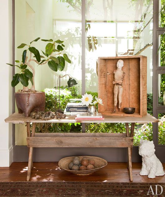
Huntley & Co. | Ellen DeGeneres

Jean-Louis Deniot


Huntley & Co. (L&R) | Elle Décor (center)


Elsie de Wolfe | David Hicks

Alexandra Kidd


Huntley & Co. | Ernesto Pigni
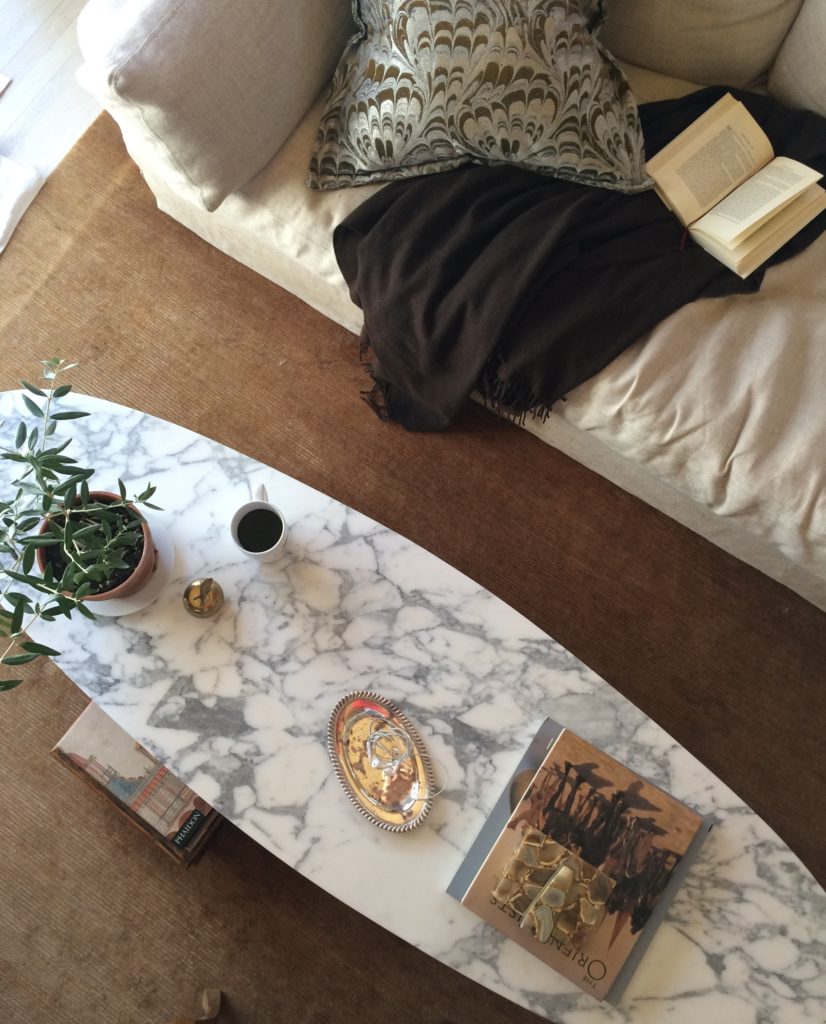

Sunday morning at chez Huntley | The National Museum of American History in DC


Darryl Carter | Lucinda Wharton | Horsch Interiors
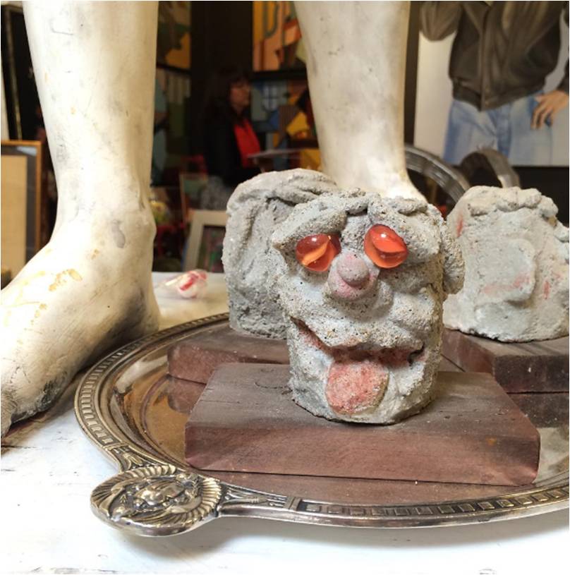
Best tableau ever by A. Shaw Antiques at Highpoint.

Drop by the Luxe & Lucid Pinterest page for dozens of other gorgeous, brilliant vignettes.

-
THE AD DESIGN SHOW :: TRICIA’S 10
I spent the day at the Architectural Digest Design Show in New York on Friday. It’s always good to see what’s new, talk with vendors and “kick the tires” so to speak. Seeing the finish/scale/construction of products in person is integral to quality control and intelligent design. And, of course, it’s fun. I’ve shared ten best picks — whether it be a specific piece or an entire collection — and why each was worth a closer look.

#1 Van Cronenburg
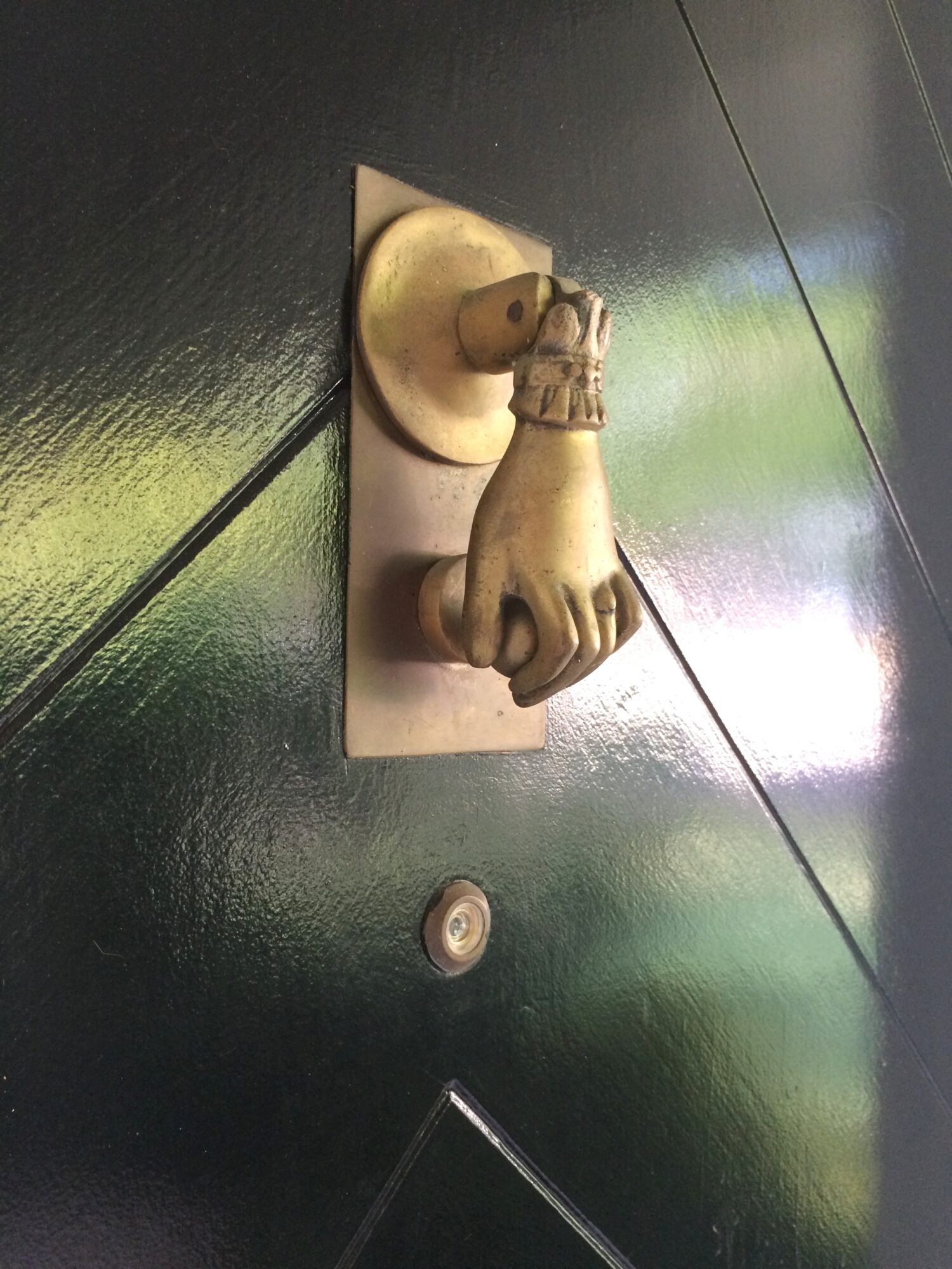
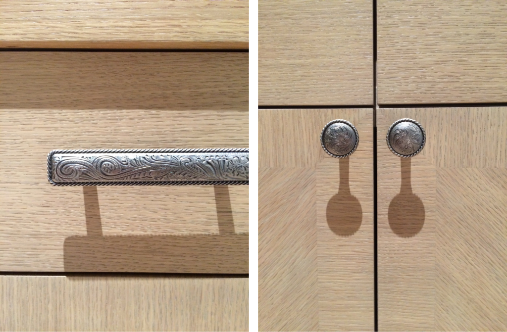
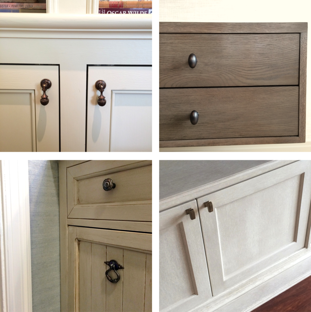
I am passionate about hardware and this company is stellar. Substance and exquisite detail in every piece.


#2 A Space Wall Sconce
All of the products from A Space – lighting, furniture, vases – are beautiful, but the Falling Star lamp was a show-stopper. It will undoubtedly make a lot of “it lists”.


#3 Archetypal
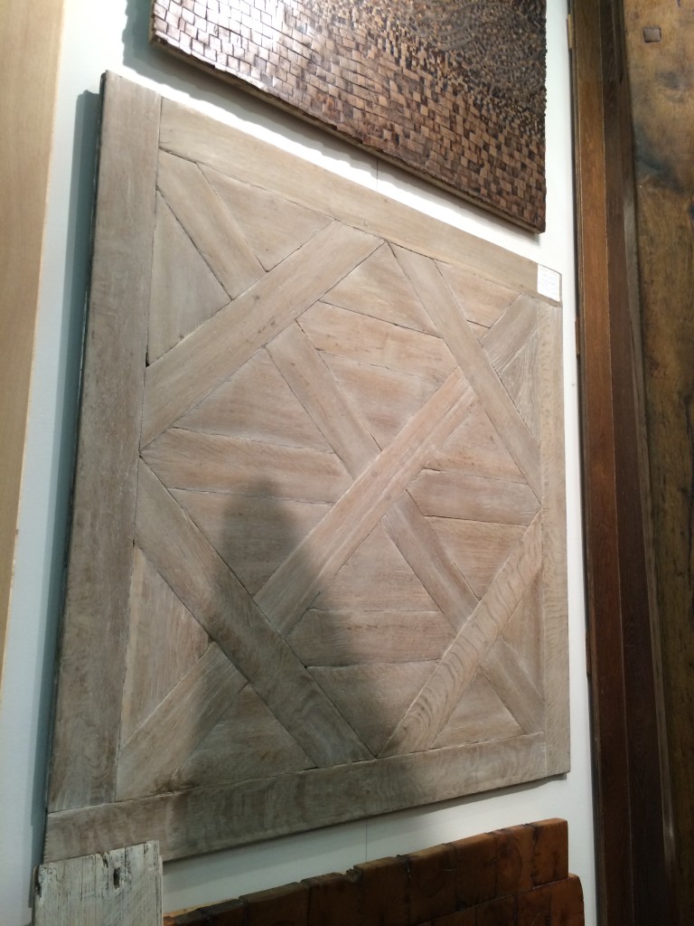
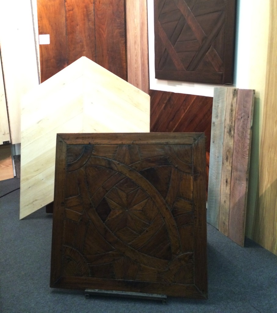
In a perfect world, Archetypal’s work would be on the floors of every home in America. A designer can dream.


#4 Jennifer Schinzing
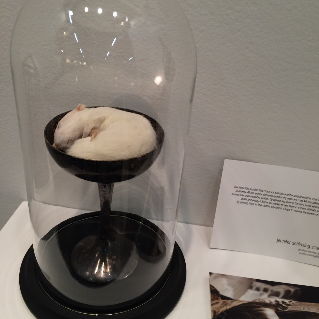
Jennifer’s love for the natural world inspired her to learn taxidermy. She preserves small animals (many of them road kill casualties) and transforms them into art installations. The thoughtfulness and beauty of each “memorial” was remarkable. Take note world, SHE IS ONE TO WATCH.



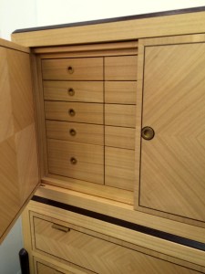
#5 Visilek
This cabinet was perfection. The veneers, the joints, the mechanics, the proportions were all flawless. Filipe Rodrigues’ work is masterful.



#6 Brizio Faucet
The Brizio Solna faucet. It’s black, it’s functional, it’s sexy … and it’s plumbing. Gotta’ love it.


#7 Jefferson Hayman Photography
I never jumped on the gallery-style art installation bandwagon in design. Perhaps because often times it’s just a bunch of crap thrown up on the wall (yes, I just wrote that). But Jefferson Hayman’s installation at the AD Design Show was simply lovely. The collection was intimate, multi-faceted and beautifully framed. Purchasing the entire installation crossed my mind … and I think that of the gentleman in the photo (yes, I was eaves-dropping).


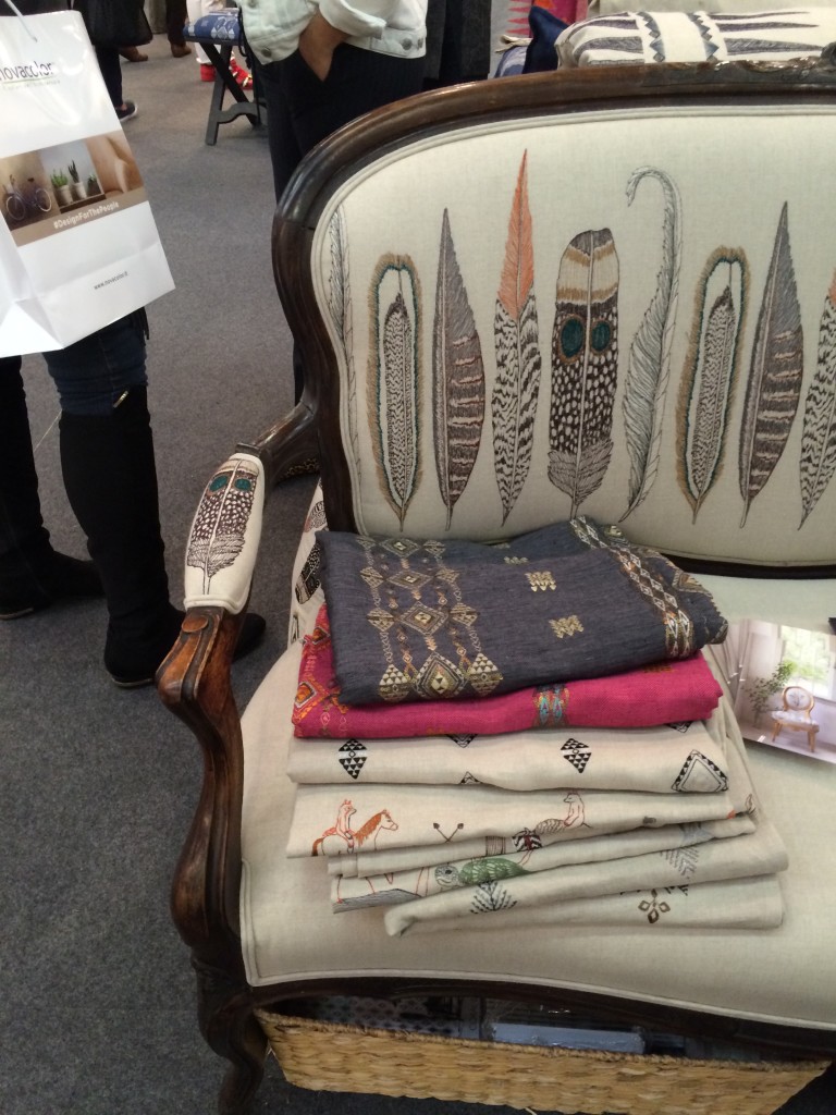
#8 Coral & Tusk
I’m a sucker for animal motifs, so naturally I was drawn to Coral & Tusk’s display. But what’s lovely about these goods is that the patterns are cute without being saccharine. The imagery is grounded by the quality and authenticity of the textiles. Moreover, Stephanie Housley was delightful; her enthusiasm and love for her work was evident.


#9 Joya’s F vs. S Candles
These candles may seem simple, but something about them caught my eye. They whispered [vs. shouted] sexy and luxurious — my personal sweet spot without a doubt. I inquired about an order at the show and pretty much want to purchase the whole collection of fragrances upon seeing the website.


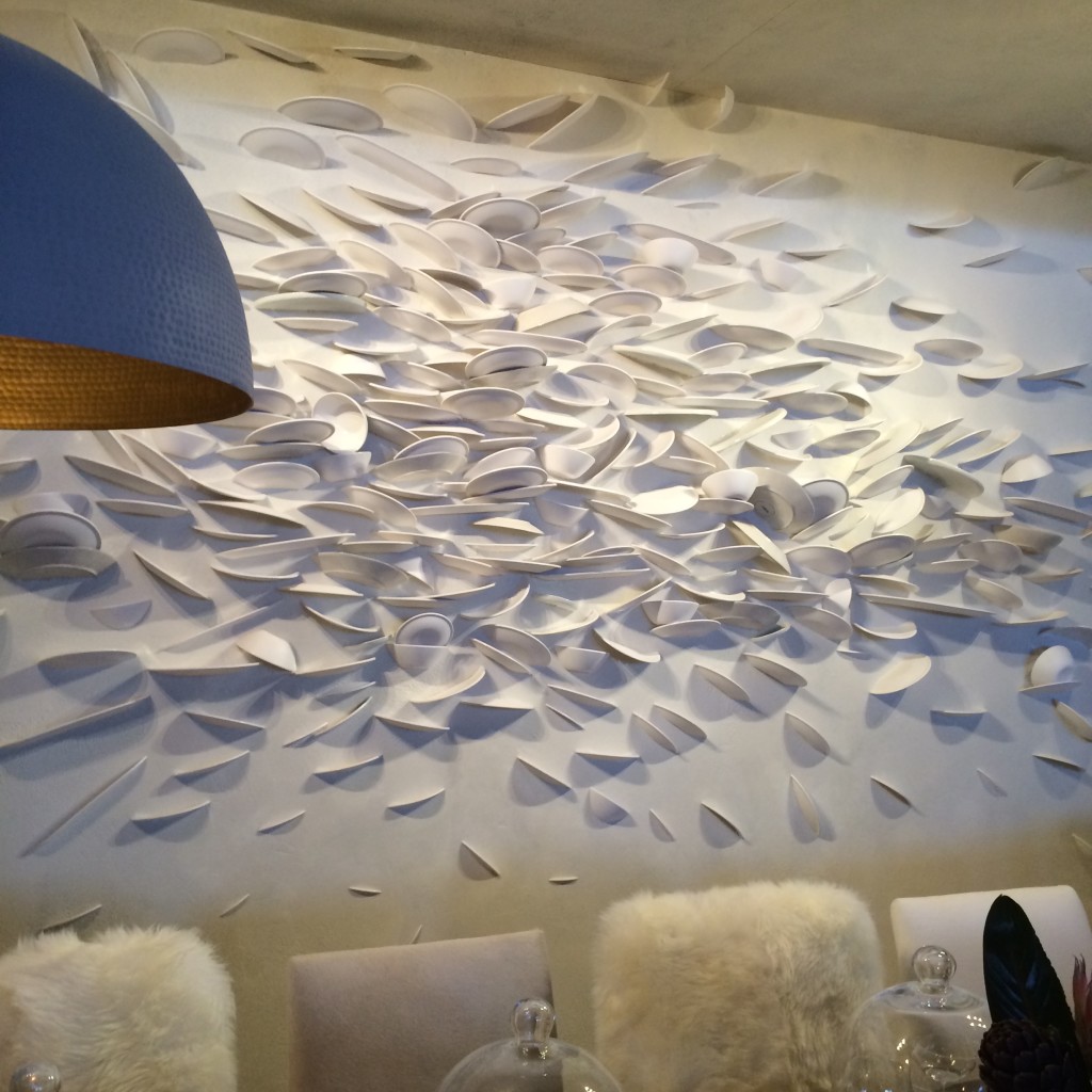
#10 C&B at Dining by Design
Believe it or not, I am including Crate & Barrell in this list. Their dining room for DIFFA included a brilliant wall “art” installation. How many plates were broken to create this I don’t know. But what fun and how tongue-in-cheek. Kudos C&B.

*All photos are my own save the two that are hyperlinked. Thank you for sharing your beautiful images with our readers.
-
Beautiful Stranger
Architectural Digest – the original grande dame of shelter magazines – is back and better than ever
with an absolutely stunning debut issue produced by new editor-in-chief, Margaret Russell. The always
polished and discerning Ms. Russell understands that true design aficionados are not interested in Joan
Rivers’ pink bedroom or Neverland Ranch. Remarkable style, storied architecture and designers at the
top of their game are the trademarks of the AD we have known and loved. As a young girl I would wait
anxiously each month for the latest issue to arrive. After studying the elegant and intoxicating images
for days, I would file away each publication in my archives (i.e. my bedroom closet) for future reference.
Those pages inspired my love for interiors and helped shape my future career as a designer.
So it is with great sincerity and fervent optimism that I say,
“Welcome back gorgeous – we’ve missed you!”
A cover to inspire the next generation of designers
featuring a New York living room by Michael S. Smith.
– STATE OF GRACE –
A traditional dining room decorated by Richard Leith Langham.
Mississippi river scenes are portrayed in the custom Gracie paper covering the walls.
– TRUE BELIEVER –
An LA bachelor pad designed for a young entrepreneur
who envisioned the renovated home as a “stylish villain’s lair”.
– RARE & REFINED –
Michael Smith's elegant and sumptuous design themes continue throughout the New York
apartment featured on the cover – as seen here in the library but in darker, richer tones.
An abstract Peter Lanyon painting hangs above an
18th century bibliothèque in the entrance hall.
– GOOD VIBRATIONS –
The living room of Sheryl Crow’s Spanish Colonial home.
And a curved, rustic staircase on the property of the Hollywood estate.
– A PEACEABLE KINGDOM –
Muriel Brandolini’s living room with large scale George Condo painting,
carpet by Fedora Design and “Smarties” cocktail table by Mattia Bonetti.
Corduroy covers the dining room walls and is hand-beaded with
abstract letters … emblematic of the designer’s risk-taking style.
If you haven’t already, pick up a copy of AD’s March issue today. Reading
a blog post doesn’t compare to flipping through the pages of an actual
magazine. I may be a blogger, but my first love will always be the real thing.
Tricia xo











![porcelain-joya[1]](https://luxeandlucidblog.com/wp-content/uploads/2016/03/porcelain-joya11-1024x808.jpg)
