-
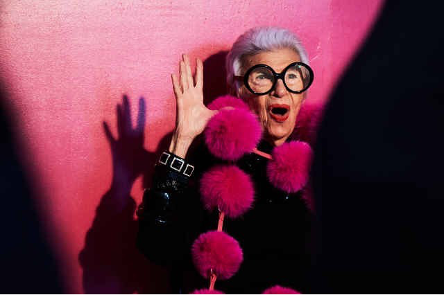
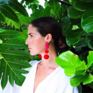
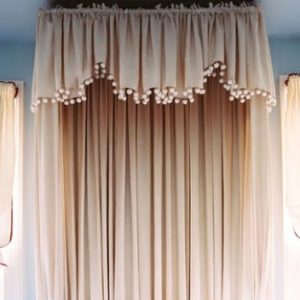
POM POMS
-
The Floors Beneath our Feet
Like a painter preps his canvas, a good designer attends to the bones of a room before honing in on its decorative elements. We make strategic shifts in proportion, tone, and detail, both subtle and grandiose, when thoughtfully designing a space. A beautiful wood floor is one such essential element that has the power to really make our rooms sing. We’re always told to “look up” or “look forward”, as a kind of mantra to mindfulness, happiness and all things good. Well, I say “look down” because there’s beauty and inspiration to be had at your feet!


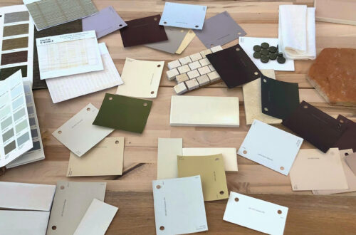
Our design studio becomes a laboratory for deep diving, where we work elbows deep in samples to determine the best tone for the wood floors. We consider location, use, and material adjacencies when making our recommendations. Ultimately, we outfitted a Georgetown residence with rich, classic patterned parquet in a deep and luxurious tone.


Material and tone are carefully considered for each client.
(left): We installed subtly hand hewn floor boards in soft, neutral tones to be bright but forgiving for a young family. (center): This grand PA home called for rich tones that complimented adjacent materials and the scale of the space. (right): We were inspired by sandy textures in this beachside retreat when we chose these soft, washed, waxy tones of warm brown.


(left): We gave the existing parquet flooring of a pre-war Manhattan apartment new life with a lighter stain – showing off the beautiful pattern and brightening the small space. (right): New french oak flooring in an Alexandria townhouse has been pickled, adding much needed warmth and texture to a once incohesive collection of different vinyl flooring.


Inspiration at its finest. (left): Jeffrey Bilhuber (right): Hillwood Estate (bottom): Archetypal Floors
-
Branded
There is one question I receive more than any other from prospective clients, writers, editors, vendors and
the public-at-large. “What’s Your Style?” Simple enough I suppose. After all, most designers and novice
decorators have a catch phrase … “edited elegance”, “shabby chic”, “retro glam”, etcetera. The funny thing
is that despite having worked as an interior designer for fifteen years and having my own firm for five, I’ve never
been able to provide a nice neat answer to that all-important question. I guess I found it difficult to sum up all
of my professional passions and aspirations into a few choice words. And perhaps subconsciously I realized
that I needed to soak up as much as I could from the talented pool of designers, architects and artisans around
me before attaching myself to a specific slogan. Or maybe I’m just a knucklehead. Whatever the reason, in this
era of branding, I think it’s time to find a trademark for TRICIA HUNTLEY INC. and certainly for HUNTLEY & CO.
I believe I have a contender, so I’m hoping the Luxe & Lucid audience will help me with my decision. Based on
the cues below, let me know if I’m on target. I welcome comments and suggestions from my clever readers.
– Influential Designers -
Sills Huniford (now parted), Jeffrey Bilhuber & Solis Betancourt (top to bottom),
Three stellar firms that deliver genius with every project. Of course, I may be a little partial to SB
since it is headed by my former bosses who happen to be the nicest, most gracious men on earth.
- The Glamour Found in Nature -
I love me a manicured hedge and a nice hunk of rock.
Jacques Garcia temple photo c/o World of Interiors
– Gorgeous, Dramatic Art –
John Singer Sargent, Elliott Puckette, Francisco Goya & Giacometti (top to bottom).
– Sexy, Laid-Back, All-American Fashion –
Tory Burch, Gwyneth Paltrow and one of my favorite looks - skinny jeans, flats and a [faux] fur coat.
– My Collected Thoughts-
This scrapbook is a collection of images I have pulled because they are beautiful
and inspiring, regardless of context. I started this “stream of consciousness” project
to help me with the idea of branding and to jump start the design for my own house.
– My Own Work –
Whether I’m working on a modern apartment or sprawling traditional home, there are always
three elements key to my interiors; they need to be beautiful, original and unpretentious. Not
only do I want them to reflect the spirit and lifestyle of my clients, but I want them to be livable.
So taking all of the above into consideration, I think the best way to describe my style is …
“NATURAL GLAMOUR”
Wacha’ think? Tricia xo
* Refer to blog posts Designer DNA and Wuzzup?
as well as the Huntley & Co. website for more info.
-
Singin’ the Blues
I was recently asked by a publisher what I thought the prevailing design trend for 2010
would be. My answer was immediate and definitive – seen here in the quote I sent her:
RICH SHADES OF BLUE!
Prussian, Midnight, Cerulean & Turquoise.
Everyone is looking to get a lot of "bang for their buck" these days and that applies to
color as well. Deep, intoxicating colors like those mentioned above bring a sense of
richness to a room when applied to walls (with paint, paper or fabric). Moreover, these
shades of blue are überhip – perfect for the young, the bold and the stylish among us.
Lo and behold, the next day Elle Decor’s March issue dropped with a deep blue room on the cover. Snap!
The aforementioned cover – evidence of my intuition, insight, brilliance??? ; )
And a sick spread inside featuring GORGEOUS jewelry and home accessories.

One of my favorite Vogue covers of all time. Winona never looked so beautiful.
Steven Gambrel’s west village townhouse. Blue that’s sexy and masculine and unexpected. Perfection.
And wouldn’t you love to drive home to chez fabulous in a 1968 midnight blue Jaguar?
Maybe you’re a little more diva and a little less duchess?
You might prefer to put your Manolo to the metal in an electric blue model from ‘84.
These stilettos would do the trick! Gucci’s Debra heel.
.
After a long day of wearing said stilettos, it’s time for a comfy pair of slippers.
Textile maven Gretchen Bellinger made these plush peds for me in a luxurious Bellinger mohair.
Yes, she's a rock star and yes, I worship her.
A vintage silk folding screen in my bedroom as seen behind my slippers in the photo above.
And a beautiful blue Degas book on my bedside table.
Timothy Paul carries linens, accessories and some of the most beautiful pillows in town.
David Collins' London home is a lesson in layering … dozens of shades of blue.
The gorgeous spread was featured in Spanish AD.
The perfect foil to the Collins' living room above? Joan Holloway sipping a cocktail.
Miles Redd is a designer who knows how to sex-up interiors with bright, bold colors.
Dress as Caribbean vacation in last month’s Vogue Nippon.
Muriel Brandolini mixing cobalt, acid yellow and magenta in her own New York parlor.
The same colors as seen in Balenciaga’s fall ‘09 ad campaign with Jennifer Connelly.
The Stella McCartney bag I carry during the winter months.
The color changes from indigo to midnight to black depending on the light.
And the electric blue hooded jacket I love to layer over simple slacks and tees.
I was deeply imbedded in my blue obsession as of December – my 2009 holiday cards.
Two clutches from Vivre. This company always nails it with accessories.
One doesn’t typically associate cameos with cobalt blue … but how striking!
A country home with a complex and completely original palette like only my man JB could do.
For evening, dramatic blues look best on strong, sexy, confident women.
And let’s not forget about the original indigo – denim. Whether dressed up or dressed down,
jeans are ALWAYS sexy. Illustrated by BFF's Katie Holmes and Victoria Beckham.
-
The Gold Standard
I'm a gold girl. Bronze, silver, not even platinum gives me the rush that gold does.
It’s warm and sexy and adds a little magic to any material. I love gold fabric, furniture, lighting
and especially jewelry and hardware. I would plate everything in gold if I could. Now for you nay-sayers
who think gold is a finish that belongs in the 80s, take a look at the images below and get ready to swoon.
A few of my current favorite gold fabrics.
A glamorous gold face in Vogue Nippon.
At the Washington Design Center's spring 2007 design house I painted the walls
India Yellow by Farrow & Ball and added gold David Iatesta sconces.
A vintage Curtis Jere wall sculpture.
I'm saving this image in my inspiration file for a future project.
The layers of gold could inform an entire color scheme.
Some of the amazing metalwork at Grand Central Station.
What artist celebrated the brilliance of gold more than Klimt?
Sooo gorgeous … LOVE this gold and citrine pin! I would wear it with a [faux]
fur vest layered over a grey cashmere sweater, jeans and a sick pair of heels.
Some of my favorite jewelry piled in a gold tray.
I get a ton of compliments on this Chloe purse.
Nancy Lorenz added graffiti-esque gold accents to Jeffrey Bilhuber's scenic
paper-covered bedroom walls. A gutsy move by the interior design genius.
I'm seriously considering switching my flatware over to gold … so much sexier!
Columbina Flatware at The Moma Store.
I love this mug! The perfect glam/punk combo.Where better to wear gold than on your toes? Louboutin heels from the 2005 collection.
Looking for a gift for the woman who has everything? Yes, there is a gold facial.
Gold paperclips – A Huntley & Co. office standard!
