-
Ironware’s Designer Spotlight
In an interview with Ironware International, Tricia answers all your burning questions including what inspires her, what’s on her bucket list and whether she prefers 70s soul, country music or contemporary pop (hint: all of the above).

Ironware Q&A
Who is a designer you admire and why?
Muriel Brandolini. I admire her creativity, fearlessness, passion for craftsmanship and ability to mold her very particular look into something traditional or modern.
Where is your favorite travel destination?
Italy. Rome and Florence are favorites – The Boboli Gardens particularly in Florence.
What or who has inspired your work recently.
I recently watched the documentary ‘Agnelli’ about the life of Gianni Agnelli. His style is legendary. His clothing, grooming, homes, cars, art, mannerisms—all were impeccable, incredibly glamorous, and yet, totally effortless. He embodied midcentury Italian style.
Is there a special detail you always add to your projects?
Bespoke furnishings. We always create custom furniture, lighting and/or softgoods for our projects.
What is the most common mistake you see in interiors?
Uninspired art. Seeing a well-executed interior with art that’s decorative or pedestrian is soul-crushing. An artwork collection should be a mix of genres and price points; some should be thoughtfully curated pieces, others should be “finds” from vacations and flea markets. It shouldn’t be too perfect, too much of the same or purchased based on what your friends own.
What is most exciting to you in your career at this moment?
The landscape of our industry is constantly shifting and it’s become an ongoing challenge for designers. The good news is that I love a challenge. I never thought I would have to explain or defend my professional value at this point in my career, but I’ve come to realize that it ups my game in many ways. I continually pursue new levels of excellence in design and business. That keeps my job exciting and interesting.
How would you best describe your style?
Eclectic yet edited. I like unexpected pairings and a bit of tension wrapped in a thoughtful, comfortable envelope.
Describe a favorite piece in your personal home
I purchased a vintage coromandel screen last year and installed it in my dining room. It has a rich warm wood finish with slightly colored carvings. It has great scale and is both very elegant and a bit weird. It’s flanked by crystal Swedish sconces with my dining table, pink leather chairs and brutalist chandelier completing the arrangement.
What are three (or four!) things you can’t live without besides family, faith and friends?
Comedy radio, cursive handwriting, my Swell water bottle and Nina, my beloved Norwegian Elkhound.
Name something on your bucket list
Going on safari in Africa.
What music are you listening to right now?
70s soul, country and the Sia station on Pandora.
Why do you choose Ironware for your projects?
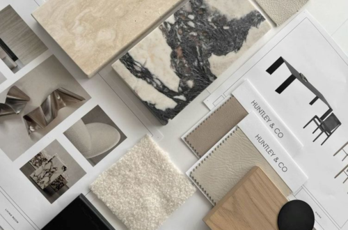
Ironware has substance. Playing the textural and sculptural against clean lines is part of what makes a Huntley & Co. interior. Ironware is the perfect counterpoint to more tailored furnishings.
Ironware x Huntley

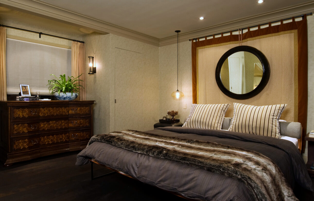
(L to R): the Alicia table in an Annapolis project; the Huntley-designed Celine pendant; a master bedroom features the Diego bed. 
The Celine pendant and a multitude of other gorgeous light fixtures, furnishings and accessories are available to-the-trade on the Ironware International website. HUNTLEYCODESIGN loves IRONWARE!

www.luxeandlucidblog.com
www.huntleyandcompany.com -
Beautiful Stranger
Architectural Digest – the original grande dame of shelter magazines – is back and better than ever
with an absolutely stunning debut issue produced by new editor-in-chief, Margaret Russell. The always
polished and discerning Ms. Russell understands that true design aficionados are not interested in Joan
Rivers’ pink bedroom or Neverland Ranch. Remarkable style, storied architecture and designers at the
top of their game are the trademarks of the AD we have known and loved. As a young girl I would wait
anxiously each month for the latest issue to arrive. After studying the elegant and intoxicating images
for days, I would file away each publication in my archives (i.e. my bedroom closet) for future reference.
Those pages inspired my love for interiors and helped shape my future career as a designer.
So it is with great sincerity and fervent optimism that I say,
“Welcome back gorgeous – we’ve missed you!”
A cover to inspire the next generation of designers
featuring a New York living room by Michael S. Smith.
– STATE OF GRACE –
A traditional dining room decorated by Richard Leith Langham.
Mississippi river scenes are portrayed in the custom Gracie paper covering the walls.
– TRUE BELIEVER –
An LA bachelor pad designed for a young entrepreneur
who envisioned the renovated home as a “stylish villain’s lair”.
– RARE & REFINED –
Michael Smith's elegant and sumptuous design themes continue throughout the New York
apartment featured on the cover – as seen here in the library but in darker, richer tones.
An abstract Peter Lanyon painting hangs above an
18th century bibliothèque in the entrance hall.
– GOOD VIBRATIONS –
The living room of Sheryl Crow’s Spanish Colonial home.
And a curved, rustic staircase on the property of the Hollywood estate.
– A PEACEABLE KINGDOM –
Muriel Brandolini’s living room with large scale George Condo painting,
carpet by Fedora Design and “Smarties” cocktail table by Mattia Bonetti.
Corduroy covers the dining room walls and is hand-beaded with
abstract letters … emblematic of the designer’s risk-taking style.
If you haven’t already, pick up a copy of AD’s March issue today. Reading
a blog post doesn’t compare to flipping through the pages of an actual
magazine. I may be a blogger, but my first love will always be the real thing.
Tricia xo
-
Singin’ the Blues
I was recently asked by a publisher what I thought the prevailing design trend for 2010
would be. My answer was immediate and definitive – seen here in the quote I sent her:
RICH SHADES OF BLUE!
Prussian, Midnight, Cerulean & Turquoise.
Everyone is looking to get a lot of "bang for their buck" these days and that applies to
color as well. Deep, intoxicating colors like those mentioned above bring a sense of
richness to a room when applied to walls (with paint, paper or fabric). Moreover, these
shades of blue are überhip – perfect for the young, the bold and the stylish among us.
Lo and behold, the next day Elle Decor’s March issue dropped with a deep blue room on the cover. Snap!
The aforementioned cover – evidence of my intuition, insight, brilliance??? ; )
And a sick spread inside featuring GORGEOUS jewelry and home accessories.

One of my favorite Vogue covers of all time. Winona never looked so beautiful.
Steven Gambrel’s west village townhouse. Blue that’s sexy and masculine and unexpected. Perfection.
And wouldn’t you love to drive home to chez fabulous in a 1968 midnight blue Jaguar?
Maybe you’re a little more diva and a little less duchess?
You might prefer to put your Manolo to the metal in an electric blue model from ‘84.
These stilettos would do the trick! Gucci’s Debra heel.
.
After a long day of wearing said stilettos, it’s time for a comfy pair of slippers.
Textile maven Gretchen Bellinger made these plush peds for me in a luxurious Bellinger mohair.
Yes, she's a rock star and yes, I worship her.
A vintage silk folding screen in my bedroom as seen behind my slippers in the photo above.
And a beautiful blue Degas book on my bedside table.
Timothy Paul carries linens, accessories and some of the most beautiful pillows in town.
David Collins' London home is a lesson in layering … dozens of shades of blue.
The gorgeous spread was featured in Spanish AD.
The perfect foil to the Collins' living room above? Joan Holloway sipping a cocktail.
Miles Redd is a designer who knows how to sex-up interiors with bright, bold colors.
Dress as Caribbean vacation in last month’s Vogue Nippon.
Muriel Brandolini mixing cobalt, acid yellow and magenta in her own New York parlor.
The same colors as seen in Balenciaga’s fall ‘09 ad campaign with Jennifer Connelly.
The Stella McCartney bag I carry during the winter months.
The color changes from indigo to midnight to black depending on the light.
And the electric blue hooded jacket I love to layer over simple slacks and tees.
I was deeply imbedded in my blue obsession as of December – my 2009 holiday cards.
Two clutches from Vivre. This company always nails it with accessories.
One doesn’t typically associate cameos with cobalt blue … but how striking!
A country home with a complex and completely original palette like only my man JB could do.
For evening, dramatic blues look best on strong, sexy, confident women.
And let’s not forget about the original indigo – denim. Whether dressed up or dressed down,
jeans are ALWAYS sexy. Illustrated by BFF's Katie Holmes and Victoria Beckham.
