• montage of 5 photos from red to green

    Palette | Red and Green

    What better day to embrace a green and red palette, than today, Christmas. This may seem like a color scheme best reserved for the holidays, but I’m actually a big fan. My own home riffs on this palette. And because both red and green have so many gorgeous iterations, you can do some really interesting things when using them in an interior. I created three designs below in honor of the combo and this magical holiday. 

    Living Room

    Mint and cherry red in an aesthete’s modern living room.

    Study

    Avocado and burgundy in a textural, eclectic study.

    Bedroom

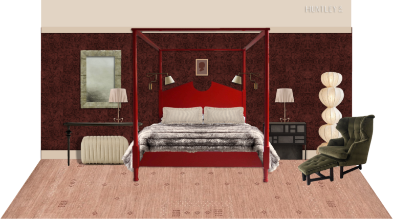
    A tomato red canopy bed is tempered by murkier greens and russet, as well as shades of blush.

    Short and sweet, but chock full of inspo for your Christmas Day. May your holiday be one of love and laughter. Cheers!

    signature of name Tricia
    PS: You can source the rooms above on our Luxe & Lucid Pinterest page. Unfortunately, the link will eventually expire.
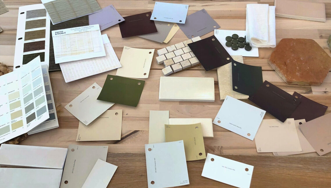
  • paint and other samples on a table in the huntley & Co. studio

    Concept Before Color

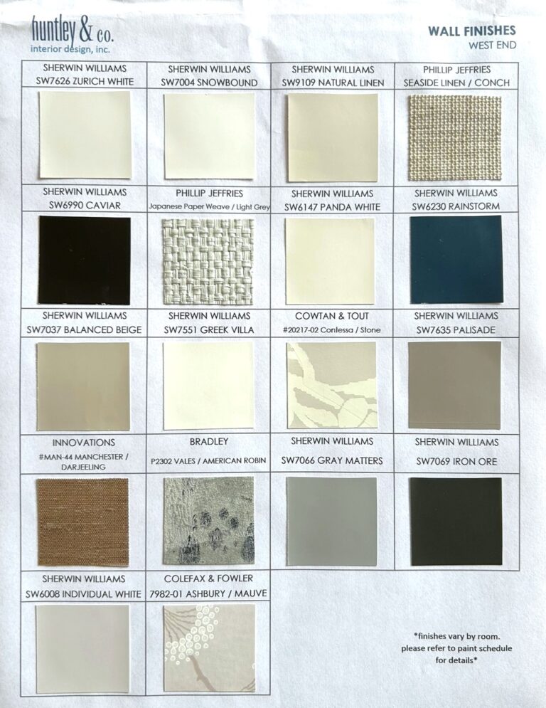
    The most common question I have been asked as an interior designer over the years is, without a doubt, “What are your favorite paint colors?” I suspect it ranks among the most popular design topics of all time. Funny thing is, I don’t have favorite paint colors (shock, awe!). I do not have a stable of SW’s BM’s, or F&B’s that I play on repeat. I liken that to a makeup artist applying the same look to a young, cherub-faced, blonde as she would a middle-aged, raven-haired woman with high cheekbones. Each home has its own architecture, light, and vibe that necessitates its own palette and specific application. How do you figure out that palette and specific application?! Start with a concept. 

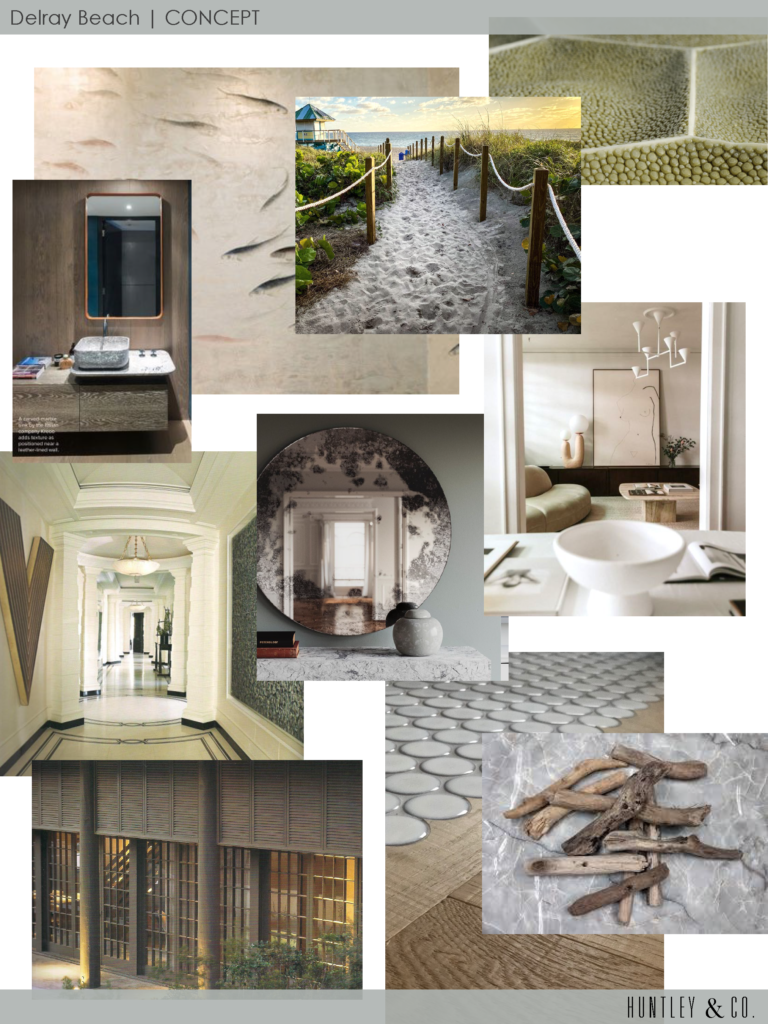
    Example 1 | Delray Beach, FL

    CONCEPT

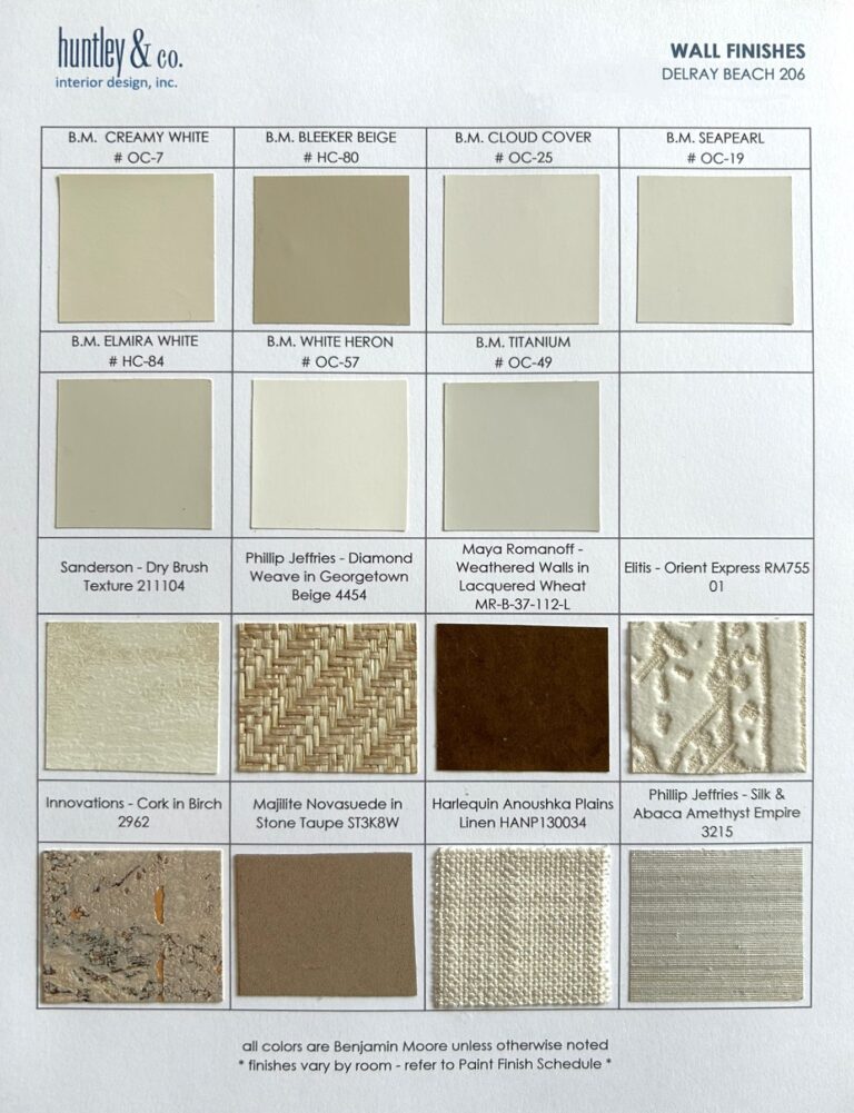
    COLORS

    RESULT

    WHO/WHERE: A beachfront, second home in Florida for empty-nesters.

    VIBE: Relaxed, soft-modern

    PALETTE: A low-contrast range of beiges and browns with accents of silvery, blue-grey

    Example 2 | Washington, DC

    CONCEPT

    COLORS

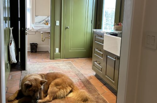
    RESULT

    WHO/WHERE: A city townhouse for a young couple and soon-to-be parents

    VIBE: Old-school formal meets youthful cool

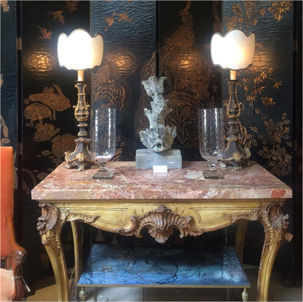
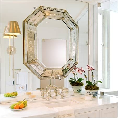
    PALETTE: From ecru, cafe au lait, and green-grey to caramel, peacock blue, and near-blacks

    What you’ll notice is that the Delray Beach and West End palettes are not in opposite hemispheres; there is overlap. It’s the contrast, variety of hues and color temps, as well as the adjacent materials and finishes that set them apart. Both interiors may have shades of creamy-white, but we selected different versions because the light and vibe in DC varies considerably from the light and vibe in Florida. And, of course, the floors were a factor as pairing paint with white oak is worlds away from pairing it with an ebony-stain.

    Visit the Delray Beach and West End portfolios on the Huntley & Co. website for a more comprehensive view of each project (note, not all rooms are photographed). Go to Tiktok and view my companion video to this post for additional examples of the concept-color-interior throughline. I am on a quiet mission to change hearts and minds! #conceptbeforecolor

    signature of name Tricia
    { PS: Photography and online screens distort the actual colors of the samples shown above. } 

    All work and projects above are by Huntley & Co. Interior Design

  • Shark!

    Sharks are certainly newsworthy these days.  Shark Week is in full swing on Discovery, JAWS  just celebrated the 40th anniversary of its release, and on a less inviting note, Carcharhinus have made the Outer Banks their summer vacation destination.  Yikes!  Surprising as it may seem, I am loving every minute of it.  Despite my lifelong fear of sharks, I am obsessed with the movie Jaws.  I admit this seems a bit odd for a land lover, professional aesthete and enthusiast of all things cute and fuzzy.  First, I love a good thriller.  Second, the cast is perfection.  Third, the cinematography (Spielberg, of course) is inventive yet convincing.  And fourth, the dialog makes it one of the most quotable films of all time.  Yes, I could go on and on.  As a creative person, I believe a piece of art is worth celebrating, regardless of the medium or subject.  So without further ado, here’s to the most fascinating and freakin’ scariest fish in the sea.

    paragraph

    HBZ+Rihanna+Subscriber+Cover

    Rihanna, Bruce (aka Jaws) and Harper’s Bazaar magazine.  Has their ever been a better magazine cover?!

    paragraph

    iheartjaws

    Quint, Brody and Hooper (Robert Shaw, Roy Scheider and Richard Dreyfuss respectively).  Arguably the best ensemble on film.

    paragraph

    1A

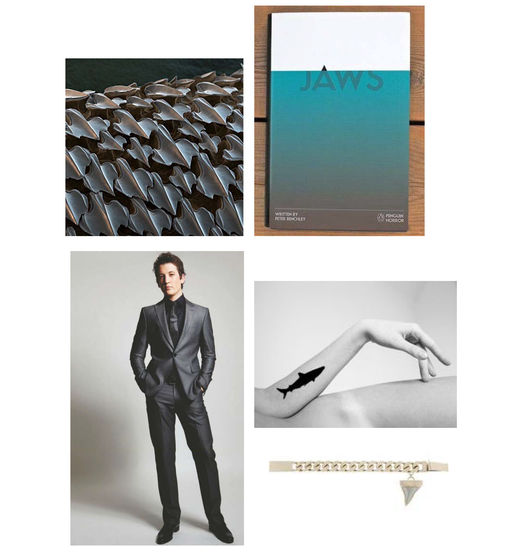
    clockwise from top left:  (1) electron microphoto of sharkskin, (2) Peter Benchley’s book cover, (3) a shark tattoo, (4) Givenchy’s shark tooth bracelet and (5) Miles Teller in a sharkskin suit.

    paragraph

    2a

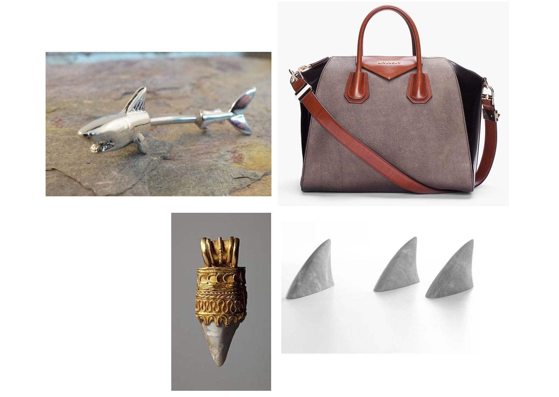
    clockwise from top left:  (1) shark belly button ring, (2) Givenchy Antigona sharksin-effect bag, (3) marble Squalo Sharkfin doorstops by James Irvine and (4) a 5th century Etruscan amulet with shark’s tooth.

    paragraph

    3

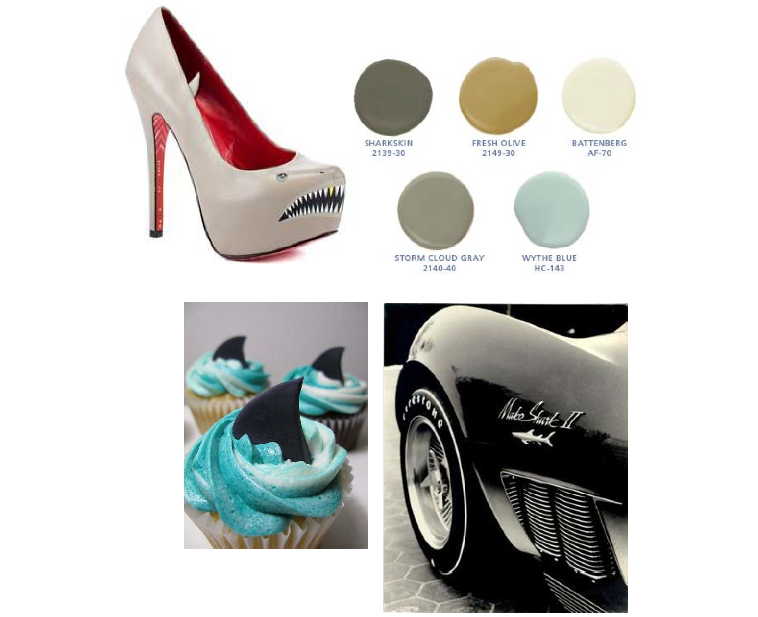
    clockwise from top left:  (1) Sharkie Heels from TaylorSays – so crazy I almost want a pair, (2) Sharkskin paint by Benjamin Moore, (3) the incredibly sexy Chevy Mako Shark II and (4)  the perfect cupcakes for a Jaws-themed party.

    paragraph

    4B

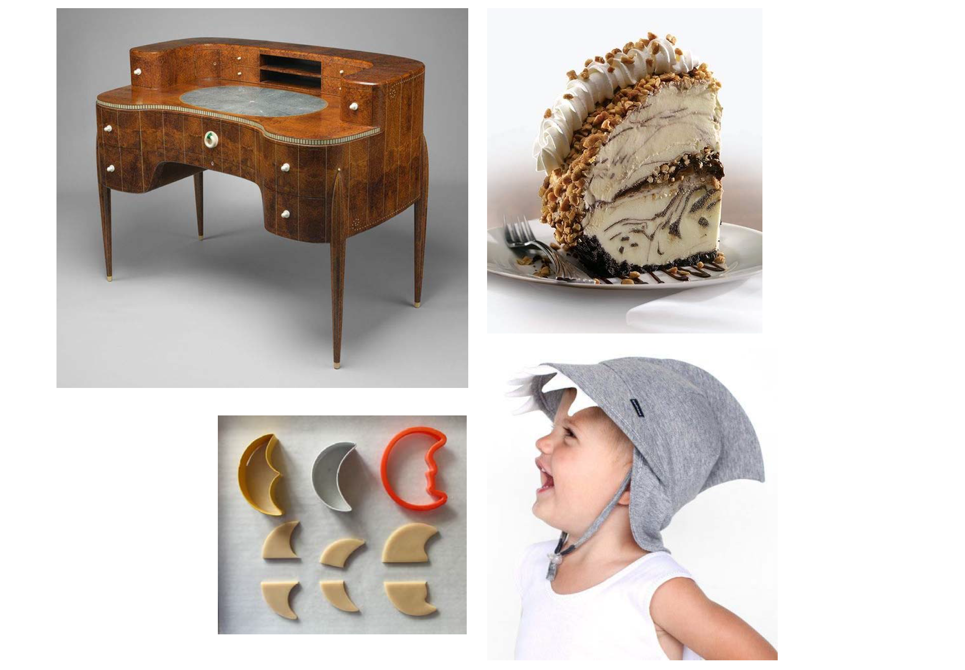
    clockwise from top left:  (1) Ruhlmann amboyna wood desk with sharkskin inlay, (2) Sharkfin pie – yes please, (3) SunSwimPlay grey Sharkie hat for baby and (4) sharkfin cookie molds/cutters.

    paragraph


    Links to these and other shark-themed items as well as JAWS film stills and movie quotes can be found on the Shark!  Pinterest board.

    paragraph

    IMG_2459 - Copy (2) - Copy

     ~~~~~~~^~~ Tricia
    paragraph