-
The Floors Beneath our Feet
Like a painter preps his canvas, a good designer attends to the bones of a room before honing in on its decorative elements. We make strategic shifts in proportion, tone, and detail, both subtle and grandiose, when thoughtfully designing a space. A beautiful wood floor is one such essential element that has the power to really make our rooms sing. We’re always told to “look up” or “look forward”, as a kind of mantra to mindfulness, happiness and all things good. Well, I say “look down” because there’s beauty and inspiration to be had at your feet!


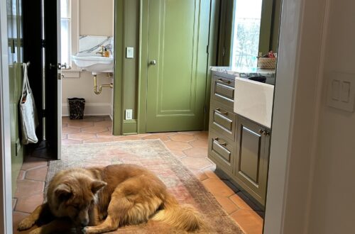
Our design studio becomes a laboratory for deep diving, where we work elbows deep in samples to determine the best tone for the wood floors. We consider location, use, and material adjacencies when making our recommendations. Ultimately, we outfitted a Georgetown residence with rich, classic patterned parquet in a deep and luxurious tone.


Material and tone are carefully considered for each client.
(left): We installed subtly hand hewn floor boards in soft, neutral tones to be bright but forgiving for a young family. (center): This grand PA home called for rich tones that complimented adjacent materials and the scale of the space. (right): We were inspired by sandy textures in this beachside retreat when we chose these soft, washed, waxy tones of warm brown.


(left): We gave the existing parquet flooring of a pre-war Manhattan apartment new life with a lighter stain – showing off the beautiful pattern and brightening the small space. (right): New french oak flooring in an Alexandria townhouse has been pickled, adding much needed warmth and texture to a once incohesive collection of different vinyl flooring.


Inspiration at its finest. (left): Jeffrey Bilhuber (right): Hillwood Estate (bottom): Archetypal Floors
-
THE AD DESIGN SHOW :: TRICIA’S 10
I spent the day at the Architectural Digest Design Show in New York on Friday. It’s always good to see what’s new, talk with vendors and “kick the tires” so to speak. Seeing the finish/scale/construction of products in person is integral to quality control and intelligent design. And, of course, it’s fun. I’ve shared ten best picks — whether it be a specific piece or an entire collection — and why each was worth a closer look.

#1 Van Cronenburg
I am passionate about hardware and this company is stellar. Substance and exquisite detail in every piece.


#2 A Space Wall Sconce
All of the products from A Space – lighting, furniture, vases – are beautiful, but the Falling Star lamp was a show-stopper. It will undoubtedly make a lot of “it lists”.


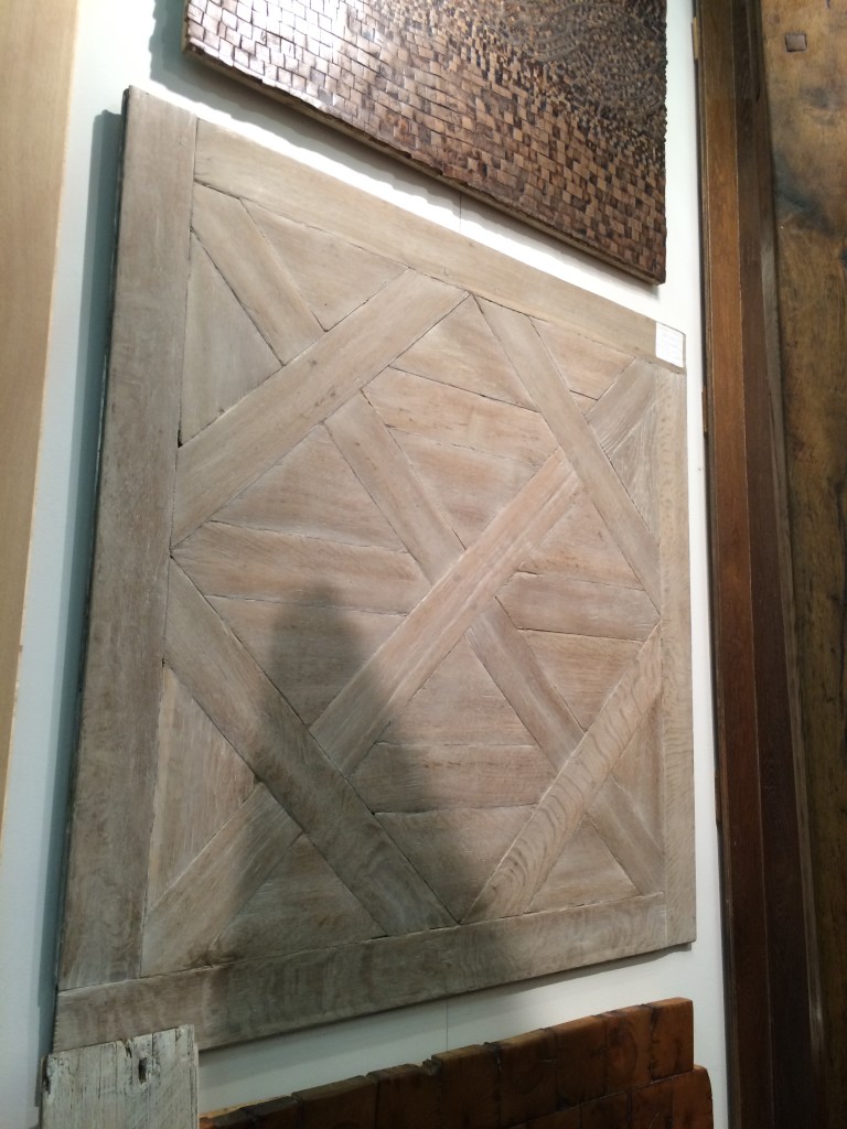
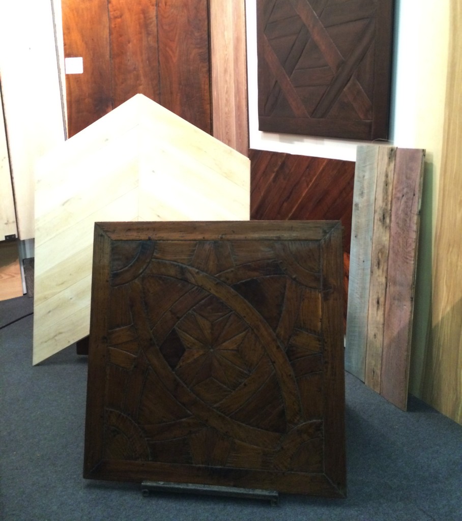
#3 Archetypal
In a perfect world, Archetypal’s work would be on the floors of every home in America. A designer can dream.


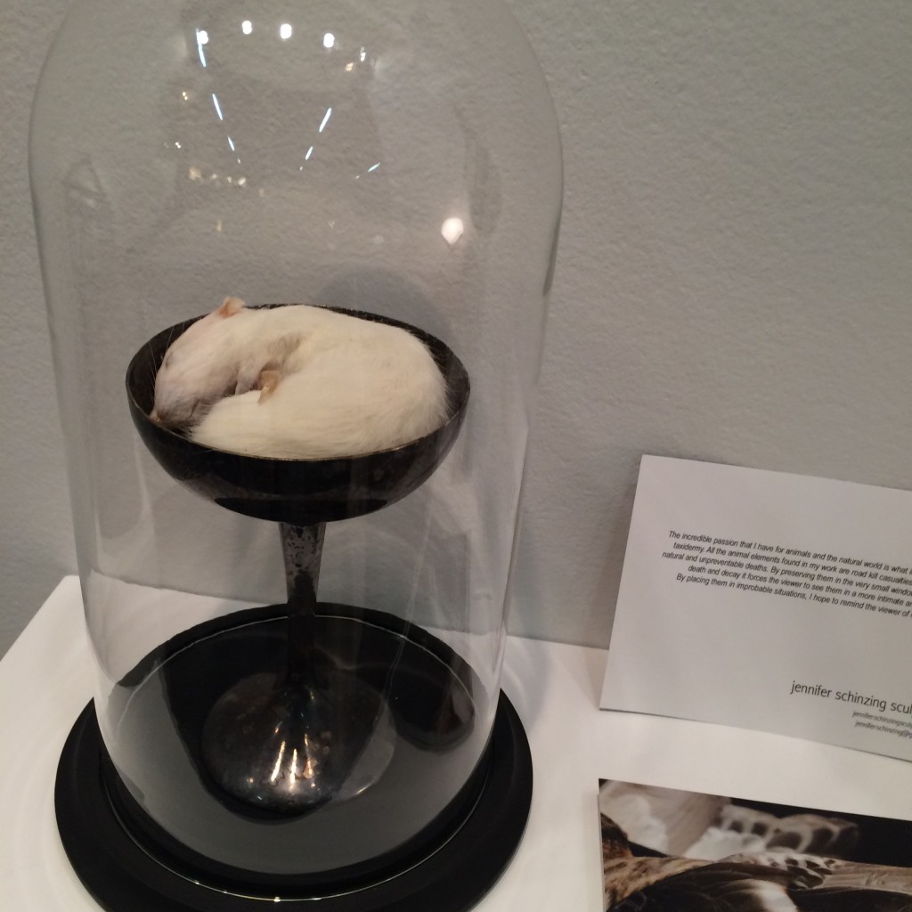
#4 Jennifer Schinzing
Jennifer’s love for the natural world inspired her to learn taxidermy. She preserves small animals (many of them road kill casualties) and transforms them into art installations. The thoughtfulness and beauty of each “memorial” was remarkable. Take note world, SHE IS ONE TO WATCH.



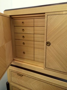
#5 Visilek
This cabinet was perfection. The veneers, the joints, the mechanics, the proportions were all flawless. Filipe Rodrigues’ work is masterful.



#6 Brizio Faucet
The Brizio Solna faucet. It’s black, it’s functional, it’s sexy … and it’s plumbing. Gotta’ love it.


#7 Jefferson Hayman Photography
I never jumped on the gallery-style art installation bandwagon in design. Perhaps because often times it’s just a bunch of crap thrown up on the wall (yes, I just wrote that). But Jefferson Hayman’s installation at the AD Design Show was simply lovely. The collection was intimate, multi-faceted and beautifully framed. Purchasing the entire installation crossed my mind … and I think that of the gentleman in the photo (yes, I was eaves-dropping).


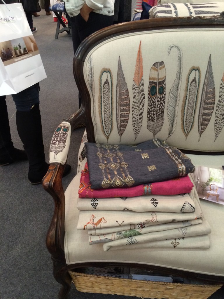
#8 Coral & Tusk
I’m a sucker for animal motifs, so naturally I was drawn to Coral & Tusk’s display. But what’s lovely about these goods is that the patterns are cute without being saccharine. The imagery is grounded by the quality and authenticity of the textiles. Moreover, Stephanie Housley was delightful; her enthusiasm and love for her work was evident.


#9 Joya’s F vs. S Candles
These candles may seem simple, but something about them caught my eye. They whispered [vs. shouted] sexy and luxurious — my personal sweet spot without a doubt. I inquired about an order at the show and pretty much want to purchase the whole collection of fragrances upon seeing the website.


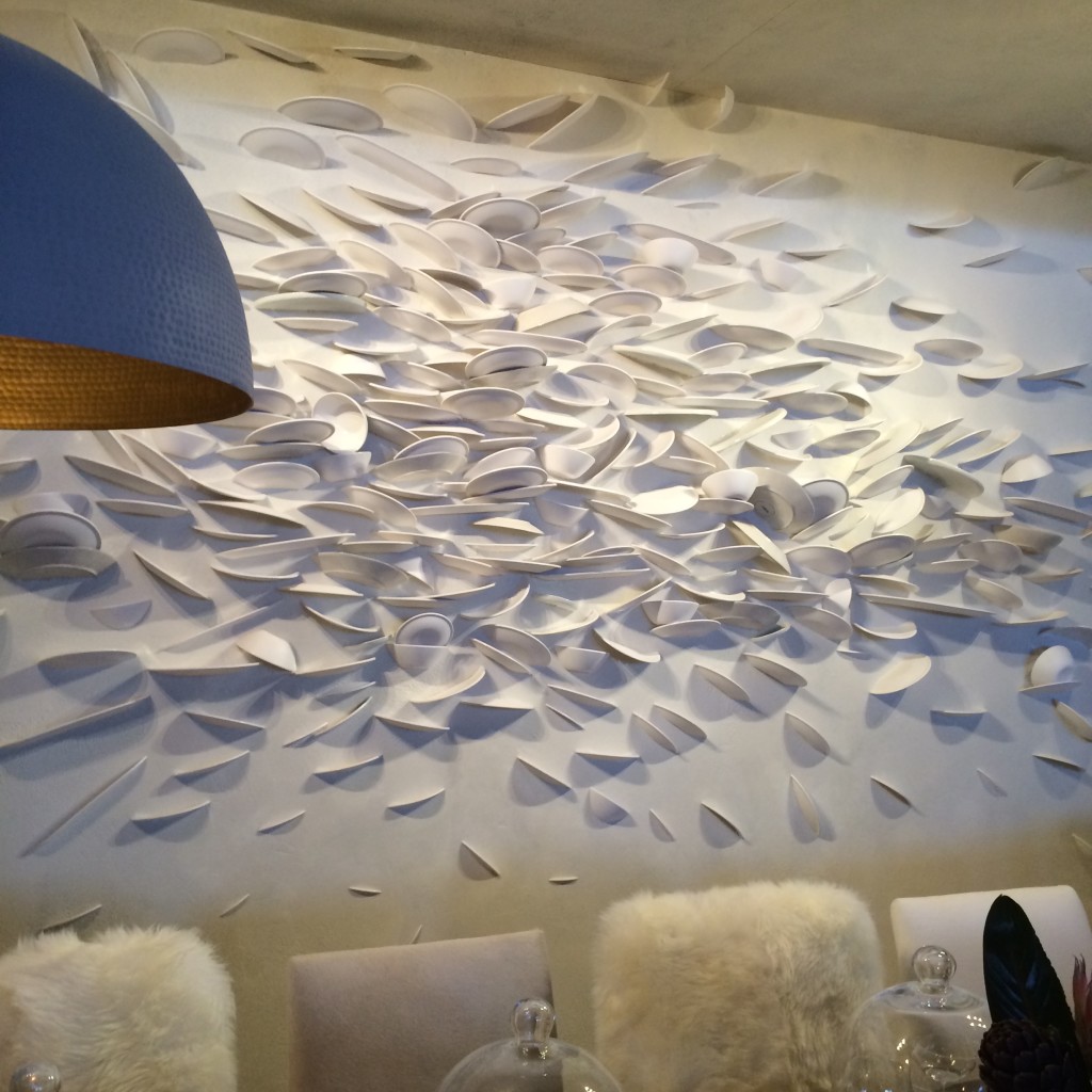
#10 C&B at Dining by Design
Believe it or not, I am including Crate & Barrell in this list. Their dining room for DIFFA included a brilliant wall “art” installation. How many plates were broken to create this I don’t know. But what fun and how tongue-in-cheek. Kudos C&B.

*All photos are my own save the two that are hyperlinked. Thank you for sharing your beautiful images with our readers.



![porcelain-joya[1]](https://luxeandlucidblog.com/wp-content/uploads/2016/03/porcelain-joya11-1024x808.jpg)
