-
THE AD DESIGN SHOW :: TRICIA’S 10
I spent the day at the Architectural Digest Design Show in New York on Friday. It’s always good to see what’s new, talk with vendors and “kick the tires” so to speak. Seeing the finish/scale/construction of products in person is integral to quality control and intelligent design. And, of course, it’s fun. I’ve shared ten best picks — whether it be a specific piece or an entire collection — and why each was worth a closer look.

#1 Van Cronenburg
I am passionate about hardware and this company is stellar. Substance and exquisite detail in every piece.


#2 A Space Wall Sconce
All of the products from A Space – lighting, furniture, vases – are beautiful, but the Falling Star lamp was a show-stopper. It will undoubtedly make a lot of “it lists”.


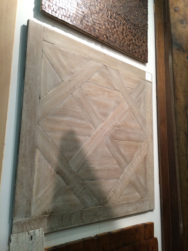
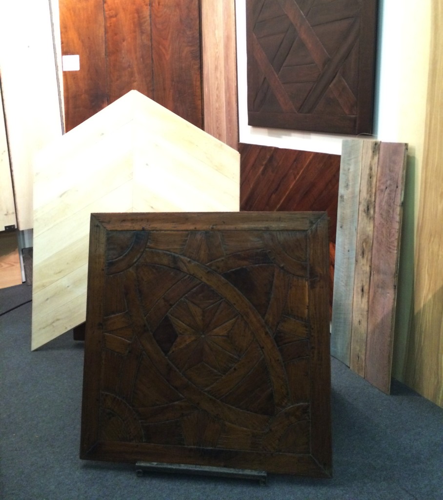
#3 Archetypal
In a perfect world, Archetypal’s work would be on the floors of every home in America. A designer can dream.


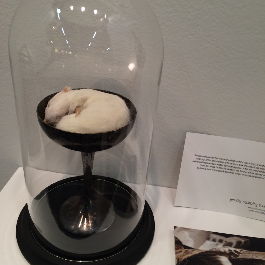
#4 Jennifer Schinzing
Jennifer’s love for the natural world inspired her to learn taxidermy. She preserves small animals (many of them road kill casualties) and transforms them into art installations. The thoughtfulness and beauty of each “memorial” was remarkable. Take note world, SHE IS ONE TO WATCH.



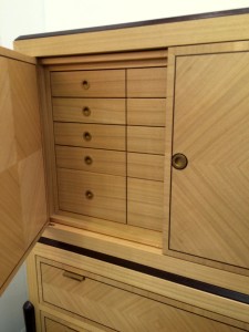
#5 Visilek
This cabinet was perfection. The veneers, the joints, the mechanics, the proportions were all flawless. Filipe Rodrigues’ work is masterful.



#6 Brizio Faucet
The Brizio Solna faucet. It’s black, it’s functional, it’s sexy … and it’s plumbing. Gotta’ love it.


#7 Jefferson Hayman Photography
I never jumped on the gallery-style art installation bandwagon in design. Perhaps because often times it’s just a bunch of crap thrown up on the wall (yes, I just wrote that). But Jefferson Hayman’s installation at the AD Design Show was simply lovely. The collection was intimate, multi-faceted and beautifully framed. Purchasing the entire installation crossed my mind … and I think that of the gentleman in the photo (yes, I was eaves-dropping).


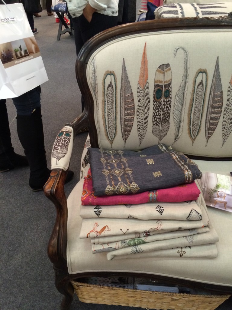
#8 Coral & Tusk
I’m a sucker for animal motifs, so naturally I was drawn to Coral & Tusk’s display. But what’s lovely about these goods is that the patterns are cute without being saccharine. The imagery is grounded by the quality and authenticity of the textiles. Moreover, Stephanie Housley was delightful; her enthusiasm and love for her work was evident.


#9 Joya’s F vs. S Candles
These candles may seem simple, but something about them caught my eye. They whispered [vs. shouted] sexy and luxurious — my personal sweet spot without a doubt. I inquired about an order at the show and pretty much want to purchase the whole collection of fragrances upon seeing the website.


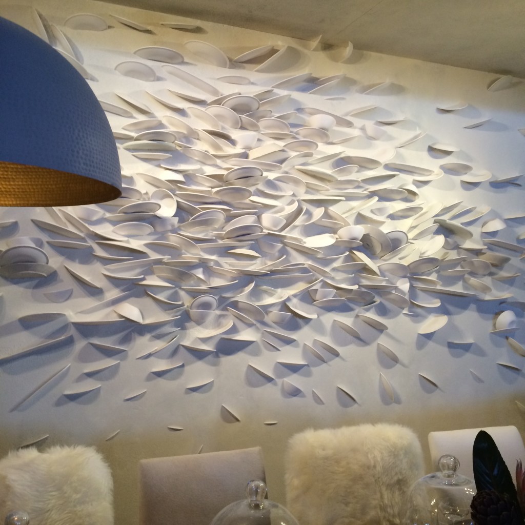
#10 C&B at Dining by Design
Believe it or not, I am including Crate & Barrell in this list. Their dining room for DIFFA included a brilliant wall “art” installation. How many plates were broken to create this I don’t know. But what fun and how tongue-in-cheek. Kudos C&B.

*All photos are my own save the two that are hyperlinked. Thank you for sharing your beautiful images with our readers.
-
Light it Up
I enjoyed some exceptional work days last week. I was in Charleston visiting The Urban Electric Company. Urban Electric is a lighting company with a distinctive vision, brilliant products and a stellar team. I have been using their light fixtures in my designs for nearly a decade. In recent years, I started to design custom fixtures for them to produce. In an exciting development last year, UECo chose to select one of those designs for their permanent collection. The “Huntley” was born as a sconce for a client’s Bethesda home and can now can be found in residential and commercial projects in the US and abroad. As part of their BEHIND THE SCENES video series, Urban Electric invited me to Charleston to discuss the Huntley, my other custom fixtures and the method behind my design process. UECo filmed while I toured their production facility, met with craftsmen and talked with the team about what inspires me. I’ve shared our behind-the-scene shots of Urban Electric’s headquarters and the day’s activities in the photo album below.
A sign that embodies Urban Electric’s stylistic heritage and the spirit of their manufacturing environment.
Touring the metalworking areas with the Urban Electric team.
Learning more about each process. Fascinating.
Lantern multiples prior to welding. A craftsman at work.
Detailed finish work on the second floor. Discussing the components of a custom piece.
Individual parts of The Huntley await assembly. A finished Huntley sconce on the shelves.
Pendants and lanterns from the UECo collection hang throughout. Speaking with visionary owner Dave Dawson during the tour.
Filming the interview.
Huntley sconce installations including a Huntley & Co. foyer and a London department store.
(photos at left and right c/o The Urban Electric Co.)
Many thanks to my Urban Electric hosts for their gracious southern hospitality.
Tricia xo

![porcelain-joya[1]](https://luxeandlucidblog.com/wp-content/uploads/2016/03/porcelain-joya11-1024x808.jpg)
