-
Art to Interior
I love art. I considered curatorial studies for a time while in college. During my first exhibit installation, however, I broke two large glass plates protecting a famous photographer’s work. I concluded pretty quickly that “this is probably not for me”. Still, my love affair continued well into my interior design degree and career. There is almost no genre or medium that I don’t appreciate in some way. A 1982 kinetic sculpture and an oil portrait from the 19th century can both stir my senses. It follows then that artwork sometimes informs my designs.

THE STARTING POINT
Essie, Ruby and Ferdinand – Children of Asher Wertheimer, 1902
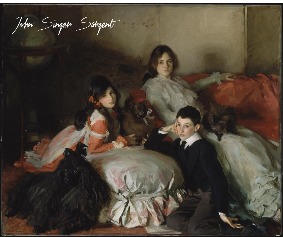
It’s hard to not love Sargent. His oil paintings are lush, moody and undeniably beautiful. I chose this work as a jumping off point for a media principal’s office for its sophistication and intimacy.

THE INTERPRETATION
The idea here is art as muse. I pulled what spoke to me – the colors, tones, textures and emotions. My design is an interpretation of the painting, not a copy of it.
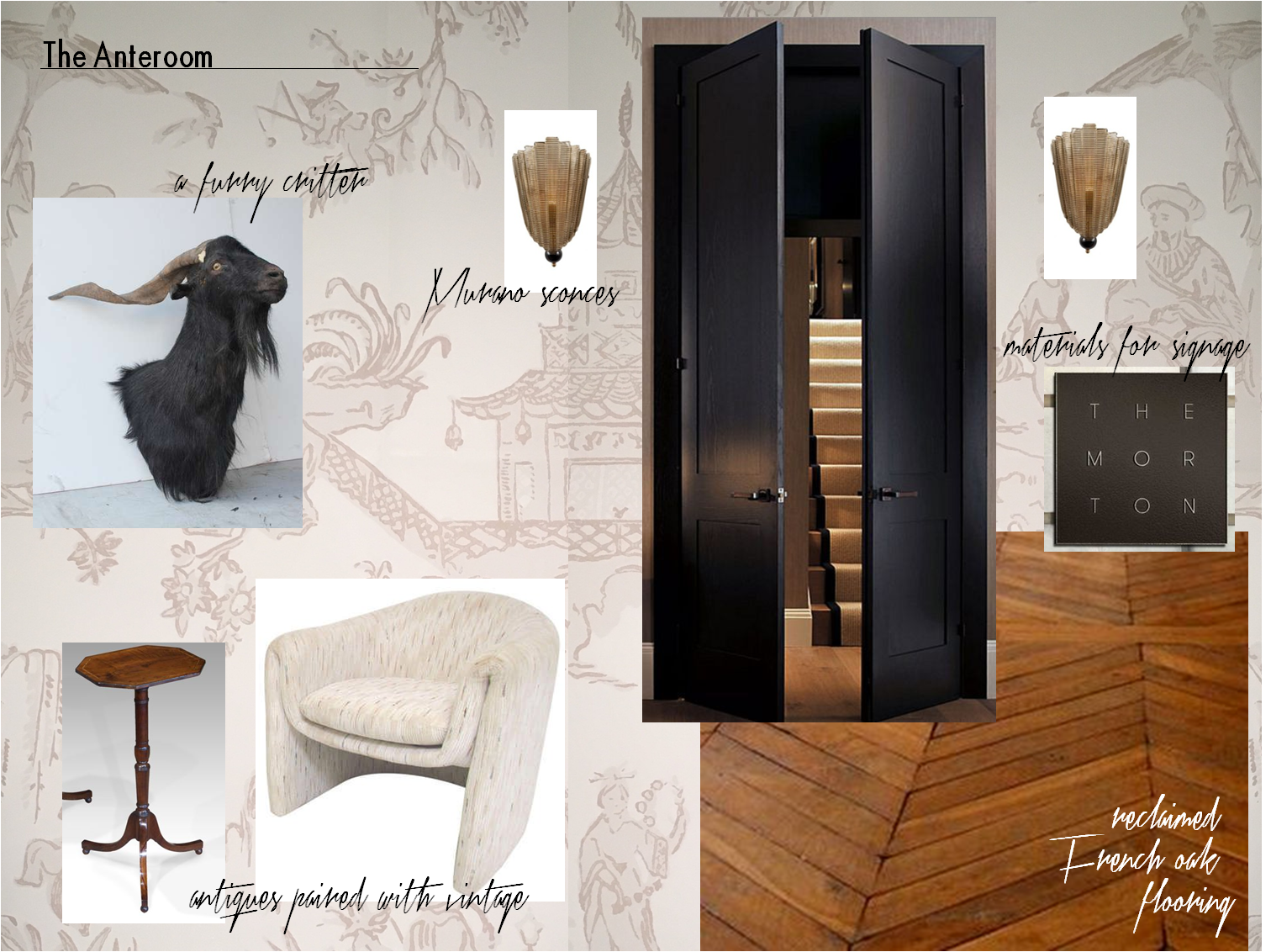
Our client’s office is entered by way of an anteroom. The space is a waiting area for visitors and serves as a buffer between her office and the staff workplace. The finish selections and air of elegance are derived from the Sergent painting. But as this is a modern woman’s office and a Huntley & Co. interior, we changed tack by mixing genres and funking up certain elements.

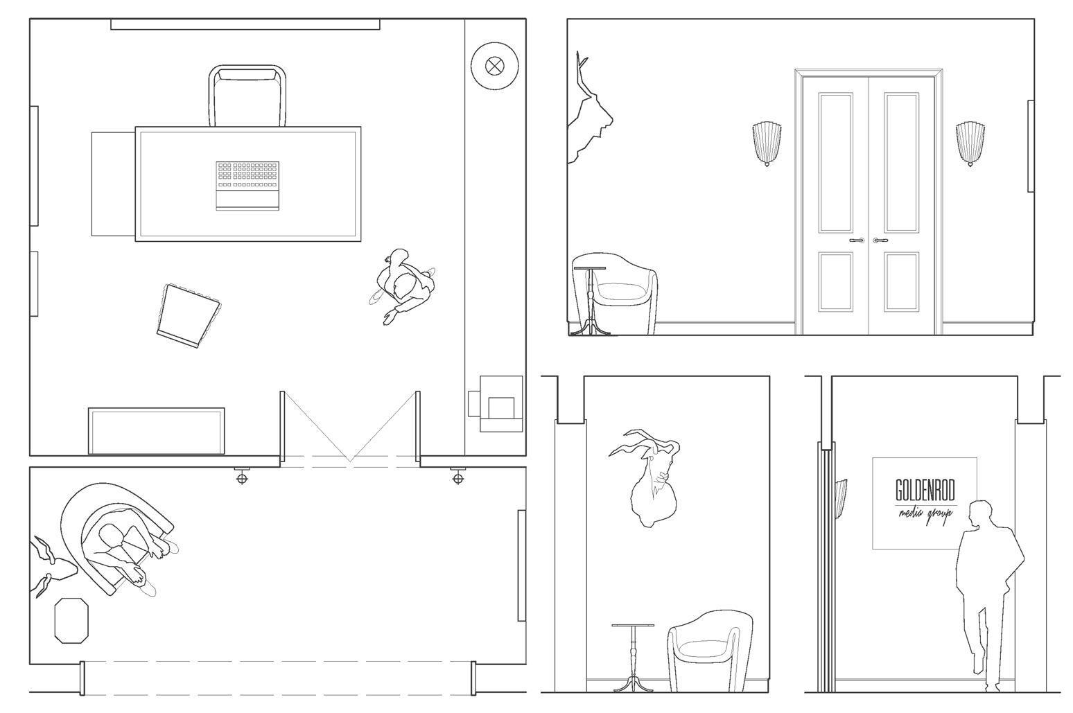
– plan & anteroom elevations –

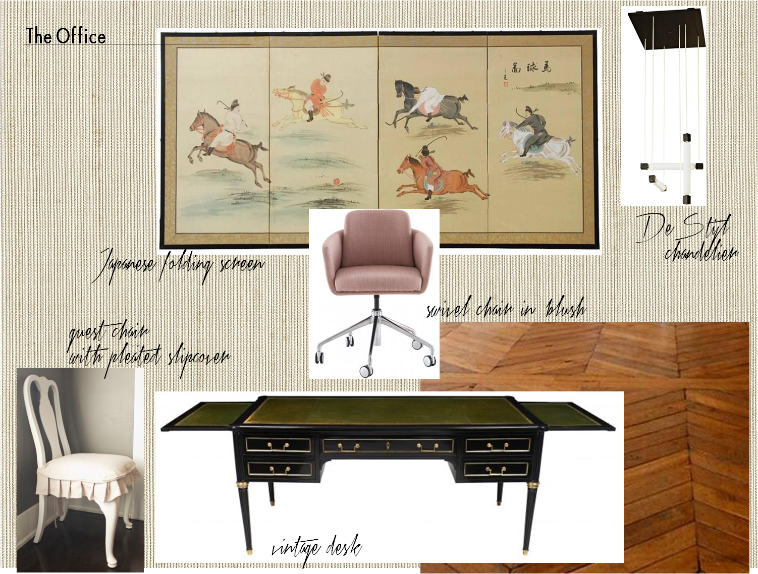
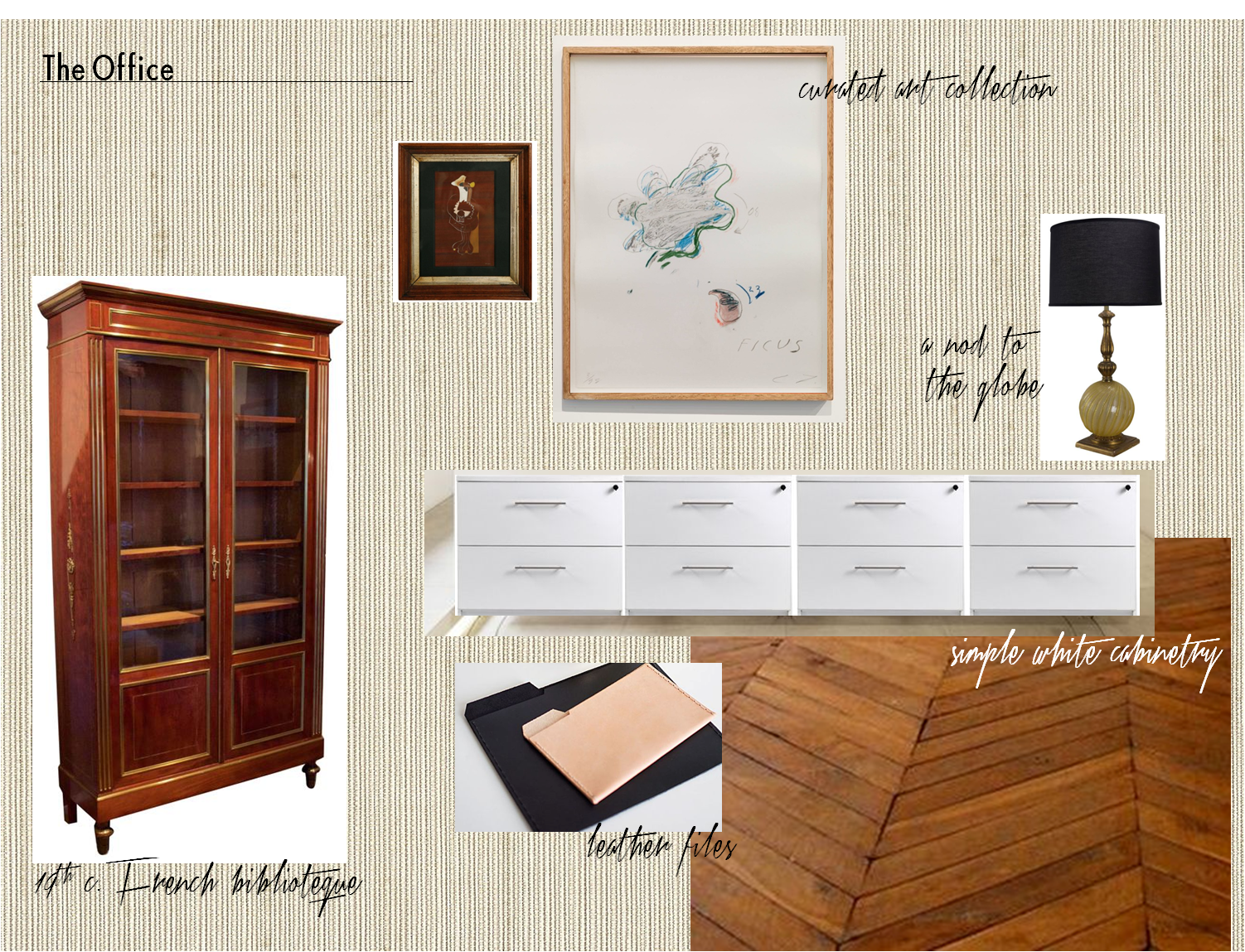

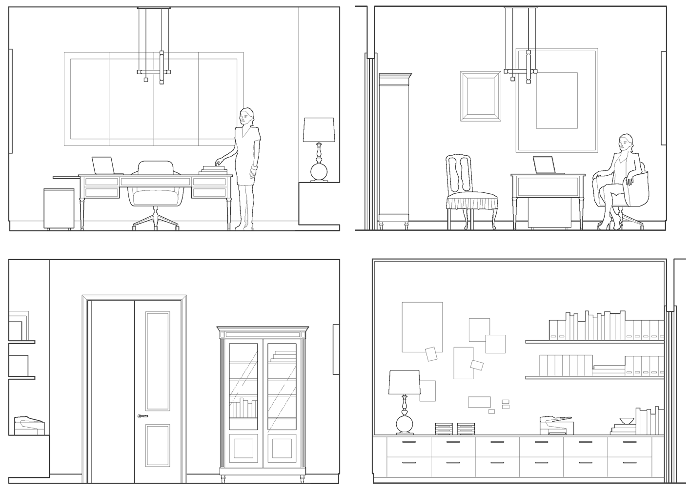
– office elevations –

Our client is a businesswoman and loving mother. She is worldly, feminine and capable – someone who is both interesting and interested. Her combination of sophistication, warmth and strength is part of what has made her a success in her field. With that in mind, we imbued her workspace with a similar sensibility and furnished it with antiques, modern European pieces and an impressive art collection. We think Mrs. Asher Wertheimer would have approved.


Subscribe to our newsletter or find us on Bloglovin’ and you won’t miss a thing.
-
Tip deLuxe
DIVERSIFY YOUR HUE
It's a common pitfall. You want a blue (or green or yellow or red) room and you think the answer is paint.
But alas, a room is not built on paint alone. A room with one color is like a song with one note – flat.
It takes layers of colors, textures, fabrics and finishes to really make a room "sing". The dining room
below from Bunny Williams is a beautiful example. The star of this room is a dramatic cerulean blue, but
it's the supporting shades of green, yellow, gold and cream that make it pop. Moreover, the designer
chose checked slipcovers, a large 18th century framed wallpaper panel and a collection of Chinese
porcelain to bring this shade of blue to life. So take Bunny's cue and diversify your hue!
photo courtesy of Ms. Williams' book "Point of View".
