-
EDGEMOOR SUNROOM :: PART III
Developing a thorough drawing set is critical to the success of all Huntley & Co. projects. It’s the technical backbone of the design, ensuring precision and accuracy. The Edgemoor sunroom features two expansive nano walls, a seamlessly integrated reflecting pool and a dramatic skylight. With fenestrations composing 90% of the room, it was important to consider the furniture and its arrangement carefully. We worked through an endless stream of floorplans to maximize circulation, engage the views and allow for both conversation and lounging. And we selected pieces that spoke to a luxurious “camp” style (think Out of Africa or Lawrence of Arabia). An abundance of comfort promises a room that is open, yet absolutely intimate.
— The Floorplan —
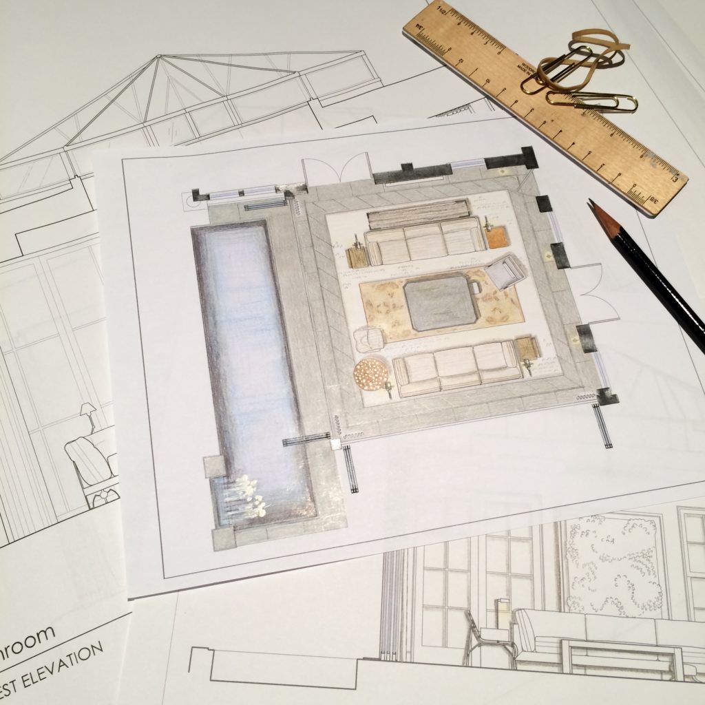
It always starts with the floorplan; a birds-eye view provides a wealth of knowledge. Drawing everything (walls, windows, doors, floor vents, etc.) to the exact measurement is critical. Because an inch can be the difference between a flawless installation and a costly mistake.
As shown in the floorplan above, pulling the furniture into the center of the room creates circulation space.
— The Study of Furniture & Lighting —
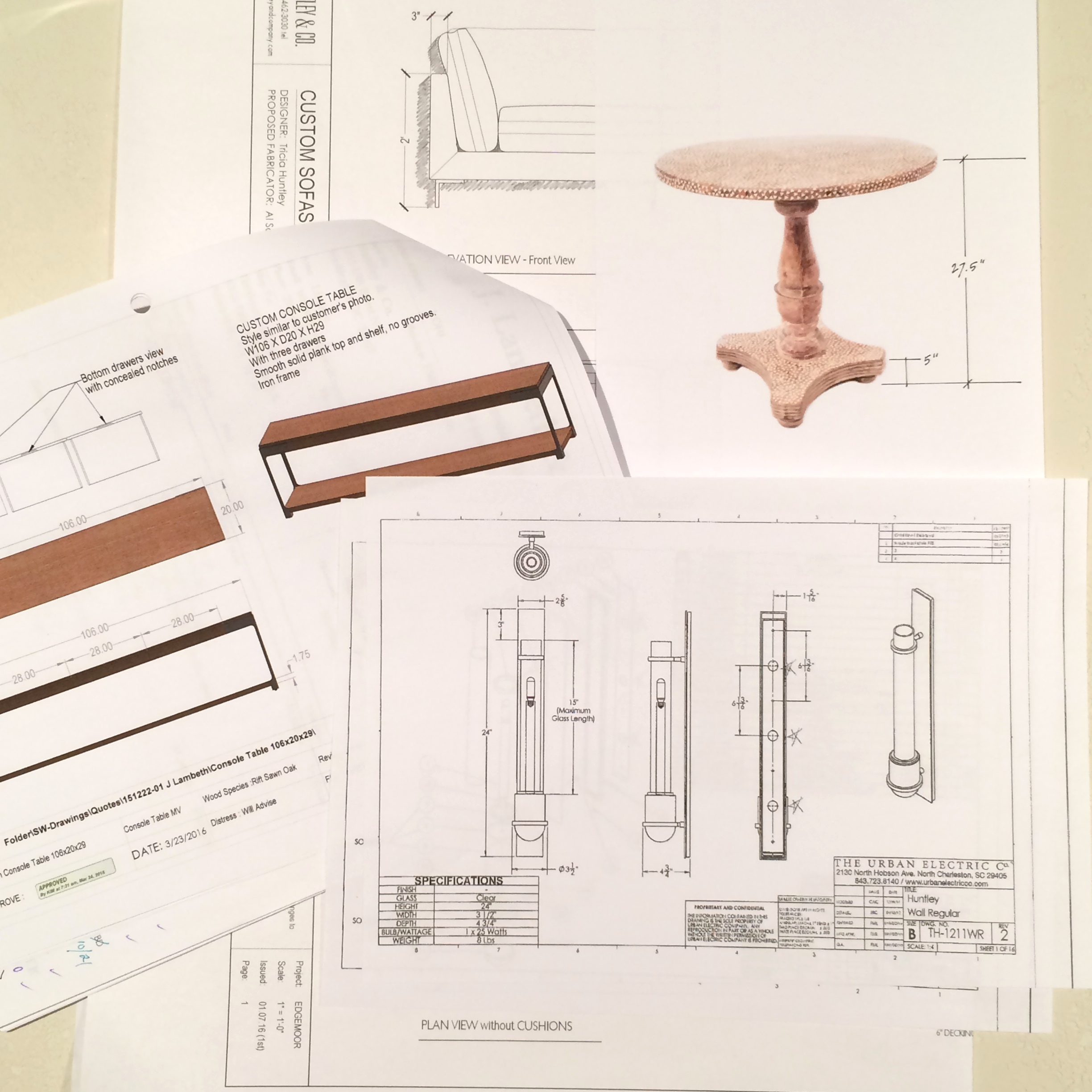
Each and every piece that goes into our projects is vetted for size and scale. We collaborate with our vendors to verify, and sometimes adjust, dimensions down to the 1/16″ — ensuring the best possible function and fit.
Drawings above include the custom console and sofas, pedestal table and the Huntley sconce from Urban Electric Co.
— The Perspective Drawing —
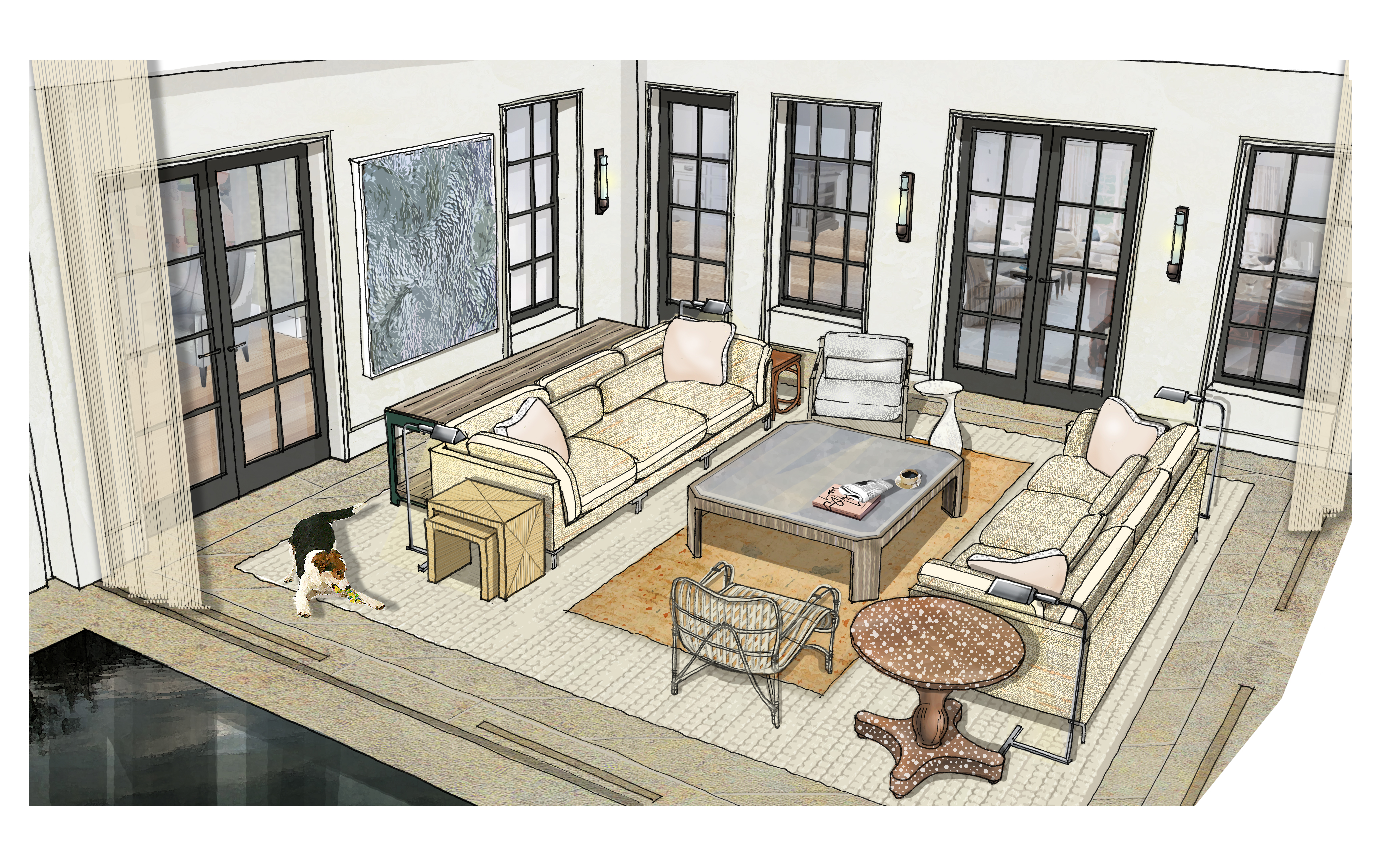
Perspectives are exciting because they allow us to “pull a design up” and study the relationship between architecture and décor. The Edgemoor sunroom is visually complex – from the dramatic skylight to all those windows – so it was important to implement décor that would complement, not compete with the envelope. A neutral palette, low slung furnishings and layers of softness add the right amount of quiet.
Our perspective drawing illustrates how open the sunroom becomes when the nano doors are retracted. The layered rugs and sheer drapery panels at the perimeter help create intimacy.
A room like this is, without a doubt, a design challenge. Generating meticulous drawings allowed us to tackle the project in an informed, confident manner. With that, seeing our drawings “go vertical” during the construction process is when the real fun begins. Well, typically. Our next post will include on-site progress photos replete with a little unexpected drama. Stay tuned!
xo, Huntley & Co.
Subscribe to our newsletter or find us on Bloglovin’ and you won’t miss a thing ; )
-
show-house // faux-client :: the reveal!
We know you and our fabulous faux clients have been waiting for our big reveal. The design process is nothing, if not, an exercise in patience. From concept to installation, interior design requires vision, tenacity and know-how. It’s a labor of love, but labor nonetheless. So when the time finally comes to present our clients with their dream home, our excitement is hard to contain. This particular dream home is ‘faux show’, but the thrill of the reveal remains the same … So without further ado!
— THE 2016 FAUX HOUSE REVEAL —
[ Our clients seem pleased ]
* * *
— DESIGNER Q&A —
Our Huntley & Co. clients and room may have been crafted from imagination,
but they do speak to the real methodology and design vernacular of our firm’s work.
Here, principal Tricia Huntley, opens up about her influences, the importance
of breaking the rules and the best song to get a party started.
1. What are some of the things that influence you, aside from furniture and décor?
Museums, music, fashion, history, parks/nature, architecture, poetry … those things that are thoughtful, provocative, moving. I like to start with a feeling or mood before I pivot to the tangible aspect of things.
2. What qualities of a room do you most admire?
Substantial hardware and appropriate, expertly executed millwork. I would rather live in an empty house with those two qualities than a shoddy new-build with the best furniture.
3. Design rule you love to break?
Symmetry. I was classically trained so I believe in building a space according to the rules of symmetry. But I also believe that breaking that symmetry in clever, nuanced ways is what brings a room to life.
4. You know these clients will be having many a fete, what’s a good hostess gift?
I love to give sophisticated, unusual candles and fragrances. Aedes de Venustas, Joya and Santa Maria Novella all offer intriguing scents in stunning vessels. And of course, good booze and wine never go out of style. Add a beautiful ribbon with a handwritten tag and you’re done.
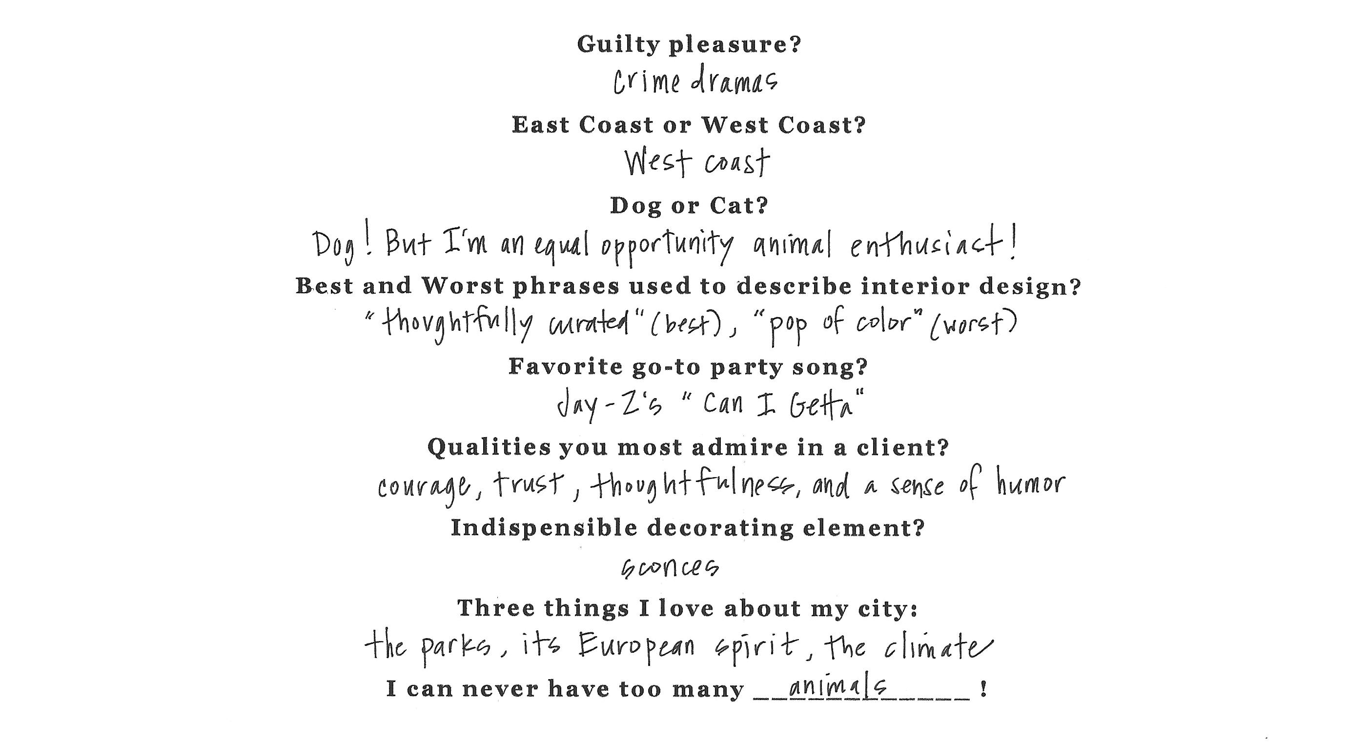
5. Rapid Fire!
* * *
It’s been fun, but we need to dash! Our clients told us to get out so they can enjoy their new home ; )
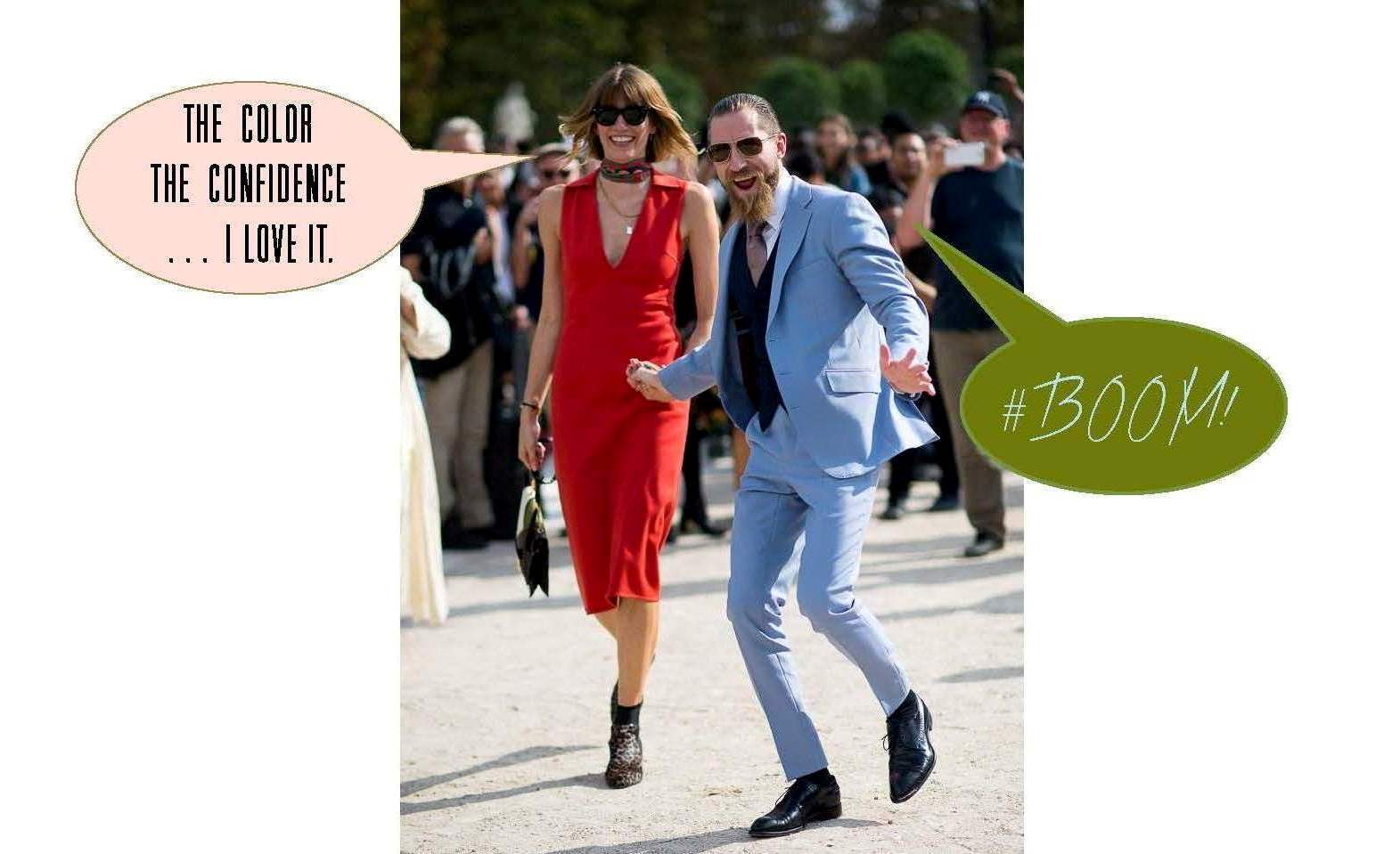
If you want another glimpse at the process, simply click on posts Part I, Part II and/or Part III. And special thanks to our “faux clients” Justin O’Shea and Veronika Heilbrunner. They are the coolest couple on the planet and dream clients fo sho!