-
Scale Up / Scale Down
Symmetry, balance and proportion are key tenets of how I develop an interior; I was trained in classical architecture. Yet, when I get to the decorating portion of the design process, I throw Palladio’s rules out the window – especially scale. Playing with scale (blowing things up, sizing them down) is a way for me to change the vibe in a space, and therefore, how its experienced.


Go Big
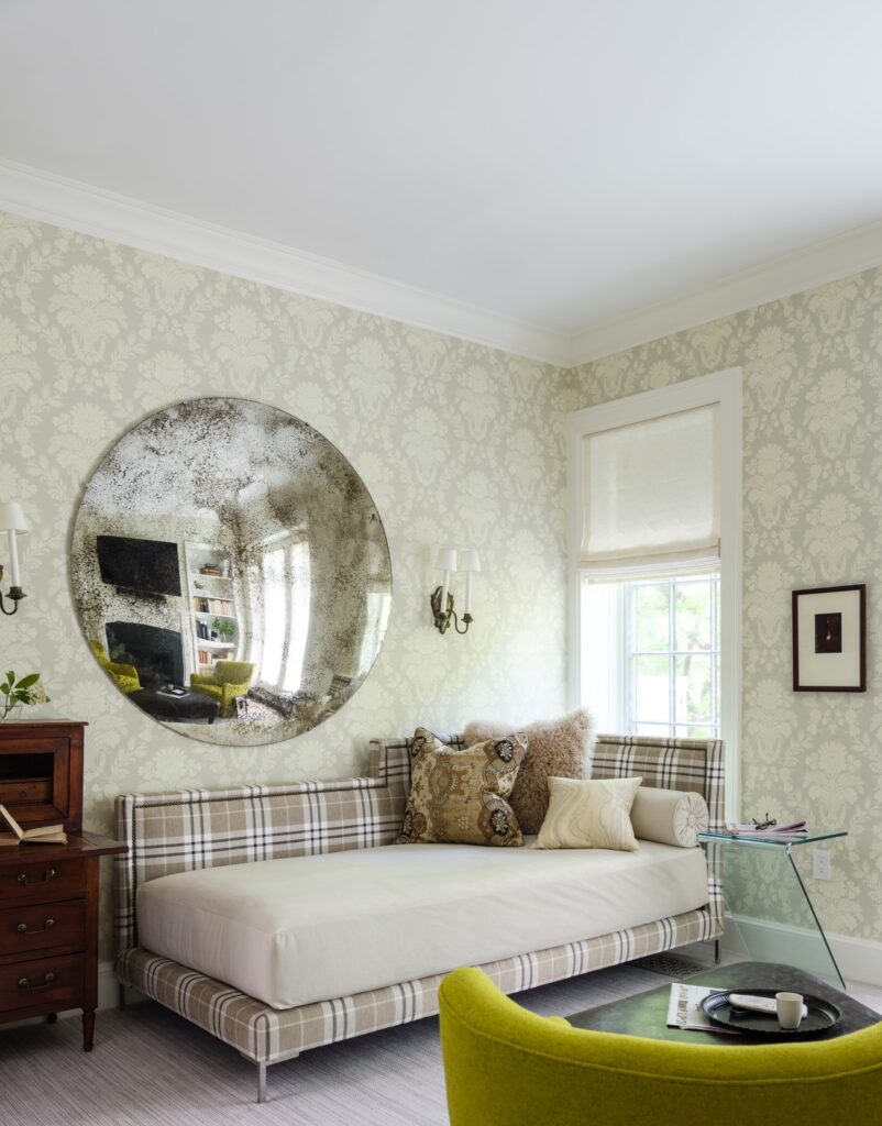
There are times when you just need to go big or go home. An oversized mirror can completely change a room. And a chandelier or pendant that outsizes a dining table is pure drama. Scaling up disrupts the status quo – it wakes us up and brings a room alive.

Featured image: Shinola Hotel by Gachot Studios; Middle 4 clockwise: Bjorn Wallender, Moooi, Steven Gambrel, Huntley & Co.; Bottom: Thom Filicia

Stay Small
Sometimes making a statement means staying small. A diminutive artwork on a large wall will draw you to it. A low sofa beside tall windows will create elegant volume. A tiny light fixture over a table creates intimacy. Design isn’t always about knocking someone’s socks off. At times, it’s about creating a serene environment or eliciting an emotion.


Top: Raji RM; Middle 4 clockwise: Workstead, Billy Cotton, Huntley & Co., Rose Uniacke (?); Bottom: Laura Santos


Happy election week America. See you on the other side!

-
Looking Back / Looking Forward
2017 was quite a year. Despite all the drama, trauma and homegrown insanity in the world – there was plenty of good to celebrate at Huntley & Co. Leave it to design to keep our spirits up. We’re looking back at a great year and looking ahead to even bigger and better things in the 12 months to come. Stay tuned!

Spring

– Traditional Home Designer Panel –
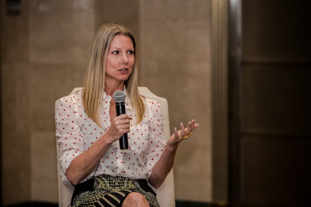
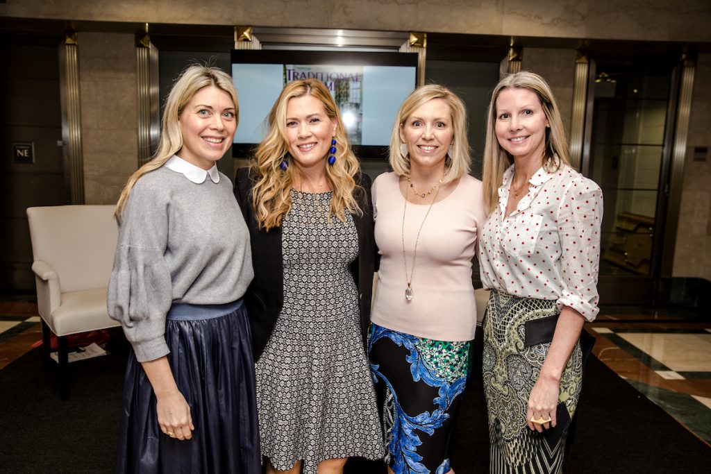
I talked design, business and keepin’ it real with Traditional Home at the Washington Design Center’s Spring Market. Sharing the stage with 3 smart, sassy blondes – Tori Mellott, Liz Levin and Maria Crosby – was a treat. #blondedesignmafia
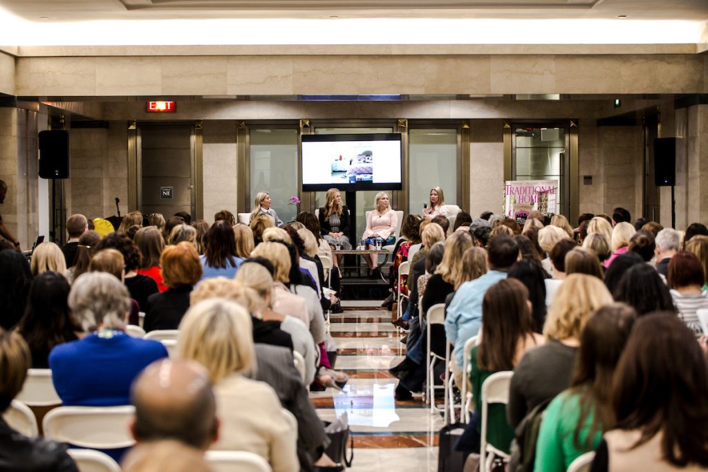
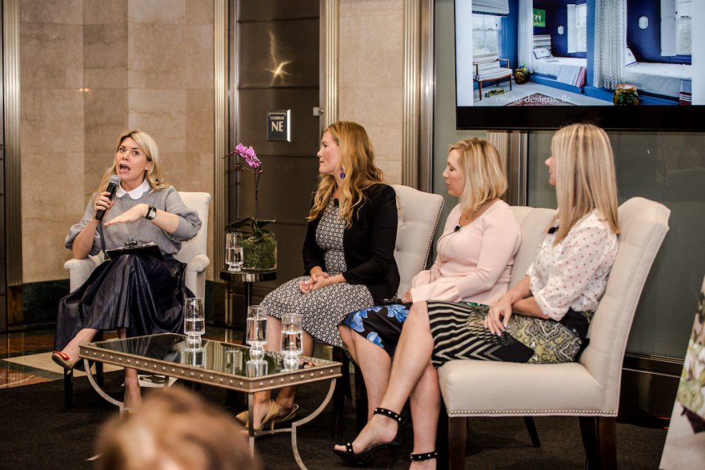
Photos by © 2017 Kaz Sasahara (www.lancerphotography.com). All rights reserved.

– Washingtonian –
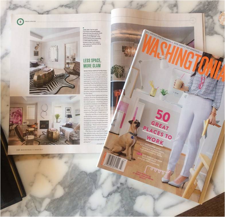
Our petite pied-a-terre project at The Montrose was featured in Washingtonian magazine’s March issue.

Summer

– Bethesda Installation –
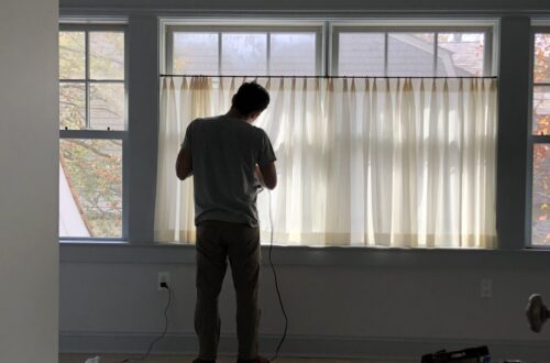
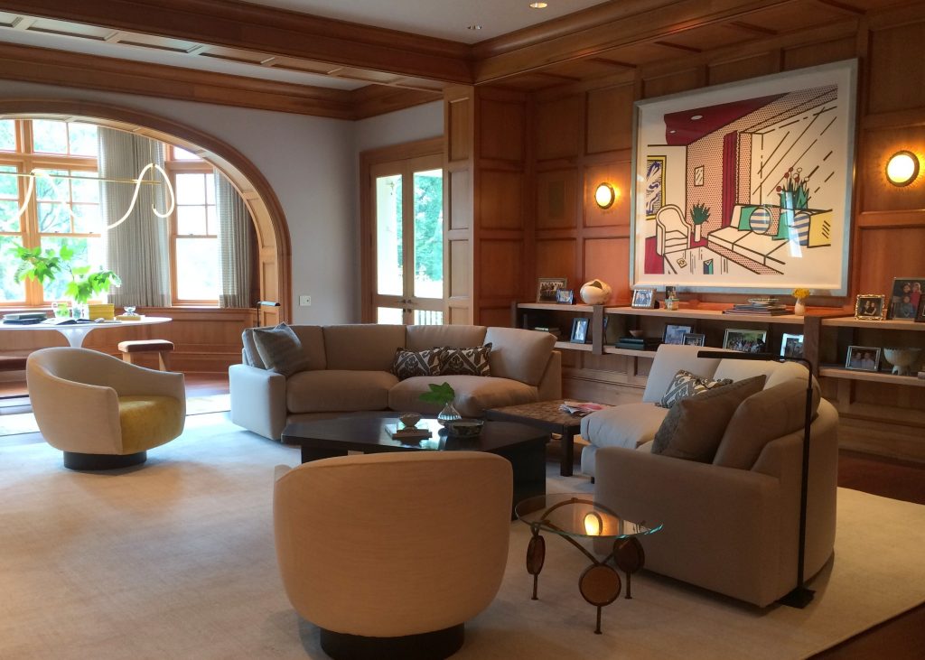
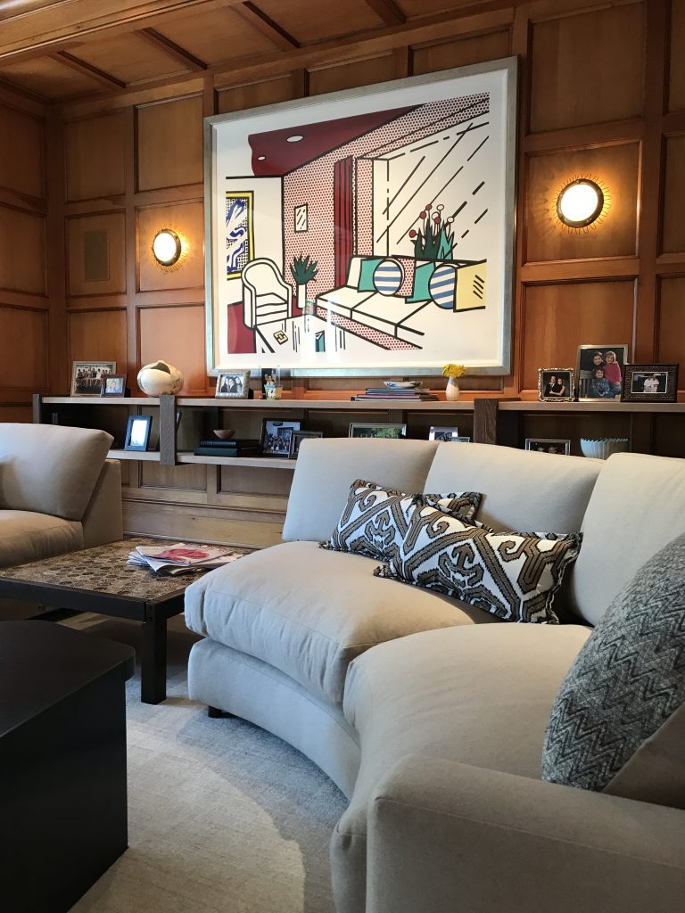
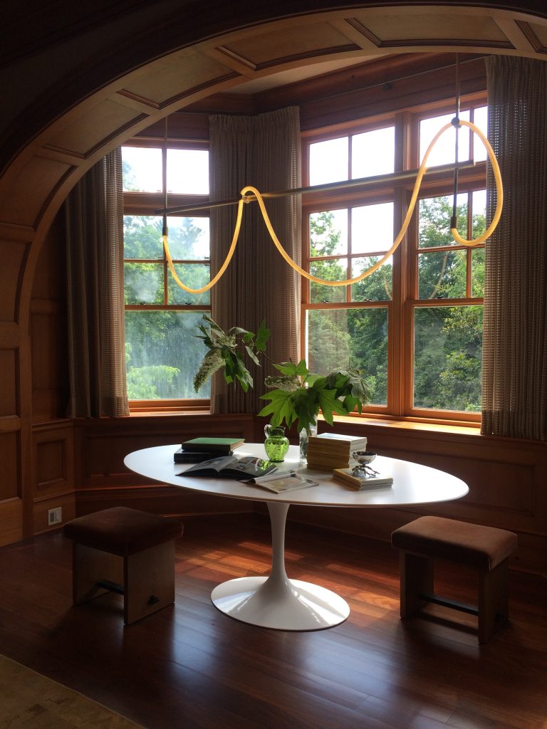
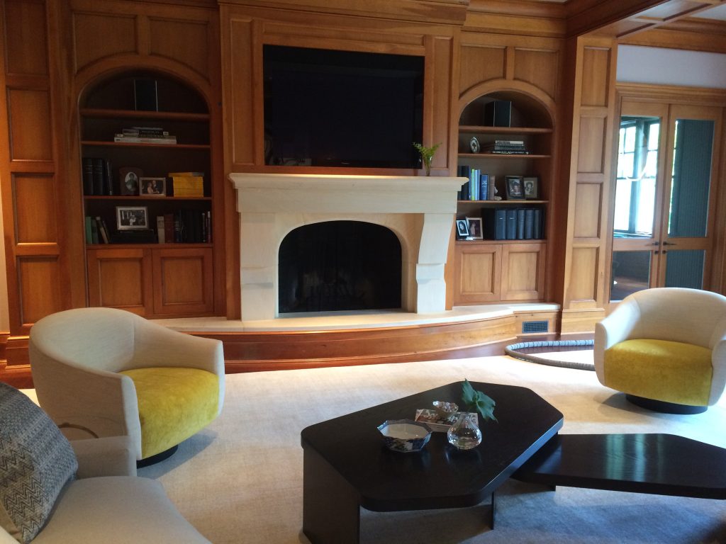
We redesigned and installed a family room in Maryland for one of our most beloved clients. We had completed the majority of the house previously and have always enjoyed collaborating with the husband and wife. The room had great bones, so we changed up the finishes and furnishings to complement its geometry and lift its spirit. It lost it’s rigidity (thanks to plenty of sinuous shapes) and now has a healthy dose of verve.


– House Beautiful –
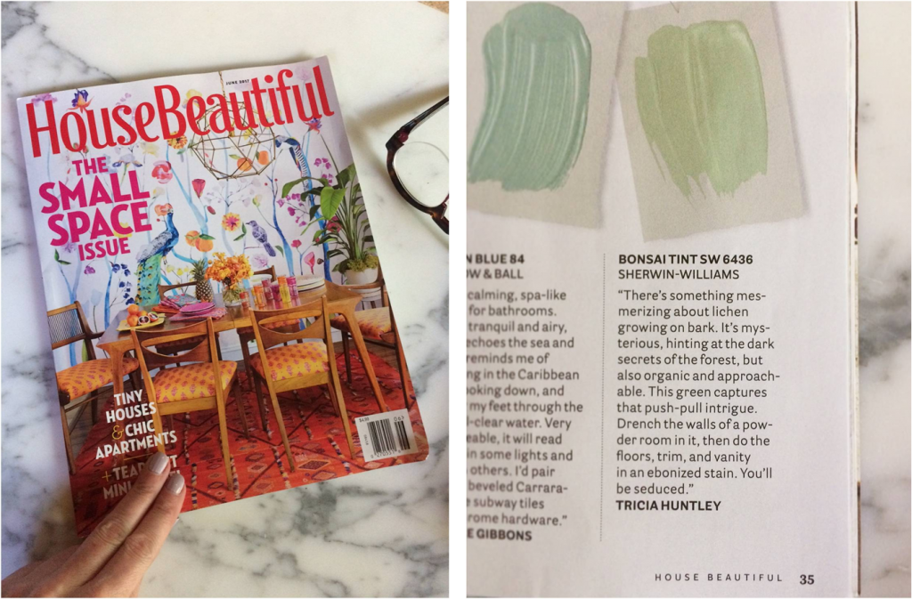
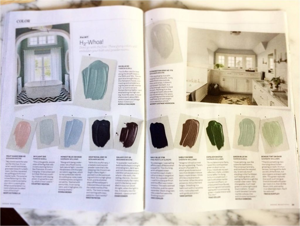
I shared a favorite shade of green in House Beautiful‘s June COLOR section. Bonsai Tint is the perfect summer hue.

Fall

– NOLA –
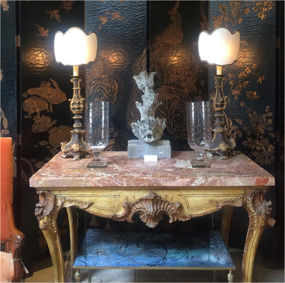
In September I traveled to New Orleans for a design-filled weekend hosted by native Gretchen Everett. We toured incredible homes, visited all the best antique stores, and of course, ate and imbibed. It was fantastic! The intimate view of New Orleans’ beauty and lifestyle had me seriously considering a move to The Big Easy.
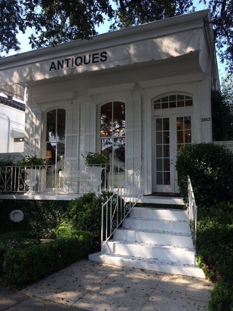
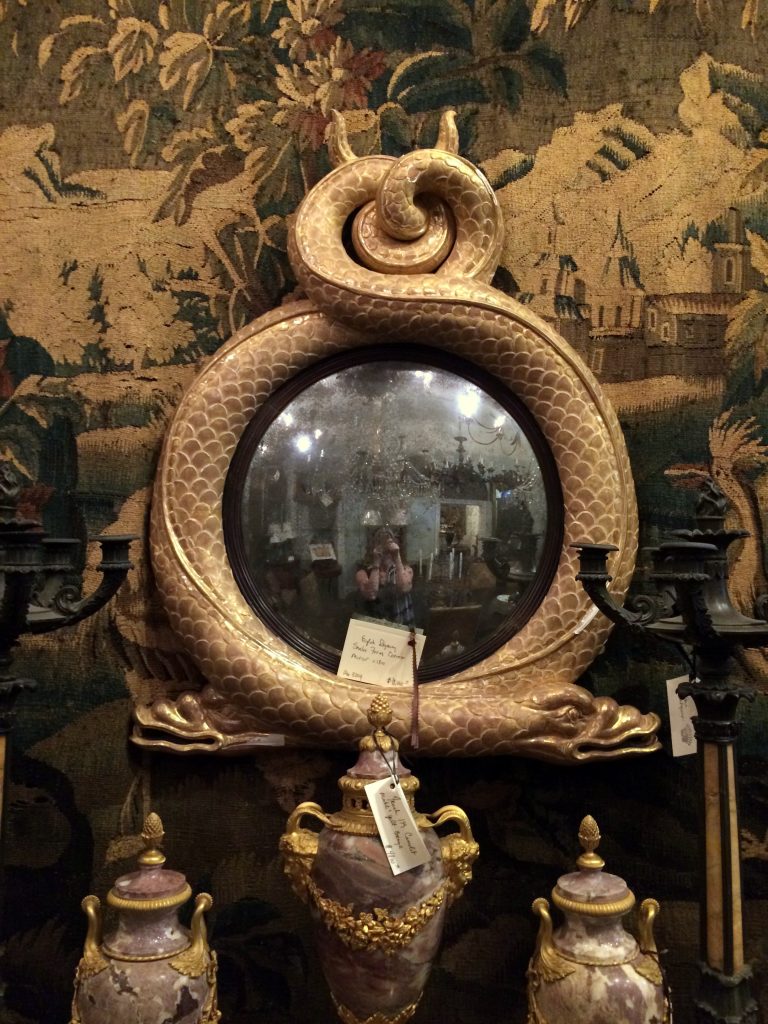
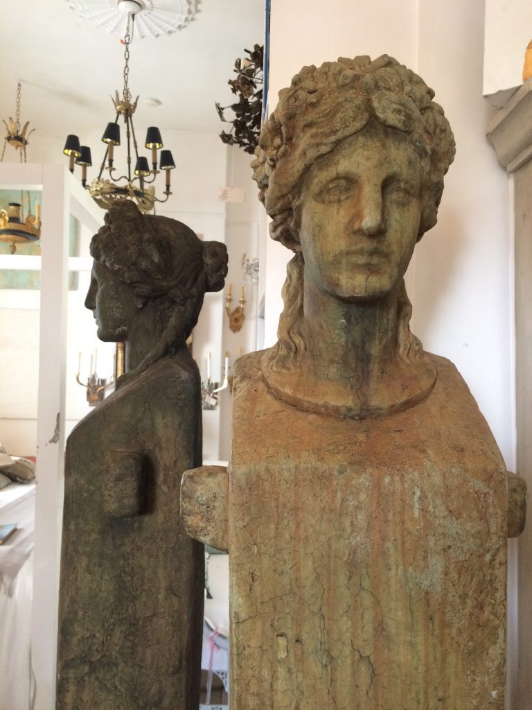
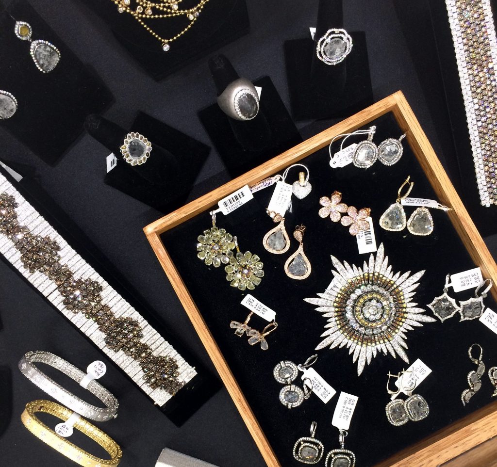
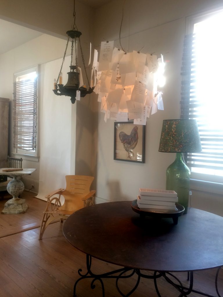
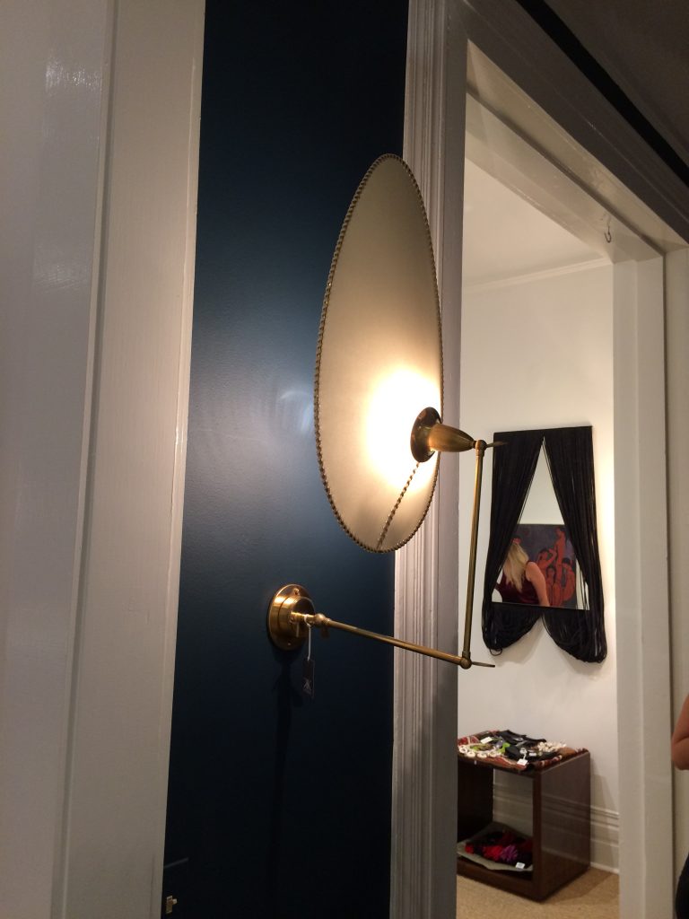
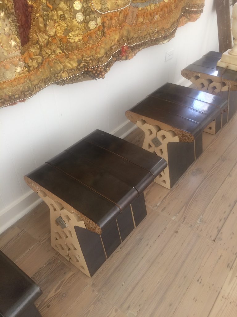
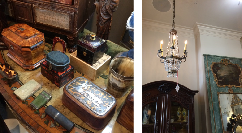
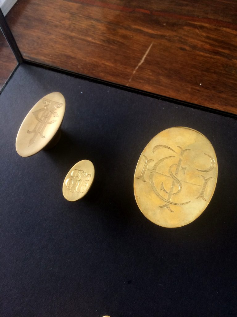
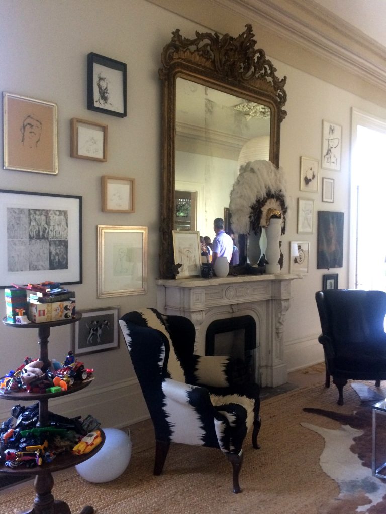
Featured Above: Ann Koerner Antiques, Appartique, Balzac Antiques, Bremermann Designs, Hope Goldman Meyer, Katie Koch Home, Marion Cage and Kevin Stone Antiques.

– The Celine in AD –
My Celine Pendant for Ironware International was included in Architectural Digest’s list of things worth coveting. Thank you AD – I’m a fan too! ; )

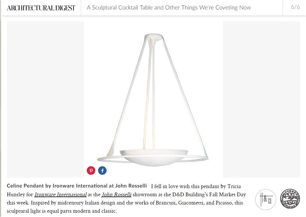
Photo c/o architecturaldigest.com

I hope the holidays treated you well and you are excited to tackle the year ahead!

Subscribe to our newsletter or find us on Bloglovin’ and you won’t miss a thing.
** all photos in this post are my own unless noted as otherwise
-
Art to Interior
I love art. I considered curatorial studies for a time while in college. During my first exhibit installation, however, I broke two large glass plates protecting a famous photographer’s work. I concluded pretty quickly that “this is probably not for me”. Still, my love affair continued well into my interior design degree and career. There is almost no genre or medium that I don’t appreciate in some way. A 1982 kinetic sculpture and an oil portrait from the 19th century can both stir my senses. It follows then that artwork sometimes informs my designs.

THE STARTING POINT
Essie, Ruby and Ferdinand – Children of Asher Wertheimer, 1902
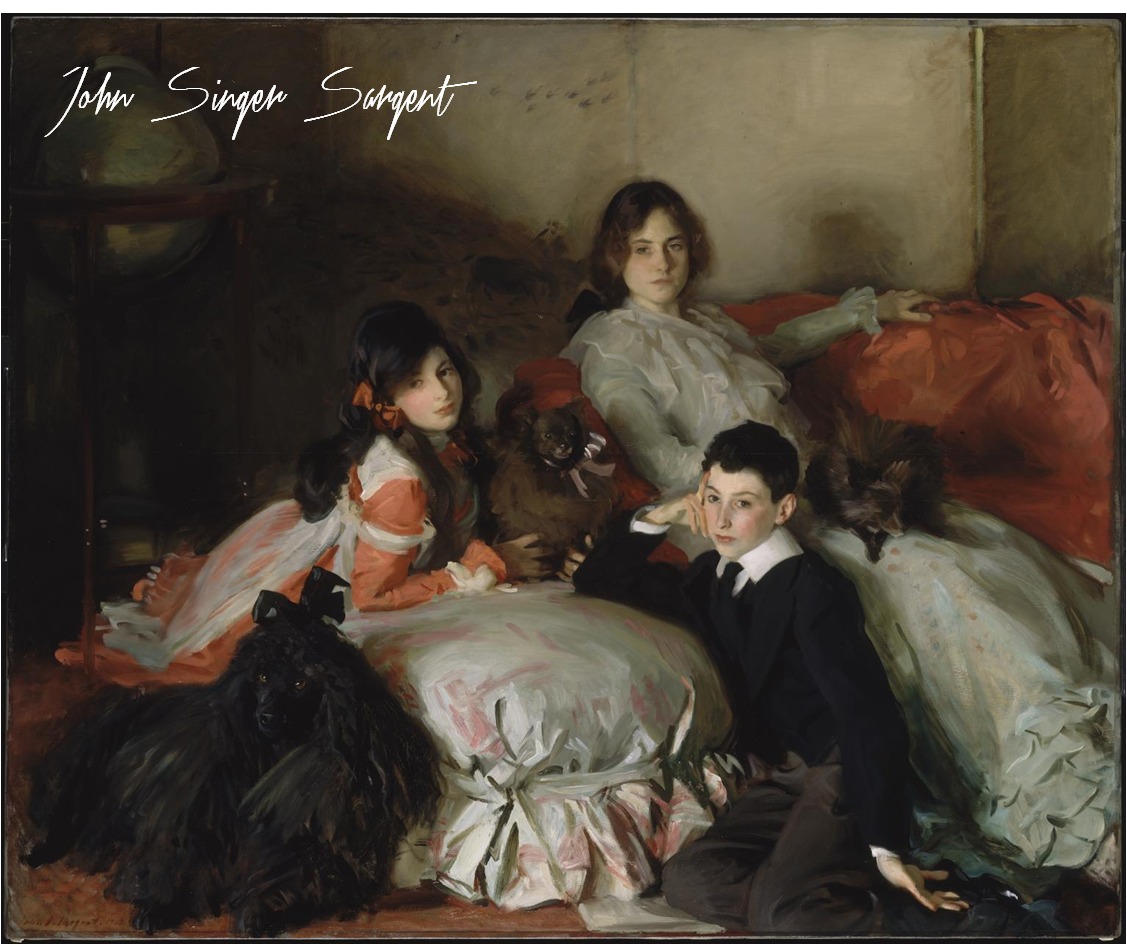
It’s hard to not love Sargent. His oil paintings are lush, moody and undeniably beautiful. I chose this work as a jumping off point for a media principal’s office for its sophistication and intimacy.

THE INTERPRETATION
The idea here is art as muse. I pulled what spoke to me – the colors, tones, textures and emotions. My design is an interpretation of the painting, not a copy of it.
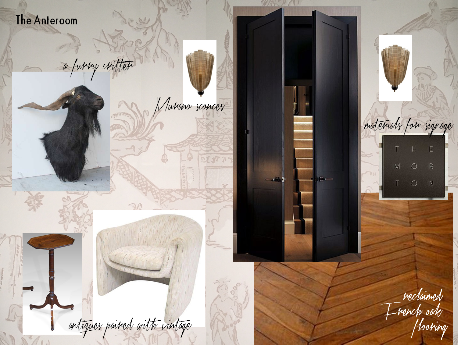
Our client’s office is entered by way of an anteroom. The space is a waiting area for visitors and serves as a buffer between her office and the staff workplace. The finish selections and air of elegance are derived from the Sergent painting. But as this is a modern woman’s office and a Huntley & Co. interior, we changed tack by mixing genres and funking up certain elements.

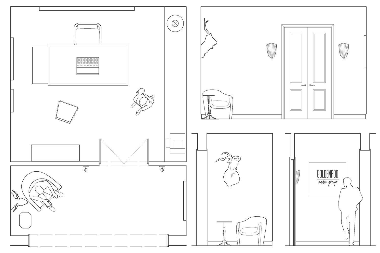
– plan & anteroom elevations –

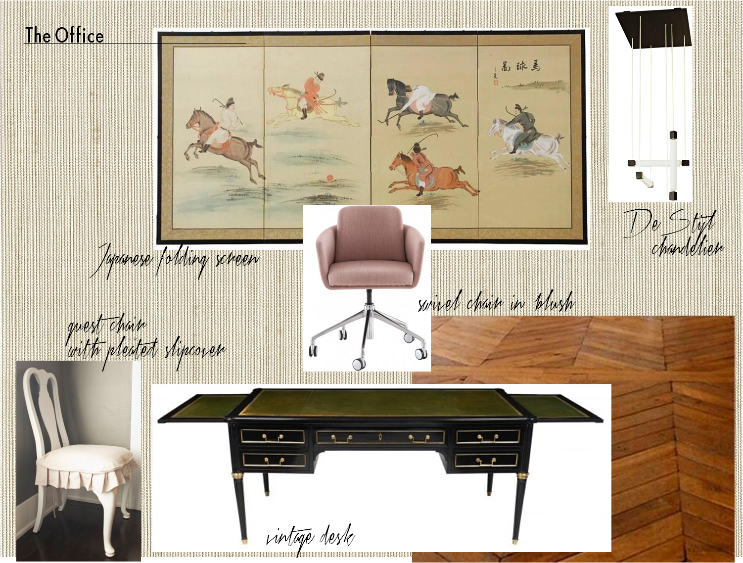
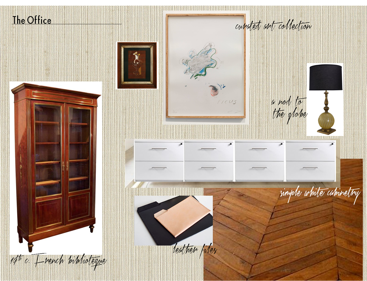

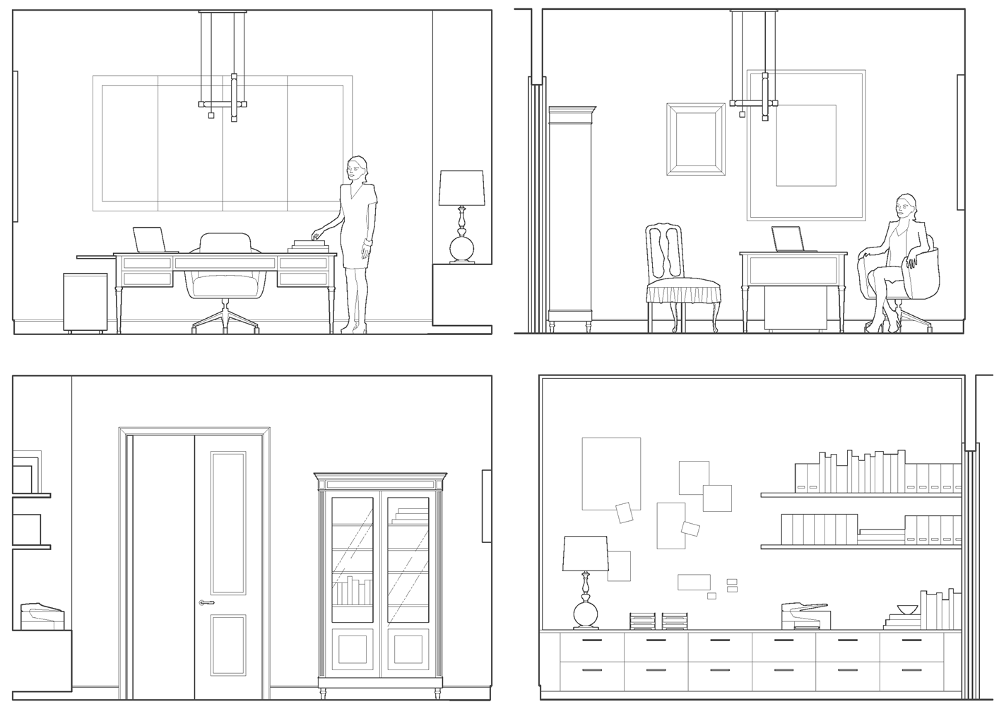
– office elevations –

Our client is a businesswoman and loving mother. She is worldly, feminine and capable – someone who is both interesting and interested. Her combination of sophistication, warmth and strength is part of what has made her a success in her field. With that in mind, we imbued her workspace with a similar sensibility and furnished it with antiques, modern European pieces and an impressive art collection. We think Mrs. Asher Wertheimer would have approved.


Subscribe to our newsletter or find us on Bloglovin’ and you won’t miss a thing.
