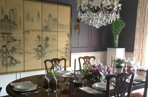
-
Scale Up / Scale Down
Symmetry, balance and proportion are key tenets of how I develop an interior; I was trained in classical architecture. Yet, when I get to the decorating portion of the design process, I throw Palladio’s rules out the window – especially scale. Playing with scale (blowing things up, sizing them down) is a way for me to change the vibe in a space, and therefore, how its experienced.


Go Big
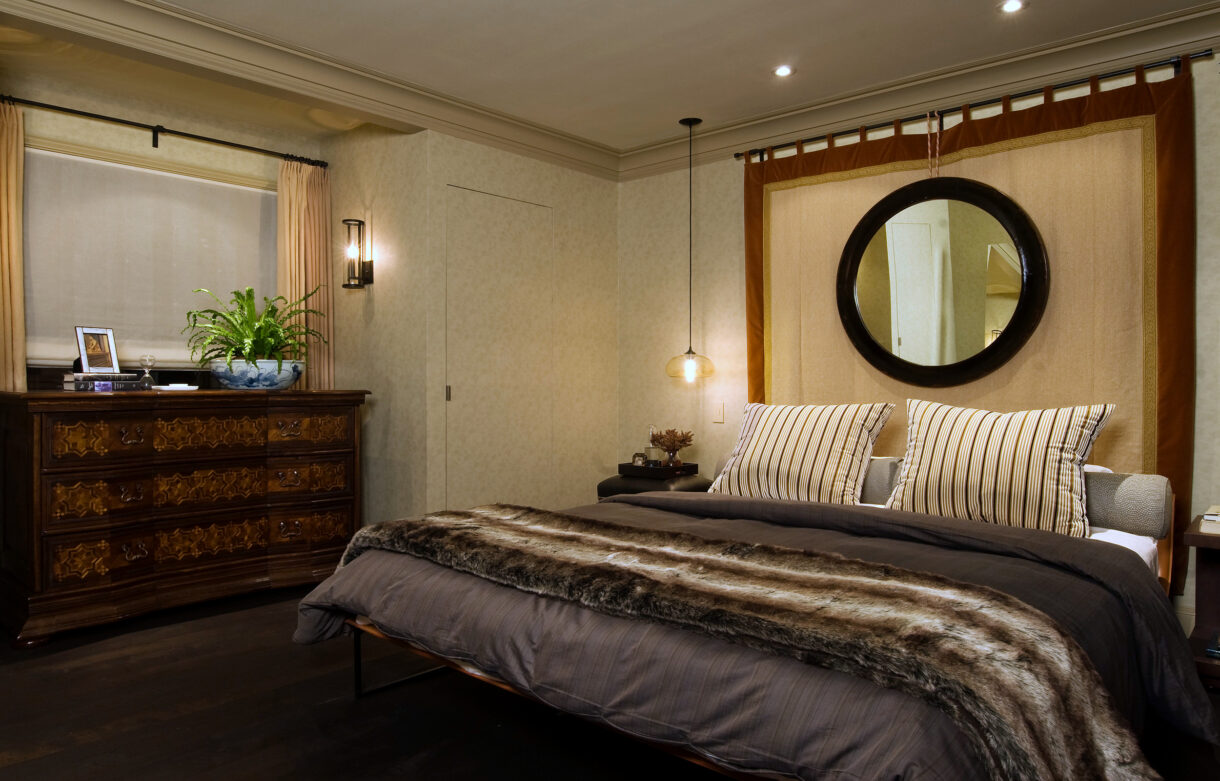
There are times when you just need to go big or go home. An oversized mirror can completely change a room. And a chandelier or pendant that outsizes a dining table is pure drama. Scaling up disrupts the status quo – it wakes us up and brings a room alive.

Featured image: Shinola Hotel by Gachot Studios; Middle 4 clockwise: Bjorn Wallender, Moooi, Steven Gambrel, Huntley & Co.; Bottom: Thom Filicia

Stay Small
Sometimes making a statement means staying small. A diminutive artwork on a large wall will draw you to it. A low sofa beside tall windows will create elegant volume. A tiny light fixture over a table creates intimacy. Design isn’t always about knocking someone’s socks off. At times, it’s about creating a serene environment or eliciting an emotion.


Top: Raji RM; Middle 4 clockwise: Workstead, Billy Cotton, Huntley & Co., Rose Uniacke (?); Bottom: Laura Santos


Happy election week America. See you on the other side!

-
West End :: The Reveal

This reveal has been a long time coming. Not because it was only just installed, but because Luxe & Lucid was tied up in a parallel universe after we moved the Huntley & Co. website to another platform. The technical side of small business is the gift that keeps on giving. So we thank you for your patience, and without further ado, we reveal our West End project installation!
* * *

Making it Move-In Ready
———————————————————

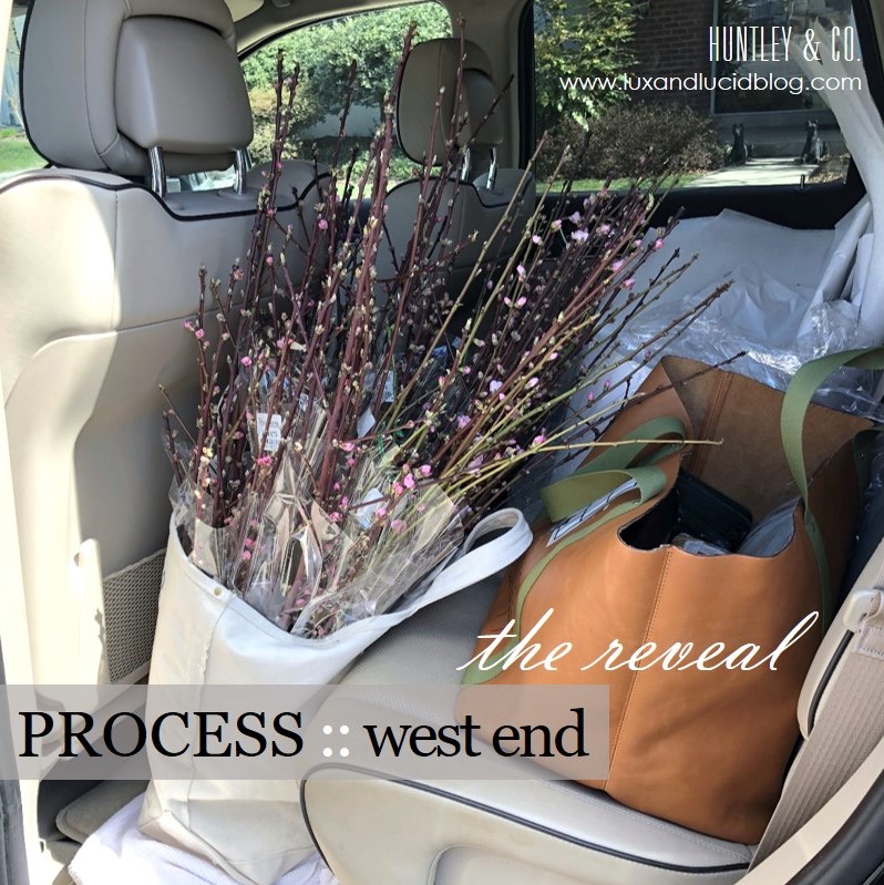
Obviously before our clients can move in, we have to install carpet, light fixtures, wallcovering and window treatments. Then, with our backdrop complete, our team is ready to bring in the furniture and accessories.


(top L to R) Living room chandelier install; Master bedroom carpeting in progress; Wallpaper in the third floor den; Installation of master bedroom roman shades.
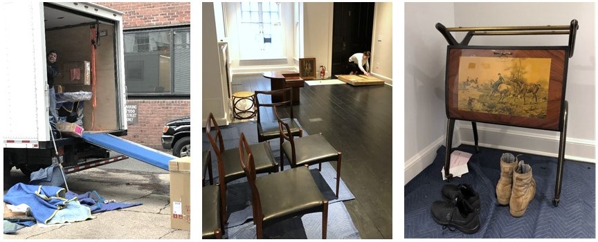
(bottom L to R) The crew unloading the truck; Opening artwork; Vintage Italian barcart.
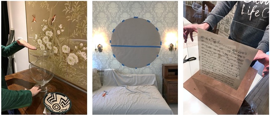
(L to R) Setting the stage with flowers and accessories; Paper template for a tricky mirror install; Preparing a vintage music montage for the dining room.

Welcome Home!
———————————————————
Alas, our vision for a classic interior full of cosmopolitan flair has come to life. This is, hands down, our favorite part of the process!

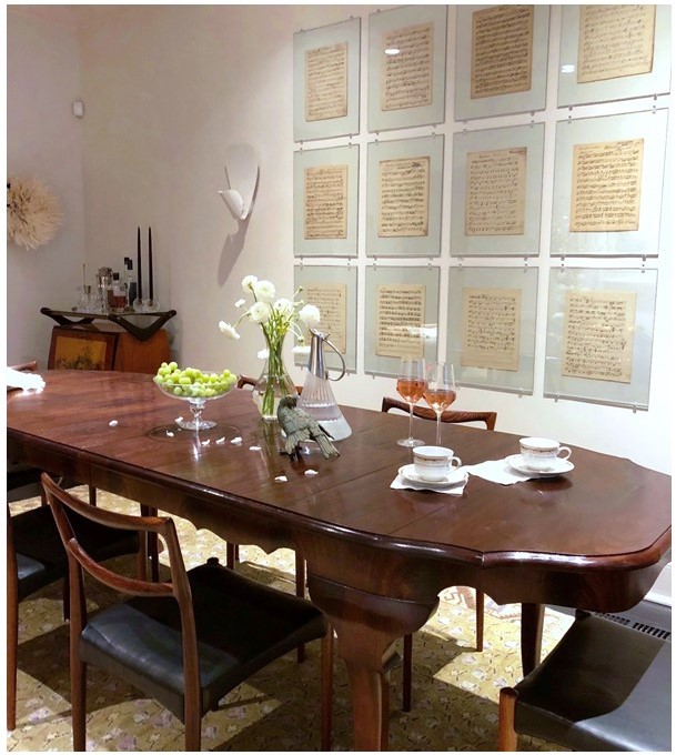
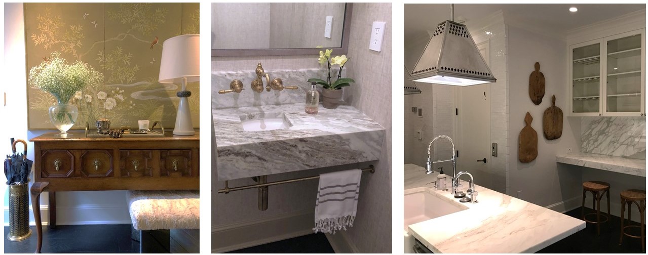
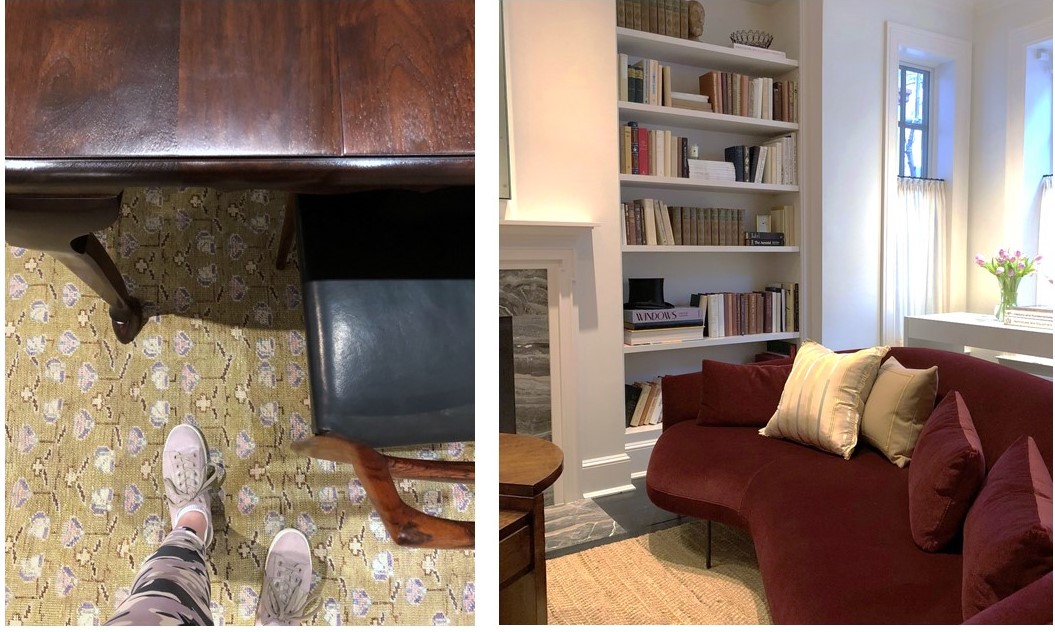
(top to bottom) A custom dining table paired with vintage chairs; Mixed materials in the entryway; A bespoke vanity in a teeny tiny powder room; Unexpected lighting in the kitchen; Dining room details; A chic Italian sofa with lyrical curves anchors the living room.
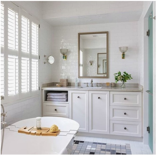
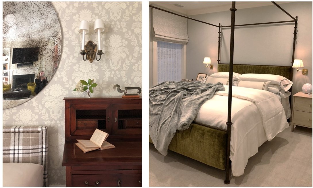
(top to bottom) Master bath wrapped in handmade tiles and featuring vintage lighting; An engaging mix of pattern and texture in the third floor den; Bespoke linens in the master bedroom – how luxe!

And That’s a Wrap
———————————————————
A big thank you to our wonderful West End collaborators. We hate to say goodbye, but we’re off to design more beautiful spaces …

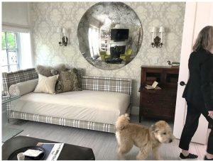
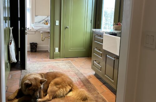
Tricia gives the resident pup, Barney, a tour of his new home.

To see the gorgeous professional photos of the West End project, visit the Huntley & Co. portfolio. Or take it one step further and help us win a Luxe RED award by voting for this project! Voting closes January 25.
xo huntleycodesign

-
West End Process :: Concept
One of our favorite Huntley & Co. projects this year was for a young couple who hired us to design and renovate their newly purchased townhouse in the West End neighborhood of Washington. Much to our delight, the duo brought a combination of sophistication and excitement to the endeavor. Translating that into a concept and then into a finished product was a multi-step process — and worth every minute.
* * *

| THE CONCEPT |

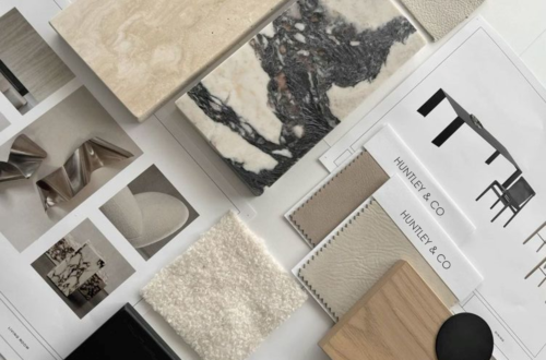
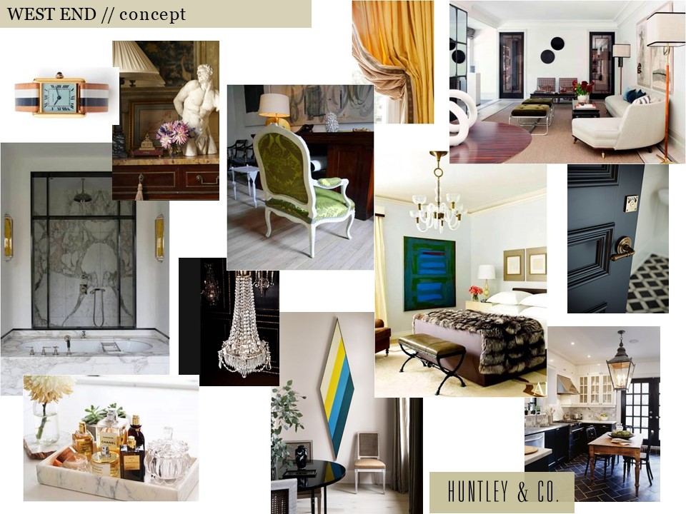
Our clients inspired a decidedly cosmopolitan aesthetic. Accordingly, we imagined an eclectic mix of vintage and antique furnishings, unexpected stone and tile, and layers of complex colors and tones. As shown below, the mood board we created conveyed our idea of an elevated yet spirited home – a true classic that’s never boring.

Selected photos clockwise from top left: Cartier Tank watch via Goop; Timothy Corrigan vignette; a crisp Madrid living room by Isabel Lopez-Quesada; a bedroom from Architectural Digest; a corner of Sandra Nunnerley’s home featuring “Diamond” artwork by Kenneth Noland; an austere and elegant marble bathroom.


| HOW WE GOT THERE |

The start of a project is full of excitement and potential. Before diving into design, we take time to fully understand both the space and the client. On the technical side, we site measure the building and generate CAD drawings for study and revision. On the conceptual side, we issue a questionnaire and cull images related to our clients’ answers. The questions range from pedestrian to abstract and are intended to give us practical information as well as insight into their lifestyle and aesthetic.
// Question & Answer
A two page questionnaire sheds light on what’s important.


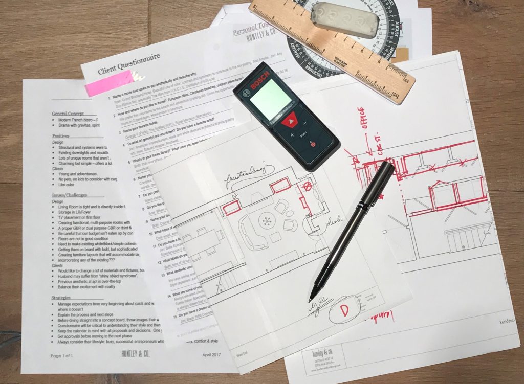
The client questionnaire is a key part of our initial survey and analysis.

// Pulling Together a Visual Story
We pull images that reference our clients’ feedback … and they share photos as well.


TRAVEL // From a honeymoon spot to favorites in Paris and NYC, these hotels topped our client’s list. L to R: Royal Mansour Marrakesh; George V in Paris; The NoMad Hotel in NYC.


FILM // Playful, witty and adventurous. L to R: Lock, Stock and Two Smoking Barrels; Amélie; The Man From U.N.C.L.E.
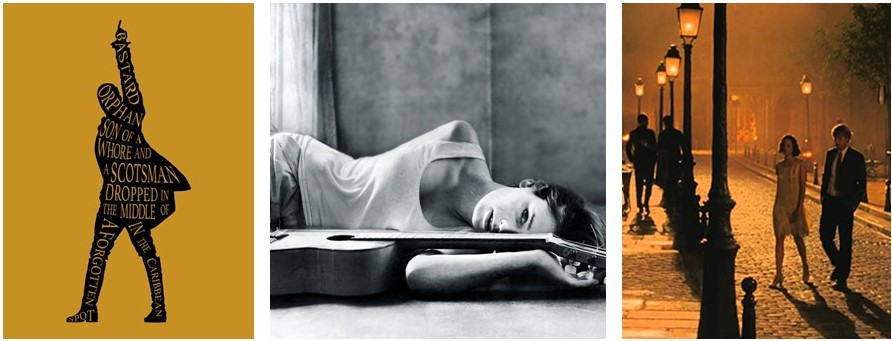
MUSIC // Eclectic and soulful music that bridges time and genres including the Hamilton soundtrack and Carla Bruni’s album, Quelqu’un m’a dit.

 FASHION // Classic, all-American cool c/o Vince, J. Crew and Celine.
INTERIORS // Rich and sleek. Warm and bright. Tailored and organic. L to R: Interior by Joseph Dirand includes works by Anish Kapoor, Pierre Jeanneret and Paavo Tynell; Patricia Urquiola collection for Georg Jensen; a sculptural Alvar Aalto chair; master suite cabinetry seen on Pinterest.

* * *

We love the conceptual stage of a project. Engaging in a thorough deep dive to excavate both the practical and the magical is the difference between a good project and a great one. Stay tuned for our next post where we transition into design development and project management — when we make the concept a reality.
xo, Huntley & Co.

-
Looking Back / Looking Forward
2017 was quite a year. Despite all the drama, trauma and homegrown insanity in the world – there was plenty of good to celebrate at Huntley & Co. Leave it to design to keep our spirits up. We’re looking back at a great year and looking ahead to even bigger and better things in the 12 months to come. Stay tuned!

Spring

– Traditional Home Designer Panel –
I talked design, business and keepin’ it real with Traditional Home at the Washington Design Center’s Spring Market. Sharing the stage with 3 smart, sassy blondes – Tori Mellott, Liz Levin and Maria Crosby – was a treat. #blondedesignmafia
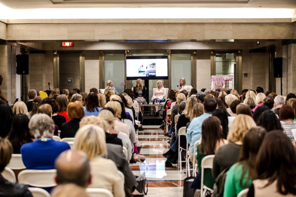
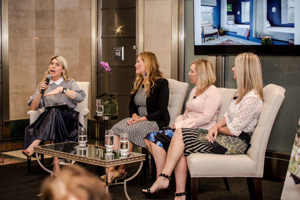
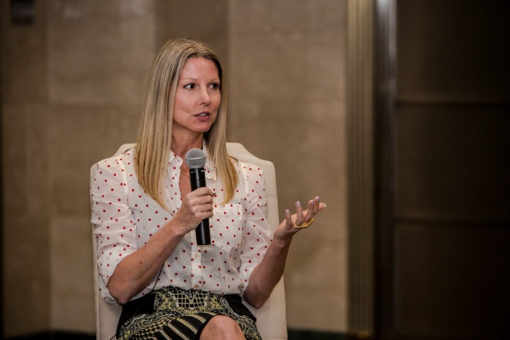
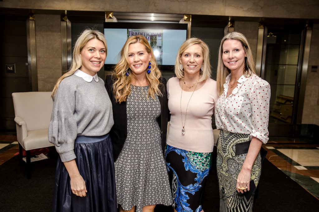
Photos by © 2017 Kaz Sasahara (www.lancerphotography.com). All rights reserved.

– Washingtonian –
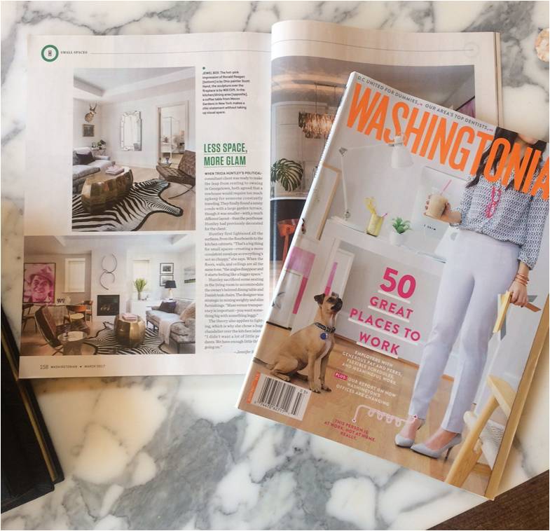
Our petite pied-a-terre project at The Montrose was featured in Washingtonian magazine’s March issue.

Summer

– Bethesda Installation –
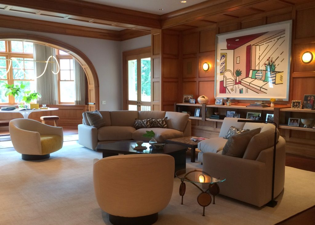
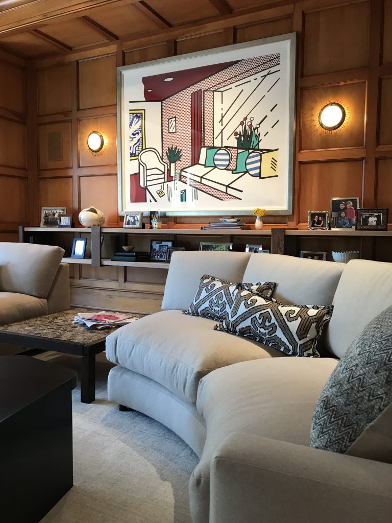
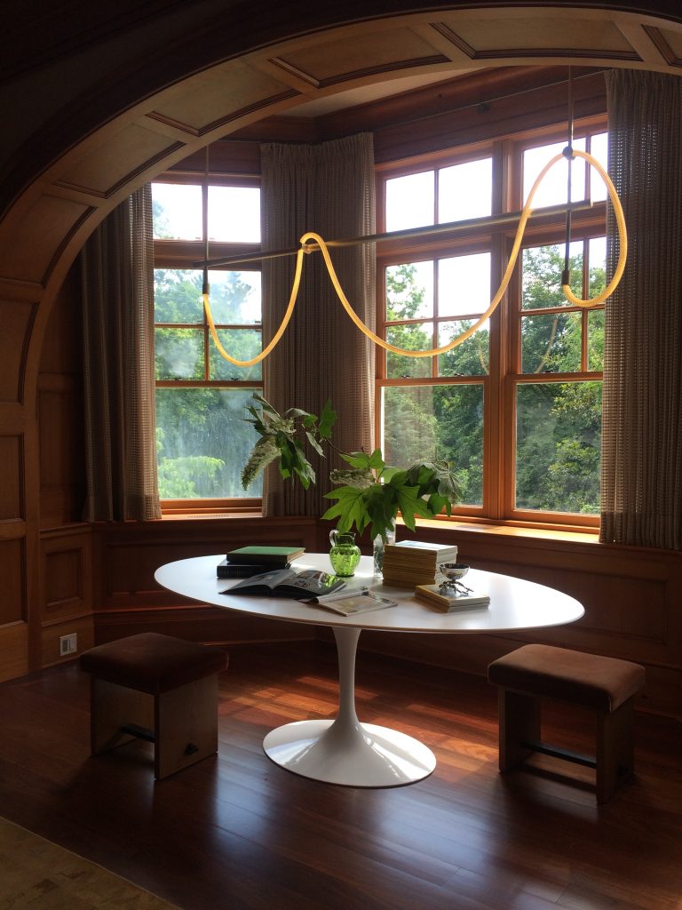
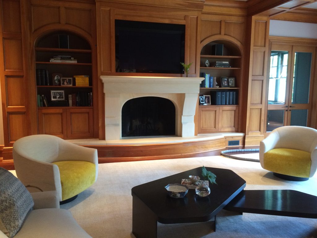
We redesigned and installed a family room in Maryland for one of our most beloved clients. We had completed the majority of the house previously and have always enjoyed collaborating with the husband and wife. The room had great bones, so we changed up the finishes and furnishings to complement its geometry and lift its spirit. It lost it’s rigidity (thanks to plenty of sinuous shapes) and now has a healthy dose of verve.


– House Beautiful –
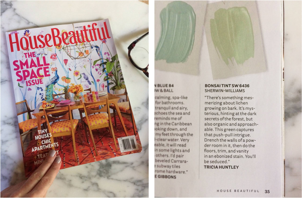
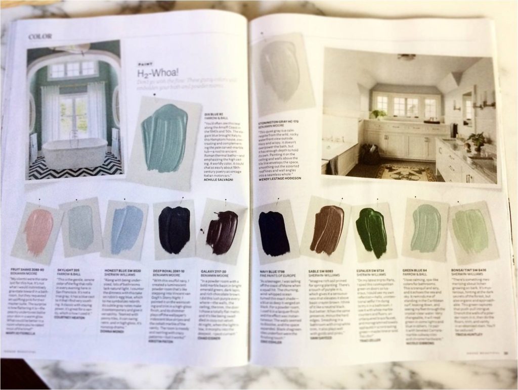
I shared a favorite shade of green in House Beautiful‘s June COLOR section. Bonsai Tint is the perfect summer hue.

Fall

– NOLA –
In September I traveled to New Orleans for a design-filled weekend hosted by native Gretchen Everett. We toured incredible homes, visited all the best antique stores, and of course, ate and imbibed. It was fantastic! The intimate view of New Orleans’ beauty and lifestyle had me seriously considering a move to The Big Easy.
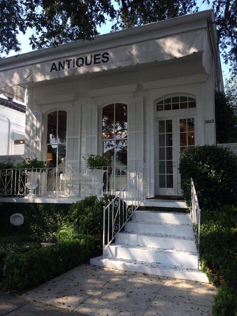
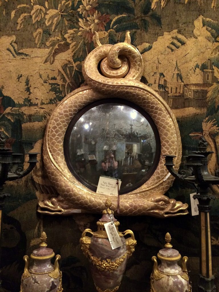
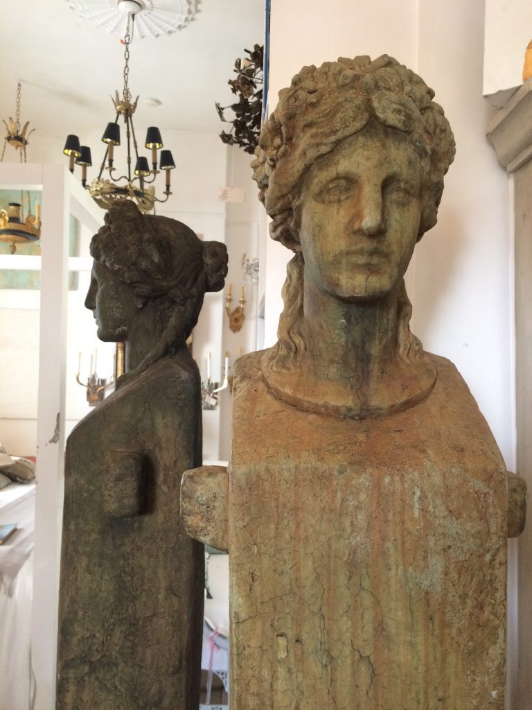
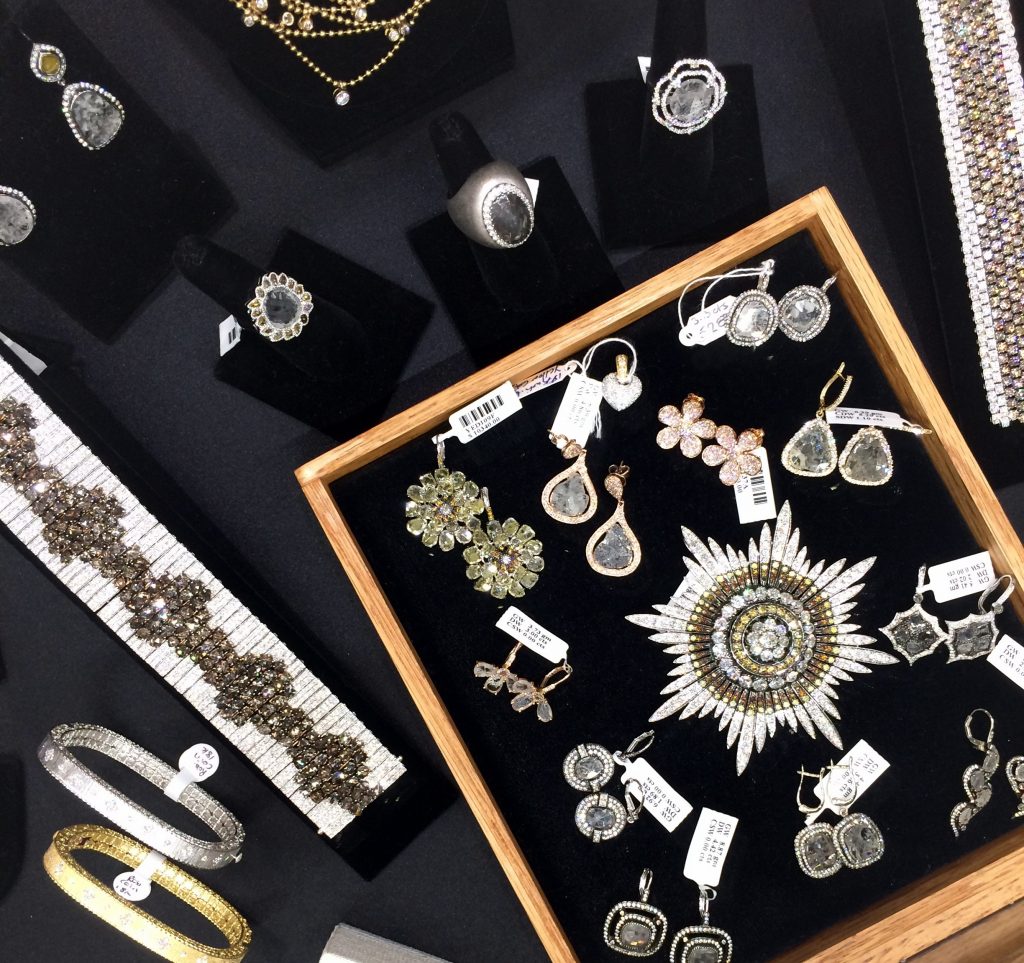
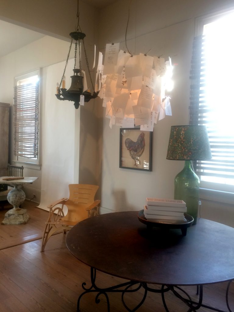
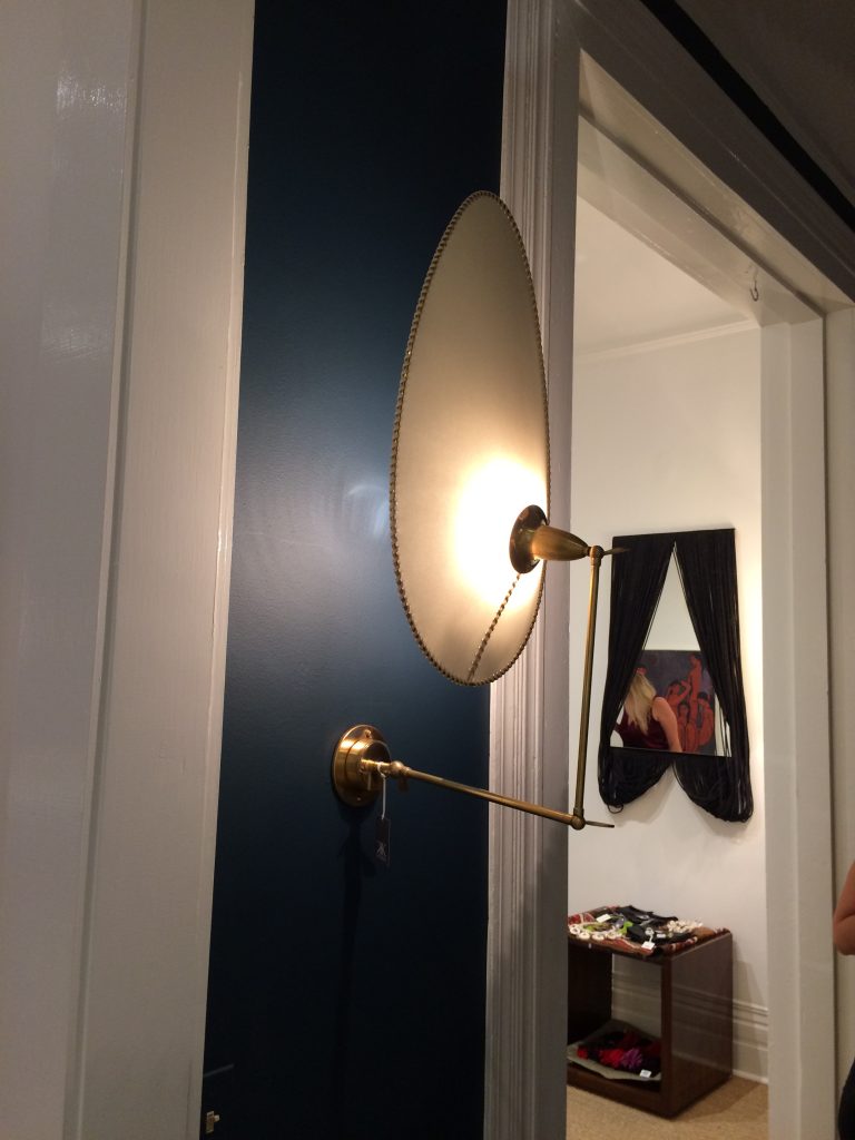
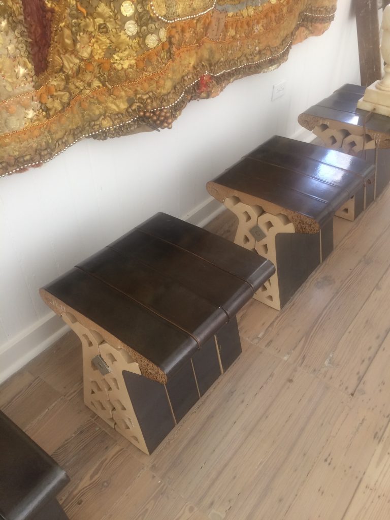
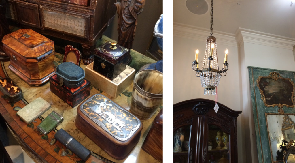
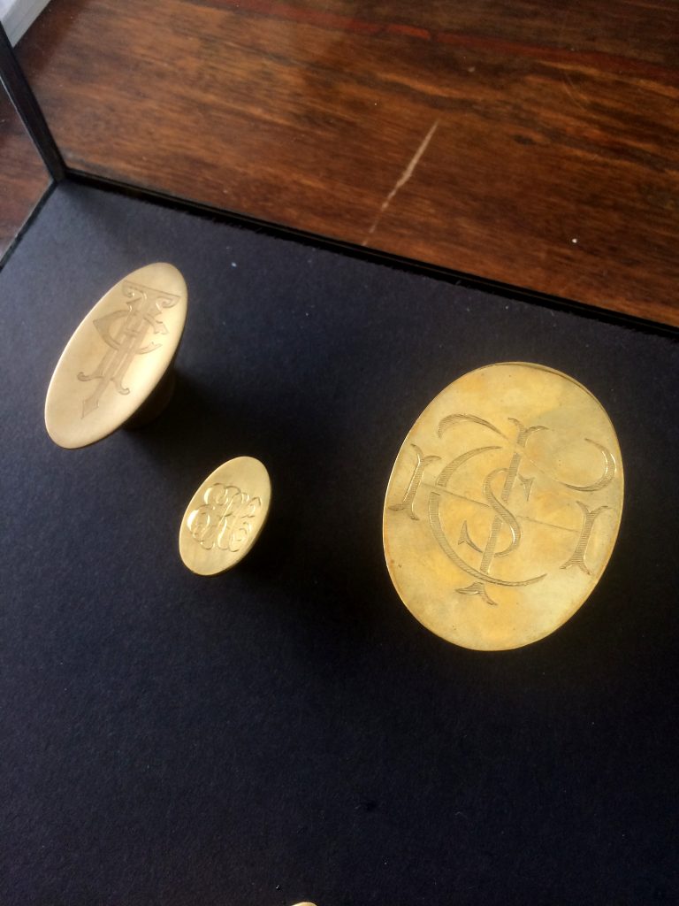
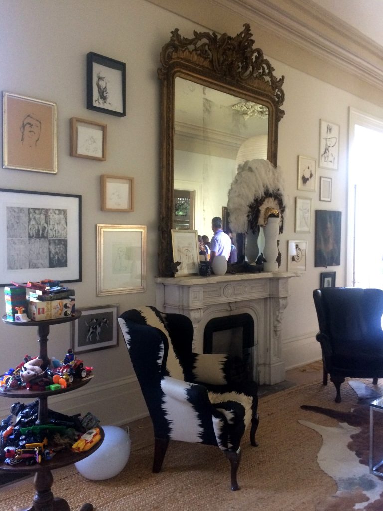
Featured Above: Ann Koerner Antiques, Appartique, Balzac Antiques, Bremermann Designs, Hope Goldman Meyer, Katie Koch Home, Marion Cage and Kevin Stone Antiques.

– The Celine in AD –
My Celine Pendant for Ironware International was included in Architectural Digest’s list of things worth coveting. Thank you AD – I’m a fan too! ; )

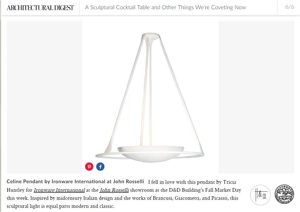
Photo c/o architecturaldigest.com

I hope the holidays treated you well and you are excited to tackle the year ahead!

Subscribe to our newsletter or find us on Bloglovin’ and you won’t miss a thing.
** all photos in this post are my own unless noted as otherwise
-
THE AD DESIGN SHOW :: TRICIA’S 10
I spent the day at the Architectural Digest Design Show in New York on Friday. It’s always good to see what’s new, talk with vendors and “kick the tires” so to speak. Seeing the finish/scale/construction of products in person is integral to quality control and intelligent design. And, of course, it’s fun. I’ve shared ten best picks — whether it be a specific piece or an entire collection — and why each was worth a closer look.

#1 Van Cronenburg
I am passionate about hardware and this company is stellar. Substance and exquisite detail in every piece.


#2 A Space Wall Sconce
All of the products from A Space – lighting, furniture, vases – are beautiful, but the Falling Star lamp was a show-stopper. It will undoubtedly make a lot of “it lists”.


#3 Archetypal
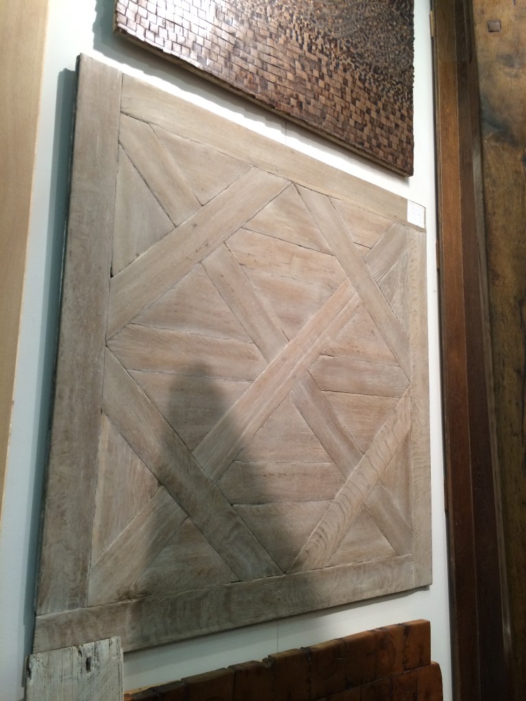
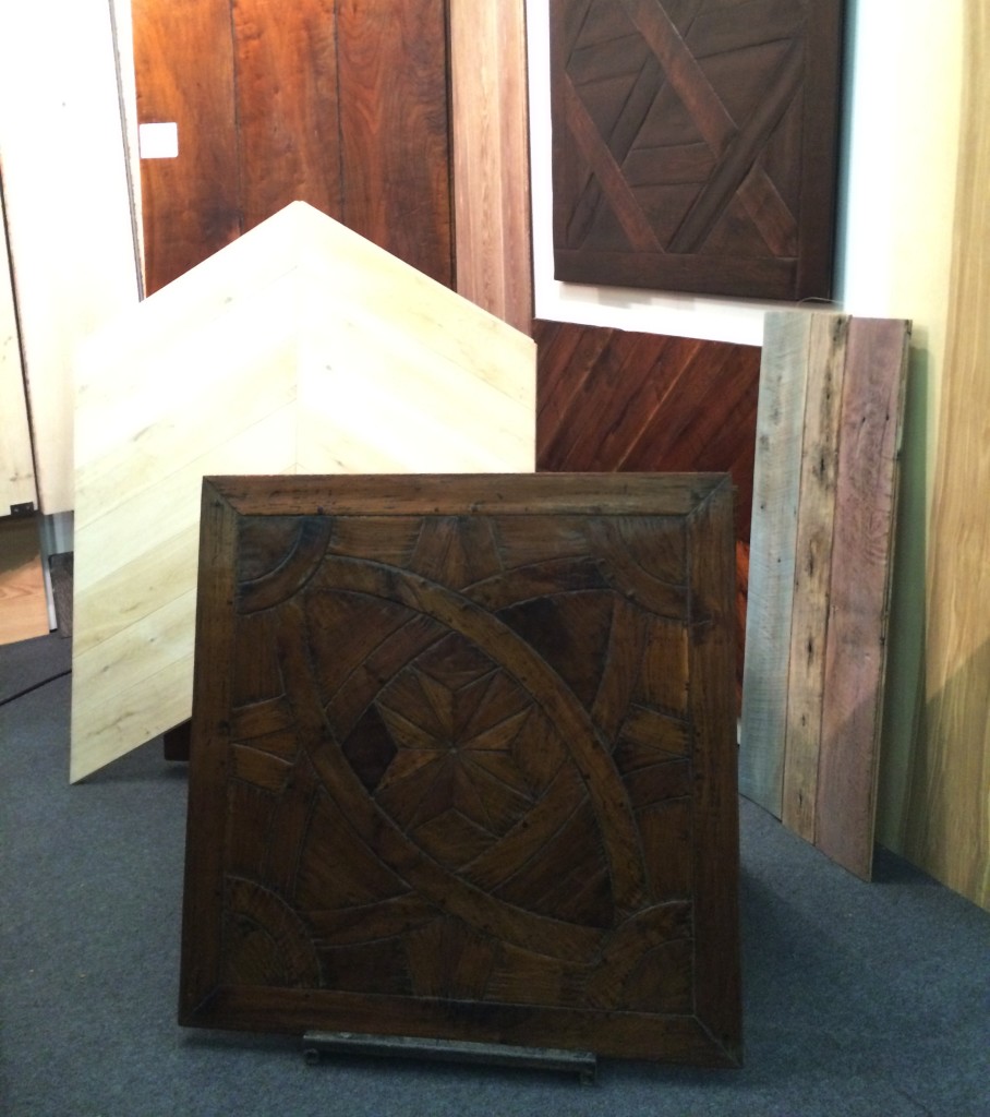
In a perfect world, Archetypal’s work would be on the floors of every home in America. A designer can dream.


#4 Jennifer Schinzing
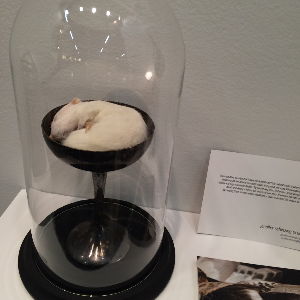
Jennifer’s love for the natural world inspired her to learn taxidermy. She preserves small animals (many of them road kill casualties) and transforms them into art installations. The thoughtfulness and beauty of each “memorial” was remarkable. Take note world, SHE IS ONE TO WATCH.



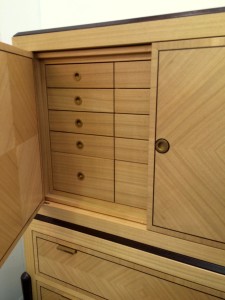
#5 Visilek
This cabinet was perfection. The veneers, the joints, the mechanics, the proportions were all flawless. Filipe Rodrigues’ work is masterful.



#6 Brizio Faucet
The Brizio Solna faucet. It’s black, it’s functional, it’s sexy … and it’s plumbing. Gotta’ love it.


#7 Jefferson Hayman Photography
I never jumped on the gallery-style art installation bandwagon in design. Perhaps because often times it’s just a bunch of crap thrown up on the wall (yes, I just wrote that). But Jefferson Hayman’s installation at the AD Design Show was simply lovely. The collection was intimate, multi-faceted and beautifully framed. Purchasing the entire installation crossed my mind … and I think that of the gentleman in the photo (yes, I was eaves-dropping).


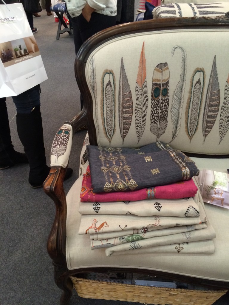
#8 Coral & Tusk
I’m a sucker for animal motifs, so naturally I was drawn to Coral & Tusk’s display. But what’s lovely about these goods is that the patterns are cute without being saccharine. The imagery is grounded by the quality and authenticity of the textiles. Moreover, Stephanie Housley was delightful; her enthusiasm and love for her work was evident.


#9 Joya’s F vs. S Candles
These candles may seem simple, but something about them caught my eye. They whispered [vs. shouted] sexy and luxurious — my personal sweet spot without a doubt. I inquired about an order at the show and pretty much want to purchase the whole collection of fragrances upon seeing the website.


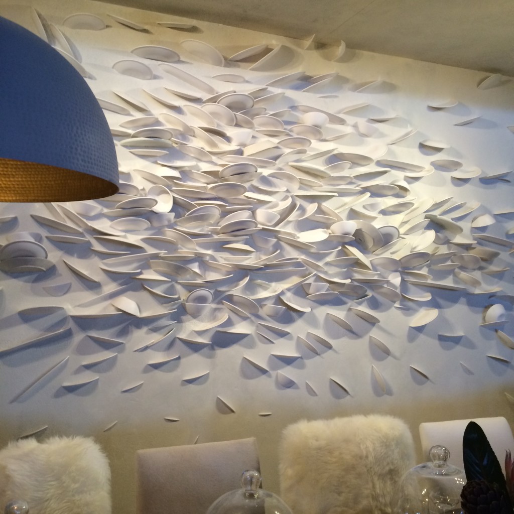
#10 C&B at Dining by Design
Believe it or not, I am including Crate & Barrell in this list. Their dining room for DIFFA included a brilliant wall “art” installation. How many plates were broken to create this I don’t know. But what fun and how tongue-in-cheek. Kudos C&B.

*All photos are my own save the two that are hyperlinked. Thank you for sharing your beautiful images with our readers.
-
PARADOX = DESIGN HARMONY
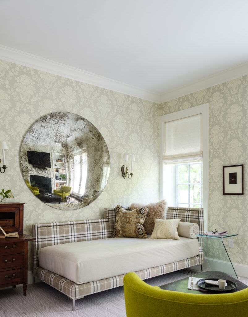
Paradox is my passion — contrasting modern with traditional, sexy with conventional and subtle with provocative. Introducing incongruity and tension give a room interest and energy. As we designers say, it’s what makes a room “sing”. In the simplest of terms, I like a little rock-n-roll with my ladylike. It’s integral to my designs, my fashion sense and my attitude.


bubble chandelier + oushak | classical-themed wallpaper + midcentury architecure | columnar lamp atop leather-wrapped dresser + modern high-rise apartment


graphic polka dot tank + pink animal-motif shorts + snakeskin heels | distressed jeans + damask pattern jacket + large belt buckle

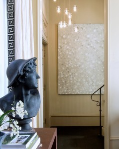
camelback sofa + vintage lamps + saarinen table | bust of hermes + robin rose painting + lamb’s tongue railing


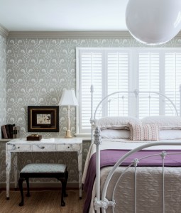
modern asymmetrical mirror + velvet flocked wallpaper | surrealist watercolor + toile wallcovering | antique iron bed + globe pendant


oak paneled wall + silk velvet headboard + circular shag rug | multiple contemporary genres + yellow-painted vintage valet chair

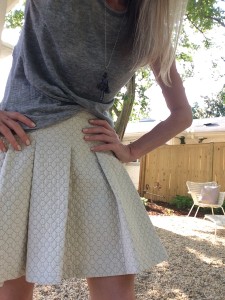
chunky woven sweater + gold lame harem pants | grey heathered tee + quilted derek lam skirt


pitched beadboard ceiling + gold dome pendant | midcentury mobile + antique leather hall chair | builder-grade powder room + contemporary wallpaper + bronze repousse mirror
… in other words, “luxe and lucid”









![porcelain-joya[1]](https://luxeandlucidblog.com/wp-content/uploads/2016/03/porcelain-joya11-1024x808.jpg)

