-
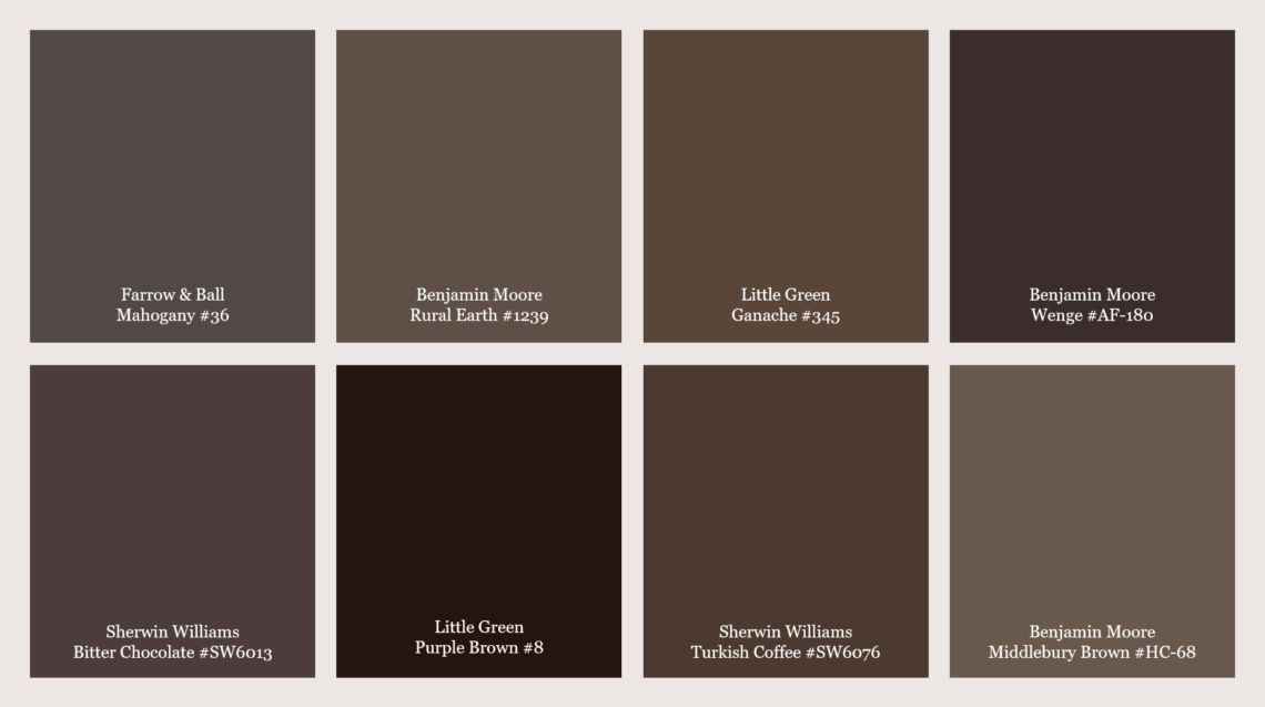
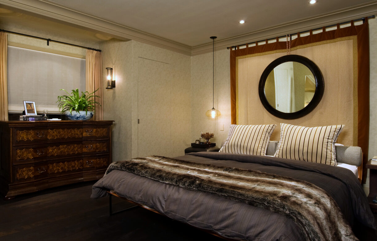
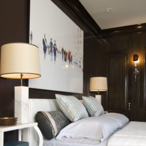
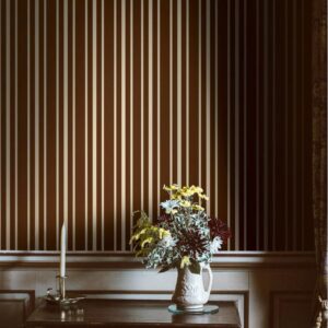
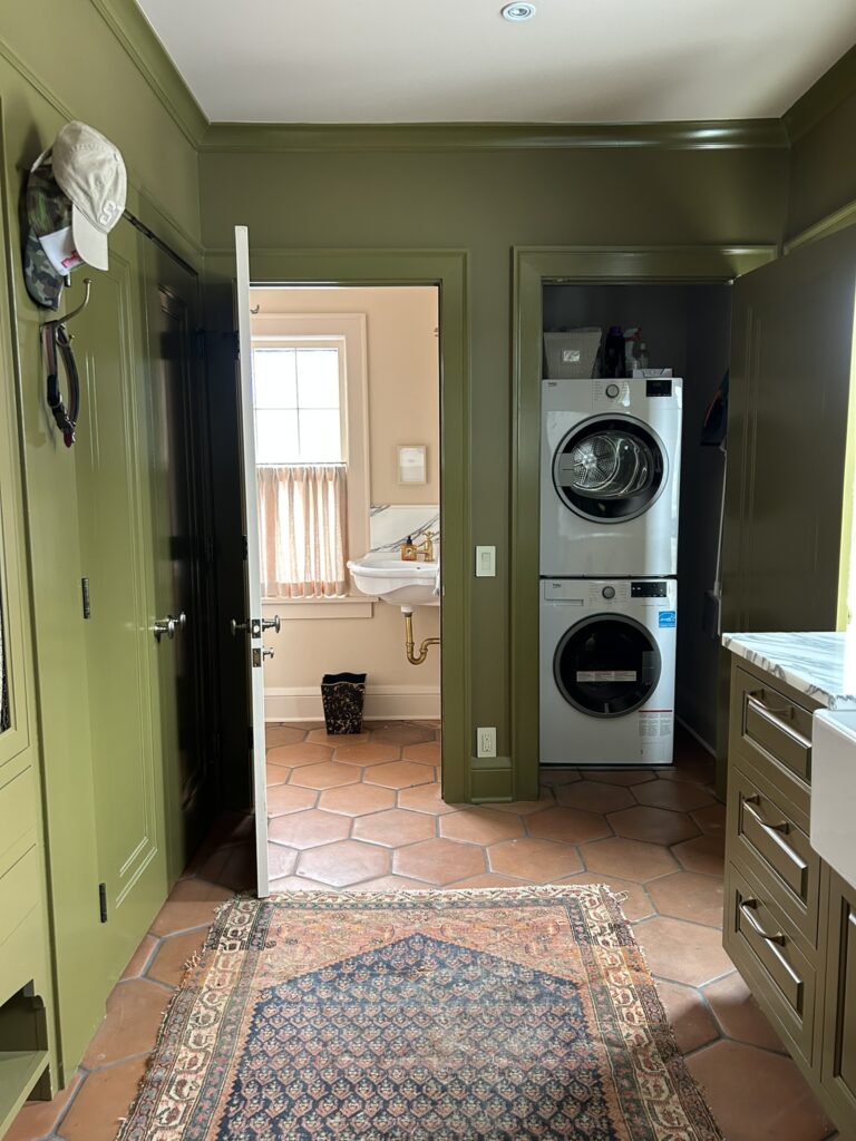
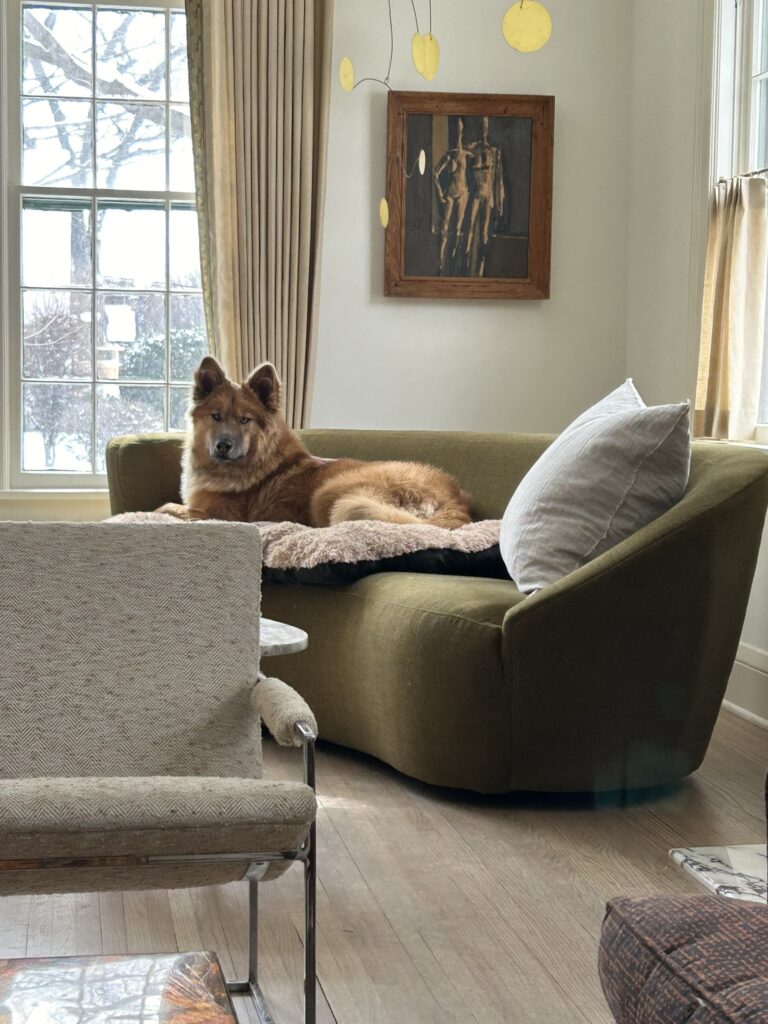
Bold Browns & Best Practices


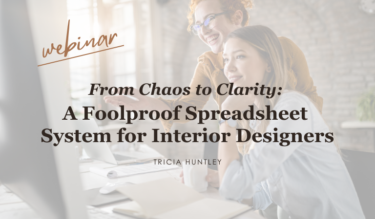
upcoming webinar
“From Chaos to Clarity”

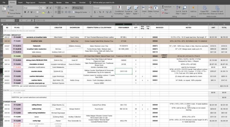
Learn how to create your own customizable budget and how to use it to outline costs, track orders, and stay on top of all those details! Fill out the form and type #systemsaresexy in your Message to receive updates and an invitation to sign-up.
-
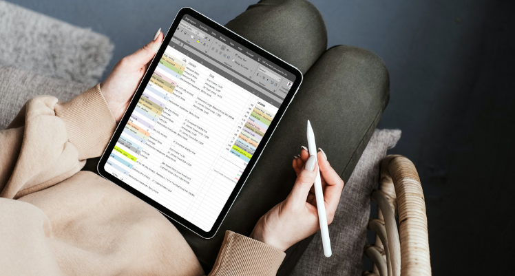
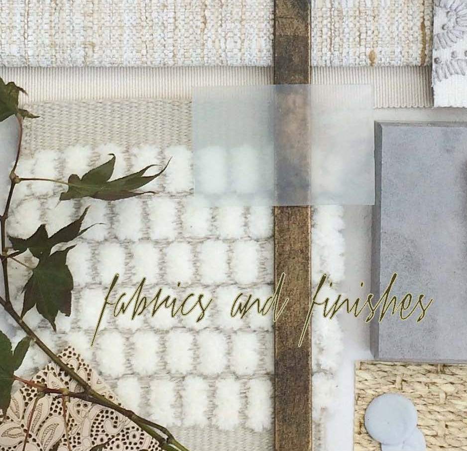
The Essential Tool Every Interior Designer Needs


-
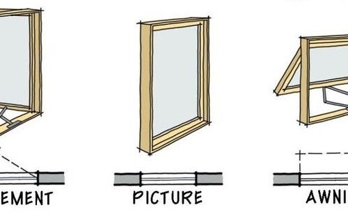
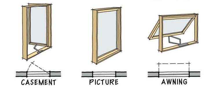
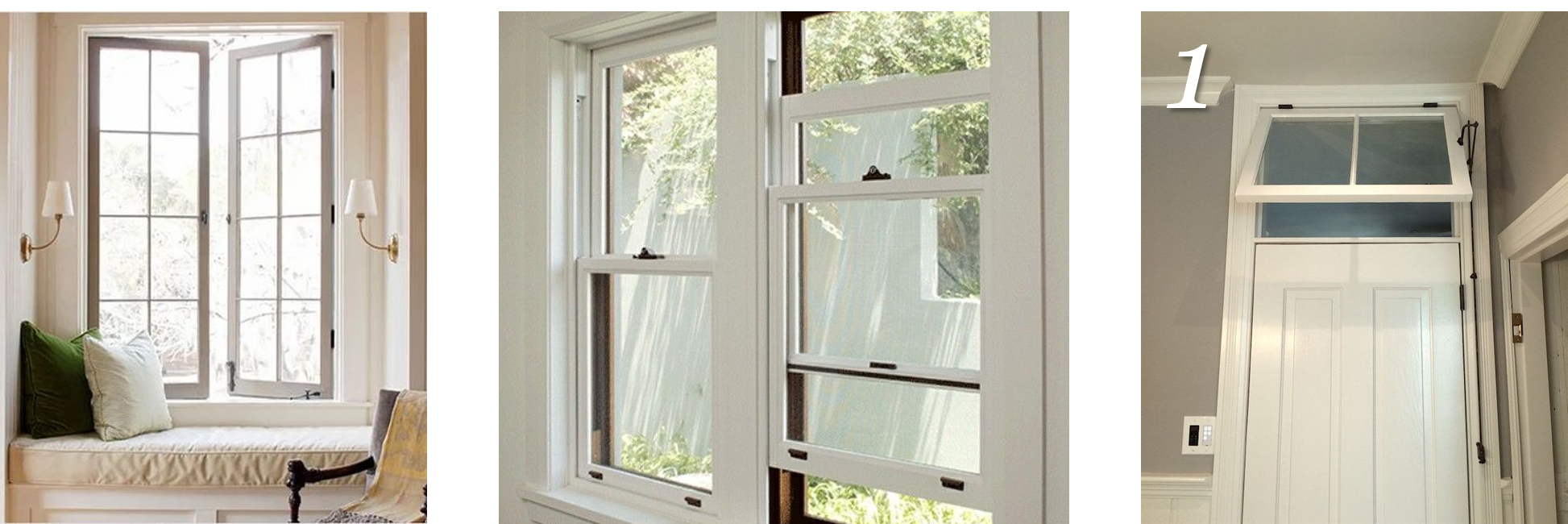
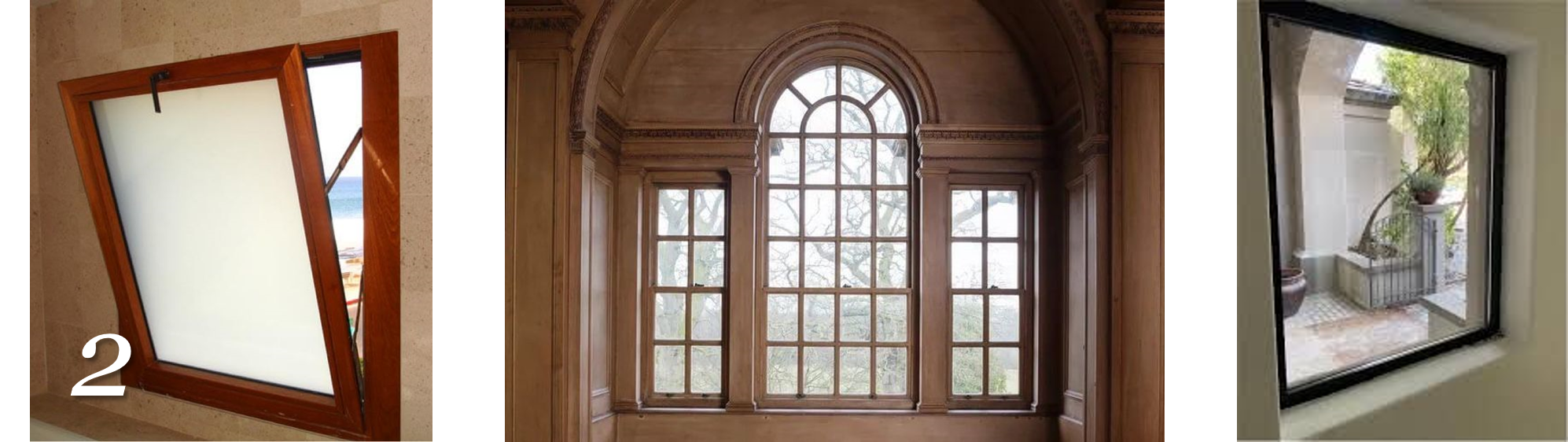
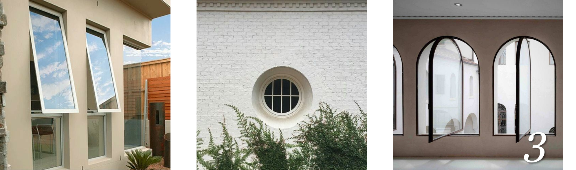
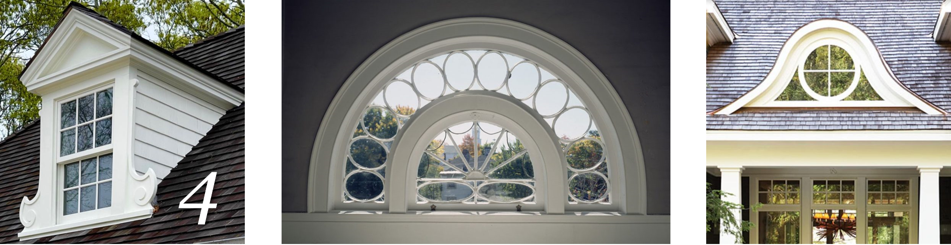
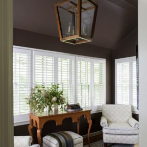
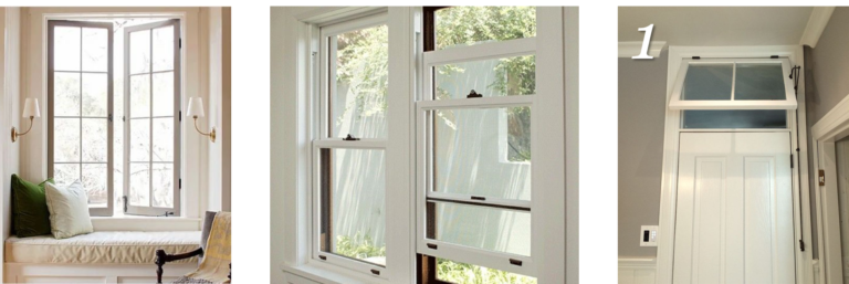
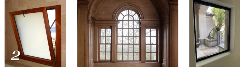
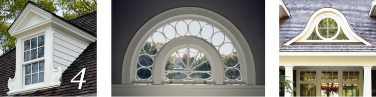
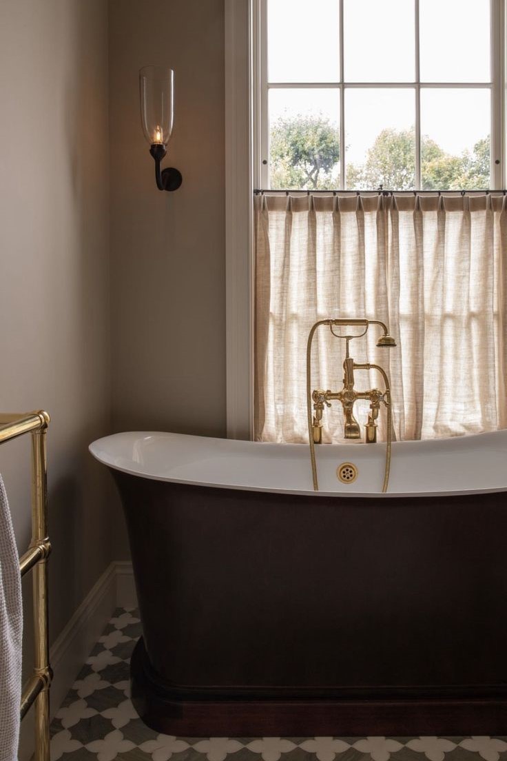
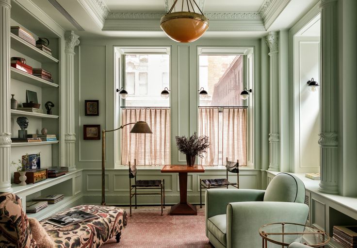
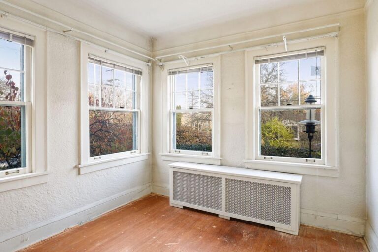
A Closer Look at Windows


-
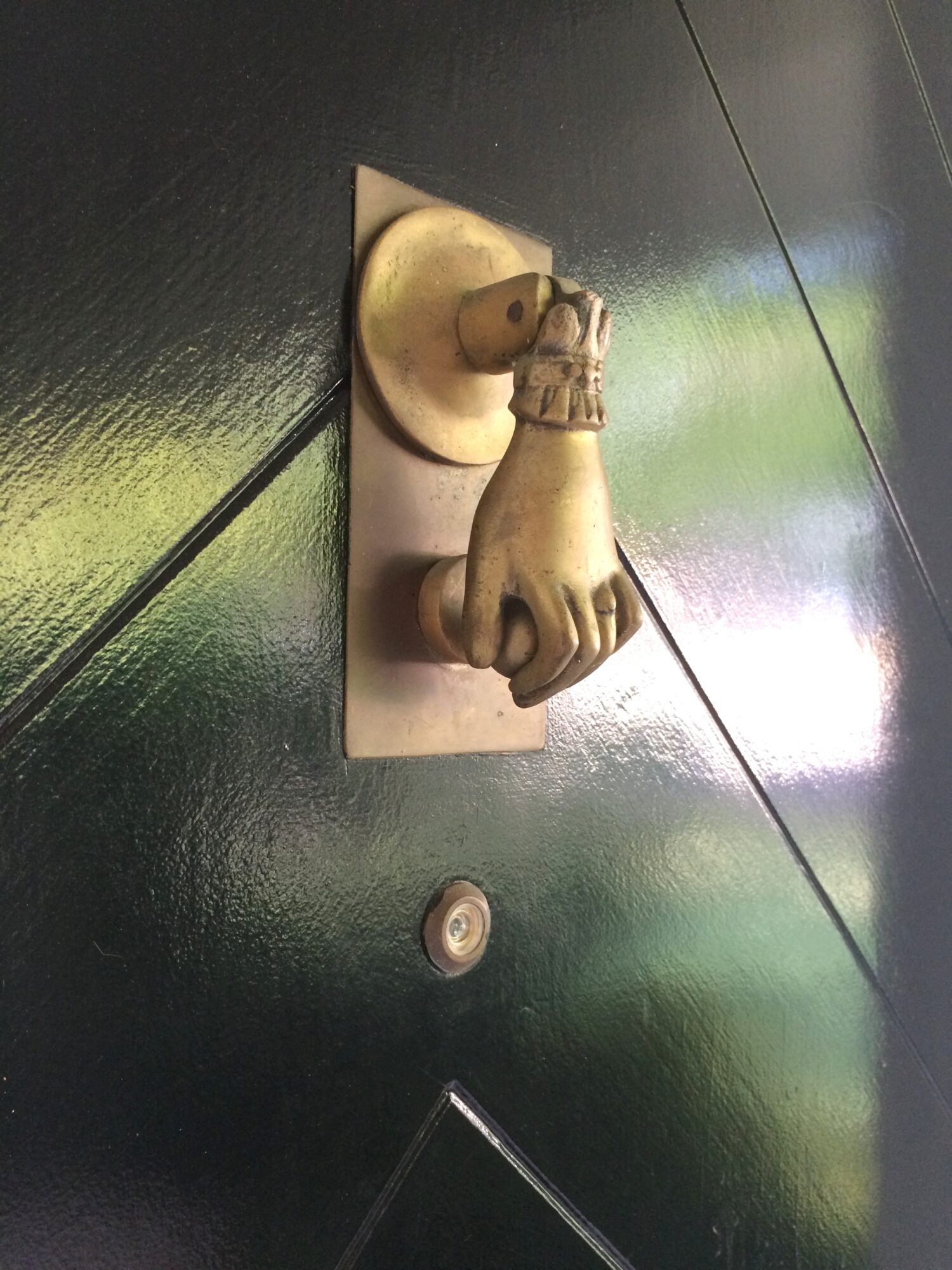
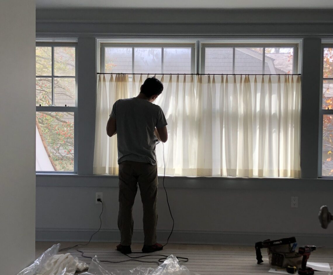
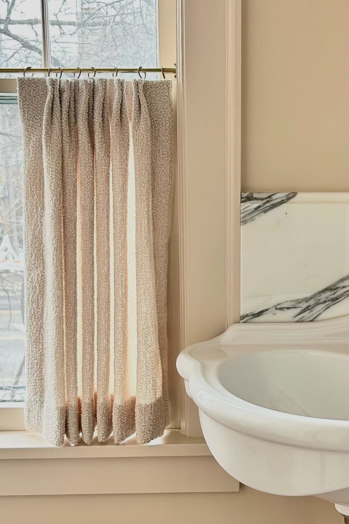
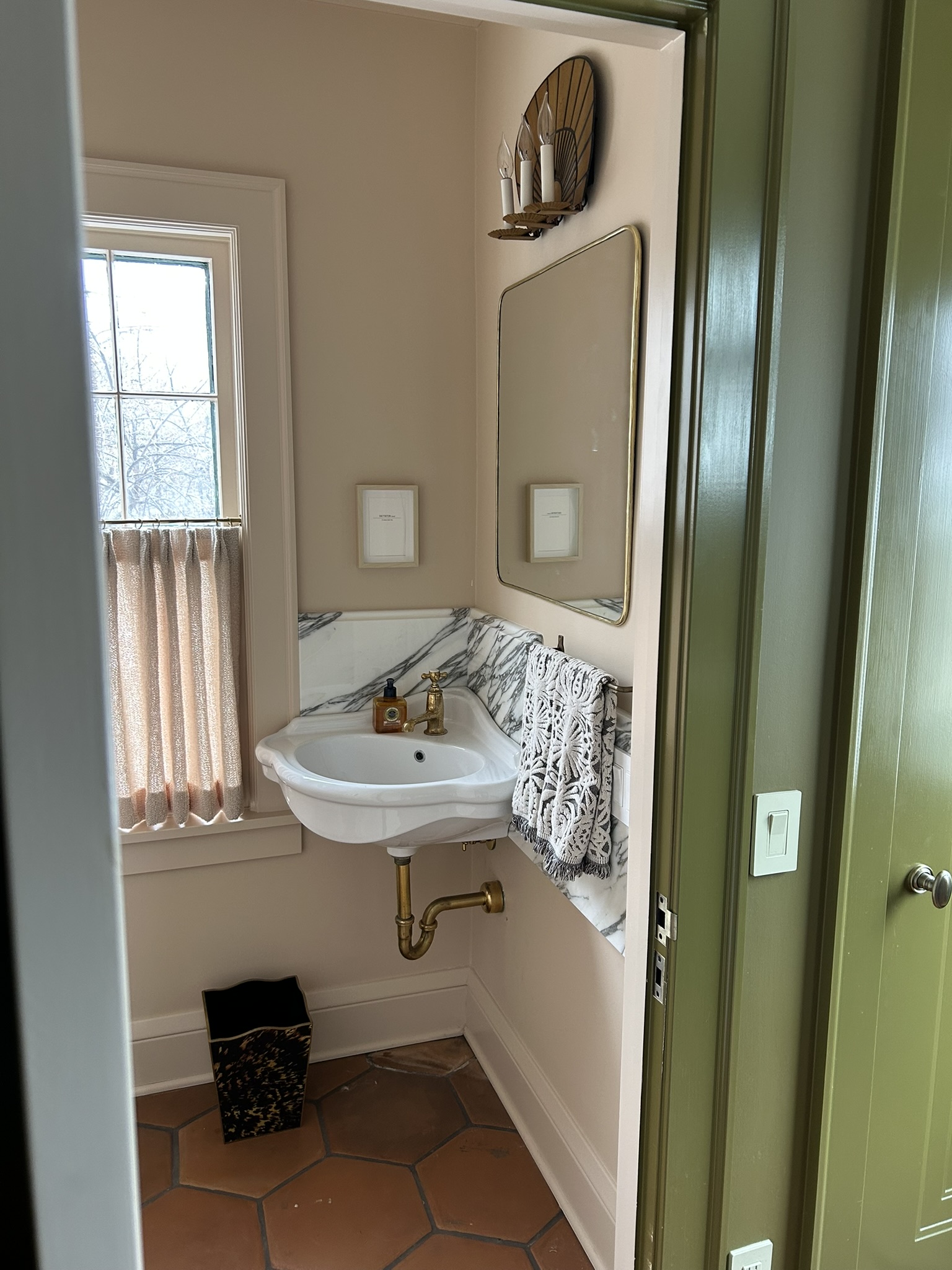
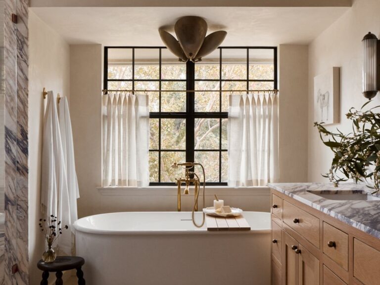
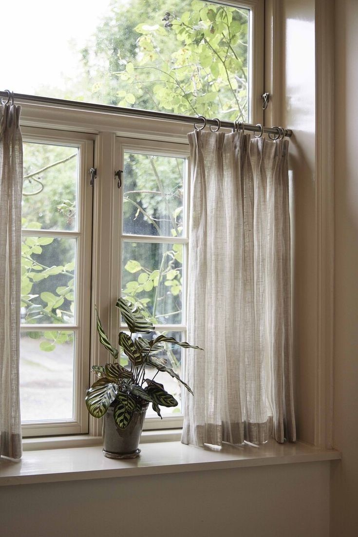
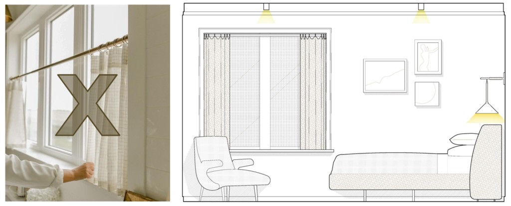
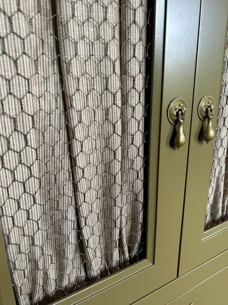
The Right and Wrong Way to Hang Cafe Curtains


-
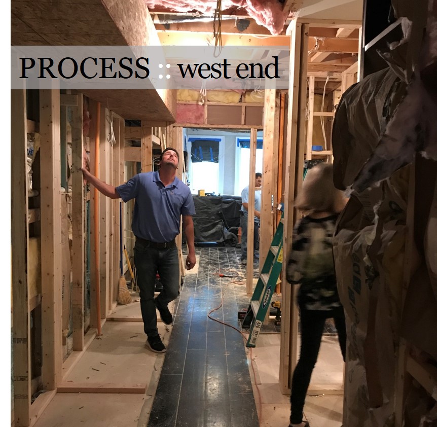
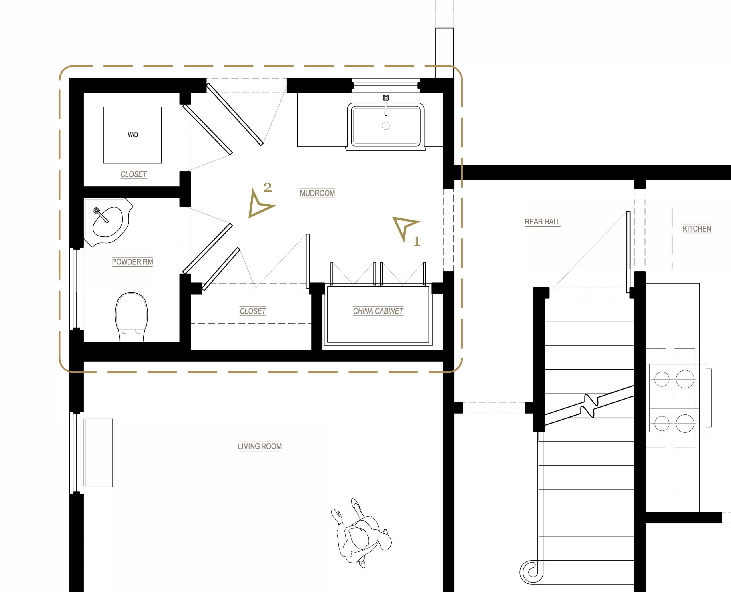
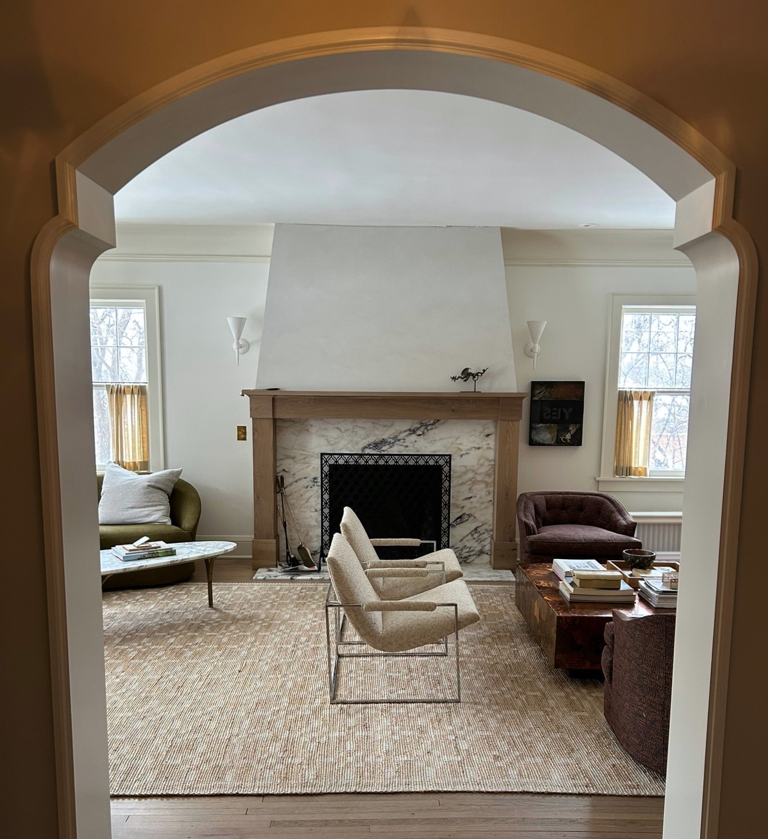
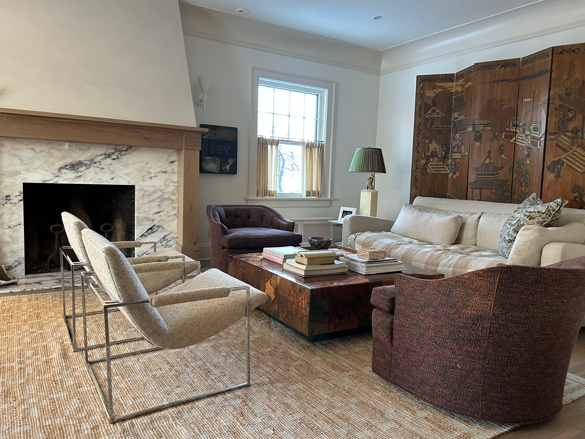
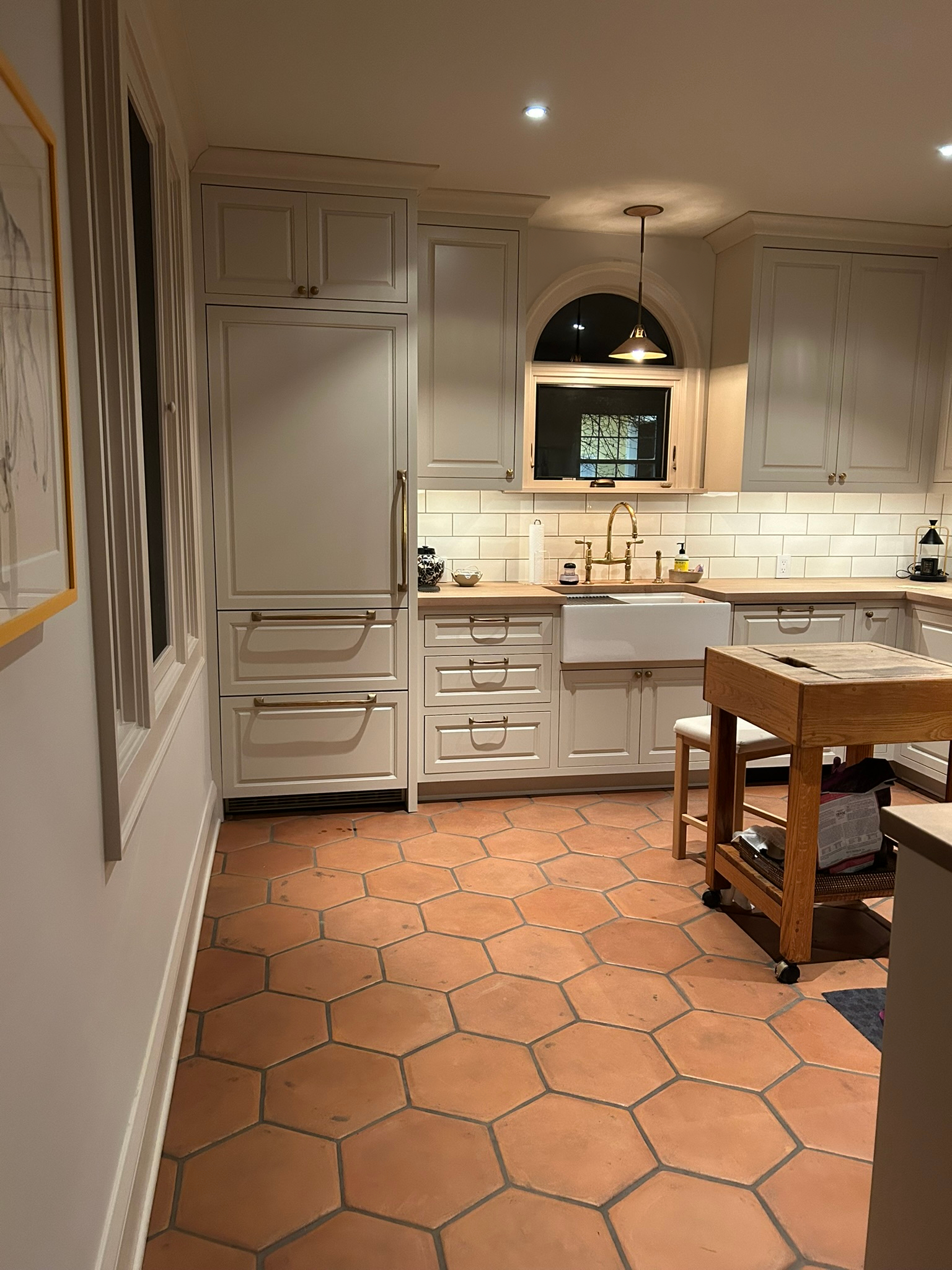
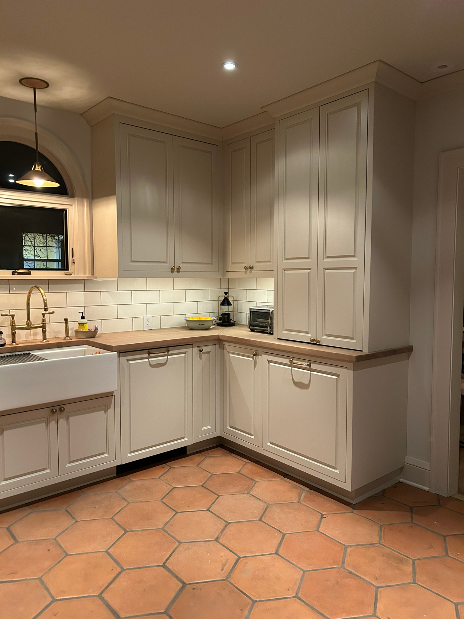
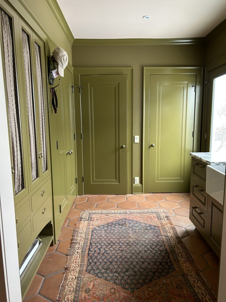
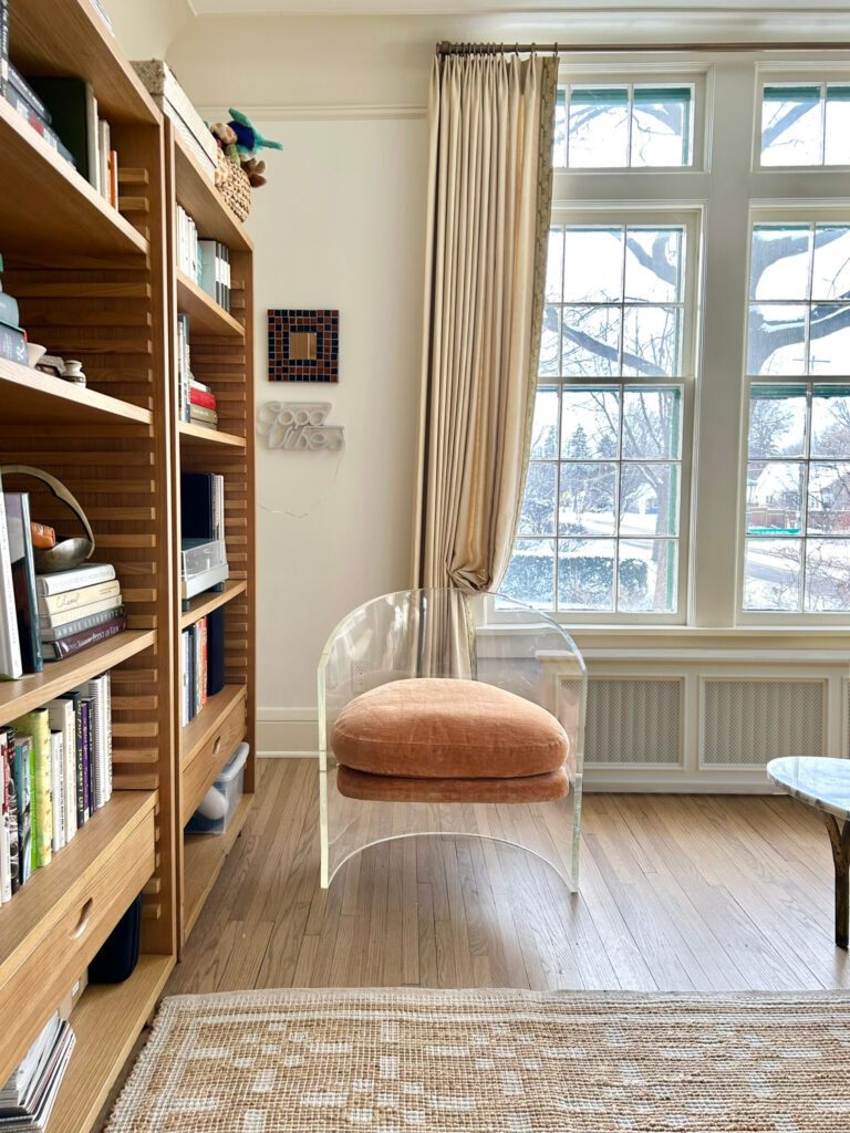
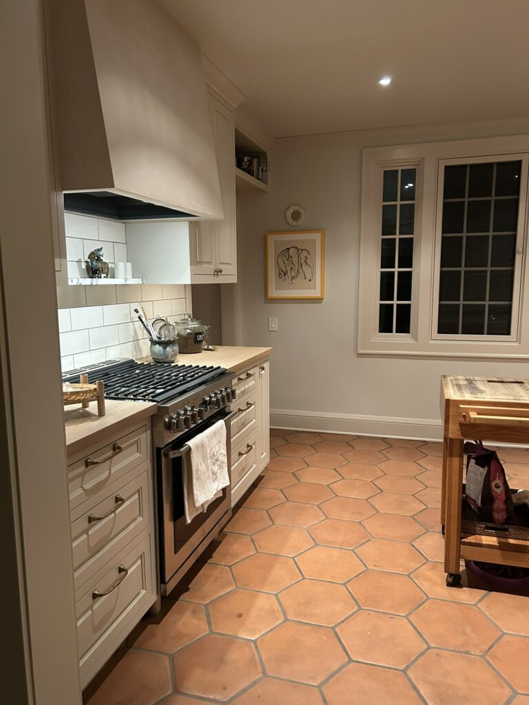
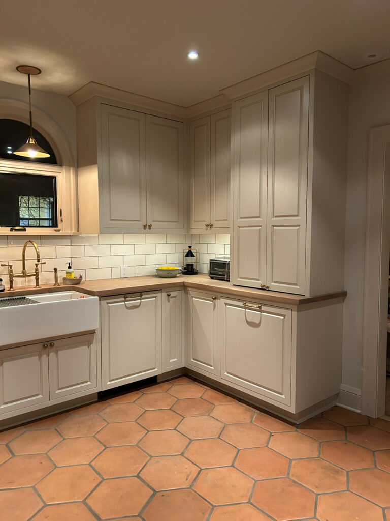
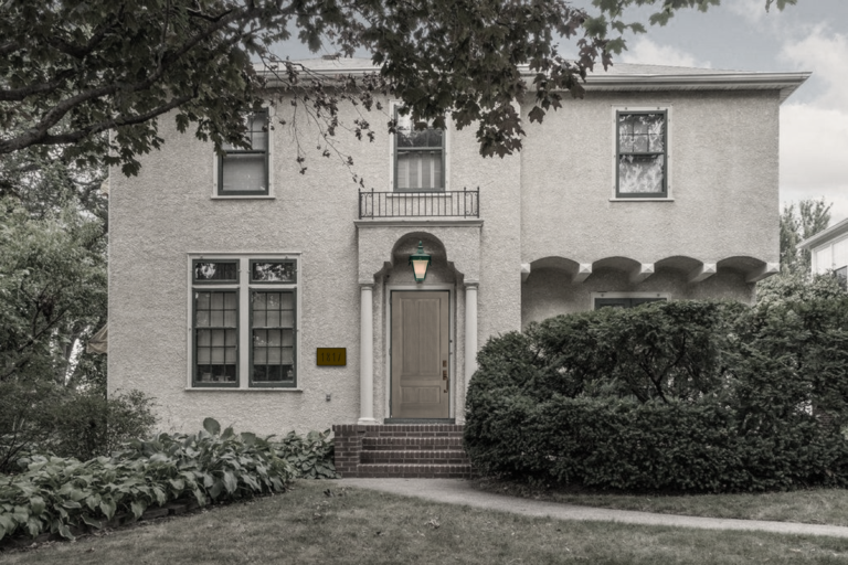
New and Improved : Hillcrest v.3
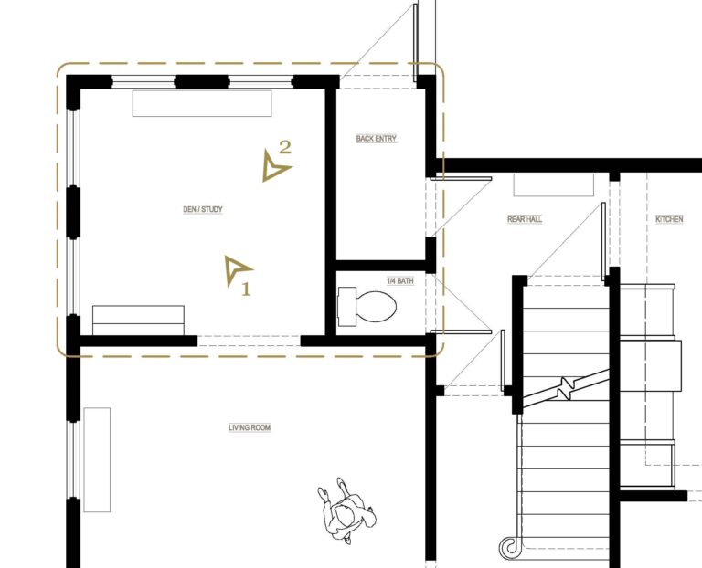


-
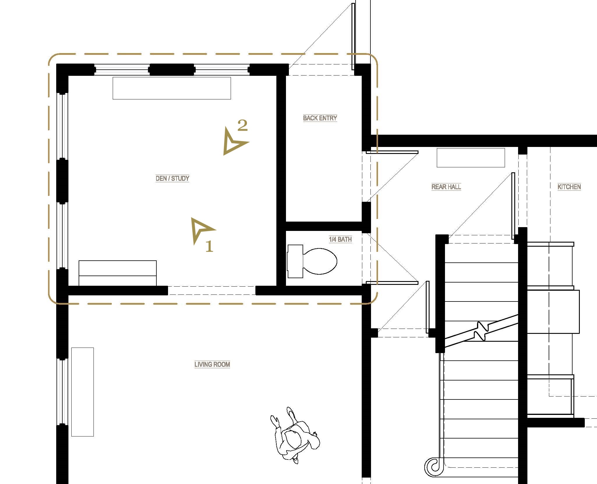
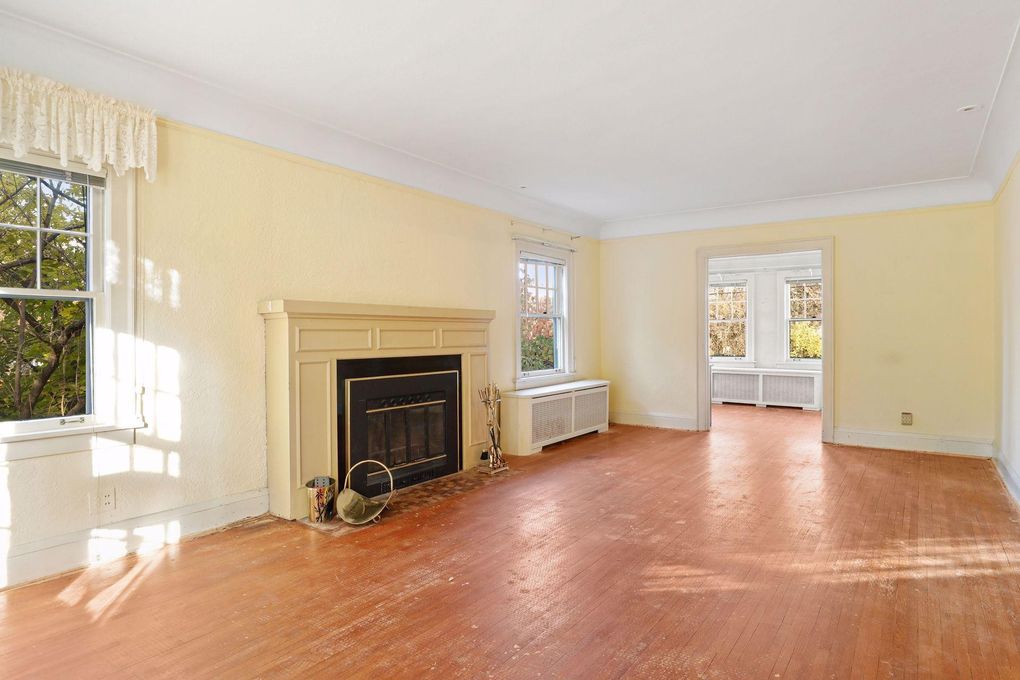
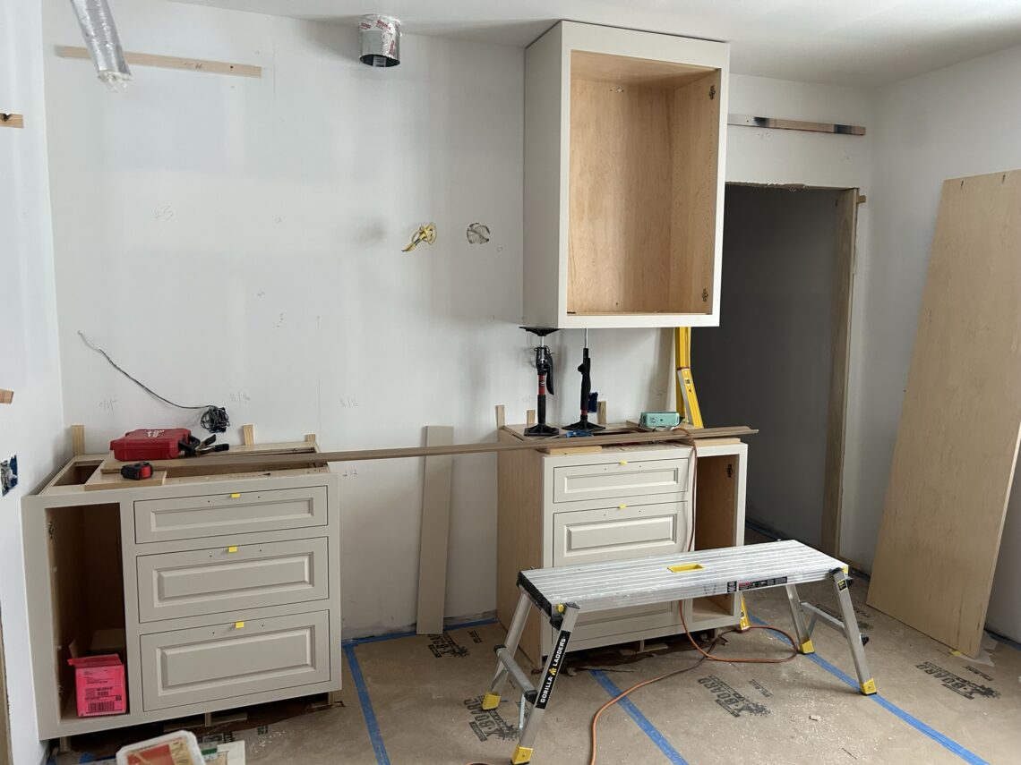
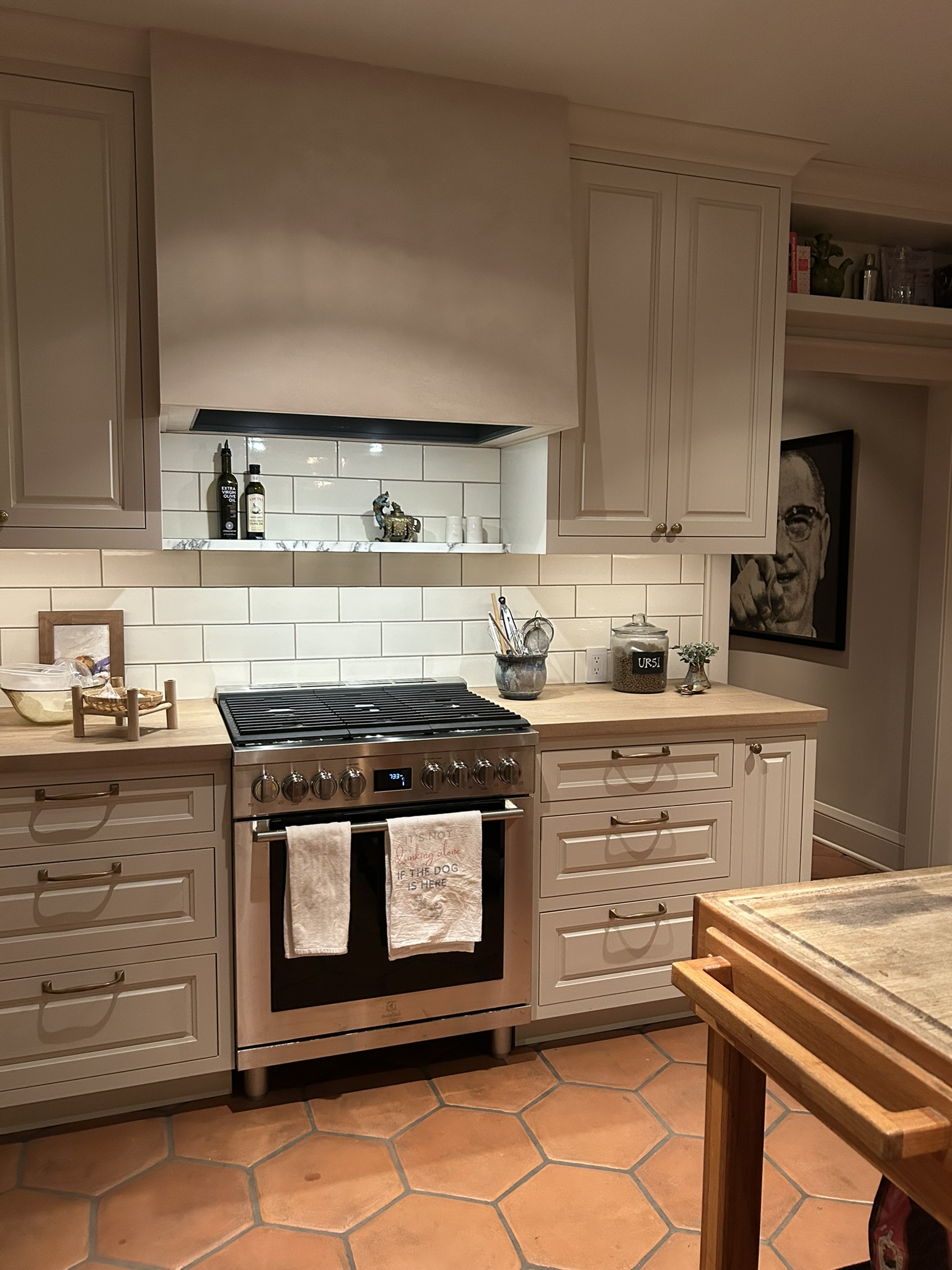
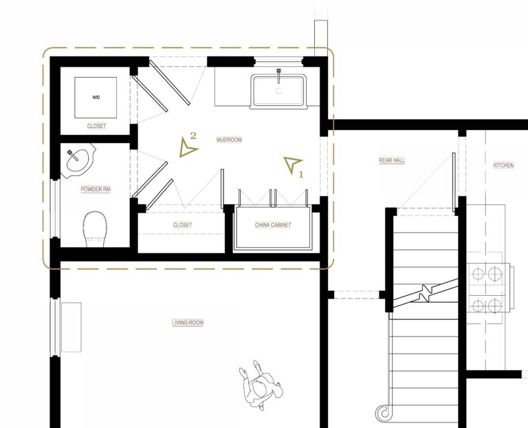
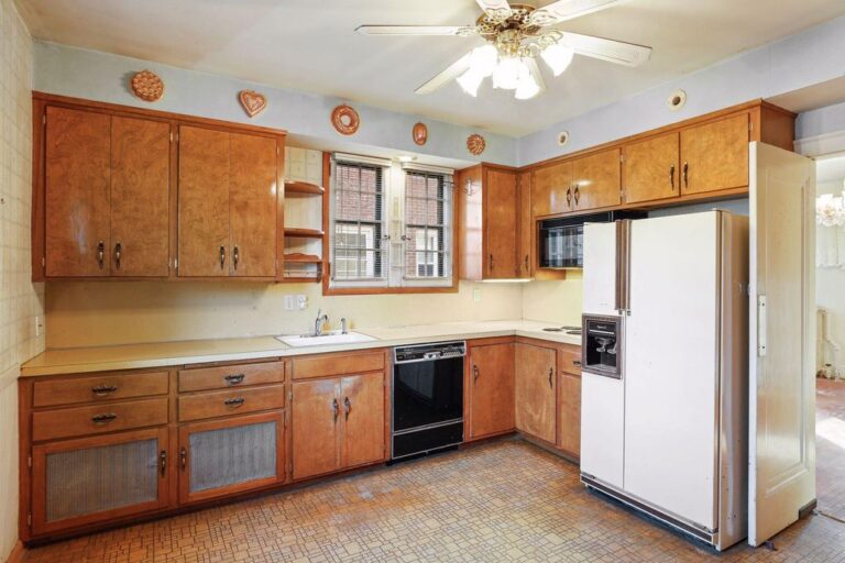
New and Improved : Hillcrest v.2


-
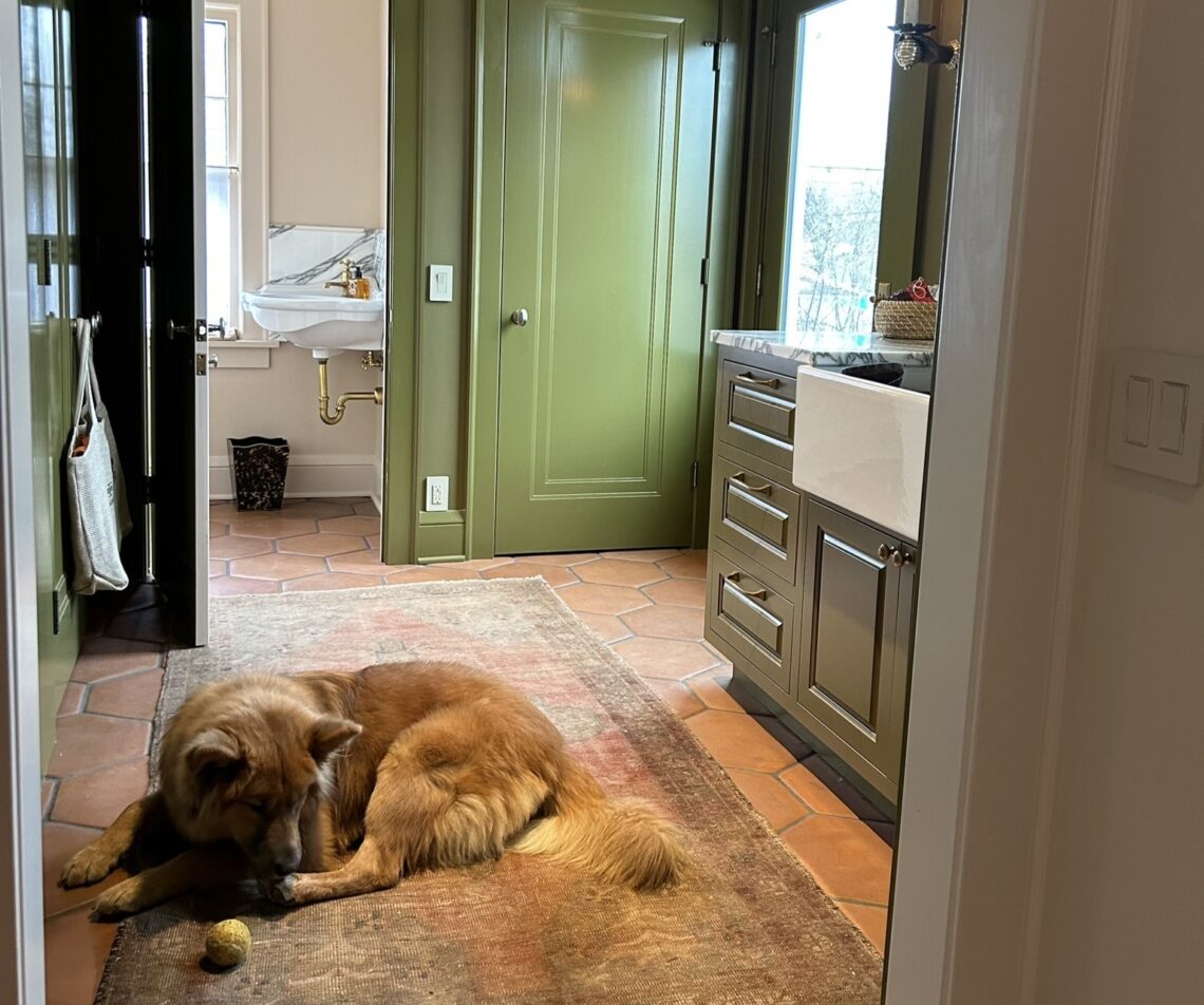
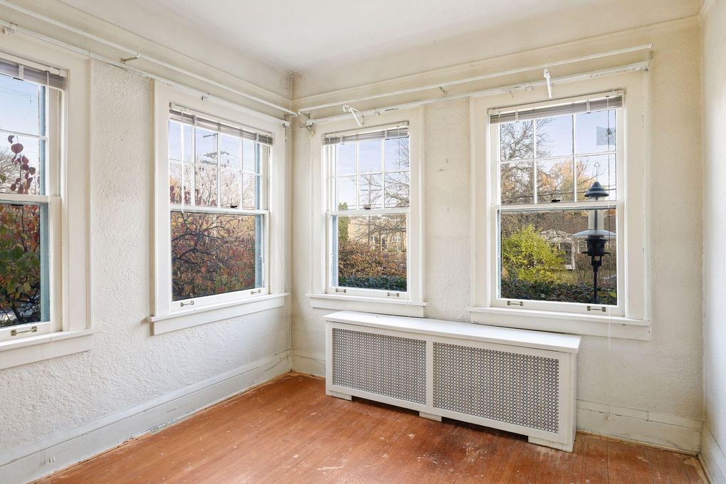
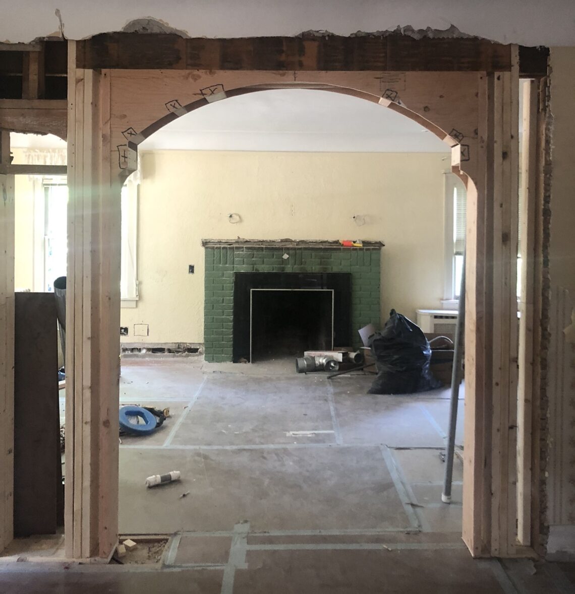
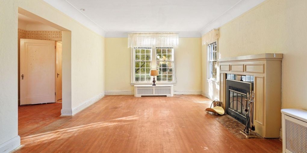
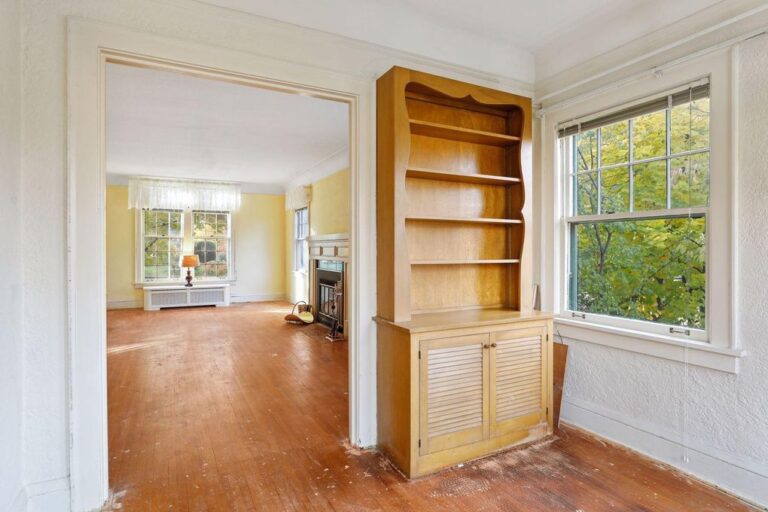
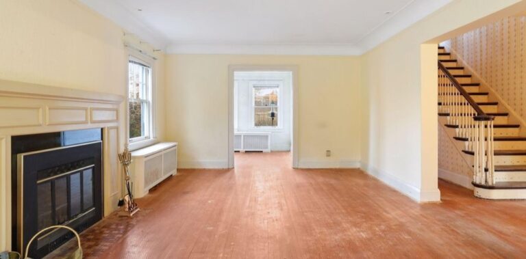
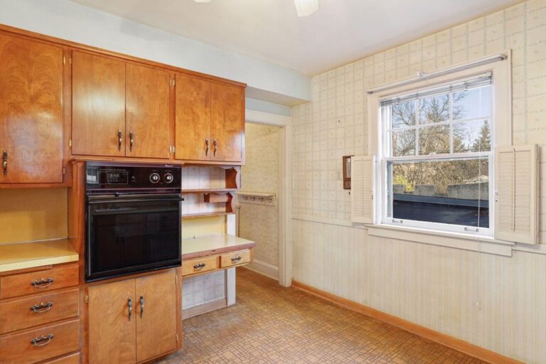
New and Improved : Hillcrest v.1


THE MUSINGS OF DESIGNER TRICIA HUNTLEY