-
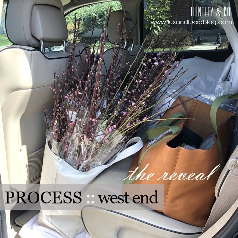
West End :: The Reveal

This reveal has been a long time coming. Not because it was only just installed, but because Luxe & Lucid was tied up in a parallel universe after we moved the Huntley & Co. website to another platform. The technical side of small business is the gift that keeps on giving. So we thank you for your patience, and without further ado, we reveal our West End project installation!
* * *

Making it Move-In Ready
———————————————————

Obviously before our clients can move in, we have to install carpet, light fixtures, wallcovering and window treatments. Then, with our backdrop complete, our team is ready to bring in the furniture and accessories.


(top L to R) Living room chandelier install; Master bedroom carpeting in progress; Wallpaper in the third floor den; Installation of master bedroom roman shades.
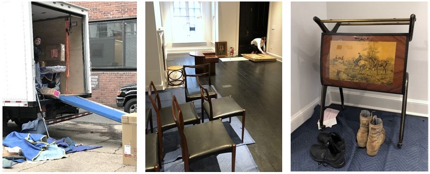
(bottom L to R) The crew unloading the truck; Opening artwork; Vintage Italian barcart.
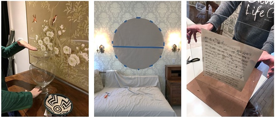
(L to R) Setting the stage with flowers and accessories; Paper template for a tricky mirror install; Preparing a vintage music montage for the dining room.

Welcome Home!
———————————————————
Alas, our vision for a classic interior full of cosmopolitan flair has come to life. This is, hands down, our favorite part of the process!

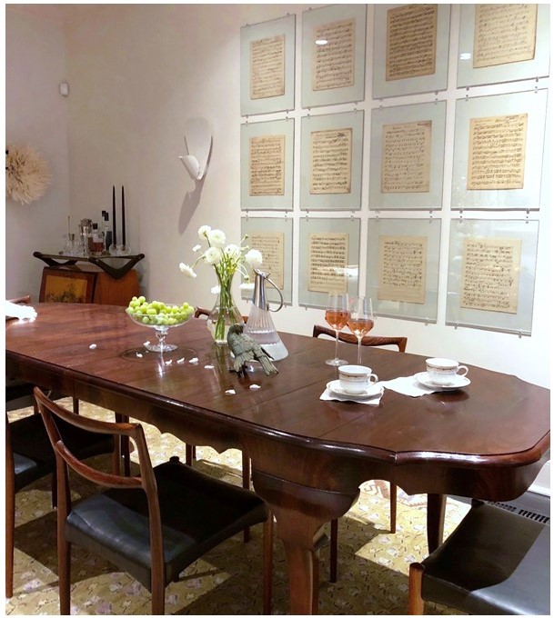
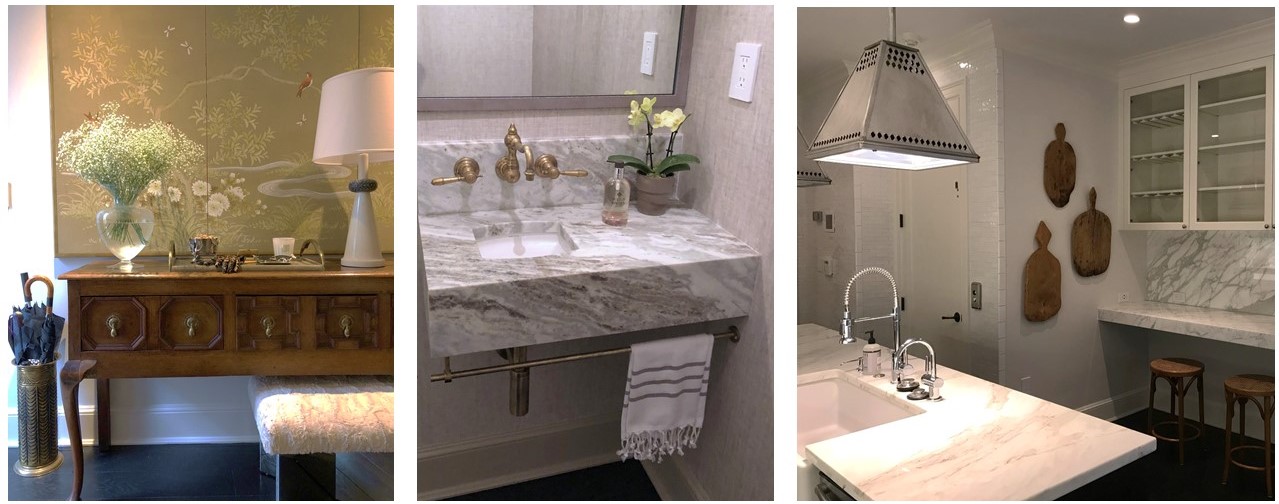
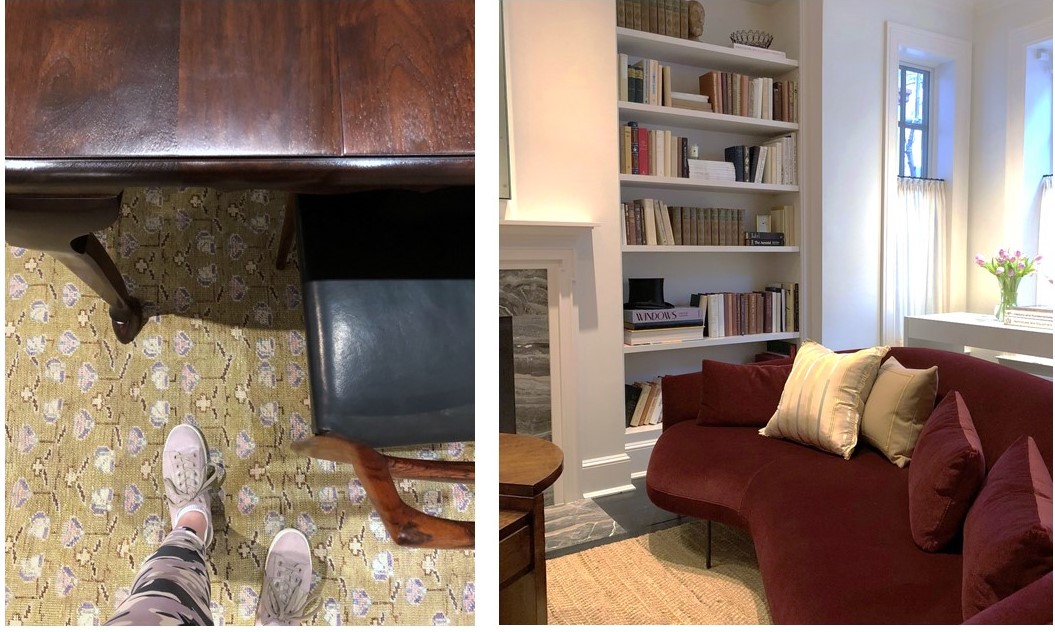
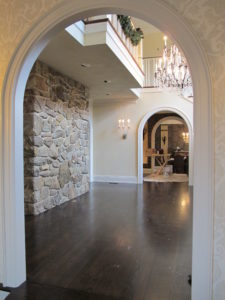
(top to bottom) A custom dining table paired with vintage chairs; Mixed materials in the entryway; A bespoke vanity in a teeny tiny powder room; Unexpected lighting in the kitchen; Dining room details; A chic Italian sofa with lyrical curves anchors the living room.
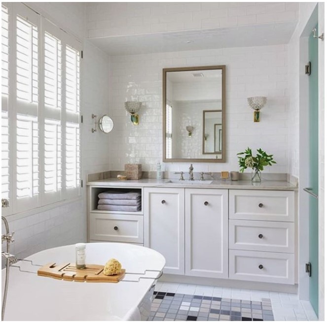
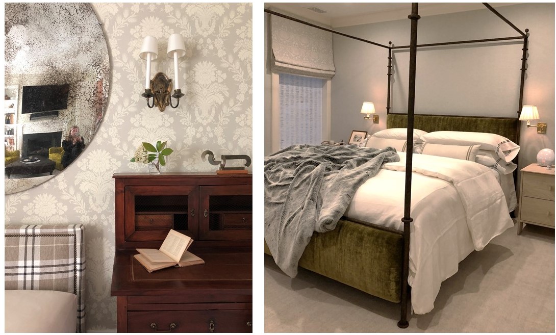
(top to bottom) Master bath wrapped in handmade tiles and featuring vintage lighting; An engaging mix of pattern and texture in the third floor den; Bespoke linens in the master bedroom – how luxe!

And That’s a Wrap
———————————————————
A big thank you to our wonderful West End collaborators. We hate to say goodbye, but we’re off to design more beautiful spaces …

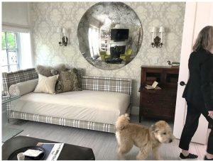
Tricia gives the resident pup, Barney, a tour of his new home.

To see the gorgeous professional photos of the West End project, visit the Huntley & Co. portfolio. Or take it one step further and help us win a Luxe RED award by voting for this project! Voting closes January 25.
xo huntleycodesign

-
Whatchu Lookin At?
Vicente Wolf published a book sometime back called ‘Learning to See’. I have always thought that was such a meaningful title. Seeing (and looking, fundamentally) is at the heart of a creative person. What drives artistic and design-minded individuals is a desire to seek out and study what’s interesting, beautiful and/or weird about the stuff of the world.
I’m no exception; I never stop culling the visual data around me. And I have no shame when it comes to capturing what I see on film. I’ll lie down on the sidewalk or crawl in the dirt if I see something worth photographing. Inspiration for my designs can be found in all kinds of places: museums, parks or city streets. It doesn’t matter if I’m looking at a Rodin sculpture or the bark of a tree. Cultivating one’s oeuvre (i.e. learning to see) means looking EVERYWHERE, even in the most unlikely of places.

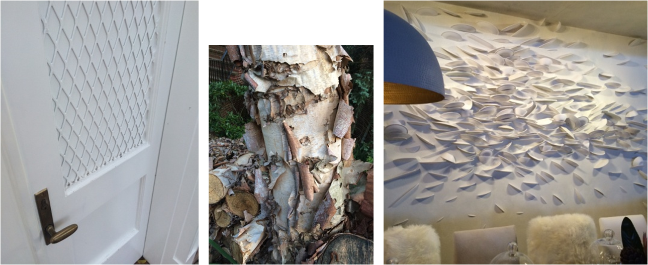
– 3 unique versions of texture –
Left to right: DIY lattice on a courtyard door in LA; Crepe Myrtle bark in my neighborhood; a broken plate art installation at the 2016 AD Design Show.

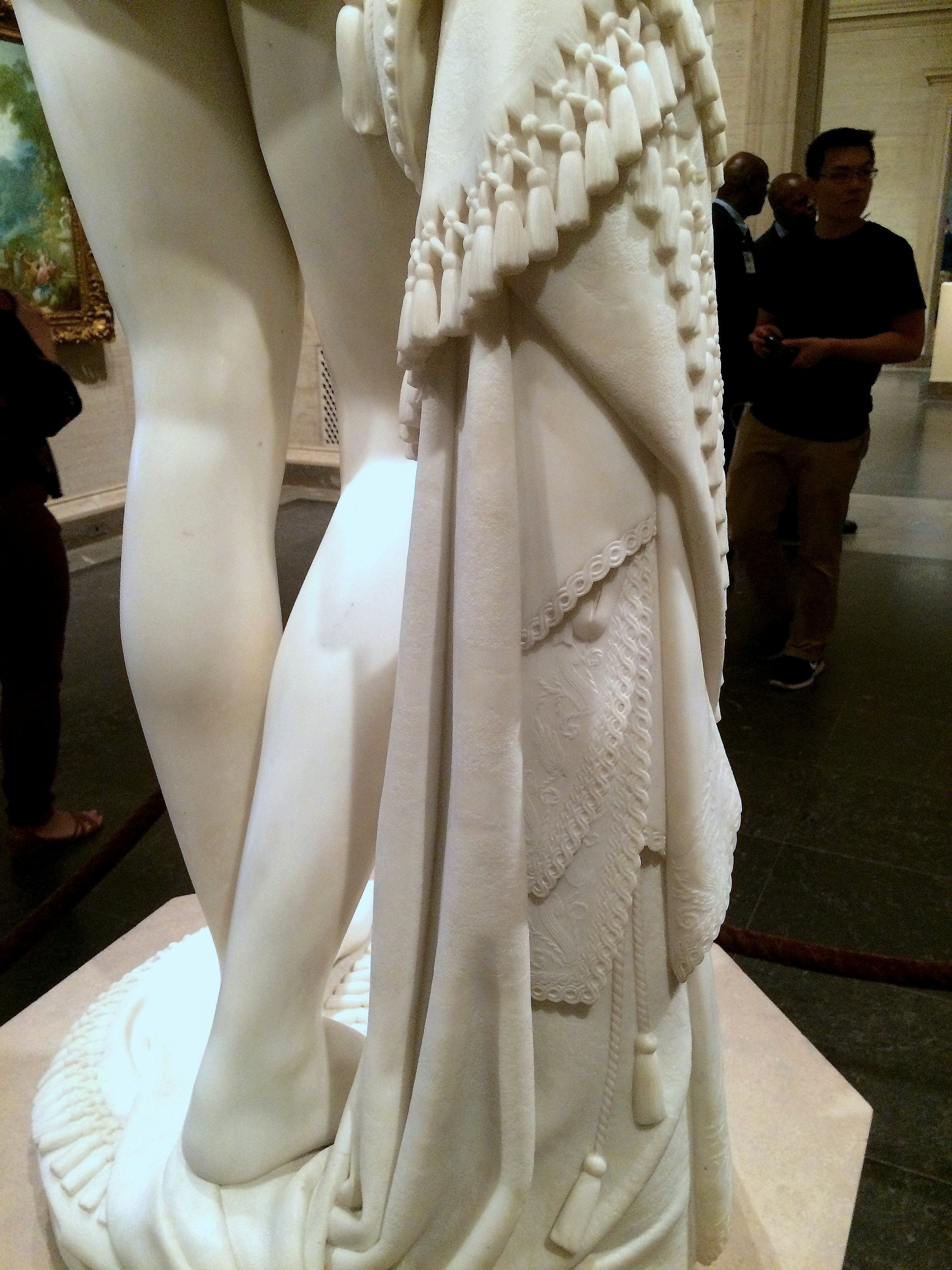
Masterfully carved tassels and lace details on a marble statue at the National Gallery of Art.

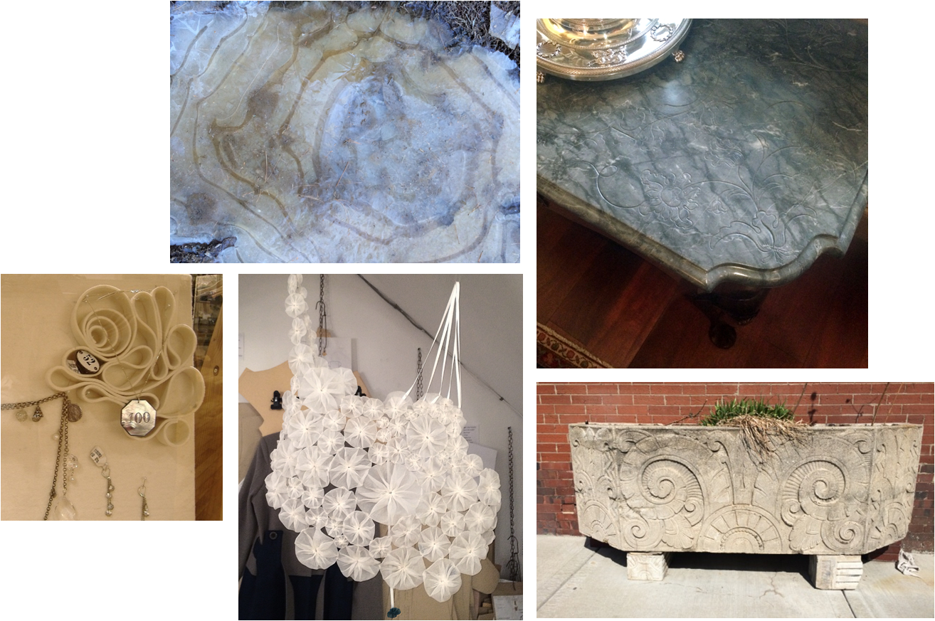
– a sophisticated collection of swirls and curlicues –
Clockwise from top left: A frozen puddle in West Virginia; an antique carved marble table top at the State Department; an Art Deco planter on a Kansas City sidewalk; an ornamental fabric necklace in a London shop; a felt jewelry display at Anthropologie.

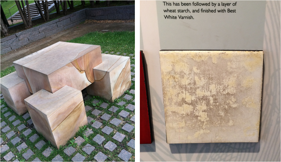
Left: Faux finish inspiration discovered at the Minneapolis Sculpture Garden. Right: A sample of Japanning at the Geffrye Museum in London.

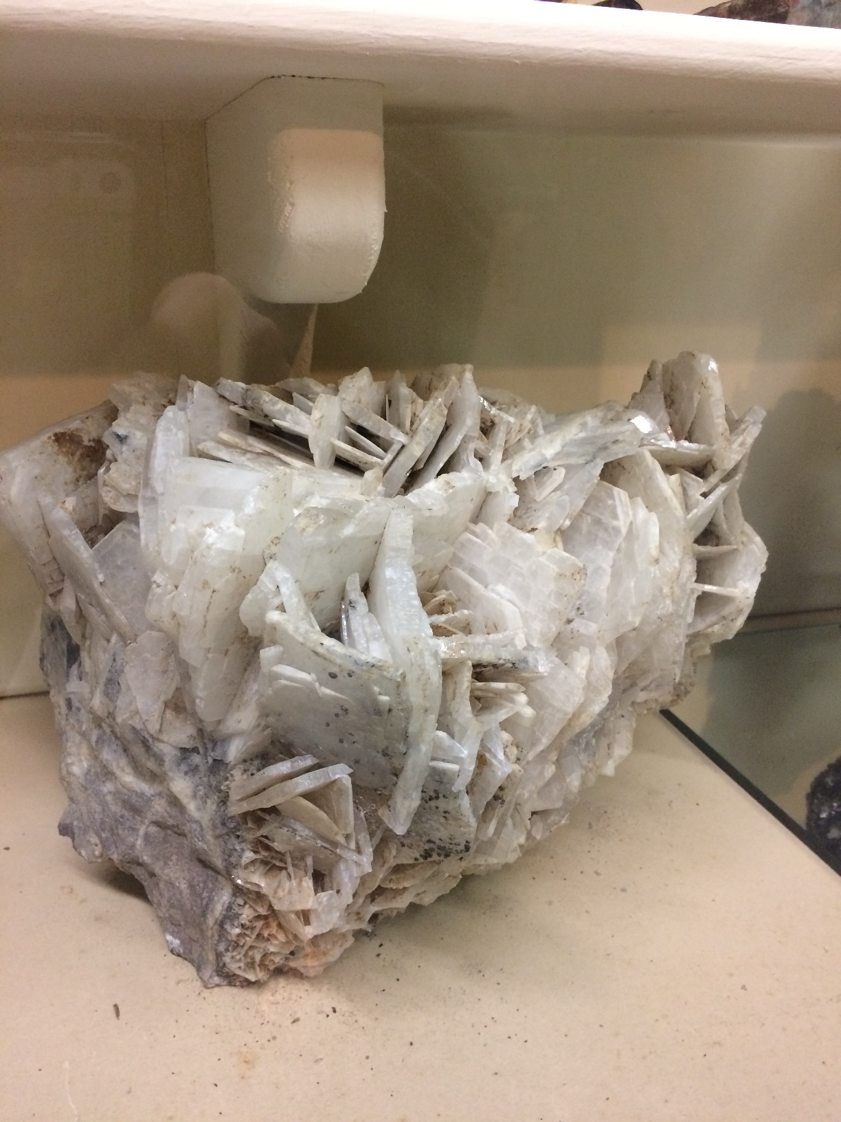
A large mineral sample on display at a mining museum in Creede, Colorado.

So many photos and so little time. This post could have been a mile long, so instead, you can expect a Part II, Part III and maybe even a Part IV of Whatchu Lookin At? Until next time — look, see and soak it all up!

Subscribe to our newsletter or find us on Bloglovin’ and you won’t miss a thing.
** all photos in this blog post are my own : )
-
EDGEMOOR SUNROOM :: THE REVEAL!
The Edgemoor sunroom has been installed! Installation days are such a highlight for interior designers. They represent the culmination of months of hard work, careful planning and patience. Considering this project started in the summer of 2015, we were thrilled to see the room finally come to life. So it is with great delight that we report that the room is even more beautiful than we expected. We always have an idea of how an interior will look, but we can’t necessarily anticipate how it will feel. Being in a space where the architecture, the decor and the surroundings truly sing makes all the trials and tribulations of the previous months disappear. We’re thrilled and our clients are thrilled. Santa couldn’t have brought us a better present for the holidays. Enjoy!

|| Pre-Install Site Review ||

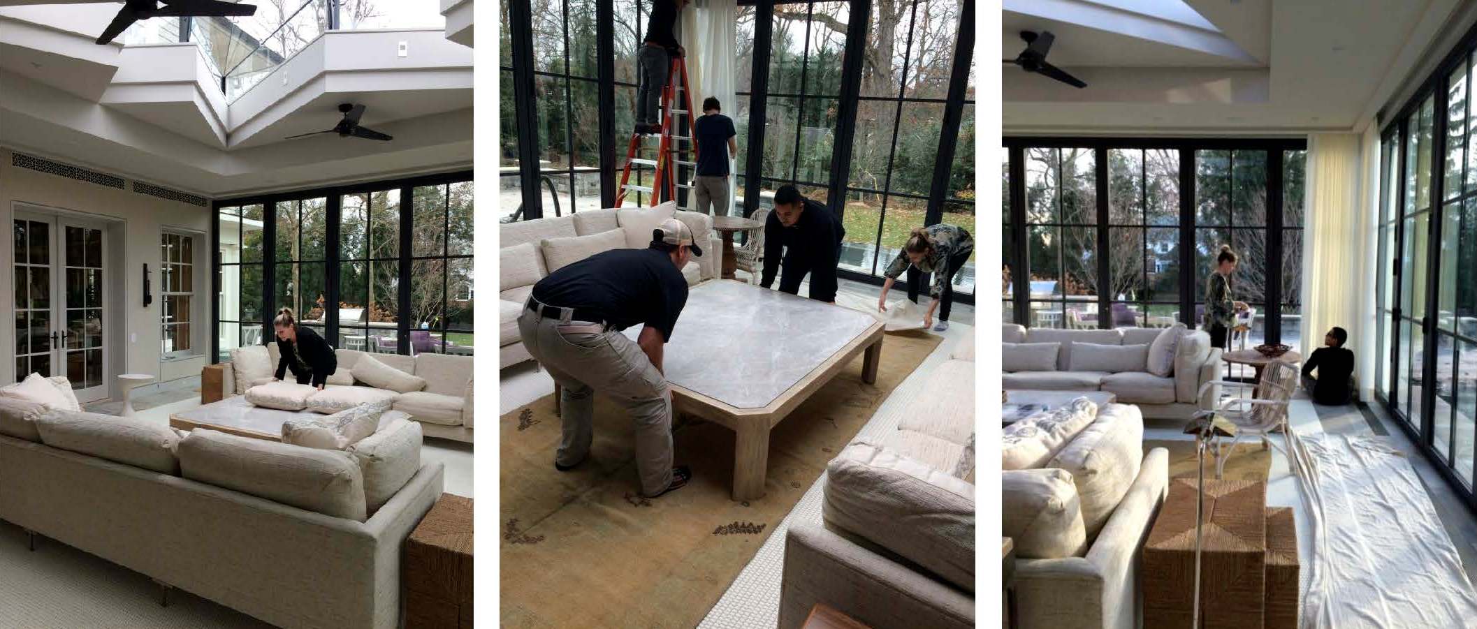
We scoped out the site the day before to ensure that there were no surprises on install day. Thanks to the contractor, all of the construction debris had been removed and the floors and glass were clean. This is a small, but important detail when delivering a room full of fresh, new [and valuable] furnishings. And with a blank slate before us, we were finally able to appreciate all of the beautiful architectural lines and the gracious volume of space.
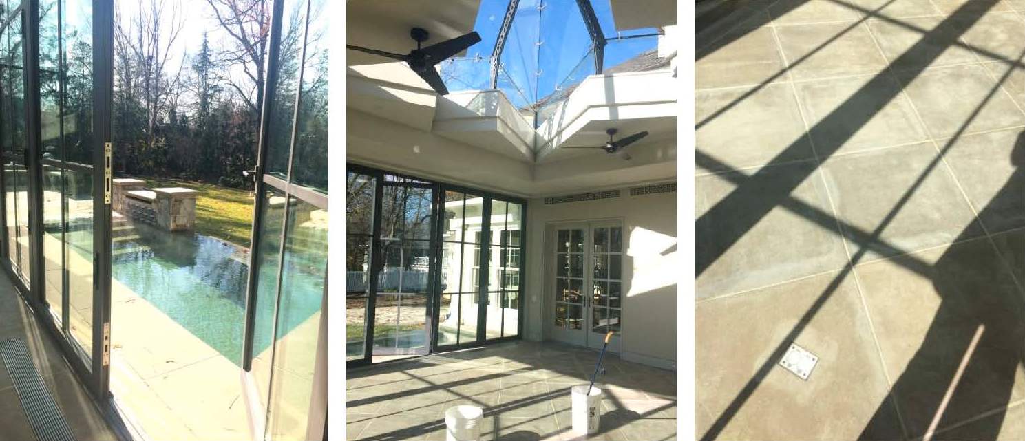

|| Design is [not] glamorous ||

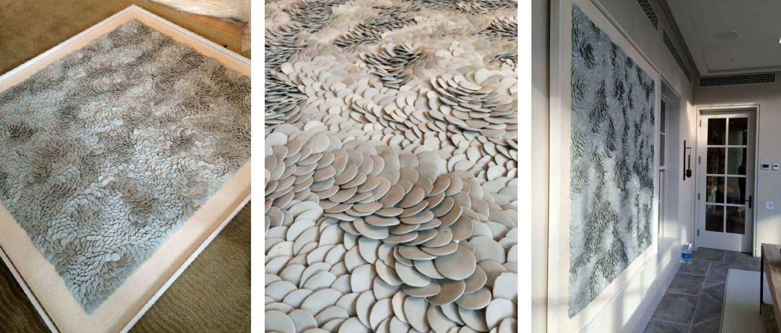
Installations requires a mix of muscle, troubleshooting and finesse. Pillows get fluffed, furniture placement tweaked, and motorized curtains programmed and dressed. One of the trickier exercises of the day was hanging the porcelain Fenella Elms artwork. Both delicate and heavy — and weighing in at well over 100 lbs — it took four men and two very nerve-wracking attempts to hang it on the wall. Needless to say, we all gave a cheer and a generous sigh of relief once it was in place.

|| A Beautiful Finish ||

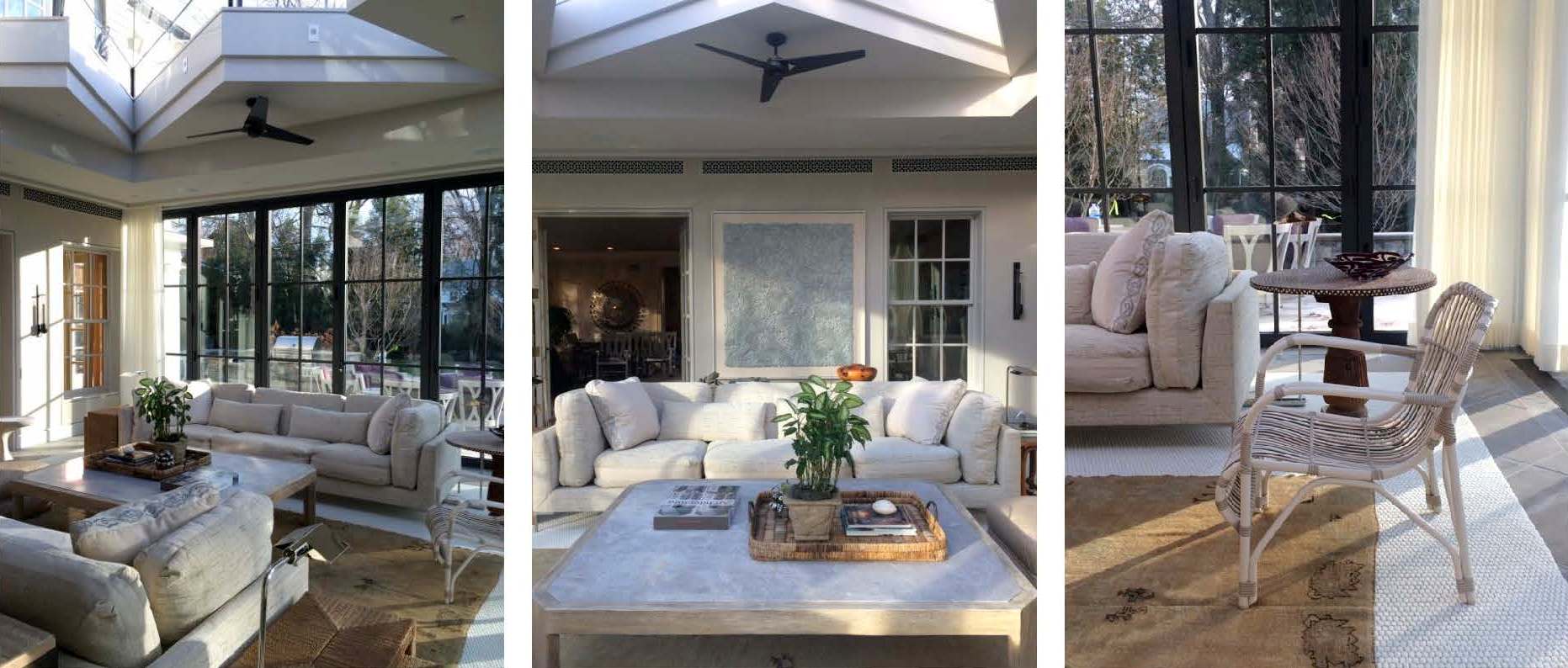
Just as we were finishing the installation, the sun came out and cast an ethereal light into the room giving it a magical sparkle. The shadows danced off the porcelain artwork, the plaster walls, and the mother of pearl inlay on the pedestal table top. Simultaneously, the light saturated the drapery with warmth and illuminated the dramatic skylight overhead. Enveloped by so much natural beauty, it’s easy to envision spending hours in this space lounging, reading, socializing or napping.

|| Taking Care ||

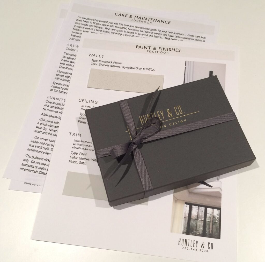
Our work here is done! Well, almost. Installations require guidance regarding the care and maintenance of the space. We strive to ensure our client’s satisfaction by giving them the tools they need to enjoy their homes for years to come. Our care packages vary depending on the scope of a project and specific needs of the client. However, they generally include care and maintenance instructions, mechanical specifications and a paint+finish schedule. In this particular case, we also included a separate artwork care package. The art we installed is fragile and valuable, so we provided our clients with handling instructions along with extra porcelain pieces. And of course, we packaged it beautifully in a Huntley & Co. box with ribbon – something befitting the showstopper art piece itself.

We hope you enjoyed following our Edgemoor series. In case you missed anything, check out each phase here, here, here and here. We will be signing off for the next few weeks to enjoy some R&R. We will post again in 2017 with new installations, discoveries and our behind-the-scenes adventures. Until then, Huntley & Co. — and our mascot Nina — wish you and yours the happiest of holidays!


Subscribe to our newsletter or find us on Bloglovin’ and you won’t miss a thing ; )
-
Edgemoor Sunroom :: Part II
-
The Floors Beneath our Feet
Like a painter preps his canvas, a good designer attends to the bones of a room before honing in on its decorative elements. We make strategic shifts in proportion, tone, and detail, both subtle and grandiose, when thoughtfully designing a space. A beautiful wood floor is one such essential element that has the power to really make our rooms sing. We’re always told to “look up” or “look forward”, as a kind of mantra to mindfulness, happiness and all things good. Well, I say “look down” because there’s beauty and inspiration to be had at your feet!


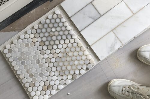
Our design studio becomes a laboratory for deep diving, where we work elbows deep in samples to determine the best tone for the wood floors. We consider location, use, and material adjacencies when making our recommendations. Ultimately, we outfitted a Georgetown residence with rich, classic patterned parquet in a deep and luxurious tone.


Material and tone are carefully considered for each client.
(left): We installed subtly hand hewn floor boards in soft, neutral tones to be bright but forgiving for a young family. (center): This grand PA home called for rich tones that complimented adjacent materials and the scale of the space. (right): We were inspired by sandy textures in this beachside retreat when we chose these soft, washed, waxy tones of warm brown.


(left): We gave the existing parquet flooring of a pre-war Manhattan apartment new life with a lighter stain – showing off the beautiful pattern and brightening the small space. (right): New french oak flooring in an Alexandria townhouse has been pickled, adding much needed warmth and texture to a once incohesive collection of different vinyl flooring.


Inspiration at its finest. (left): Jeffrey Bilhuber (right): Hillwood Estate (bottom): Archetypal Floors
