-
SHOW-HOUSE // FAUX-CLIENT :: PART III
Sourcing goods and materials for our interior fuels our creativity, but drawings take the design to the next level. After all, a room is only as good as it is functional — we aren’t aiming for beauty just for beauty’s sake. Working out our ideas in AutoCAD ensures that we are on target with scale, proportion and spatial relationships. A well-trained designer can evaluate whether a piece will work in a room or not simply by looking at it. Still, transferring its dimensions to paper (or the computer as in our case) ensures down-to-the-1/8” accuracy. Huntley & Co. is a business built on mindfulness and our drawings are the technical backbone of our work.


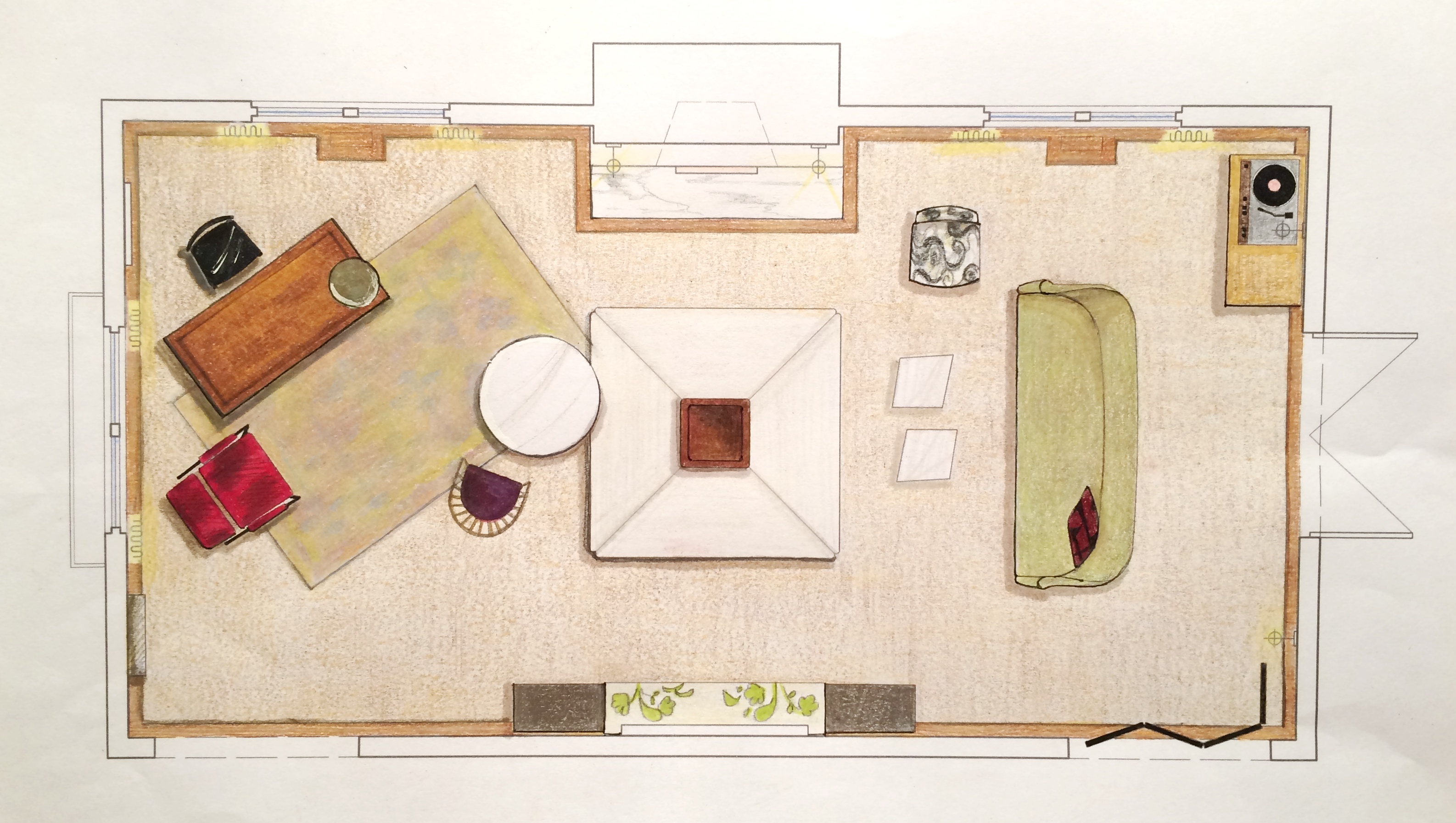
The Floorplan___________________________
We start with a floor plan, which guides the flow and circulation of a space. With our clients’ penchant for entertaining, it was important to think outside the traditional box and get creative with furniture placement. Our ‘star’ is the four sided bench that beautifully anchors the room. Varied seating arrangements offer opportunities for independent conversations and debate for our clients’ guests who come from a wide range of cultures, professions and political views. The room is meant to be as warm, interesting and thoughtful as the clients are.


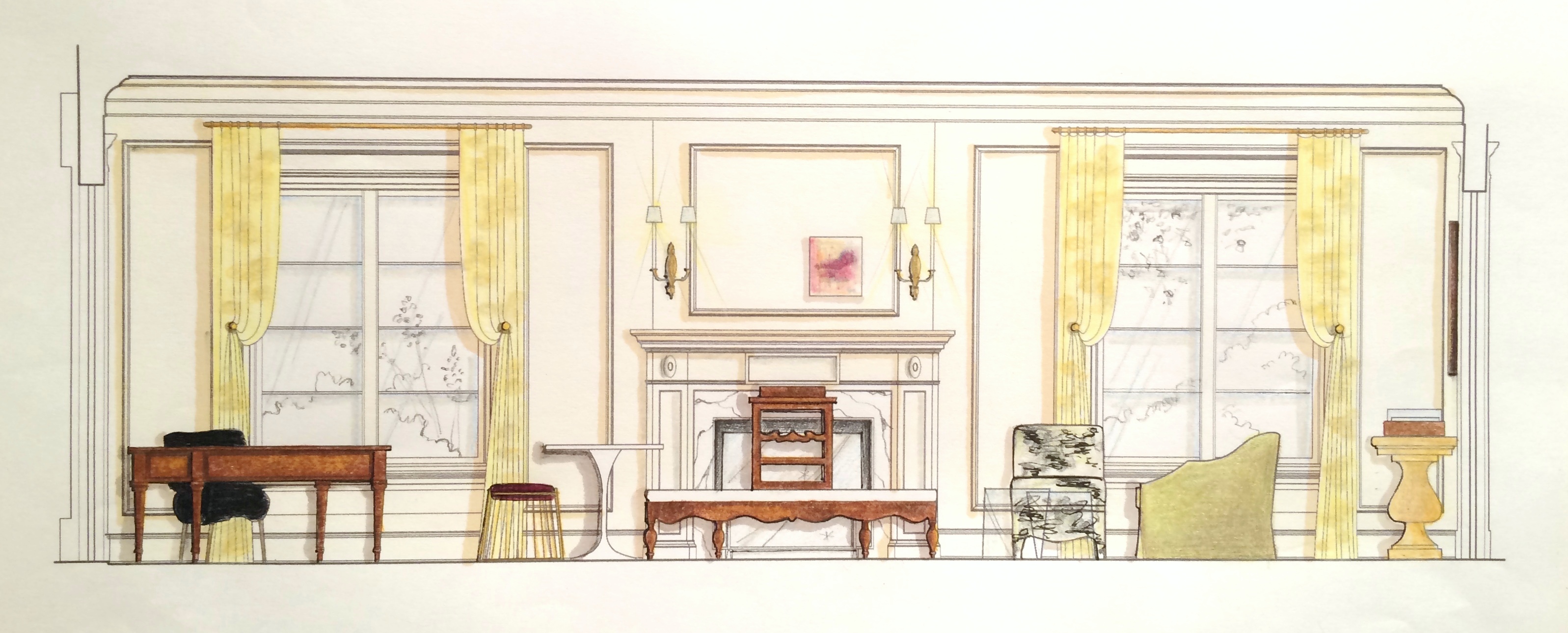
The Elevations___________________________
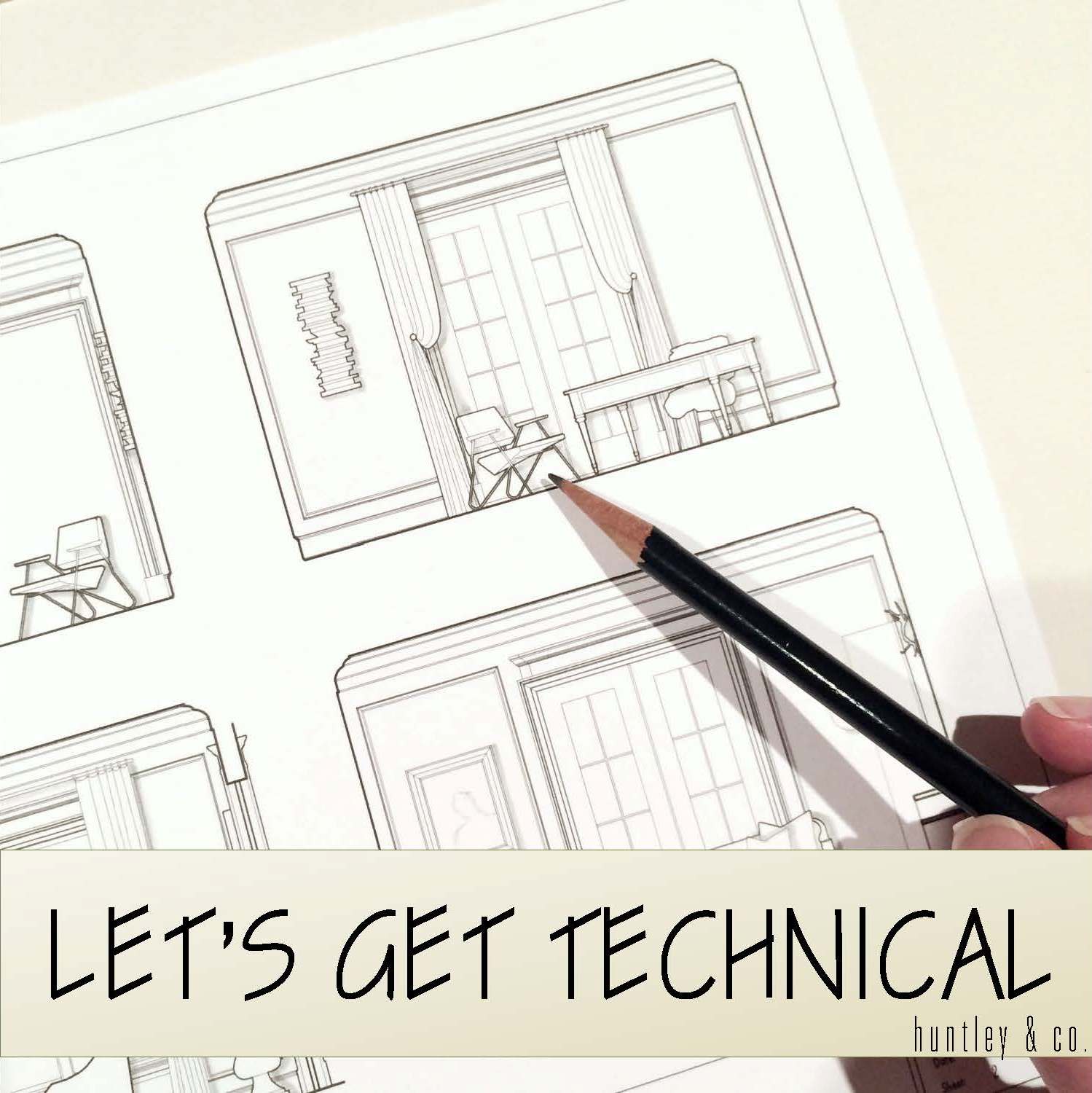
Elevations reveal how a room’s architecture, furnishings and art will work together. A space won’t look or feel good if there are too many masses, it’s too ‘leggy’, everything is at the same level or the values are off-balance. Deep-diving the millwork, fenestrations and other details gives us the platform we need to make good decisions. Not to mention that “pulling the design up” and seeing it come to life happens to be pretty exciting ; )


The Presentation Board____________________
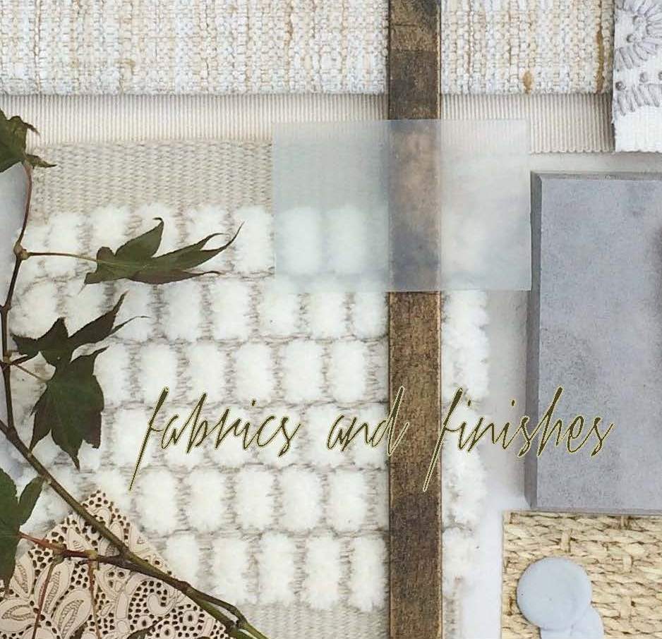
The presentation board is our opportunity to showcase the tactility of a room. Ambience is affected by the ratio of soft vs. coarse, understated vs. luminous and natural vs. refined materials and textures. We wanted this space to feel glamorous, but totally approachable with an air of intelligent wit. With that in mind we combined fibers like linen, seagrass and rushing with velvet and damask. Then we took it a step further by incorporating lacquered leather, eelskin and electric-colored cowhide. This is a luxurious space where you can kick up your feet and have fun!


The Response___________________________
And because these are the dreamiest of clients, they love everything and will TAKE IT ALL! Orders are placed and construction begins. This next phase is about site visits, management, coordination, follow-up and a lot of patience. But we’re getting our hands dirty and seeing our workrooms do their magic — so we love it!


______________________________________________________________________________
Tune in next week for a fun Q&A and the FINAL REVEAL! We will be sharing more insights about our process and the why’s and how’s of a successful design project.

Subscribe to our newsletter or find us on Bloglovin’ and you won’t miss a thing ; )
-
Chez Huntley – update 11/13
I am happy to write that the public spaces of chez Huntley are more or less complete. Hallelujah! And while I would love to give my readers a comprehensive 360 degree tour … it aint’ gonna happen. Apparently divulging too much about a project on one’s blog limits its exposure elsewhere, so I’ve learned. When did design get so complicated?! So alas another sneak peek will have to suffice. Hopefully the pix are enough of a fix – enjoy!
— Chez Huntley Interior Details —
My home reflects my own personal vibe. I love drama and a bit of sparkle, but I need natural elements to ground the glitz. For me, a humble sense of glamour is what makes a home (and life) truly elegant.

Tricia xo
-
Tip deLuxe
STEALING BEAUTY
We’re embarking on a new year (a new decade actually!) and you’re ready to make some changes
to chez vous. Where to start? Everyone, even professional interior designers, need a jumping off point,
a focus, a raison d’être. It’s called inspiration. And without it, you’ll spend the next six months going around
and around in circles trying to figure out “what’s my style???” So take a little time during this holiday break,
grab a stack of magazines (remember those?) and start tearing. Don’t think about it, just rip out what you like.
Fashion layouts, jewelry ads, interiors, food features … whatever speaks to you. When you’re done, pull aside
the two or three that say “THIS IS ME!” and file the rest away. Yes, steal some beauty and allons-y!
Dolce & Gabbana’s Fall ‘09 campaign and a beautiful Payard feature from Town & Country Travel magazine.
Confectionary images to inspire the interiors of the girly-girls out there.
A room by designer Anne Coyle.
If you could live inside the Fall Gucci campaign or the latest Gorsuch catalog then you
respond to texture, layering and luxury and should book a trip to St. Moritz immediately.
Tom Scheerer’s Kip’s Bay Showhouse bedroom.
Maybe you’re a traditionalist with a saucy side. Like these ladies captured by Kate Spade and Slim Aarons.
Think vivid colors, floral prints and vintage accents with a little leather thrown in.
A Miles Redd bedroom from Domino.
Are you drawn to sleek, sexy, fashionable images?
Then let David Bowie and Marni’s 2008 collection be your inspiration.
A Chicago installation by Kara Mann.
Let the dark side of life be your muse. Like these images from 1992's Dracula and the blog Tedore.
The current vampire craze could inform a dark, dramatic space.
Anthony Gianacakos’ East Harlem bedroom from Lonny magazine.
