-
SHOW-HOUSE // FAUX-CLIENT :: PART III
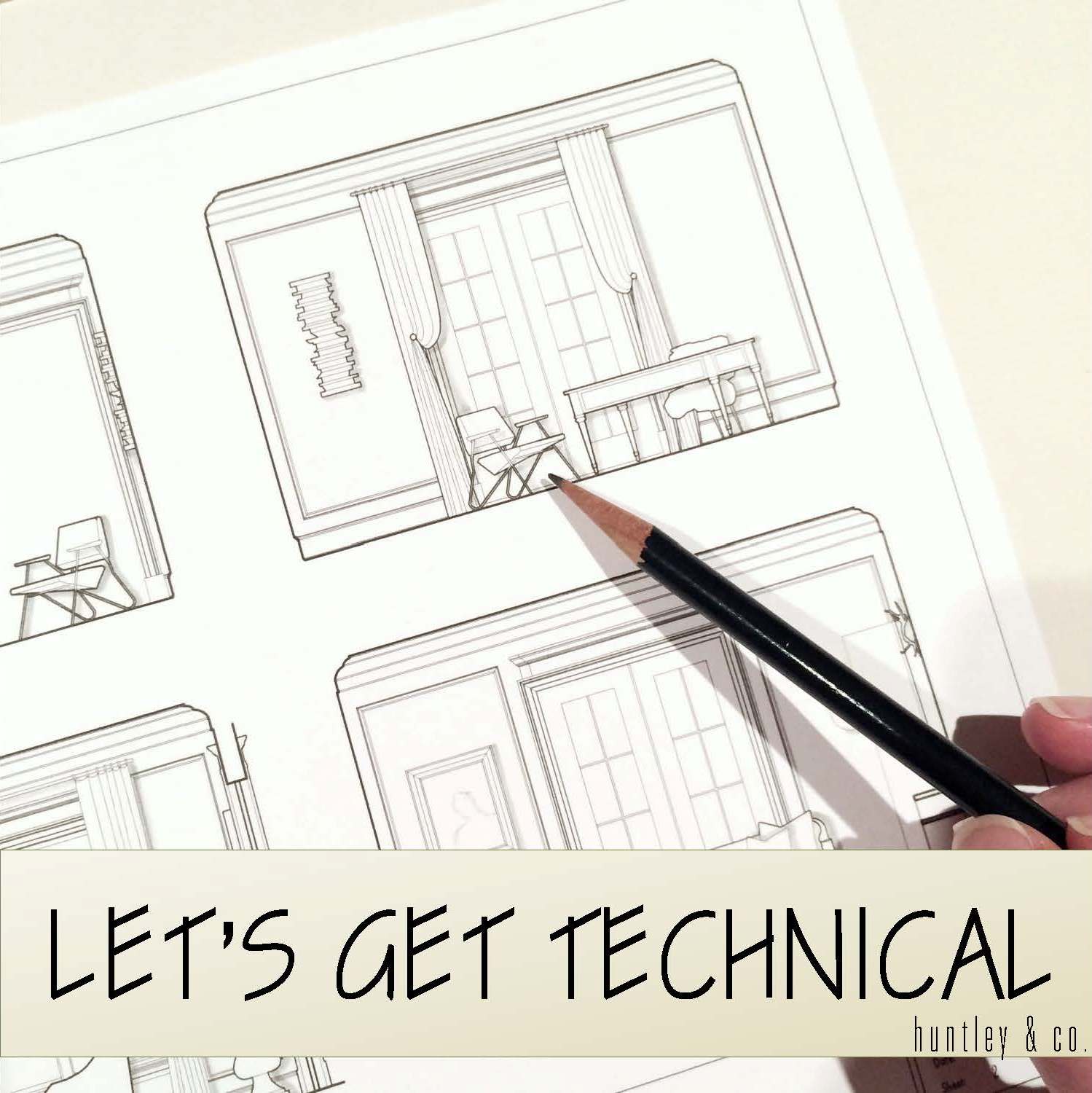
Sourcing goods and materials for our interior fuels our creativity, but drawings take the design to the next level. After all, a room is only as good as it is functional — we aren’t aiming for beauty just for beauty’s sake. Working out our ideas in AutoCAD ensures that we are on target with scale, proportion and spatial relationships. A well-trained designer can evaluate whether a piece will work in a room or not simply by looking at it. Still, transferring its dimensions to paper (or the computer as in our case) ensures down-to-the-1/8” accuracy. Huntley & Co. is a business built on mindfulness and our drawings are the technical backbone of our work.


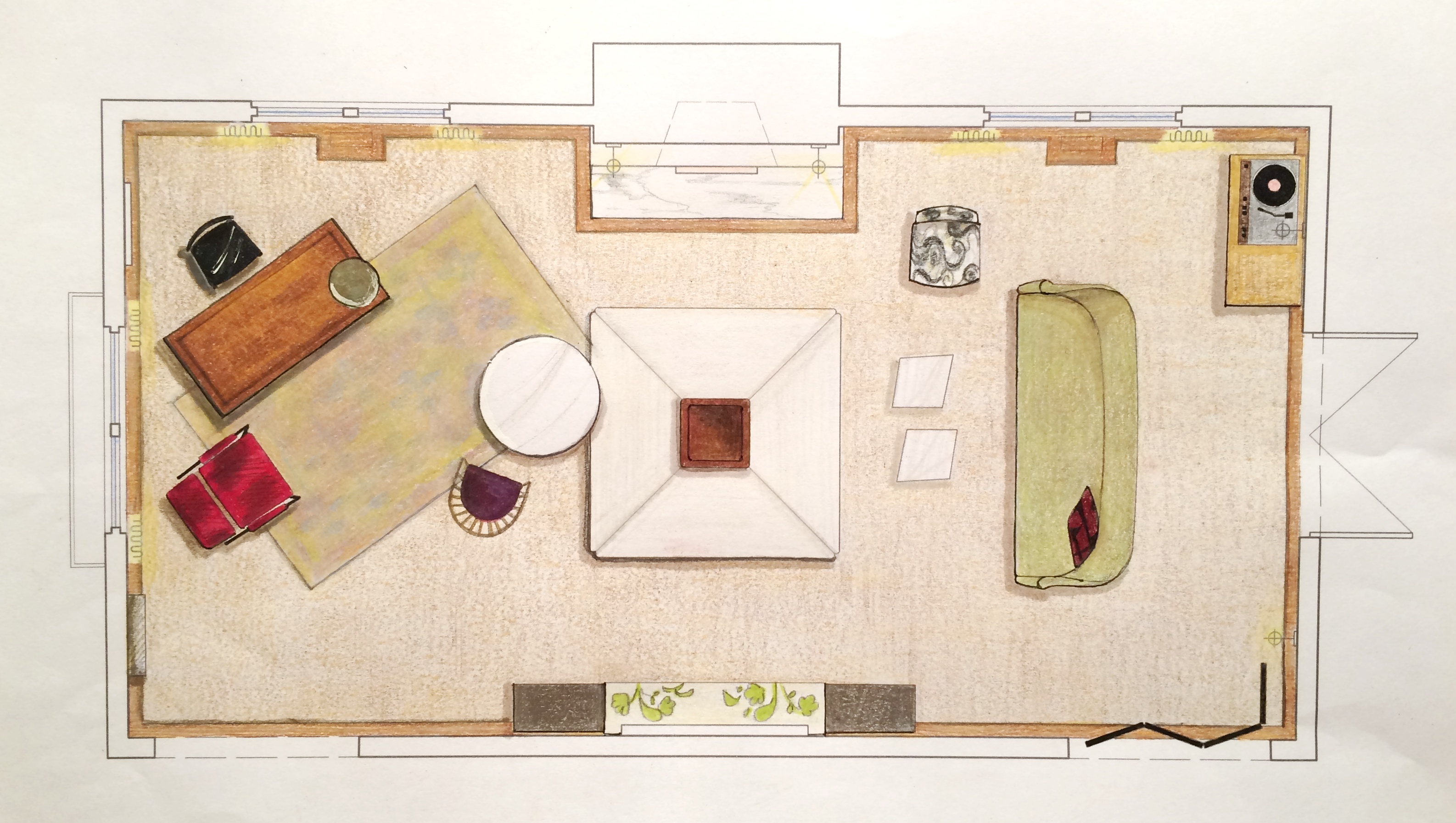
The Floorplan___________________________
We start with a floor plan, which guides the flow and circulation of a space. With our clients’ penchant for entertaining, it was important to think outside the traditional box and get creative with furniture placement. Our ‘star’ is the four sided bench that beautifully anchors the room. Varied seating arrangements offer opportunities for independent conversations and debate for our clients’ guests who come from a wide range of cultures, professions and political views. The room is meant to be as warm, interesting and thoughtful as the clients are.


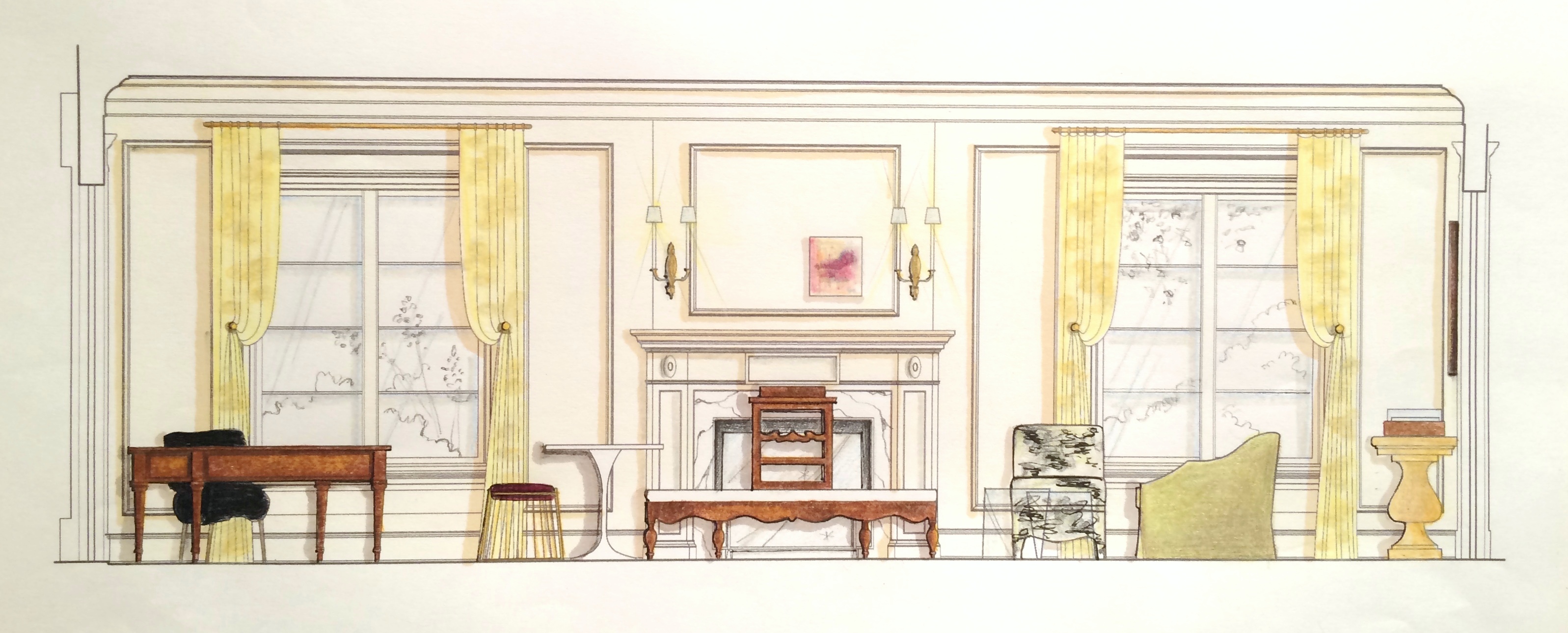
The Elevations___________________________
Elevations reveal how a room’s architecture, furnishings and art will work together. A space won’t look or feel good if there are too many masses, it’s too ‘leggy’, everything is at the same level or the values are off-balance. Deep-diving the millwork, fenestrations and other details gives us the platform we need to make good decisions. Not to mention that “pulling the design up” and seeing it come to life happens to be pretty exciting ; )


The Presentation Board____________________
The presentation board is our opportunity to showcase the tactility of a room. Ambience is affected by the ratio of soft vs. coarse, understated vs. luminous and natural vs. refined materials and textures. We wanted this space to feel glamorous, but totally approachable with an air of intelligent wit. With that in mind we combined fibers like linen, seagrass and rushing with velvet and damask. Then we took it a step further by incorporating lacquered leather, eelskin and electric-colored cowhide. This is a luxurious space where you can kick up your feet and have fun!


The Response___________________________
And because these are the dreamiest of clients, they love everything and will TAKE IT ALL! Orders are placed and construction begins. This next phase is about site visits, management, coordination, follow-up and a lot of patience. But we’re getting our hands dirty and seeing our workrooms do their magic — so we love it!


______________________________________________________________________________
Tune in next week for a fun Q&A and the FINAL REVEAL! We will be sharing more insights about our process and the why’s and how’s of a successful design project.

Subscribe to our newsletter or find us on Bloglovin’ and you won’t miss a thing ; )
-
SHOW-HOUSE // FAUX-CLIENT :: part II
Like the early stages of a romance, the onset of a new design project brings lots of excitement, energy and anticipation. Now that we’ve “gotten to know” our Faux Clients better and have defined a visual narrative for their space, we are ready to start deep-diving the design. It’s time to measure the room, pull our materials and find our gorgeous furnishings — let’s show this showhouse what we’re made of!

Prep Work______________________________
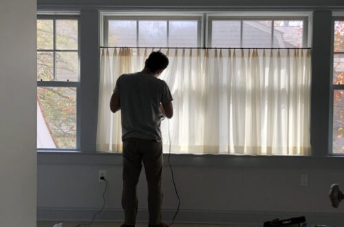
Preparation and foresight are the secret weapons behind a good design. We always arrive well-prepped for site visits and measures. Camera? Check. Tape measure? Check. Comfortable shoes? Definitely check.


Scouting for Furnishings____________________
Scouting for hidden treasure is one of design’s greatest thrills. Fortunately, we are blessed to have access to a rich variety of vendors and shops from which to source our goods. We let serendipity play a part in our work, so it’s usually one or two really special discoveries that drives our designs. This part of the process is not about “shopping”; it’s about having an informed concept, an open mind and a great eye. Our goal at Huntley & Co. is always to curate an interior that is both timeless and forward-thinking — to evoke an emotional response that inspires and nourishes the spirit of the client.


Pulling Together the Scheme_________________
Besides hunting for furnishings during this phase, we pour through our office library for fabrics and finishes. We strive to use materials that enhance a home’s architecture and complement the lifestyle of our clients. A thoughtfully selected mix of light and dark, textural and refined, beautiful and odd are what make a room interesting and livable.


Next week we’ll bring you Part III of our Show-house/Faux-client series where we’ll dive into the technical aspects (drawings!) of the project. Subscribe to our newsletter or find us on Bloglovin’ to stay tuned.
