-
installing Annapolis (ed. 3)
Now that wallcovering is up, it’s time to layer in the FLOORCOVERINGS at our Annapolis project. Installing carpet and rugs in a home is a sensory blanket of sorts. They reduce ambient noise, soften impact underfoot and warm up cold floors. They can also unify furniture in a large room and make stairs safer. Beauty with benefits – that’s what interior design is all about!
floorcovering installation ::
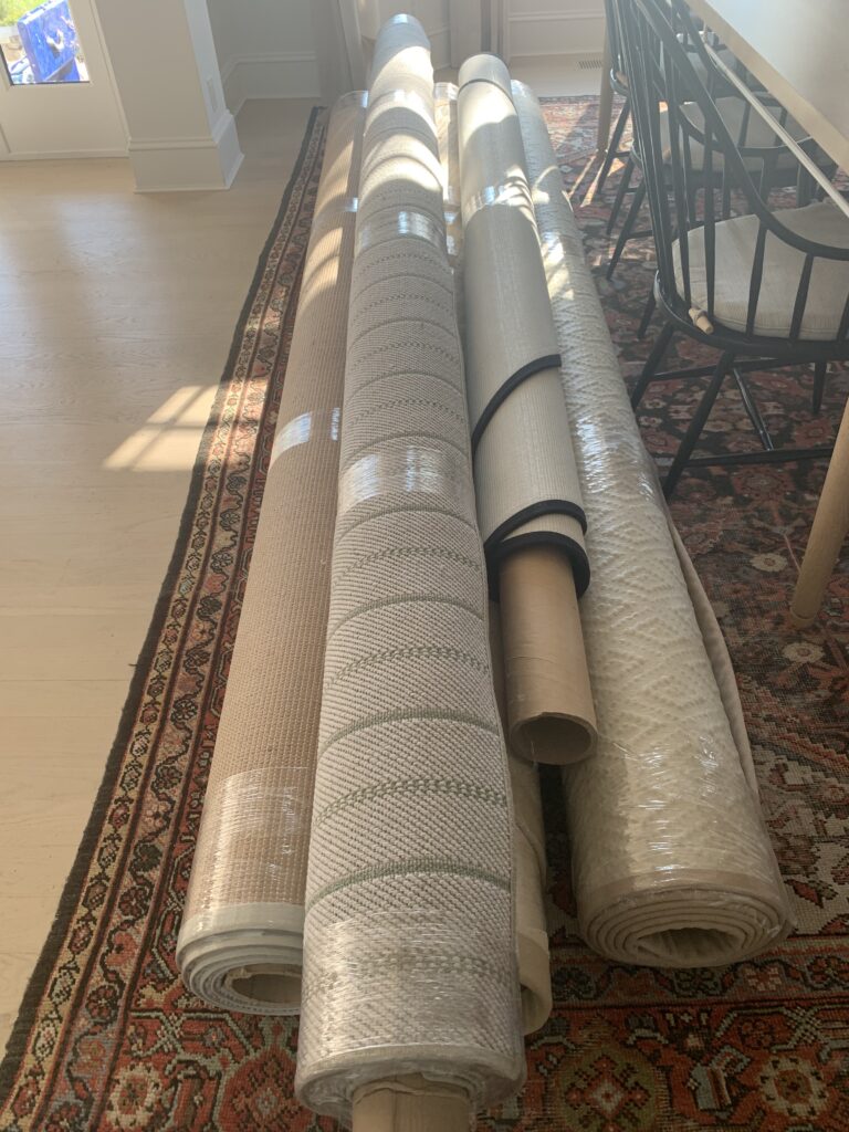
Got rugs? We do and they are ready to roll!
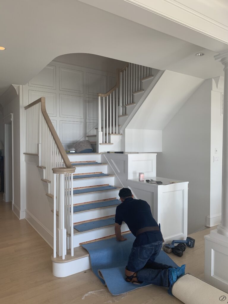
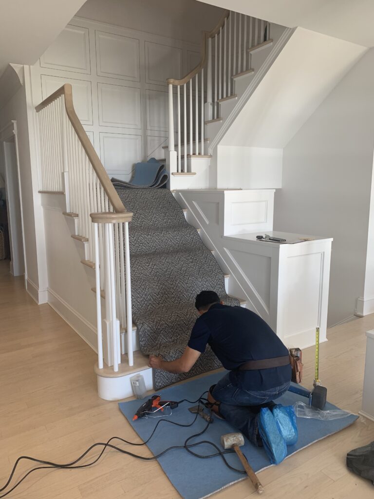
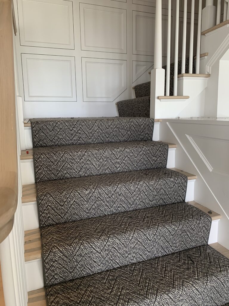
Installing the first set of three stairs. All three received the same runner style for continuity and balance in the home.
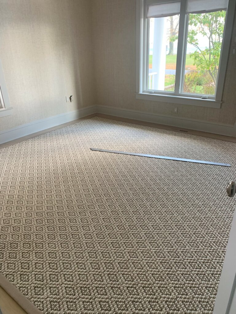
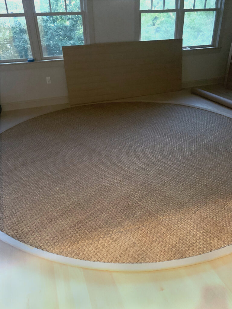
(left) In her office I wanted pattern, but not color. This diamond pattern from Stark expands the space without looking busy. (right) I chose a classic seagrass rug in a round shape for his office. A round rug can work magic in a room. It can soften angular architecture and integrate a disparate furniture arrangement.
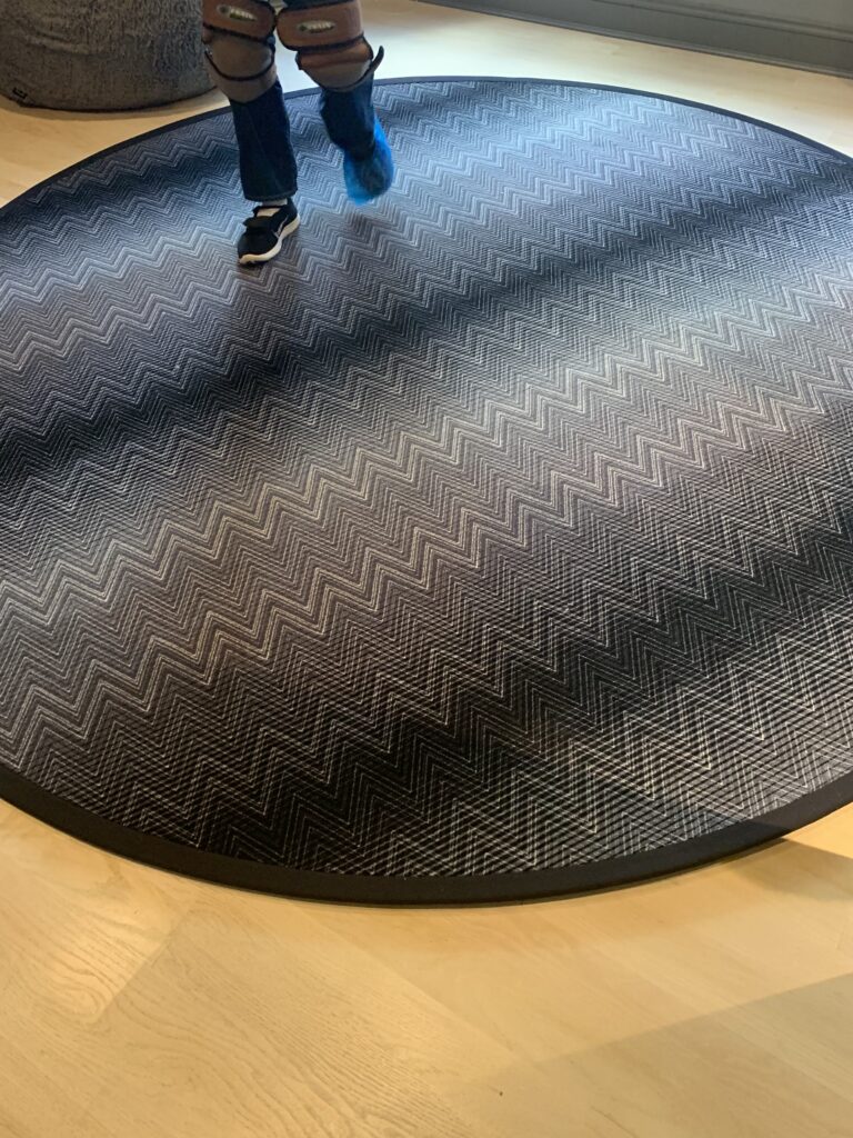
Speaking of round rugs, this one for the son’s bedroom is a Missoni pattern. It is spirited yet sophisticated – a style that will carry him into his teenage and young adult years.
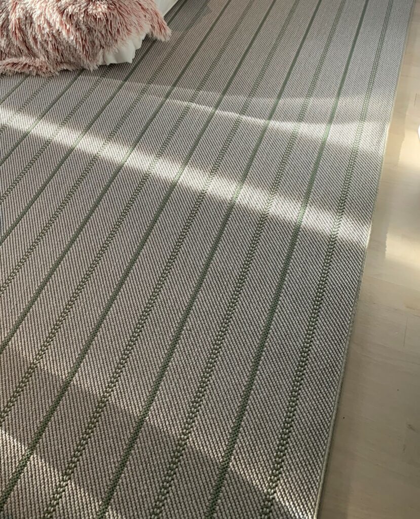
(left) A grey and green stripe fills the expansive younger daughter’s room. (right) I chose a blue-grey ribbed style for the older daughter’s room. It marries beautifully with the wallcovering and has just enough slubs and flecking (let’s hope!) to stand up to a teenager.
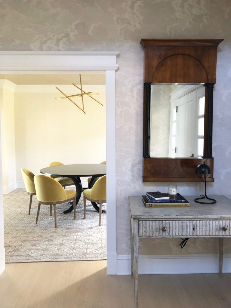
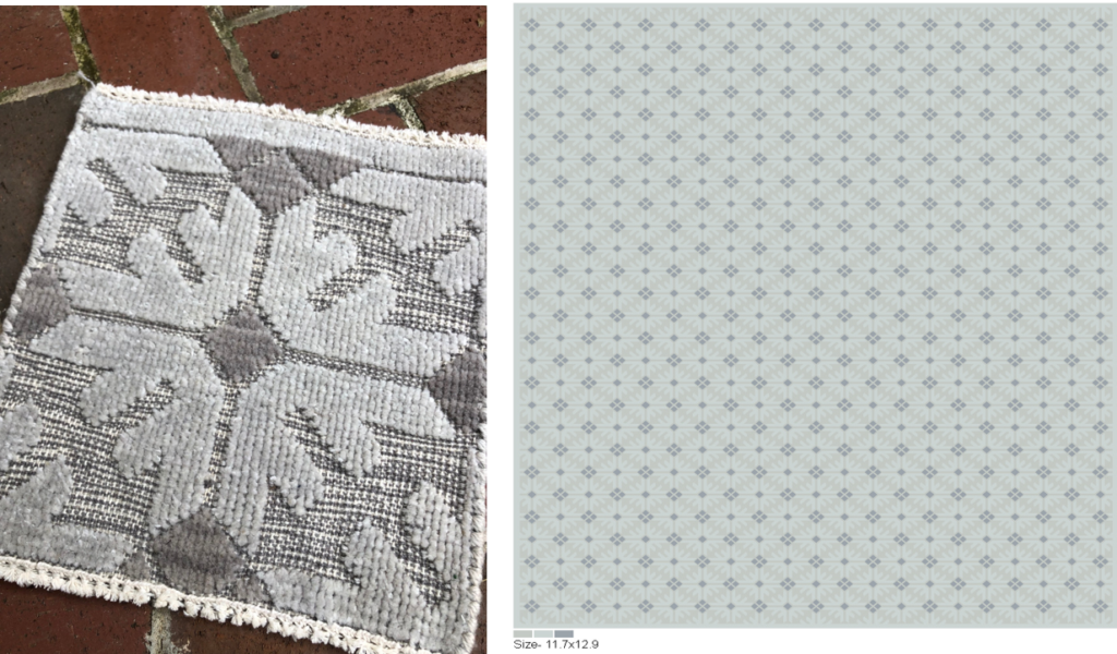
(top) A view into the dining room and its new graphic but subtle area rug. (bottom) The original sample at left and the artwork for approval at right.
It took months to find the right rug for the guest bedroom. Finally, one day, I found the perfect one. It’s the correct size, style, texture and combination of colors. #needleinahaystack
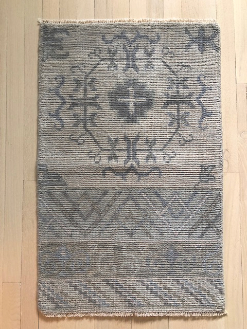
Isn’t this sample lovely? It’s a custom khotan for the master bedroom. Unfortunately, it’s behind schedule – by a lot – and not on site. It was the first order we wrote for this project, so not receiving it in time was unexpected and very disappointing. We think it will be worth the wait, so we will definitely post photos on Instagram when it does arrive.
-
Installing Annapolis (ed. 2)
Last week we shared a behind-the-scenes look at the lighting installation at our Bay Ridge project. This week we are focusing on the WALLCOVERING. Softening the envelope and warming up the interior was a big focus of this design. Once paper is up on the walls (and ceilings in many cases) an interior really starts to feel like a home.
wallcovering installation ::
Our PO with samples of all the papers attached for the paperhanger.
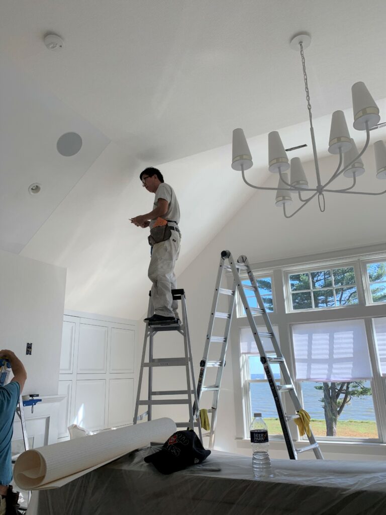
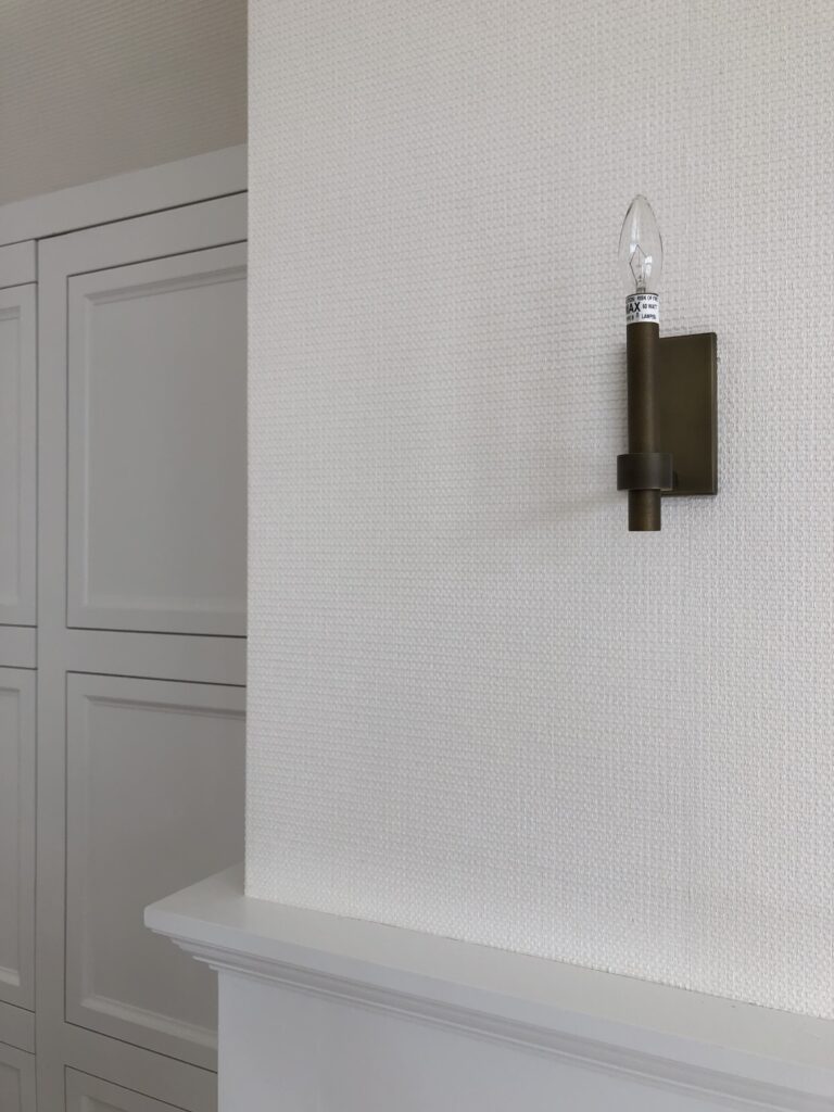
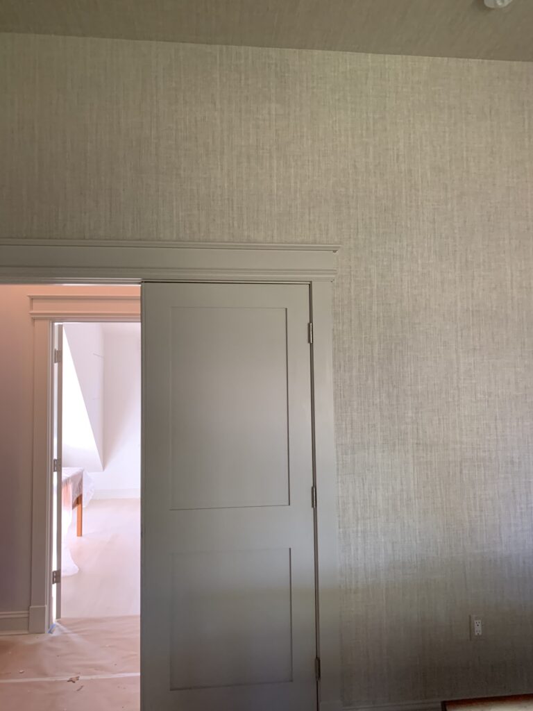
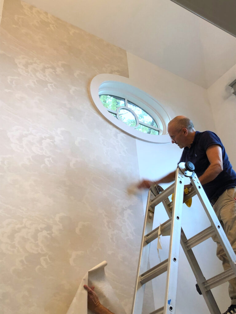
Papering a spacious room requires a ladder and teamwork. The photo at right reveals the texture of the paper.
A soothing beige-on-beige paint and paper combination in the guest bedroom.
(top to bottom) Lining up a paper’s pattern; An installation diagram we sketched for the contractor; The paper freshly hung in the younger daughter’s bedroom.
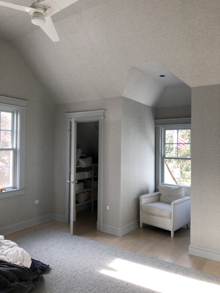
A subtle grey paper in the final stages of installation in the oldest daughter’s bedroom.
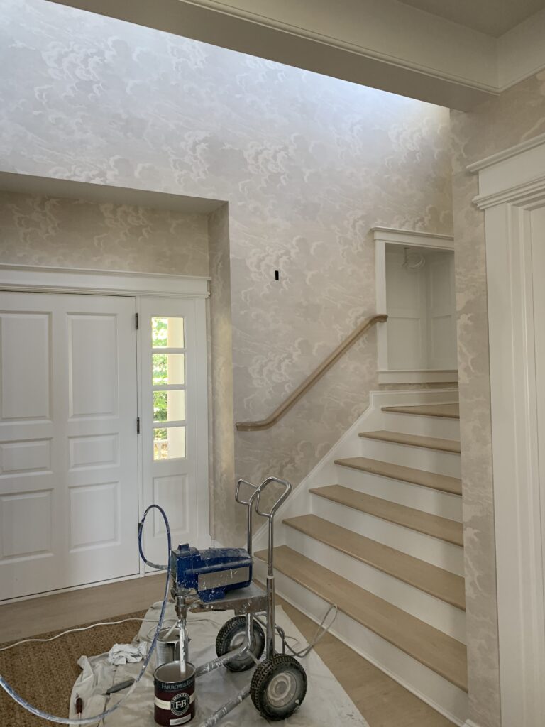
Proof that wallcovering can transform a space. This foyer has become a showstopper in this home.
Thank you Michael for all your great work! Next up is floorcoverings.
-
Installing Annapolis (ed. 1)
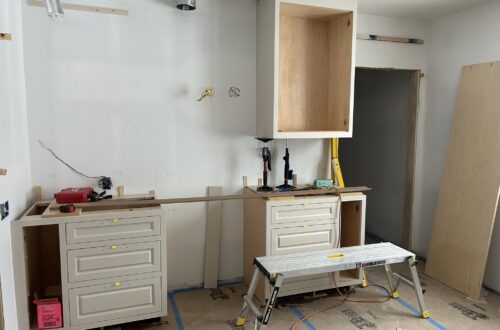
Huntley & Co. spends months behind the scenes working on our projects. And it isn’t until the last 6 weeks or so that photos are really worth sharing – that’s when we get to the point of actually installing things in a home: lighting and wallcovering first, then floorcoverings, then furniture. We are in the installation phase now at our Bay Ridge project in Annapolis (yes!) and are seeing items that we spec’d or purchased 9+ months ago go up on the walls, ceiling, etc. During the final push, LIGHTING makes a particularly big impact. The placement, style and finish all affect the function and feel of the home. And like jewelry on a woman, it’s these fixtures that can truly ‘light up’ a house ; )
lighting installation ::
Some of the elevations we generated for the contractor and electrician.
The installation of surface mount fixtures in two daughters’ bedrooms – a pendant in the room at left and a pair of wall sconces in the room at right. And yes, sometimes one has to cut 5 (count em, 5!) holes to wire a single fixture.
Determining if/where to install a pinlight in a niche.
Chandeliers, sconces, pendants and lamps we are installing at Bay Ridge. The lighting package is a clean, modern|traditional mix that includes vintage, antiques and pieces from some of our favorite manufacturers including Ironware, Vaughan, Circa and UEco.
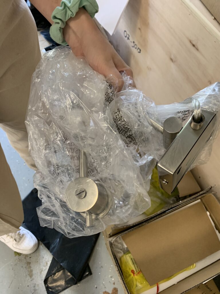
Inspecting a fixture’s finish now that it’s on site.
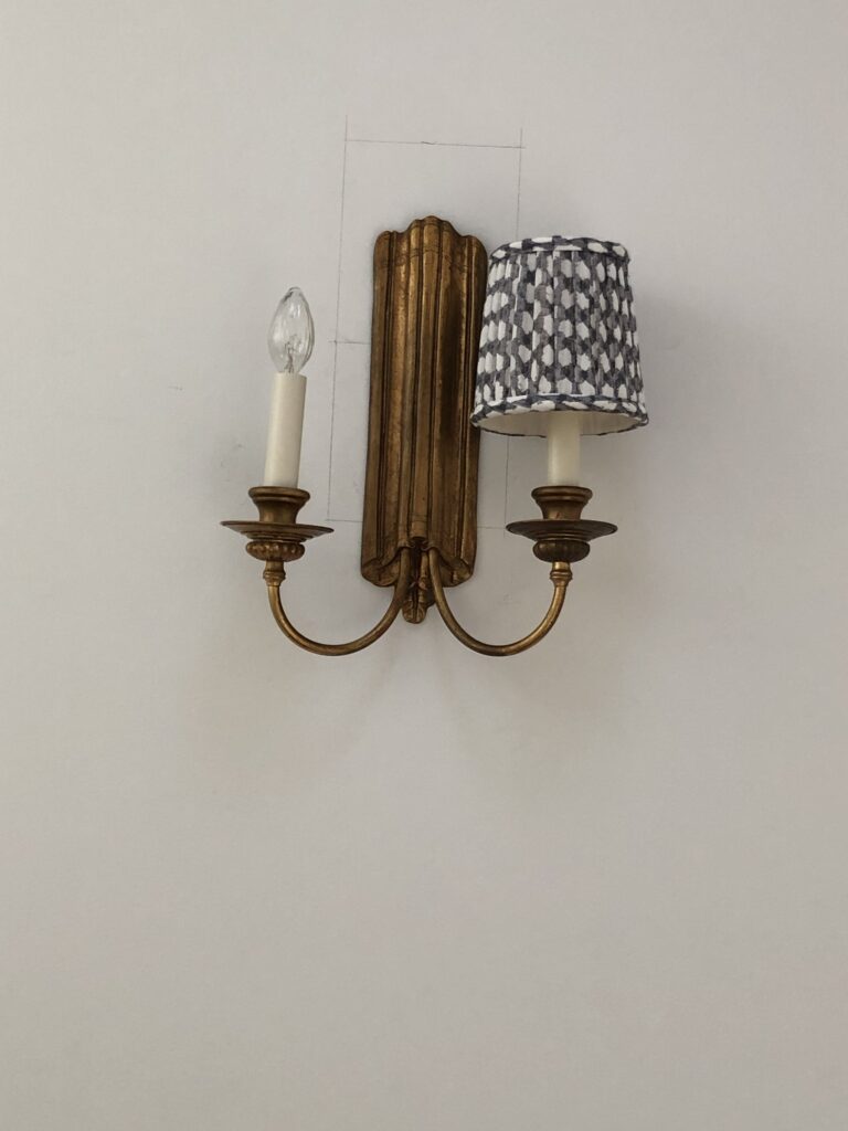
Vintage sconces in the upstairs hallway. The rest of the lighting will be installed by the end of the week.
Thank you to Bayview Builders for all your great work! Next up is wallcovering.
-
SHOW-HOUSE // FAUX-CLIENT :: part II
Like the early stages of a romance, the onset of a new design project brings lots of excitement, energy and anticipation. Now that we’ve “gotten to know” our Faux Clients better and have defined a visual narrative for their space, we are ready to start deep-diving the design. It’s time to measure the room, pull our materials and find our gorgeous furnishings — let’s show this showhouse what we’re made of!
Prep Work______________________________
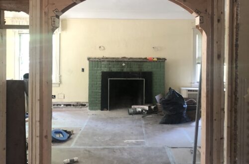
Preparation and foresight are the secret weapons behind a good design. We always arrive well-prepped for site visits and measures. Camera? Check. Tape measure? Check. Comfortable shoes? Definitely check.
Scouting for Furnishings____________________
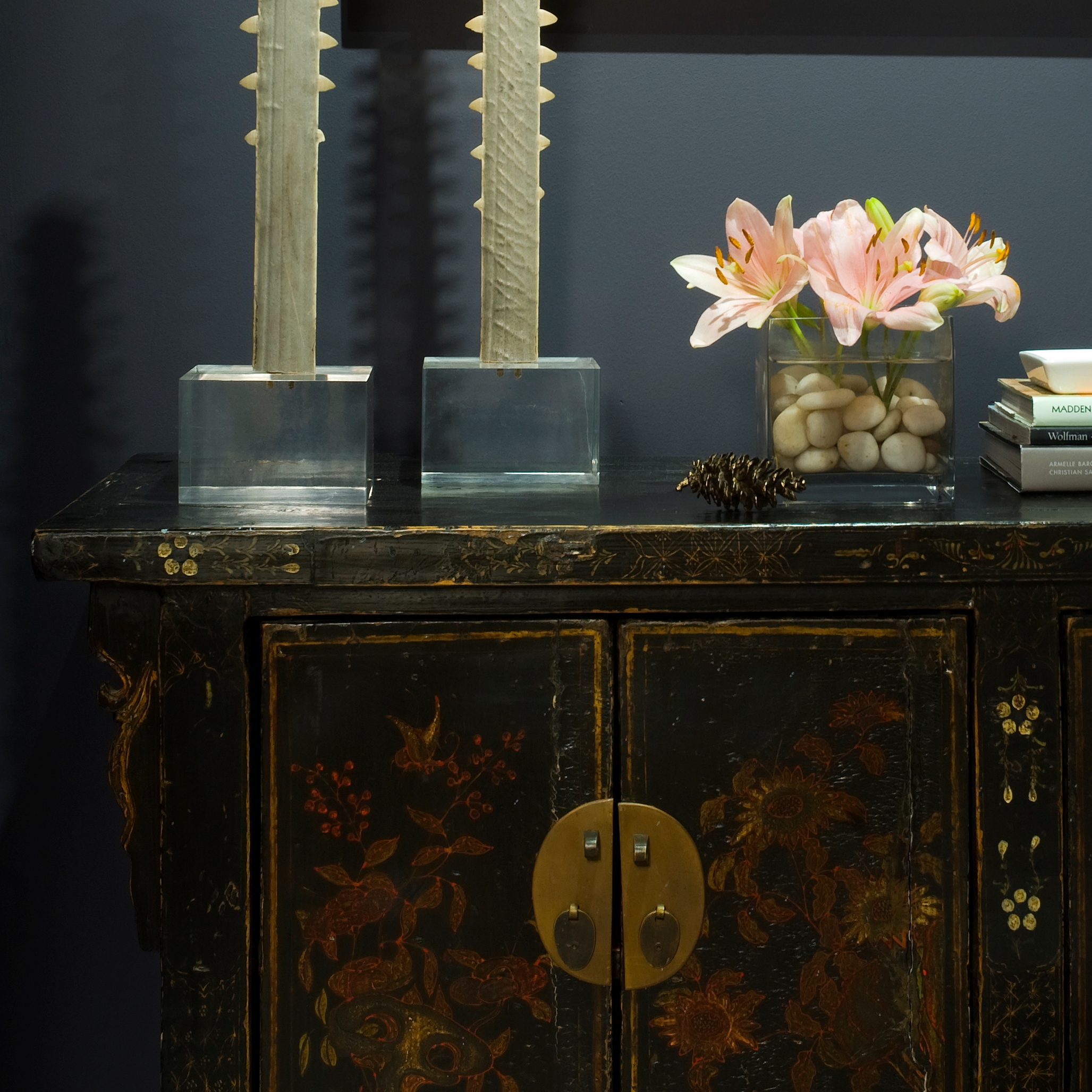
Scouting for hidden treasure is one of design’s greatest thrills. Fortunately, we are blessed to have access to a rich variety of vendors and shops from which to source our goods. We let serendipity play a part in our work, so it’s usually one or two really special discoveries that drives our designs. This part of the process is not about “shopping”; it’s about having an informed concept, an open mind and a great eye. Our goal at Huntley & Co. is always to curate an interior that is both timeless and forward-thinking — to evoke an emotional response that inspires and nourishes the spirit of the client.
Pulling Together the Scheme_________________
Besides hunting for furnishings during this phase, we pour through our office library for fabrics and finishes. We strive to use materials that enhance a home’s architecture and complement the lifestyle of our clients. A thoughtfully selected mix of light and dark, textural and refined, beautiful and odd are what make a room interesting and livable.
Next week we’ll bring you Part III of our Show-house/Faux-client series where we’ll dive into the technical aspects (drawings!) of the project. Subscribe to our newsletter or find us on Bloglovin’ to stay tuned.