-
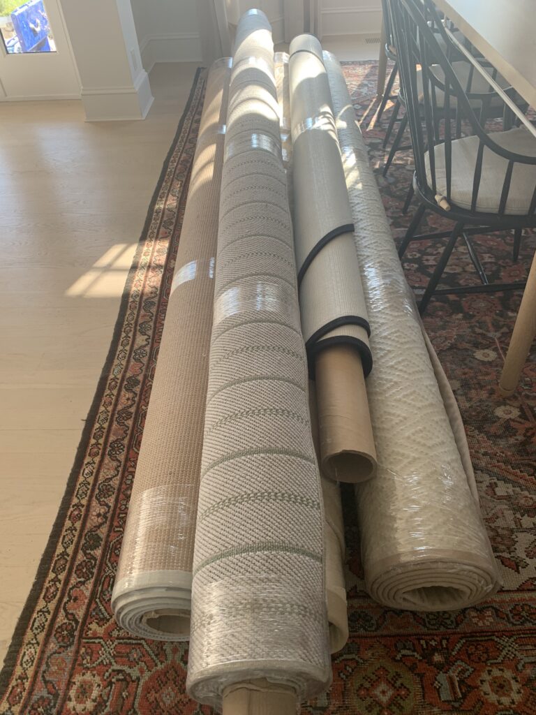
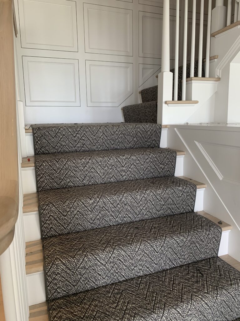
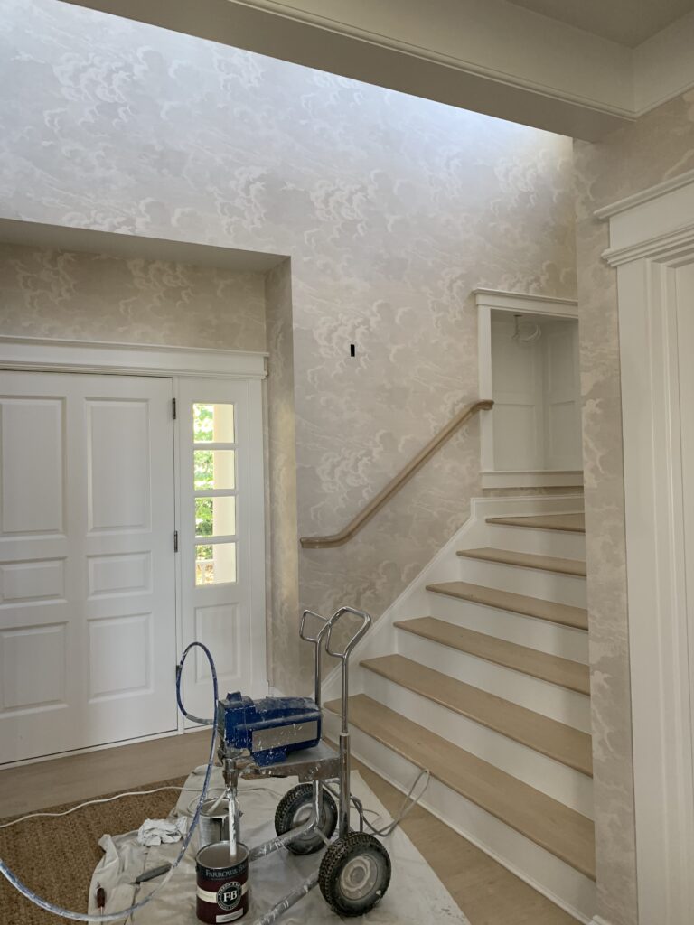
Installing Annapolis (ed. 3)
-
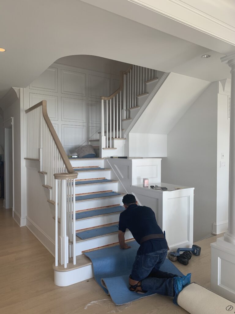
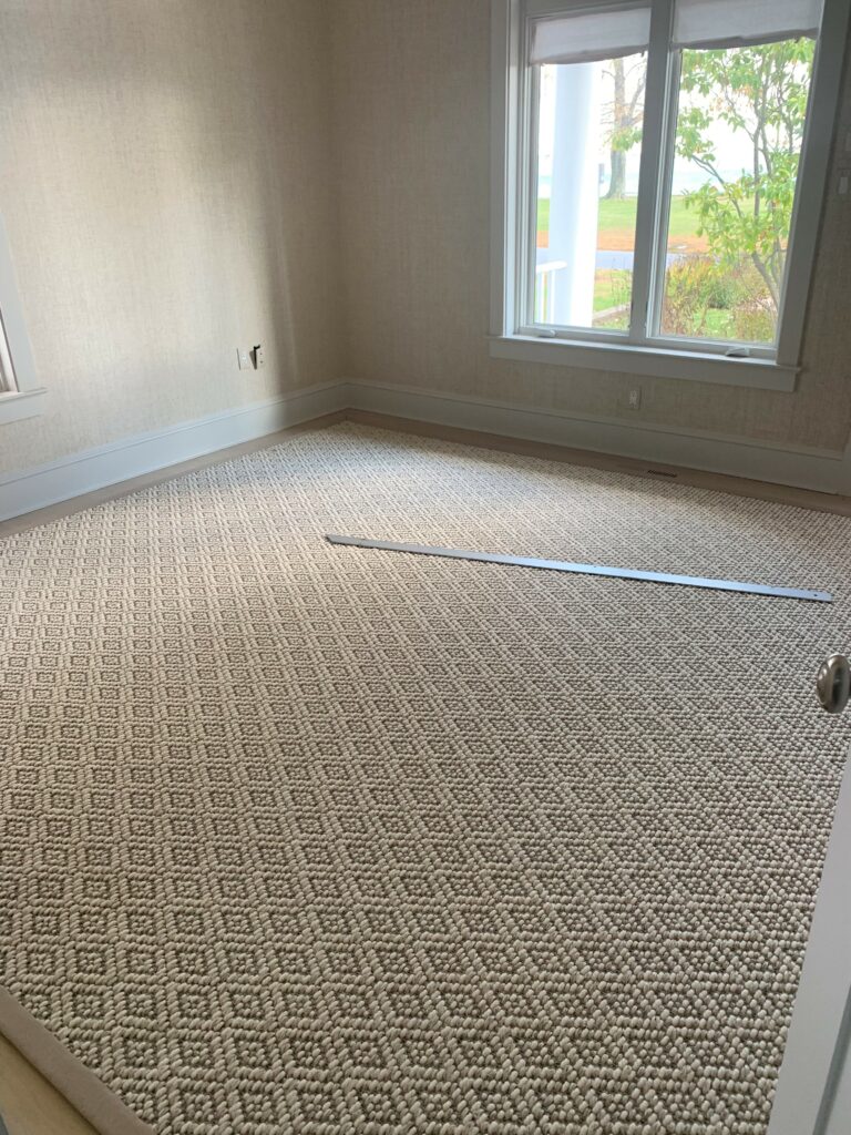
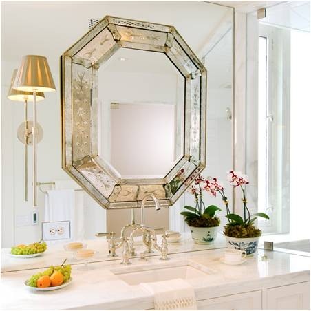
Installing Annapolis (ed. 2)
-
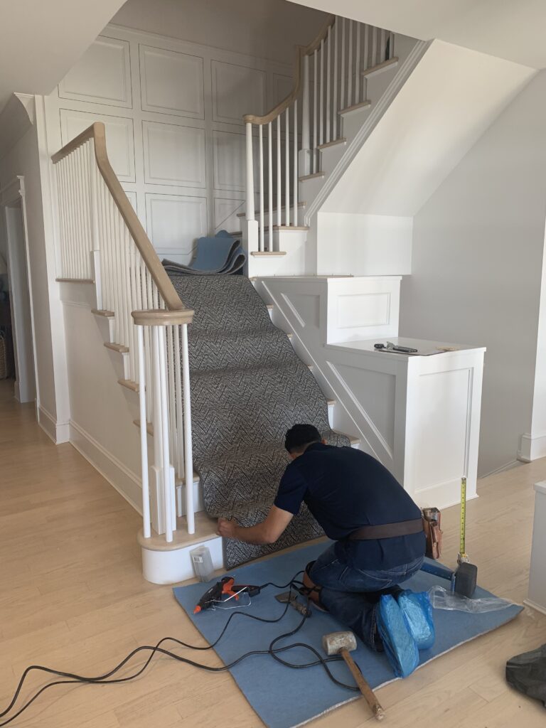
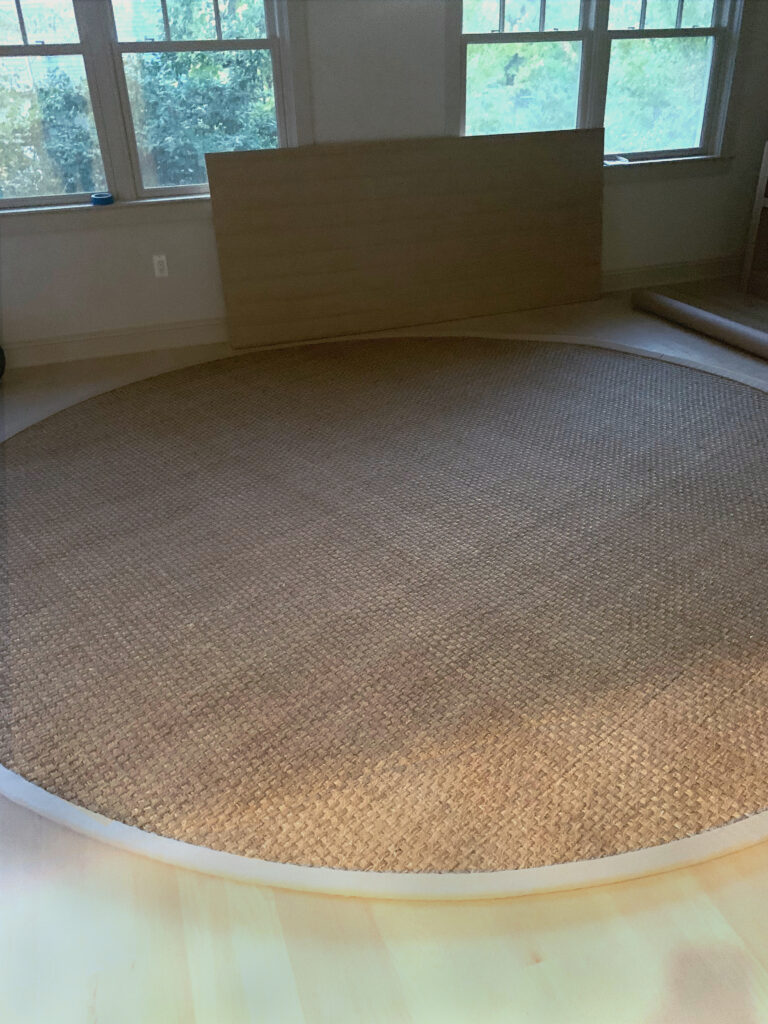
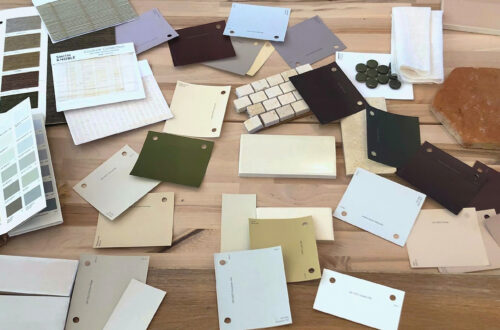
Installing Annapolis (ed. 1)
-
West End Process :: Concept
One of our favorite Huntley & Co. projects this year was for a young couple who hired us to design and renovate their newly purchased townhouse in the West End neighborhood of Washington. Much to our delight, the duo brought a combination of sophistication and excitement to the endeavor. Translating that into a concept and then into a finished product was a multi-step process — and worth every minute.
* * *

| THE CONCEPT |

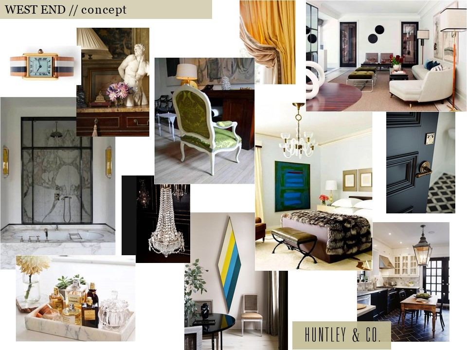
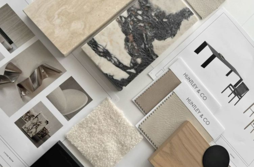
Our clients inspired a decidedly cosmopolitan aesthetic. Accordingly, we imagined an eclectic mix of vintage and antique furnishings, unexpected stone and tile, and layers of complex colors and tones. As shown below, the mood board we created conveyed our idea of an elevated yet spirited home – a true classic that’s never boring.

Selected photos clockwise from top left: Cartier Tank watch via Goop; Timothy Corrigan vignette; a crisp Madrid living room by Isabel Lopez-Quesada; a bedroom from Architectural Digest; a corner of Sandra Nunnerley’s home featuring “Diamond” artwork by Kenneth Noland; an austere and elegant marble bathroom.


| HOW WE GOT THERE |

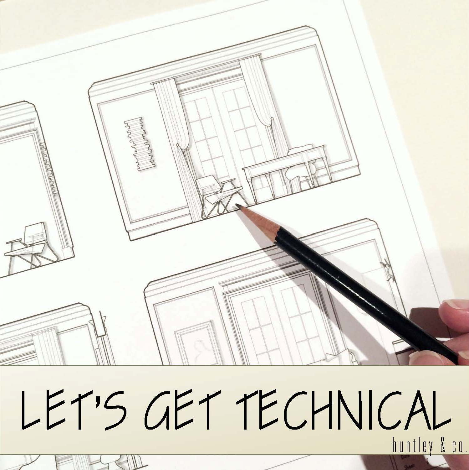
The start of a project is full of excitement and potential. Before diving into design, we take time to fully understand both the space and the client. On the technical side, we site measure the building and generate CAD drawings for study and revision. On the conceptual side, we issue a questionnaire and cull images related to our clients’ answers. The questions range from pedestrian to abstract and are intended to give us practical information as well as insight into their lifestyle and aesthetic.
// Question & Answer
A two page questionnaire sheds light on what’s important.


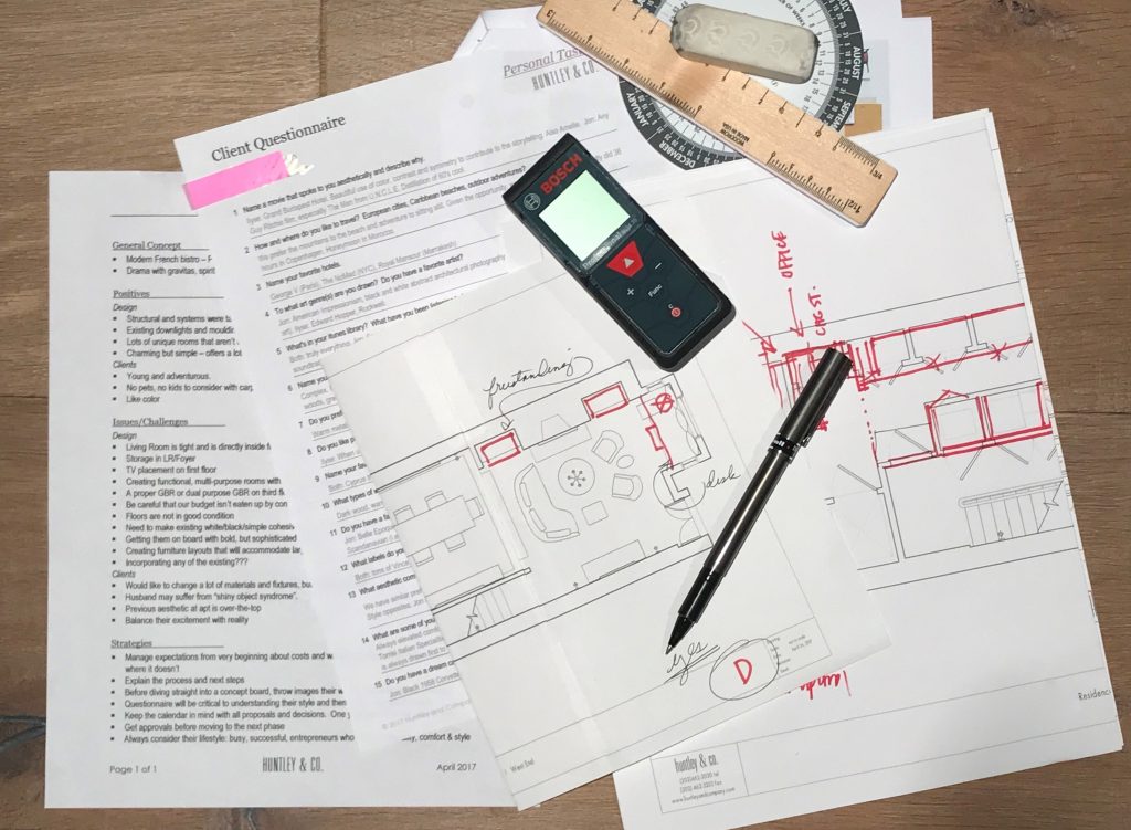
The client questionnaire is a key part of our initial survey and analysis.

// Pulling Together a Visual Story
We pull images that reference our clients’ feedback … and they share photos as well.


TRAVEL // From a honeymoon spot to favorites in Paris and NYC, these hotels topped our client’s list. L to R: Royal Mansour Marrakesh; George V in Paris; The NoMad Hotel in NYC.


FILM // Playful, witty and adventurous. L to R: Lock, Stock and Two Smoking Barrels; Amélie; The Man From U.N.C.L.E.
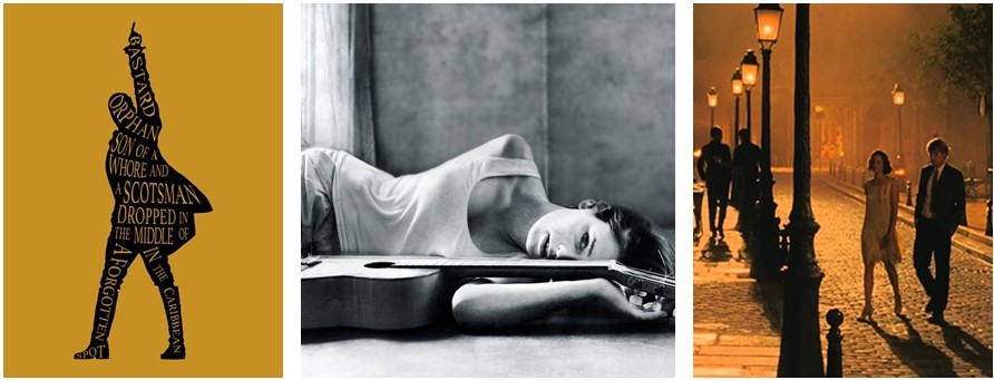
MUSIC // Eclectic and soulful music that bridges time and genres including the Hamilton soundtrack and Carla Bruni’s album, Quelqu’un m’a dit.

 FASHION // Classic, all-American cool c/o Vince, J. Crew and Celine.
INTERIORS // Rich and sleek. Warm and bright. Tailored and organic. L to R: Interior by Joseph Dirand includes works by Anish Kapoor, Pierre Jeanneret and Paavo Tynell; Patricia Urquiola collection for Georg Jensen; a sculptural Alvar Aalto chair; master suite cabinetry seen on Pinterest.

* * *

We love the conceptual stage of a project. Engaging in a thorough deep dive to excavate both the practical and the magical is the difference between a good project and a great one. Stay tuned for our next post where we transition into design development and project management — when we make the concept a reality.
xo, Huntley & Co.

-
PARADOX = DESIGN HARMONY
Paradox is my passion — contrasting modern with traditional, sexy with conventional and subtle with provocative. Introducing incongruity and tension give a room interest and energy. As we designers say, it’s what makes a room “sing”. In the simplest of terms, I like a little rock-n-roll with my ladylike. It’s integral to my designs, my fashion sense and my attitude.


bubble chandelier + oushak | classical-themed wallpaper + midcentury architecure | columnar lamp atop leather-wrapped dresser + modern high-rise apartment


graphic polka dot tank + pink animal-motif shorts + snakeskin heels | distressed jeans + damask pattern jacket + large belt buckle

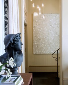
camelback sofa + vintage lamps + saarinen table | bust of hermes + robin rose painting + lamb’s tongue railing


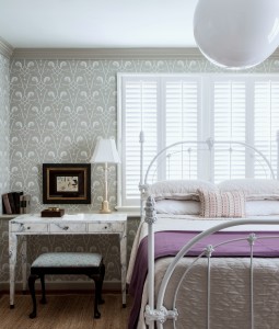
modern asymmetrical mirror + velvet flocked wallpaper | surrealist watercolor + toile wallcovering | antique iron bed + globe pendant


oak paneled wall + silk velvet headboard + circular shag rug | multiple contemporary genres + yellow-painted vintage valet chair

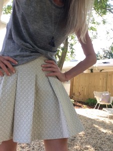
chunky woven sweater + gold lame harem pants | grey heathered tee + quilted derek lam skirt


pitched beadboard ceiling + gold dome pendant | midcentury mobile + antique leather hall chair | builder-grade powder room + contemporary wallpaper + bronze repousse mirror
… in other words, “luxe and lucid”

