-
EDGEMOOR SUNROOM
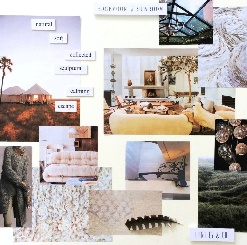
November is filled with anticipation as the holidays quickly approach and designers clamour to wrap up design projects. At Huntley & Co., we have labored long and hard for one Bethesda client in particular and are eager to put the finishing touches on their remarkable sunroom renovation. Our goal was to create a sculptural, textural space that elegantly captures the spirit of indoor/outdoor living. We will be featuring work product and site photos for this sunroom-cum-lounge in the next several posts. And we’ll reveal the installation around Thanksgiving, so just a little more patience! To give you an idea of the inspiration behind our design, we’ve shared the Edgemoor Sunroom concept board below. Wrap yourself up in the luxe imagery and escape.
 xo, Huntley & Co.
* Subscribe to our newsletter or find us on Bloglovin’ and you wont miss a thing.

-
Tableaux
There are only two things in this world of which I will never tire. One, cute animals. And two, vignettes. It’s true, nothing snaps me out of a bad mood faster than a cleverly styled tabletop or an otter eating lettuce on Youtube. Vignettes I love because they can be pulled together in minutes. I love them because everyday things – a branch from the yard, a child’s toy, a vintage teacup – always make them more interesting. I love them because they have personality. I love them because they’re artistic and inspirational. I love them because they make me happy … even sans otter.

A favorite vignette from my LA trip this spring.


Richard Holley | McAlpine, Booth & Ferrier

Lorenzo Castillo


Huntley & Co. (L&R) | Peter Vitale (center)

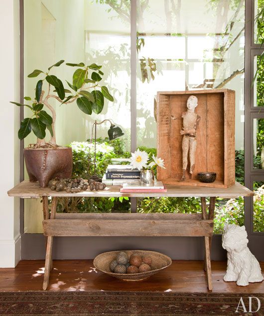
Huntley & Co. | Ellen DeGeneres

Jean-Louis Deniot


Huntley & Co. (L&R) | Elle Décor (center)


Elsie de Wolfe | David Hicks

Alexandra Kidd


Huntley & Co. | Ernesto Pigni
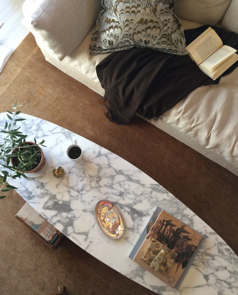

Sunday morning at chez Huntley | The National Museum of American History in DC


Darryl Carter | Lucinda Wharton | Horsch Interiors
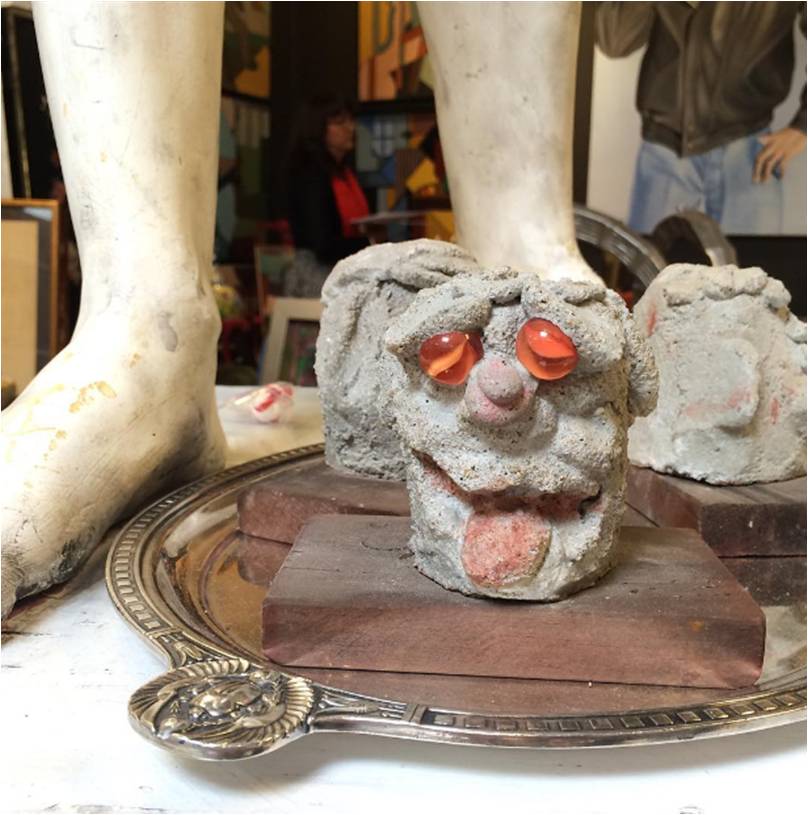
Best tableau ever by A. Shaw Antiques at Highpoint.

Drop by the Luxe & Lucid Pinterest page for dozens of other gorgeous, brilliant vignettes.

-
THE AD DESIGN SHOW :: TRICIA’S 10
I spent the day at the Architectural Digest Design Show in New York on Friday. It’s always good to see what’s new, talk with vendors and “kick the tires” so to speak. Seeing the finish/scale/construction of products in person is integral to quality control and intelligent design. And, of course, it’s fun. I’ve shared ten best picks — whether it be a specific piece or an entire collection — and why each was worth a closer look.

#1 Van Cronenburg
I am passionate about hardware and this company is stellar. Substance and exquisite detail in every piece.


#2 A Space Wall Sconce
All of the products from A Space – lighting, furniture, vases – are beautiful, but the Falling Star lamp was a show-stopper. It will undoubtedly make a lot of “it lists”.


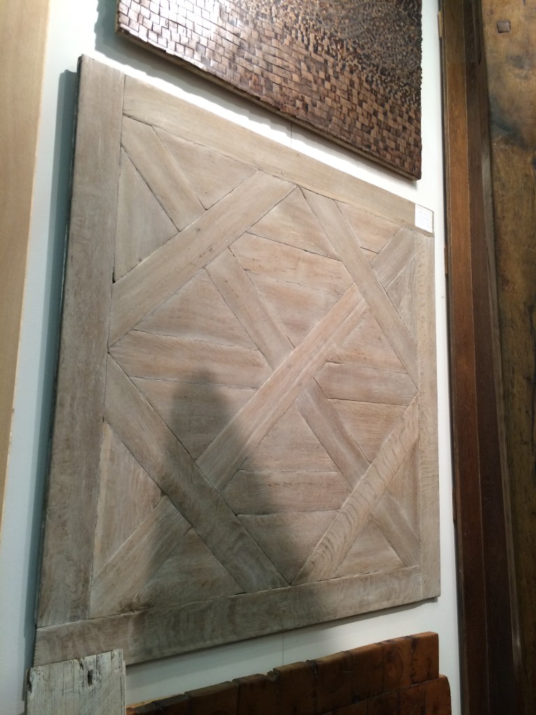
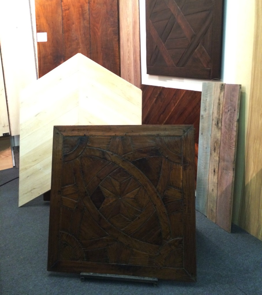
#3 Archetypal
In a perfect world, Archetypal’s work would be on the floors of every home in America. A designer can dream.


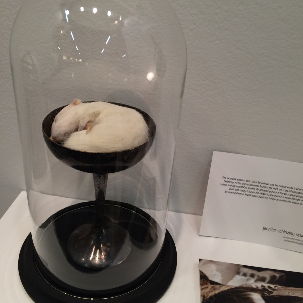
#4 Jennifer Schinzing
Jennifer’s love for the natural world inspired her to learn taxidermy. She preserves small animals (many of them road kill casualties) and transforms them into art installations. The thoughtfulness and beauty of each “memorial” was remarkable. Take note world, SHE IS ONE TO WATCH.



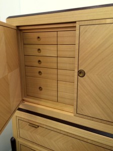
#5 Visilek
This cabinet was perfection. The veneers, the joints, the mechanics, the proportions were all flawless. Filipe Rodrigues’ work is masterful.



#6 Brizio Faucet
The Brizio Solna faucet. It’s black, it’s functional, it’s sexy … and it’s plumbing. Gotta’ love it.


#7 Jefferson Hayman Photography
I never jumped on the gallery-style art installation bandwagon in design. Perhaps because often times it’s just a bunch of crap thrown up on the wall (yes, I just wrote that). But Jefferson Hayman’s installation at the AD Design Show was simply lovely. The collection was intimate, multi-faceted and beautifully framed. Purchasing the entire installation crossed my mind … and I think that of the gentleman in the photo (yes, I was eaves-dropping).


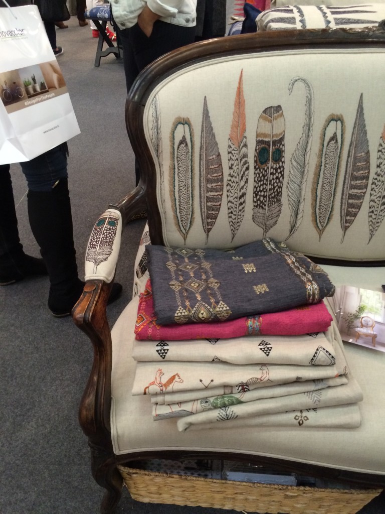
#8 Coral & Tusk
I’m a sucker for animal motifs, so naturally I was drawn to Coral & Tusk’s display. But what’s lovely about these goods is that the patterns are cute without being saccharine. The imagery is grounded by the quality and authenticity of the textiles. Moreover, Stephanie Housley was delightful; her enthusiasm and love for her work was evident.


#9 Joya’s F vs. S Candles
These candles may seem simple, but something about them caught my eye. They whispered [vs. shouted] sexy and luxurious — my personal sweet spot without a doubt. I inquired about an order at the show and pretty much want to purchase the whole collection of fragrances upon seeing the website.


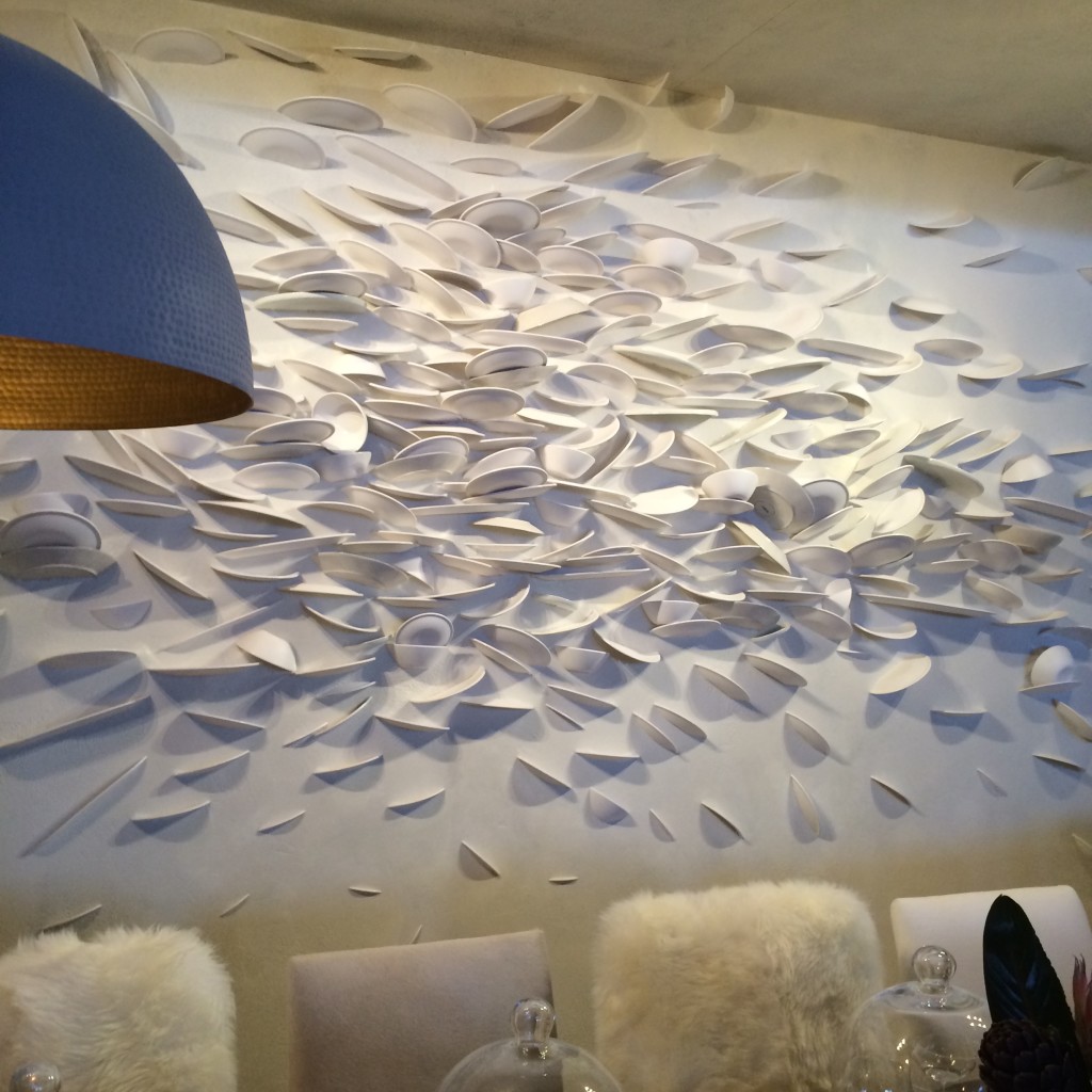
#10 C&B at Dining by Design
Believe it or not, I am including Crate & Barrell in this list. Their dining room for DIFFA included a brilliant wall “art” installation. How many plates were broken to create this I don’t know. But what fun and how tongue-in-cheek. Kudos C&B.

*All photos are my own save the two that are hyperlinked. Thank you for sharing your beautiful images with our readers.
-
A Perfect Fit
Luxe & Lucid is hosting its first guest blogger this week. At the helm is Molly Hammond –
assistant designer, project manager, and all around go-to girl at Huntley & Co. With a unique
sense of style and impeccable writing she is sure to deliver a beautiful and memorable post.
See you all next week!
Tricia xo
Rather than going into studio art, I was steered towards interiors with the help of my older sister, also a designer.
It gives me the opportunity for practical application of principles I learned in painting, and honestly is more
suited for my personality since every day is different on this job. From time to time, I miss working with
my hands and can find infinite inspiration by studying other disciplines. All in all, there is no other work
I would rather do. One of my favorite aspects of the design process is materials selection. I want to share
the work of a few jewelers, furniture makers, and architects that have pushed the boundaries of the materials
they are composing with, have really created something magnificent out of something ordinary, and have
risen to the challenge of fabricating their designs: you may notice they are all like intricate puzzles.
– CERAMIC –
These ceramics by Solomia Zoumaras are exquisite. Some of her pieces are interlocking.
– PAPER –
Jewelry by Janna Syvanoja represented by Alternatives Gallery in Florence. The amount of precision required
to work with such a delicate material to create these ethereal forms is amazing to me. These shapes could
translate to larger scales sculptures. I have been obsessed for years and still love
these pieces as much now as when I first saw them.
– CONCRETE –
Who else but Scarpa? Its possible that just looking at these details makes me giddy.
I would love to study the original detail drawings for these.
Top two, snapshots taken in Venice at Olivetti: Bottom two, Brion Vega Cemetery
From top left: A staircase at the Palazzo Della Penna in Perugia.(which also houses a collection
of chalkboards by Joseph Beuys) Casa Dos Cubas by Embaixada Architects.
A sculpture at a private residence by Tsao & McKown
- MIXED METALS –
Two brooches in mixed metals by Stefano Marchetti. Some of his additional work is posted
on a favorite inspiration resource, Klimt 02. I am drawn to works with a combination
of sculptural, free forms realized by meticulous craftsmanship.
- STONE –
Kengo Kuma built this assembly space from Ooya Stone.
– CLOCK HANDS –
The wildcard. I had never though of this as an agent for artistic creativity but now I know differently.
From Left. Clock by Christiaan Postma. Jewelry by Sergey Jivetin, at Jewelers Werk
– WOOD –
Made by Meta. In awe. “38 seamlessly joined, curving facets of superbly matched Cocobolo Veneer”
– MORE PERFECT FITS –
Art & Food: an architect & a designer
Left to my own devices, I would probably spend every available weekend at a museum. So, to have
someone that it enthusiastic and knowledgeable about the same is beyond wonderful – I'm really fortunate.
A few weeks ago my fiance and I had a chance for some exploring in New York after visiting friends.
It’s surprising what you can fit into one afternoon, even upstate. We didn’t leave the city until noon,
but still managed a 1 hour drive up the Hudson on a sunny day, time to bask in the almost-unimaginable-
expansiveness of the Dia Beacon, a quick tour of downtown Beacon’s antique shops, and the most delicious
dinner of my life. It’s a very feasible outing and a memorable experience: keep in mind for the next time
you are in the area! My highest recommendation.
At the Dia Beacon. Top: John Chamberlain. Bottom: Michael Heizer, North, East, South, West.
Richard Serra. The Dia is located directly on the Hudson,
so it gets incredible light like I haven’t seen anywhere else.
Blue Hill at Stone Barns. I am still having dreams about this place. Every detail is accounted for.
(Architecture by Peter Guzy of Asfour Guzy Architects) We intended to dine in for lunch, but
got wrapped up at the Dia so we made it for dinner instead. Getting a table on a Saturday night
without a reservation is impossible, so dinner was served at the bar after enjoying expertly blended
cocktails by the fireplace. These bartenders know more about what they do than I may ever know
about design, and having their company for dinner was half the fun. A five course “Farmers Feast”
was actually more like 8 courses and the whisky tasting alongside the meal was another bonus.
My first time having Rip Van Winkle Bourbon … as much for the name and packaging as the flavor.
I had to hold back from gasping at every presentation. Vegetables served on
spikes (!), potato chips woven with sage leaves, and I even wanted to take
home the gorgeous bread basket. And those are just the appetizers.
Thank you for letting me take over this week, Tricia.
Hopefully you all enjoy – and hopefully I’ll be back again :)
– Molly


![porcelain-joya[1]](https://luxeandlucidblog.com/wp-content/uploads/2016/03/porcelain-joya11-1024x808.jpg)
