-
DESIGNING WITH PASSION :: THE COLORS OF VALENTINE’S DAY
I love the colors associated with Valentine’s Day. Red, garnet, blush, pink, plum — they’re all so delicious and sexy. This is a palette that seduces in design, fashion, and even nature. I suggest that you soak in the gorgeous inspiration of our post today, especially if you are spending the holiday sans sig-other. There is no balm for the soul like beauty. Well, that and a really good bottle of pinot noir and dark chocolate.
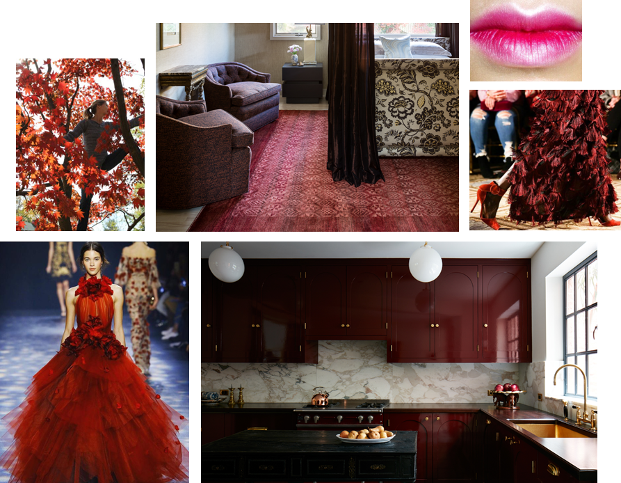
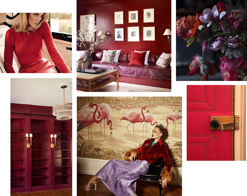
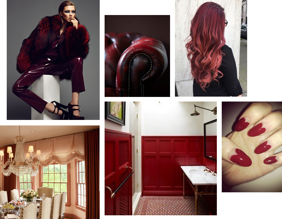
HAPPY VALENTINE’S DAY!

** Sources/links for the photos above can be found on our Pinterest page … along with other Valentine’s Day inspiration.
-
EDGEMOOR SUNROOM :: THE REVEAL!
The Edgemoor sunroom has been installed! Installation days are such a highlight for interior designers. They represent the culmination of months of hard work, careful planning and patience. Considering this project started in the summer of 2015, we were thrilled to see the room finally come to life. So it is with great delight that we report that the room is even more beautiful than we expected. We always have an idea of how an interior will look, but we can’t necessarily anticipate how it will feel. Being in a space where the architecture, the decor and the surroundings truly sing makes all the trials and tribulations of the previous months disappear. We’re thrilled and our clients are thrilled. Santa couldn’t have brought us a better present for the holidays. Enjoy!

|| Pre-Install Site Review ||

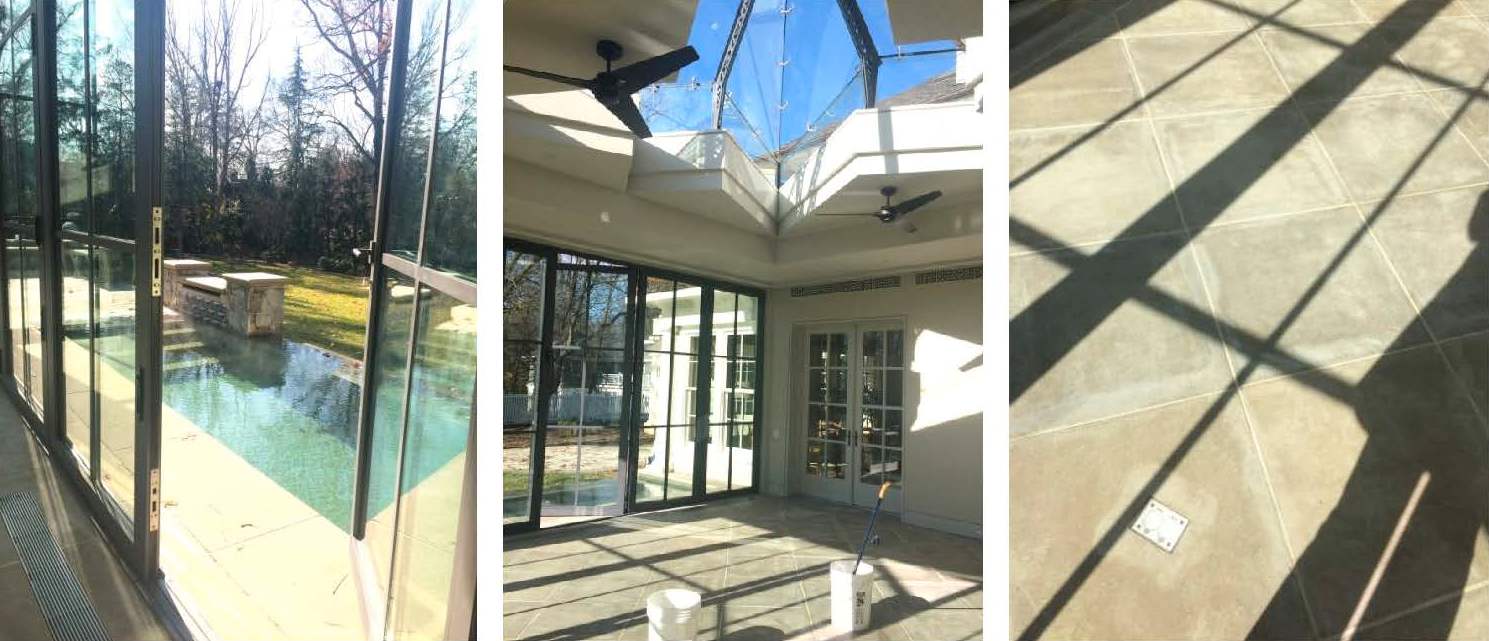
We scoped out the site the day before to ensure that there were no surprises on install day. Thanks to the contractor, all of the construction debris had been removed and the floors and glass were clean. This is a small, but important detail when delivering a room full of fresh, new [and valuable] furnishings. And with a blank slate before us, we were finally able to appreciate all of the beautiful architectural lines and the gracious volume of space.

|| Design is [not] glamorous ||

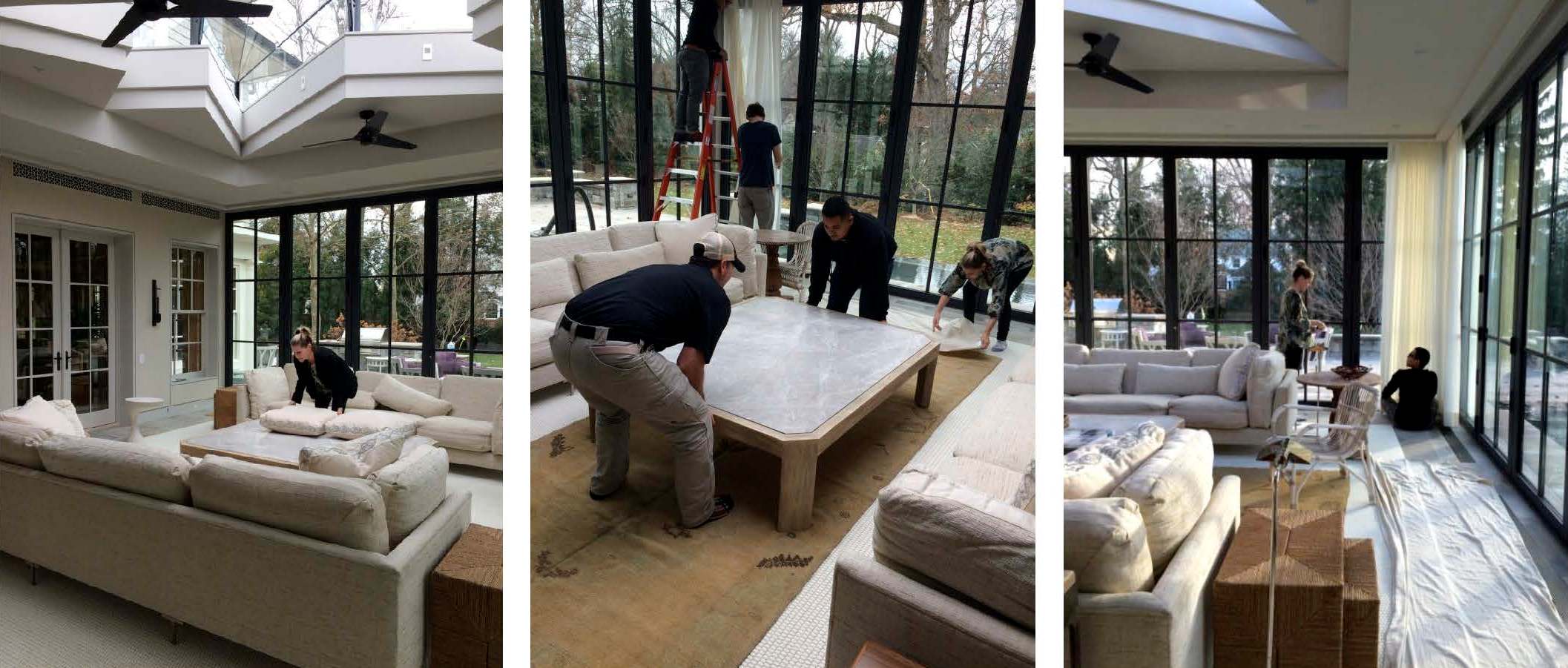
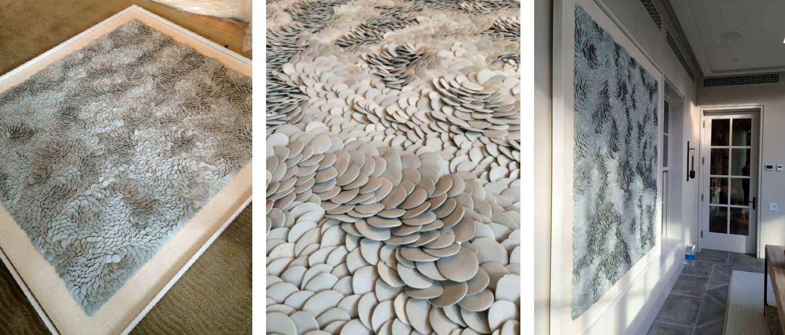
Installations requires a mix of muscle, troubleshooting and finesse. Pillows get fluffed, furniture placement tweaked, and motorized curtains programmed and dressed. One of the trickier exercises of the day was hanging the porcelain Fenella Elms artwork. Both delicate and heavy — and weighing in at well over 100 lbs — it took four men and two very nerve-wracking attempts to hang it on the wall. Needless to say, we all gave a cheer and a generous sigh of relief once it was in place.

|| A Beautiful Finish ||

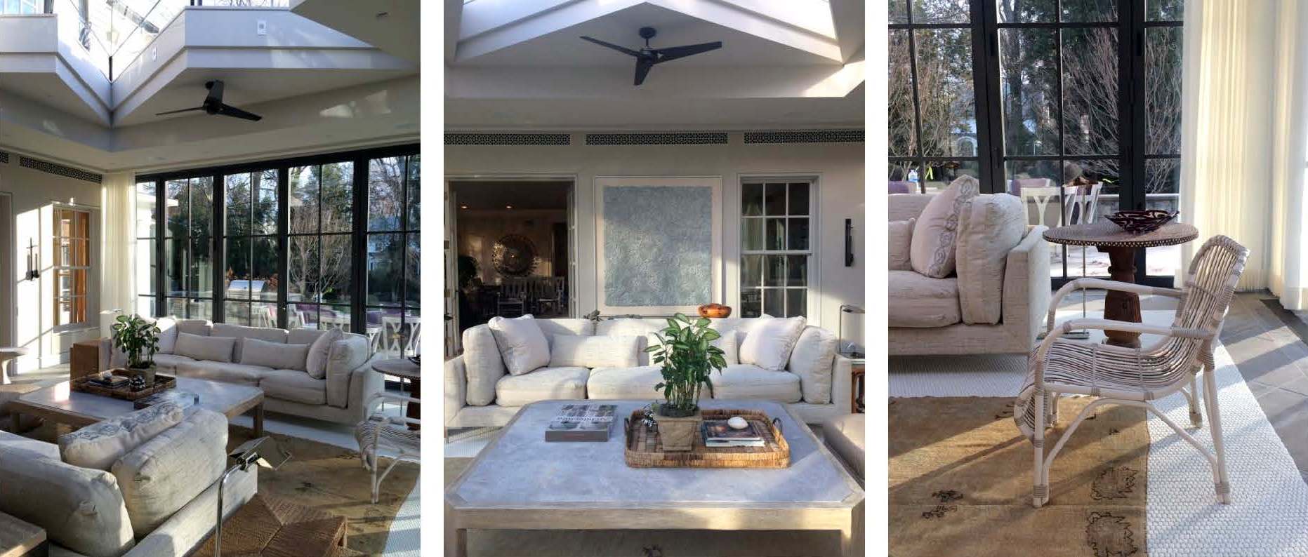
Just as we were finishing the installation, the sun came out and cast an ethereal light into the room giving it a magical sparkle. The shadows danced off the porcelain artwork, the plaster walls, and the mother of pearl inlay on the pedestal table top. Simultaneously, the light saturated the drapery with warmth and illuminated the dramatic skylight overhead. Enveloped by so much natural beauty, it’s easy to envision spending hours in this space lounging, reading, socializing or napping.

|| Taking Care ||

Our work here is done! Well, almost. Installations require guidance regarding the care and maintenance of the space. We strive to ensure our client’s satisfaction by giving them the tools they need to enjoy their homes for years to come. Our care packages vary depending on the scope of a project and specific needs of the client. However, they generally include care and maintenance instructions, mechanical specifications and a paint+finish schedule. In this particular case, we also included a separate artwork care package. The art we installed is fragile and valuable, so we provided our clients with handling instructions along with extra porcelain pieces. And of course, we packaged it beautifully in a Huntley & Co. box with ribbon – something befitting the showstopper art piece itself.
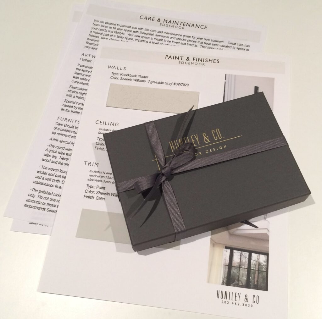

We hope you enjoyed following our Edgemoor series. In case you missed anything, check out each phase here, here, here and here. We will be signing off for the next few weeks to enjoy some R&R. We will post again in 2017 with new installations, discoveries and our behind-the-scenes adventures. Until then, Huntley & Co. — and our mascot Nina — wish you and yours the happiest of holidays!


Subscribe to our newsletter or find us on Bloglovin’ and you won’t miss a thing ; )
-
Edgemoor Sunroom :: Part II
-
Chez Huntley – update 11/13
I am happy to write that the public spaces of chez Huntley are more or less complete. Hallelujah! And while I would love to give my readers a comprehensive 360 degree tour … it aint’ gonna happen. Apparently divulging too much about a project on one’s blog limits its exposure elsewhere, so I’ve learned. When did design get so complicated?! So alas another sneak peek will have to suffice. Hopefully the pix are enough of a fix – enjoy!
— Chez Huntley Interior Details —
My home reflects my own personal vibe. I love drama and a bit of sparkle, but I need natural elements to ground the glitz. For me, a humble sense of glamour is what makes a home (and life) truly elegant.

Tricia xo
-
Branded
There is one question I receive more than any other from prospective clients, writers, editors, vendors and
the public-at-large. “What’s Your Style?” Simple enough I suppose. After all, most designers and novice
decorators have a catch phrase … “edited elegance”, “shabby chic”, “retro glam”, etcetera. The funny thing
is that despite having worked as an interior designer for fifteen years and having my own firm for five, I’ve never
been able to provide a nice neat answer to that all-important question. I guess I found it difficult to sum up all
of my professional passions and aspirations into a few choice words. And perhaps subconsciously I realized
that I needed to soak up as much as I could from the talented pool of designers, architects and artisans around
me before attaching myself to a specific slogan. Or maybe I’m just a knucklehead. Whatever the reason, in this
era of branding, I think it’s time to find a trademark for TRICIA HUNTLEY INC. and certainly for HUNTLEY & CO.
I believe I have a contender, so I’m hoping the Luxe & Lucid audience will help me with my decision. Based on
the cues below, let me know if I’m on target. I welcome comments and suggestions from my clever readers.
– Influential Designers -
Sills Huniford (now parted), Jeffrey Bilhuber & Solis Betancourt (top to bottom),
Three stellar firms that deliver genius with every project. Of course, I may be a little partial to SB
since it is headed by my former bosses who happen to be the nicest, most gracious men on earth.
- The Glamour Found in Nature -
I love me a manicured hedge and a nice hunk of rock.
Jacques Garcia temple photo c/o World of Interiors
– Gorgeous, Dramatic Art –
John Singer Sargent, Elliott Puckette, Francisco Goya & Giacometti (top to bottom).
– Sexy, Laid-Back, All-American Fashion –
Tory Burch, Gwyneth Paltrow and one of my favorite looks - skinny jeans, flats and a [faux] fur coat.
– My Collected Thoughts-
This scrapbook is a collection of images I have pulled because they are beautiful
and inspiring, regardless of context. I started this “stream of consciousness” project
to help me with the idea of branding and to jump start the design for my own house.
– My Own Work –
Whether I’m working on a modern apartment or sprawling traditional home, there are always
three elements key to my interiors; they need to be beautiful, original and unpretentious. Not
only do I want them to reflect the spirit and lifestyle of my clients, but I want them to be livable.
So taking all of the above into consideration, I think the best way to describe my style is …
“NATURAL GLAMOUR”
Wacha’ think? Tricia xo
* Refer to blog posts Designer DNA and Wuzzup?
as well as the Huntley & Co. website for more info.
