-
Gifting
Shopping for Christmas (Hanukkah, etc.) can be a blast when you find just the right gift for your special someone. I’m sharing some of my best finds for those of you who are still on the hunt. Happy holidays!
* Scroll to the bottom for LUXE & LUCID gifts that give back *

| FOR THE AESTHETE |
 Male or female, the key to buying a gift for this type is finding a functional object that is executed beautifully.

Shagreen matchstriker (L); custom knife from Rockin’ One Knives (C); UrbanEars headphones (R)


| FOR YOUR MAN |
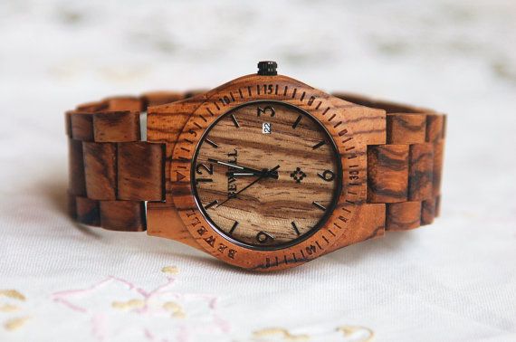
He is no doubt handsome, but with these accessories, he will be even more dashing. #hawt


Zebrawood Watch
Aquascutum checked weekender bag.


| FOR THE FEMALE FREQUENT FLYER |
 Add something special to the carry-on of the woman who often finds herself on planes and in airports.
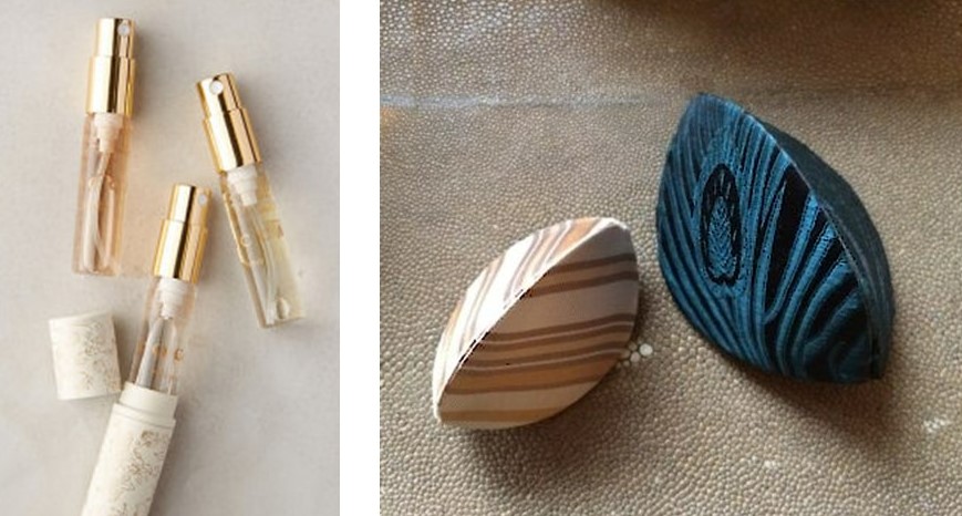
Tocca perfume travel trio (L); Silk earring cases (R); Handmade and customized leather luggage tag (B)


| FOR THE COOL CROWD |
 If you receive one of these gifts, we all bow down to your über cool-ness.
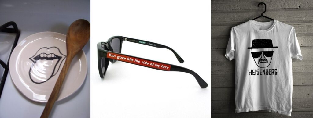
Big Lick spoon rest (L); Barbara Kruger sunglasses (C); Breaking Bad tee (R)


| FOR THE PERSON WHO HAS EVERYTHING |

‘Not Another Bill’

A gift subscription service customized to your or your giftees preferences.
Custom Fonts


Download interesting and original fonts onto your partner’s/parent’s/colleague’s computer


| GIVE A GIFT THAT SAVES LIVES |
Donate to a local shelter or national animal rescue organization in the name of a loved one.


Washington Humane Society (L); PETA (C); ASPCA (R)
** Leave a COMMENT ONLINE and Luxe & Lucid will make a DONATION in your name to one of the organizations listed here. **
-
East Wing Inspiration
I was hungry for some inspiration this past week and decided to break from my routine, play hooky and hit a local museum. I walked through the National Gallery’s East Wing on Wednesday – one of the many world class museums that just happen to be in my ‘hood – and soaked up the amazing collection of modern sculpture they have on display. Giacometti, Calder, Bertoia … delicious.

An enormous mobile by Calder hovers above the light filled central space.

Artist Richard Long assembled rough cut blocks of slate to form an elegant circle on the main floor. A guard stands watch for those visitors tempted to disturb the work.
Diana and a Hound realized in bronze by Paul Manship in 1925.

A view of Ursula von Rydingsvard’s work Five Cones from afar … and up close.

A massive, seemingly lightweight sculpture perched on a ledge.

The Invisible Object (Hands Holding the Void) by Giacometti. Brilliant, always.

Basalt sculpture by Isamu Noguchi.

Bertoia – the famous furniture designer started as a sculptor.

An installation creates drama through the repetition of hundreds of photograph-like plaster pieces.


Moisture as sculpture. Incredible.

Three Motives Against Wall, Number 1
Henry Moore, 1958

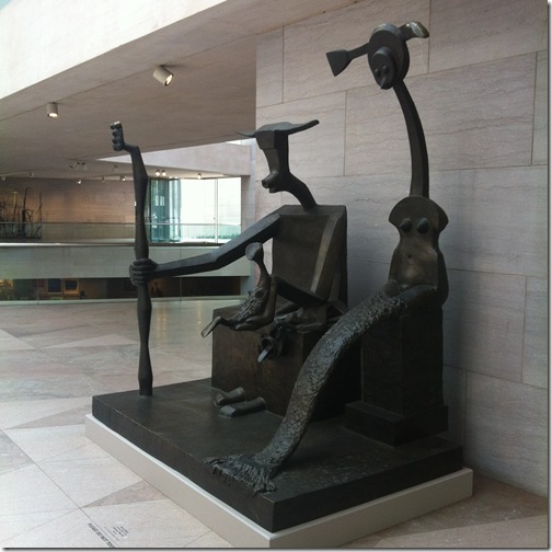
Capricorn by Max Ernst
A massive, somewhat monstrous interpretation of family and sexual politics by the German artist.


Another Giacometti takes stride on the mezzanine.

The perfect departure from the east wing — via moving walkway surrounded by a complex, pulsating light sculpture.
Multiverse, by American Artist Leo Villareal

Tricia xo
* Please note, the East Wing is currently under renovation and sections of the museum are closed to the public.
-
Broken
Breaking Bread, Breaking News, Breaking Ground, Breaking Bad.
Breakthrough, Breakup, Breakdown, Breakaway.
Tough Break, Flat Broke, Broken Hearted, Goin’ for Broke.
I thought I would have a little fun exploring all the ways we use the word “break” and its derivatives in our daily speak. This because I took a bit of a spill and broke my arm two weeks ago. I was mountain biking in Virginia and had a pretty nasty wreck – flying over the handlebars of a bike was never on my bucket list. However, what I clearly lacked in skills, I made up for in fortitude. I’m proud to say I finished the ride and made it all the way down the mountain, break and all. I’ve hung up my helmet for now (and possibly forever) to refocus my attention on safer and surer things. However, in honor of my epic tumble, I’ve decided to find the beauty in broken.
Sea Breeze light sculpture, Deborah Thomas 2013 | still from The Sixth Sense
a geode split open reveals the magic inside | broken boulders in New Zealand
abandoned villa by Eva van Oosten | modern faceted mirror | glamorous rubble by Esther Watson
Pompeiian wall crumbling in 2014 | a Greek wedding tradition
“When the Japanese mend broken objects, they aggrandize the damage by
filling the cracks with gold. They believe that when something’s suffered
damage and has a history, it becomes more beautiful.” Billie Mobayed

Tricia xo
-
Light it Up
I enjoyed some exceptional work days last week. I was in Charleston visiting The Urban Electric Company. Urban Electric is a lighting company with a distinctive vision, brilliant products and a stellar team. I have been using their light fixtures in my designs for nearly a decade. In recent years, I started to design custom fixtures for them to produce. In an exciting development last year, UECo chose to select one of those designs for their permanent collection. The “Huntley” was born as a sconce for a client’s Bethesda home and can now can be found in residential and commercial projects in the US and abroad. As part of their BEHIND THE SCENES video series, Urban Electric invited me to Charleston to discuss the Huntley, my other custom fixtures and the method behind my design process. UECo filmed while I toured their production facility, met with craftsmen and talked with the team about what inspires me. I’ve shared our behind-the-scene shots of Urban Electric’s headquarters and the day’s activities in the photo album below.
A sign that embodies Urban Electric’s stylistic heritage and the spirit of their manufacturing environment.
Touring the metalworking areas with the Urban Electric team.
Learning more about each process. Fascinating.
Lantern multiples prior to welding. A craftsman at work.
Detailed finish work on the second floor. Discussing the components of a custom piece.
Individual parts of The Huntley await assembly. A finished Huntley sconce on the shelves.
Pendants and lanterns from the UECo collection hang throughout. Speaking with visionary owner Dave Dawson during the tour.
Filming the interview.
Huntley sconce installations including a Huntley & Co. foyer and a London department store.
(photos at left and right c/o The Urban Electric Co.)
Many thanks to my Urban Electric hosts for their gracious southern hospitality.
Tricia xo
-
The Alchemy of Opposites
I mentioned in my last post that I like a little “rock-n-roll with my ladylike”. That statement describes more than just my fashion sense – it’s a personal credo, a balancing act and the foundation for how I design. Contrasting modern with traditional, sexy with conventional and subtle with provocative allows me to enjoy all the world has to offer. More importantly, it’s the incongruity and tension that makes a room or collection [and even a relationship] sing.

Huntley & Co. interiors.

Mixing pieces that seem incompatible gives an ensemble just the right edge.
(L) Dries Van Noten, (M) unknown (R) Christopher Kane

It’s not easy to find a car when one’s style is epitomized by dichotomy. But this weekend, I actually spotted my dream ride.
I had never seen the Volvo 1800ES; it’s from the early 70s. Part roadster, part wagon. Stylized yet practical. Sexy and a little weird. I AM IN LOVE!

Dynamic duos – Opposites attract and are, truthfully, more interesting.
(L) “Portland, Oregon” blends Jack White’s tinny, rockabilly melody with Loretta Lynn’s old-school country style.
(M) Even more intriguing than Jesse and Walt’s differences on Breaking Bad are their internal dichotomies – troubled yet innocent heroine addict and conservative yet calculating high school teacher.
(R) Marilyn Monroe and Arthur Miller – the love story of a fragile seductress and brilliant playwright.

Food may be the most tangible way to enjoy nature’s complex and complementary offerings.
(L) Apricot stuffed pork shoulder with soy/honey glaze. (M) Figs and blue cheese wrapped in prosciutto. (R) Cannelini bean, salmon and caviar canapes.

Another one of nature’s delicious offerings – MEN!
Polished/scruffy, strong/approachable, sexy/odd, clever/intelligent. Mmmmm, one of each please.
Tricia xo
* You can find these photos and links on my Pinterest page *

-
NYFW
New York Fashion Week is coming to a close, and like so many, I’ve spent a significant amount of time trolling the internet looking at all the glorious goods. I like to think I have a healthy relationship with fashion. I’m not a slave to it, but I do enjoy pulling together my ensembles. I love to mix styles and textures to give my look just the right amount of attitude. Fashion is a form of expression much like interior design. The upside is that it offers immediate gratification and I can switch up my style every day if I like to suit my mood. That’s a nice change of pace for someone who works in an atmosphere of planning and permanence. I’ve saved some of my looks from the past year along with a few of my favorite online fashion “clippings” for posterity. If there’s a common thread among them, it’s contrast. I like a little rock-n-roll with my ladylike and a bit of humble with my glam.
Now for the real deal.
Tricia xo
-
Garnet & Goats
Hmmm, January. This can be a challenging month. The holiday sparkle has worn off, a little too much winter lies ahead and we’re all a whiter shade of pale. I agree it’s tough to feel motivated when it’s cold and dreary outside and happiness is Haagen-Dazs and a Snuggie on Friday night. However, I’m a January baby and a Capricorn which means I believe from problems come opportunities and there is still reason to celebrate a month as gloomy as this. January can actually offer inspiration. Not in an obvious way, but beneath the surface and outside the box. As with so many things worthwhile, in January you have to dig a little deeper and work a little harder to get to the good stuff.

GARNET
January’s birthstone is like no other. The deep crimson is at once sophisticated and sultry. It has undeniable glamour, yet totally lacks pretention.
Garnet jewelry is always dramatic.
Modern earrings by Caprichosa, antique Victorian brooch, Islamic ring,
This look from Gucci is all about the lips. I have been saving this photo since fall with the intentions of replicating it for a glamorous night.
My current garnet pedicure.
A stunning garnet velvet I used alongside pastel fabrics in a Virginia living room.
And speaking of fabric …
The gorgeous drape of Zac Posen on Naomi Watts at the Golden Globes. She is always red carpet perfection.

JANUS
January is the month of Janus, the Roman god of gates and doorways. As a designer and architecture buff, I photograph a lot of gates and doorways … actually more than I realized once I began combing through my files.
– all photos from my life and travels except central image –
row 1: Munich, Los Angeles, Hempel Hotel
row 2: Georgetown, Melbourne residence (via est Magazine), Italy
row 3: Minneapolis Sculpture Garden, Dubuque church, Dumbarton Oaks

THE GOAT
Although January 19 ended Capricorn’s (i.e. the goat’s) reign, it’s never too late to have fun with die ziege.
We found these darling little guys in Montreux.
If there’s one thing most of us like to do in January, it’s eat. And Lord knows, I love me my cheese … thank you goats! Clearly a girl who takes photos of cheese and cheese shops (as seen here) has a thing for chevre.
Goatskin (often referred to as vellum or parchment) is a preferred material of designers and furniture makers both contemporary and past. I gravitate to it myself and have selected several furniture pieces for projects over the years. Like wood or marble, its beauty is innate and born from nature; it can’t be faked.
Furnishings for DC, Switzerland and London Huntley & Co. projects respectively.

WHITES, GREYS & PALES
The colors of winter may seem a bit solemn, but they translate beautifully.
White, grey and pale works in a stark, ethereal European bedroom or in a bar/restaurant on Mallorca.
Moonstone and black onyx rings by Mathilde Danglade.
The concept of black and white in art stretches beyond the medium of photography.
A painting by Picasso, a photo study of a golf swing and a neon installation by Glenn Ligon.

Perhaps the only thing that could entice me to spend an afternoon in subzero temperatures – beautiful, beguiling and utterly happy sled dogs.
Happy January. Hopefully your new year is off to a good start!
Tricia xo

-
Seven
January 11 marked the seven year anniversary of Huntley & Co. Interior Design. Amazing how time flies! In honor of my biz’s birthday, I’m sharing seven sets of seven favorites. I typically champion quality over quantity, but it’s nice to be surrounded by inspiration – from design to television to words of wisdom – in abundance these days. Here’s to seven years of success, a fantastic 2013 and a life filled with beauty, humor and a healthy dose of fun.
7 YEARS OF HUNTLEY & CO.
7 ARTISTS
 I am OBSESSED with the work of the artists below. Need me a millionaire (or maybe billionaire) boyfriend.
7 ARCHITECTURAL WONDERS
A spectacular collection of architecture is featured in February’s issue of AD.
Four of the structures are included below along with three photos from my own travels.
Perot Museum_Dallas – Harpa Concert Hall_Reykjavik
The Shard_London – Gardens by the Bay_Singapore
New York Public Library_NYC – Rolex Learning Center_Lausanne, Switzerland – steps of Siena

7 BOOKS
Life, Keith Richards
A surprisingly poignant memoir from the ultimate rock star.
Gone Girl, Gillian Flynn
The best plot twist since The Sixth Sense.
Middlesex, Jeffrey Eugenides
A story spanning 3 generations of Greek-Americans and featuring a young, hermaphroditic protagonist named Calliope.
An epic, unorthodox Pulitzer Prize winner.
Religion for Atheists, Alain de Botton
For the open-minded, curious individual who seeks to understand all sides of an argument.
The Black Spider, Jeremias GotthelfA 19th century novella about a small German town infested with spiders after one of the villagers makes a pact with the devil.
A good old-fashioned religious allegory written to inspire fear.
The World of Muriel Brandolini
I had to include one design book.Brandolini’s work is completely original and worth a study.
Blood, Bones & Butter, Gabrielle Hamilton
This was just recommended to me. I can’t wait to sink my teeth into it, so to speak.

7 SHOWS
I’m not one of those people who claims she never watches TV.
With provocative storylines, million dollar sets and brilliant characters, you’re missing out if you’re not tuning in.
Downton Abbey
Delicious and addictive whether you’re an aesthete or not.
Top Chef
The tenth season is as mouth-watering as ever and has been featuring some serious girl power.
Mad Men
Like any dashing, egocentric, womanizing man worth his salt, Don Draper still has us hooked.
It’s Always Sunny in Philadelphia
Characters so wrong, you can’t help but champion their insanity.
Justified
For those of us who felt robbed when Deadwood ended.

Walking Dead
A smart, well-crafted show about zombies. Who would have thunk it?
Following
A serial killer show starring Kevin Bacon and James Purefoy. I’m sold. Premieres January 21.

7 PEARLS OF WISDOM
“You were born an original. Don’t die a copy.”
“Style is knowing who you are, what you want to say and not giving a damn.”
– Gore Vidal
“I never dreamed about success. I worked for it.”
– Estee Lauder
“The best love is the one that makes you a better person without changing you into someone other than yourself.”
“It is not what you do for your children, but what you have taught them to do for themselves that will make them successful human beings.”
– Ann Landers
“I don’t know the key to success, but the key to failure is trying to please everybody.”
– Bill Cosby
“Don’t try to explain yourself to stupid people. You’re not the Jackass Whisperer.”

7 YEARS OF NINA
My other baby is seven too!
HAPPY NEW YEAR!
Tricia xo
-
One Kings Lane Sale
To do list for Tuesday, November 6:
1. Vote
2. Shop my Tastemaker Tag Sale on ONE KINGS LANE!
– starts tomorrow 8AM west coast/11AM east coast –
Tricia xo
-
Holiday House_The Reveal
After an arduous final push, I am happy to say, ze’ room is ready! Tricia and her team worked tirelessly to pull it all together. Now I can escape to my sumptuous and relaxed lounge with its soaring windows and glorious light whenever I am in New York. As you can see below, the space is already set for a party – a holiday luncheon that I intend to turn into an all-night bash. In fact, you’re all invited (through November 18). Let’s celebrate!
Ahhhh, “home glamorous home”.
Chic yet comfortable seating? Oui.
Dining table nestled between dramatic art and a chandelier dripping with porcelain fairies? Oui.
A bar tucked in the corner and stocked to the hilt? But of course!
Details.
Including an incredible sculpture, “Mascara” by artist Edwina Sandys.
Tricia being interviewed by the effervescent Tori Mellott …
and ready to party (!) with Huntley & Co. assistant-extraordinaire, Sarah Beth.
Auf wiedersehen, my lovelies. It’s been fun!
M.
Special thanks to Designer Attache, Roche Bobois, Lladro, Audio Doctor, Bespoke Global and Derek Skorupski.
* photo at top by Marco Ricca *
