-
Ironware’s Designer Spotlight
In an interview with Ironware International, Tricia answers all your burning questions including what inspires her, what’s on her bucket list and whether she prefers 70s soul, country music or contemporary pop (hint: all of the above).

Ironware Q&A
Who is a designer you admire and why?
Muriel Brandolini. I admire her creativity, fearlessness, passion for craftsmanship and ability to mold her very particular look into something traditional or modern.
Where is your favorite travel destination?
Italy. Rome and Florence are favorites – The Boboli Gardens particularly in Florence.
What or who has inspired your work recently.
I recently watched the documentary ‘Agnelli’ about the life of Gianni Agnelli. His style is legendary. His clothing, grooming, homes, cars, art, mannerisms—all were impeccable, incredibly glamorous, and yet, totally effortless. He embodied midcentury Italian style.
Is there a special detail you always add to your projects?
Bespoke furnishings. We always create custom furniture, lighting and/or softgoods for our projects.
What is the most common mistake you see in interiors?
Uninspired art. Seeing a well-executed interior with art that’s decorative or pedestrian is soul-crushing. An artwork collection should be a mix of genres and price points; some should be thoughtfully curated pieces, others should be “finds” from vacations and flea markets. It shouldn’t be too perfect, too much of the same or purchased based on what your friends own.
What is most exciting to you in your career at this moment?
The landscape of our industry is constantly shifting and it’s become an ongoing challenge for designers. The good news is that I love a challenge. I never thought I would have to explain or defend my professional value at this point in my career, but I’ve come to realize that it ups my game in many ways. I continually pursue new levels of excellence in design and business. That keeps my job exciting and interesting.
How would you best describe your style?
Eclectic yet edited. I like unexpected pairings and a bit of tension wrapped in a thoughtful, comfortable envelope.
Describe a favorite piece in your personal home
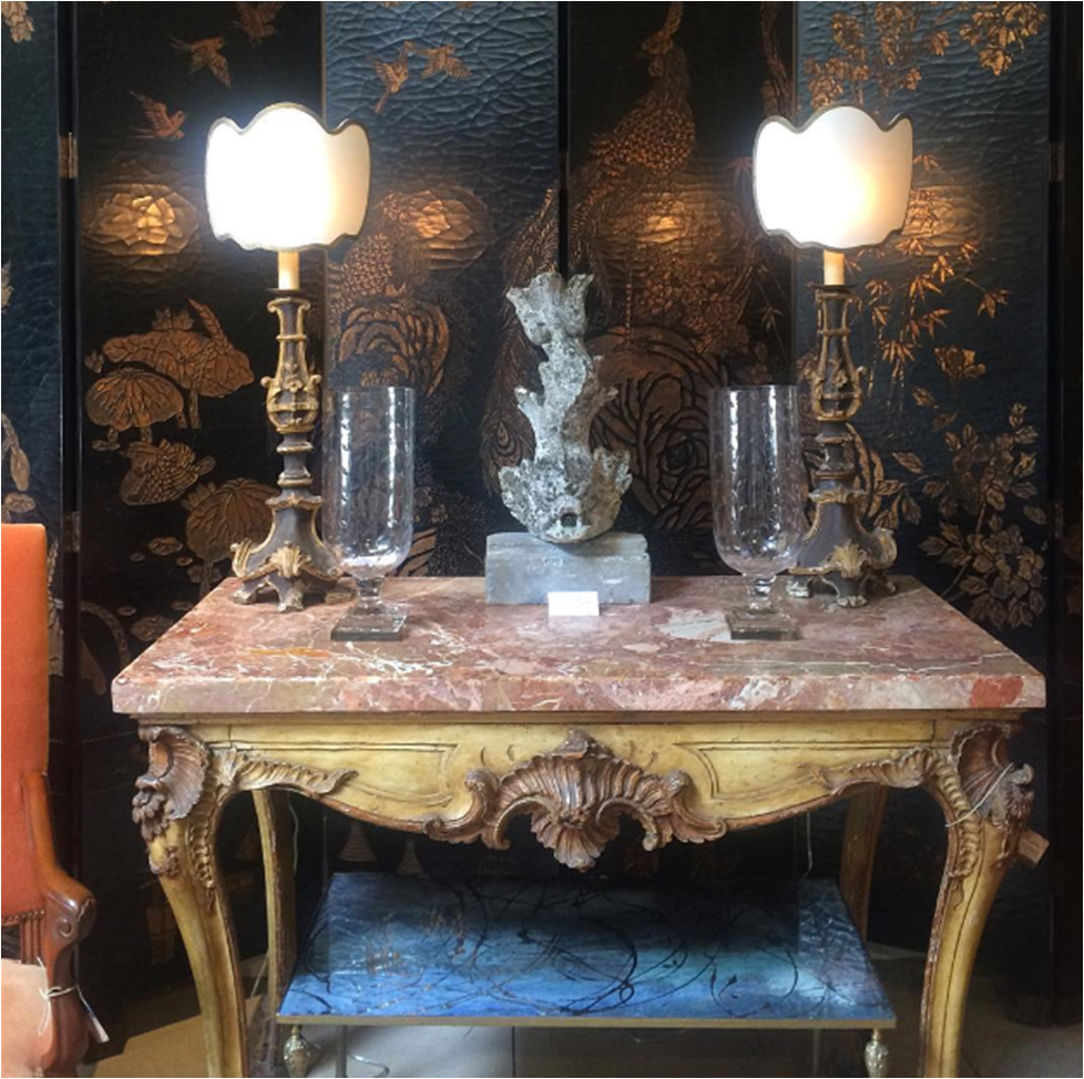
I purchased a vintage coromandel screen last year and installed it in my dining room. It has a rich warm wood finish with slightly colored carvings. It has great scale and is both very elegant and a bit weird. It’s flanked by crystal Swedish sconces with my dining table, pink leather chairs and brutalist chandelier completing the arrangement.
What are three (or four!) things you can’t live without besides family, faith and friends?
Comedy radio, cursive handwriting, my Swell water bottle and Nina, my beloved Norwegian Elkhound.
Name something on your bucket list
Going on safari in Africa.
What music are you listening to right now?
70s soul, country and the Sia station on Pandora.
Why do you choose Ironware for your projects?
Ironware has substance. Playing the textural and sculptural against clean lines is part of what makes a Huntley & Co. interior. Ironware is the perfect counterpoint to more tailored furnishings.
Ironware x Huntley

(L to R): the Alicia table in an Annapolis project; the Huntley-designed Celine pendant; a master bedroom features the Diego bed. 
The Celine pendant and a multitude of other gorgeous light fixtures, furnishings and accessories are available to-the-trade on the Ironware International website. HUNTLEYCODESIGN loves IRONWARE!

www.luxeandlucidblog.com
www.huntleyandcompany.com -
West End Process :: Concept
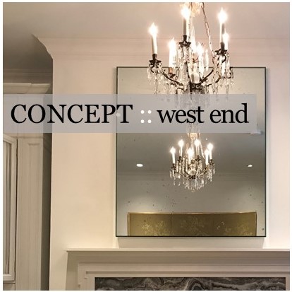
One of our favorite Huntley & Co. projects this year was for a young couple who hired us to design and renovate their newly purchased townhouse in the West End neighborhood of Washington. Much to our delight, the duo brought a combination of sophistication and excitement to the endeavor. Translating that into a concept and then into a finished product was a multi-step process — and worth every minute.
* * *

| THE CONCEPT |

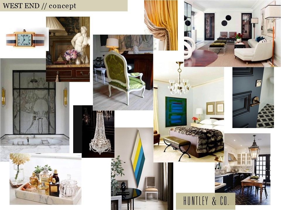
Our clients inspired a decidedly cosmopolitan aesthetic. Accordingly, we imagined an eclectic mix of vintage and antique furnishings, unexpected stone and tile, and layers of complex colors and tones. As shown below, the mood board we created conveyed our idea of an elevated yet spirited home – a true classic that’s never boring.

Selected photos clockwise from top left: Cartier Tank watch via Goop; Timothy Corrigan vignette; a crisp Madrid living room by Isabel Lopez-Quesada; a bedroom from Architectural Digest; a corner of Sandra Nunnerley’s home featuring “Diamond” artwork by Kenneth Noland; an austere and elegant marble bathroom.


| HOW WE GOT THERE |

The start of a project is full of excitement and potential. Before diving into design, we take time to fully understand both the space and the client. On the technical side, we site measure the building and generate CAD drawings for study and revision. On the conceptual side, we issue a questionnaire and cull images related to our clients’ answers. The questions range from pedestrian to abstract and are intended to give us practical information as well as insight into their lifestyle and aesthetic.
// Question & Answer
A two page questionnaire sheds light on what’s important.


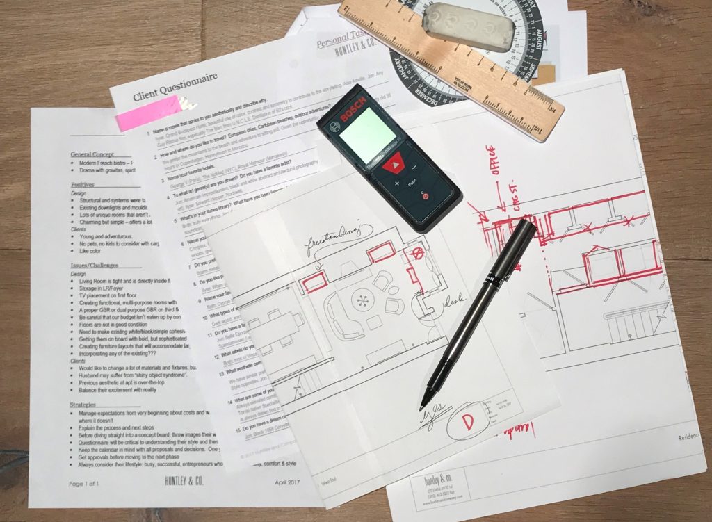
The client questionnaire is a key part of our initial survey and analysis.

// Pulling Together a Visual Story
We pull images that reference our clients’ feedback … and they share photos as well.


TRAVEL // From a honeymoon spot to favorites in Paris and NYC, these hotels topped our client’s list. L to R: Royal Mansour Marrakesh; George V in Paris; The NoMad Hotel in NYC.


FILM // Playful, witty and adventurous. L to R: Lock, Stock and Two Smoking Barrels; Amélie; The Man From U.N.C.L.E.
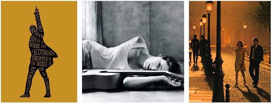
MUSIC // Eclectic and soulful music that bridges time and genres including the Hamilton soundtrack and Carla Bruni’s album, Quelqu’un m’a dit.

 FASHION // Classic, all-American cool c/o Vince, J. Crew and Celine.
INTERIORS // Rich and sleek. Warm and bright. Tailored and organic. L to R: Interior by Joseph Dirand includes works by Anish Kapoor, Pierre Jeanneret and Paavo Tynell; Patricia Urquiola collection for Georg Jensen; a sculptural Alvar Aalto chair; master suite cabinetry seen on Pinterest.

* * *

We love the conceptual stage of a project. Engaging in a thorough deep dive to excavate both the practical and the magical is the difference between a good project and a great one. Stay tuned for our next post where we transition into design development and project management — when we make the concept a reality.
xo, Huntley & Co.

-
Art to Interior
I love art. I considered curatorial studies for a time while in college. During my first exhibit installation, however, I broke two large glass plates protecting a famous photographer’s work. I concluded pretty quickly that “this is probably not for me”. Still, my love affair continued well into my interior design degree and career. There is almost no genre or medium that I don’t appreciate in some way. A 1982 kinetic sculpture and an oil portrait from the 19th century can both stir my senses. It follows then that artwork sometimes informs my designs.

THE STARTING POINT
Essie, Ruby and Ferdinand – Children of Asher Wertheimer, 1902
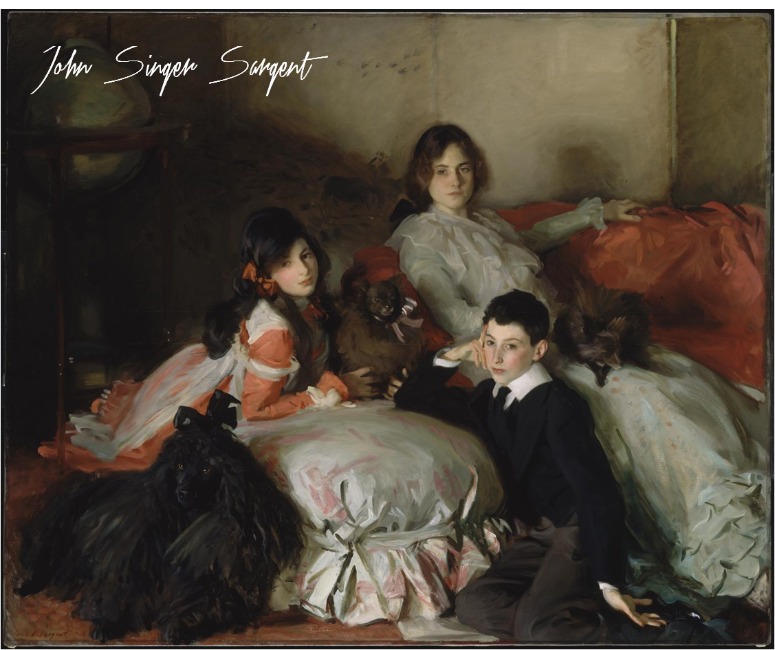
It’s hard to not love Sargent. His oil paintings are lush, moody and undeniably beautiful. I chose this work as a jumping off point for a media principal’s office for its sophistication and intimacy.

THE INTERPRETATION
The idea here is art as muse. I pulled what spoke to me – the colors, tones, textures and emotions. My design is an interpretation of the painting, not a copy of it.
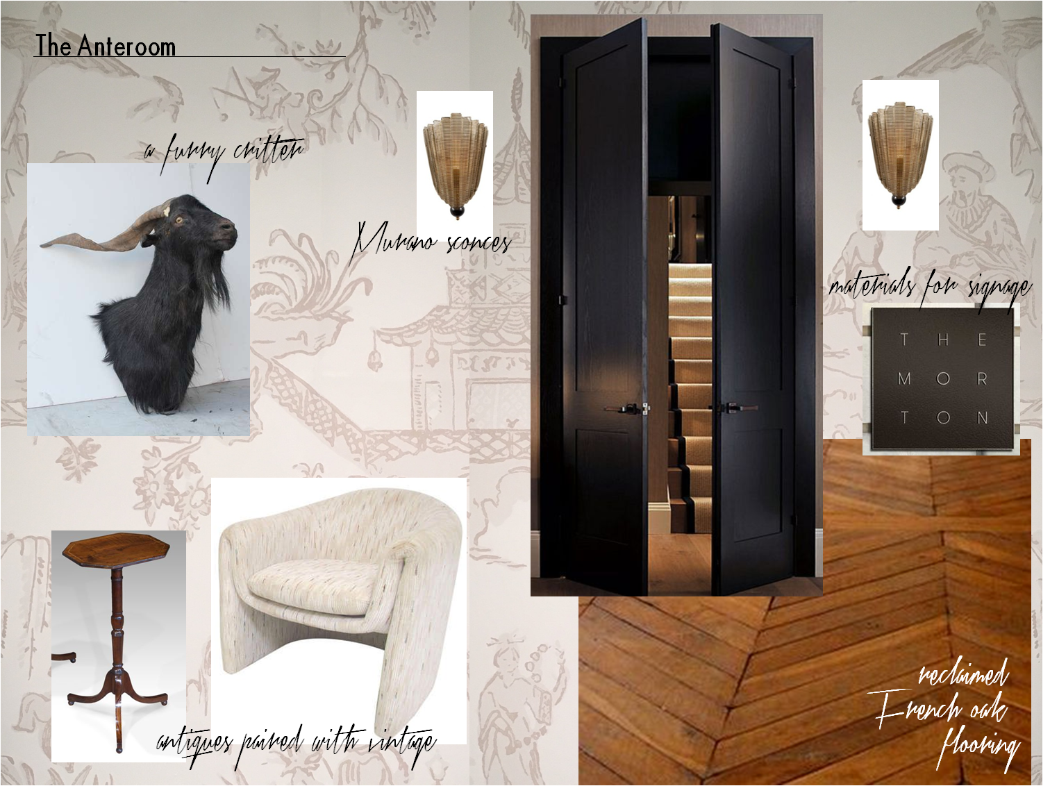
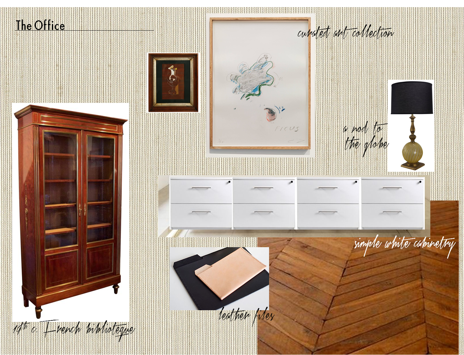
Our client’s office is entered by way of an anteroom. The space is a waiting area for visitors and serves as a buffer between her office and the staff workplace. The finish selections and air of elegance are derived from the Sergent painting. But as this is a modern woman’s office and a Huntley & Co. interior, we changed tack by mixing genres and funking up certain elements.

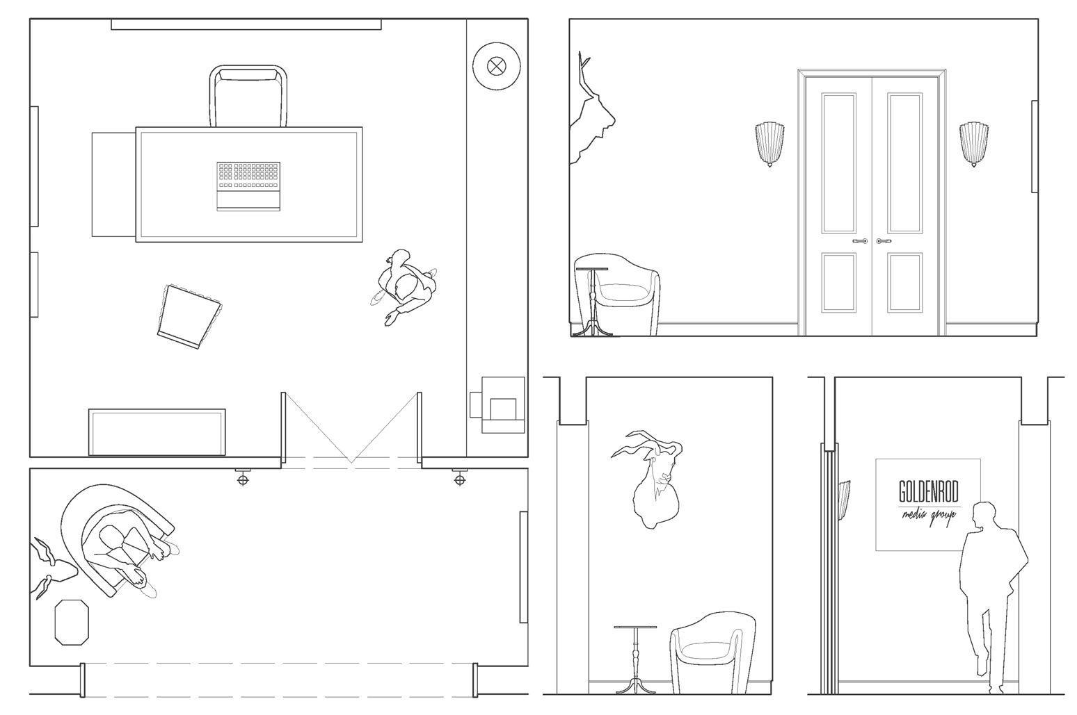
– plan & anteroom elevations –

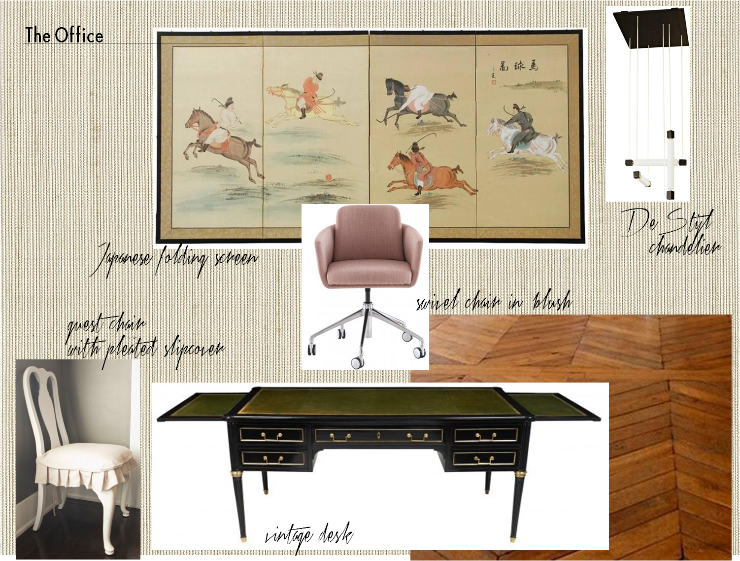

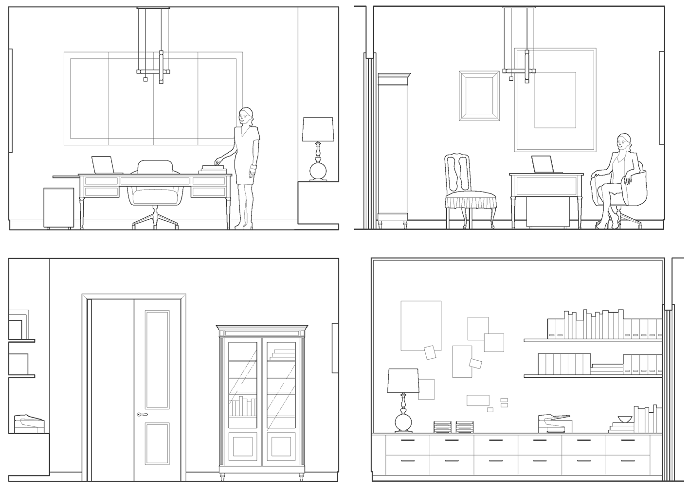
– office elevations –

Our client is a businesswoman and loving mother. She is worldly, feminine and capable – someone who is both interesting and interested. Her combination of sophistication, warmth and strength is part of what has made her a success in her field. With that in mind, we imbued her workspace with a similar sensibility and furnished it with antiques, modern European pieces and an impressive art collection. We think Mrs. Asher Wertheimer would have approved.

Subscribe to our newsletter or find us on Bloglovin’ and you won’t miss a thing.
-
SHOW-HOUSE // FAUX-CLIENT :: PART III
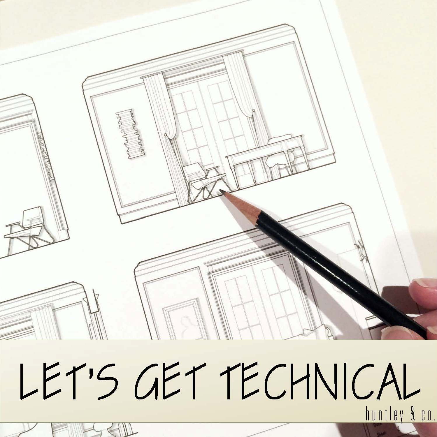
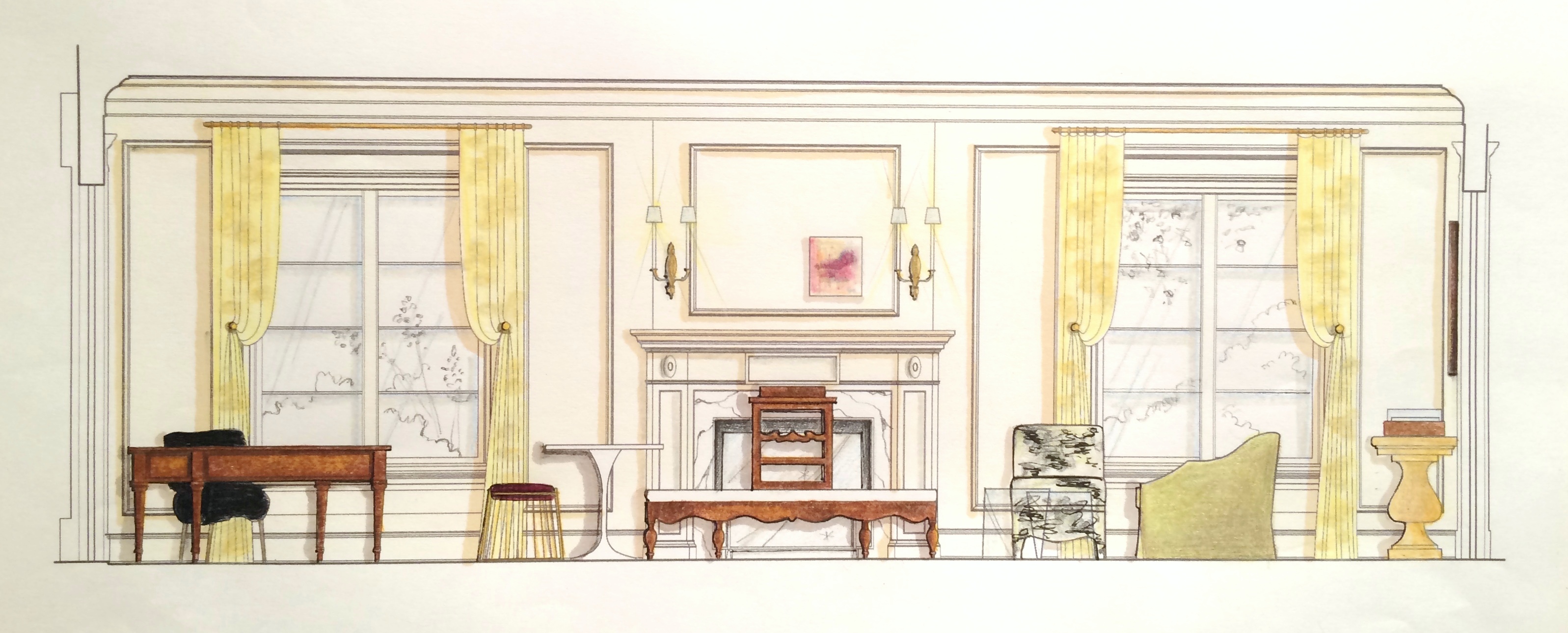
Sourcing goods and materials for our interior fuels our creativity, but drawings take the design to the next level. After all, a room is only as good as it is functional — we aren’t aiming for beauty just for beauty’s sake. Working out our ideas in AutoCAD ensures that we are on target with scale, proportion and spatial relationships. A well-trained designer can evaluate whether a piece will work in a room or not simply by looking at it. Still, transferring its dimensions to paper (or the computer as in our case) ensures down-to-the-1/8” accuracy. Huntley & Co. is a business built on mindfulness and our drawings are the technical backbone of our work.


The Floorplan___________________________
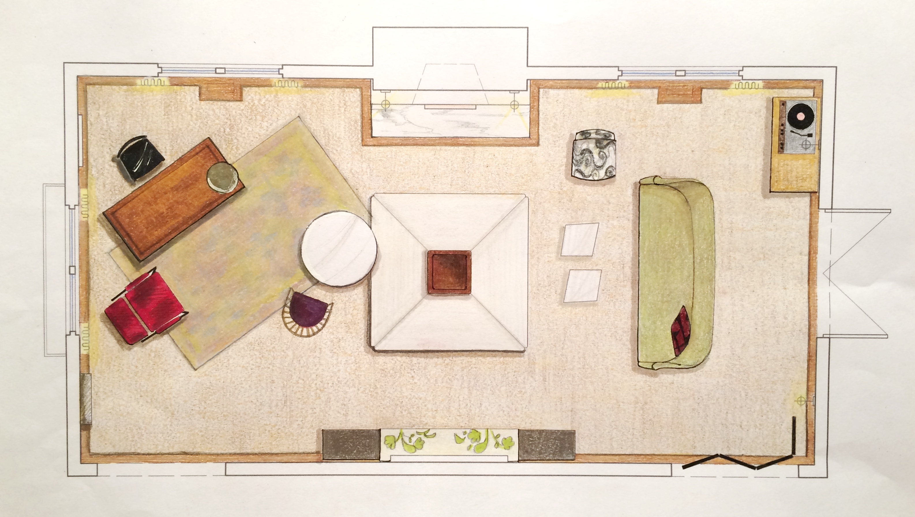
We start with a floor plan, which guides the flow and circulation of a space. With our clients’ penchant for entertaining, it was important to think outside the traditional box and get creative with furniture placement. Our ‘star’ is the four sided bench that beautifully anchors the room. Varied seating arrangements offer opportunities for independent conversations and debate for our clients’ guests who come from a wide range of cultures, professions and political views. The room is meant to be as warm, interesting and thoughtful as the clients are.


The Elevations___________________________
Elevations reveal how a room’s architecture, furnishings and art will work together. A space won’t look or feel good if there are too many masses, it’s too ‘leggy’, everything is at the same level or the values are off-balance. Deep-diving the millwork, fenestrations and other details gives us the platform we need to make good decisions. Not to mention that “pulling the design up” and seeing it come to life happens to be pretty exciting ; )


The Presentation Board____________________
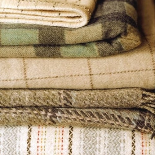
The presentation board is our opportunity to showcase the tactility of a room. Ambience is affected by the ratio of soft vs. coarse, understated vs. luminous and natural vs. refined materials and textures. We wanted this space to feel glamorous, but totally approachable with an air of intelligent wit. With that in mind we combined fibers like linen, seagrass and rushing with velvet and damask. Then we took it a step further by incorporating lacquered leather, eelskin and electric-colored cowhide. This is a luxurious space where you can kick up your feet and have fun!


The Response___________________________
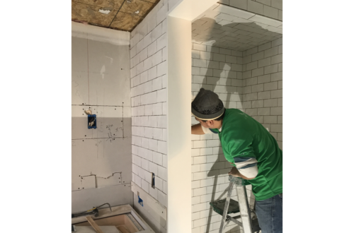
And because these are the dreamiest of clients, they love everything and will TAKE IT ALL! Orders are placed and construction begins. This next phase is about site visits, management, coordination, follow-up and a lot of patience. But we’re getting our hands dirty and seeing our workrooms do their magic — so we love it!


______________________________________________________________________________
Tune in next week for a fun Q&A and the FINAL REVEAL! We will be sharing more insights about our process and the why’s and how’s of a successful design project.

Subscribe to our newsletter or find us on Bloglovin’ and you won’t miss a thing ; )
