-
THE BEST OF LA // DESIGN

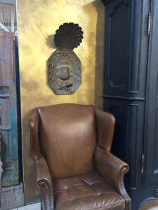
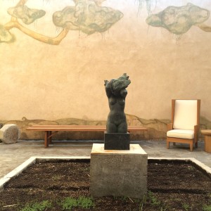
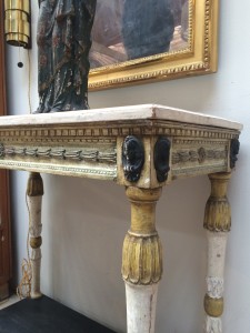
I was in LA recently. It’s the perfect getaway and has everything my heart desires — a warm climate, a cool vibe, a lush and luxurious urban landscape and all the shopping a girl could want. It’s not called the “city of angels” for nothin’ people. For designers, the LA scene offers gorgeous settings, lovely laidback staff and some of the best furnishings in the US. Key streets are Highland, Beverly Blvd, La Cienega, Melrose Ave and Melrose Place. Head to Blackman Cruz, JF Chen, The Window, Harbinger, Hollyhock, Nicky Kehoe, Kelly Wearstler, Galerie Half, Garde, Lief … to name just a few. The east coast is unseasonably cold and Legends of La Cienega is on the horizon, so book your ticket for tinseltown today!


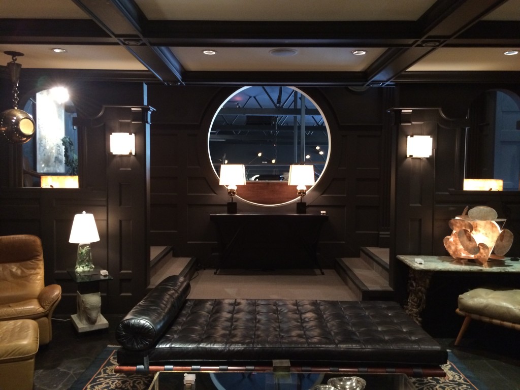
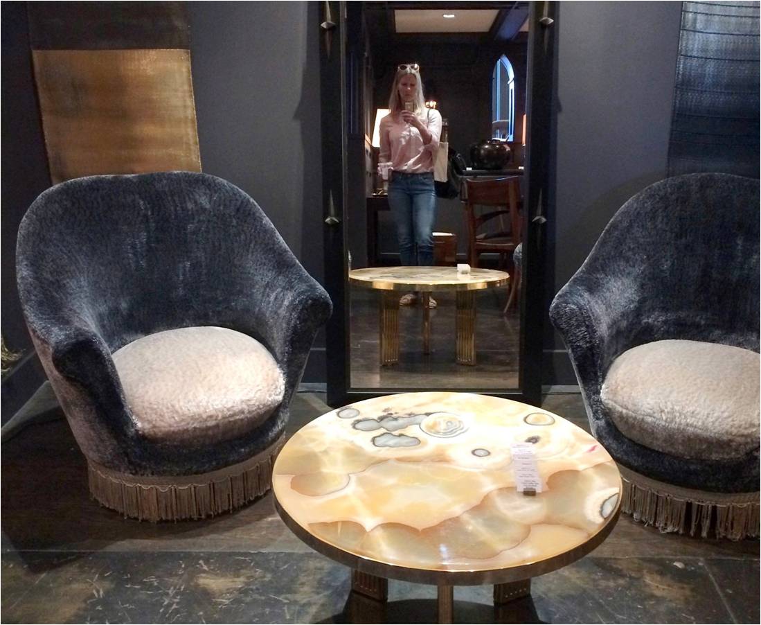
Blackman Cruz


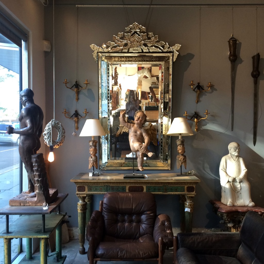
JF Chen


Galerie Half


Nicky Kehoe


Leif


***
And, of course, a little R&R is in store after pounding the pavement all day. One night I met up with a pair of stylish LA friends at Estrella on Sunset to cocktail, nosh and chat about east coast vs. west coast life, business and girlpower. The night ended with an impromptu manager-guided tour through the speakeasy-esque lounges and private screening room. Fabulous.


Estrella
Another night was spent at Wally’s in Beverly Hills reminiscing with a beloved sorority sister. A chic, casual yet elegant vibe with a stellar wine list, amazing menu and, of course, the occasional short-skirted, silicone-injected woman in the corner snapping selfies. Only in LA.

Wally’s
There are so many gorgeous hotels in LA. But for this trip, I wanted to stay in the heart of West Hollywood. The London was a fantastic choice. Nestled at the corner of Sunset and San Vicente; it’s the perfect urbanite location with beautiful décor and superb service and amenities to boot.
![30277746-H1-080611_LWH_ENTRANCE_SHELBY_F3[1]](https://luxeandlucidblog.com/wp-content/uploads/2016/04/30277746-H1-080611_LWH_ENTRANCE_SHELBY_F31-1024x683.jpg)


London West Hollywood

OTHER LUXE & LUCID FAVES TO ADD TO YOUR LIST
HOTELS: Hollywood Roosevelt, Chamberlain, Huntley Hotel, Palihouse, Hotel Bel Air
————–
DINING: Lucques, Fig & Olive, Joan’s on Third, Son of a Gun, Norah (a must!)
————–
COFFEE: Alfred and Urrth in WH, Nespresso in BH
————–
HIKES: Runyon Canyon Loop, Topanga State Park
————–
GALLERIES: Honor Fraser, Blum & Poe
————–
CULTURAL: Huntington Botanical Gardens, Getty Center & Gardens, The Getty Villa
** LA = LOVE AFFAIR and THE BEST OF LA // FASHION offer additional itinerary ideas **

-
THE AD DESIGN SHOW :: TRICIA’S 10
I spent the day at the Architectural Digest Design Show in New York on Friday. It’s always good to see what’s new, talk with vendors and “kick the tires” so to speak. Seeing the finish/scale/construction of products in person is integral to quality control and intelligent design. And, of course, it’s fun. I’ve shared ten best picks — whether it be a specific piece or an entire collection — and why each was worth a closer look.

#1 Van Cronenburg
I am passionate about hardware and this company is stellar. Substance and exquisite detail in every piece.


#2 A Space Wall Sconce
All of the products from A Space – lighting, furniture, vases – are beautiful, but the Falling Star lamp was a show-stopper. It will undoubtedly make a lot of “it lists”.


#3 Archetypal
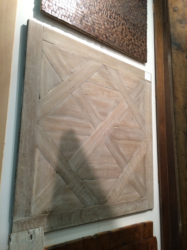
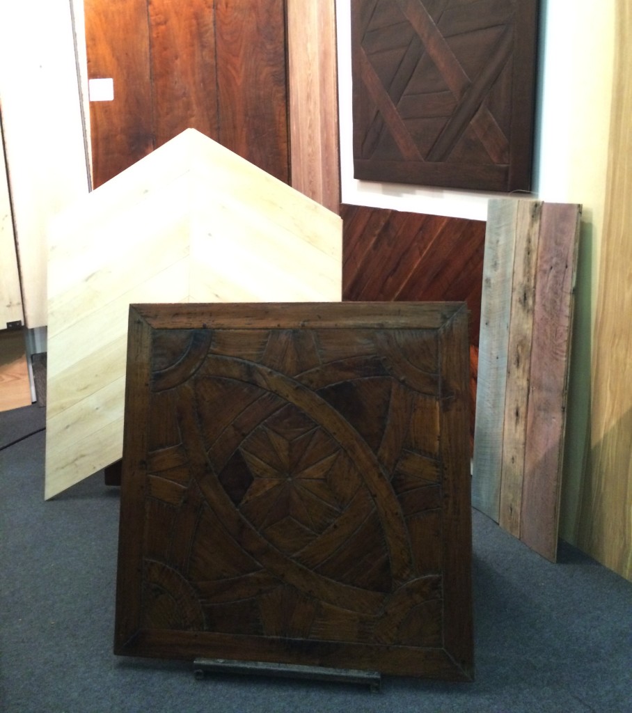
In a perfect world, Archetypal’s work would be on the floors of every home in America. A designer can dream.


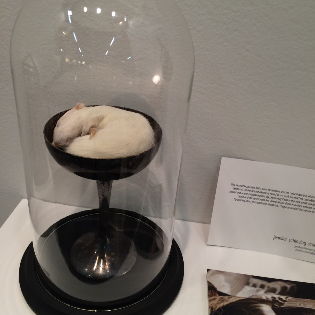
#4 Jennifer Schinzing
Jennifer’s love for the natural world inspired her to learn taxidermy. She preserves small animals (many of them road kill casualties) and transforms them into art installations. The thoughtfulness and beauty of each “memorial” was remarkable. Take note world, SHE IS ONE TO WATCH.



#5 Visilek
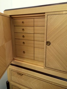
This cabinet was perfection. The veneers, the joints, the mechanics, the proportions were all flawless. Filipe Rodrigues’ work is masterful.



#6 Brizio Faucet
The Brizio Solna faucet. It’s black, it’s functional, it’s sexy … and it’s plumbing. Gotta’ love it.


#7 Jefferson Hayman Photography
I never jumped on the gallery-style art installation bandwagon in design. Perhaps because often times it’s just a bunch of crap thrown up on the wall (yes, I just wrote that). But Jefferson Hayman’s installation at the AD Design Show was simply lovely. The collection was intimate, multi-faceted and beautifully framed. Purchasing the entire installation crossed my mind … and I think that of the gentleman in the photo (yes, I was eaves-dropping).


#8 Coral & Tusk
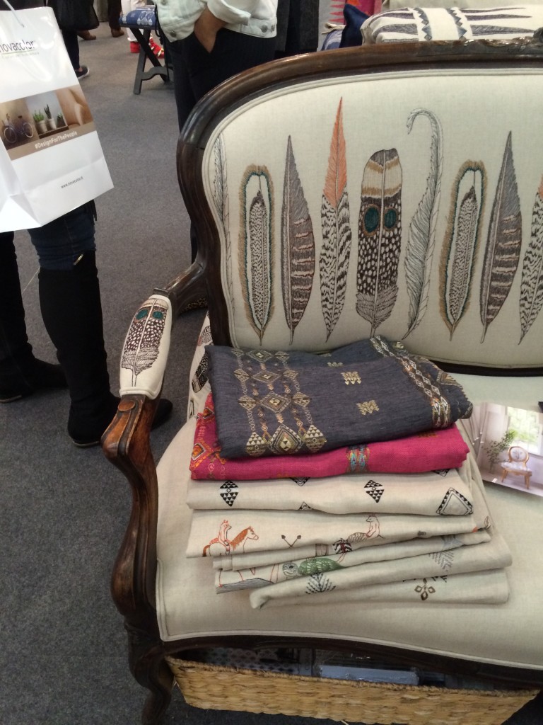
I’m a sucker for animal motifs, so naturally I was drawn to Coral & Tusk’s display. But what’s lovely about these goods is that the patterns are cute without being saccharine. The imagery is grounded by the quality and authenticity of the textiles. Moreover, Stephanie Housley was delightful; her enthusiasm and love for her work was evident.


#9 Joya’s F vs. S Candles
These candles may seem simple, but something about them caught my eye. They whispered [vs. shouted] sexy and luxurious — my personal sweet spot without a doubt. I inquired about an order at the show and pretty much want to purchase the whole collection of fragrances upon seeing the website.


#10 C&B at Dining by Design
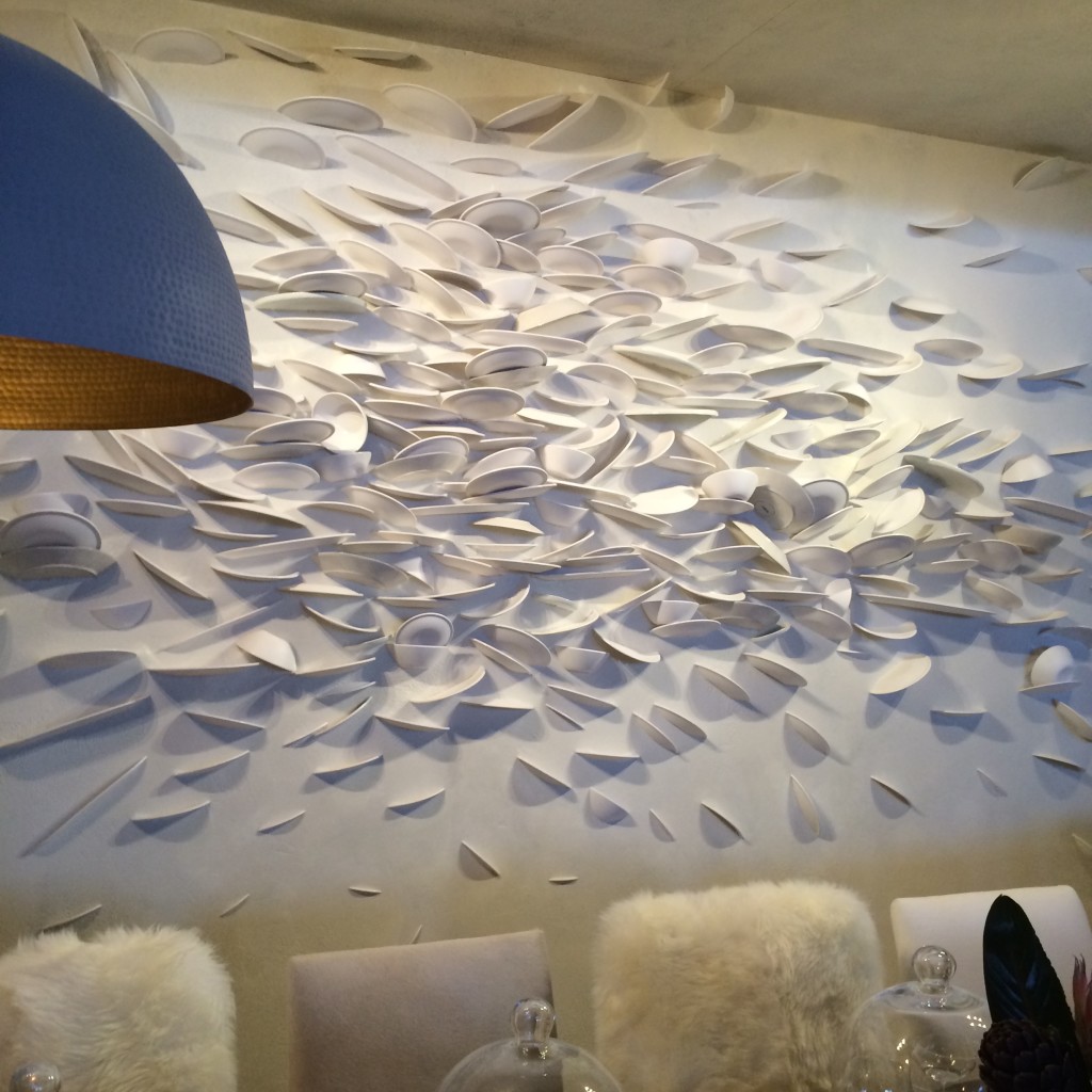
Believe it or not, I am including Crate & Barrell in this list. Their dining room for DIFFA included a brilliant wall “art” installation. How many plates were broken to create this I don’t know. But what fun and how tongue-in-cheek. Kudos C&B.

*All photos are my own save the two that are hyperlinked. Thank you for sharing your beautiful images with our readers.
-
HAPPY 10-YEAR ANNIVERSARY HUNTLEY & COMPANY!

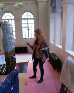
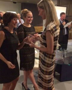
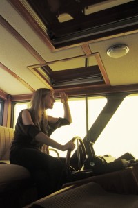
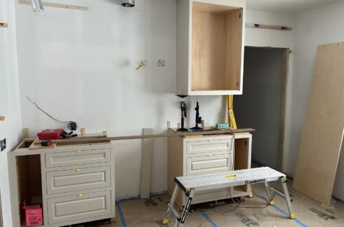
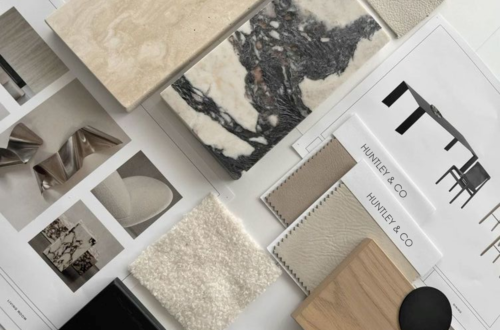
Behind the scenes, spearheading a design firm is not all glamour and bon-bons. The photos below illustrate how often I shift gears and how drastic those shifts are. In a single day I may be generating spreadsheets, drawing in Autocad, conferencing with colleagues, hauling furnishings to a job site and attending an industry event in the evening. 9-5 and consistent this job is not. But it’s always interesting and always challenging. I exercise both my left brain and right brain on a daily basis (not to mention my biceps, quads and glutes!). Problem-solving, schlepping, creating, collaborating … it’s all in a day’s work and a gift to those who love to hustle!

I am fortunate enough to have enjoyed a decade of transformation and collaboration among the best and the brightest in the nation’s capital. Wow and wow. I will be celebrating this milestone with photos and features looking back on the past ten years. There is a wealth of beauty, joy, work and laughter to share.

-
Dark and Inky
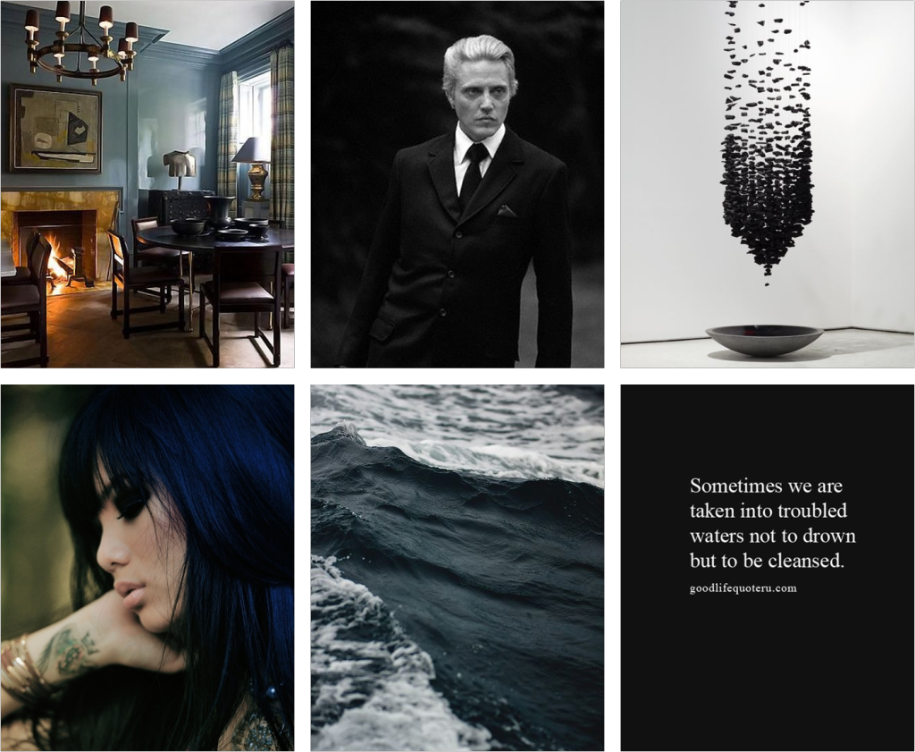
Halloween always inspires me. I relish the drama and suspense of the holiday, not to mention the excuse to go a little goth and watch scary movies. It’s always good to embrace one’s darker side, especially if you lean a little type A. So with all my clean and tailored design tendencies comes a need for what I call “dark and inky”. If you’ve worked with me or for me, you’ve heard me use this term. I am always on the quest for the perfect murky green, garnet or ebonized-blue (and of course black). Whether it’s a lacquered leather chair, a kick-ass pair of aubergine boots or a smokey eye for evening – it just doesn’t get any sexier than dark and inky.

Links and sources for these images and others can be found on the Luxe & Lucid Pinterest board. Happy Halloween!


-
Time for Reflection

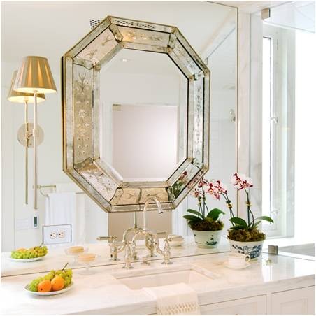
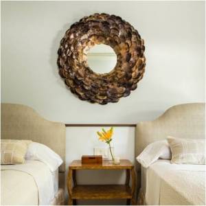
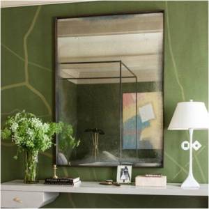
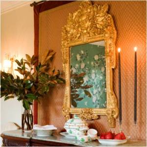
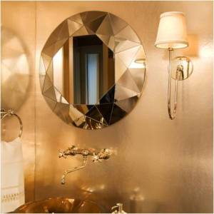
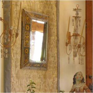
The end of the year is indeed a time of reflection for many. But rather than wax poetic about 2014 and all it meant and what we learned (blah, blah, blah), I choose to look back in a more literal and playful manner. Using mirrors, and the magic of reflection, is one of the most beautiful and effective tools in my designer bag-of-tricks. Regardless of shape, size, provenance or patina – mirrors bounce light, enlarge a space and add a hint of enchantment to any room. So let’s say goodbye to 2014 not with regret or melancholy, but with anticipation for the year ahead and all that 2015 has in store for us … while taking one last glance in the mirror and congratulating ourselves for all that we accomplished this year ; )

| HUNTLEY & CO. REFLECTIONS |
(photography by Kevin Allen, Angie Seckinger & Tricia Huntley)

Wishing everyone a festive new year’s eve!


-
Gifting
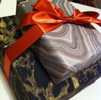
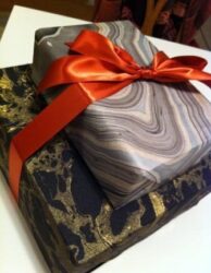
Shopping for Christmas (Hanukkah, etc.) can be a blast when you find just the right gift for your special someone. I’m sharing some of my best finds for those of you who are still on the hunt. Happy holidays!
* Scroll to the bottom for LUXE & LUCID gifts that give back *

| FOR THE AESTHETE |
 Male or female, the key to buying a gift for this type is finding a functional object that is executed beautifully.

Shagreen matchstriker (L); custom knife from Rockin’ One Knives (C); UrbanEars headphones (R)


| FOR YOUR MAN |
He is no doubt handsome, but with these accessories, he will be even more dashing. #hawt


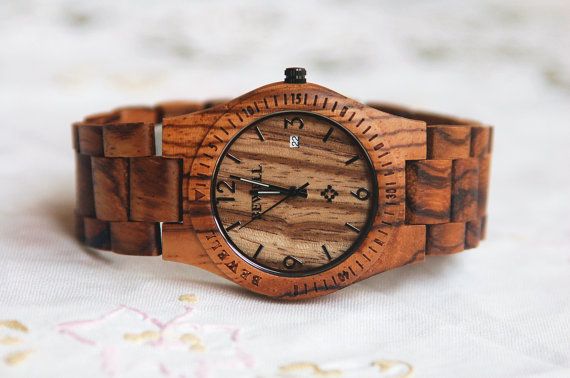
Zebrawood Watch
Aquascutum checked weekender bag.


| FOR THE FEMALE FREQUENT FLYER |
 Add something special to the carry-on of the woman who often finds herself on planes and in airports.
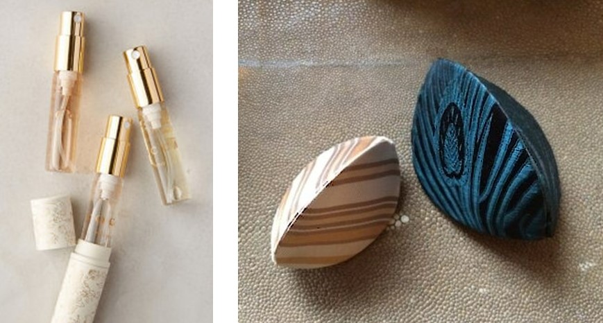
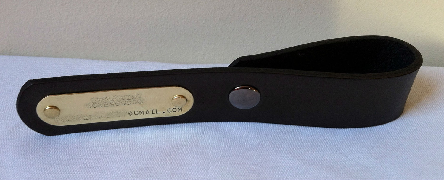
Tocca perfume travel trio (L); Silk earring cases (R); Handmade and customized leather luggage tag (B)


| FOR THE COOL CROWD |
 If you receive one of these gifts, we all bow down to your über cool-ness.
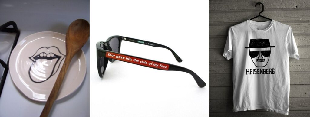
Big Lick spoon rest (L); Barbara Kruger sunglasses (C); Breaking Bad tee (R)


| FOR THE PERSON WHO HAS EVERYTHING |

‘Not Another Bill’

A gift subscription service customized to your or your giftees preferences.
Custom Fonts


Download interesting and original fonts onto your partner’s/parent’s/colleague’s computer


| GIVE A GIFT THAT SAVES LIVES |
Donate to a local shelter or national animal rescue organization in the name of a loved one.


Washington Humane Society (L); PETA (C); ASPCA (R)
** Leave a COMMENT ONLINE and Luxe & Lucid will make a DONATION in your name to one of the organizations listed here. **
-
Light it Up
I enjoyed some exceptional work days last week. I was in Charleston visiting The Urban Electric Company. Urban Electric is a lighting company with a distinctive vision, brilliant products and a stellar team. I have been using their light fixtures in my designs for nearly a decade. In recent years, I started to design custom fixtures for them to produce. In an exciting development last year, UECo chose to select one of those designs for their permanent collection. The “Huntley” was born as a sconce for a client’s Bethesda home and can now can be found in residential and commercial projects in the US and abroad. As part of their BEHIND THE SCENES video series, Urban Electric invited me to Charleston to discuss the Huntley, my other custom fixtures and the method behind my design process. UECo filmed while I toured their production facility, met with craftsmen and talked with the team about what inspires me. I’ve shared our behind-the-scene shots of Urban Electric’s headquarters and the day’s activities in the photo album below.
A sign that embodies Urban Electric’s stylistic heritage and the spirit of their manufacturing environment.
Touring the metalworking areas with the Urban Electric team.
Learning more about each process. Fascinating.
Lantern multiples prior to welding. A craftsman at work.
Detailed finish work on the second floor. Discussing the components of a custom piece.
Individual parts of The Huntley await assembly. A finished Huntley sconce on the shelves.
Pendants and lanterns from the UECo collection hang throughout. Speaking with visionary owner Dave Dawson during the tour.
Filming the interview.
Huntley sconce installations including a Huntley & Co. foyer and a London department store.
(photos at left and right c/o The Urban Electric Co.)
Many thanks to my Urban Electric hosts for their gracious southern hospitality.
Tricia xo
-
The Alchemy of Opposites
I mentioned in my last post that I like a little “rock-n-roll with my ladylike”. That statement describes more than just my fashion sense – it’s a personal credo, a balancing act and the foundation for how I design. Contrasting modern with traditional, sexy with conventional and subtle with provocative allows me to enjoy all the world has to offer. More importantly, it’s the incongruity and tension that makes a room or collection [and even a relationship] sing.

Huntley & Co. interiors.

Mixing pieces that seem incompatible gives an ensemble just the right edge.
(L) Dries Van Noten, (M) unknown (R) Christopher Kane

It’s not easy to find a car when one’s style is epitomized by dichotomy. But this weekend, I actually spotted my dream ride.
I had never seen the Volvo 1800ES; it’s from the early 70s. Part roadster, part wagon. Stylized yet practical. Sexy and a little weird. I AM IN LOVE!

Dynamic duos – Opposites attract and are, truthfully, more interesting.
(L) “Portland, Oregon” blends Jack White’s tinny, rockabilly melody with Loretta Lynn’s old-school country style.
(M) Even more intriguing than Jesse and Walt’s differences on Breaking Bad are their internal dichotomies – troubled yet innocent heroine addict and conservative yet calculating high school teacher.
(R) Marilyn Monroe and Arthur Miller – the love story of a fragile seductress and brilliant playwright.

Food may be the most tangible way to enjoy nature’s complex and complementary offerings.
(L) Apricot stuffed pork shoulder with soy/honey glaze. (M) Figs and blue cheese wrapped in prosciutto. (R) Cannelini bean, salmon and caviar canapes.

Another one of nature’s delicious offerings – MEN!
Polished/scruffy, strong/approachable, sexy/odd, clever/intelligent. Mmmmm, one of each please.
Tricia xo
* You can find these photos and links on my Pinterest page *

-
NYFW
New York Fashion Week is coming to a close, and like so many, I’ve spent a significant amount of time trolling the internet looking at all the glorious goods. I like to think I have a healthy relationship with fashion. I’m not a slave to it, but I do enjoy pulling together my ensembles. I love to mix styles and textures to give my look just the right amount of attitude. Fashion is a form of expression much like interior design. The upside is that it offers immediate gratification and I can switch up my style every day if I like to suit my mood. That’s a nice change of pace for someone who works in an atmosphere of planning and permanence. I’ve saved some of my looks from the past year along with a few of my favorite online fashion “clippings” for posterity. If there’s a common thread among them, it’s contrast. I like a little rock-n-roll with my ladylike and a bit of humble with my glam.
Now for the real deal.
Tricia xo
-
Garnet & Goats
Hmmm, January. This can be a challenging month. The holiday sparkle has worn off, a little too much winter lies ahead and we’re all a whiter shade of pale. I agree it’s tough to feel motivated when it’s cold and dreary outside and happiness is Haagen-Dazs and a Snuggie on Friday night. However, I’m a January baby and a Capricorn which means I believe from problems come opportunities and there is still reason to celebrate a month as gloomy as this. January can actually offer inspiration. Not in an obvious way, but beneath the surface and outside the box. As with so many things worthwhile, in January you have to dig a little deeper and work a little harder to get to the good stuff.

GARNET
January’s birthstone is like no other. The deep crimson is at once sophisticated and sultry. It has undeniable glamour, yet totally lacks pretention.
Garnet jewelry is always dramatic.
Modern earrings by Caprichosa, antique Victorian brooch, Islamic ring,
This look from Gucci is all about the lips. I have been saving this photo since fall with the intentions of replicating it for a glamorous night.
My current garnet pedicure.
A stunning garnet velvet I used alongside pastel fabrics in a Virginia living room.
And speaking of fabric …
The gorgeous drape of Zac Posen on Naomi Watts at the Golden Globes. She is always red carpet perfection.

JANUS
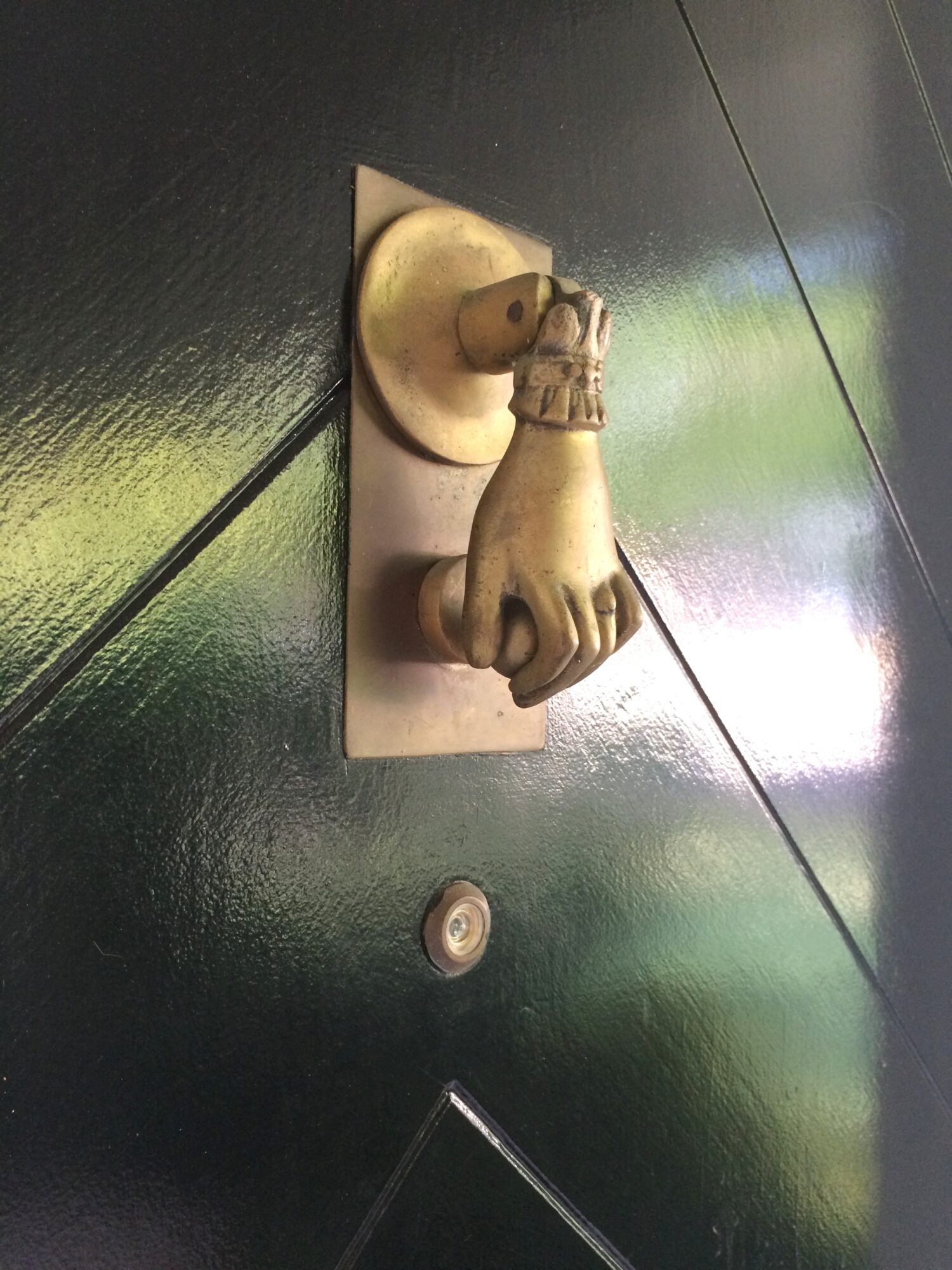
January is the month of Janus, the Roman god of gates and doorways. As a designer and architecture buff, I photograph a lot of gates and doorways … actually more than I realized once I began combing through my files.
– all photos from my life and travels except central image –
row 1: Munich, Los Angeles, Hempel Hotel
row 2: Georgetown, Melbourne residence (via est Magazine), Italy
row 3: Minneapolis Sculpture Garden, Dubuque church, Dumbarton Oaks

THE GOAT
Although January 19 ended Capricorn’s (i.e. the goat’s) reign, it’s never too late to have fun with die ziege.
We found these darling little guys in Montreux.
If there’s one thing most of us like to do in January, it’s eat. And Lord knows, I love me my cheese … thank you goats! Clearly a girl who takes photos of cheese and cheese shops (as seen here) has a thing for chevre.
Goatskin (often referred to as vellum or parchment) is a preferred material of designers and furniture makers both contemporary and past. I gravitate to it myself and have selected several furniture pieces for projects over the years. Like wood or marble, its beauty is innate and born from nature; it can’t be faked.
Furnishings for DC, Switzerland and London Huntley & Co. projects respectively.

WHITES, GREYS & PALES
The colors of winter may seem a bit solemn, but they translate beautifully.
White, grey and pale works in a stark, ethereal European bedroom or in a bar/restaurant on Mallorca.
Moonstone and black onyx rings by Mathilde Danglade.
The concept of black and white in art stretches beyond the medium of photography.
A painting by Picasso, a photo study of a golf swing and a neon installation by Glenn Ligon.

Perhaps the only thing that could entice me to spend an afternoon in subzero temperatures – beautiful, beguiling and utterly happy sled dogs.
Happy January. Hopefully your new year is off to a good start!
Tricia xo



![porcelain-joya[1]](https://luxeandlucidblog.com/wp-content/uploads/2016/03/porcelain-joya11-1024x808.jpg)
