-
New and Improved : Hillcrest v.3
-
Installing Annapolis (ed. 2)
-
Installing Annapolis (ed. 1)
-
West End :: The Reveal

This reveal has been a long time coming. Not because it was only just installed, but because Luxe & Lucid was tied up in a parallel universe after we moved the Huntley & Co. website to another platform. The technical side of small business is the gift that keeps on giving. So we thank you for your patience, and without further ado, we reveal our West End project installation!
* * *

Making it Move-In Ready
———————————————————

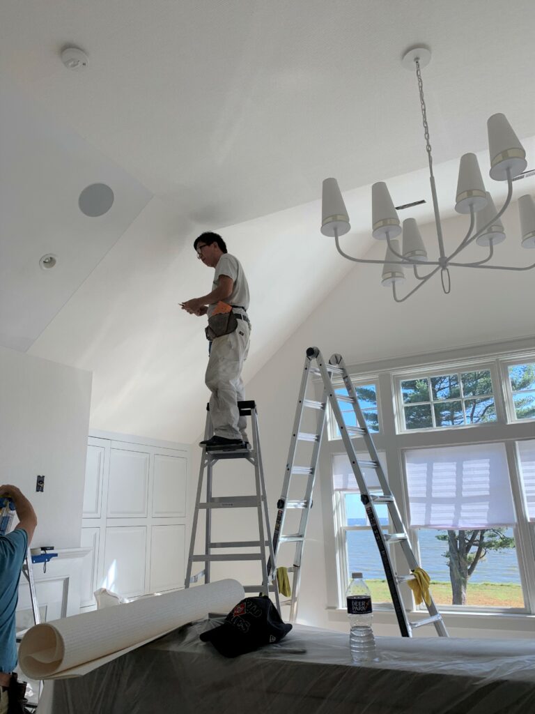
Obviously before our clients can move in, we have to install carpet, light fixtures, wallcovering and window treatments. Then, with our backdrop complete, our team is ready to bring in the furniture and accessories.


(top L to R) Living room chandelier install; Master bedroom carpeting in progress; Wallpaper in the third floor den; Installation of master bedroom roman shades.
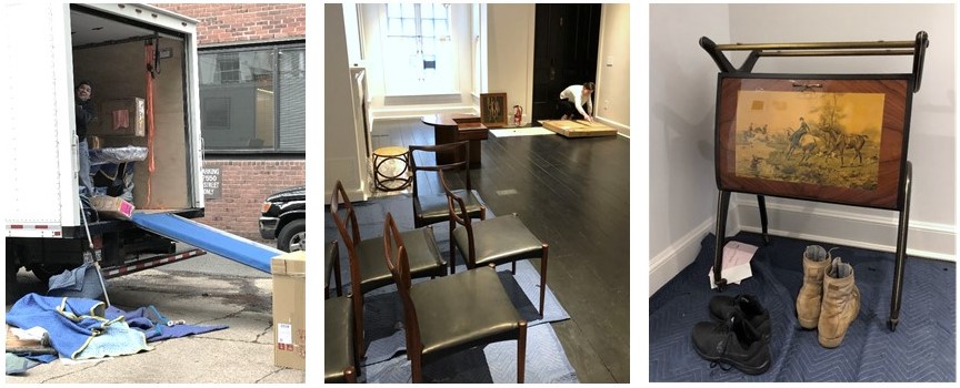
(bottom L to R) The crew unloading the truck; Opening artwork; Vintage Italian barcart.
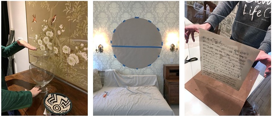
(L to R) Setting the stage with flowers and accessories; Paper template for a tricky mirror install; Preparing a vintage music montage for the dining room.

Welcome Home!
———————————————————
Alas, our vision for a classic interior full of cosmopolitan flair has come to life. This is, hands down, our favorite part of the process!

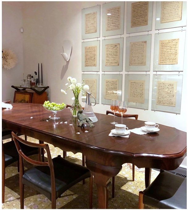
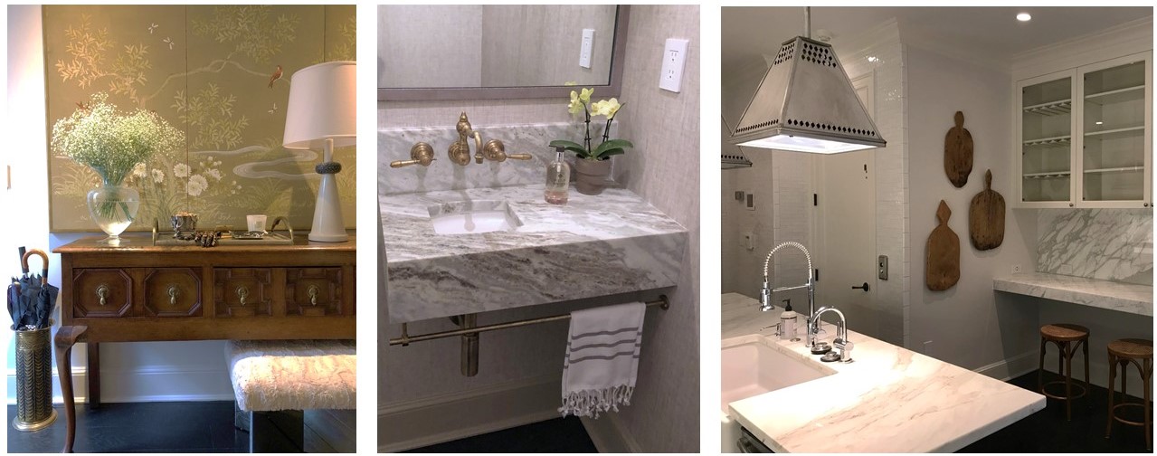
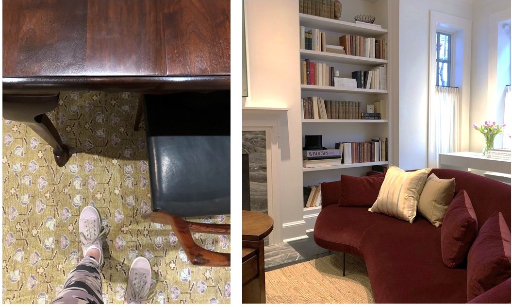
(top to bottom) A custom dining table paired with vintage chairs; Mixed materials in the entryway; A bespoke vanity in a teeny tiny powder room; Unexpected lighting in the kitchen; Dining room details; A chic Italian sofa with lyrical curves anchors the living room.
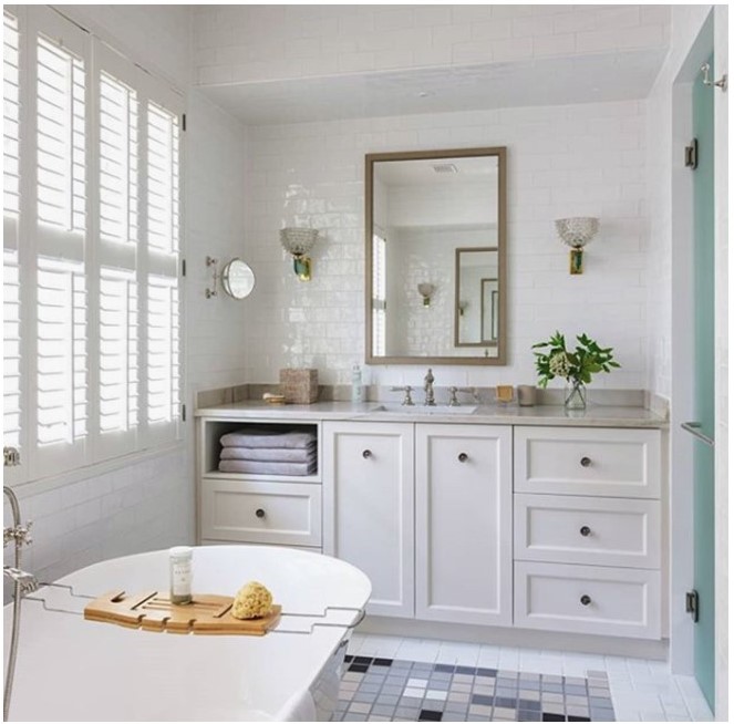
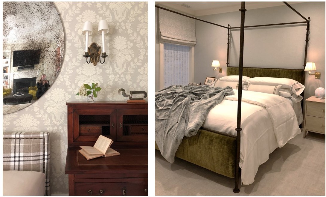
(top to bottom) Master bath wrapped in handmade tiles and featuring vintage lighting; An engaging mix of pattern and texture in the third floor den; Bespoke linens in the master bedroom – how luxe!

And That’s a Wrap
———————————————————
A big thank you to our wonderful West End collaborators. We hate to say goodbye, but we’re off to design more beautiful spaces …

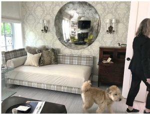
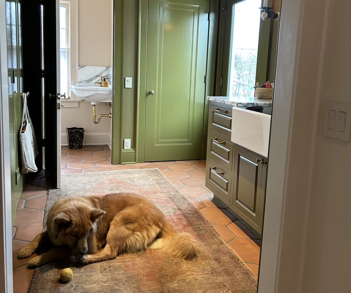
Tricia gives the resident pup, Barney, a tour of his new home.

To see the gorgeous professional photos of the West End project, visit the Huntley & Co. portfolio. Or take it one step further and help us win a Luxe RED award by voting for this project! Voting closes January 25.
xo huntleycodesign

-
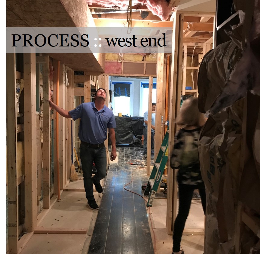
West End Process :: Envelope
For Huntley & Co., the first and foremost concern in design development is the “envelope”. TH can’t talk about it enough! Getting the envelope right – spacial relationships, interior architecture, materials and finishes – means a thoughtful, comfortable home that needs less stuff to look good.

| CONFIGURING THE SPACE |

Reconfiguring an interior is a process – it requires a lot of drawings and plenty of site meetings. It’s important to be as technical and thorough as possible while understanding there will likely be a few surprises and adjustments along the way.
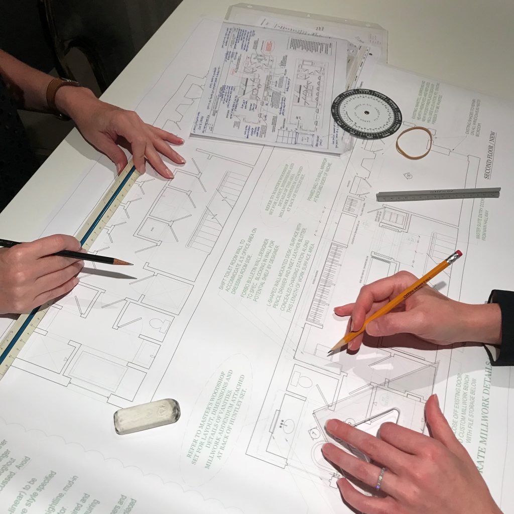
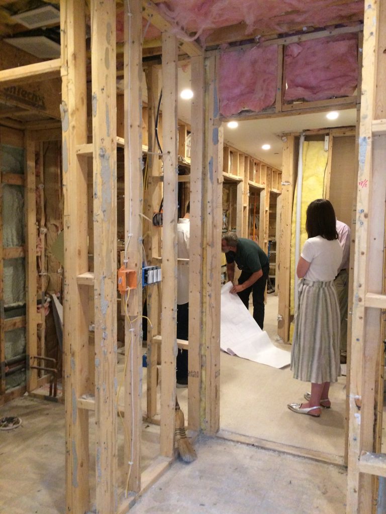
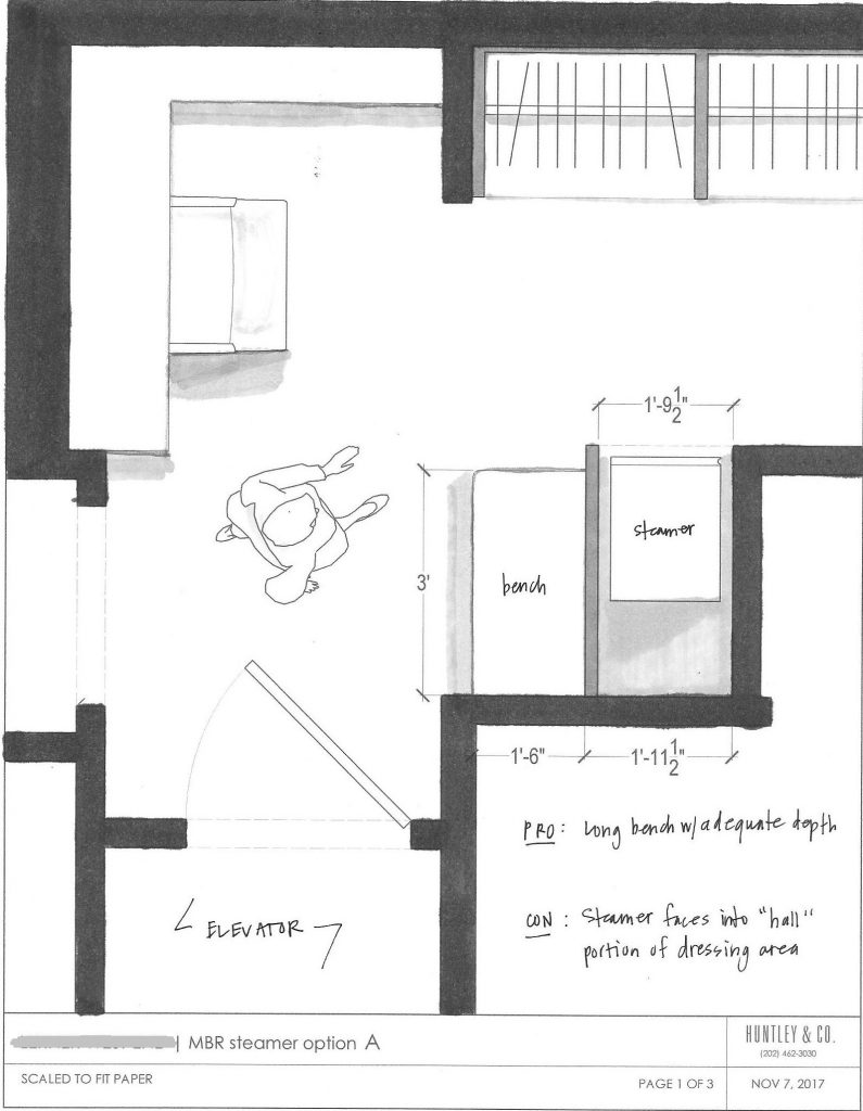
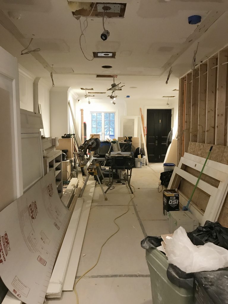
Top photo: One of the pages in the H&Co. drawing set. Bottom L to R: Meeting with the contractor; a study of the circulation in a tight area; drywall in progress.

| MILLWORK |

Millwork is one of the most impactful aspects of an interior. When it’s done well, it can make the house. When it’s done cheaply, it’s like bad teeth – it doesn’t matter how pretty the face is. With this project, our main focus was to reconcile the incongruous architectural details throughout the home and create a more finessed envelope. This included doors, crown, paneling and custom mantels as shown below.

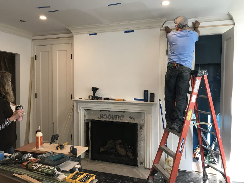
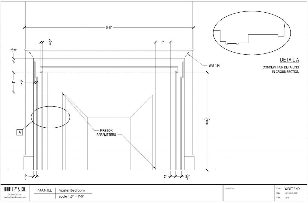
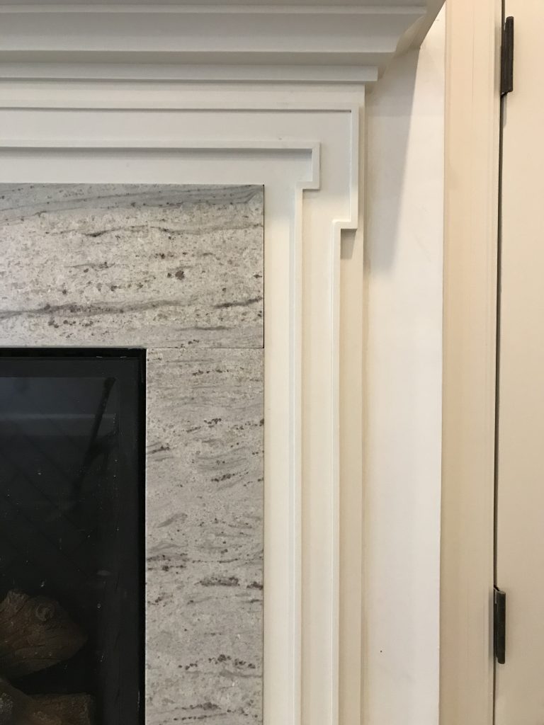
The mantels were designed to complement adjacent millwork for a quieter, more elegant presentation.

| MATERIALS |

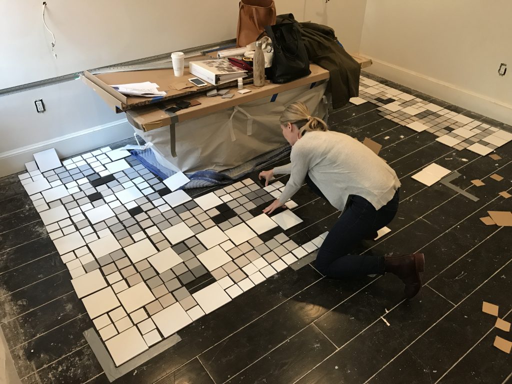
Material selection – wood, stone, tile, metal finishes – sets the tone for the home’s atmosphere and lays the groundwork for decorative elements. When selecting a material, we keep everything else in mind. In a bathroom for instance: Are the windows facing north? What type of glass do the vintage sconces have? How white is the tub? These details are part of the “conversation” and influence what marble slab I approve and tile colors I select.

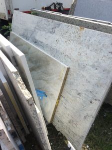
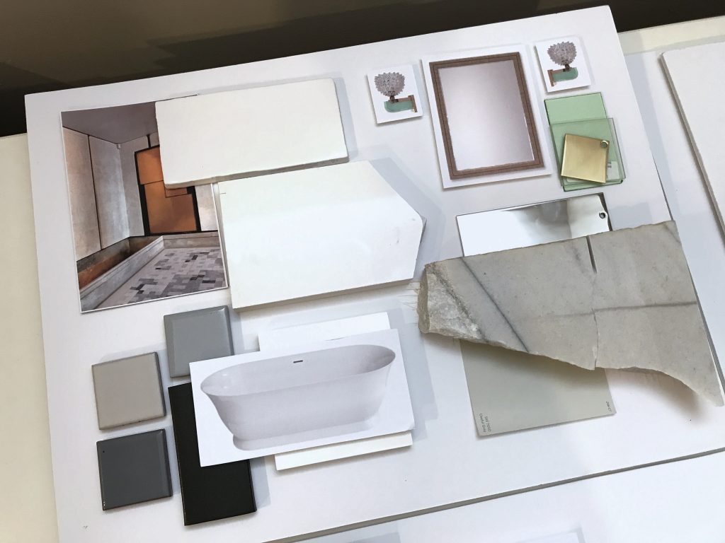
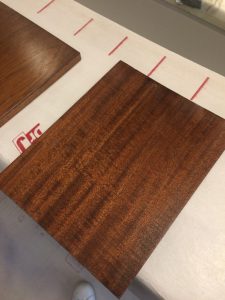
Top L to R: Slab for a fireplace surround; master bath materials, final wood selection for the library.
Bottom: The tile layout for the master bath was a hands-on (and ugh, thighs and knees) process that took several hours. Click photo for a video of the legendary H&Co. attention to detail.

* * *
We hope you’ll join us next week when we’ll share more about the process of specifying furnishings and softgoods! Or take another look at our Concept: West End post to see how this project began.
xo Huntley & Co.

-
EDGEMOOR SUNROOM :: PART IV
The Edgemoor sunroom has required patience, perseverance and plenty of blood, sweat and tears (and bones, but I’ll get to that later). After nearly a year of design and planning, construction finally began in early spring. Starting work was both a relief and a thrill.
With a schedule as protracted as this one, there are plenty of progress photos to share.

From start to finish there hasn’t been a dull moment!


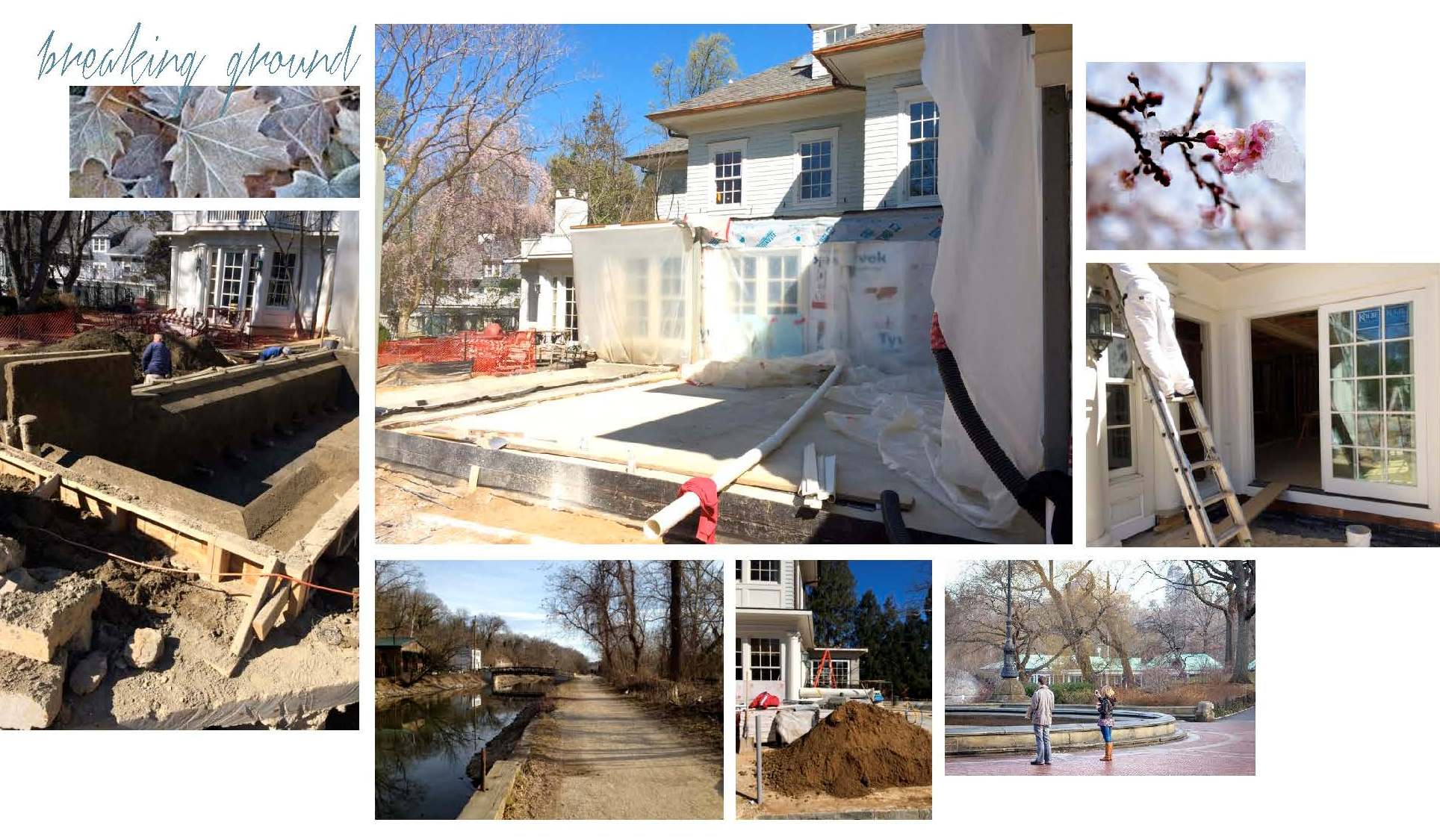
— Breaking Ground —
Construction crews arrived at the end of February to dig, set drainage lines and pour the slab for the sunroom. The most dramatic transformations start with a lot of dirt!

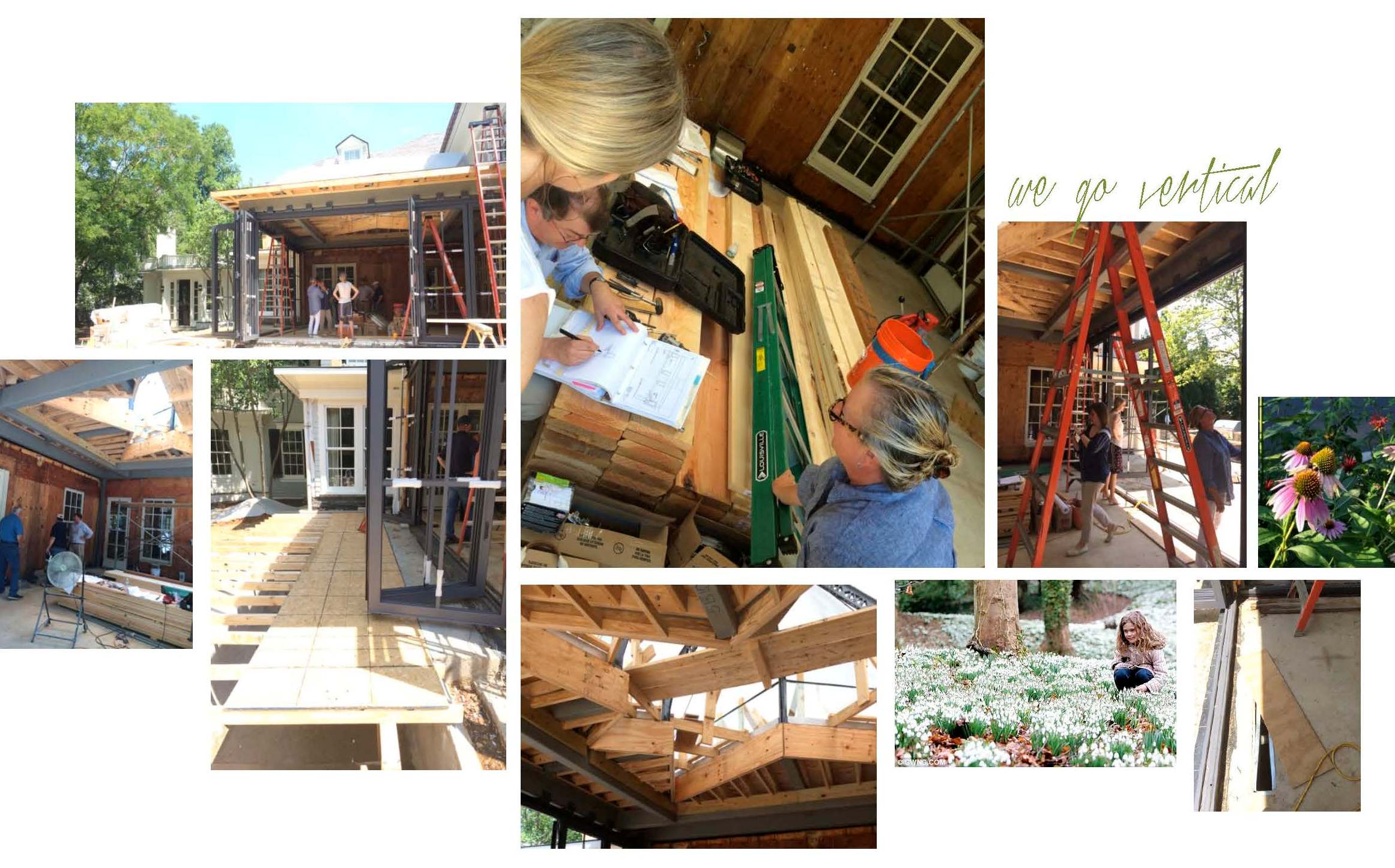
— Movin’ on Up! —
Once July arrived, the building finally started to take shape. Remember that patience we mentioned? This phase of the project is all about oversight and troubleshooting as needed. We made several site visits and met everyone from the tile installer to the drapery fabricator to review drawings and inspect details. It may seem unusual to discuss softgoods in a room without drywall, but spotting architectural modifications early allows us, and our workrooms, to modify plans accordingly.

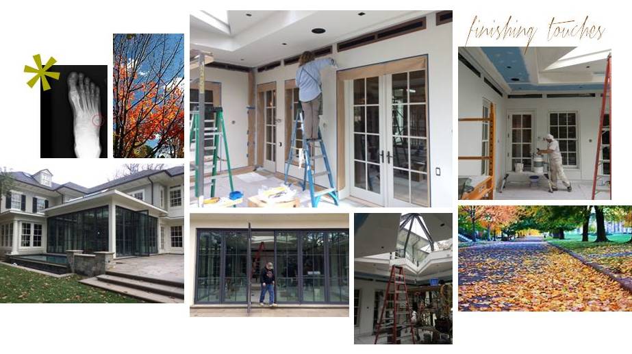
— Finishing Touches —
As you can see in the pictures below, work continued into the Fall. Still, we were happy to have a room with walls, trim, windows and doors — not to mention a massive, one-of-a-kind skylight overhead. With the space enclosed, we were ready for paint and decorative finishes. We enlisted Julia from Monkton Studios (below) to dress the room in a beautiful knockback plaster, adding warmth and subtle dimension to the envelope.

Interior design is often associated with drama. True, but we usually try to avoid it if we
can. Unfortunately, at one of the many site visits, Lindsey fell into an open floor vent
(ahem, a hidden open floor vent that is). Thanks to a broken fibula and fifth metatarsal,
the Edgemoor project is officially going out with a CRASH-BOOM-BANG!
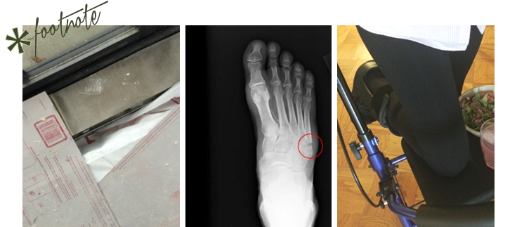
(L) the offending floor vent sans cover; (C) post site visit x-ray; (R) masterful use of the Rollator Walker

… Installation day is TODAY.

-
show-house // faux-client :: the reveal!
We know you and our fabulous faux clients have been waiting for our big reveal. The design process is nothing, if not, an exercise in patience. From concept to installation, interior design requires vision, tenacity and know-how. It’s a labor of love, but labor nonetheless. So when the time finally comes to present our clients with their dream home, our excitement is hard to contain. This particular dream home is ‘faux show’, but the thrill of the reveal remains the same … So without further ado!

— THE 2016 FAUX HOUSE REVEAL —

[ Our clients seem pleased ]

* * *

— DESIGNER Q&A —
Our Huntley & Co. clients and room may have been crafted from imagination,
but they do speak to the real methodology and design vernacular of our firm’s work.
Here, principal Tricia Huntley, opens up about her influences, the importance
of breaking the rules and the best song to get a party started.

1. What are some of the things that influence you, aside from furniture and décor?
Museums, music, fashion, history, parks/nature, architecture, poetry … those things that are thoughtful, provocative, moving. I like to start with a feeling or mood before I pivot to the tangible aspect of things.
2. What qualities of a room do you most admire?
Substantial hardware and appropriate, expertly executed millwork. I would rather live in an empty house with those two qualities than a shoddy new-build with the best furniture.
3. Design rule you love to break?
Symmetry. I was classically trained so I believe in building a space according to the rules of symmetry. But I also believe that breaking that symmetry in clever, nuanced ways is what brings a room to life.
4. You know these clients will be having many a fete, what’s a good hostess gift?
I love to give sophisticated, unusual candles and fragrances. Aedes de Venustas, Joya and Santa Maria Novella all offer intriguing scents in stunning vessels. And of course, good booze and wine never go out of style. Add a beautiful ribbon with a handwritten tag and you’re done.
5. Rapid Fire!
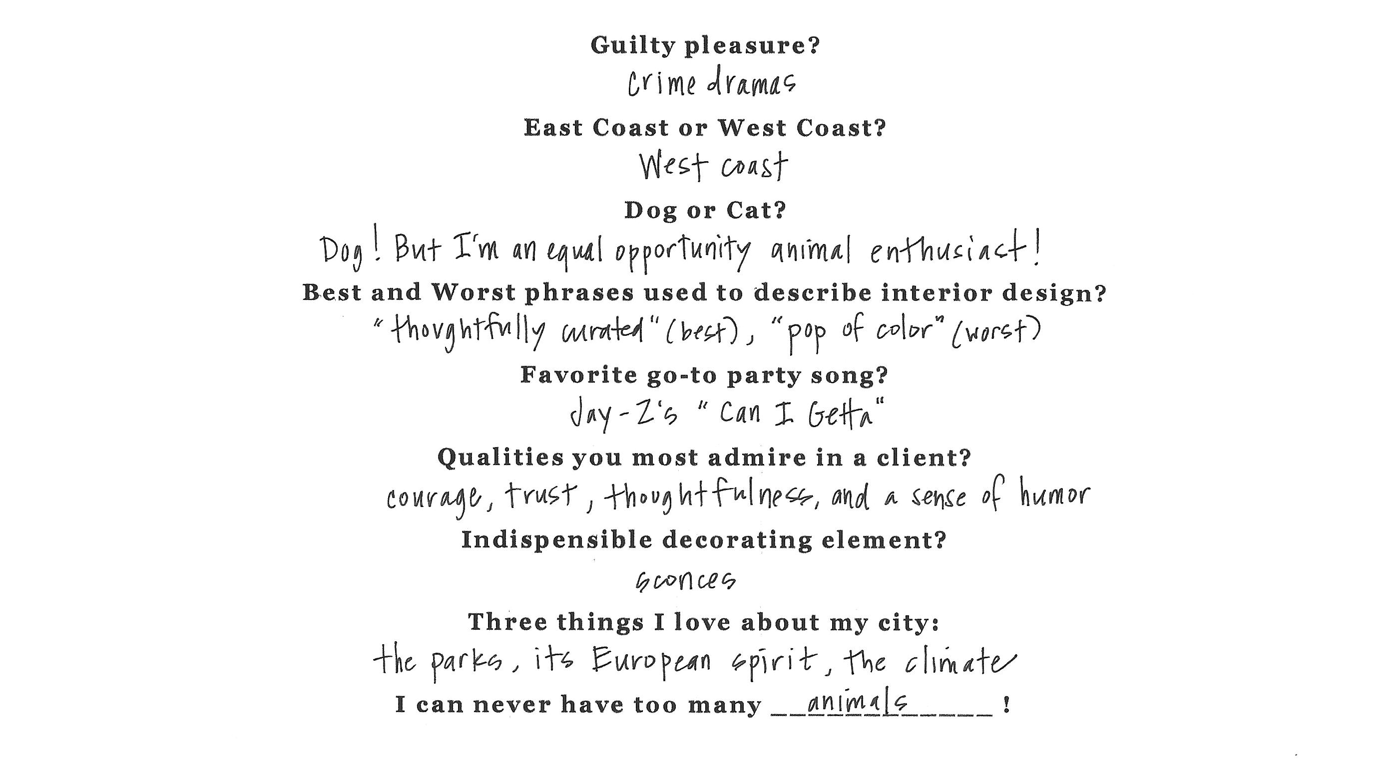
* * *

It’s been fun, but we need to dash! Our clients told us to get out so they can enjoy their new home ; )

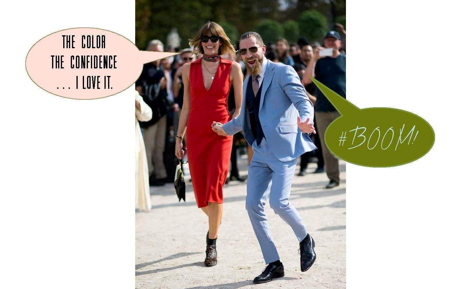
If you want another glimpse at the process, simply click on posts Part I, Part II and/or Part III. And special thanks to our “faux clients” Justin O’Shea and Veronika Heilbrunner. They are the coolest couple on the planet and dream clients fo sho!
