-
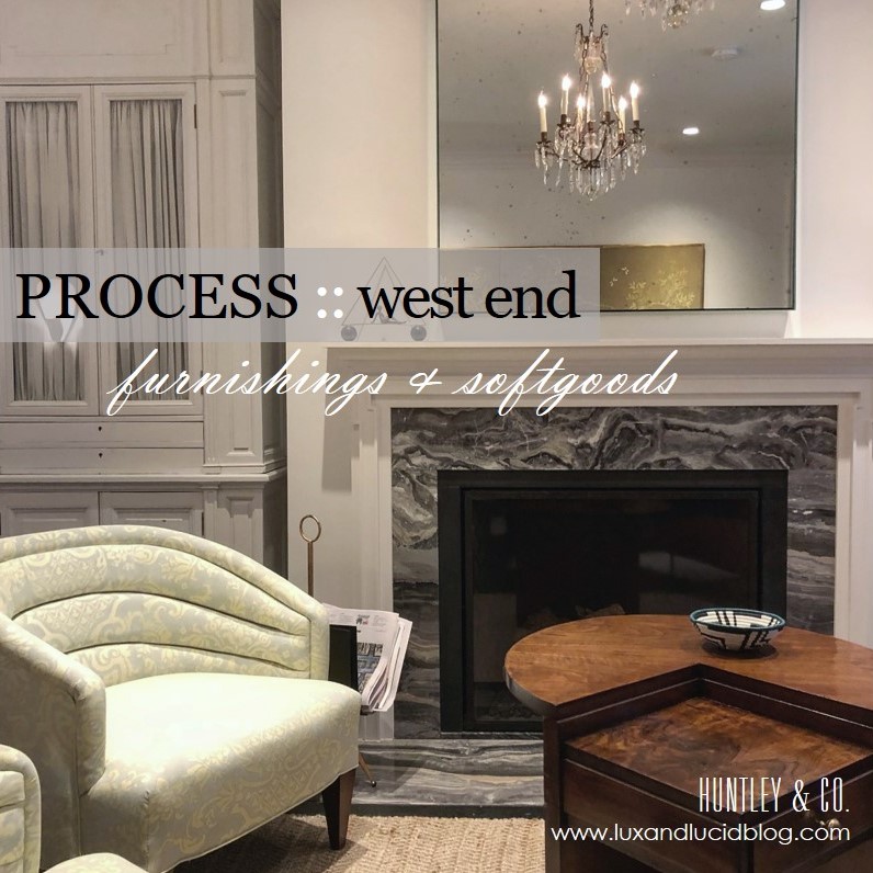
West End Process :: Furnishings
Bespoke, turn-key interiors are a signature of Huntley & Co. First, the architectural envelope and materials are perfected. Next, we turn our process to furnishings and softgoods that complement the space and the client and are unique to the project. Lots of love and labor goes into the design, drawing and specification of these goods.

| FURNISHINGS |
// Living Room channel-back chairs
We custom designed a pair of channel back lounge chairs to maximize flow, circulation and style. Visits to the workroom gave us the opportunity to make adjustments to the design, layout fabric and to monitor progress.
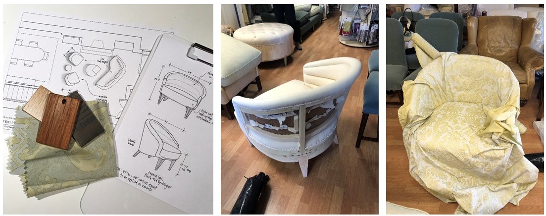
L to R: Leg finish selections; our chair frame gets mocked up in muslin; laying out the large scale fabric.
// Living Room armoire
We source a lot of antique and vintage furnishings for our projects. Sometimes, however, these pieces need modifications to “fit”. This armoire was the perfect scale for the open concept living area and provided much needed storage, but modification to the finish and interior were necessary. New hardware and shirred curtains turned this beauty into functional storage.
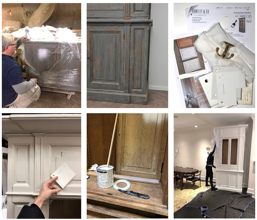
L to R: Removing the old finish; specifying all the new details; installation in progress.
// Master Bedroom canopy bed
Each project has its share of logistical challenges – and we love a good challenge because it inspires us to get extra creative. Our process never leaves things to guesswork. When we discovered that the bed, as originally designed, could not be brought up the stairs or through the windows, we had to go back to the drawing board (literally) to custom design a version that would fit.

L to R: Verifying stairwell and doorway dimensions; studio drawing of the custom pieces and parts; Ironware‘s workshop with assembly pre-shipment.
| SOFTGOODS |
// Master Bedroom roman shades & softgoods
Tailored, functional, bespoke. We designed the window treatments and pillows to complement the quietly sophisticated scheme in the master bedroom. Troubleshooting tricky corners and sourcing one-of-a-kind details makes all the difference.
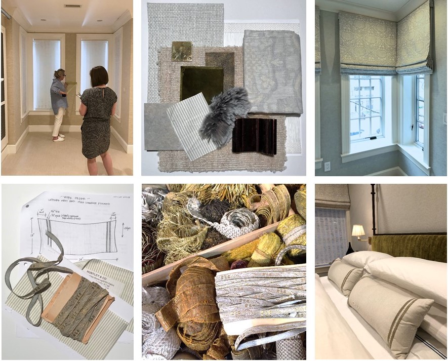
Top: Detailed site measures and schematic review; finished product! Bottom: A pillow workorder; a treasure chest of trim; a well-styled bed.
Stay tuned — Next week we’ll bring this project full circle and share our install with you! And in case you missed the other West End posts, check them out here and here.
xo, Huntley & Co.
Subscribe to our newsletter or find us on Bloglovin’ and you won’t miss a thing ; )
-
West End Process :: Envelope
For Huntley & Co., the first and foremost concern in design development is the “envelope”. TH can’t talk about it enough! Getting the envelope right – spacial relationships, interior architecture, materials and finishes – means a thoughtful, comfortable home that needs less stuff to look good.

| CONFIGURING THE SPACE |

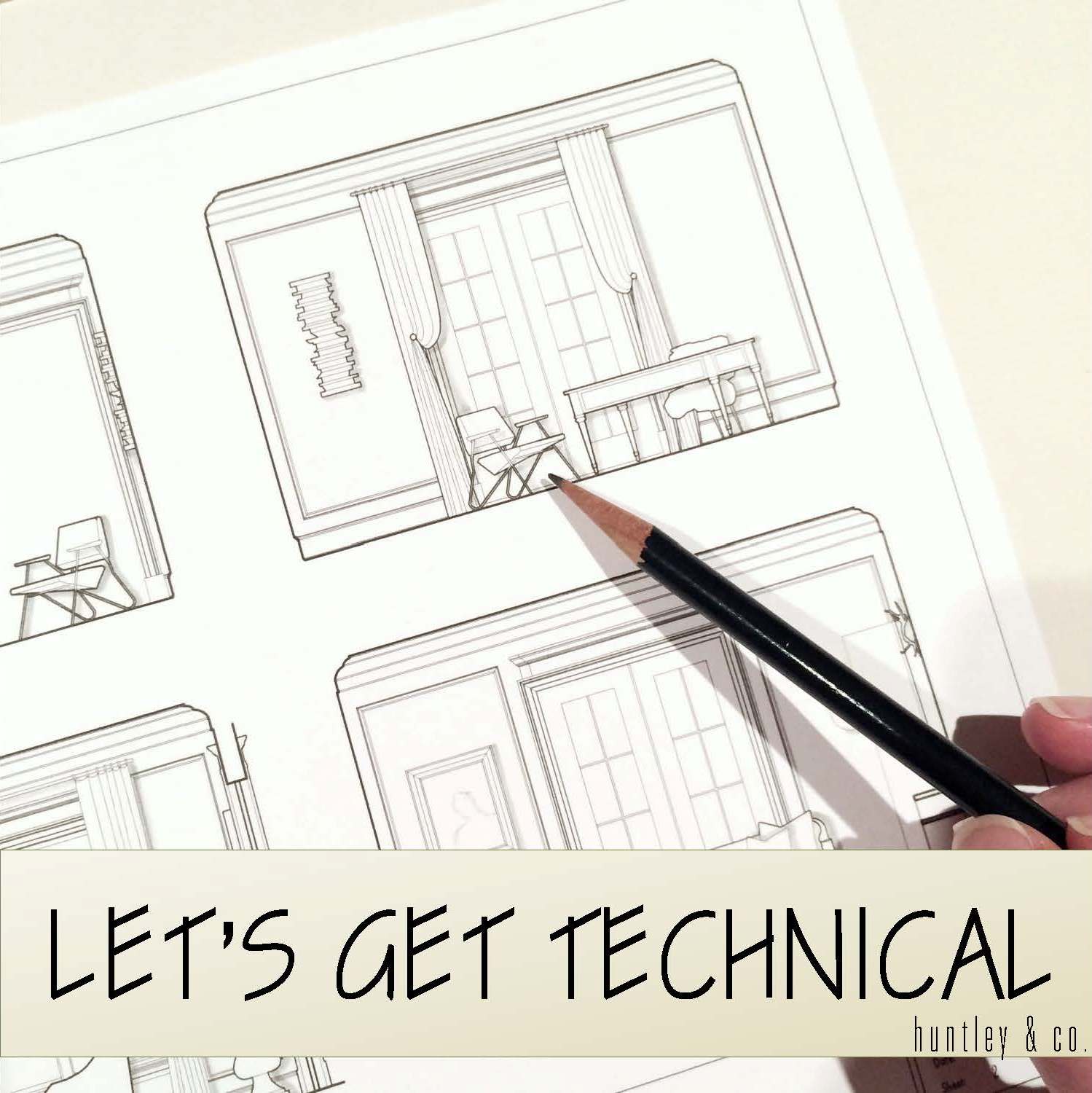
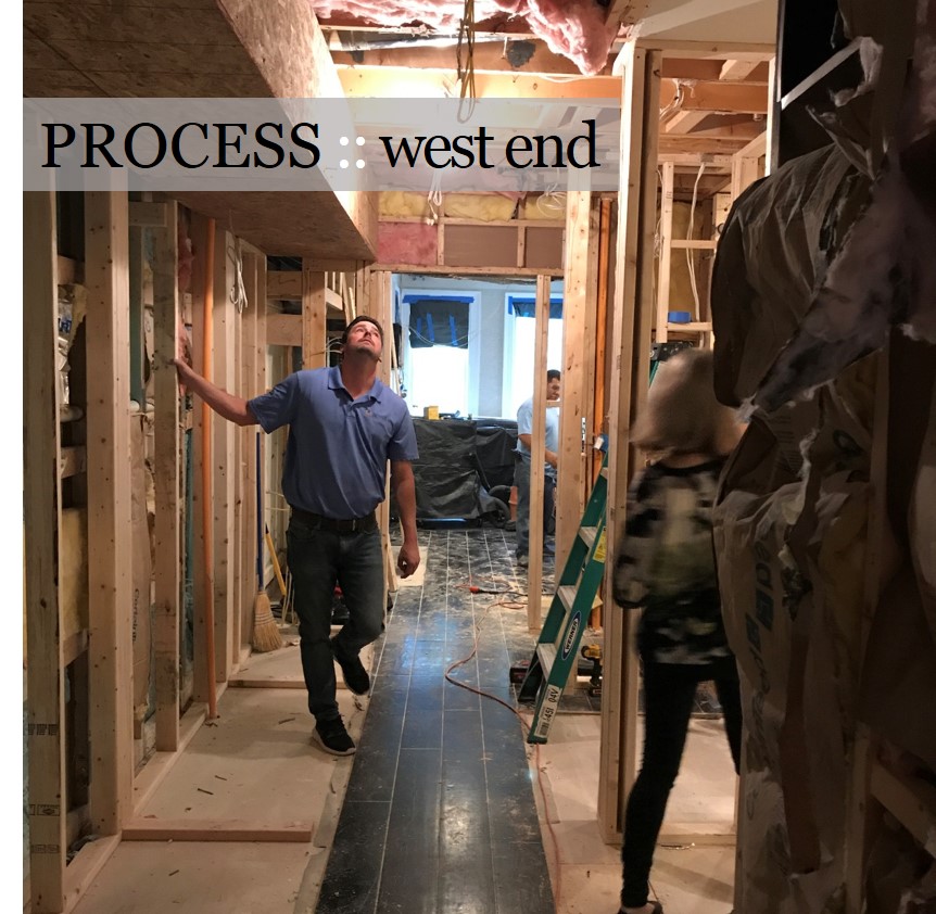
Reconfiguring an interior is a process – it requires a lot of drawings and plenty of site meetings. It’s important to be as technical and thorough as possible while understanding there will likely be a few surprises and adjustments along the way.
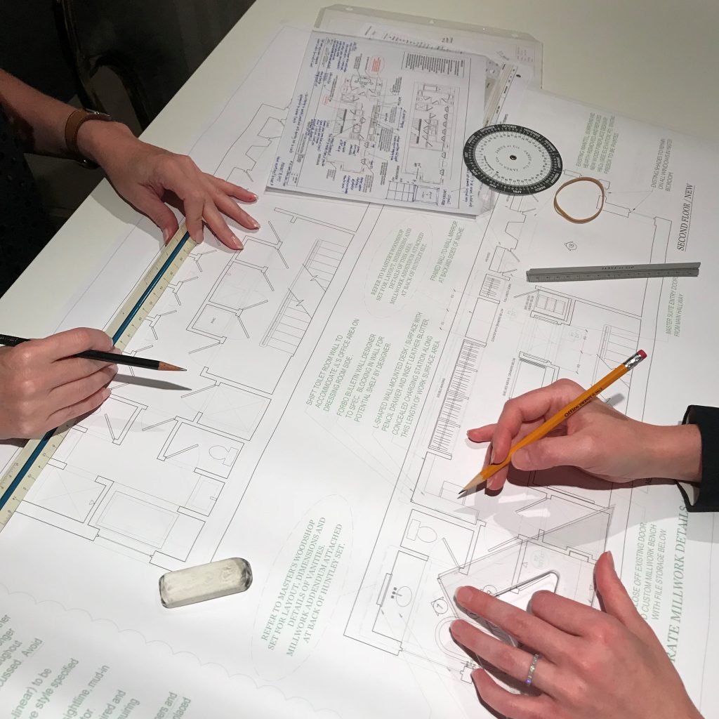
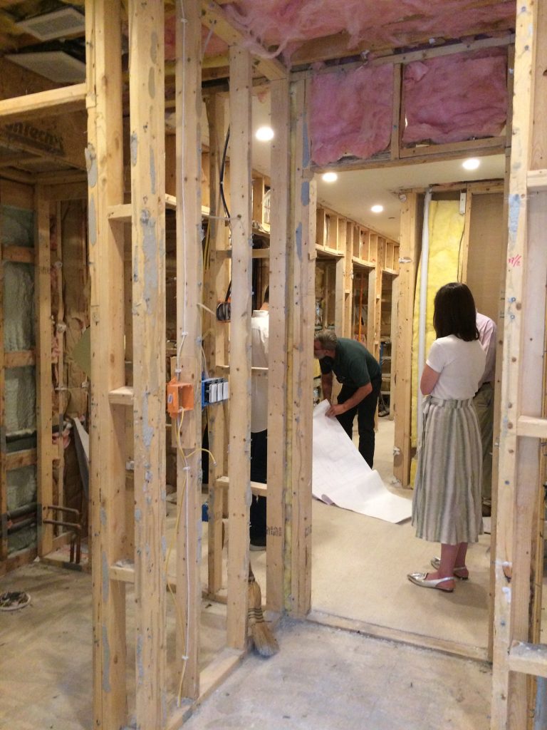
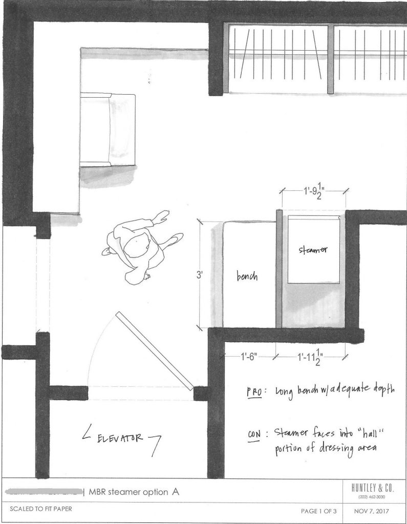
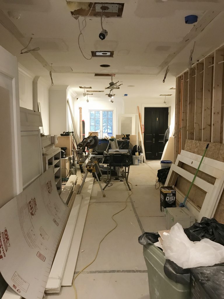
Top photo: One of the pages in the H&Co. drawing set. Bottom L to R: Meeting with the contractor; a study of the circulation in a tight area; drywall in progress.

| MILLWORK |

Millwork is one of the most impactful aspects of an interior. When it’s done well, it can make the house. When it’s done cheaply, it’s like bad teeth – it doesn’t matter how pretty the face is. With this project, our main focus was to reconcile the incongruous architectural details throughout the home and create a more finessed envelope. This included doors, crown, paneling and custom mantels as shown below.

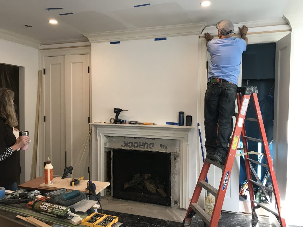
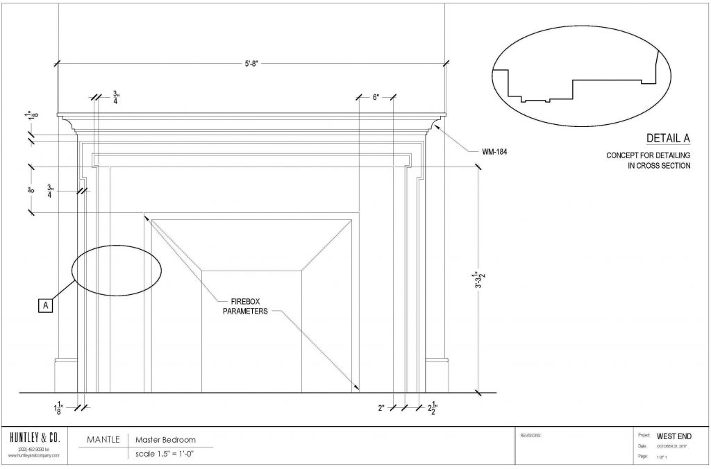
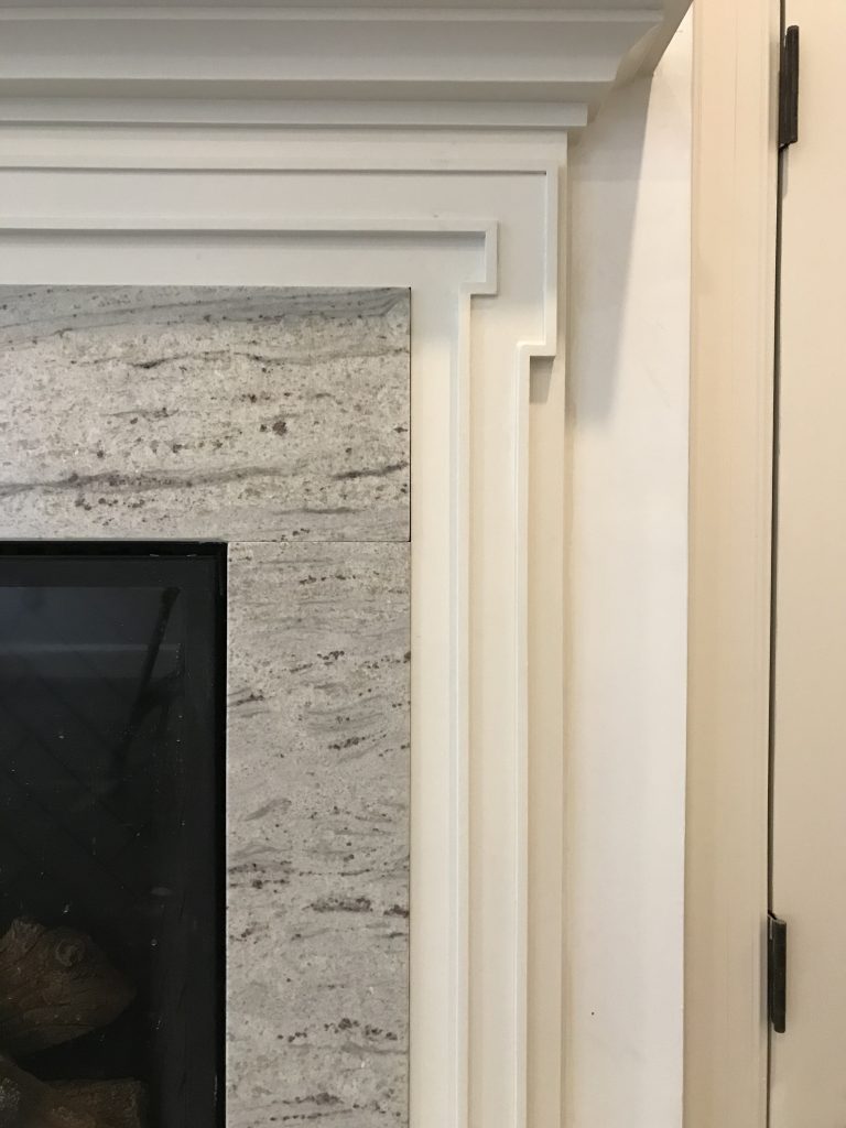
The mantels were designed to complement adjacent millwork for a quieter, more elegant presentation.

| MATERIALS |

Material selection – wood, stone, tile, metal finishes – sets the tone for the home’s atmosphere and lays the groundwork for decorative elements. When selecting a material, we keep everything else in mind. In a bathroom for instance: Are the windows facing north? What type of glass do the vintage sconces have? How white is the tub? These details are part of the “conversation” and influence what marble slab I approve and tile colors I select.

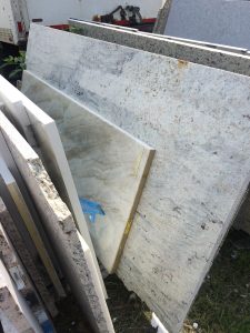
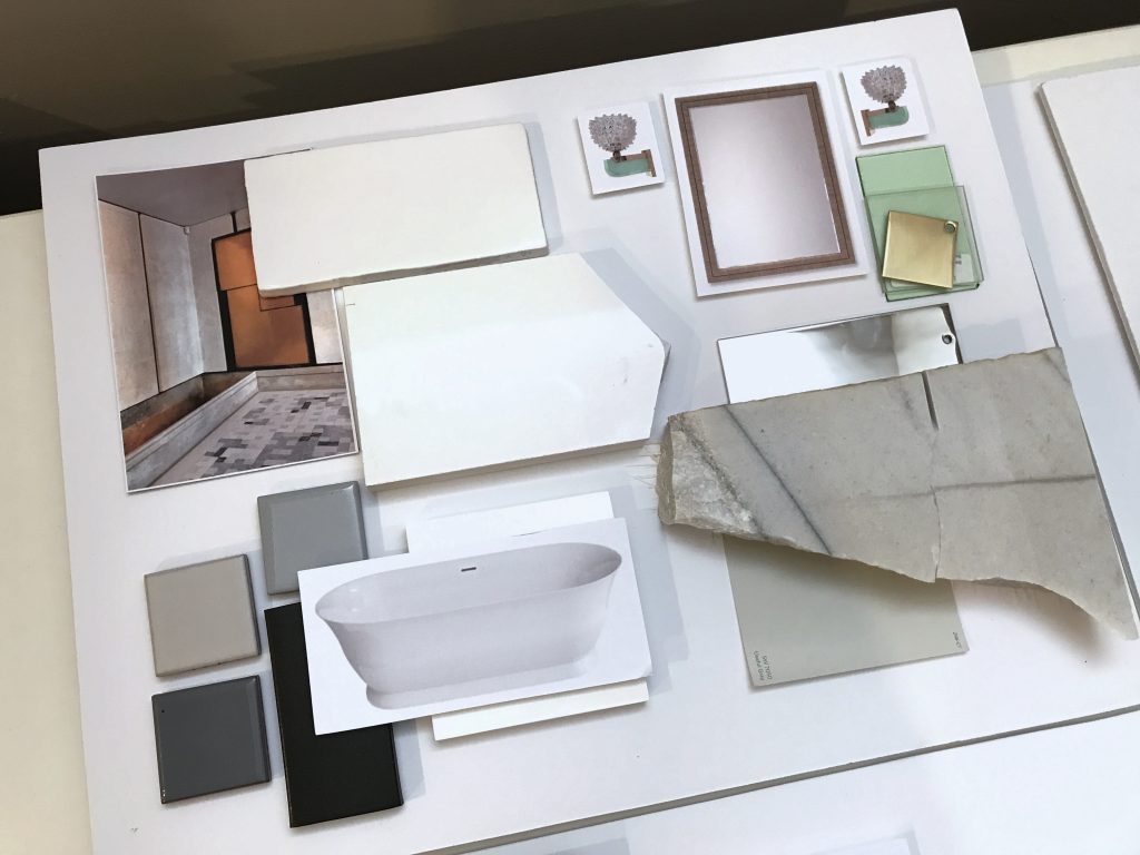
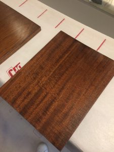
Top L to R: Slab for a fireplace surround; master bath materials, final wood selection for the library.
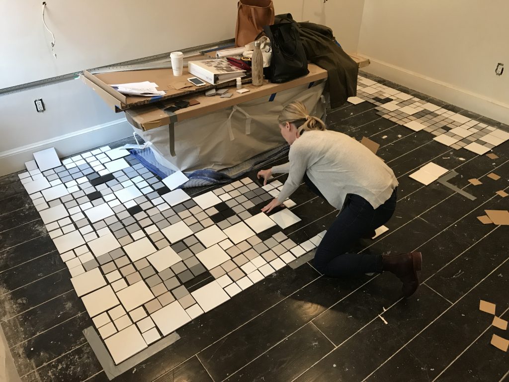
Bottom: The tile layout for the master bath was a hands-on (and ugh, thighs and knees) process that took several hours. Click photo for a video of the legendary H&Co. attention to detail.

* * *
We hope you’ll join us next week when we’ll share more about the process of specifying furnishings and softgoods! Or take another look at our Concept: West End post to see how this project began.
xo Huntley & Co.

-
DESIGNING WITH PASSION :: THE COLORS OF VALENTINE’S DAY
I love the colors associated with Valentine’s Day. Red, garnet, blush, pink, plum — they’re all so delicious and sexy. This is a palette that seduces in design, fashion, and even nature. I suggest that you soak in the gorgeous inspiration of our post today, especially if you are spending the holiday sans sig-other. There is no balm for the soul like beauty. Well, that and a really good bottle of pinot noir and dark chocolate.
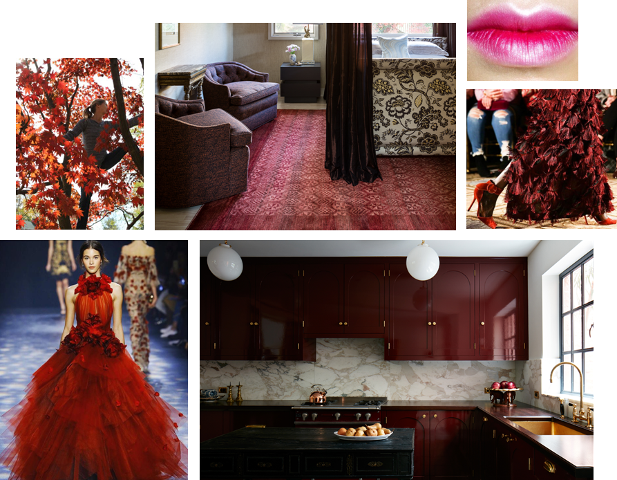
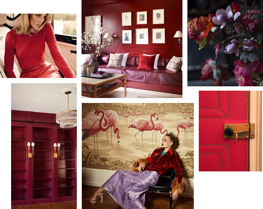
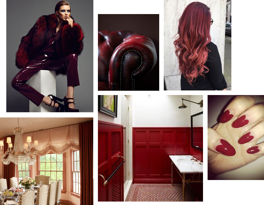
HAPPY VALENTINE’S DAY!

** Sources/links for the photos above can be found on our Pinterest page … along with other Valentine’s Day inspiration.
-
show-house // faux-client :: the reveal!
We know you and our fabulous faux clients have been waiting for our big reveal. The design process is nothing, if not, an exercise in patience. From concept to installation, interior design requires vision, tenacity and know-how. It’s a labor of love, but labor nonetheless. So when the time finally comes to present our clients with their dream home, our excitement is hard to contain. This particular dream home is ‘faux show’, but the thrill of the reveal remains the same … So without further ado!

— THE 2016 FAUX HOUSE REVEAL —

[ Our clients seem pleased ]

* * *

— DESIGNER Q&A —
Our Huntley & Co. clients and room may have been crafted from imagination,
but they do speak to the real methodology and design vernacular of our firm’s work.
Here, principal Tricia Huntley, opens up about her influences, the importance
of breaking the rules and the best song to get a party started.

1. What are some of the things that influence you, aside from furniture and décor?
Museums, music, fashion, history, parks/nature, architecture, poetry … those things that are thoughtful, provocative, moving. I like to start with a feeling or mood before I pivot to the tangible aspect of things.
2. What qualities of a room do you most admire?
Substantial hardware and appropriate, expertly executed millwork. I would rather live in an empty house with those two qualities than a shoddy new-build with the best furniture.
3. Design rule you love to break?
Symmetry. I was classically trained so I believe in building a space according to the rules of symmetry. But I also believe that breaking that symmetry in clever, nuanced ways is what brings a room to life.
4. You know these clients will be having many a fete, what’s a good hostess gift?
I love to give sophisticated, unusual candles and fragrances. Aedes de Venustas, Joya and Santa Maria Novella all offer intriguing scents in stunning vessels. And of course, good booze and wine never go out of style. Add a beautiful ribbon with a handwritten tag and you’re done.
5. Rapid Fire!
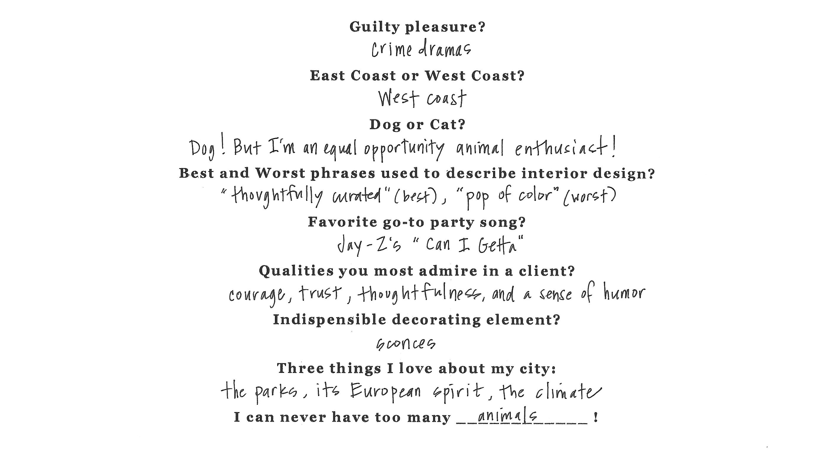
* * *

It’s been fun, but we need to dash! Our clients told us to get out so they can enjoy their new home ; )

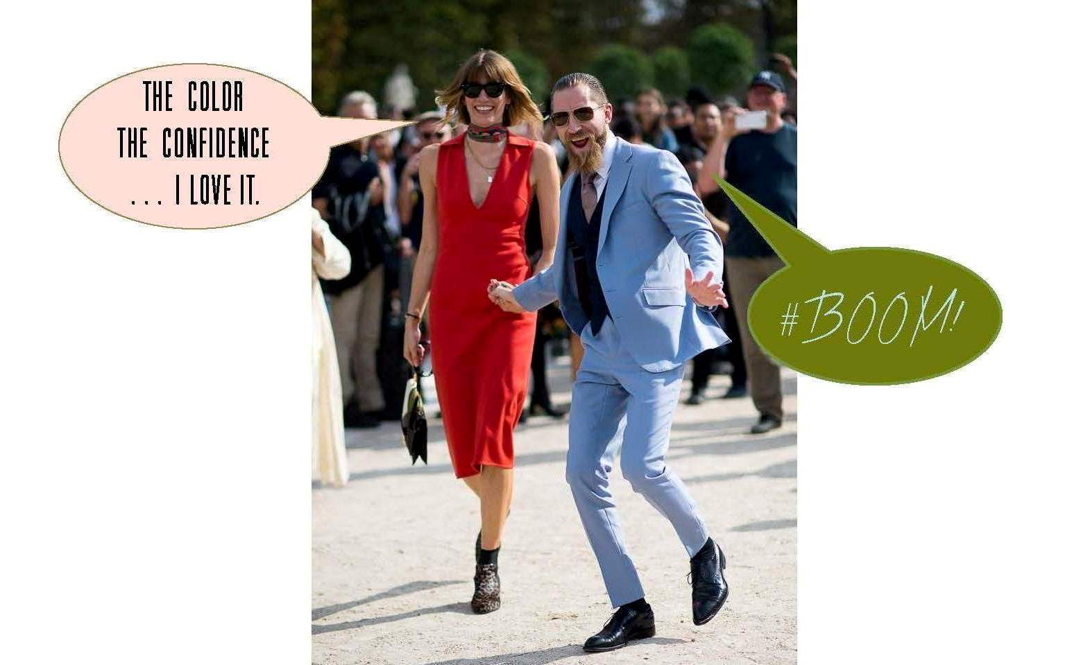
If you want another glimpse at the process, simply click on posts Part I, Part II and/or Part III. And special thanks to our “faux clients” Justin O’Shea and Veronika Heilbrunner. They are the coolest couple on the planet and dream clients fo sho!
-
The Floors Beneath our Feet
Like a painter preps his canvas, a good designer attends to the bones of a room before honing in on its decorative elements. We make strategic shifts in proportion, tone, and detail, both subtle and grandiose, when thoughtfully designing a space. A beautiful wood floor is one such essential element that has the power to really make our rooms sing. We’re always told to “look up” or “look forward”, as a kind of mantra to mindfulness, happiness and all things good. Well, I say “look down” because there’s beauty and inspiration to be had at your feet!


Our design studio becomes a laboratory for deep diving, where we work elbows deep in samples to determine the best tone for the wood floors. We consider location, use, and material adjacencies when making our recommendations. Ultimately, we outfitted a Georgetown residence with rich, classic patterned parquet in a deep and luxurious tone.


Material and tone are carefully considered for each client.
(left): We installed subtly hand hewn floor boards in soft, neutral tones to be bright but forgiving for a young family. (center): This grand PA home called for rich tones that complimented adjacent materials and the scale of the space. (right): We were inspired by sandy textures in this beachside retreat when we chose these soft, washed, waxy tones of warm brown.


(left): We gave the existing parquet flooring of a pre-war Manhattan apartment new life with a lighter stain – showing off the beautiful pattern and brightening the small space. (right): New french oak flooring in an Alexandria townhouse has been pickled, adding much needed warmth and texture to a once incohesive collection of different vinyl flooring.


Inspiration at its finest. (left): Jeffrey Bilhuber (right): Hillwood Estate (bottom): Archetypal Floors
-
THE AD DESIGN SHOW :: TRICIA’S 10
I spent the day at the Architectural Digest Design Show in New York on Friday. It’s always good to see what’s new, talk with vendors and “kick the tires” so to speak. Seeing the finish/scale/construction of products in person is integral to quality control and intelligent design. And, of course, it’s fun. I’ve shared ten best picks — whether it be a specific piece or an entire collection — and why each was worth a closer look.

#1 Van Cronenburg
I am passionate about hardware and this company is stellar. Substance and exquisite detail in every piece.


#2 A Space Wall Sconce
All of the products from A Space – lighting, furniture, vases – are beautiful, but the Falling Star lamp was a show-stopper. It will undoubtedly make a lot of “it lists”.


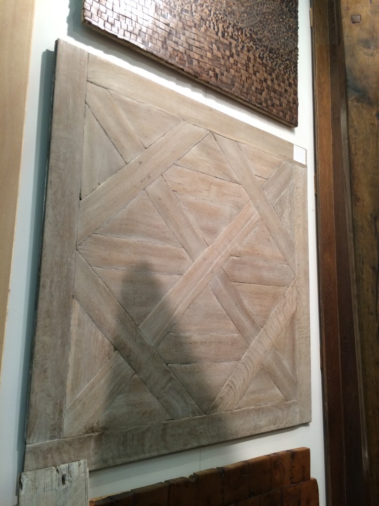
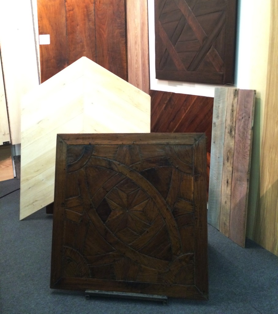
#3 Archetypal
In a perfect world, Archetypal’s work would be on the floors of every home in America. A designer can dream.


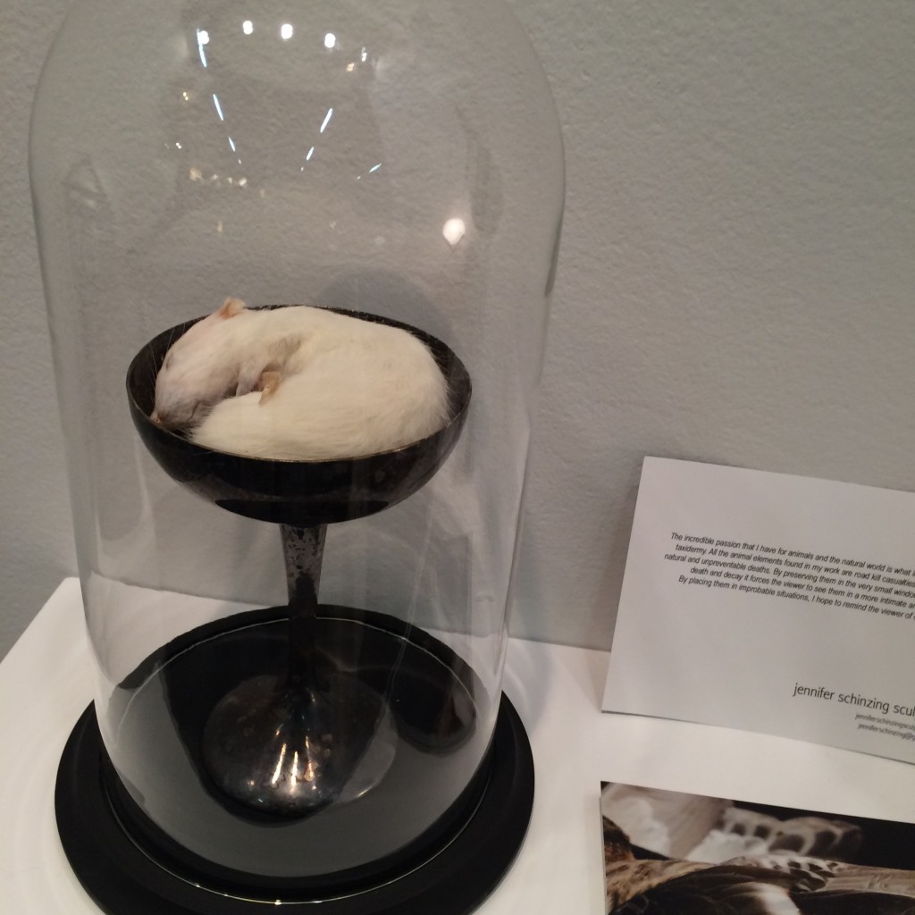
#4 Jennifer Schinzing
Jennifer’s love for the natural world inspired her to learn taxidermy. She preserves small animals (many of them road kill casualties) and transforms them into art installations. The thoughtfulness and beauty of each “memorial” was remarkable. Take note world, SHE IS ONE TO WATCH.



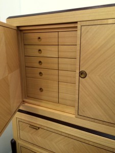
#5 Visilek
This cabinet was perfection. The veneers, the joints, the mechanics, the proportions were all flawless. Filipe Rodrigues’ work is masterful.



#6 Brizio Faucet
The Brizio Solna faucet. It’s black, it’s functional, it’s sexy … and it’s plumbing. Gotta’ love it.


#7 Jefferson Hayman Photography
I never jumped on the gallery-style art installation bandwagon in design. Perhaps because often times it’s just a bunch of crap thrown up on the wall (yes, I just wrote that). But Jefferson Hayman’s installation at the AD Design Show was simply lovely. The collection was intimate, multi-faceted and beautifully framed. Purchasing the entire installation crossed my mind … and I think that of the gentleman in the photo (yes, I was eaves-dropping).


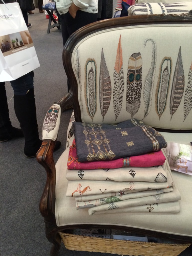
#8 Coral & Tusk
I’m a sucker for animal motifs, so naturally I was drawn to Coral & Tusk’s display. But what’s lovely about these goods is that the patterns are cute without being saccharine. The imagery is grounded by the quality and authenticity of the textiles. Moreover, Stephanie Housley was delightful; her enthusiasm and love for her work was evident.


#9 Joya’s F vs. S Candles
These candles may seem simple, but something about them caught my eye. They whispered [vs. shouted] sexy and luxurious — my personal sweet spot without a doubt. I inquired about an order at the show and pretty much want to purchase the whole collection of fragrances upon seeing the website.


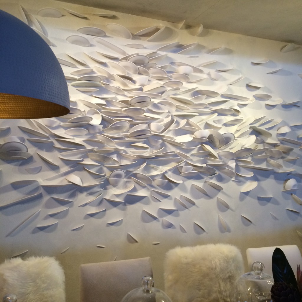
#10 C&B at Dining by Design
Believe it or not, I am including Crate & Barrell in this list. Their dining room for DIFFA included a brilliant wall “art” installation. How many plates were broken to create this I don’t know. But what fun and how tongue-in-cheek. Kudos C&B.

*All photos are my own save the two that are hyperlinked. Thank you for sharing your beautiful images with our readers.
-
Chez Huntley – update 08/05
A great deal of progress has been made here in the past couple of weeks. The millwork
installation – new casing, baseboards and bookshelves – is complete. The painting has
been corrected and looks lovely. Lighting fixtures have been installed in the foyer/living
room along with simple, modern light switches and receptacles throughout the main floor.
I’ve even styled my bookshelves and purchased a new painting for the dining room and a
pair of cast greyhounds for the front entry. And as excited as I am to move on to the next
layer of furnishings and accessories, nothing is quite as important to good design as getting
“the envelope” right. I use this term A LOT in my work. Cleaning up the architecture of a
space and adding (or removing as the case may be) details is the key to a grounded and
balanced interior. And there is something really beautiful about a well-executed space
that feels good even without any decor. But of course, I’m an interior designer, so decor
is essential too. Once I add the furniture, softgoods and artwork, the space will really sing.
– Projects –
I purchased this pair of deer sconces about 4 years ago and finally had the opportunity to
use them. I … ahem, I mean we (I got a lot of help from Molly, H&C employee extraordinaire)
painted them white, so they have a more contemporary vibe appropriate for the house.
A major accomplishment for me: my very first lighting installation!
I was so proud. I called my boyfriend, my parents and sent emails to friends everywhere.
– Millwork –
The new bookcases in my living room. Cheap yet chic!
I kept the lines simple and wrapped the baseboard around the front for a clean, modern look. You’ll see
that I was anxious to style the shelves with my books and accessories – I didn’t even wait to put away my tools.
Above the shelves are the freshly painted deer sconces with extra long candle sleeves and taupe silk shades.
– New Purchases –
This abstract oil painting circa 1960 has incredible color that almost glows.
I found the painting above and this pair of greyhounds at Comer & Co. in Georgetown.
A fantastic new shop with exquisite things and wonderful service.
And speaking of dogs … I’m happy to say that Nina is feeling much better this week.
The little stinker kept pulling off her cone, so she was forced to rock this t-shirt instead.
My poor pup was quite the fashion victim last week.
Tricia xo







![porcelain-joya[1]](https://luxeandlucidblog.com/wp-content/uploads/2016/03/porcelain-joya11-1024x808.jpg)