-
SHOW-HOUSE // FAUX-CLIENT :: PART III
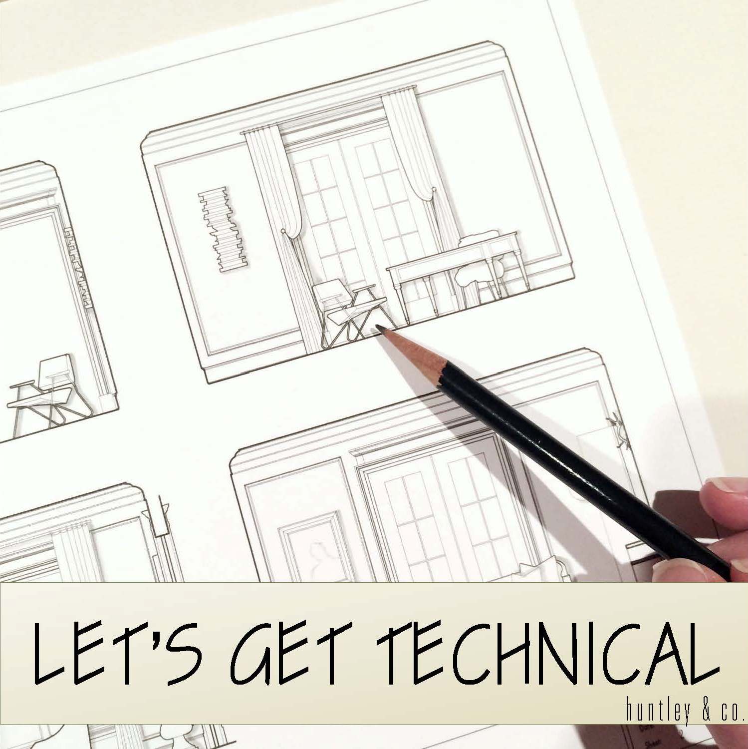
Sourcing goods and materials for our interior fuels our creativity, but drawings take the design to the next level. After all, a room is only as good as it is functional — we aren’t aiming for beauty just for beauty’s sake. Working out our ideas in AutoCAD ensures that we are on target with scale, proportion and spatial relationships. A well-trained designer can evaluate whether a piece will work in a room or not simply by looking at it. Still, transferring its dimensions to paper (or the computer as in our case) ensures down-to-the-1/8” accuracy. Huntley & Co. is a business built on mindfulness and our drawings are the technical backbone of our work.


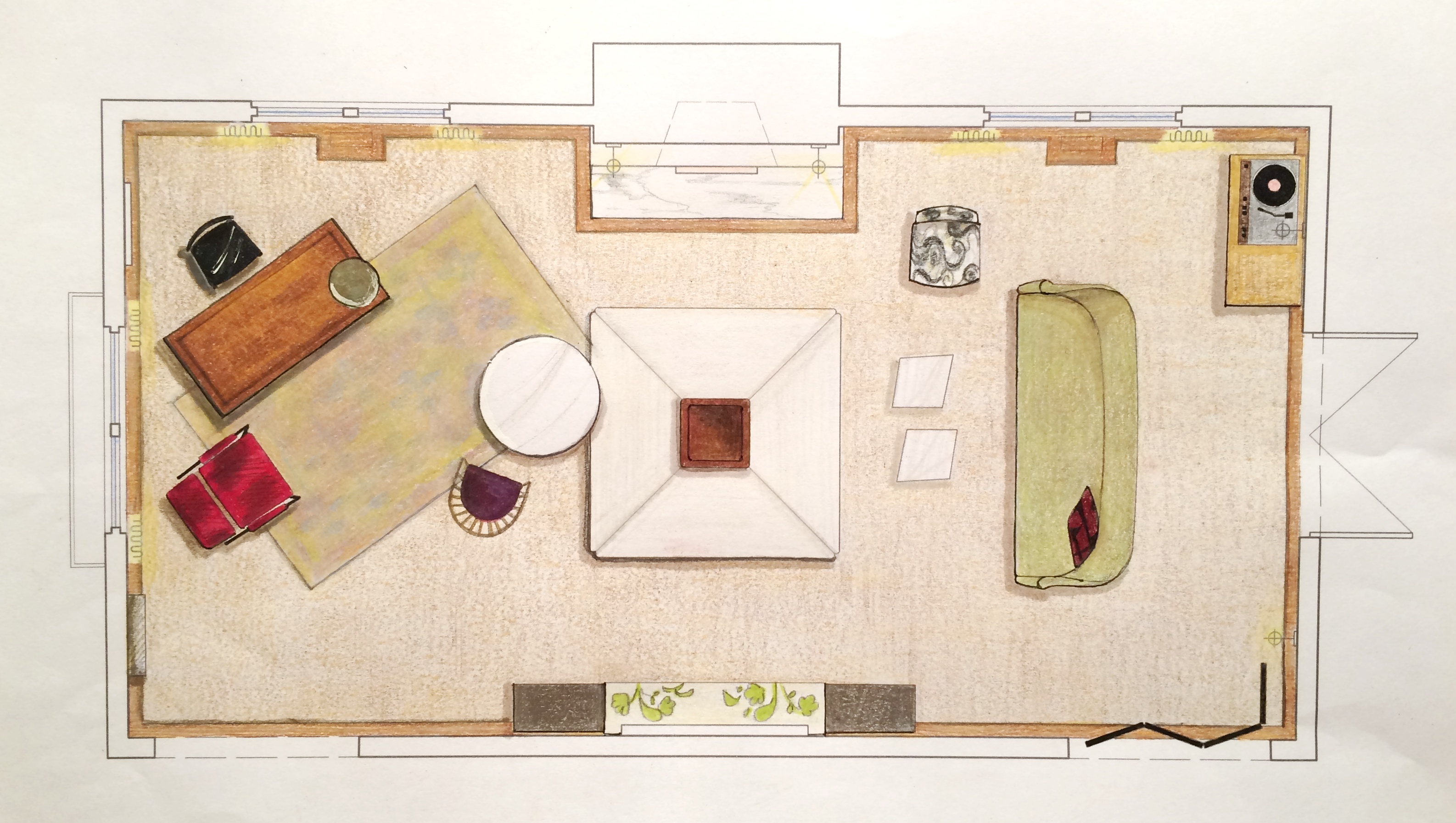
The Floorplan___________________________
We start with a floor plan, which guides the flow and circulation of a space. With our clients’ penchant for entertaining, it was important to think outside the traditional box and get creative with furniture placement. Our ‘star’ is the four sided bench that beautifully anchors the room. Varied seating arrangements offer opportunities for independent conversations and debate for our clients’ guests who come from a wide range of cultures, professions and political views. The room is meant to be as warm, interesting and thoughtful as the clients are.


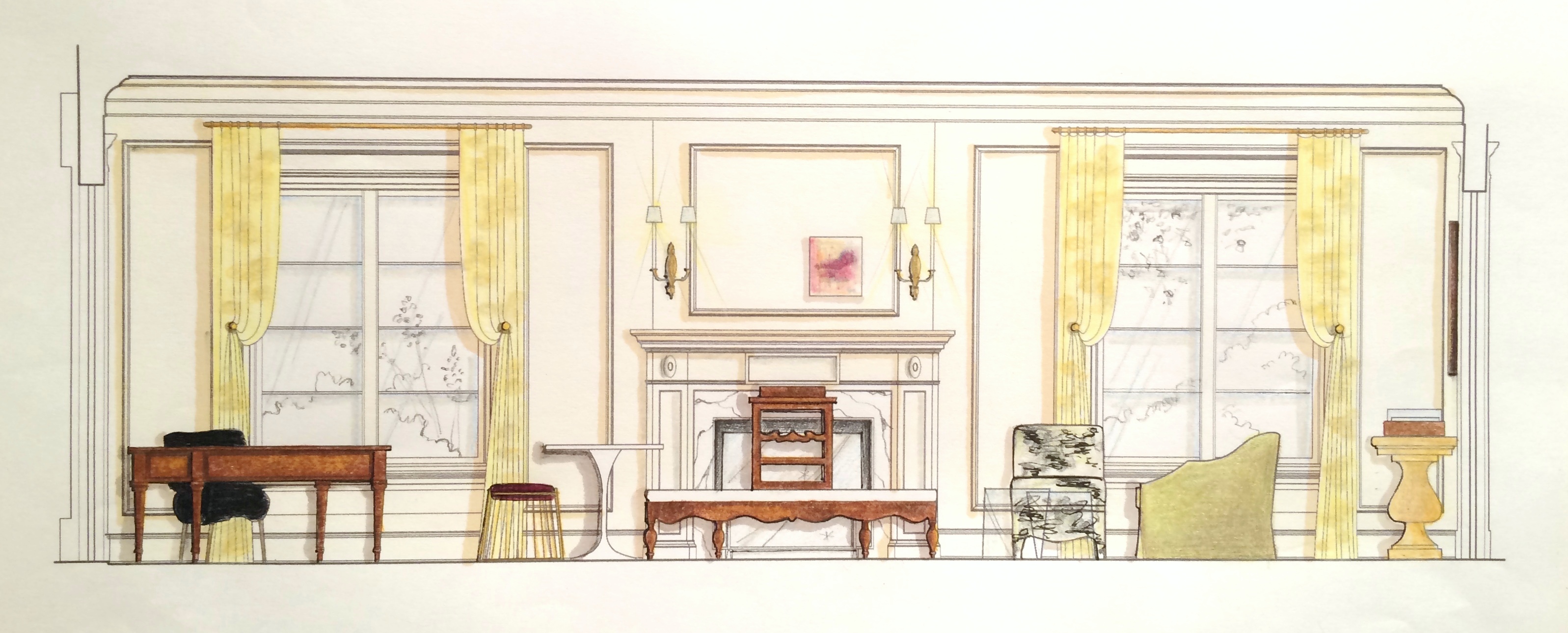
The Elevations___________________________
Elevations reveal how a room’s architecture, furnishings and art will work together. A space won’t look or feel good if there are too many masses, it’s too ‘leggy’, everything is at the same level or the values are off-balance. Deep-diving the millwork, fenestrations and other details gives us the platform we need to make good decisions. Not to mention that “pulling the design up” and seeing it come to life happens to be pretty exciting ; )


The Presentation Board____________________
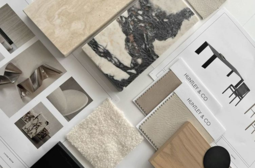
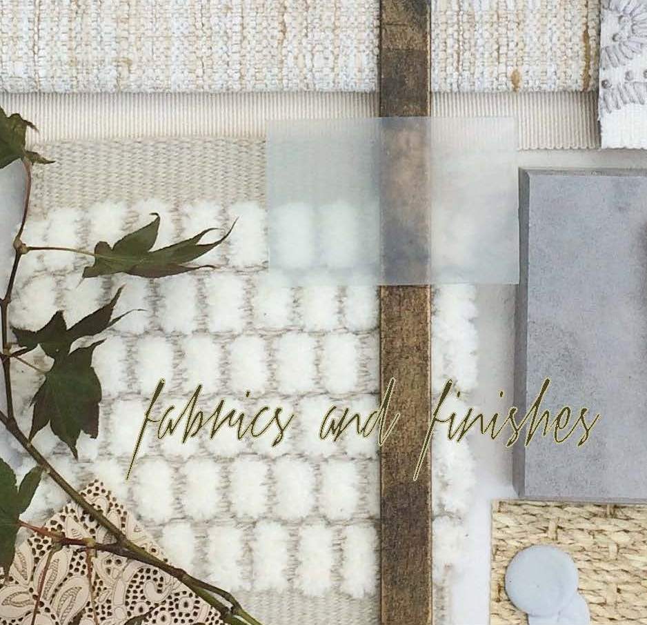
The presentation board is our opportunity to showcase the tactility of a room. Ambience is affected by the ratio of soft vs. coarse, understated vs. luminous and natural vs. refined materials and textures. We wanted this space to feel glamorous, but totally approachable with an air of intelligent wit. With that in mind we combined fibers like linen, seagrass and rushing with velvet and damask. Then we took it a step further by incorporating lacquered leather, eelskin and electric-colored cowhide. This is a luxurious space where you can kick up your feet and have fun!


The Response___________________________
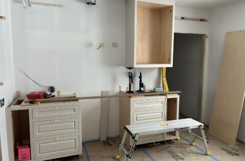
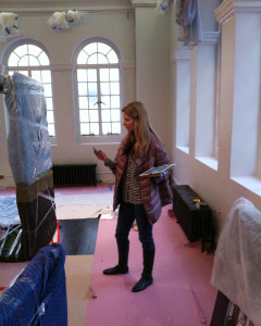
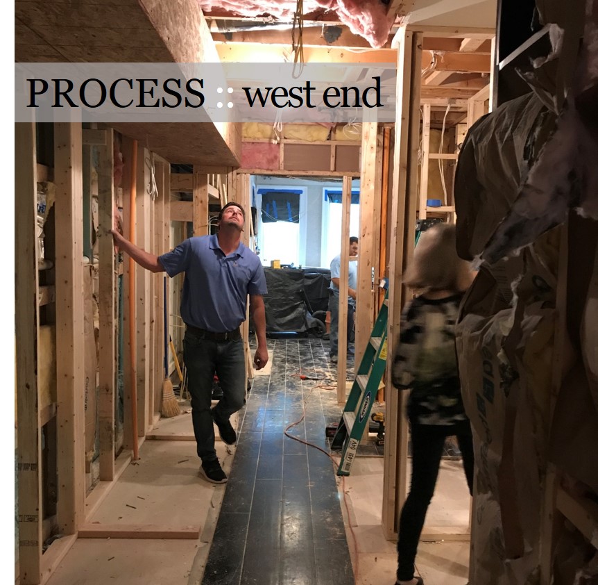
And because these are the dreamiest of clients, they love everything and will TAKE IT ALL! Orders are placed and construction begins. This next phase is about site visits, management, coordination, follow-up and a lot of patience. But we’re getting our hands dirty and seeing our workrooms do their magic — so we love it!


______________________________________________________________________________
Tune in next week for a fun Q&A and the FINAL REVEAL! We will be sharing more insights about our process and the why’s and how’s of a successful design project.

Subscribe to our newsletter or find us on Bloglovin’ and you won’t miss a thing ; )
-
SHOW-HOUSE // FAUX-CLIENT :: part II
Like the early stages of a romance, the onset of a new design project brings lots of excitement, energy and anticipation. Now that we’ve “gotten to know” our Faux Clients better and have defined a visual narrative for their space, we are ready to start deep-diving the design. It’s time to measure the room, pull our materials and find our gorgeous furnishings — let’s show this showhouse what we’re made of!

Prep Work______________________________
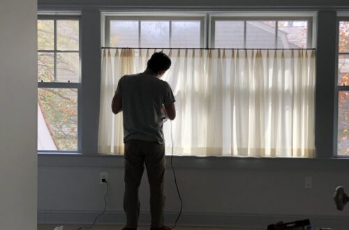
Preparation and foresight are the secret weapons behind a good design. We always arrive well-prepped for site visits and measures. Camera? Check. Tape measure? Check. Comfortable shoes? Definitely check.


Scouting for Furnishings____________________
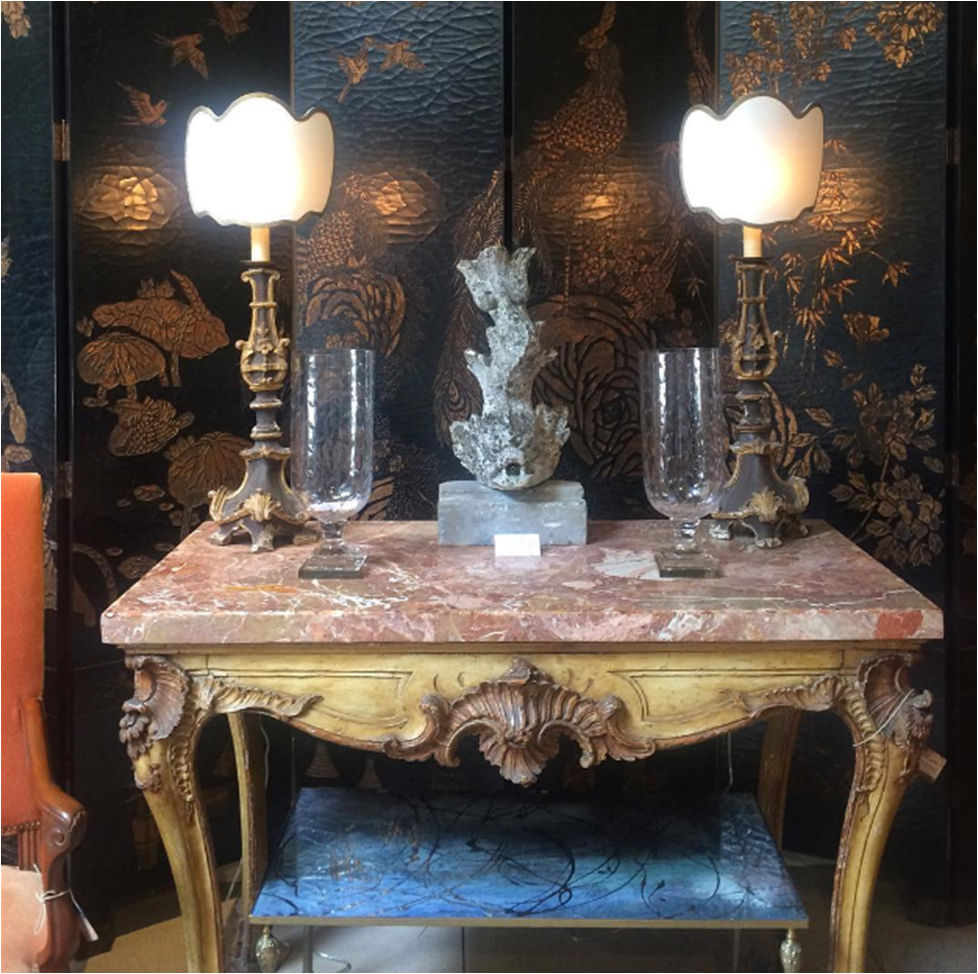
Scouting for hidden treasure is one of design’s greatest thrills. Fortunately, we are blessed to have access to a rich variety of vendors and shops from which to source our goods. We let serendipity play a part in our work, so it’s usually one or two really special discoveries that drives our designs. This part of the process is not about “shopping”; it’s about having an informed concept, an open mind and a great eye. Our goal at Huntley & Co. is always to curate an interior that is both timeless and forward-thinking — to evoke an emotional response that inspires and nourishes the spirit of the client.


Pulling Together the Scheme_________________
Besides hunting for furnishings during this phase, we pour through our office library for fabrics and finishes. We strive to use materials that enhance a home’s architecture and complement the lifestyle of our clients. A thoughtfully selected mix of light and dark, textural and refined, beautiful and odd are what make a room interesting and livable.


Next week we’ll bring you Part III of our Show-house/Faux-client series where we’ll dive into the technical aspects (drawings!) of the project. Subscribe to our newsletter or find us on Bloglovin’ to stay tuned.
-
SHOW-HOUSE // FAUX-CLIENT
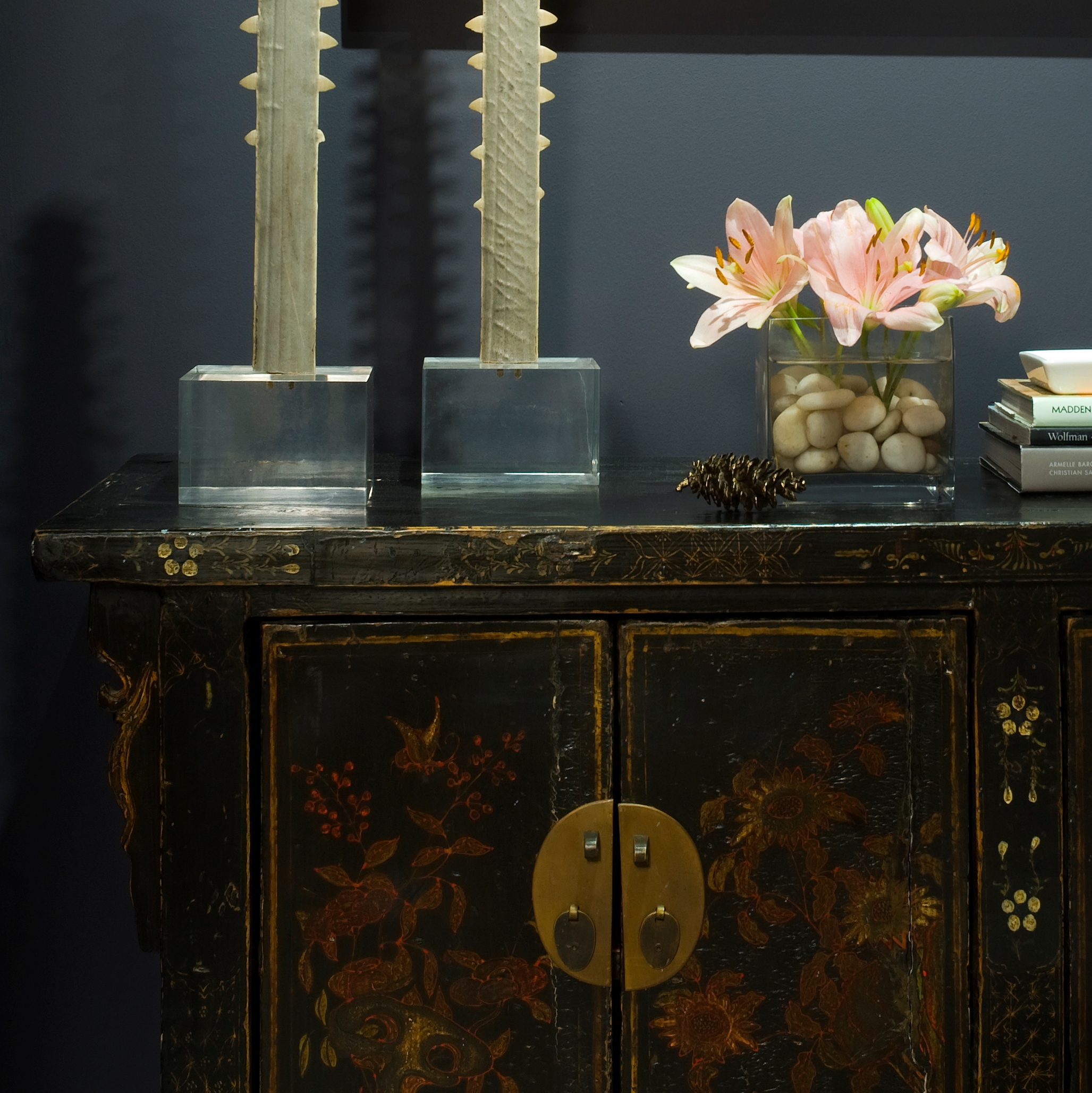
A showhouse is unique in that it provides a designer with the freedom to create a space that is bound only by her innovation and talent. With a project that lacks a scope of work and a flesh-and-blood client, we find it important to invent a narrative to guide our design concept. At Huntley & Co. we create a “faux client” to serve as muse during the showhouse process. We have been blessed with some pretty wonderful clients throughout the years, but our Faux Clients 2016 definitely have us crushing hard!


dc interior designer
Concept Development______________
Washington DC is a city filled with people of varied and interesting backgrounds. Our Huntley & Co. “clients” are an art dealer wife with an international childhood (thanks to a father who was Ambassador to Peru) and a west coast-born husband with a Renaissance spirit. The couple shares a love of art, music and philanthropy. Both travel frequently to New York, California, Europe and South America. With that in mind, our goal for these busy and passionate entrepreneurs was to create a true LIVING space that reflects their personal histories and nurtures the lifestyle of their young family.



Already inspired? Fantastic! Because Huntley & Co. will be sharing more insights into our showhouse process as well as a final ‘reveal’ in forthcoming Luxe & Lucid posts. Subscribe to our feed or follow us on Bloglovin to stay tuned!

-
The Floors Beneath our Feet
Like a painter preps his canvas, a good designer attends to the bones of a room before honing in on its decorative elements. We make strategic shifts in proportion, tone, and detail, both subtle and grandiose, when thoughtfully designing a space. A beautiful wood floor is one such essential element that has the power to really make our rooms sing. We’re always told to “look up” or “look forward”, as a kind of mantra to mindfulness, happiness and all things good. Well, I say “look down” because there’s beauty and inspiration to be had at your feet!


Our design studio becomes a laboratory for deep diving, where we work elbows deep in samples to determine the best tone for the wood floors. We consider location, use, and material adjacencies when making our recommendations. Ultimately, we outfitted a Georgetown residence with rich, classic patterned parquet in a deep and luxurious tone.


Material and tone are carefully considered for each client.
(left): We installed subtly hand hewn floor boards in soft, neutral tones to be bright but forgiving for a young family. (center): This grand PA home called for rich tones that complimented adjacent materials and the scale of the space. (right): We were inspired by sandy textures in this beachside retreat when we chose these soft, washed, waxy tones of warm brown.


(left): We gave the existing parquet flooring of a pre-war Manhattan apartment new life with a lighter stain – showing off the beautiful pattern and brightening the small space. (right): New french oak flooring in an Alexandria townhouse has been pickled, adding much needed warmth and texture to a once incohesive collection of different vinyl flooring.


Inspiration at its finest. (left): Jeffrey Bilhuber (right): Hillwood Estate (bottom): Archetypal Floors
-
The Truth About Romance
Romance for me is all about atmosphere. It’s not necessarily defined by luxury and indulgence (although that works too). It’s more about a warmth that is at once alluring and thoughtful. And it can be found anywhere … Listening to a sexy mix on Pandora; alone on a cold night next to a roaring fire; at a breathtaking art exhibit; overlooking a misty river; in a tiny shop tucked away in a gritty part of London; or, of course, cozied up with your loved one in a hotel suite for the weekend. The misconception about romance is that it’s exclusive to those with a black Amex or a wedding band. It may smack a bit of “personal growth”, but romance is everywhere. We just have to recognize it when it’s in front of us.


Happy Valentine’s Day from Luxe & Lucid, XO


* All photos c/o T. Huntley save row 3, image 3. Thank you Paola Kudacki & husband James Penfold for being the sexiest, most inspiring couple on the planet.

-
HAPPY 10-YEAR ANNIVERSARY HUNTLEY & COMPANY!

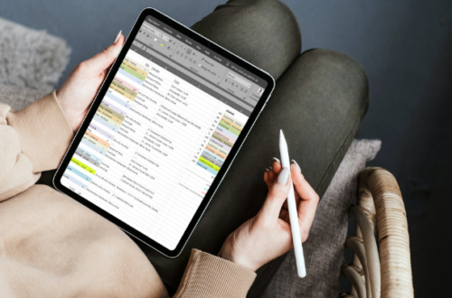
Behind the scenes, spearheading a design firm is not all glamour and bon-bons. The photos below illustrate how often I shift gears and how drastic those shifts are. In a single day I may be generating spreadsheets, drawing in Autocad, conferencing with colleagues, hauling furnishings to a job site and attending an industry event in the evening. 9-5 and consistent this job is not. But it’s always interesting and always challenging. I exercise both my left brain and right brain on a daily basis (not to mention my biceps, quads and glutes!). Problem-solving, schlepping, creating, collaborating … it’s all in a day’s work and a gift to those who love to hustle!

I am fortunate enough to have enjoyed a decade of transformation and collaboration among the best and the brightest in the nation’s capital. Wow and wow. I will be celebrating this milestone with photos and features looking back on the past ten years. There is a wealth of beauty, joy, work and laughter to share.

-
mad for plaid
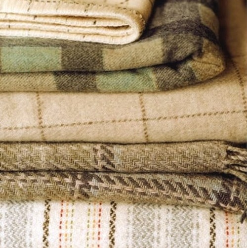
I was talking with a girlfriend recently about her upcoming wedding. “I’m thinking about incorporating tartan,” she said. “I know that’s probably not your thing as a designer.” Au contraire! I can’t get enough of checks and plaids. Everything about them appeals to me — the geometry, the endless color combinations, the nod to Midwest traditionalism. I have incorporated a check or plaid in nearly every Huntley & Co. project and have plenty of it in my closet as well. The evidence of my ongoing love affair can be seen below. You don’t have to be Scottish, traditional, Midwestern or preppy to love these patterns … fall is upon us, so embrace the opportunity to go mad for plaid!


* All images are (c) Huntley & Co. or (c) Tricia Huntley files except 11-16. Links to these sources can be found on the Luxe & Lucid Pinterest board.
-
The Gold Standard
I'm a gold girl. Bronze, silver, not even platinum gives me the rush that gold does.
It’s warm and sexy and adds a little magic to any material. I love gold fabric, furniture, lighting
and especially jewelry and hardware. I would plate everything in gold if I could. Now for you nay-sayers
who think gold is a finish that belongs in the 80s, take a look at the images below and get ready to swoon.
A few of my current favorite gold fabrics.
A glamorous gold face in Vogue Nippon.
At the Washington Design Center's spring 2007 design house I painted the walls
India Yellow by Farrow & Ball and added gold David Iatesta sconces.
A vintage Curtis Jere wall sculpture.
I'm saving this image in my inspiration file for a future project.
The layers of gold could inform an entire color scheme.
Some of the amazing metalwork at Grand Central Station.
What artist celebrated the brilliance of gold more than Klimt?
Sooo gorgeous … LOVE this gold and citrine pin! I would wear it with a [faux]
fur vest layered over a grey cashmere sweater, jeans and a sick pair of heels.
Some of my favorite jewelry piled in a gold tray.
I get a ton of compliments on this Chloe purse.
Nancy Lorenz added graffiti-esque gold accents to Jeffrey Bilhuber's scenic
paper-covered bedroom walls. A gutsy move by the interior design genius.
I'm seriously considering switching my flatware over to gold … so much sexier!
Columbina Flatware at The Moma Store.
I love this mug! The perfect glam/punk combo.Where better to wear gold than on your toes? Louboutin heels from the 2005 collection.
Looking for a gift for the woman who has everything? Yes, there is a gold facial.
Gold paperclips – A Huntley & Co. office standard!






![COPYRIGHT (C) HUNTLEY & CO. INTERIOR DESIGN KAP_9648[1]](https://luxeandlucidblog.com/wp-content/uploads/2016/02/KAP_96481-224x300.jpg)


