-
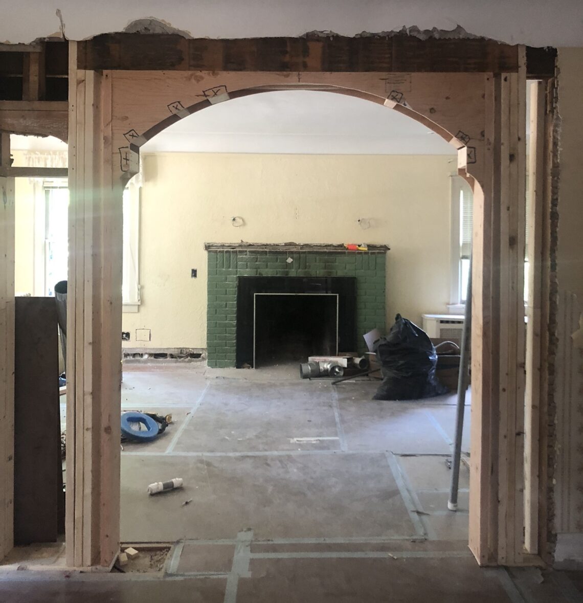
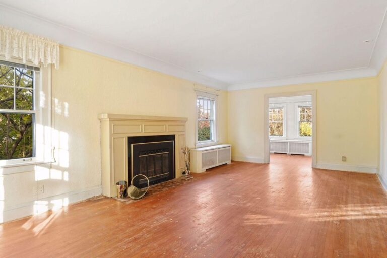
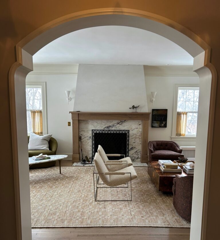
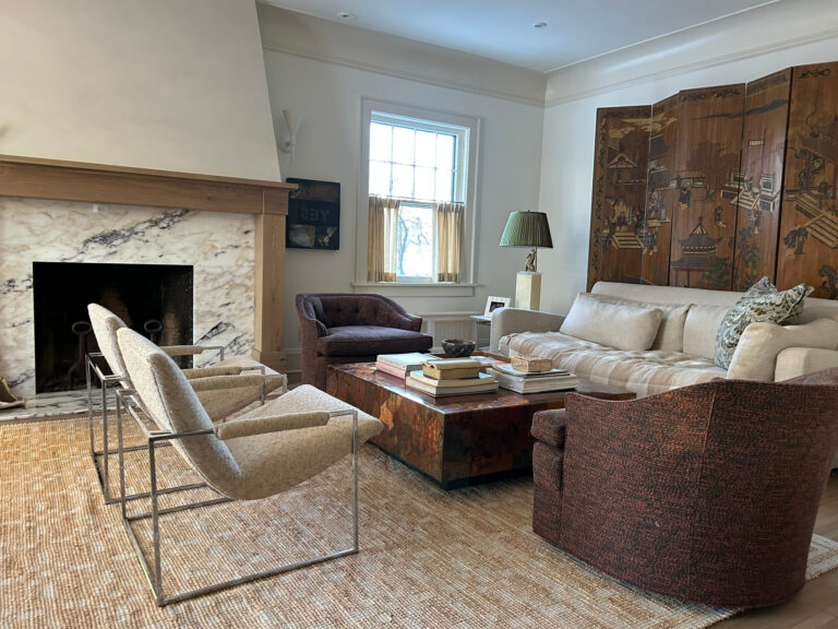
New and Improved : Hillcrest v.3
-
New and Improved : Hillcrest v.2
-
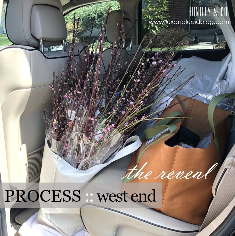
West End :: The Reveal

This reveal has been a long time coming. Not because it was only just installed, but because Luxe & Lucid was tied up in a parallel universe after we moved the Huntley & Co. website to another platform. The technical side of small business is the gift that keeps on giving. So we thank you for your patience, and without further ado, we reveal our West End project installation!
* * *

Making it Move-In Ready
———————————————————

Obviously before our clients can move in, we have to install carpet, light fixtures, wallcovering and window treatments. Then, with our backdrop complete, our team is ready to bring in the furniture and accessories.


(top L to R) Living room chandelier install; Master bedroom carpeting in progress; Wallpaper in the third floor den; Installation of master bedroom roman shades.
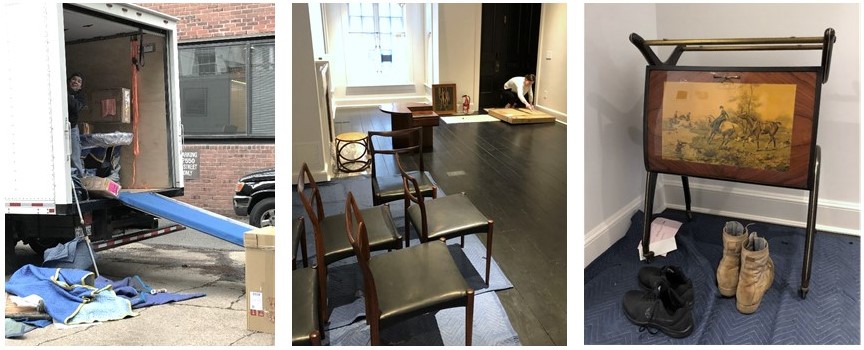
(bottom L to R) The crew unloading the truck; Opening artwork; Vintage Italian barcart.
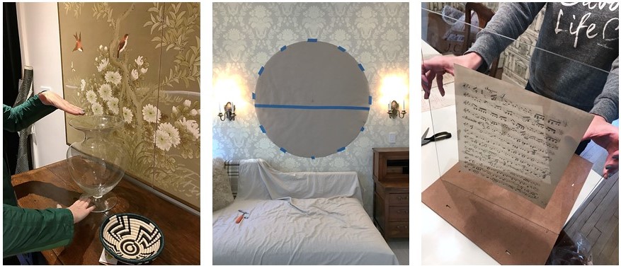
(L to R) Setting the stage with flowers and accessories; Paper template for a tricky mirror install; Preparing a vintage music montage for the dining room.

Welcome Home!
———————————————————
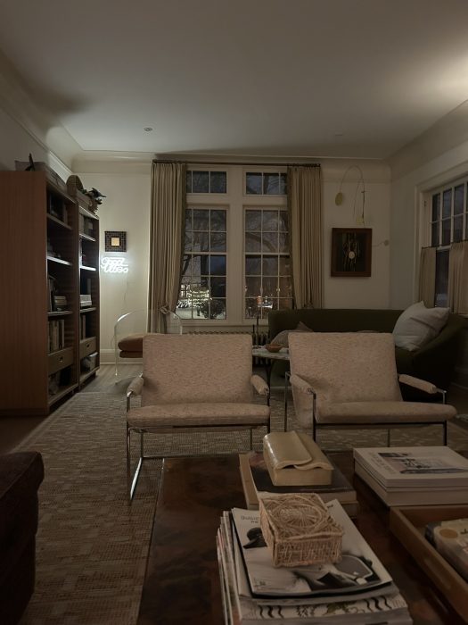
Alas, our vision for a classic interior full of cosmopolitan flair has come to life. This is, hands down, our favorite part of the process!

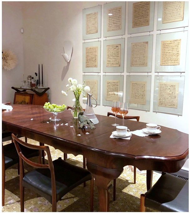
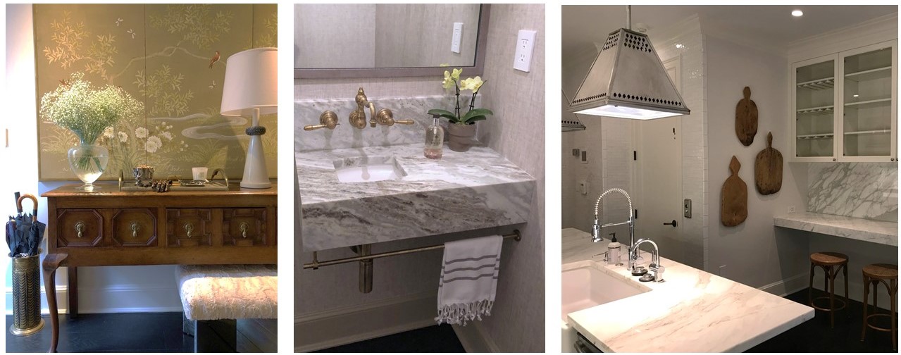
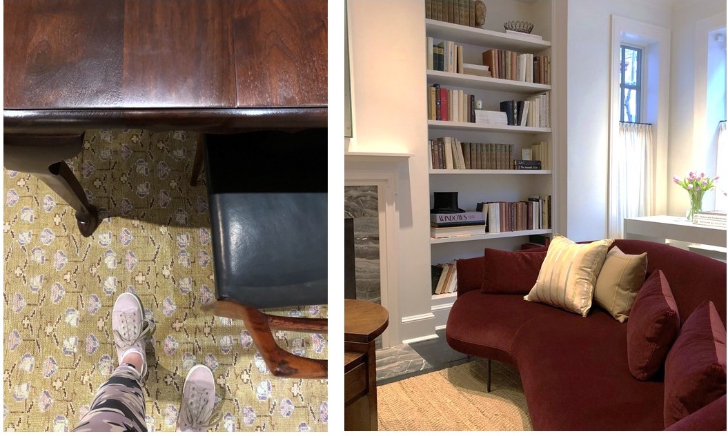
(top to bottom) A custom dining table paired with vintage chairs; Mixed materials in the entryway; A bespoke vanity in a teeny tiny powder room; Unexpected lighting in the kitchen; Dining room details; A chic Italian sofa with lyrical curves anchors the living room.
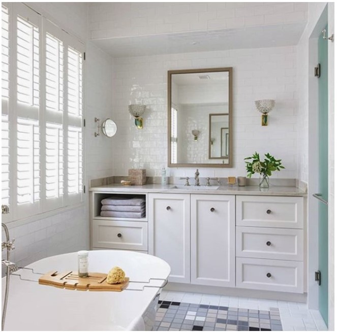
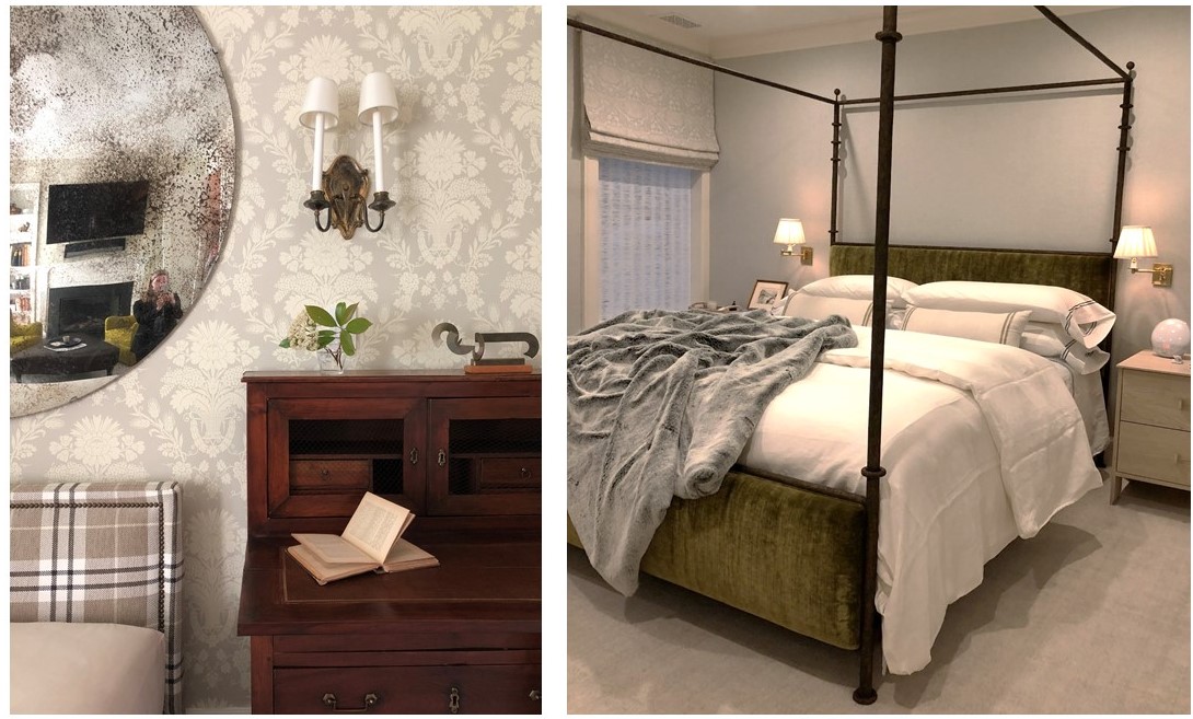
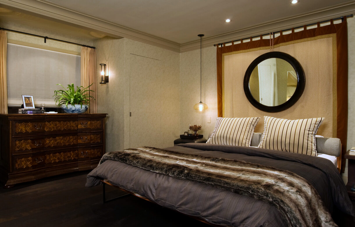
(top to bottom) Master bath wrapped in handmade tiles and featuring vintage lighting; An engaging mix of pattern and texture in the third floor den; Bespoke linens in the master bedroom – how luxe!

And That’s a Wrap
———————————————————
A big thank you to our wonderful West End collaborators. We hate to say goodbye, but we’re off to design more beautiful spaces …

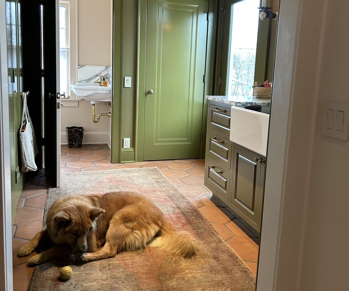
Tricia gives the resident pup, Barney, a tour of his new home.

To see the gorgeous professional photos of the West End project, visit the Huntley & Co. portfolio. Or take it one step further and help us win a Luxe RED award by voting for this project! Voting closes January 25.
xo huntleycodesign

-
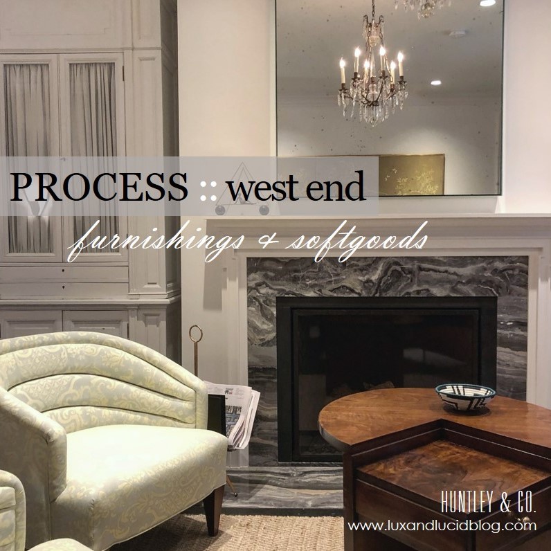
West End Process :: Furnishings
Bespoke, turn-key interiors are a signature of Huntley & Co. First, the architectural envelope and materials are perfected. Next, we turn our process to furnishings and softgoods that complement the space and the client and are unique to the project. Lots of love and labor goes into the design, drawing and specification of these goods.

| FURNISHINGS |
// Living Room channel-back chairs
We custom designed a pair of channel back lounge chairs to maximize flow, circulation and style. Visits to the workroom gave us the opportunity to make adjustments to the design, layout fabric and to monitor progress.
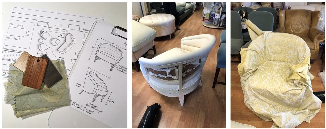
L to R: Leg finish selections; our chair frame gets mocked up in muslin; laying out the large scale fabric.
// Living Room armoire
We source a lot of antique and vintage furnishings for our projects. Sometimes, however, these pieces need modifications to “fit”. This armoire was the perfect scale for the open concept living area and provided much needed storage, but modification to the finish and interior were necessary. New hardware and shirred curtains turned this beauty into functional storage.
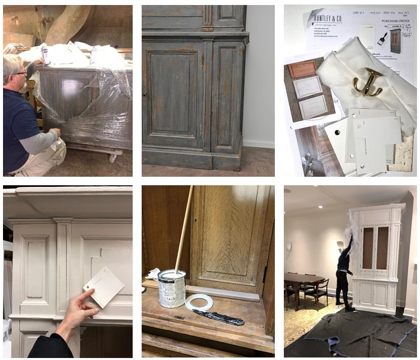
L to R: Removing the old finish; specifying all the new details; installation in progress.
// Master Bedroom canopy bed
Each project has its share of logistical challenges – and we love a good challenge because it inspires us to get extra creative. Our process never leaves things to guesswork. When we discovered that the bed, as originally designed, could not be brought up the stairs or through the windows, we had to go back to the drawing board (literally) to custom design a version that would fit.

L to R: Verifying stairwell and doorway dimensions; studio drawing of the custom pieces and parts; Ironware‘s workshop with assembly pre-shipment.
| SOFTGOODS |
// Master Bedroom roman shades & softgoods
Tailored, functional, bespoke. We designed the window treatments and pillows to complement the quietly sophisticated scheme in the master bedroom. Troubleshooting tricky corners and sourcing one-of-a-kind details makes all the difference.
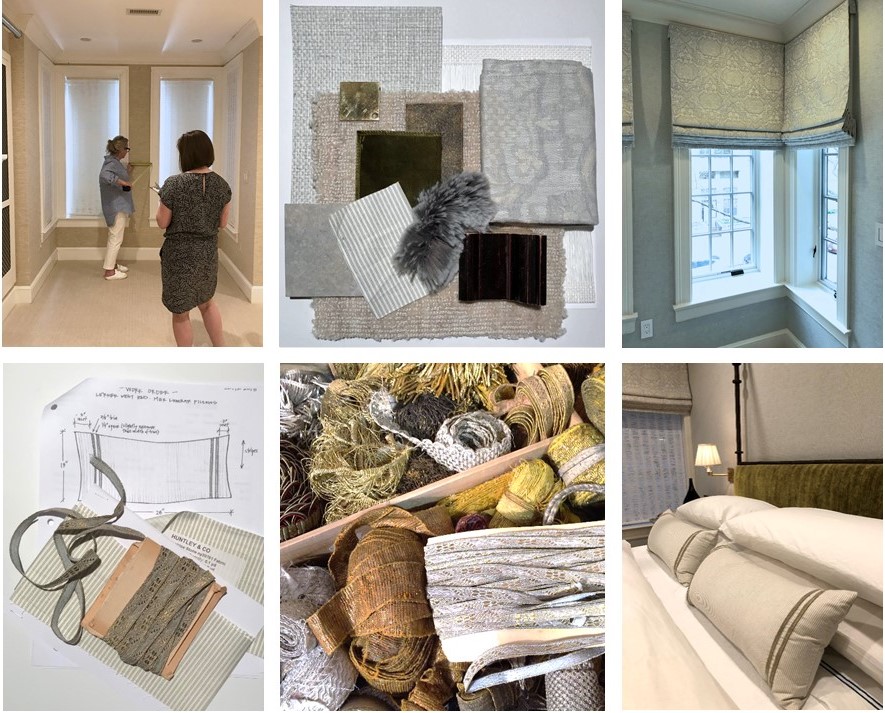
Top: Detailed site measures and schematic review; finished product! Bottom: A pillow workorder; a treasure chest of trim; a well-styled bed.
Stay tuned — Next week we’ll bring this project full circle and share our install with you! And in case you missed the other West End posts, check them out here and here.
xo, Huntley & Co.
Subscribe to our newsletter or find us on Bloglovin’ and you won’t miss a thing ; )
-
West End Process :: Envelope
For Huntley & Co., the first and foremost concern in design development is the “envelope”. TH can’t talk about it enough! Getting the envelope right – spacial relationships, interior architecture, materials and finishes – means a thoughtful, comfortable home that needs less stuff to look good.

| CONFIGURING THE SPACE |

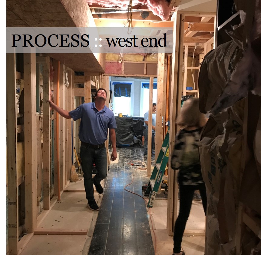
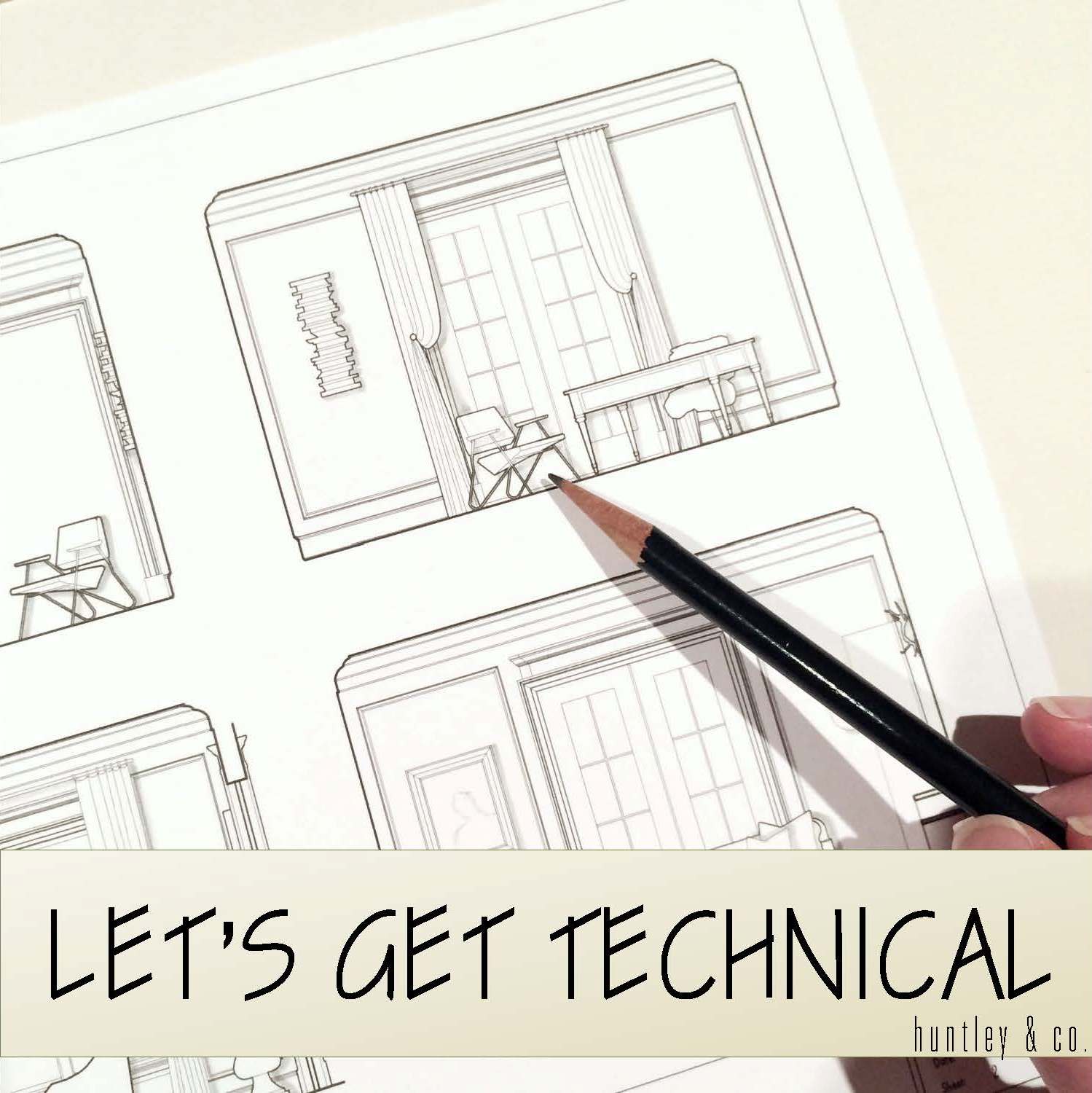
Reconfiguring an interior is a process – it requires a lot of drawings and plenty of site meetings. It’s important to be as technical and thorough as possible while understanding there will likely be a few surprises and adjustments along the way.
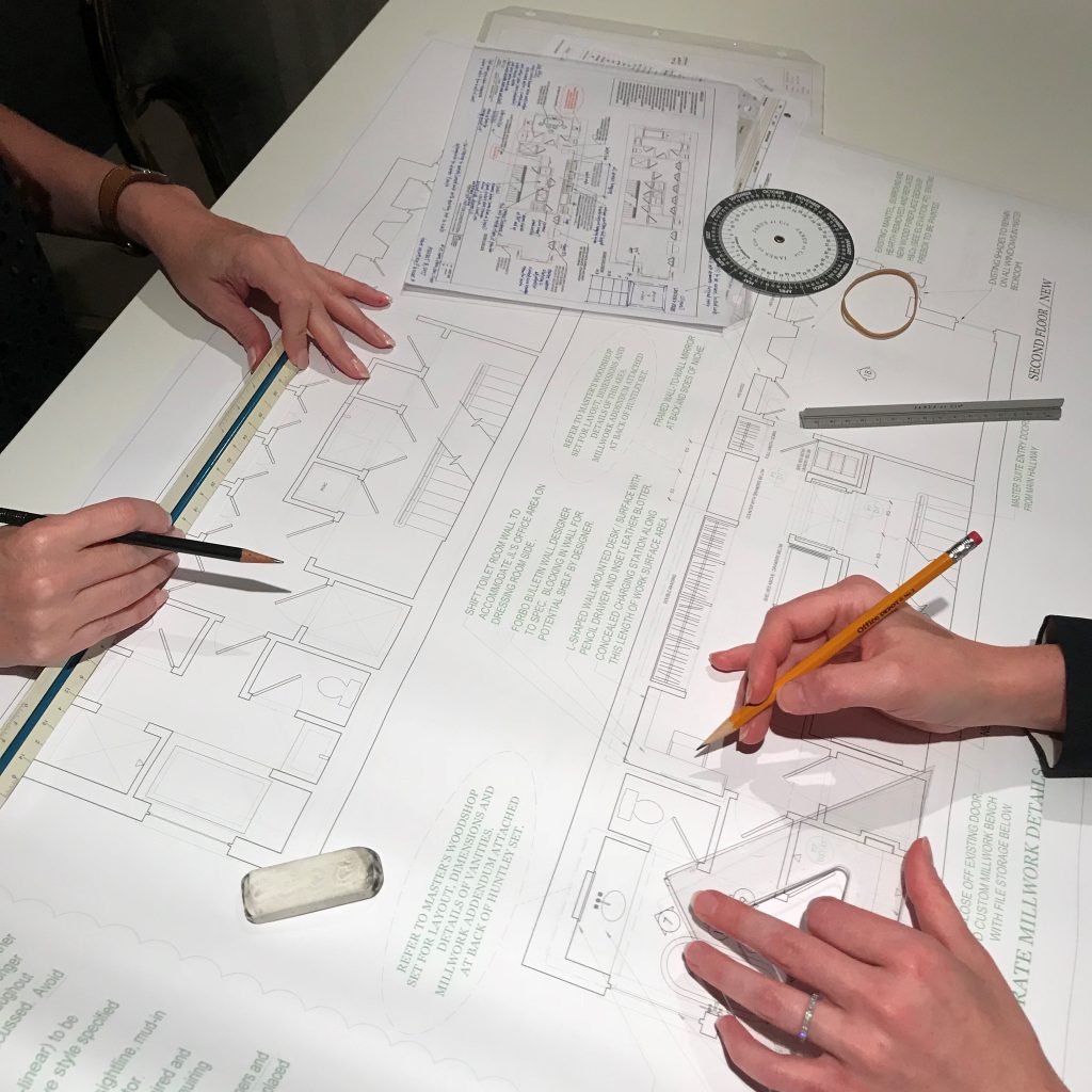
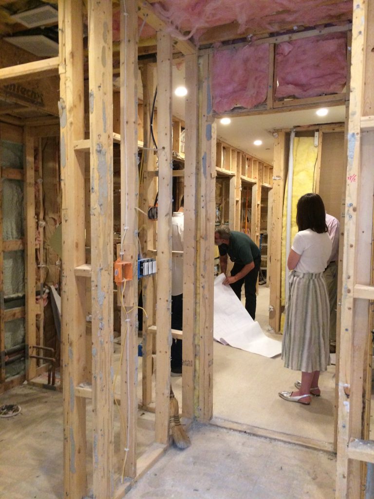
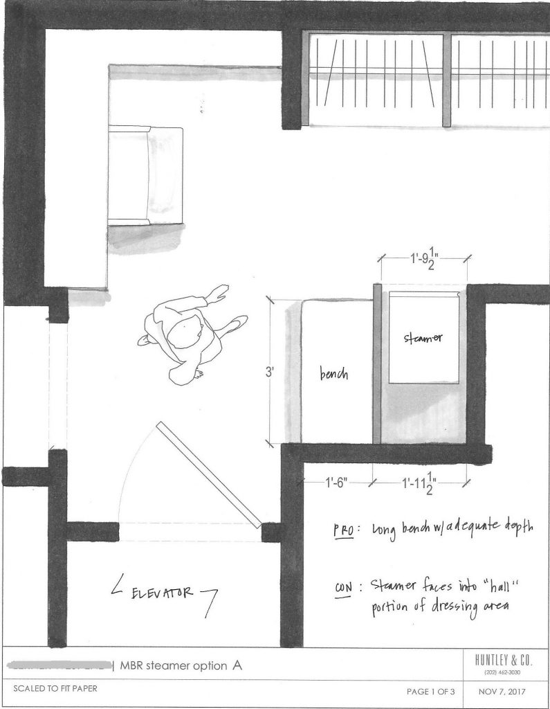
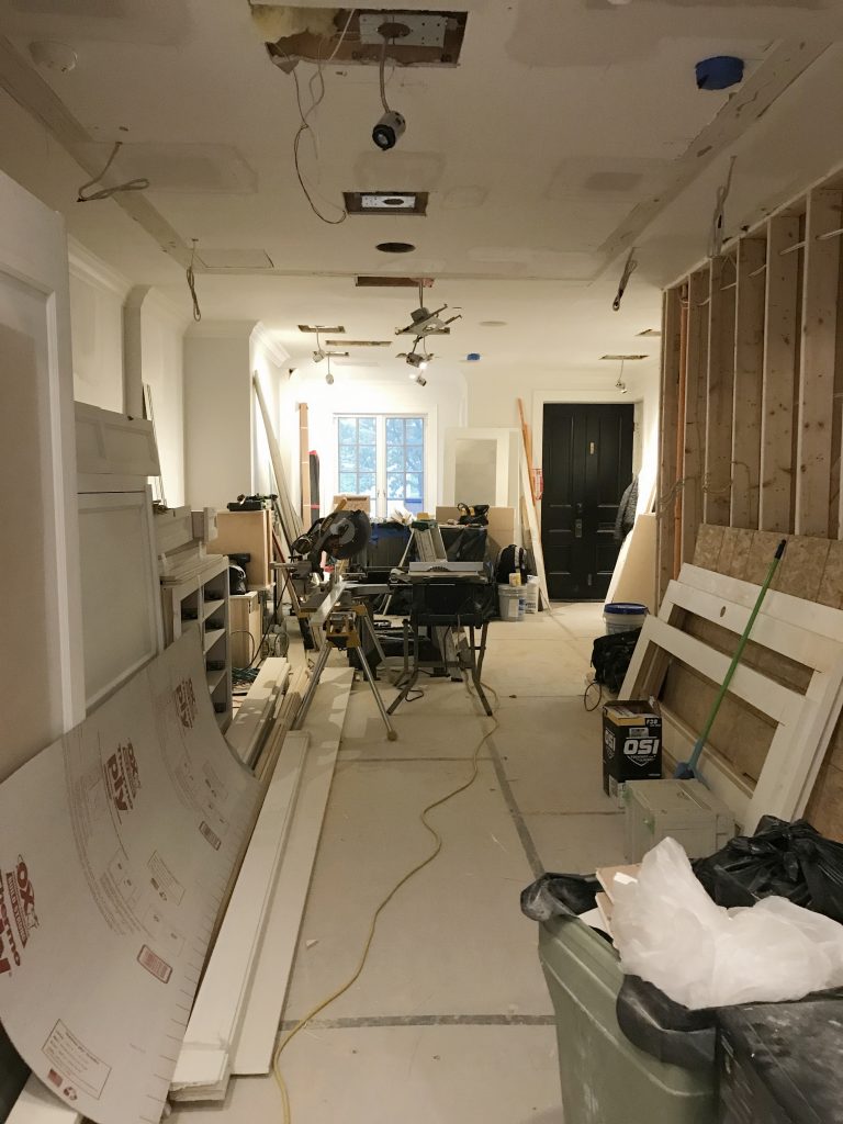
Top photo: One of the pages in the H&Co. drawing set. Bottom L to R: Meeting with the contractor; a study of the circulation in a tight area; drywall in progress.

| MILLWORK |

Millwork is one of the most impactful aspects of an interior. When it’s done well, it can make the house. When it’s done cheaply, it’s like bad teeth – it doesn’t matter how pretty the face is. With this project, our main focus was to reconcile the incongruous architectural details throughout the home and create a more finessed envelope. This included doors, crown, paneling and custom mantels as shown below.

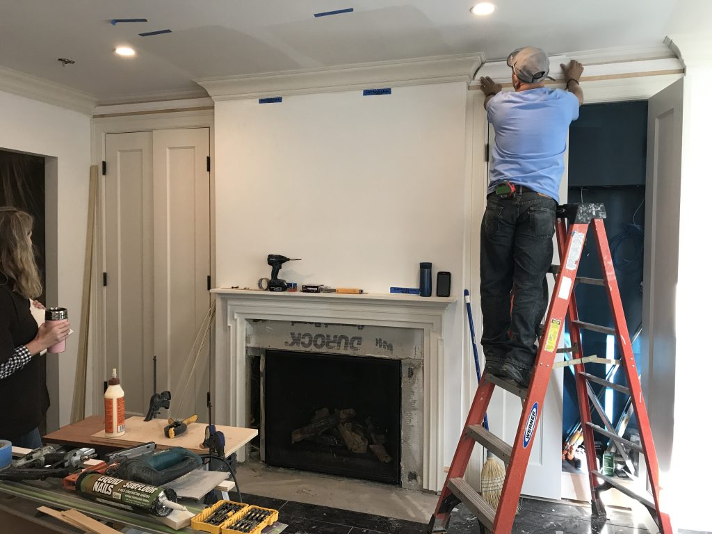
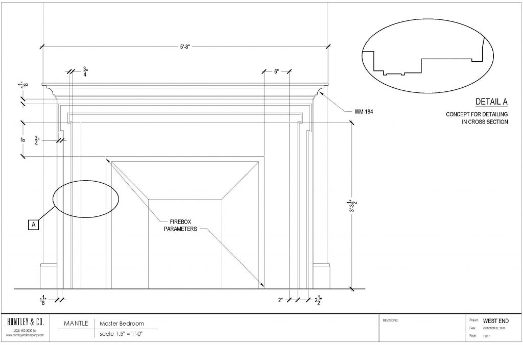
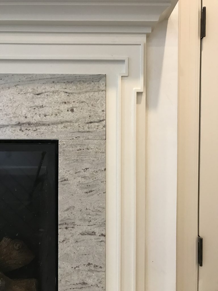
The mantels were designed to complement adjacent millwork for a quieter, more elegant presentation.

| MATERIALS |

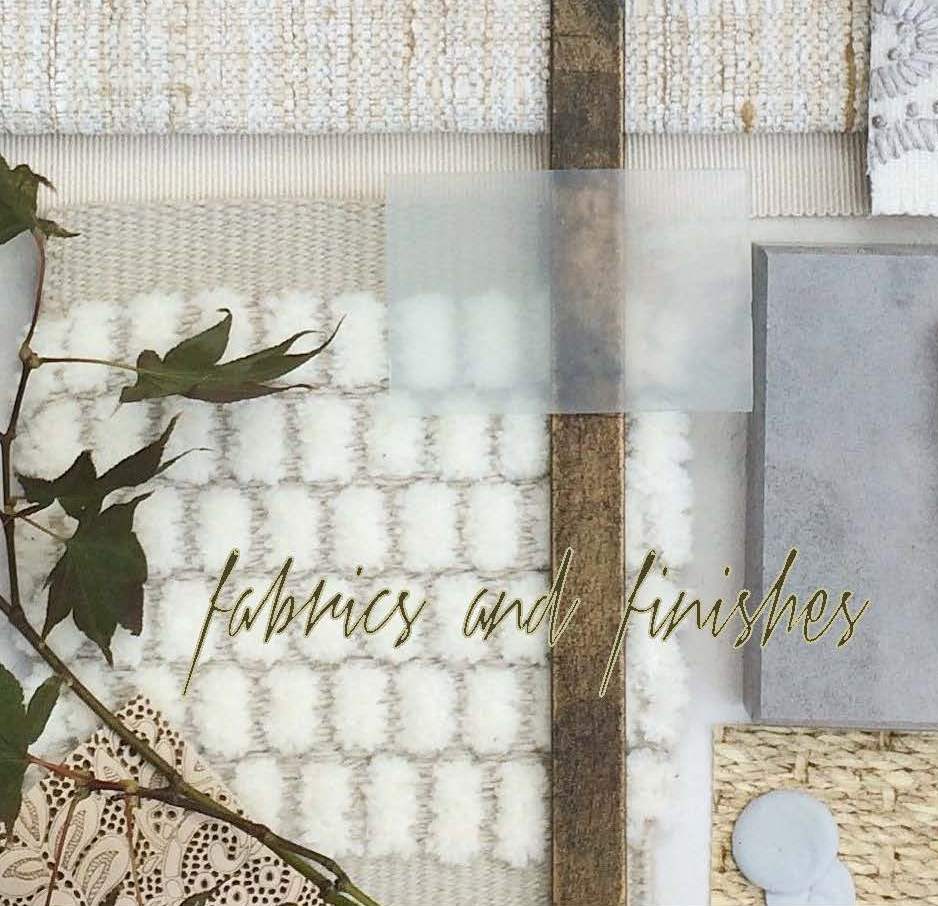
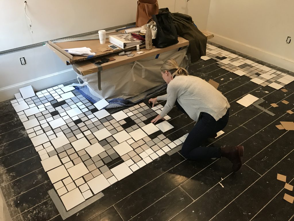
Material selection – wood, stone, tile, metal finishes – sets the tone for the home’s atmosphere and lays the groundwork for decorative elements. When selecting a material, we keep everything else in mind. In a bathroom for instance: Are the windows facing north? What type of glass do the vintage sconces have? How white is the tub? These details are part of the “conversation” and influence what marble slab I approve and tile colors I select.

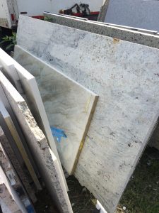
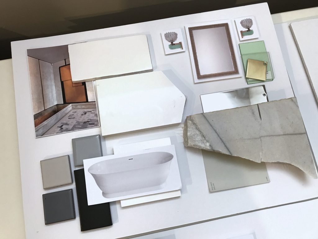
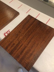
Top L to R: Slab for a fireplace surround; master bath materials, final wood selection for the library.
Bottom: The tile layout for the master bath was a hands-on (and ugh, thighs and knees) process that took several hours. Click photo for a video of the legendary H&Co. attention to detail.

* * *
We hope you’ll join us next week when we’ll share more about the process of specifying furnishings and softgoods! Or take another look at our Concept: West End post to see how this project began.
xo Huntley & Co.

-
Edgemoor Sunroom :: Part III
-
A Perfect Fit
Luxe & Lucid is hosting its first guest blogger this week. At the helm is Molly Hammond –
assistant designer, project manager, and all around go-to girl at Huntley & Co. With a unique
sense of style and impeccable writing she is sure to deliver a beautiful and memorable post.
See you all next week!
Tricia xo
Rather than going into studio art, I was steered towards interiors with the help of my older sister, also a designer.
It gives me the opportunity for practical application of principles I learned in painting, and honestly is more
suited for my personality since every day is different on this job. From time to time, I miss working with
my hands and can find infinite inspiration by studying other disciplines. All in all, there is no other work
I would rather do. One of my favorite aspects of the design process is materials selection. I want to share
the work of a few jewelers, furniture makers, and architects that have pushed the boundaries of the materials
they are composing with, have really created something magnificent out of something ordinary, and have
risen to the challenge of fabricating their designs: you may notice they are all like intricate puzzles.
– CERAMIC –
These ceramics by Solomia Zoumaras are exquisite. Some of her pieces are interlocking.
– PAPER –
Jewelry by Janna Syvanoja represented by Alternatives Gallery in Florence. The amount of precision required
to work with such a delicate material to create these ethereal forms is amazing to me. These shapes could
translate to larger scales sculptures. I have been obsessed for years and still love
these pieces as much now as when I first saw them.
– CONCRETE –
Who else but Scarpa? Its possible that just looking at these details makes me giddy.
I would love to study the original detail drawings for these.
Top two, snapshots taken in Venice at Olivetti: Bottom two, Brion Vega Cemetery
From top left: A staircase at the Palazzo Della Penna in Perugia.(which also houses a collection
of chalkboards by Joseph Beuys) Casa Dos Cubas by Embaixada Architects.
A sculpture at a private residence by Tsao & McKown
- MIXED METALS –
Two brooches in mixed metals by Stefano Marchetti. Some of his additional work is posted
on a favorite inspiration resource, Klimt 02. I am drawn to works with a combination
of sculptural, free forms realized by meticulous craftsmanship.
- STONE –
Kengo Kuma built this assembly space from Ooya Stone.
– CLOCK HANDS –
The wildcard. I had never though of this as an agent for artistic creativity but now I know differently.
From Left. Clock by Christiaan Postma. Jewelry by Sergey Jivetin, at Jewelers Werk
– WOOD –
Made by Meta. In awe. “38 seamlessly joined, curving facets of superbly matched Cocobolo Veneer”
– MORE PERFECT FITS –
Art & Food: an architect & a designer
Left to my own devices, I would probably spend every available weekend at a museum. So, to have
someone that it enthusiastic and knowledgeable about the same is beyond wonderful – I'm really fortunate.
A few weeks ago my fiance and I had a chance for some exploring in New York after visiting friends.
It’s surprising what you can fit into one afternoon, even upstate. We didn’t leave the city until noon,
but still managed a 1 hour drive up the Hudson on a sunny day, time to bask in the almost-unimaginable-
expansiveness of the Dia Beacon, a quick tour of downtown Beacon’s antique shops, and the most delicious
dinner of my life. It’s a very feasible outing and a memorable experience: keep in mind for the next time
you are in the area! My highest recommendation.
At the Dia Beacon. Top: John Chamberlain. Bottom: Michael Heizer, North, East, South, West.
Richard Serra. The Dia is located directly on the Hudson,
so it gets incredible light like I haven’t seen anywhere else.
Blue Hill at Stone Barns. I am still having dreams about this place. Every detail is accounted for.
(Architecture by Peter Guzy of Asfour Guzy Architects) We intended to dine in for lunch, but
got wrapped up at the Dia so we made it for dinner instead. Getting a table on a Saturday night
without a reservation is impossible, so dinner was served at the bar after enjoying expertly blended
cocktails by the fireplace. These bartenders know more about what they do than I may ever know
about design, and having their company for dinner was half the fun. A five course “Farmers Feast”
was actually more like 8 courses and the whisky tasting alongside the meal was another bonus.
My first time having Rip Van Winkle Bourbon … as much for the name and packaging as the flavor.
I had to hold back from gasping at every presentation. Vegetables served on
spikes (!), potato chips woven with sage leaves, and I even wanted to take
home the gorgeous bread basket. And those are just the appetizers.
Thank you for letting me take over this week, Tricia.
Hopefully you all enjoy – and hopefully I’ll be back again :)
– Molly
