-
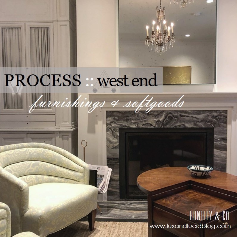
West End Process :: Furnishings
Bespoke, turn-key interiors are a signature of Huntley & Co. First, the architectural envelope and materials are perfected. Next, we turn our process to furnishings and softgoods that complement the space and the client and are unique to the project. Lots of love and labor goes into the design, drawing and specification of these goods.

| FURNISHINGS |
// Living Room channel-back chairs
We custom designed a pair of channel back lounge chairs to maximize flow, circulation and style. Visits to the workroom gave us the opportunity to make adjustments to the design, layout fabric and to monitor progress.
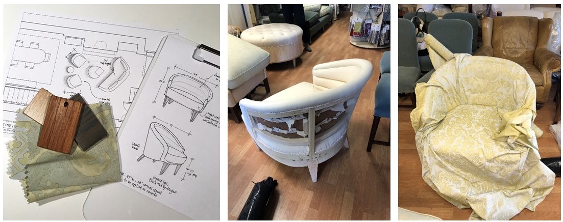
L to R: Leg finish selections; our chair frame gets mocked up in muslin; laying out the large scale fabric.
// Living Room armoire
We source a lot of antique and vintage furnishings for our projects. Sometimes, however, these pieces need modifications to “fit”. This armoire was the perfect scale for the open concept living area and provided much needed storage, but modification to the finish and interior were necessary. New hardware and shirred curtains turned this beauty into functional storage.
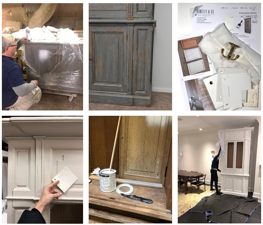
L to R: Removing the old finish; specifying all the new details; installation in progress.
// Master Bedroom canopy bed
Each project has its share of logistical challenges – and we love a good challenge because it inspires us to get extra creative. Our process never leaves things to guesswork. When we discovered that the bed, as originally designed, could not be brought up the stairs or through the windows, we had to go back to the drawing board (literally) to custom design a version that would fit.

L to R: Verifying stairwell and doorway dimensions; studio drawing of the custom pieces and parts; Ironware‘s workshop with assembly pre-shipment.
| SOFTGOODS |
// Master Bedroom roman shades & softgoods
Tailored, functional, bespoke. We designed the window treatments and pillows to complement the quietly sophisticated scheme in the master bedroom. Troubleshooting tricky corners and sourcing one-of-a-kind details makes all the difference.
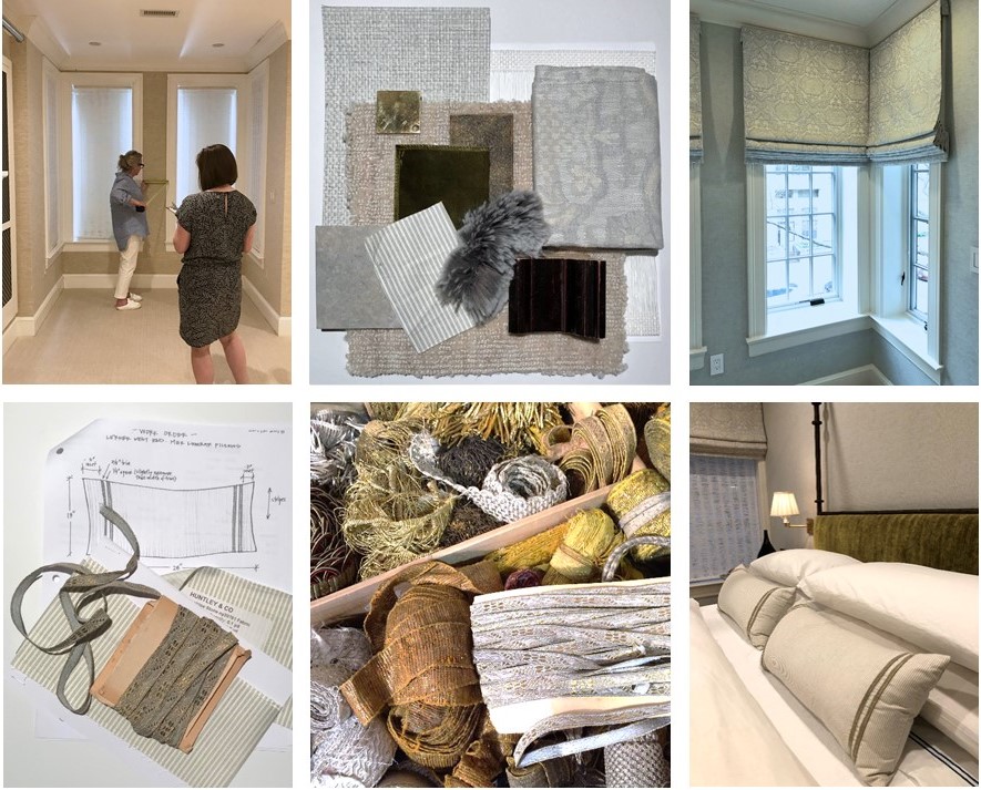
Top: Detailed site measures and schematic review; finished product! Bottom: A pillow workorder; a treasure chest of trim; a well-styled bed.
Stay tuned — Next week we’ll bring this project full circle and share our install with you! And in case you missed the other West End posts, check them out here and here.
xo, Huntley & Co.
Subscribe to our newsletter or find us on Bloglovin’ and you won’t miss a thing ; )
-
Art to Interior
I love art. I considered curatorial studies for a time while in college. During my first exhibit installation, however, I broke two large glass plates protecting a famous photographer’s work. I concluded pretty quickly that “this is probably not for me”. Still, my love affair continued well into my interior design degree and career. There is almost no genre or medium that I don’t appreciate in some way. A 1982 kinetic sculpture and an oil portrait from the 19th century can both stir my senses. It follows then that artwork sometimes informs my designs.

THE STARTING POINT
Essie, Ruby and Ferdinand – Children of Asher Wertheimer, 1902
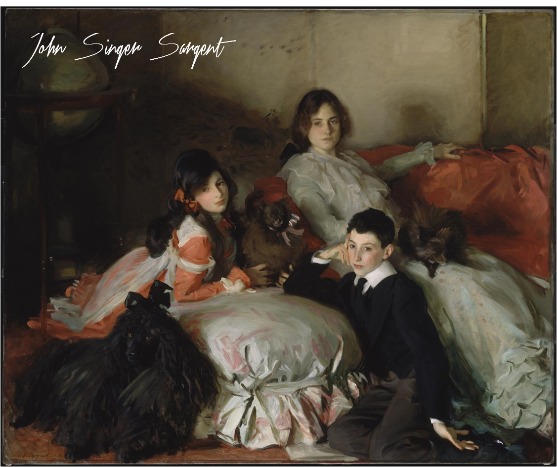
It’s hard to not love Sargent. His oil paintings are lush, moody and undeniably beautiful. I chose this work as a jumping off point for a media principal’s office for its sophistication and intimacy.

THE INTERPRETATION
The idea here is art as muse. I pulled what spoke to me – the colors, tones, textures and emotions. My design is an interpretation of the painting, not a copy of it.
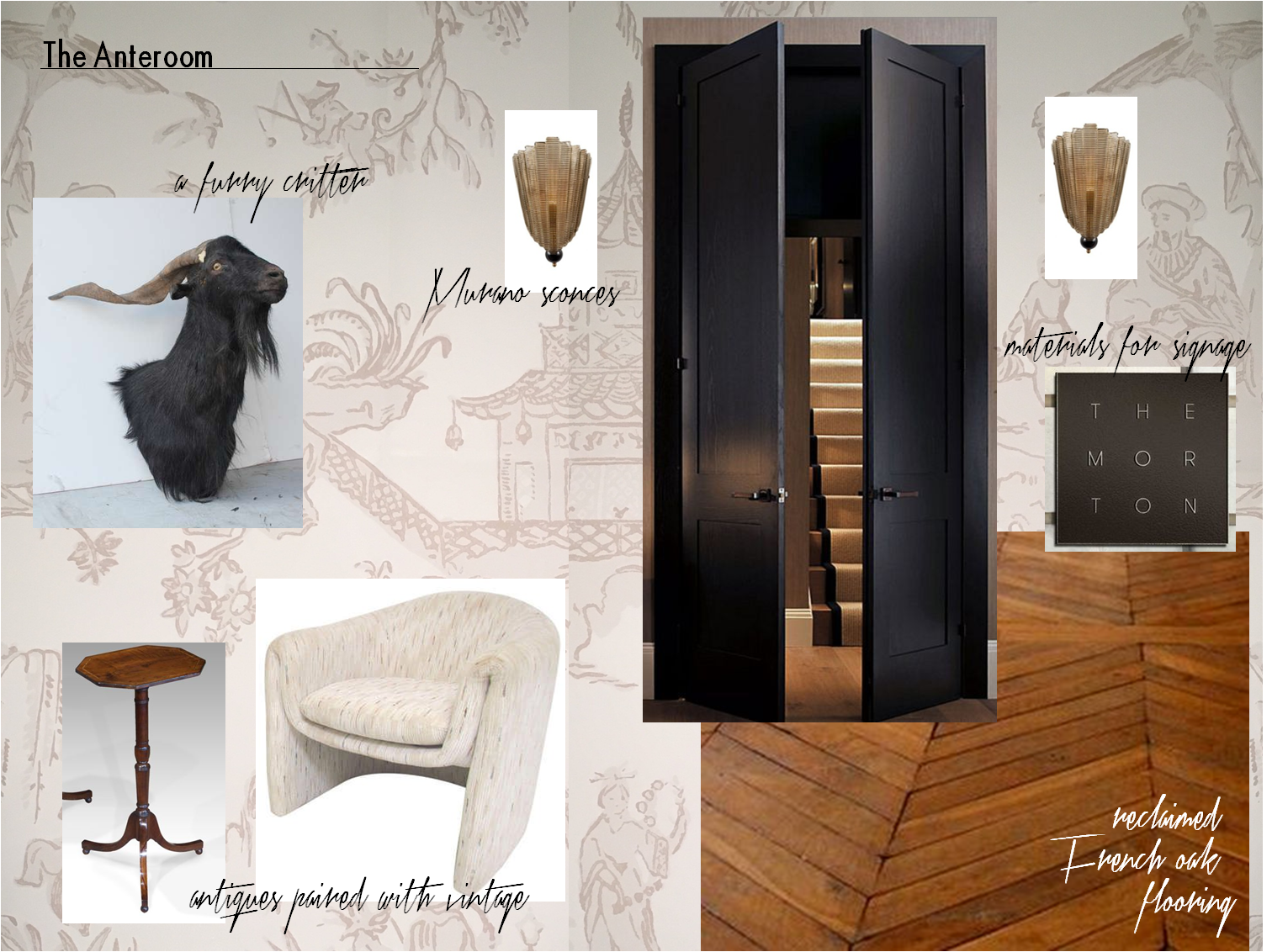
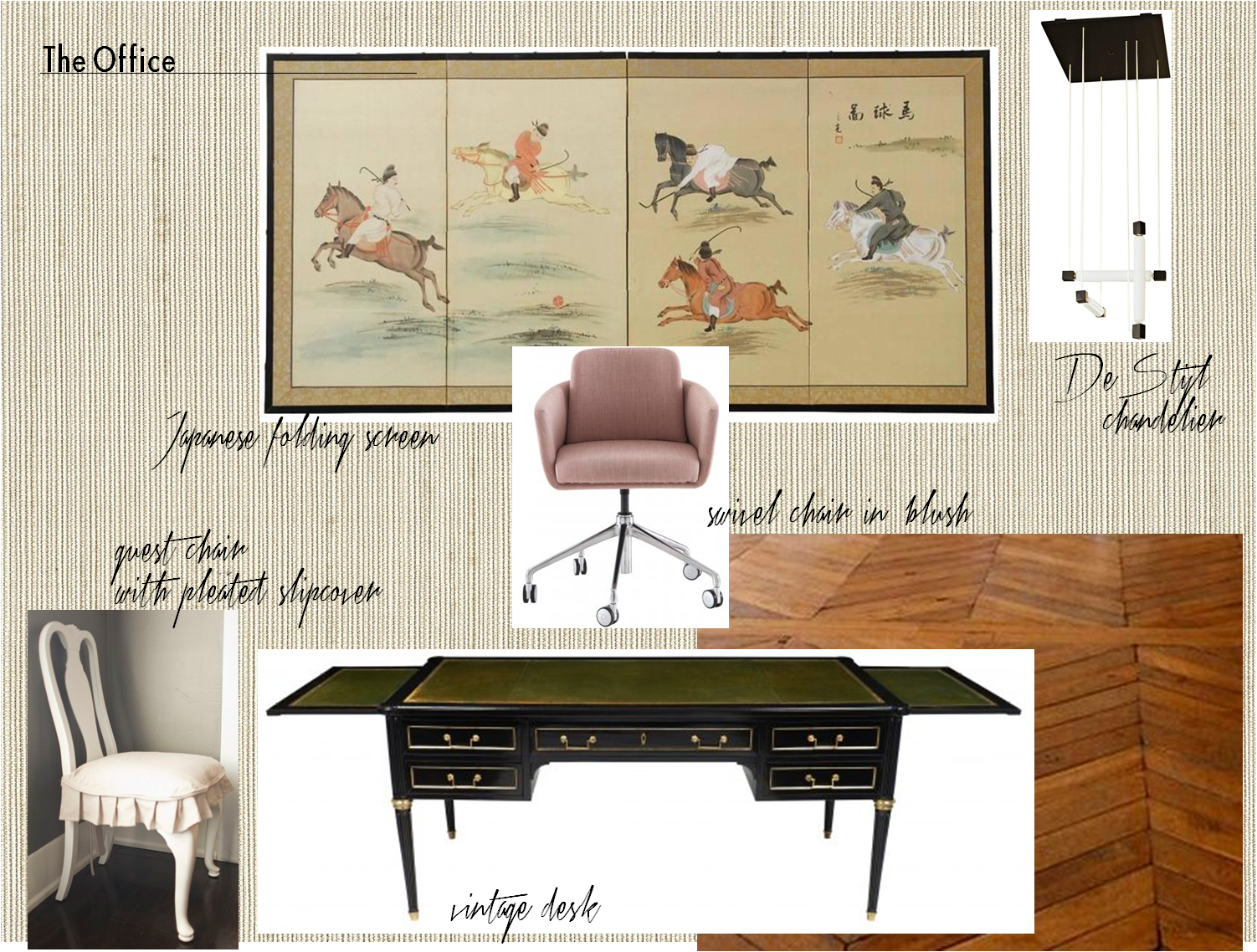
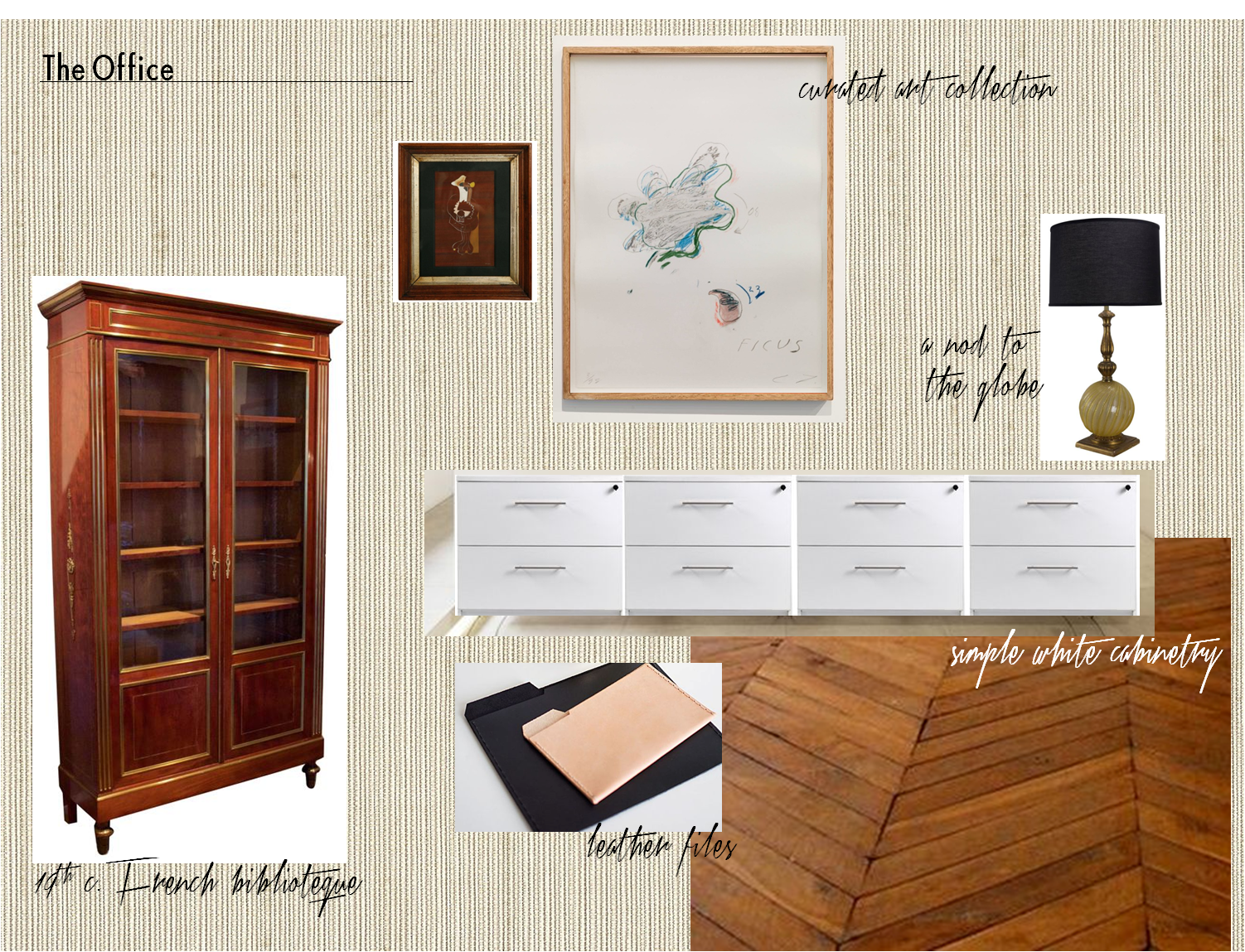
Our client’s office is entered by way of an anteroom. The space is a waiting area for visitors and serves as a buffer between her office and the staff workplace. The finish selections and air of elegance are derived from the Sergent painting. But as this is a modern woman’s office and a Huntley & Co. interior, we changed tack by mixing genres and funking up certain elements.

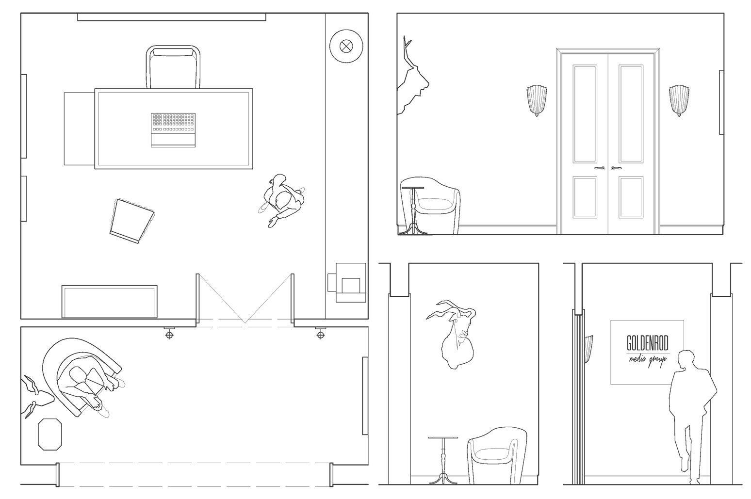
– plan & anteroom elevations –


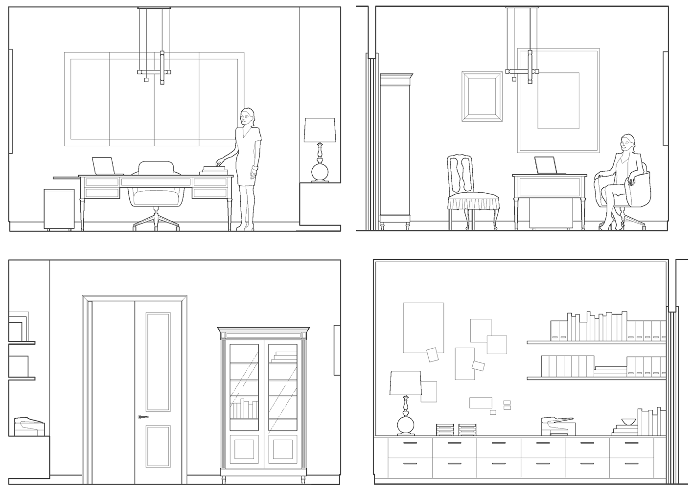
– office elevations –

Our client is a businesswoman and loving mother. She is worldly, feminine and capable – someone who is both interesting and interested. Her combination of sophistication, warmth and strength is part of what has made her a success in her field. With that in mind, we imbued her workspace with a similar sensibility and furnished it with antiques, modern European pieces and an impressive art collection. We think Mrs. Asher Wertheimer would have approved.


Subscribe to our newsletter or find us on Bloglovin’ and you won’t miss a thing.
-
EDGEMOOR SUNROOM :: THE REVEAL!
The Edgemoor sunroom has been installed! Installation days are such a highlight for interior designers. They represent the culmination of months of hard work, careful planning and patience. Considering this project started in the summer of 2015, we were thrilled to see the room finally come to life. So it is with great delight that we report that the room is even more beautiful than we expected. We always have an idea of how an interior will look, but we can’t necessarily anticipate how it will feel. Being in a space where the architecture, the decor and the surroundings truly sing makes all the trials and tribulations of the previous months disappear. We’re thrilled and our clients are thrilled. Santa couldn’t have brought us a better present for the holidays. Enjoy!

|| Pre-Install Site Review ||

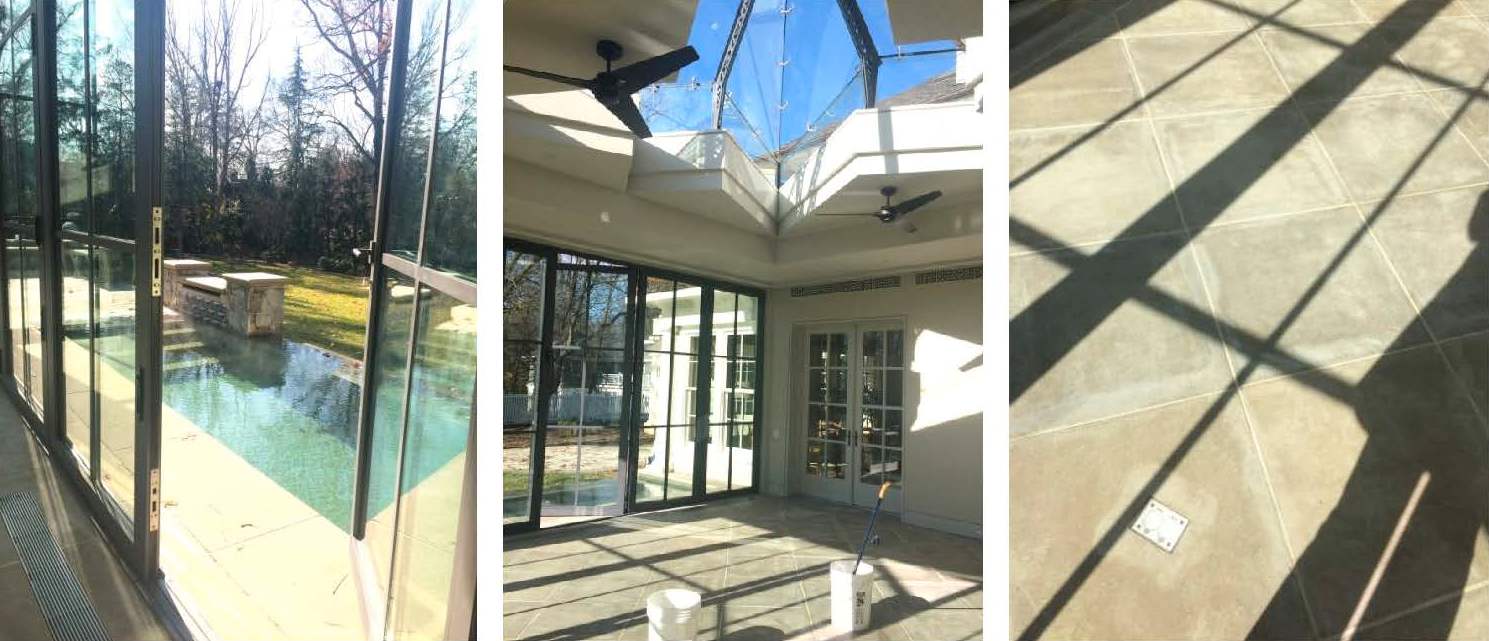
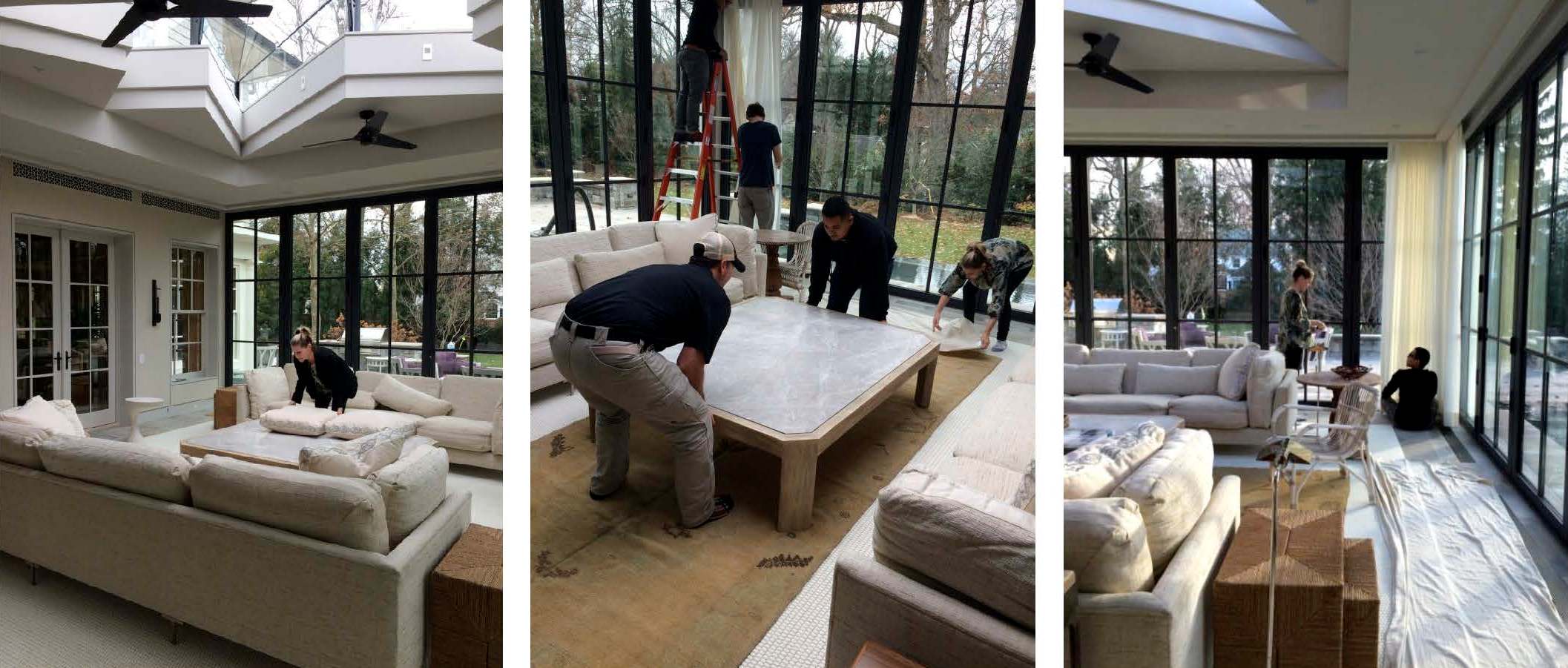
We scoped out the site the day before to ensure that there were no surprises on install day. Thanks to the contractor, all of the construction debris had been removed and the floors and glass were clean. This is a small, but important detail when delivering a room full of fresh, new [and valuable] furnishings. And with a blank slate before us, we were finally able to appreciate all of the beautiful architectural lines and the gracious volume of space.

|| Design is [not] glamorous ||

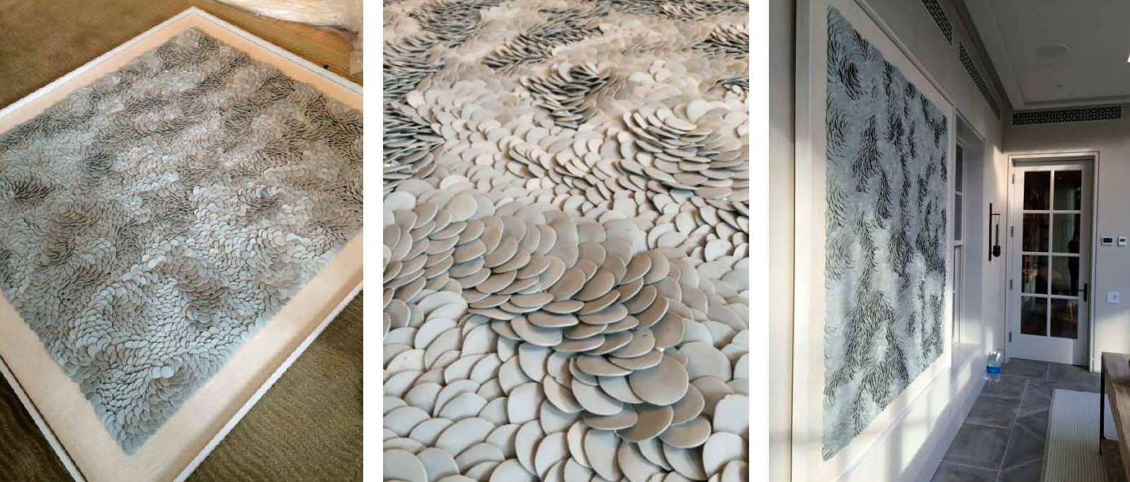
Installations requires a mix of muscle, troubleshooting and finesse. Pillows get fluffed, furniture placement tweaked, and motorized curtains programmed and dressed. One of the trickier exercises of the day was hanging the porcelain Fenella Elms artwork. Both delicate and heavy — and weighing in at well over 100 lbs — it took four men and two very nerve-wracking attempts to hang it on the wall. Needless to say, we all gave a cheer and a generous sigh of relief once it was in place.

|| A Beautiful Finish ||

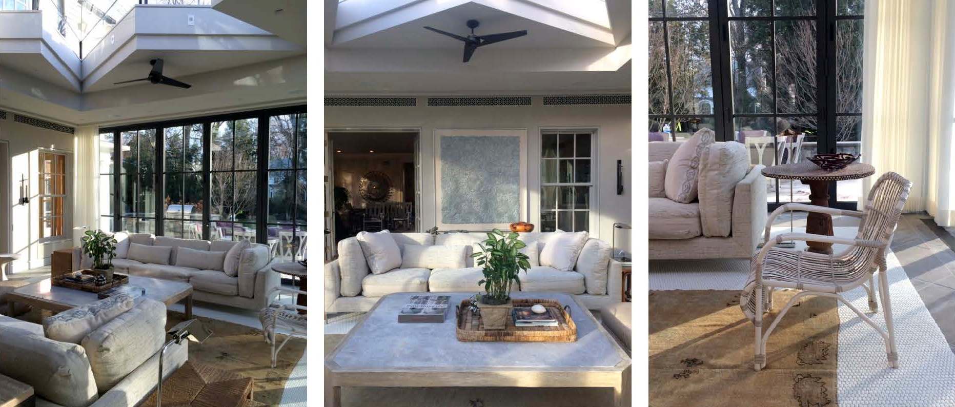
Just as we were finishing the installation, the sun came out and cast an ethereal light into the room giving it a magical sparkle. The shadows danced off the porcelain artwork, the plaster walls, and the mother of pearl inlay on the pedestal table top. Simultaneously, the light saturated the drapery with warmth and illuminated the dramatic skylight overhead. Enveloped by so much natural beauty, it’s easy to envision spending hours in this space lounging, reading, socializing or napping.

|| Taking Care ||

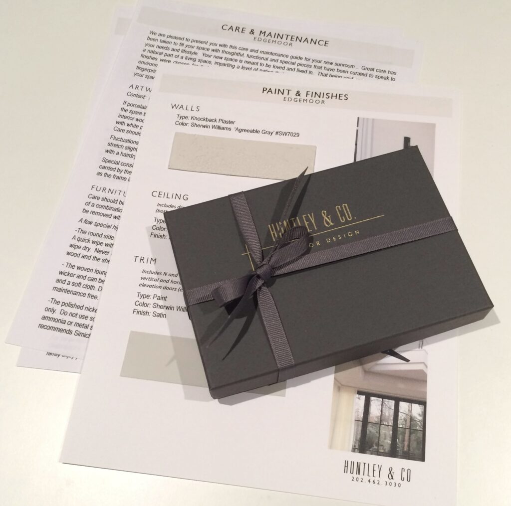
Our work here is done! Well, almost. Installations require guidance regarding the care and maintenance of the space. We strive to ensure our client’s satisfaction by giving them the tools they need to enjoy their homes for years to come. Our care packages vary depending on the scope of a project and specific needs of the client. However, they generally include care and maintenance instructions, mechanical specifications and a paint+finish schedule. In this particular case, we also included a separate artwork care package. The art we installed is fragile and valuable, so we provided our clients with handling instructions along with extra porcelain pieces. And of course, we packaged it beautifully in a Huntley & Co. box with ribbon – something befitting the showstopper art piece itself.

We hope you enjoyed following our Edgemoor series. In case you missed anything, check out each phase here, here, here and here. We will be signing off for the next few weeks to enjoy some R&R. We will post again in 2017 with new installations, discoveries and our behind-the-scenes adventures. Until then, Huntley & Co. — and our mascot Nina — wish you and yours the happiest of holidays!


Subscribe to our newsletter or find us on Bloglovin’ and you won’t miss a thing ; )
-
Edgemoor Sunroom :: Part III
-
Edgemoor Sunroom :: Part II
-
EDGEMOOR SUNROOM
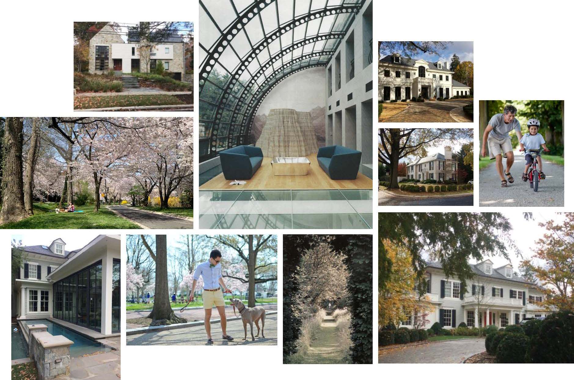
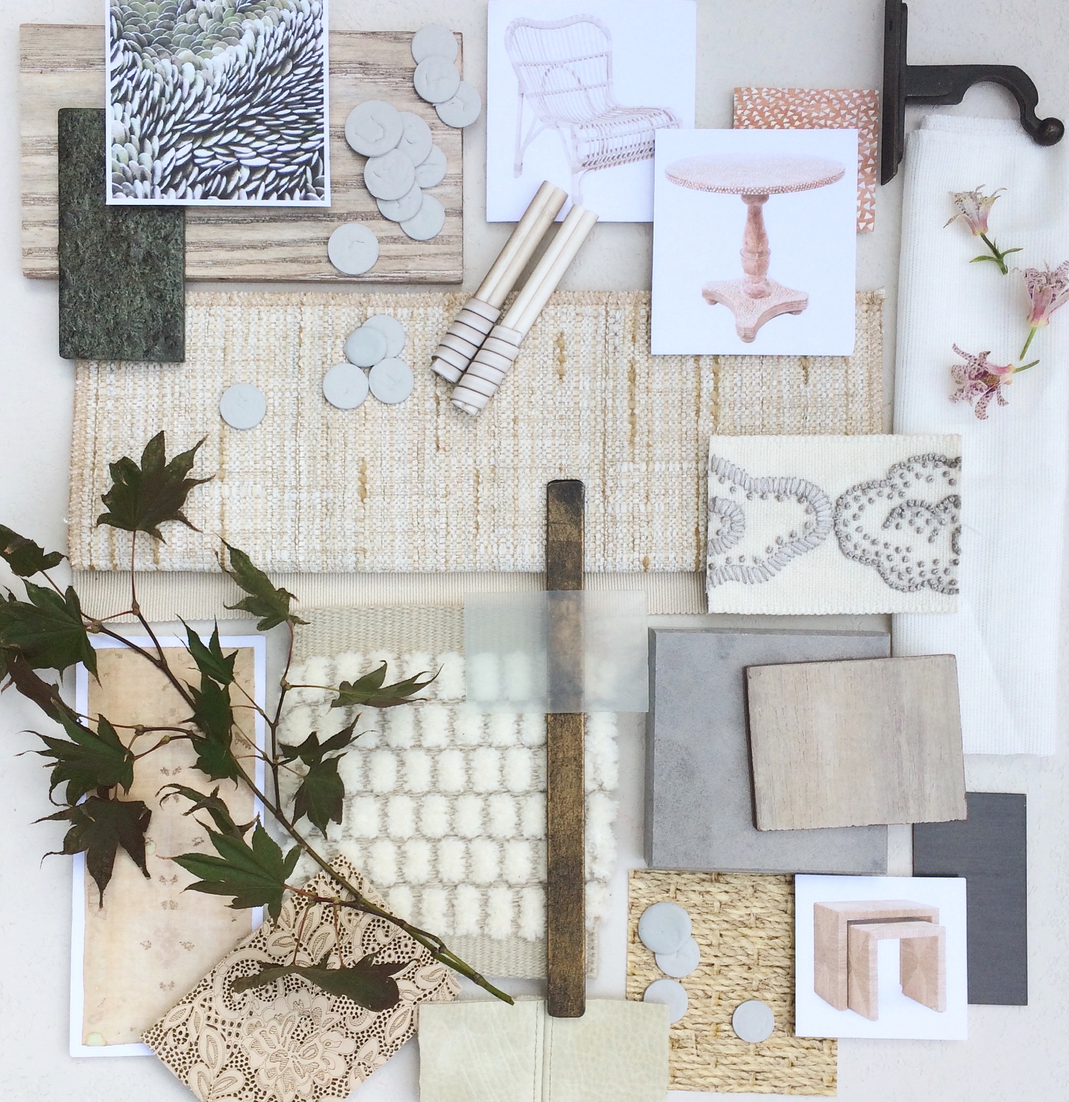
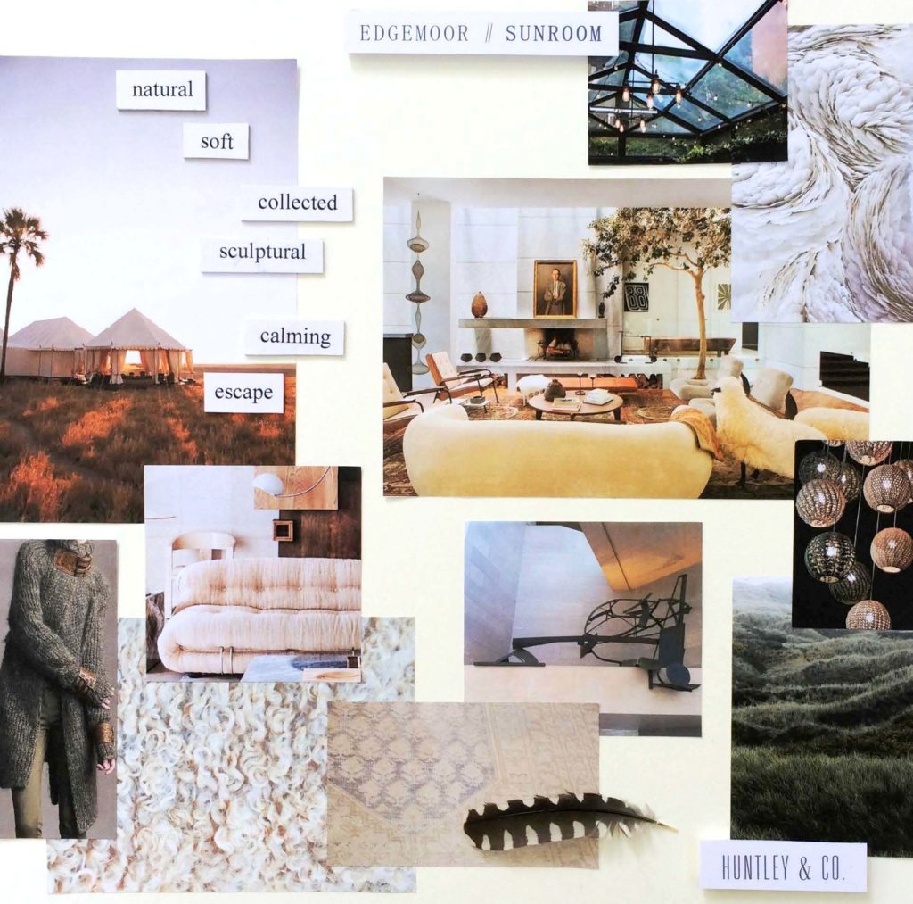
November is filled with anticipation as the holidays quickly approach and designers clamour to wrap up design projects. At Huntley & Co., we have labored long and hard for one Bethesda client in particular and are eager to put the finishing touches on their remarkable sunroom renovation. Our goal was to create a sculptural, textural space that elegantly captures the spirit of indoor/outdoor living. We will be featuring work product and site photos for this sunroom-cum-lounge in the next several posts. And we’ll reveal the installation around Thanksgiving, so just a little more patience! To give you an idea of the inspiration behind our design, we’ve shared the Edgemoor Sunroom concept board below. Wrap yourself up in the luxe imagery and escape.
 xo, Huntley & Co.
* Subscribe to our newsletter or find us on Bloglovin’ and you wont miss a thing.

-
show-house // faux-client :: the reveal!
We know you and our fabulous faux clients have been waiting for our big reveal. The design process is nothing, if not, an exercise in patience. From concept to installation, interior design requires vision, tenacity and know-how. It’s a labor of love, but labor nonetheless. So when the time finally comes to present our clients with their dream home, our excitement is hard to contain. This particular dream home is ‘faux show’, but the thrill of the reveal remains the same … So without further ado!

— THE 2016 FAUX HOUSE REVEAL —

[ Our clients seem pleased ]

* * *

— DESIGNER Q&A —
Our Huntley & Co. clients and room may have been crafted from imagination,
but they do speak to the real methodology and design vernacular of our firm’s work.
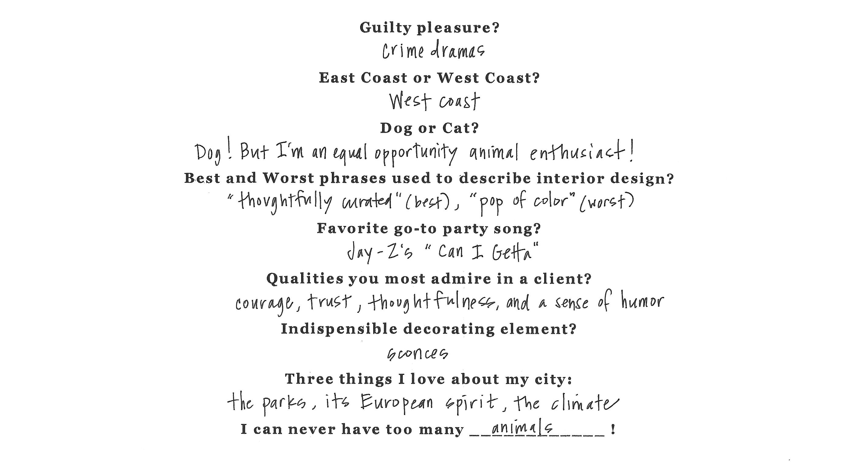
Here, principal Tricia Huntley, opens up about her influences, the importance
of breaking the rules and the best song to get a party started.

1. What are some of the things that influence you, aside from furniture and décor?
Museums, music, fashion, history, parks/nature, architecture, poetry … those things that are thoughtful, provocative, moving. I like to start with a feeling or mood before I pivot to the tangible aspect of things.
2. What qualities of a room do you most admire?
Substantial hardware and appropriate, expertly executed millwork. I would rather live in an empty house with those two qualities than a shoddy new-build with the best furniture.
3. Design rule you love to break?
Symmetry. I was classically trained so I believe in building a space according to the rules of symmetry. But I also believe that breaking that symmetry in clever, nuanced ways is what brings a room to life.
4. You know these clients will be having many a fete, what’s a good hostess gift?
I love to give sophisticated, unusual candles and fragrances. Aedes de Venustas, Joya and Santa Maria Novella all offer intriguing scents in stunning vessels. And of course, good booze and wine never go out of style. Add a beautiful ribbon with a handwritten tag and you’re done.
5. Rapid Fire!
* * *

It’s been fun, but we need to dash! Our clients told us to get out so they can enjoy their new home ; )

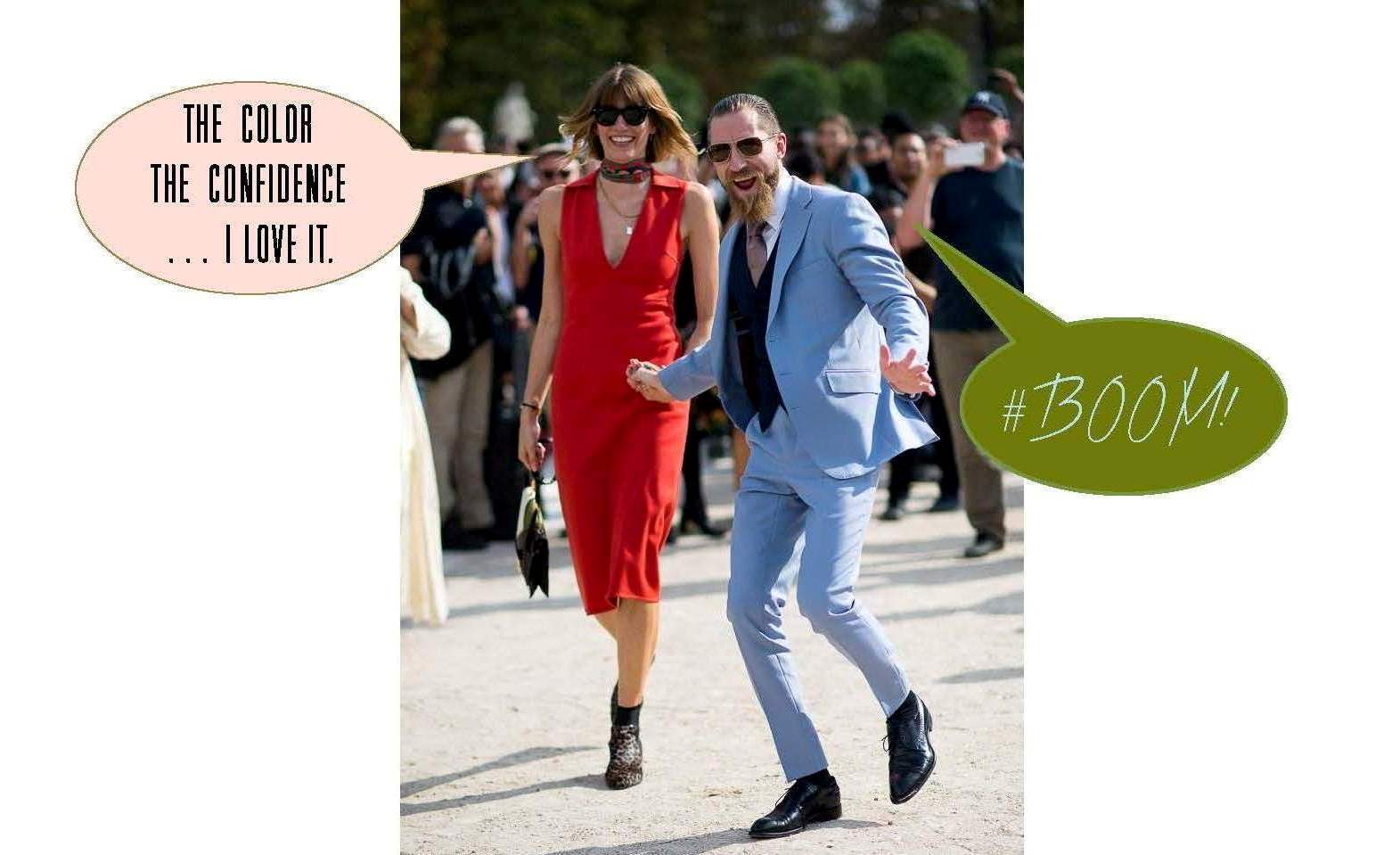
If you want another glimpse at the process, simply click on posts Part I, Part II and/or Part III. And special thanks to our “faux clients” Justin O’Shea and Veronika Heilbrunner. They are the coolest couple on the planet and dream clients fo sho!
-
SHOW-HOUSE // FAUX-CLIENT :: PART III
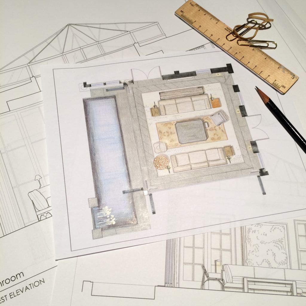
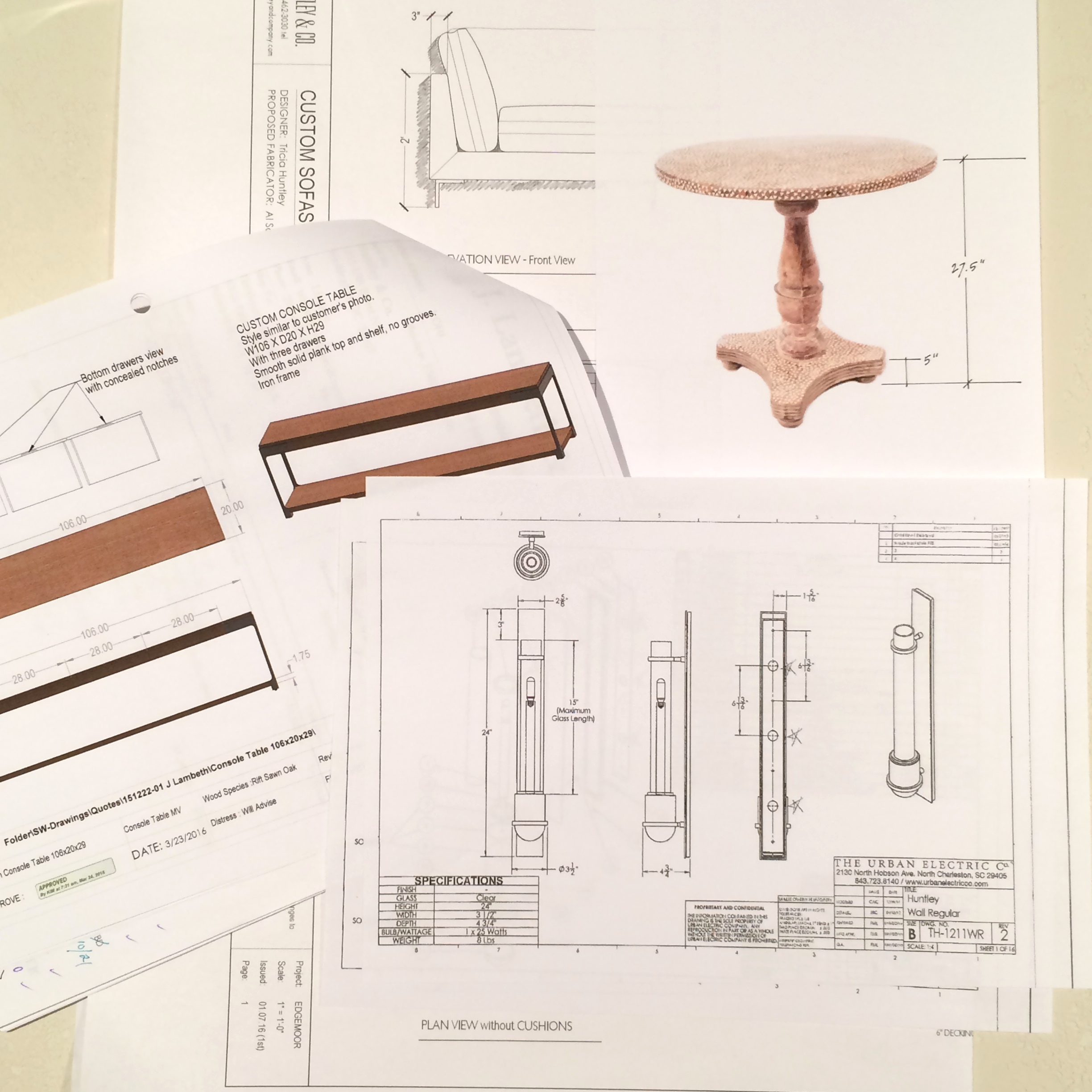
Sourcing goods and materials for our interior fuels our creativity, but drawings take the design to the next level. After all, a room is only as good as it is functional — we aren’t aiming for beauty just for beauty’s sake. Working out our ideas in AutoCAD ensures that we are on target with scale, proportion and spatial relationships. A well-trained designer can evaluate whether a piece will work in a room or not simply by looking at it. Still, transferring its dimensions to paper (or the computer as in our case) ensures down-to-the-1/8” accuracy. Huntley & Co. is a business built on mindfulness and our drawings are the technical backbone of our work.


The Floorplan___________________________
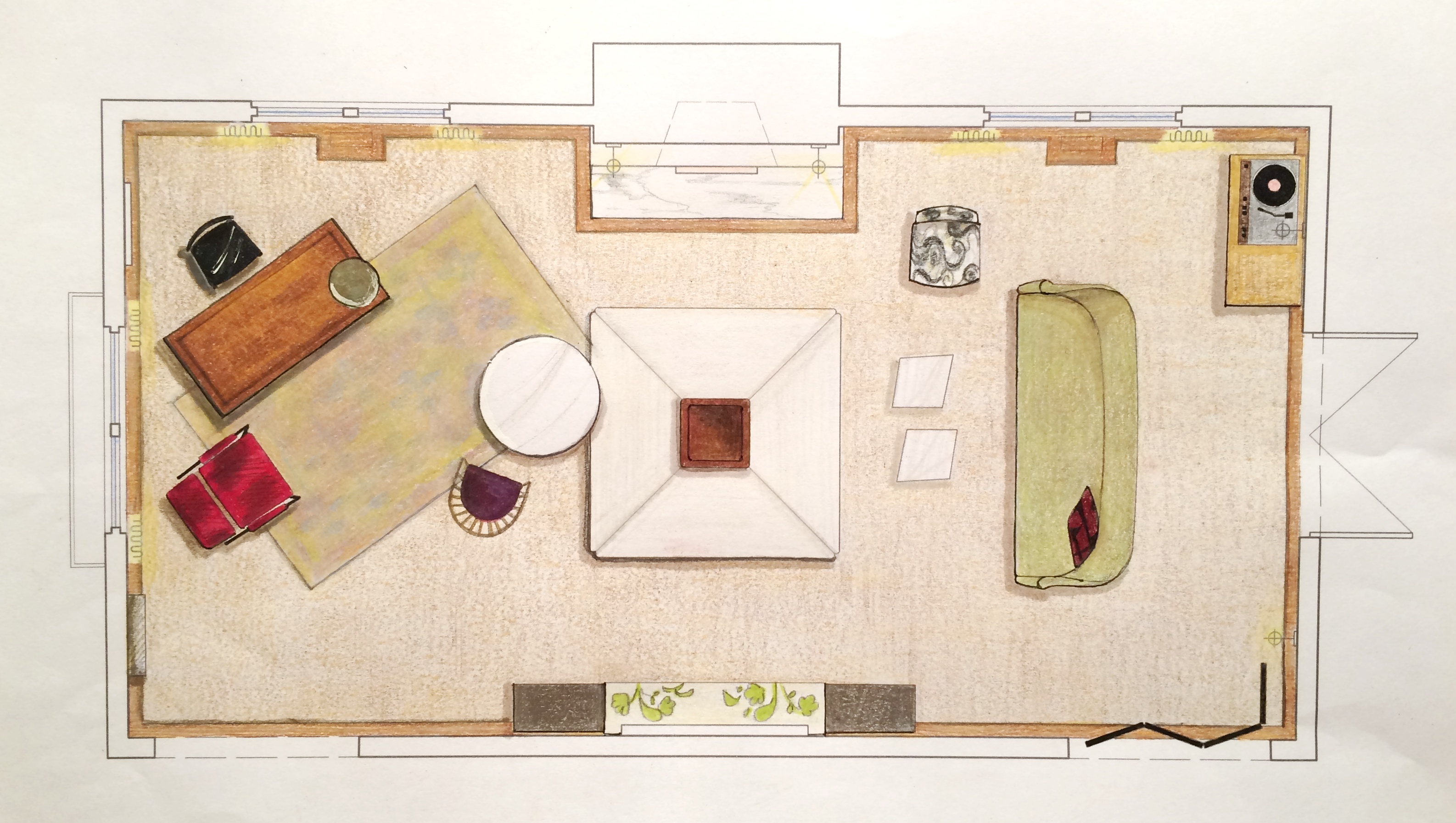
We start with a floor plan, which guides the flow and circulation of a space. With our clients’ penchant for entertaining, it was important to think outside the traditional box and get creative with furniture placement. Our ‘star’ is the four sided bench that beautifully anchors the room. Varied seating arrangements offer opportunities for independent conversations and debate for our clients’ guests who come from a wide range of cultures, professions and political views. The room is meant to be as warm, interesting and thoughtful as the clients are.


The Elevations___________________________
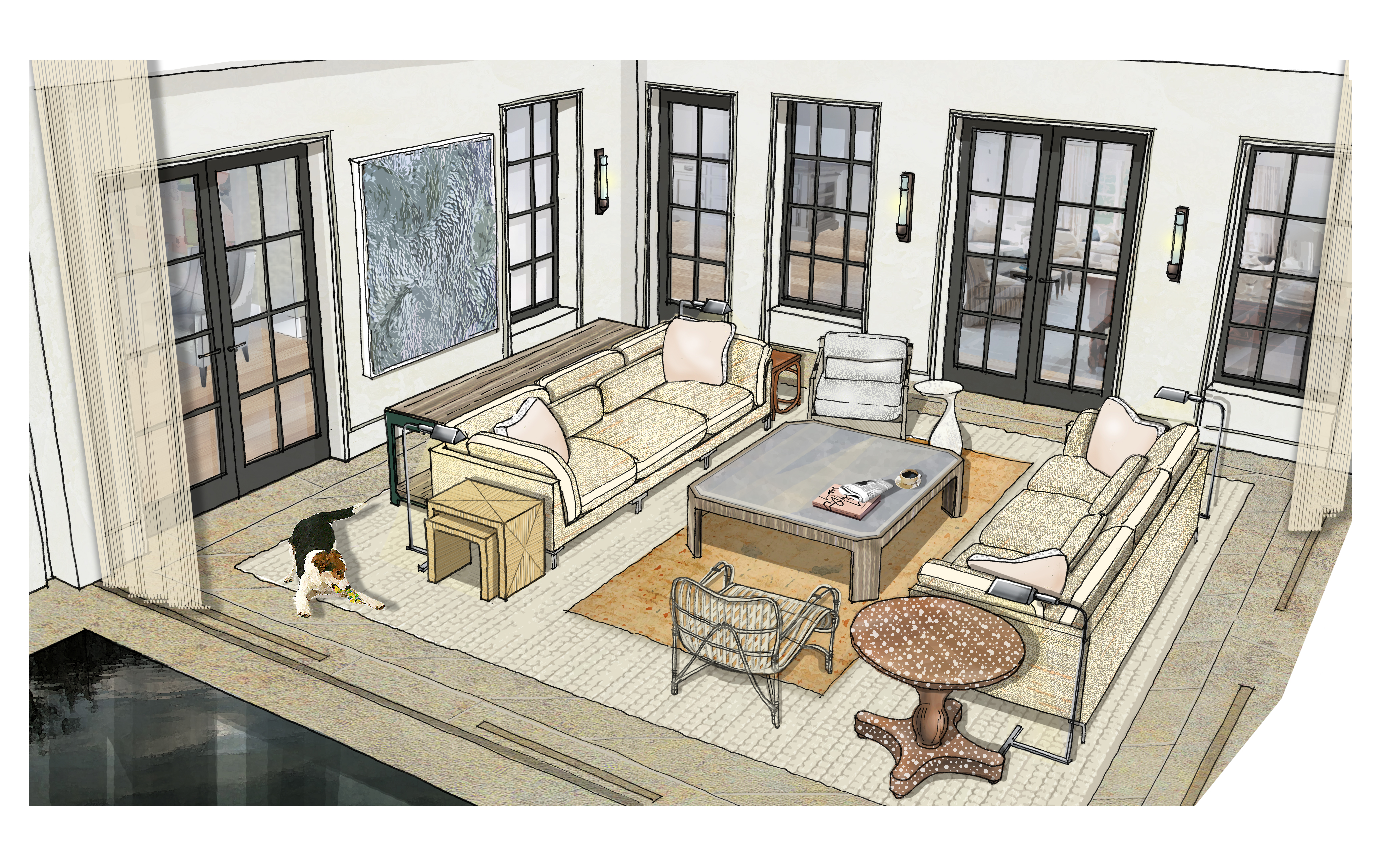
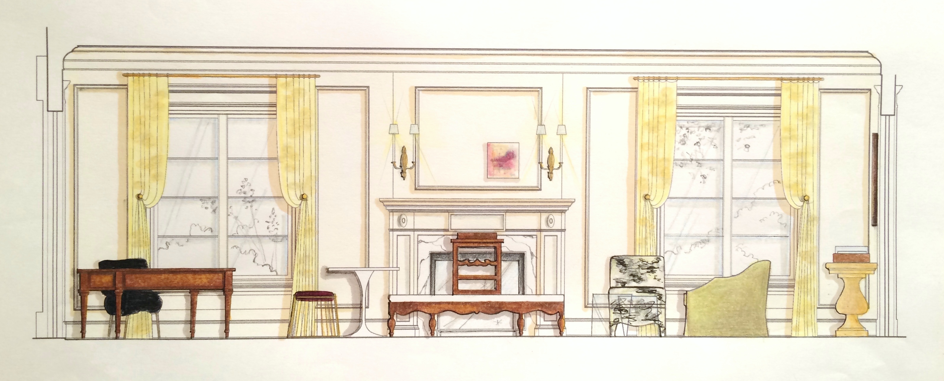
Elevations reveal how a room’s architecture, furnishings and art will work together. A space won’t look or feel good if there are too many masses, it’s too ‘leggy’, everything is at the same level or the values are off-balance. Deep-diving the millwork, fenestrations and other details gives us the platform we need to make good decisions. Not to mention that “pulling the design up” and seeing it come to life happens to be pretty exciting ; )


The Presentation Board____________________
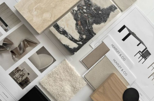
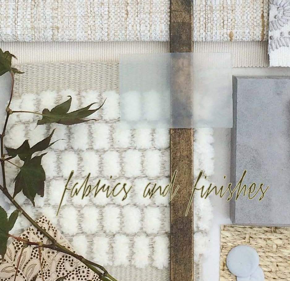
The presentation board is our opportunity to showcase the tactility of a room. Ambience is affected by the ratio of soft vs. coarse, understated vs. luminous and natural vs. refined materials and textures. We wanted this space to feel glamorous, but totally approachable with an air of intelligent wit. With that in mind we combined fibers like linen, seagrass and rushing with velvet and damask. Then we took it a step further by incorporating lacquered leather, eelskin and electric-colored cowhide. This is a luxurious space where you can kick up your feet and have fun!


The Response___________________________
And because these are the dreamiest of clients, they love everything and will TAKE IT ALL! Orders are placed and construction begins. This next phase is about site visits, management, coordination, follow-up and a lot of patience. But we’re getting our hands dirty and seeing our workrooms do their magic — so we love it!


______________________________________________________________________________
Tune in next week for a fun Q&A and the FINAL REVEAL! We will be sharing more insights about our process and the why’s and how’s of a successful design project.

Subscribe to our newsletter or find us on Bloglovin’ and you won’t miss a thing ; )
-
SHOW-HOUSE // FAUX-CLIENT
A showhouse is unique in that it provides a designer with the freedom to create a space that is bound only by her innovation and talent. With a project that lacks a scope of work and a flesh-and-blood client, we find it important to invent a narrative to guide our design concept. At Huntley & Co. we create a “faux client” to serve as muse during the showhouse process. We have been blessed with some pretty wonderful clients throughout the years, but our Faux Clients 2016 definitely have us crushing hard!


dc interior designer
Concept Development______________
Washington DC is a city filled with people of varied and interesting backgrounds. Our Huntley & Co. “clients” are an art dealer wife with an international childhood (thanks to a father who was Ambassador to Peru) and a west coast-born husband with a Renaissance spirit. The couple shares a love of art, music and philanthropy. Both travel frequently to New York, California, Europe and South America. With that in mind, our goal for these busy and passionate entrepreneurs was to create a true LIVING space that reflects their personal histories and nurtures the lifestyle of their young family.



Already inspired? Fantastic! Because Huntley & Co. will be sharing more insights into our showhouse process as well as a final ‘reveal’ in forthcoming Luxe & Lucid posts. Subscribe to our feed or follow us on Bloglovin to stay tuned!

-
Tableaux
There are only two things in this world of which I will never tire. One, cute animals. And two, vignettes. It’s true, nothing snaps me out of a bad mood faster than a cleverly styled tabletop or an otter eating lettuce on Youtube. Vignettes I love because they can be pulled together in minutes. I love them because everyday things – a branch from the yard, a child’s toy, a vintage teacup – always make them more interesting. I love them because they have personality. I love them because they’re artistic and inspirational. I love them because they make me happy … even sans otter.

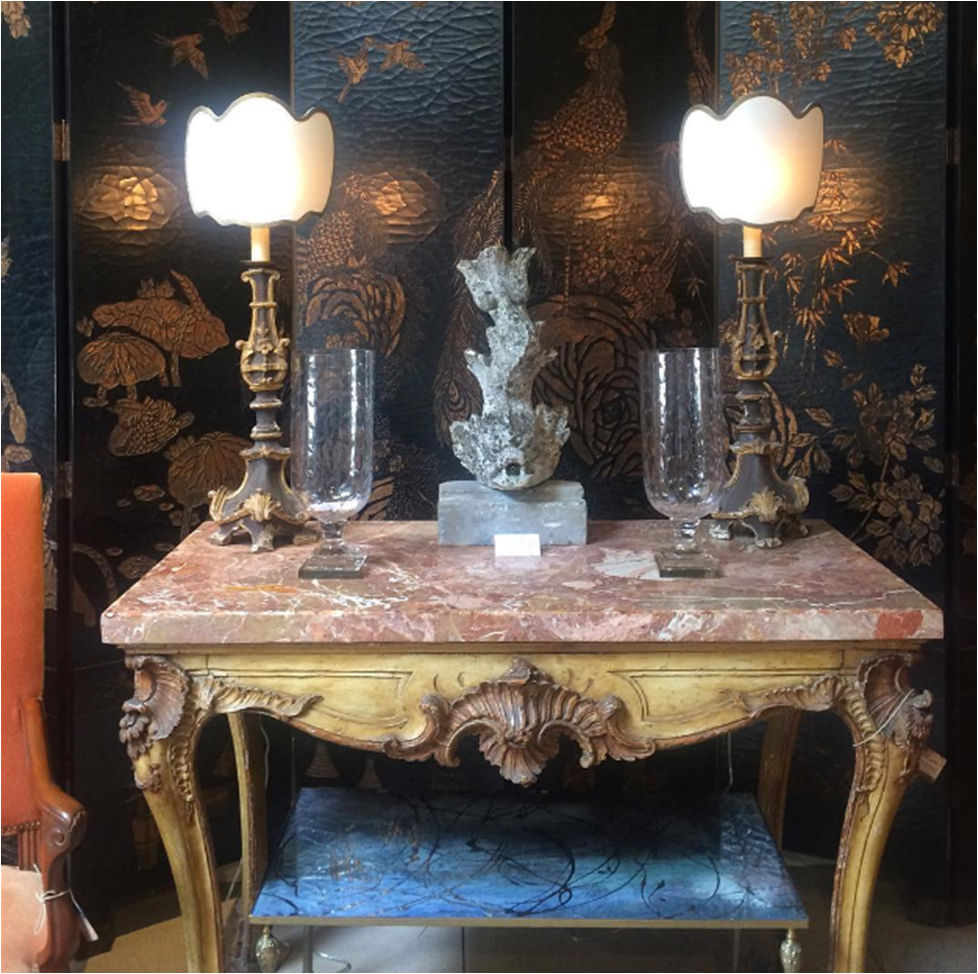
A favorite vignette from my LA trip this spring.


Richard Holley | McAlpine, Booth & Ferrier

Lorenzo Castillo


Huntley & Co. (L&R) | Peter Vitale (center)

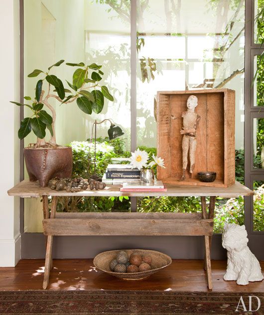
Huntley & Co. | Ellen DeGeneres

Jean-Louis Deniot


Huntley & Co. (L&R) | Elle Décor (center)


Elsie de Wolfe | David Hicks

Alexandra Kidd


Huntley & Co. | Ernesto Pigni
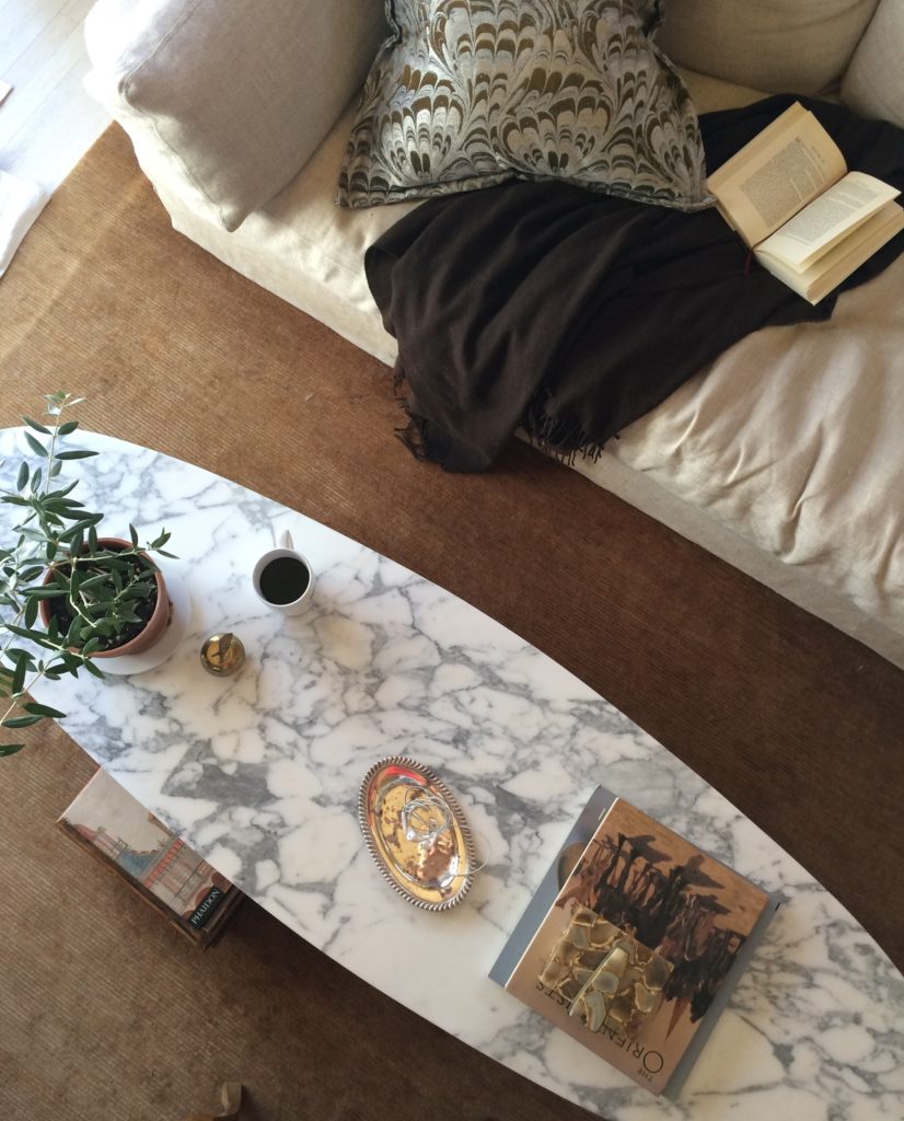

Sunday morning at chez Huntley | The National Museum of American History in DC


Darryl Carter | Lucinda Wharton | Horsch Interiors
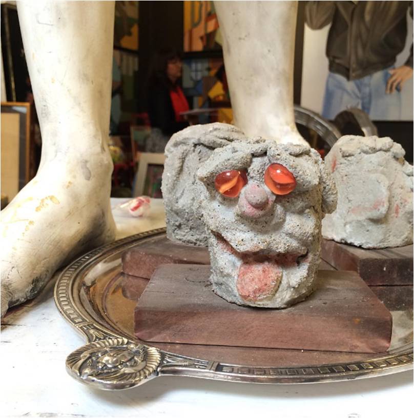
Best tableau ever by A. Shaw Antiques at Highpoint.

Drop by the Luxe & Lucid Pinterest page for dozens of other gorgeous, brilliant vignettes.

