-
Ironware’s Designer Spotlight
In an interview with Ironware International, Tricia answers all your burning questions including what inspires her, what’s on her bucket list and whether she prefers 70s soul, country music or contemporary pop (hint: all of the above).

Ironware Q&A
Who is a designer you admire and why?
Muriel Brandolini. I admire her creativity, fearlessness, passion for craftsmanship and ability to mold her very particular look into something traditional or modern.
Where is your favorite travel destination?
Italy. Rome and Florence are favorites – The Boboli Gardens particularly in Florence.
What or who has inspired your work recently.
I recently watched the documentary ‘Agnelli’ about the life of Gianni Agnelli. His style is legendary. His clothing, grooming, homes, cars, art, mannerisms—all were impeccable, incredibly glamorous, and yet, totally effortless. He embodied midcentury Italian style.
Is there a special detail you always add to your projects?
Bespoke furnishings. We always create custom furniture, lighting and/or softgoods for our projects.
What is the most common mistake you see in interiors?
Uninspired art. Seeing a well-executed interior with art that’s decorative or pedestrian is soul-crushing. An artwork collection should be a mix of genres and price points; some should be thoughtfully curated pieces, others should be “finds” from vacations and flea markets. It shouldn’t be too perfect, too much of the same or purchased based on what your friends own.
What is most exciting to you in your career at this moment?
The landscape of our industry is constantly shifting and it’s become an ongoing challenge for designers. The good news is that I love a challenge. I never thought I would have to explain or defend my professional value at this point in my career, but I’ve come to realize that it ups my game in many ways. I continually pursue new levels of excellence in design and business. That keeps my job exciting and interesting.
How would you best describe your style?
Eclectic yet edited. I like unexpected pairings and a bit of tension wrapped in a thoughtful, comfortable envelope.
Describe a favorite piece in your personal home
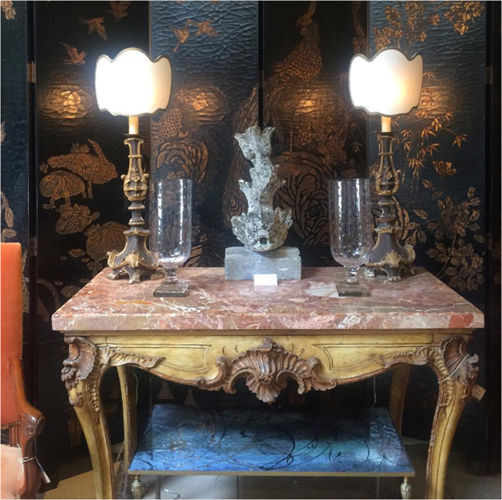
I purchased a vintage coromandel screen last year and installed it in my dining room. It has a rich warm wood finish with slightly colored carvings. It has great scale and is both very elegant and a bit weird. It’s flanked by crystal Swedish sconces with my dining table, pink leather chairs and brutalist chandelier completing the arrangement.
What are three (or four!) things you can’t live without besides family, faith and friends?
Comedy radio, cursive handwriting, my Swell water bottle and Nina, my beloved Norwegian Elkhound.
Name something on your bucket list
Going on safari in Africa.
What music are you listening to right now?
70s soul, country and the Sia station on Pandora.
Why do you choose Ironware for your projects?
Ironware has substance. Playing the textural and sculptural against clean lines is part of what makes a Huntley & Co. interior. Ironware is the perfect counterpoint to more tailored furnishings.
Ironware x Huntley

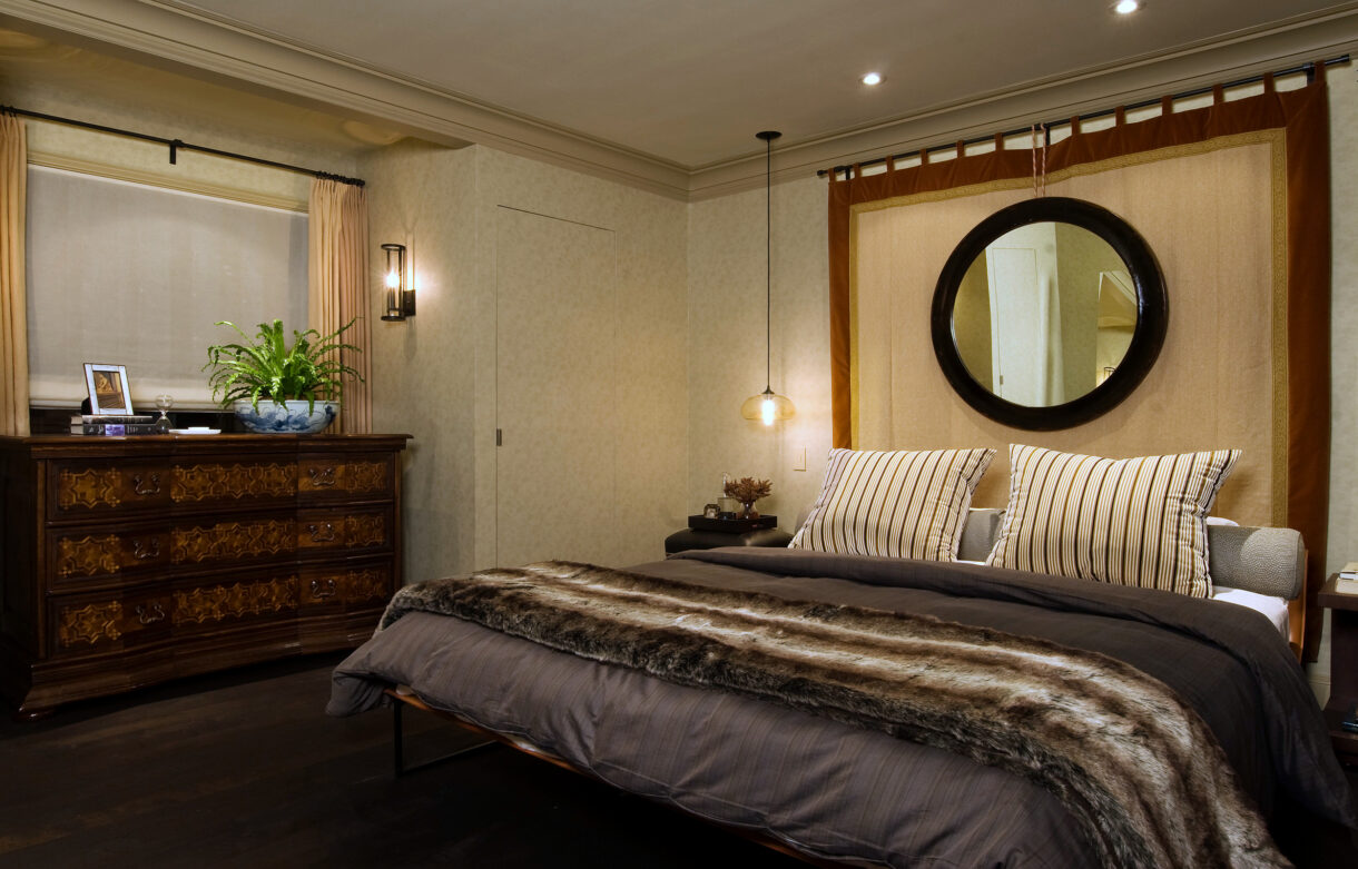
(L to R): the Alicia table in an Annapolis project; the Huntley-designed Celine pendant; a master bedroom features the Diego bed. 
The Celine pendant and a multitude of other gorgeous light fixtures, furnishings and accessories are available to-the-trade on the Ironware International website. HUNTLEYCODESIGN loves IRONWARE!

www.luxeandlucidblog.com
www.huntleyandcompany.com -
West End :: The Reveal

This reveal has been a long time coming. Not because it was only just installed, but because Luxe & Lucid was tied up in a parallel universe after we moved the Huntley & Co. website to another platform. The technical side of small business is the gift that keeps on giving. So we thank you for your patience, and without further ado, we reveal our West End project installation!
* * *

Making it Move-In Ready
———————————————————

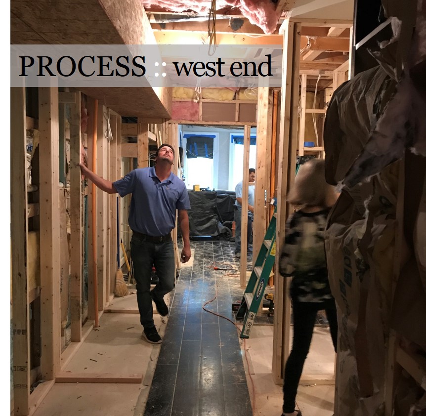
Obviously before our clients can move in, we have to install carpet, light fixtures, wallcovering and window treatments. Then, with our backdrop complete, our team is ready to bring in the furniture and accessories.


(top L to R) Living room chandelier install; Master bedroom carpeting in progress; Wallpaper in the third floor den; Installation of master bedroom roman shades.
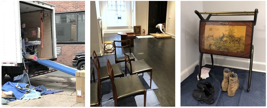
(bottom L to R) The crew unloading the truck; Opening artwork; Vintage Italian barcart.
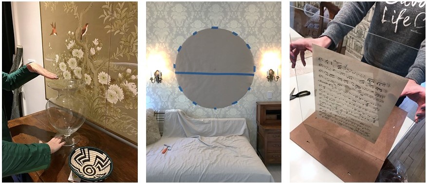
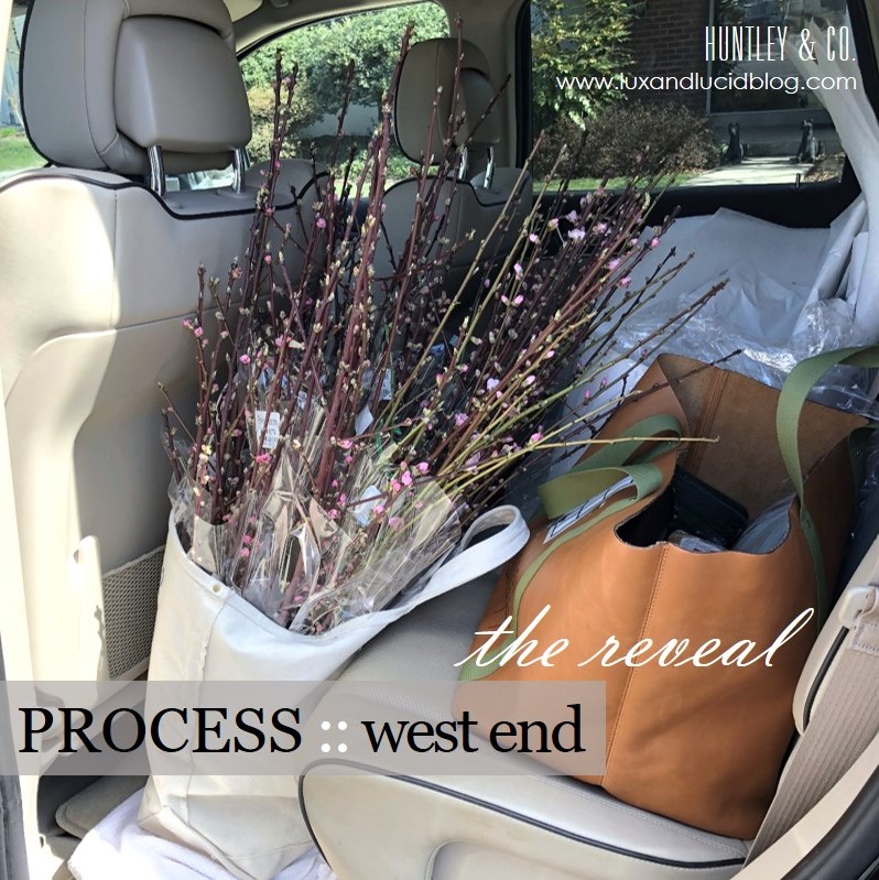
(L to R) Setting the stage with flowers and accessories; Paper template for a tricky mirror install; Preparing a vintage music montage for the dining room.

Welcome Home!
———————————————————
Alas, our vision for a classic interior full of cosmopolitan flair has come to life. This is, hands down, our favorite part of the process!

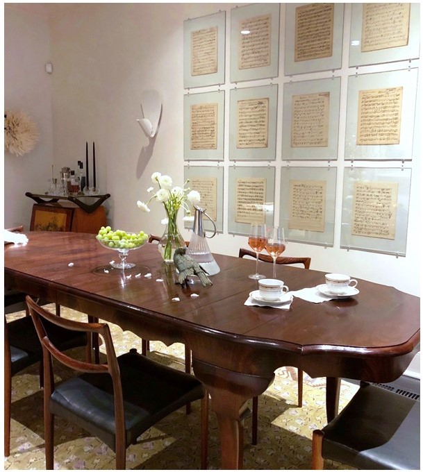
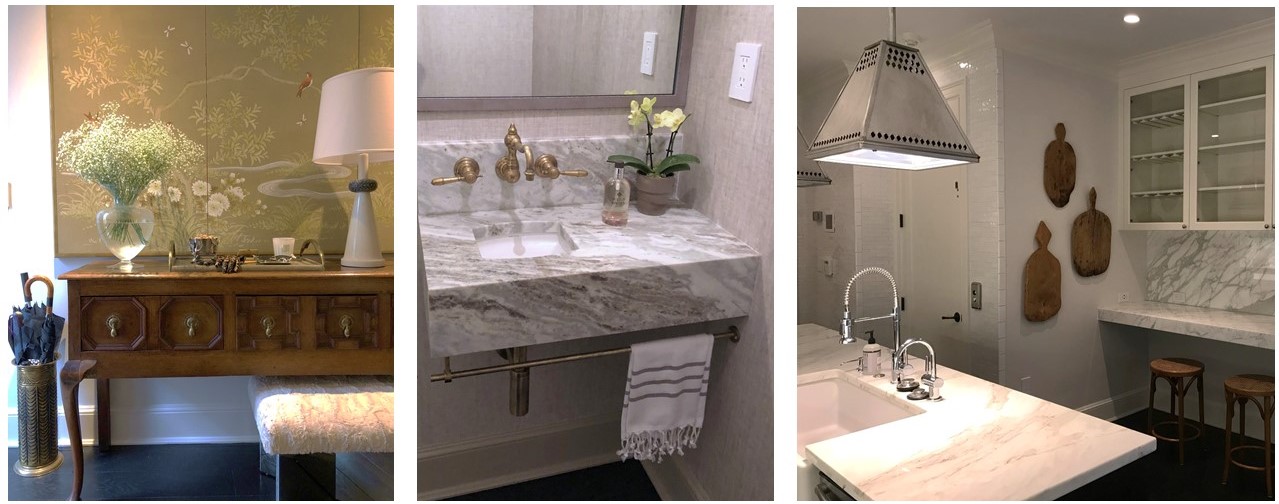
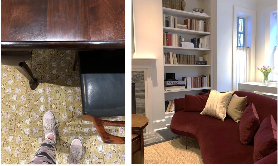
(top to bottom) A custom dining table paired with vintage chairs; Mixed materials in the entryway; A bespoke vanity in a teeny tiny powder room; Unexpected lighting in the kitchen; Dining room details; A chic Italian sofa with lyrical curves anchors the living room.
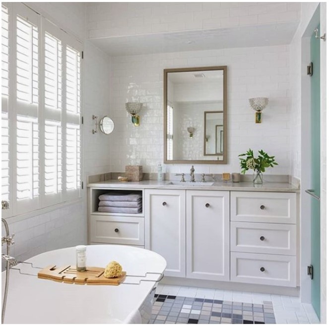
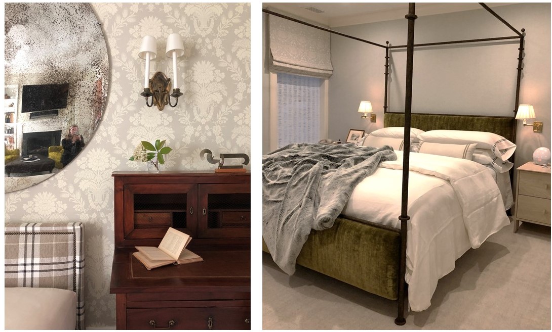
(top to bottom) Master bath wrapped in handmade tiles and featuring vintage lighting; An engaging mix of pattern and texture in the third floor den; Bespoke linens in the master bedroom – how luxe!

And That’s a Wrap
———————————————————
A big thank you to our wonderful West End collaborators. We hate to say goodbye, but we’re off to design more beautiful spaces …

Tricia gives the resident pup, Barney, a tour of his new home.

To see the gorgeous professional photos of the West End project, visit the Huntley & Co. portfolio. Or take it one step further and help us win a Luxe RED award by voting for this project! Voting closes January 25.
xo huntleycodesign

-
West End Process :: Furnishings
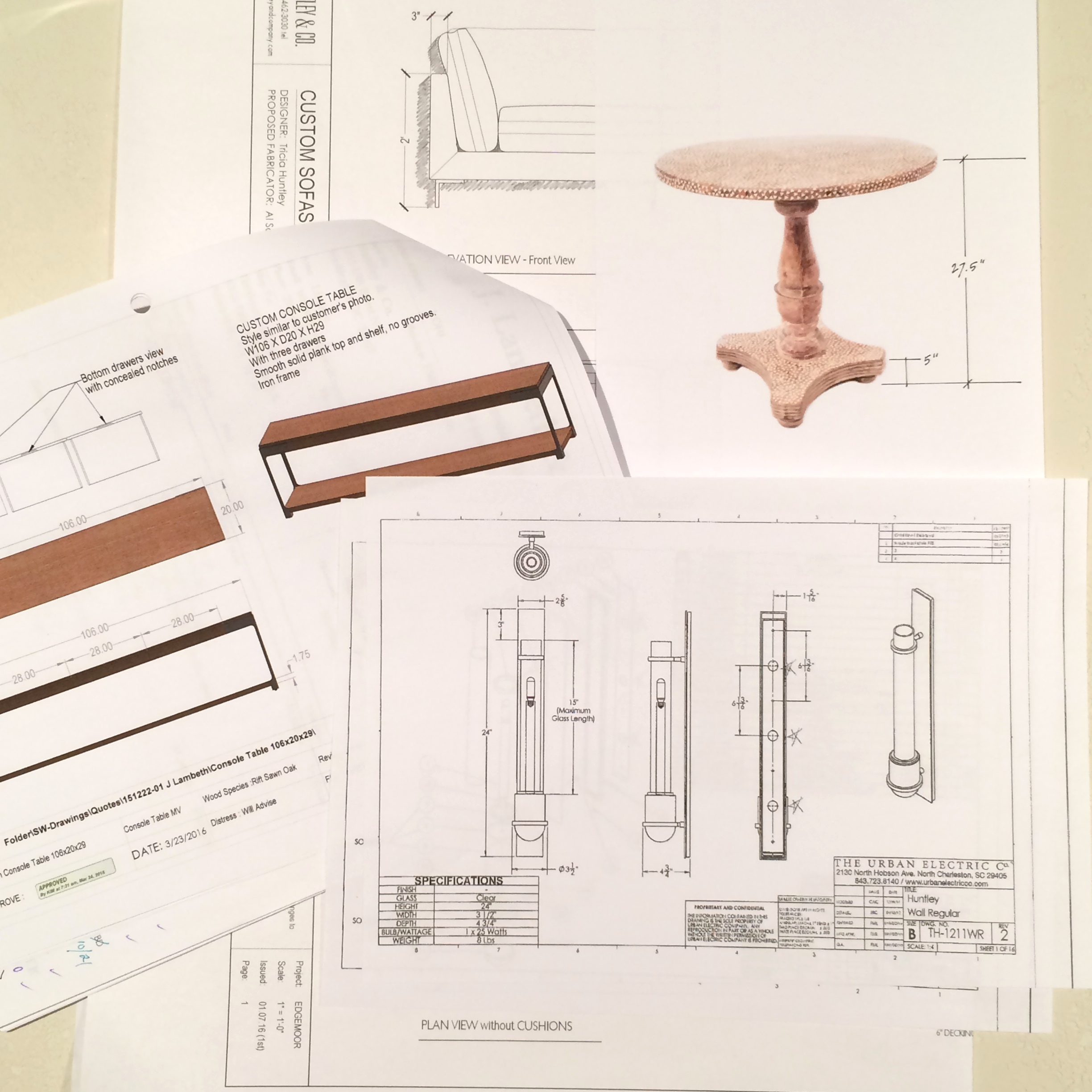
Bespoke, turn-key interiors are a signature of Huntley & Co. First, the architectural envelope and materials are perfected. Next, we turn our process to furnishings and softgoods that complement the space and the client and are unique to the project. Lots of love and labor goes into the design, drawing and specification of these goods.

| FURNISHINGS |
// Living Room channel-back chairs
We custom designed a pair of channel back lounge chairs to maximize flow, circulation and style. Visits to the workroom gave us the opportunity to make adjustments to the design, layout fabric and to monitor progress.
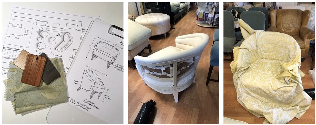
L to R: Leg finish selections; our chair frame gets mocked up in muslin; laying out the large scale fabric.
// Living Room armoire
We source a lot of antique and vintage furnishings for our projects. Sometimes, however, these pieces need modifications to “fit”. This armoire was the perfect scale for the open concept living area and provided much needed storage, but modification to the finish and interior were necessary. New hardware and shirred curtains turned this beauty into functional storage.
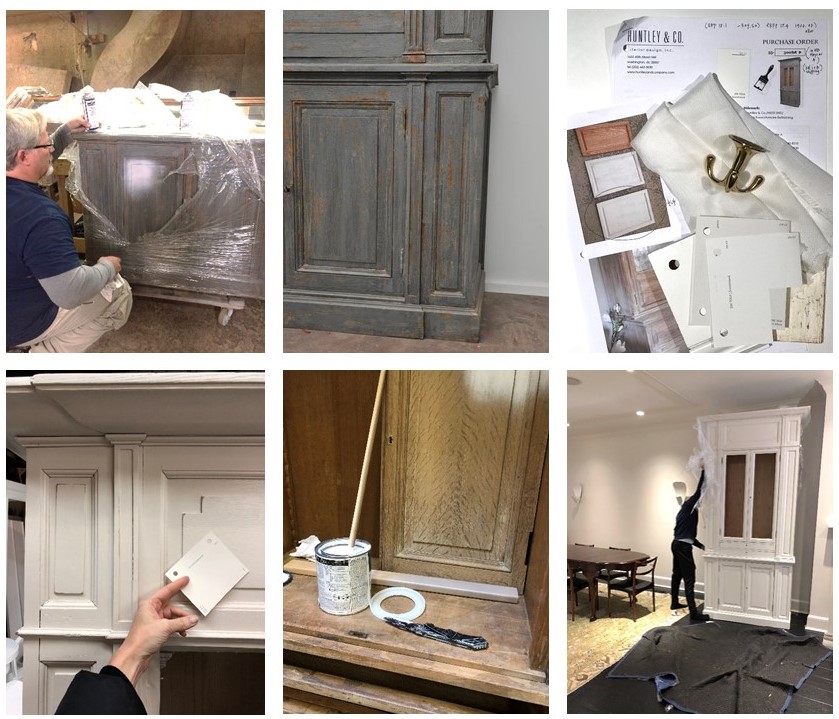
L to R: Removing the old finish; specifying all the new details; installation in progress.
// Master Bedroom canopy bed
Each project has its share of logistical challenges – and we love a good challenge because it inspires us to get extra creative. Our process never leaves things to guesswork. When we discovered that the bed, as originally designed, could not be brought up the stairs or through the windows, we had to go back to the drawing board (literally) to custom design a version that would fit.

L to R: Verifying stairwell and doorway dimensions; studio drawing of the custom pieces and parts; Ironware‘s workshop with assembly pre-shipment.
| SOFTGOODS |
// Master Bedroom roman shades & softgoods
Tailored, functional, bespoke. We designed the window treatments and pillows to complement the quietly sophisticated scheme in the master bedroom. Troubleshooting tricky corners and sourcing one-of-a-kind details makes all the difference.
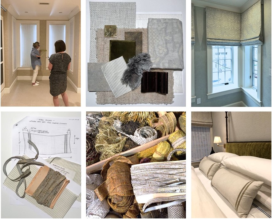
Top: Detailed site measures and schematic review; finished product! Bottom: A pillow workorder; a treasure chest of trim; a well-styled bed.
Stay tuned — Next week we’ll bring this project full circle and share our install with you! And in case you missed the other West End posts, check them out here and here.
xo, Huntley & Co.
Subscribe to our newsletter or find us on Bloglovin’ and you won’t miss a thing ; )
-
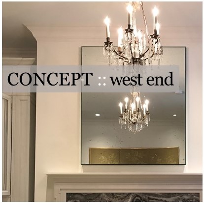
West End Process :: Concept
One of our favorite Huntley & Co. projects this year was for a young couple who hired us to design and renovate their newly purchased townhouse in the West End neighborhood of Washington. Much to our delight, the duo brought a combination of sophistication and excitement to the endeavor. Translating that into a concept and then into a finished product was a multi-step process — and worth every minute.
* * *

| THE CONCEPT |

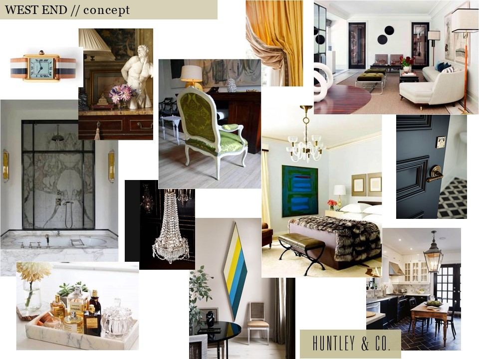
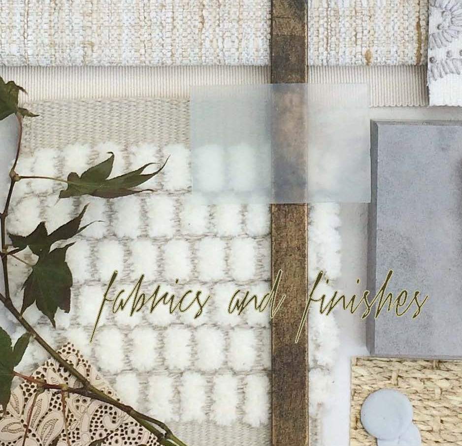
Our clients inspired a decidedly cosmopolitan aesthetic. Accordingly, we imagined an eclectic mix of vintage and antique furnishings, unexpected stone and tile, and layers of complex colors and tones. As shown below, the mood board we created conveyed our idea of an elevated yet spirited home – a true classic that’s never boring.

Selected photos clockwise from top left: Cartier Tank watch via Goop; Timothy Corrigan vignette; a crisp Madrid living room by Isabel Lopez-Quesada; a bedroom from Architectural Digest; a corner of Sandra Nunnerley’s home featuring “Diamond” artwork by Kenneth Noland; an austere and elegant marble bathroom.


| HOW WE GOT THERE |

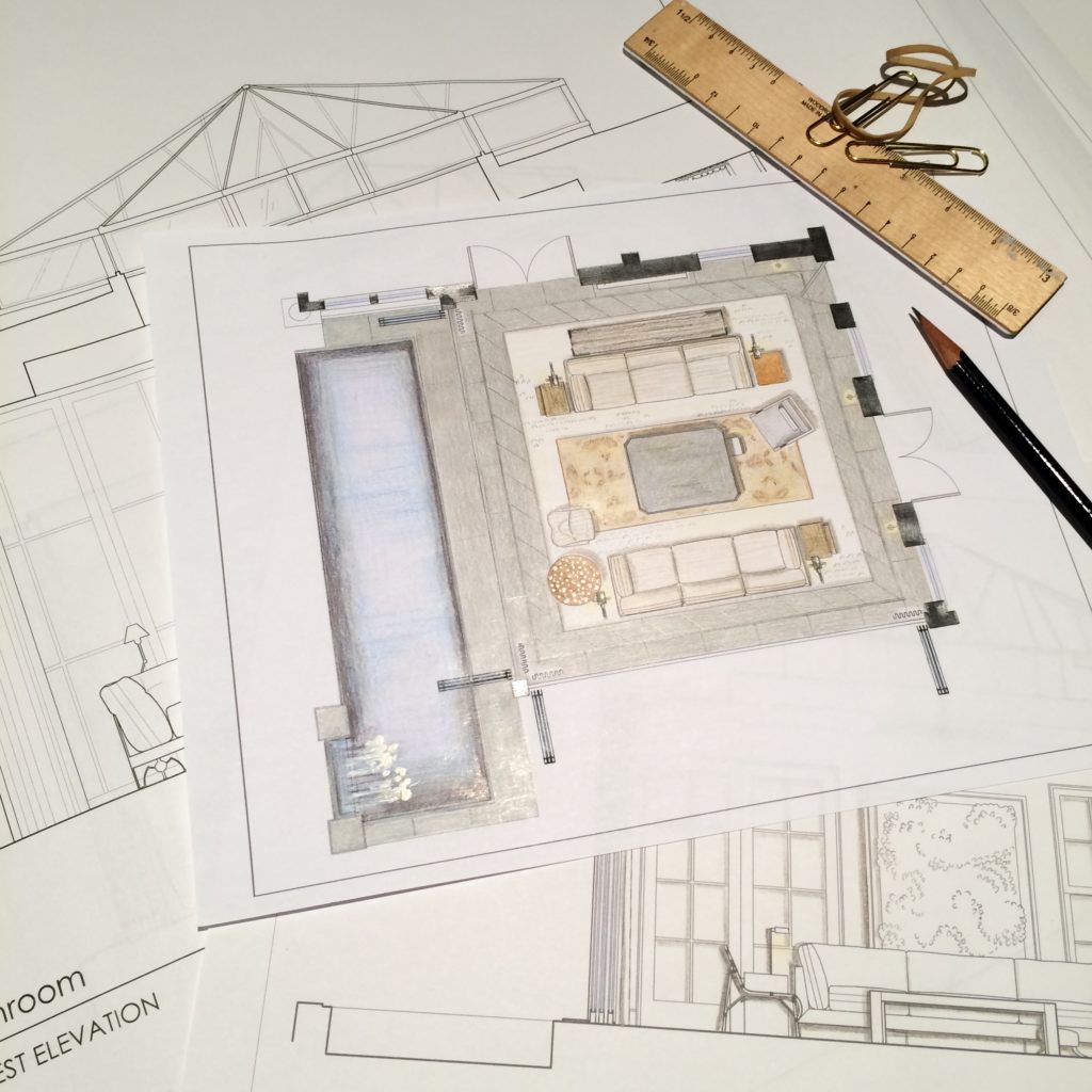
The start of a project is full of excitement and potential. Before diving into design, we take time to fully understand both the space and the client. On the technical side, we site measure the building and generate CAD drawings for study and revision. On the conceptual side, we issue a questionnaire and cull images related to our clients’ answers. The questions range from pedestrian to abstract and are intended to give us practical information as well as insight into their lifestyle and aesthetic.
// Question & Answer
A two page questionnaire sheds light on what’s important.


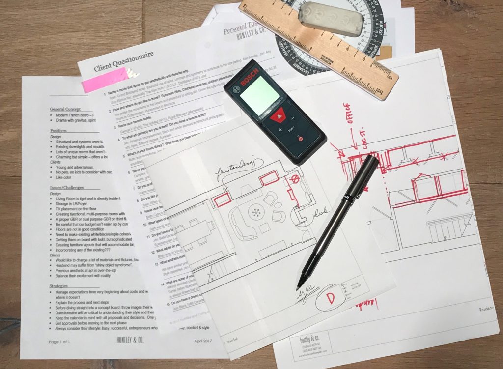
The client questionnaire is a key part of our initial survey and analysis.

// Pulling Together a Visual Story
We pull images that reference our clients’ feedback … and they share photos as well.


TRAVEL // From a honeymoon spot to favorites in Paris and NYC, these hotels topped our client’s list. L to R: Royal Mansour Marrakesh; George V in Paris; The NoMad Hotel in NYC.


FILM // Playful, witty and adventurous. L to R: Lock, Stock and Two Smoking Barrels; Amélie; The Man From U.N.C.L.E.
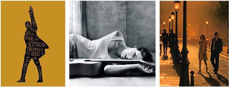
MUSIC // Eclectic and soulful music that bridges time and genres including the Hamilton soundtrack and Carla Bruni’s album, Quelqu’un m’a dit.

 FASHION // Classic, all-American cool c/o Vince, J. Crew and Celine.
INTERIORS // Rich and sleek. Warm and bright. Tailored and organic. L to R: Interior by Joseph Dirand includes works by Anish Kapoor, Pierre Jeanneret and Paavo Tynell; Patricia Urquiola collection for Georg Jensen; a sculptural Alvar Aalto chair; master suite cabinetry seen on Pinterest.

* * *

We love the conceptual stage of a project. Engaging in a thorough deep dive to excavate both the practical and the magical is the difference between a good project and a great one. Stay tuned for our next post where we transition into design development and project management — when we make the concept a reality.
xo, Huntley & Co.

-
EDGEMOOR SUNROOM :: THE REVEAL!
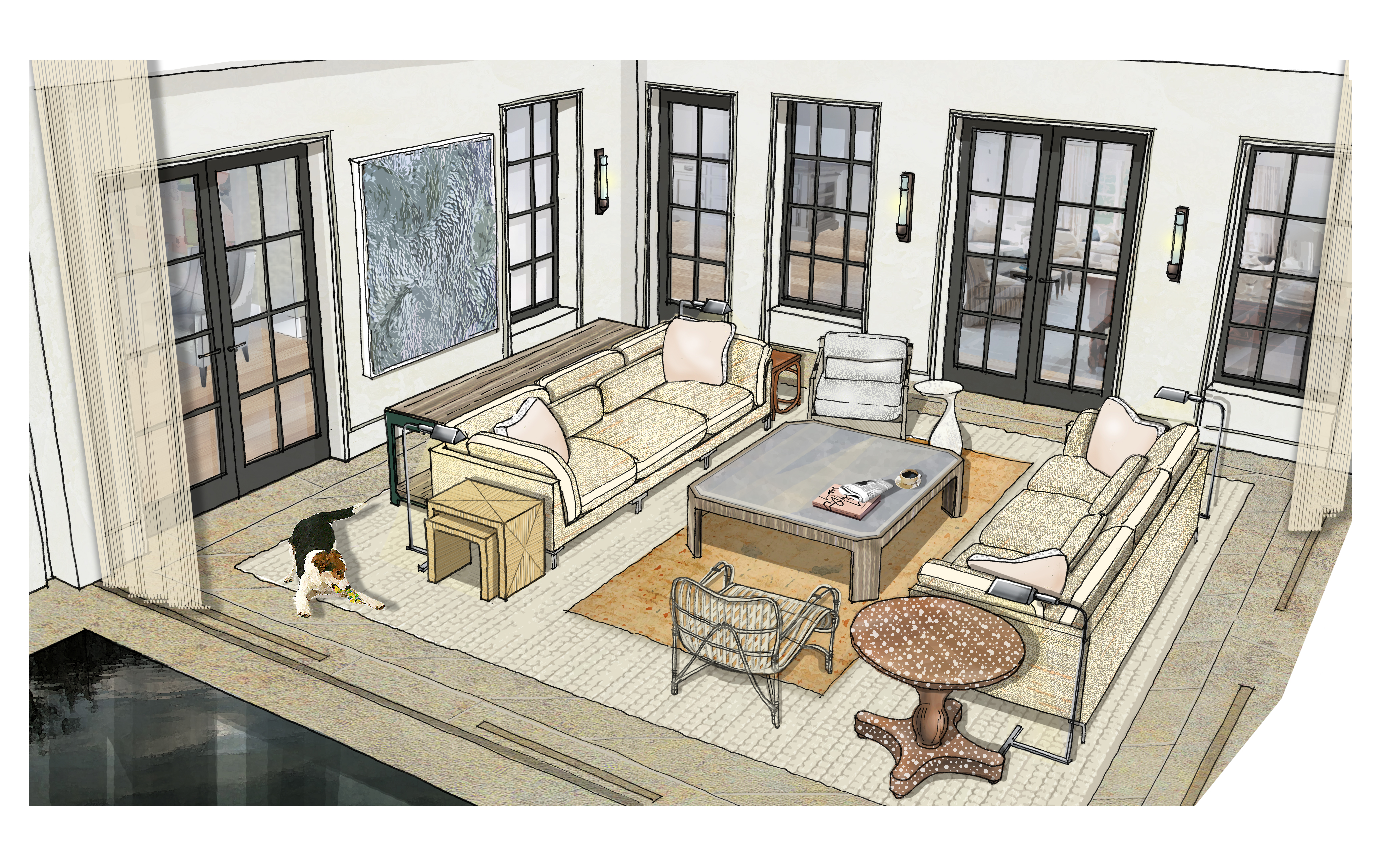
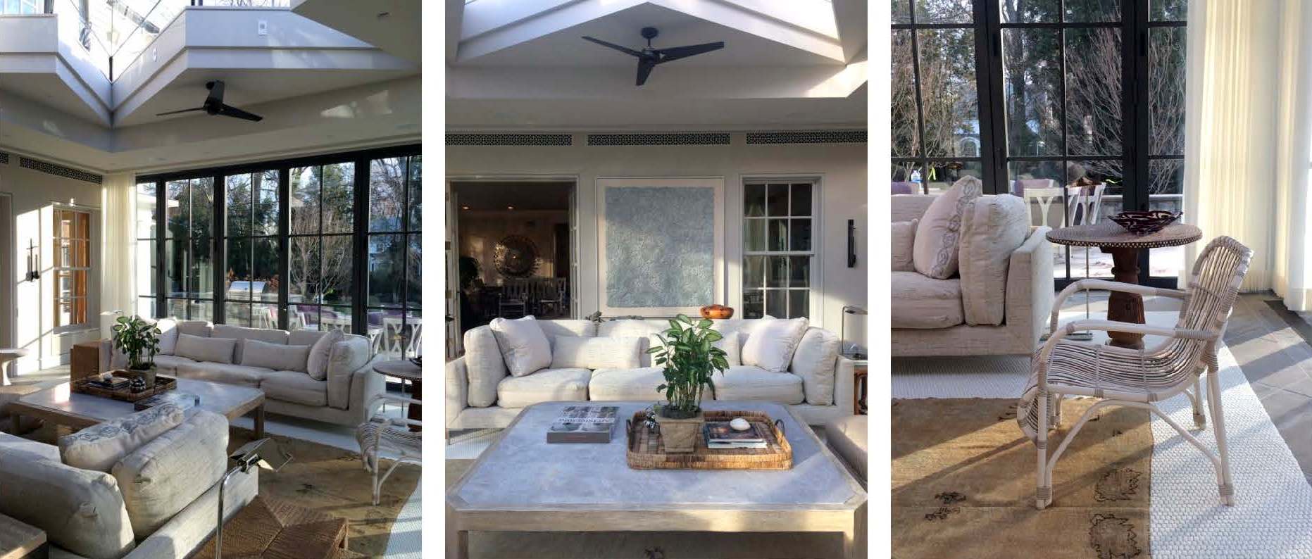
The Edgemoor sunroom has been installed! Installation days are such a highlight for interior designers. They represent the culmination of months of hard work, careful planning and patience. Considering this project started in the summer of 2015, we were thrilled to see the room finally come to life. So it is with great delight that we report that the room is even more beautiful than we expected. We always have an idea of how an interior will look, but we can’t necessarily anticipate how it will feel. Being in a space where the architecture, the decor and the surroundings truly sing makes all the trials and tribulations of the previous months disappear. We’re thrilled and our clients are thrilled. Santa couldn’t have brought us a better present for the holidays. Enjoy!

|| Pre-Install Site Review ||

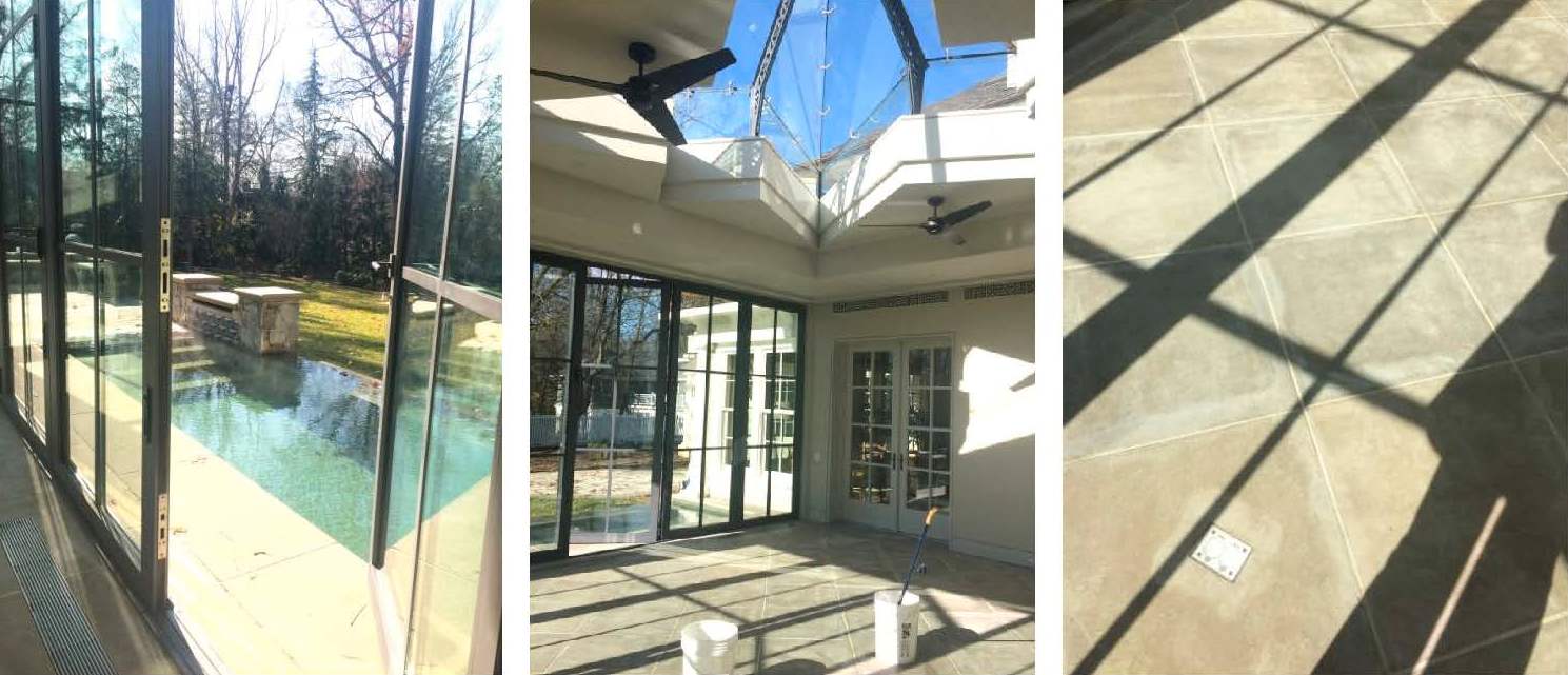
We scoped out the site the day before to ensure that there were no surprises on install day. Thanks to the contractor, all of the construction debris had been removed and the floors and glass were clean. This is a small, but important detail when delivering a room full of fresh, new [and valuable] furnishings. And with a blank slate before us, we were finally able to appreciate all of the beautiful architectural lines and the gracious volume of space.

|| Design is [not] glamorous ||

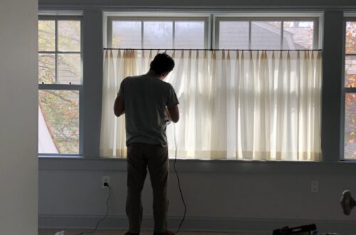
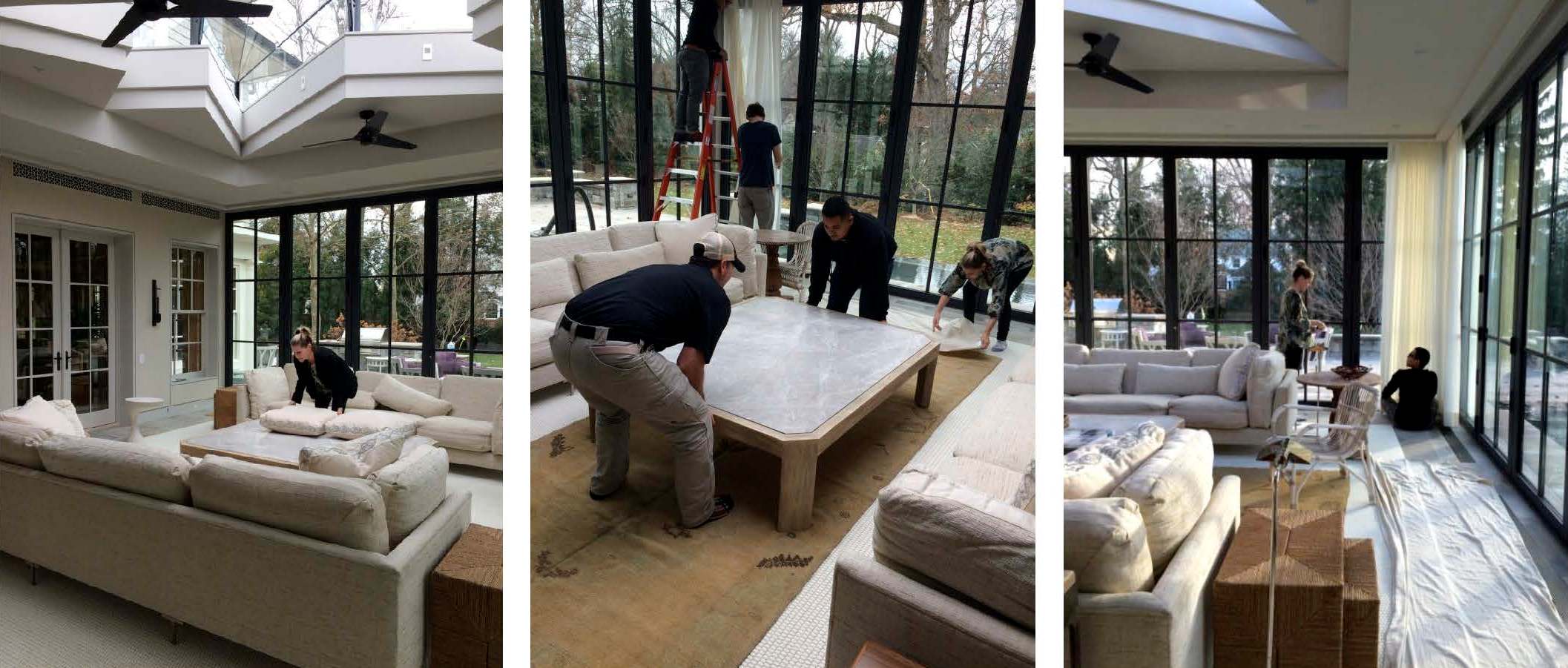
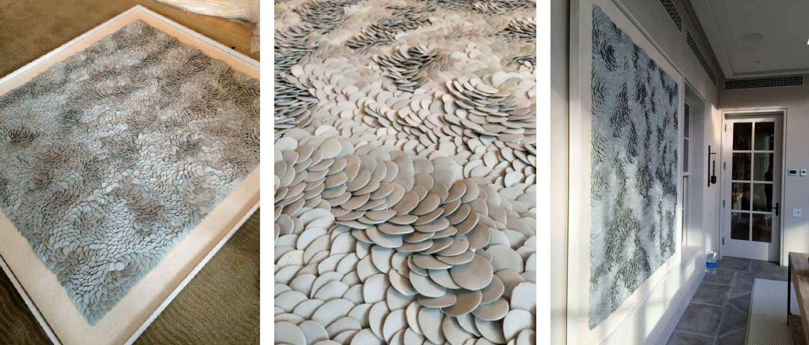
Installations requires a mix of muscle, troubleshooting and finesse. Pillows get fluffed, furniture placement tweaked, and motorized curtains programmed and dressed. One of the trickier exercises of the day was hanging the porcelain Fenella Elms artwork. Both delicate and heavy — and weighing in at well over 100 lbs — it took four men and two very nerve-wracking attempts to hang it on the wall. Needless to say, we all gave a cheer and a generous sigh of relief once it was in place.

|| A Beautiful Finish ||

Just as we were finishing the installation, the sun came out and cast an ethereal light into the room giving it a magical sparkle. The shadows danced off the porcelain artwork, the plaster walls, and the mother of pearl inlay on the pedestal table top. Simultaneously, the light saturated the drapery with warmth and illuminated the dramatic skylight overhead. Enveloped by so much natural beauty, it’s easy to envision spending hours in this space lounging, reading, socializing or napping.

|| Taking Care ||

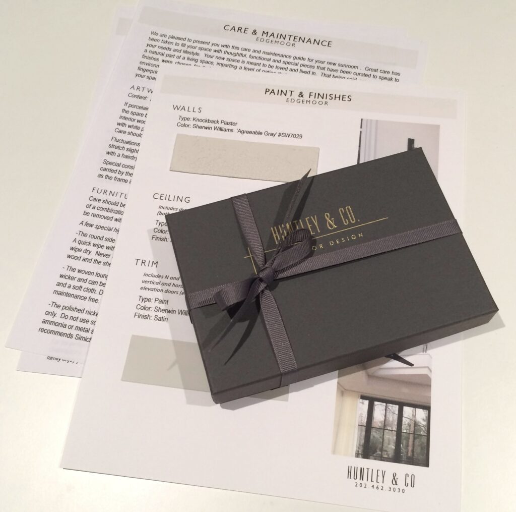
Our work here is done! Well, almost. Installations require guidance regarding the care and maintenance of the space. We strive to ensure our client’s satisfaction by giving them the tools they need to enjoy their homes for years to come. Our care packages vary depending on the scope of a project and specific needs of the client. However, they generally include care and maintenance instructions, mechanical specifications and a paint+finish schedule. In this particular case, we also included a separate artwork care package. The art we installed is fragile and valuable, so we provided our clients with handling instructions along with extra porcelain pieces. And of course, we packaged it beautifully in a Huntley & Co. box with ribbon – something befitting the showstopper art piece itself.

We hope you enjoyed following our Edgemoor series. In case you missed anything, check out each phase here, here, here and here. We will be signing off for the next few weeks to enjoy some R&R. We will post again in 2017 with new installations, discoveries and our behind-the-scenes adventures. Until then, Huntley & Co. — and our mascot Nina — wish you and yours the happiest of holidays!


Subscribe to our newsletter or find us on Bloglovin’ and you won’t miss a thing ; )
-
Edgemoor Sunroom :: Part III
-
show-house // faux-client :: the reveal!
We know you and our fabulous faux clients have been waiting for our big reveal. The design process is nothing, if not, an exercise in patience. From concept to installation, interior design requires vision, tenacity and know-how. It’s a labor of love, but labor nonetheless. So when the time finally comes to present our clients with their dream home, our excitement is hard to contain. This particular dream home is ‘faux show’, but the thrill of the reveal remains the same … So without further ado!

— THE 2016 FAUX HOUSE REVEAL —

[ Our clients seem pleased ]

* * *

— DESIGNER Q&A —
Our Huntley & Co. clients and room may have been crafted from imagination,
but they do speak to the real methodology and design vernacular of our firm’s work.
Here, principal Tricia Huntley, opens up about her influences, the importance
of breaking the rules and the best song to get a party started.

1. What are some of the things that influence you, aside from furniture and décor?
Museums, music, fashion, history, parks/nature, architecture, poetry … those things that are thoughtful, provocative, moving. I like to start with a feeling or mood before I pivot to the tangible aspect of things.
2. What qualities of a room do you most admire?
Substantial hardware and appropriate, expertly executed millwork. I would rather live in an empty house with those two qualities than a shoddy new-build with the best furniture.
3. Design rule you love to break?
Symmetry. I was classically trained so I believe in building a space according to the rules of symmetry. But I also believe that breaking that symmetry in clever, nuanced ways is what brings a room to life.
4. You know these clients will be having many a fete, what’s a good hostess gift?
I love to give sophisticated, unusual candles and fragrances. Aedes de Venustas, Joya and Santa Maria Novella all offer intriguing scents in stunning vessels. And of course, good booze and wine never go out of style. Add a beautiful ribbon with a handwritten tag and you’re done.
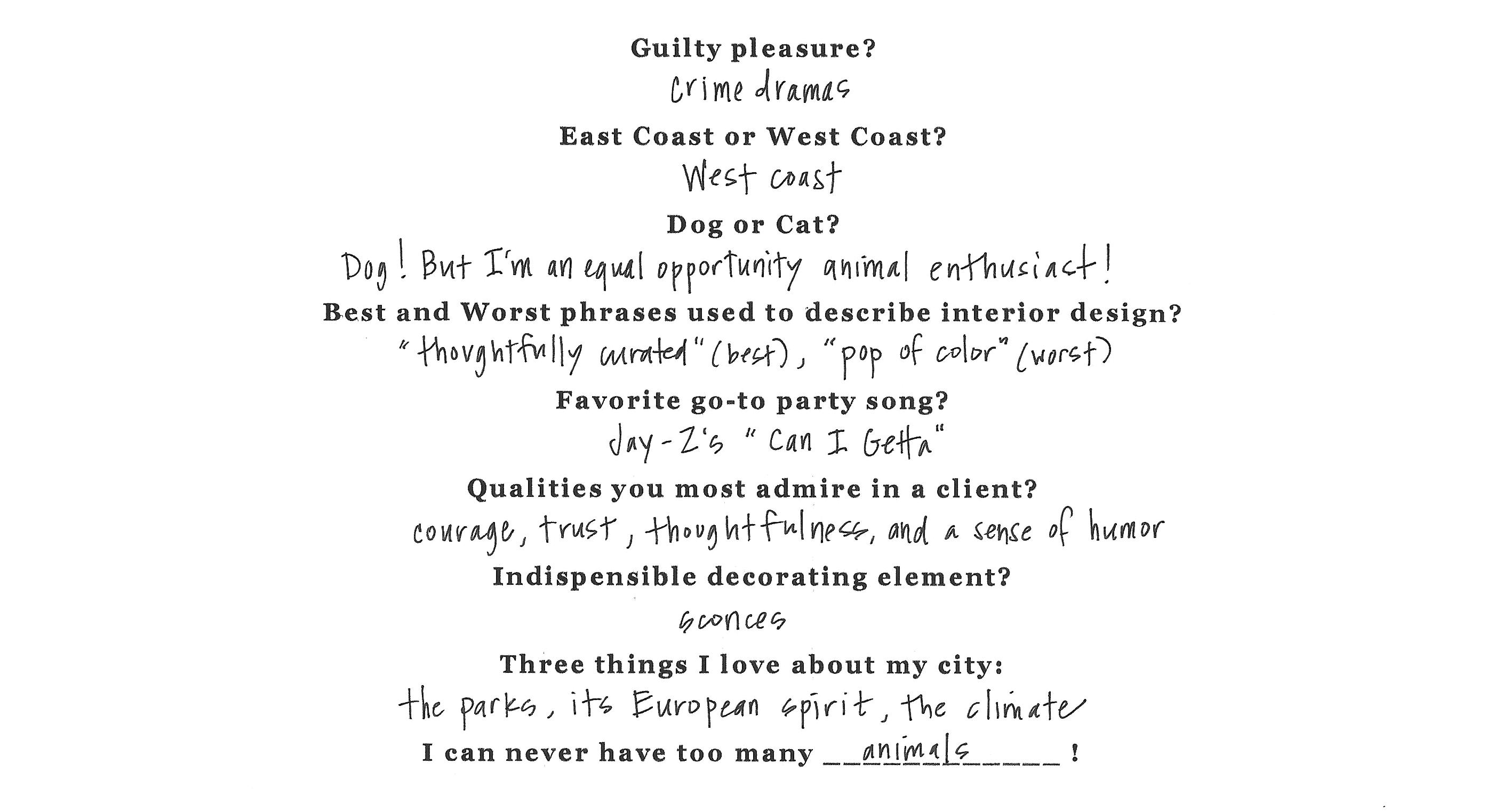
5. Rapid Fire!
* * *

It’s been fun, but we need to dash! Our clients told us to get out so they can enjoy their new home ; )

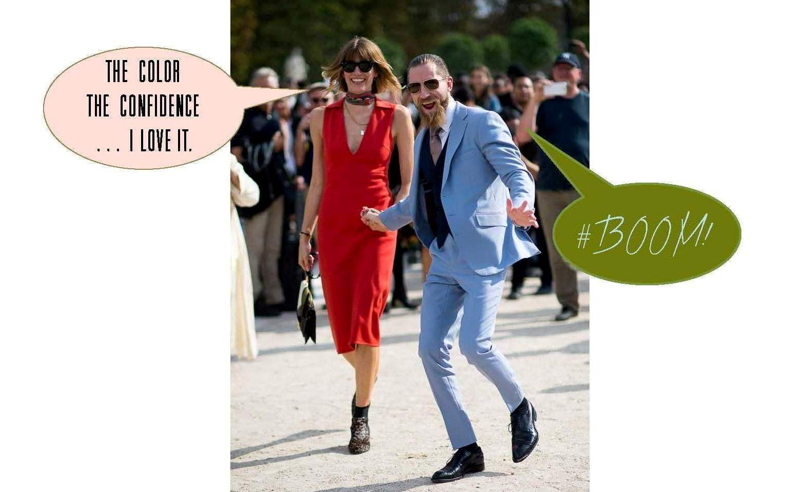
If you want another glimpse at the process, simply click on posts Part I, Part II and/or Part III. And special thanks to our “faux clients” Justin O’Shea and Veronika Heilbrunner. They are the coolest couple on the planet and dream clients fo sho!
-
SHOW-HOUSE // FAUX-CLIENT
A showhouse is unique in that it provides a designer with the freedom to create a space that is bound only by her innovation and talent. With a project that lacks a scope of work and a flesh-and-blood client, we find it important to invent a narrative to guide our design concept. At Huntley & Co. we create a “faux client” to serve as muse during the showhouse process. We have been blessed with some pretty wonderful clients throughout the years, but our Faux Clients 2016 definitely have us crushing hard!


dc interior designer
Concept Development______________
Washington DC is a city filled with people of varied and interesting backgrounds. Our Huntley & Co. “clients” are an art dealer wife with an international childhood (thanks to a father who was Ambassador to Peru) and a west coast-born husband with a Renaissance spirit. The couple shares a love of art, music and philanthropy. Both travel frequently to New York, California, Europe and South America. With that in mind, our goal for these busy and passionate entrepreneurs was to create a true LIVING space that reflects their personal histories and nurtures the lifestyle of their young family.



Already inspired? Fantastic! Because Huntley & Co. will be sharing more insights into our showhouse process as well as a final ‘reveal’ in forthcoming Luxe & Lucid posts. Subscribe to our feed or follow us on Bloglovin to stay tuned!

-
Tableaux
There are only two things in this world of which I will never tire. One, cute animals. And two, vignettes. It’s true, nothing snaps me out of a bad mood faster than a cleverly styled tabletop or an otter eating lettuce on Youtube. Vignettes I love because they can be pulled together in minutes. I love them because everyday things – a branch from the yard, a child’s toy, a vintage teacup – always make them more interesting. I love them because they have personality. I love them because they’re artistic and inspirational. I love them because they make me happy … even sans otter.

A favorite vignette from my LA trip this spring.


Richard Holley | McAlpine, Booth & Ferrier

Lorenzo Castillo


Huntley & Co. (L&R) | Peter Vitale (center)

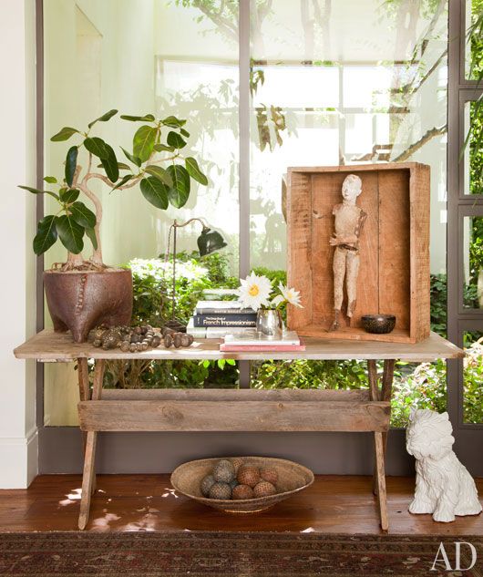
Huntley & Co. | Ellen DeGeneres

Jean-Louis Deniot


Huntley & Co. (L&R) | Elle Décor (center)


Elsie de Wolfe | David Hicks

Alexandra Kidd


Huntley & Co. | Ernesto Pigni
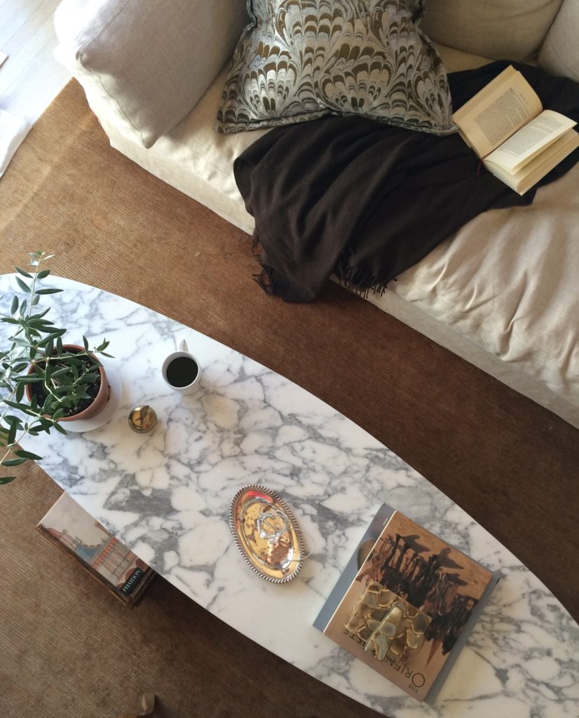

Sunday morning at chez Huntley | The National Museum of American History in DC


Darryl Carter | Lucinda Wharton | Horsch Interiors
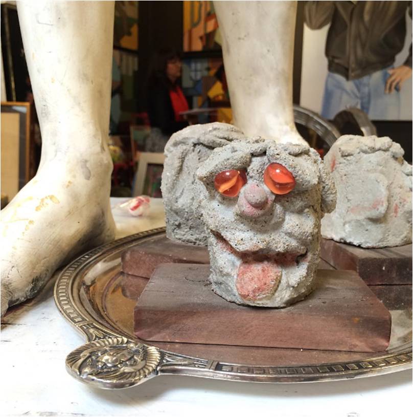
Best tableau ever by A. Shaw Antiques at Highpoint.

Drop by the Luxe & Lucid Pinterest page for dozens of other gorgeous, brilliant vignettes.

-
Thanksgiving and the beauty of home

Like so many, I love Thanksgiving. So many wonderful things come together — decorating, family, food! — on one glorious, indulgent day. I’ve designed quite a few dining rooms for clients throughout the years and it’s always exciting to see these spaces come to life on Thanksgiving. Décor isn’t the reason for the season, but sharing beauty and joy with loved ones is.

Eclectic, tailored and dramatic is just the right vibe in a dining room.

![Huntley & Co. Interior Design // www.huntleyandcompany.com KAP_9868[1] - Copy2 cropped](https://luxeandlucidblog.com/wp-content/uploads/2015/11/KAP_98681-Copy2-cropped.jpg)


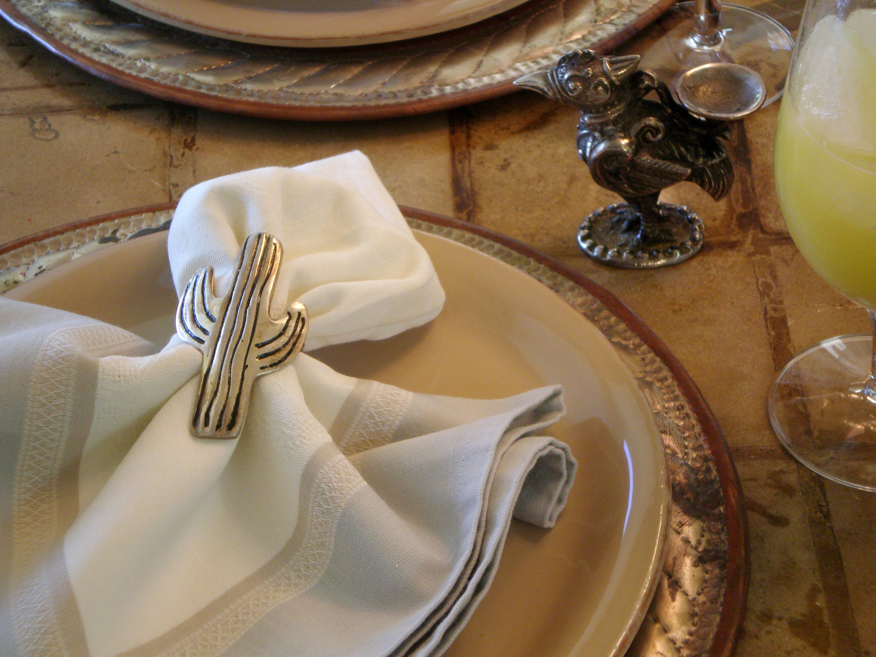
For me, design is about expression. The dining spaces below are in Maryland, DC, New York and Arizona respectively. Each is a signature of a particular home, lifestyle and client.

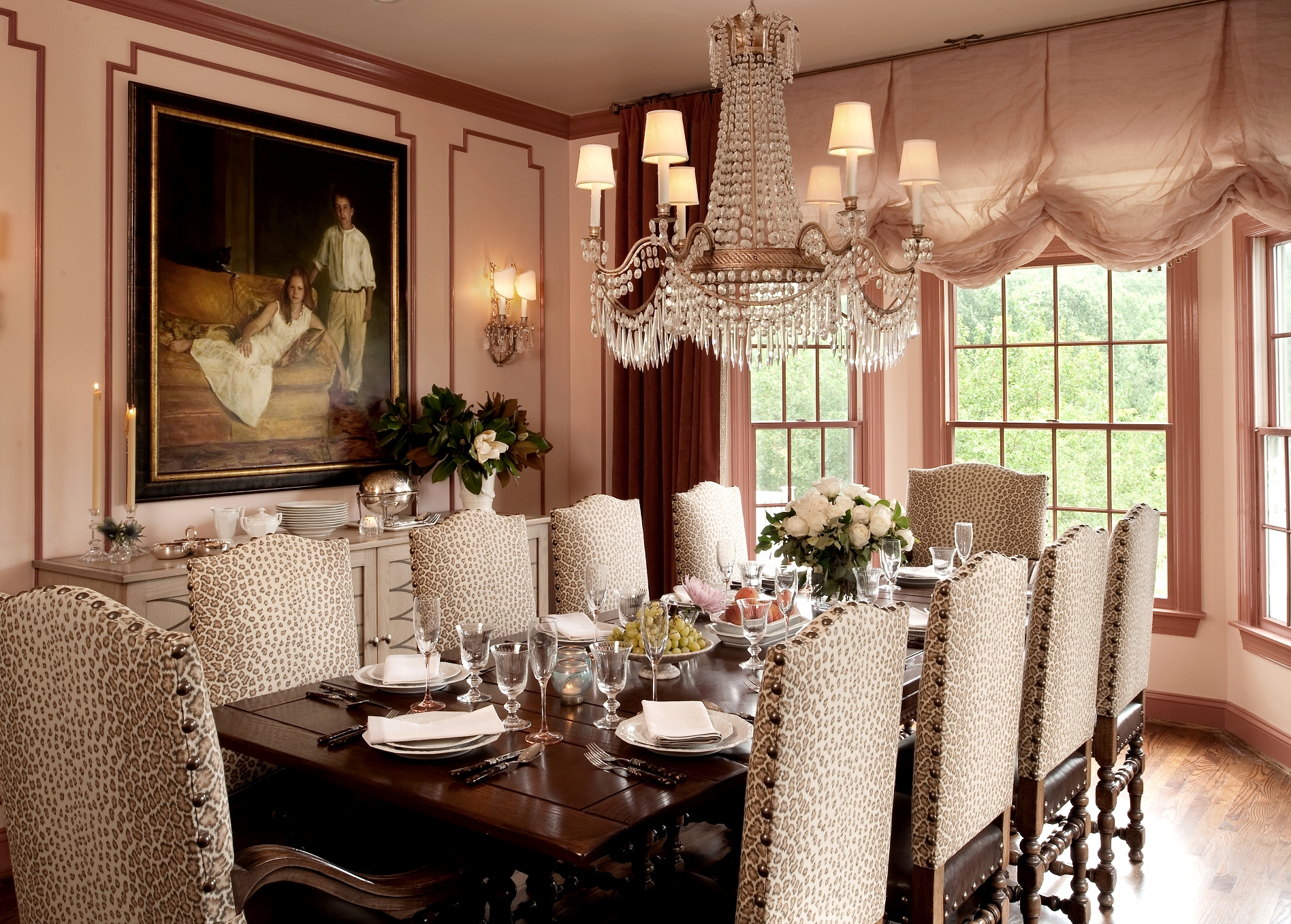


Details are a key part of the magic when entertaining for the holidays and year-round.

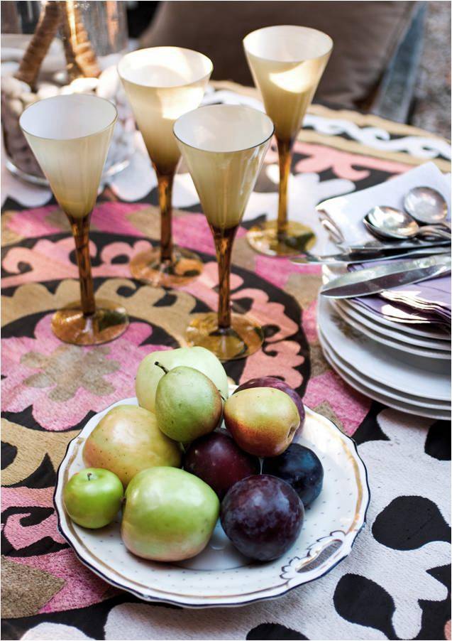



Sometimes simplicity is all the drama a space needs. Traditional in Virginia and modern in Florida.

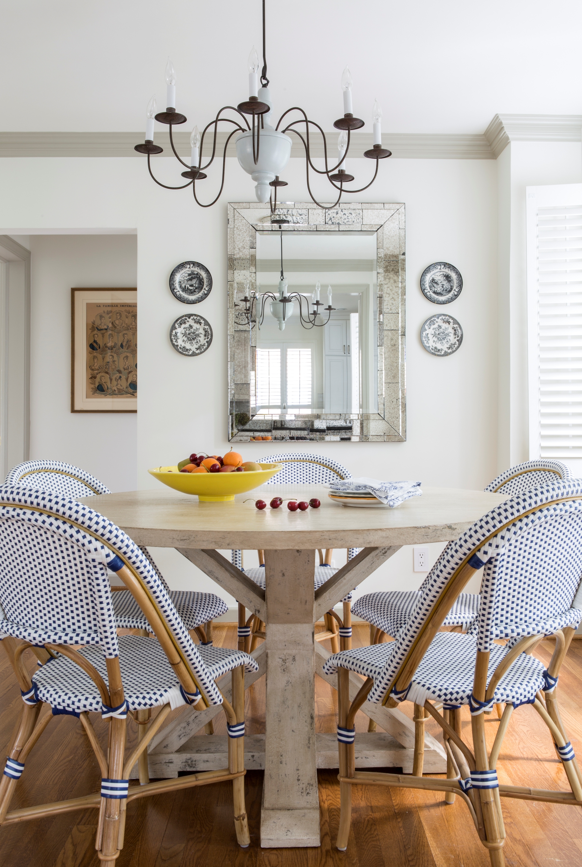


The dining room below is one of my favorites. The sophisticated color scheme creates a room that sings.


Happy Thanksgiving from Huntley & Co.
And a special thanks to our clients who make these images possible and our work lives so rich.


