-
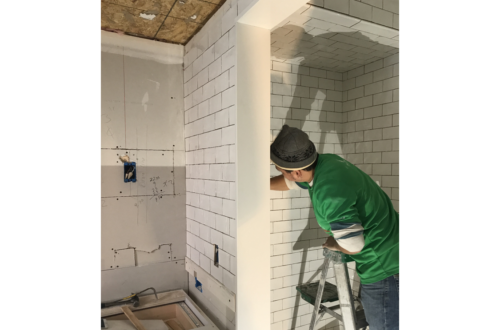
Installing Annapolis (ed. 2)
-
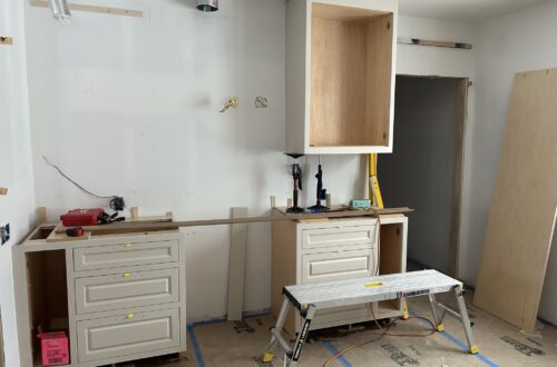
Installing Annapolis (ed. 1)
-
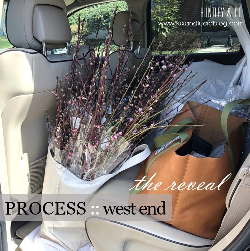
West End :: The Reveal

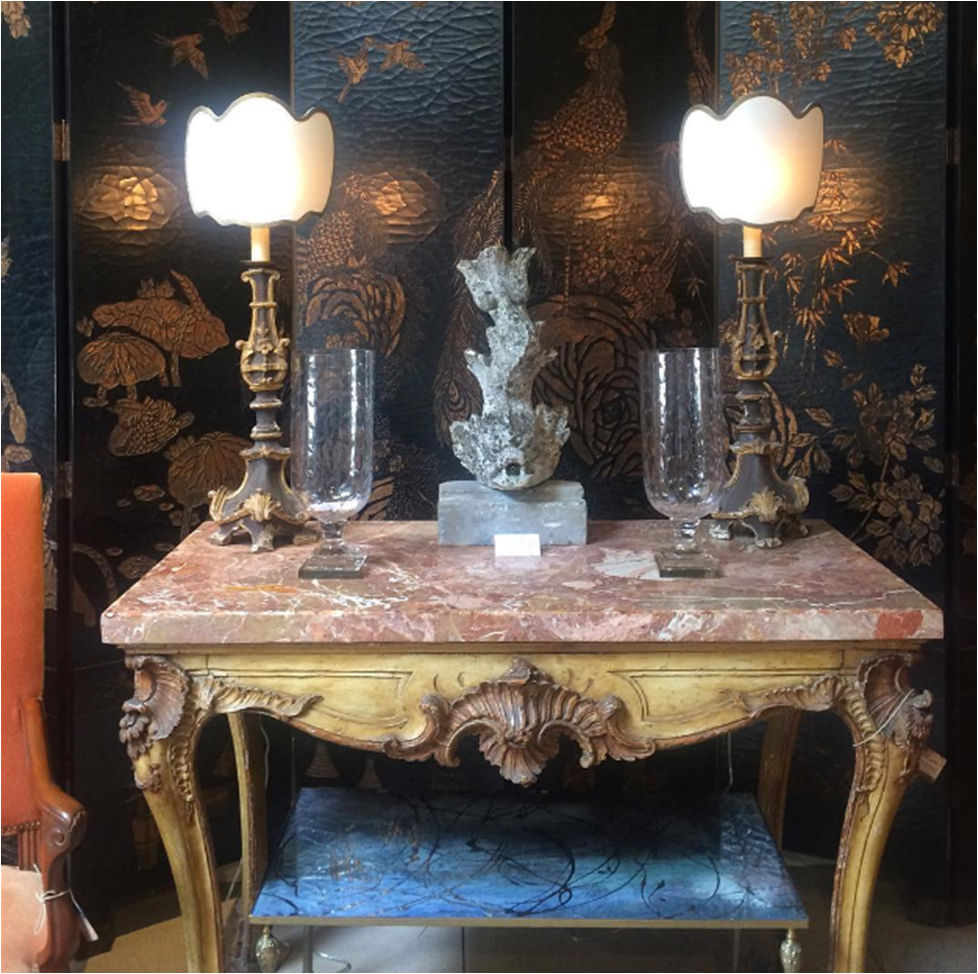
This reveal has been a long time coming. Not because it was only just installed, but because Luxe & Lucid was tied up in a parallel universe after we moved the Huntley & Co. website to another platform. The technical side of small business is the gift that keeps on giving. So we thank you for your patience, and without further ado, we reveal our West End project installation!
* * *

Making it Move-In Ready
———————————————————

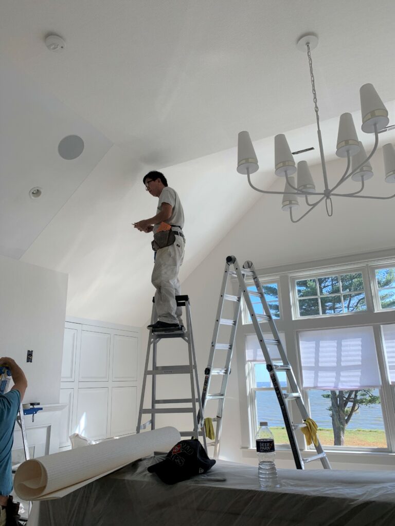
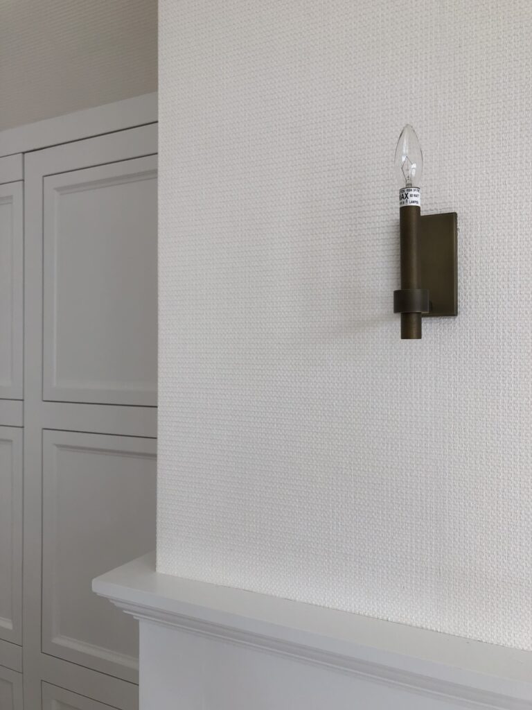
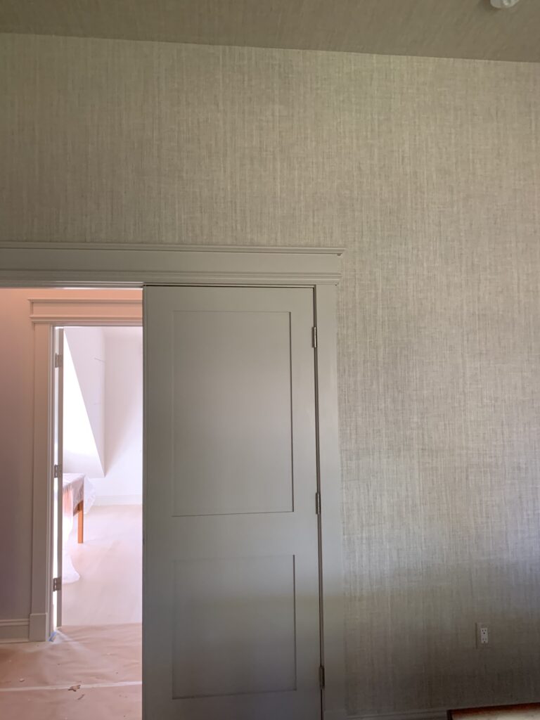
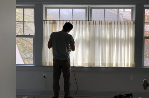
Obviously before our clients can move in, we have to install carpet, light fixtures, wallcovering and window treatments. Then, with our backdrop complete, our team is ready to bring in the furniture and accessories.


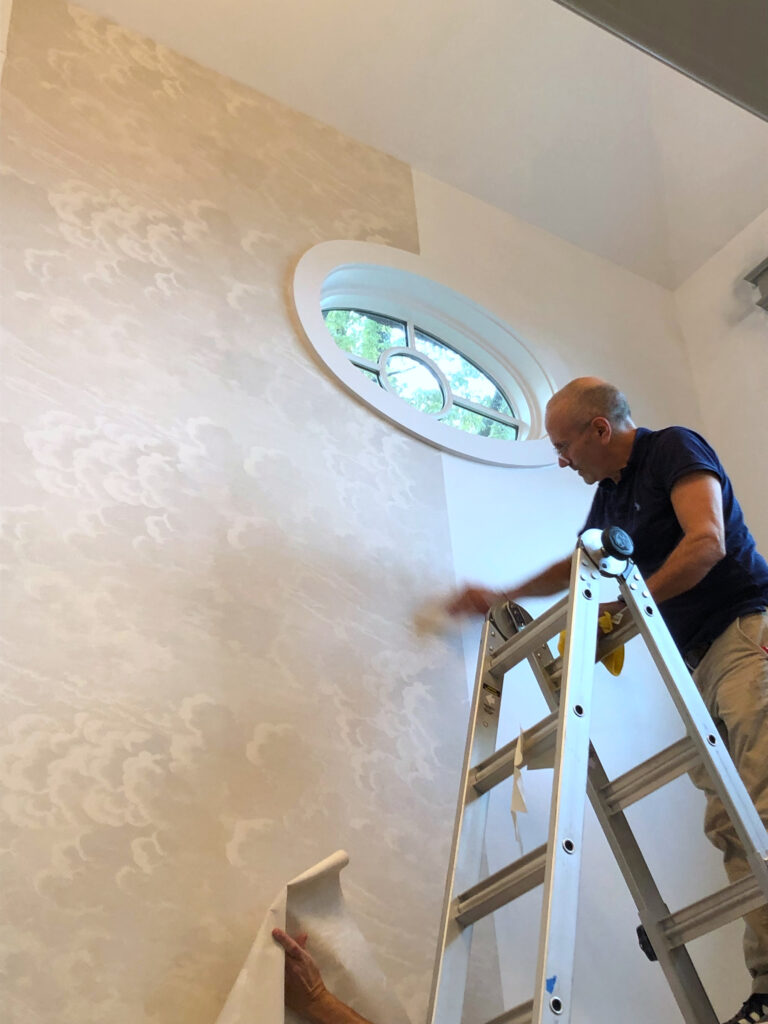
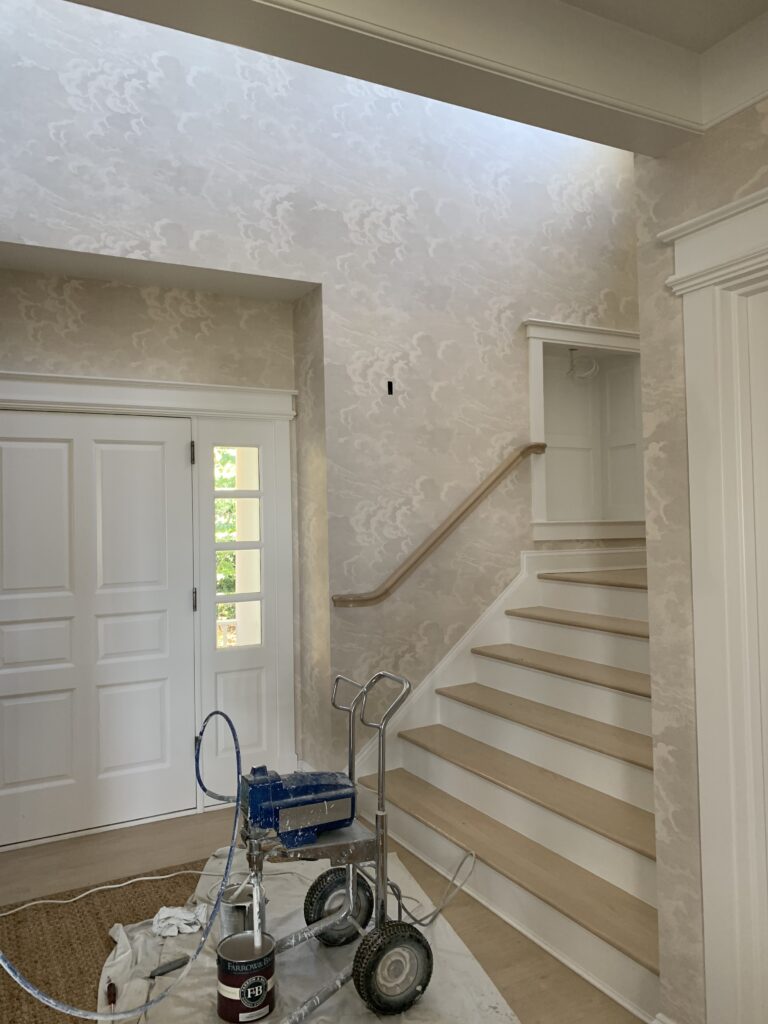
(top L to R) Living room chandelier install; Master bedroom carpeting in progress; Wallpaper in the third floor den; Installation of master bedroom roman shades.
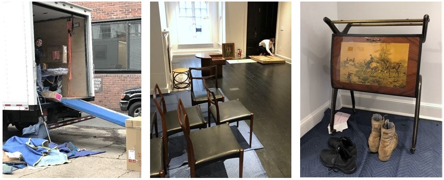
(bottom L to R) The crew unloading the truck; Opening artwork; Vintage Italian barcart.
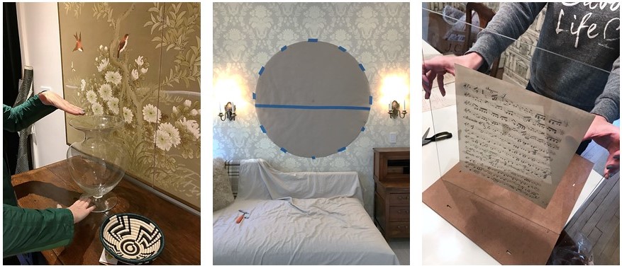
(L to R) Setting the stage with flowers and accessories; Paper template for a tricky mirror install; Preparing a vintage music montage for the dining room.

Welcome Home!
———————————————————
Alas, our vision for a classic interior full of cosmopolitan flair has come to life. This is, hands down, our favorite part of the process!

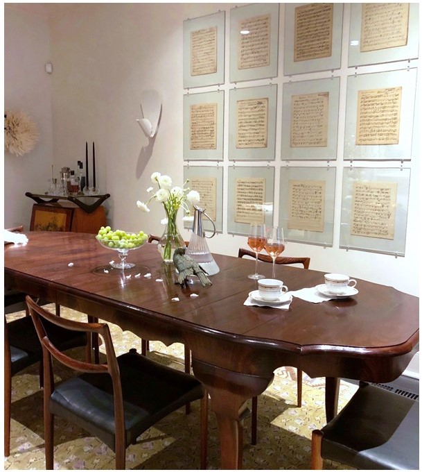
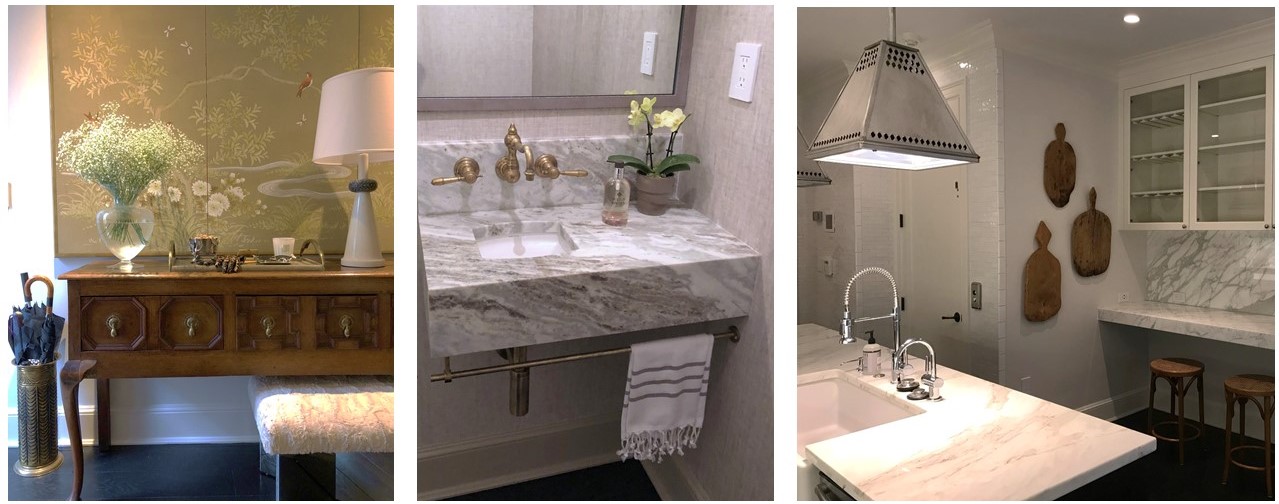
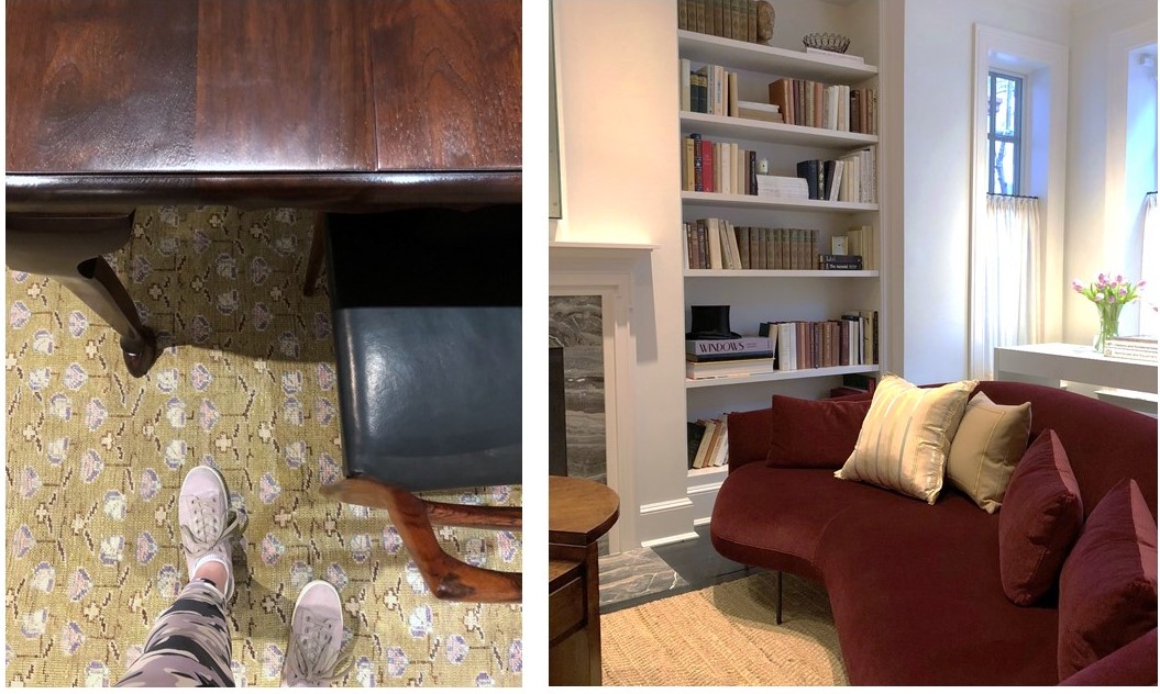
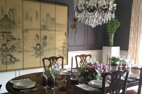
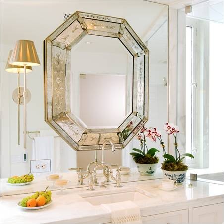
(top to bottom) A custom dining table paired with vintage chairs; Mixed materials in the entryway; A bespoke vanity in a teeny tiny powder room; Unexpected lighting in the kitchen; Dining room details; A chic Italian sofa with lyrical curves anchors the living room.
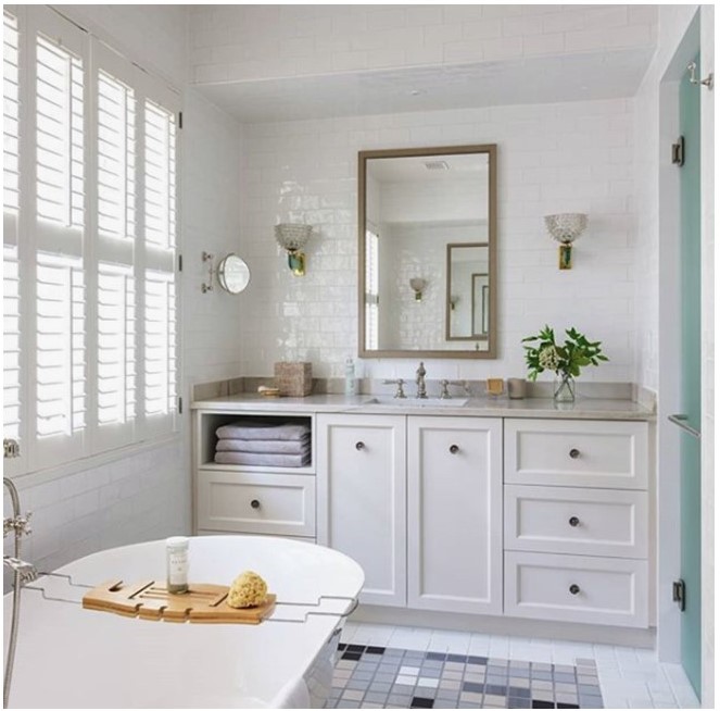
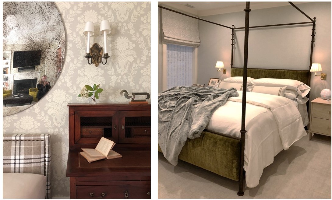
(top to bottom) Master bath wrapped in handmade tiles and featuring vintage lighting; An engaging mix of pattern and texture in the third floor den; Bespoke linens in the master bedroom – how luxe!

And That’s a Wrap
———————————————————
A big thank you to our wonderful West End collaborators. We hate to say goodbye, but we’re off to design more beautiful spaces …

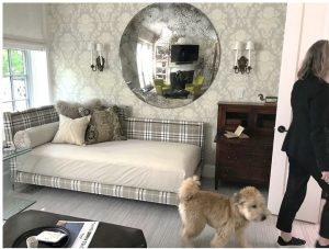
Tricia gives the resident pup, Barney, a tour of his new home.

To see the gorgeous professional photos of the West End project, visit the Huntley & Co. portfolio. Or take it one step further and help us win a Luxe RED award by voting for this project! Voting closes January 25.
xo huntleycodesign

-
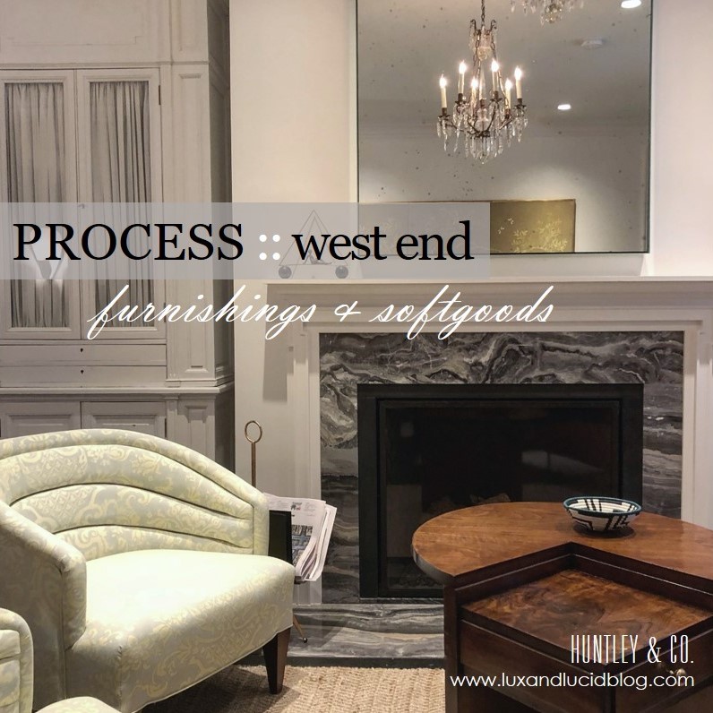
West End Process :: Furnishings
Bespoke, turn-key interiors are a signature of Huntley & Co. First, the architectural envelope and materials are perfected. Next, we turn our process to furnishings and softgoods that complement the space and the client and are unique to the project. Lots of love and labor goes into the design, drawing and specification of these goods.

| FURNISHINGS |
// Living Room channel-back chairs
We custom designed a pair of channel back lounge chairs to maximize flow, circulation and style. Visits to the workroom gave us the opportunity to make adjustments to the design, layout fabric and to monitor progress.
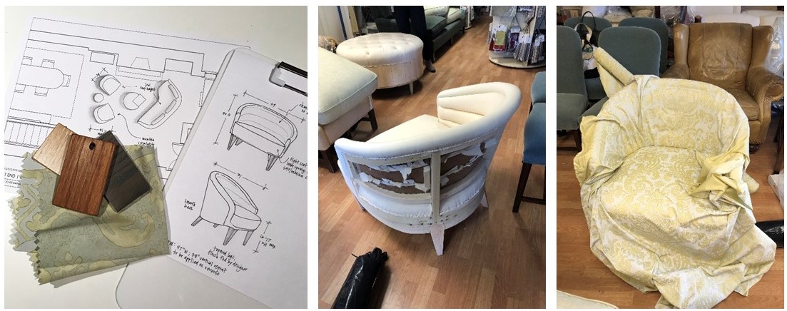
L to R: Leg finish selections; our chair frame gets mocked up in muslin; laying out the large scale fabric.
// Living Room armoire
We source a lot of antique and vintage furnishings for our projects. Sometimes, however, these pieces need modifications to “fit”. This armoire was the perfect scale for the open concept living area and provided much needed storage, but modification to the finish and interior were necessary. New hardware and shirred curtains turned this beauty into functional storage.
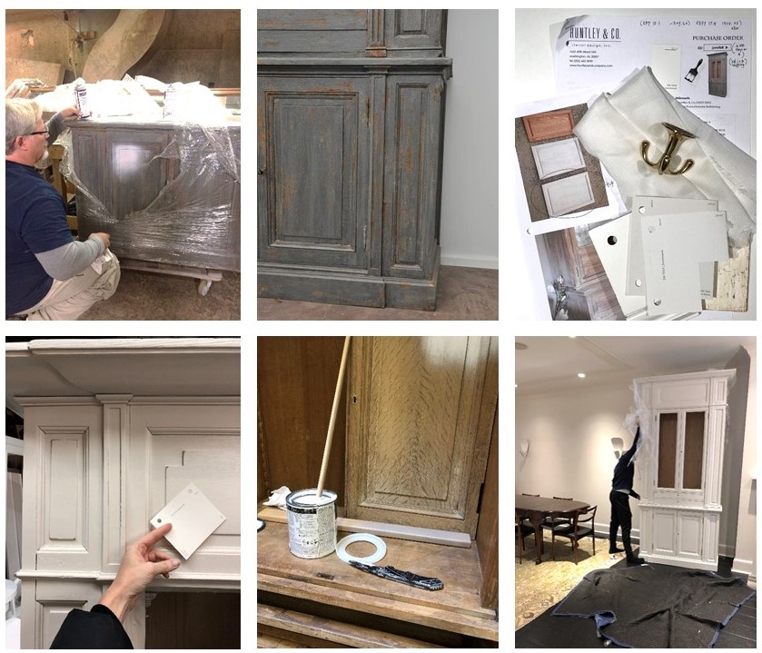
L to R: Removing the old finish; specifying all the new details; installation in progress.
// Master Bedroom canopy bed
Each project has its share of logistical challenges – and we love a good challenge because it inspires us to get extra creative. Our process never leaves things to guesswork. When we discovered that the bed, as originally designed, could not be brought up the stairs or through the windows, we had to go back to the drawing board (literally) to custom design a version that would fit.

L to R: Verifying stairwell and doorway dimensions; studio drawing of the custom pieces and parts; Ironware‘s workshop with assembly pre-shipment.
| SOFTGOODS |
// Master Bedroom roman shades & softgoods
Tailored, functional, bespoke. We designed the window treatments and pillows to complement the quietly sophisticated scheme in the master bedroom. Troubleshooting tricky corners and sourcing one-of-a-kind details makes all the difference.
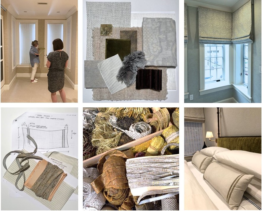
Top: Detailed site measures and schematic review; finished product! Bottom: A pillow workorder; a treasure chest of trim; a well-styled bed.
Stay tuned — Next week we’ll bring this project full circle and share our install with you! And in case you missed the other West End posts, check them out here and here.
xo, Huntley & Co.
Subscribe to our newsletter or find us on Bloglovin’ and you won’t miss a thing ; )
-
West End Process :: Concept
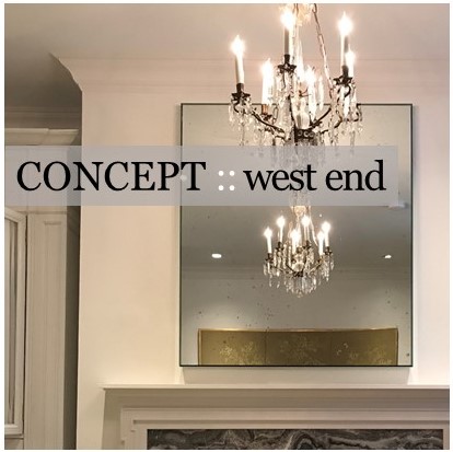
One of our favorite Huntley & Co. projects this year was for a young couple who hired us to design and renovate their newly purchased townhouse in the West End neighborhood of Washington. Much to our delight, the duo brought a combination of sophistication and excitement to the endeavor. Translating that into a concept and then into a finished product was a multi-step process — and worth every minute.
* * *

| THE CONCEPT |

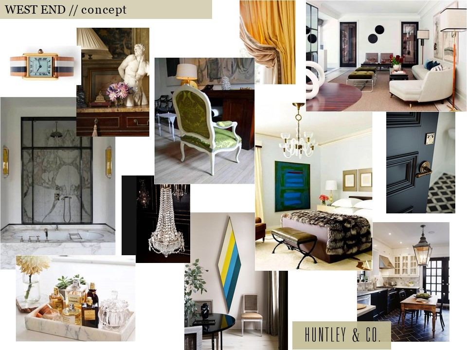
Our clients inspired a decidedly cosmopolitan aesthetic. Accordingly, we imagined an eclectic mix of vintage and antique furnishings, unexpected stone and tile, and layers of complex colors and tones. As shown below, the mood board we created conveyed our idea of an elevated yet spirited home – a true classic that’s never boring.

Selected photos clockwise from top left: Cartier Tank watch via Goop; Timothy Corrigan vignette; a crisp Madrid living room by Isabel Lopez-Quesada; a bedroom from Architectural Digest; a corner of Sandra Nunnerley’s home featuring “Diamond” artwork by Kenneth Noland; an austere and elegant marble bathroom.


| HOW WE GOT THERE |

The start of a project is full of excitement and potential. Before diving into design, we take time to fully understand both the space and the client. On the technical side, we site measure the building and generate CAD drawings for study and revision. On the conceptual side, we issue a questionnaire and cull images related to our clients’ answers. The questions range from pedestrian to abstract and are intended to give us practical information as well as insight into their lifestyle and aesthetic.
// Question & Answer
A two page questionnaire sheds light on what’s important.


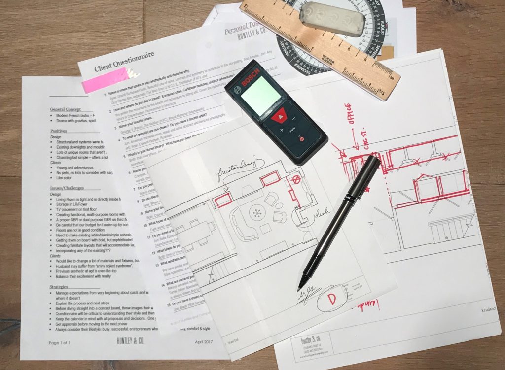
The client questionnaire is a key part of our initial survey and analysis.

// Pulling Together a Visual Story
We pull images that reference our clients’ feedback … and they share photos as well.


TRAVEL // From a honeymoon spot to favorites in Paris and NYC, these hotels topped our client’s list. L to R: Royal Mansour Marrakesh; George V in Paris; The NoMad Hotel in NYC.


FILM // Playful, witty and adventurous. L to R: Lock, Stock and Two Smoking Barrels; Amélie; The Man From U.N.C.L.E.
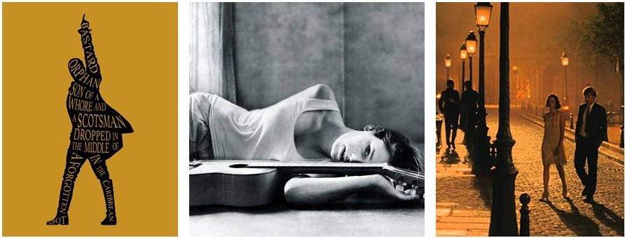
MUSIC // Eclectic and soulful music that bridges time and genres including the Hamilton soundtrack and Carla Bruni’s album, Quelqu’un m’a dit.

 FASHION // Classic, all-American cool c/o Vince, J. Crew and Celine.
INTERIORS // Rich and sleek. Warm and bright. Tailored and organic. L to R: Interior by Joseph Dirand includes works by Anish Kapoor, Pierre Jeanneret and Paavo Tynell; Patricia Urquiola collection for Georg Jensen; a sculptural Alvar Aalto chair; master suite cabinetry seen on Pinterest.

* * *

We love the conceptual stage of a project. Engaging in a thorough deep dive to excavate both the practical and the magical is the difference between a good project and a great one. Stay tuned for our next post where we transition into design development and project management — when we make the concept a reality.
xo, Huntley & Co.

-
EDGEMOOR SUNROOM
November is filled with anticipation as the holidays quickly approach and designers clamour to wrap up design projects. At Huntley & Co., we have labored long and hard for one Bethesda client in particular and are eager to put the finishing touches on their remarkable sunroom renovation. Our goal was to create a sculptural, textural space that elegantly captures the spirit of indoor/outdoor living. We will be featuring work product and site photos for this sunroom-cum-lounge in the next several posts. And we’ll reveal the installation around Thanksgiving, so just a little more patience! To give you an idea of the inspiration behind our design, we’ve shared the Edgemoor Sunroom concept board below. Wrap yourself up in the luxe imagery and escape.
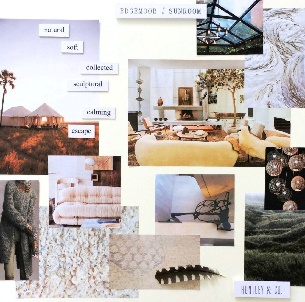
 xo, Huntley & Co.
* Subscribe to our newsletter or find us on Bloglovin’ and you wont miss a thing.

-
show-house // faux-client :: the reveal!
We know you and our fabulous faux clients have been waiting for our big reveal. The design process is nothing, if not, an exercise in patience. From concept to installation, interior design requires vision, tenacity and know-how. It’s a labor of love, but labor nonetheless. So when the time finally comes to present our clients with their dream home, our excitement is hard to contain. This particular dream home is ‘faux show’, but the thrill of the reveal remains the same … So without further ado!

— THE 2016 FAUX HOUSE REVEAL —

[ Our clients seem pleased ]

* * *

— DESIGNER Q&A —
Our Huntley & Co. clients and room may have been crafted from imagination,
but they do speak to the real methodology and design vernacular of our firm’s work.
Here, principal Tricia Huntley, opens up about her influences, the importance
of breaking the rules and the best song to get a party started.

1. What are some of the things that influence you, aside from furniture and décor?
Museums, music, fashion, history, parks/nature, architecture, poetry … those things that are thoughtful, provocative, moving. I like to start with a feeling or mood before I pivot to the tangible aspect of things.
2. What qualities of a room do you most admire?
Substantial hardware and appropriate, expertly executed millwork. I would rather live in an empty house with those two qualities than a shoddy new-build with the best furniture.
3. Design rule you love to break?
Symmetry. I was classically trained so I believe in building a space according to the rules of symmetry. But I also believe that breaking that symmetry in clever, nuanced ways is what brings a room to life.
4. You know these clients will be having many a fete, what’s a good hostess gift?
I love to give sophisticated, unusual candles and fragrances. Aedes de Venustas, Joya and Santa Maria Novella all offer intriguing scents in stunning vessels. And of course, good booze and wine never go out of style. Add a beautiful ribbon with a handwritten tag and you’re done.
5. Rapid Fire!
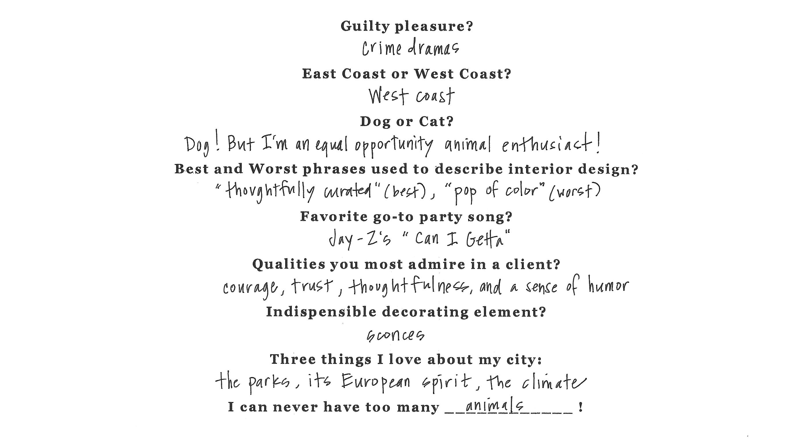
* * *

It’s been fun, but we need to dash! Our clients told us to get out so they can enjoy their new home ; )

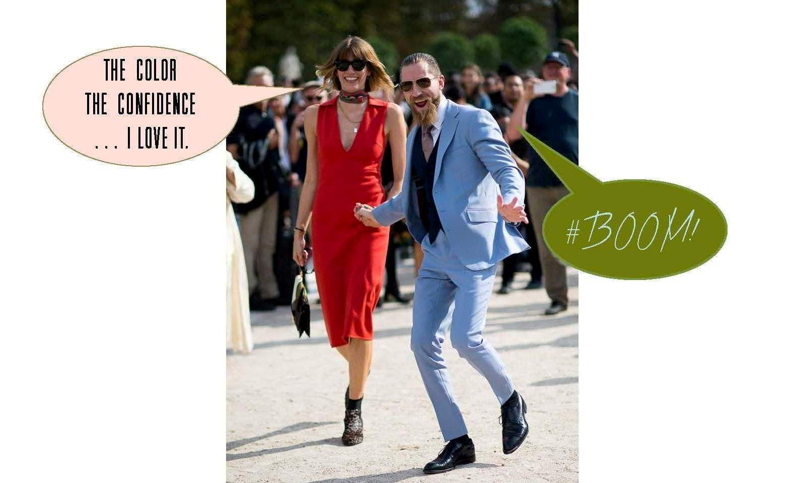
If you want another glimpse at the process, simply click on posts Part I, Part II and/or Part III. And special thanks to our “faux clients” Justin O’Shea and Veronika Heilbrunner. They are the coolest couple on the planet and dream clients fo sho!
-
SHOW-HOUSE // FAUX-CLIENT :: PART III
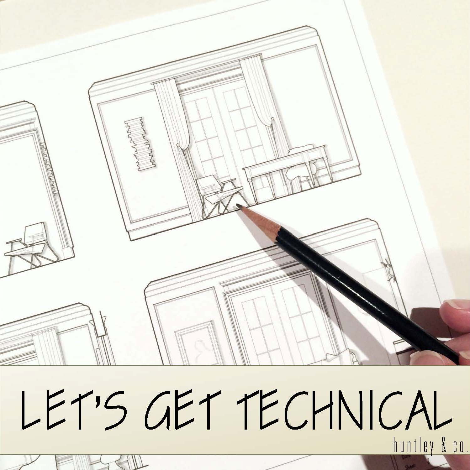
Sourcing goods and materials for our interior fuels our creativity, but drawings take the design to the next level. After all, a room is only as good as it is functional — we aren’t aiming for beauty just for beauty’s sake. Working out our ideas in AutoCAD ensures that we are on target with scale, proportion and spatial relationships. A well-trained designer can evaluate whether a piece will work in a room or not simply by looking at it. Still, transferring its dimensions to paper (or the computer as in our case) ensures down-to-the-1/8” accuracy. Huntley & Co. is a business built on mindfulness and our drawings are the technical backbone of our work.


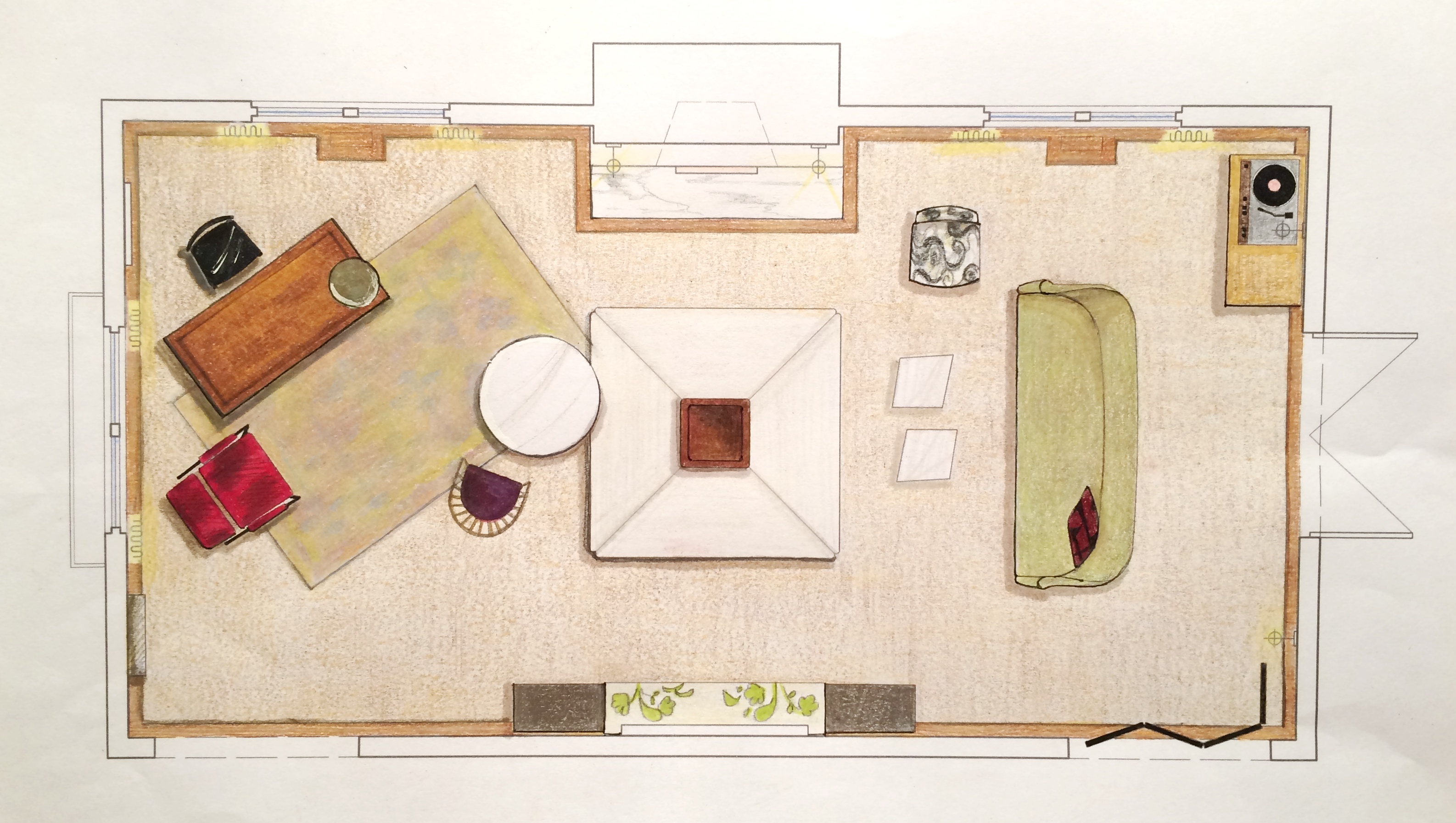
The Floorplan___________________________
We start with a floor plan, which guides the flow and circulation of a space. With our clients’ penchant for entertaining, it was important to think outside the traditional box and get creative with furniture placement. Our ‘star’ is the four sided bench that beautifully anchors the room. Varied seating arrangements offer opportunities for independent conversations and debate for our clients’ guests who come from a wide range of cultures, professions and political views. The room is meant to be as warm, interesting and thoughtful as the clients are.


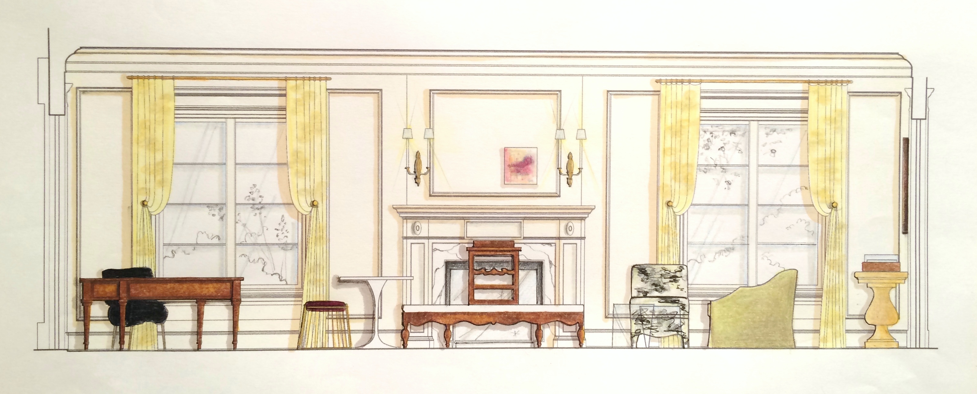
The Elevations___________________________
Elevations reveal how a room’s architecture, furnishings and art will work together. A space won’t look or feel good if there are too many masses, it’s too ‘leggy’, everything is at the same level or the values are off-balance. Deep-diving the millwork, fenestrations and other details gives us the platform we need to make good decisions. Not to mention that “pulling the design up” and seeing it come to life happens to be pretty exciting ; )


The Presentation Board____________________
The presentation board is our opportunity to showcase the tactility of a room. Ambience is affected by the ratio of soft vs. coarse, understated vs. luminous and natural vs. refined materials and textures. We wanted this space to feel glamorous, but totally approachable with an air of intelligent wit. With that in mind we combined fibers like linen, seagrass and rushing with velvet and damask. Then we took it a step further by incorporating lacquered leather, eelskin and electric-colored cowhide. This is a luxurious space where you can kick up your feet and have fun!


The Response___________________________
And because these are the dreamiest of clients, they love everything and will TAKE IT ALL! Orders are placed and construction begins. This next phase is about site visits, management, coordination, follow-up and a lot of patience. But we’re getting our hands dirty and seeing our workrooms do their magic — so we love it!


______________________________________________________________________________
Tune in next week for a fun Q&A and the FINAL REVEAL! We will be sharing more insights about our process and the why’s and how’s of a successful design project.

Subscribe to our newsletter or find us on Bloglovin’ and you won’t miss a thing ; )
-
SHOW-HOUSE // FAUX-CLIENT :: part II
Like the early stages of a romance, the onset of a new design project brings lots of excitement, energy and anticipation. Now that we’ve “gotten to know” our Faux Clients better and have defined a visual narrative for their space, we are ready to start deep-diving the design. It’s time to measure the room, pull our materials and find our gorgeous furnishings — let’s show this showhouse what we’re made of!

Prep Work______________________________
Preparation and foresight are the secret weapons behind a good design. We always arrive well-prepped for site visits and measures. Camera? Check. Tape measure? Check. Comfortable shoes? Definitely check.


Scouting for Furnishings____________________
Scouting for hidden treasure is one of design’s greatest thrills. Fortunately, we are blessed to have access to a rich variety of vendors and shops from which to source our goods. We let serendipity play a part in our work, so it’s usually one or two really special discoveries that drives our designs. This part of the process is not about “shopping”; it’s about having an informed concept, an open mind and a great eye. Our goal at Huntley & Co. is always to curate an interior that is both timeless and forward-thinking — to evoke an emotional response that inspires and nourishes the spirit of the client.


Pulling Together the Scheme_________________
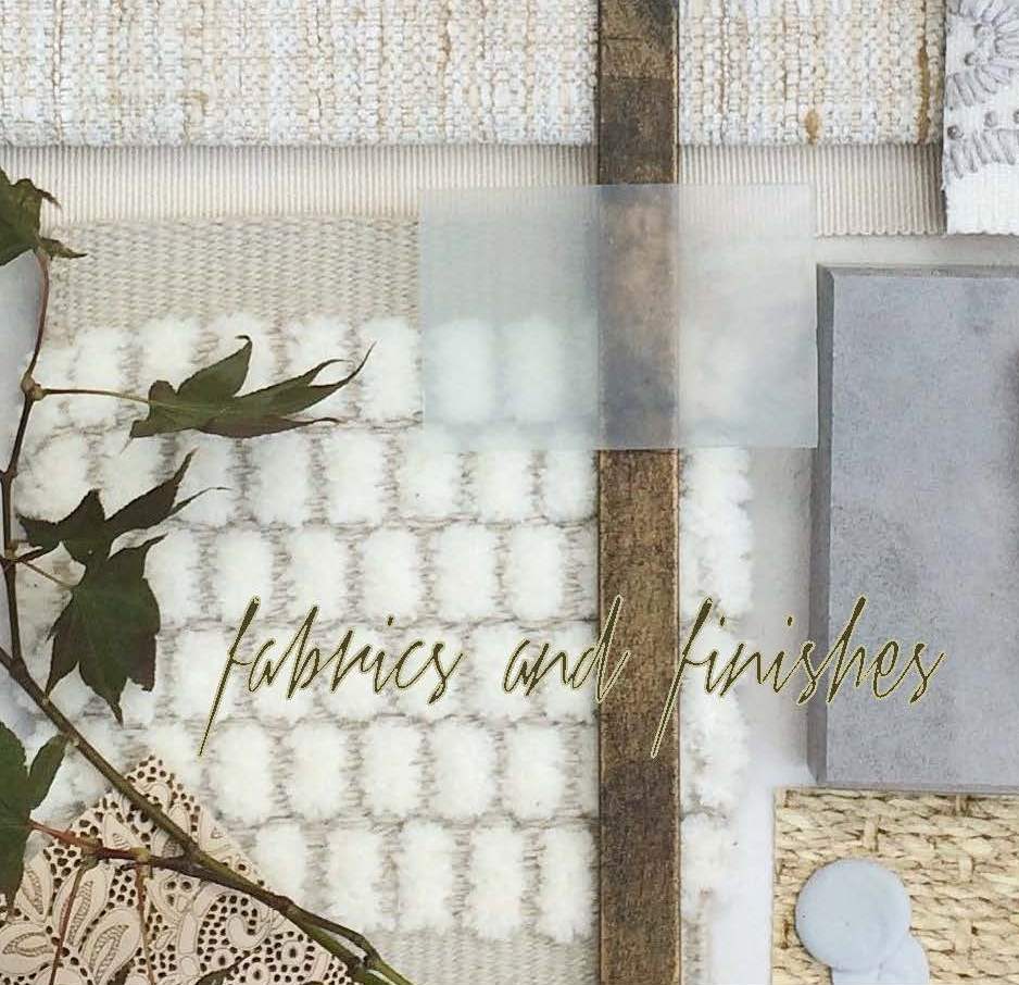
Besides hunting for furnishings during this phase, we pour through our office library for fabrics and finishes. We strive to use materials that enhance a home’s architecture and complement the lifestyle of our clients. A thoughtfully selected mix of light and dark, textural and refined, beautiful and odd are what make a room interesting and livable.


Next week we’ll bring you Part III of our Show-house/Faux-client series where we’ll dive into the technical aspects (drawings!) of the project. Subscribe to our newsletter or find us on Bloglovin’ to stay tuned.
-
SHOW-HOUSE // FAUX-CLIENT
A showhouse is unique in that it provides a designer with the freedom to create a space that is bound only by her innovation and talent. With a project that lacks a scope of work and a flesh-and-blood client, we find it important to invent a narrative to guide our design concept. At Huntley & Co. we create a “faux client” to serve as muse during the showhouse process. We have been blessed with some pretty wonderful clients throughout the years, but our Faux Clients 2016 definitely have us crushing hard!


dc interior designer
Concept Development______________
Washington DC is a city filled with people of varied and interesting backgrounds. Our Huntley & Co. “clients” are an art dealer wife with an international childhood (thanks to a father who was Ambassador to Peru) and a west coast-born husband with a Renaissance spirit. The couple shares a love of art, music and philanthropy. Both travel frequently to New York, California, Europe and South America. With that in mind, our goal for these busy and passionate entrepreneurs was to create a true LIVING space that reflects their personal histories and nurtures the lifestyle of their young family.



Already inspired? Fantastic! Because Huntley & Co. will be sharing more insights into our showhouse process as well as a final ‘reveal’ in forthcoming Luxe & Lucid posts. Subscribe to our feed or follow us on Bloglovin to stay tuned!

