-
Whatchu Lookin At?
Vicente Wolf published a book sometime back called ‘Learning to See’. I have always thought that was such a meaningful title. Seeing (and looking, fundamentally) is at the heart of a creative person. What drives artistic and design-minded individuals is a desire to seek out and study what’s interesting, beautiful and/or weird about the stuff of the world.
I’m no exception; I never stop culling the visual data around me. And I have no shame when it comes to capturing what I see on film. I’ll lie down on the sidewalk or crawl in the dirt if I see something worth photographing. Inspiration for my designs can be found in all kinds of places: museums, parks or city streets. It doesn’t matter if I’m looking at a Rodin sculpture or the bark of a tree. Cultivating one’s oeuvre (i.e. learning to see) means looking EVERYWHERE, even in the most unlikely of places.

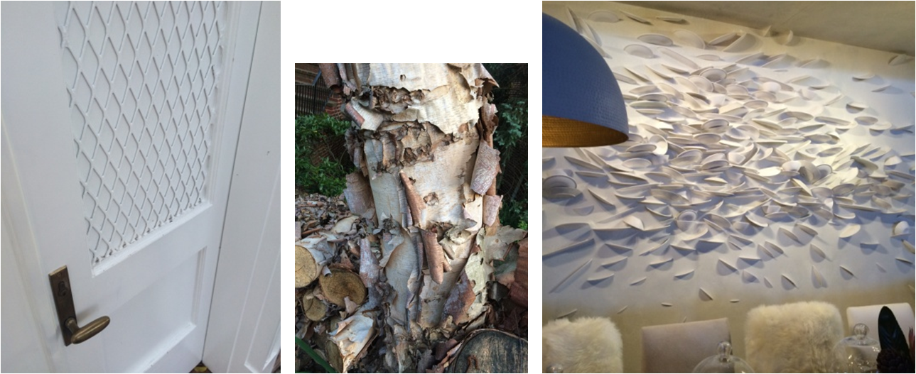
– 3 unique versions of texture –
Left to right: DIY lattice on a courtyard door in LA; Crepe Myrtle bark in my neighborhood; a broken plate art installation at the 2016 AD Design Show.

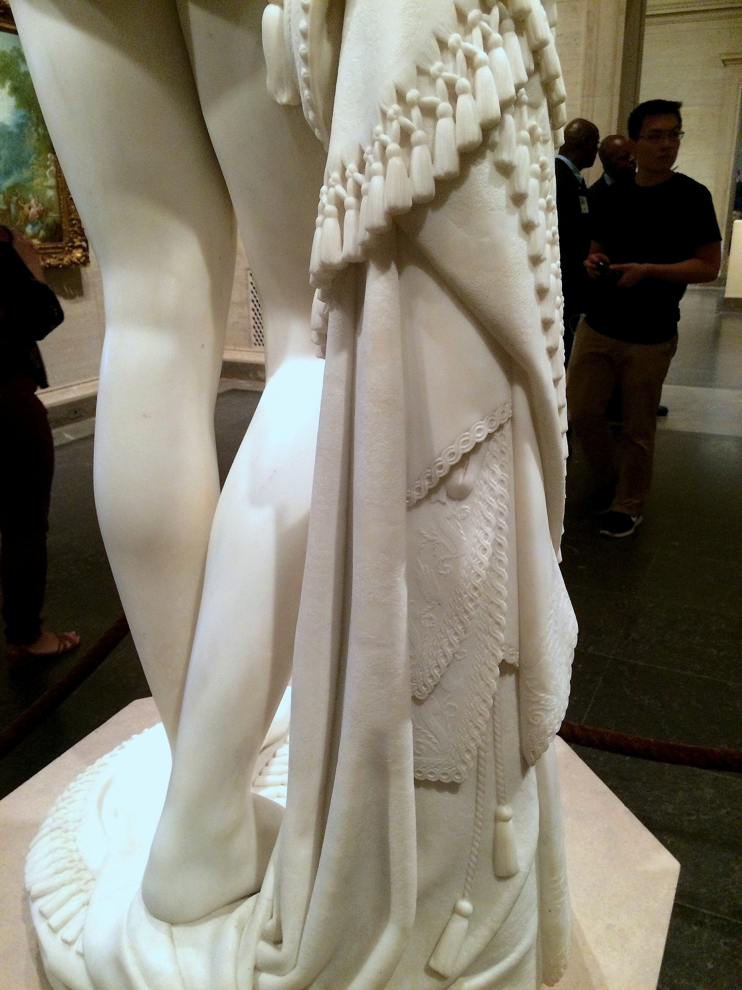
Masterfully carved tassels and lace details on a marble statue at the National Gallery of Art.

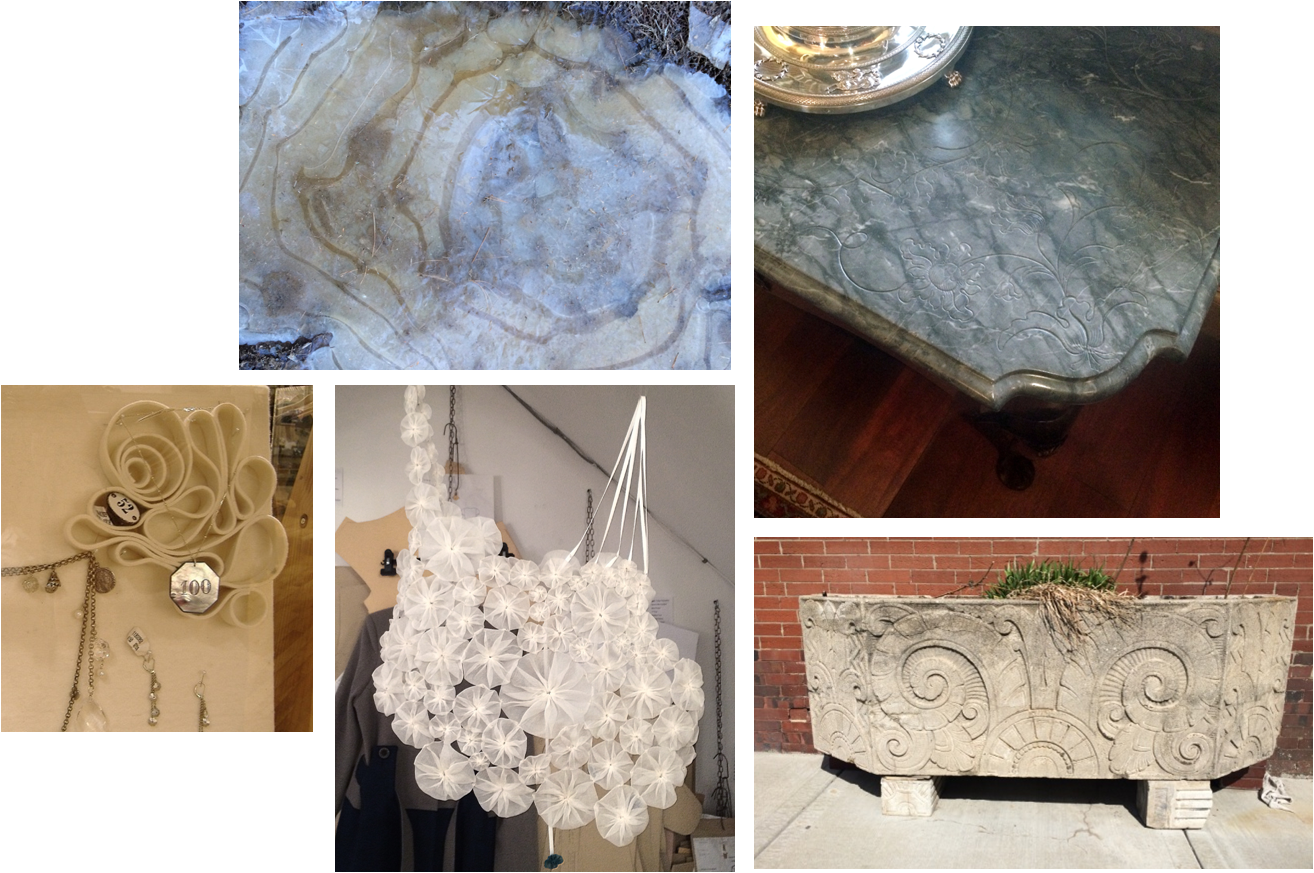
– a sophisticated collection of swirls and curlicues –
Clockwise from top left: A frozen puddle in West Virginia; an antique carved marble table top at the State Department; an Art Deco planter on a Kansas City sidewalk; an ornamental fabric necklace in a London shop; a felt jewelry display at Anthropologie.

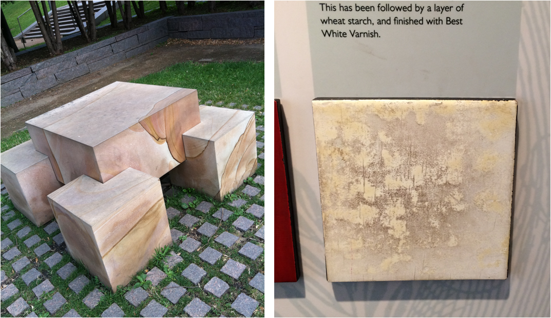
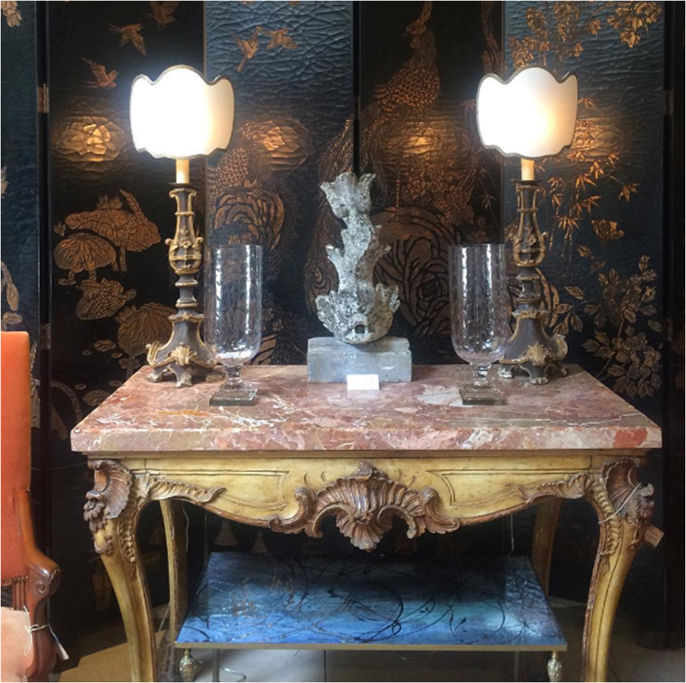
Left: Faux finish inspiration discovered at the Minneapolis Sculpture Garden. Right: A sample of Japanning at the Geffrye Museum in London.

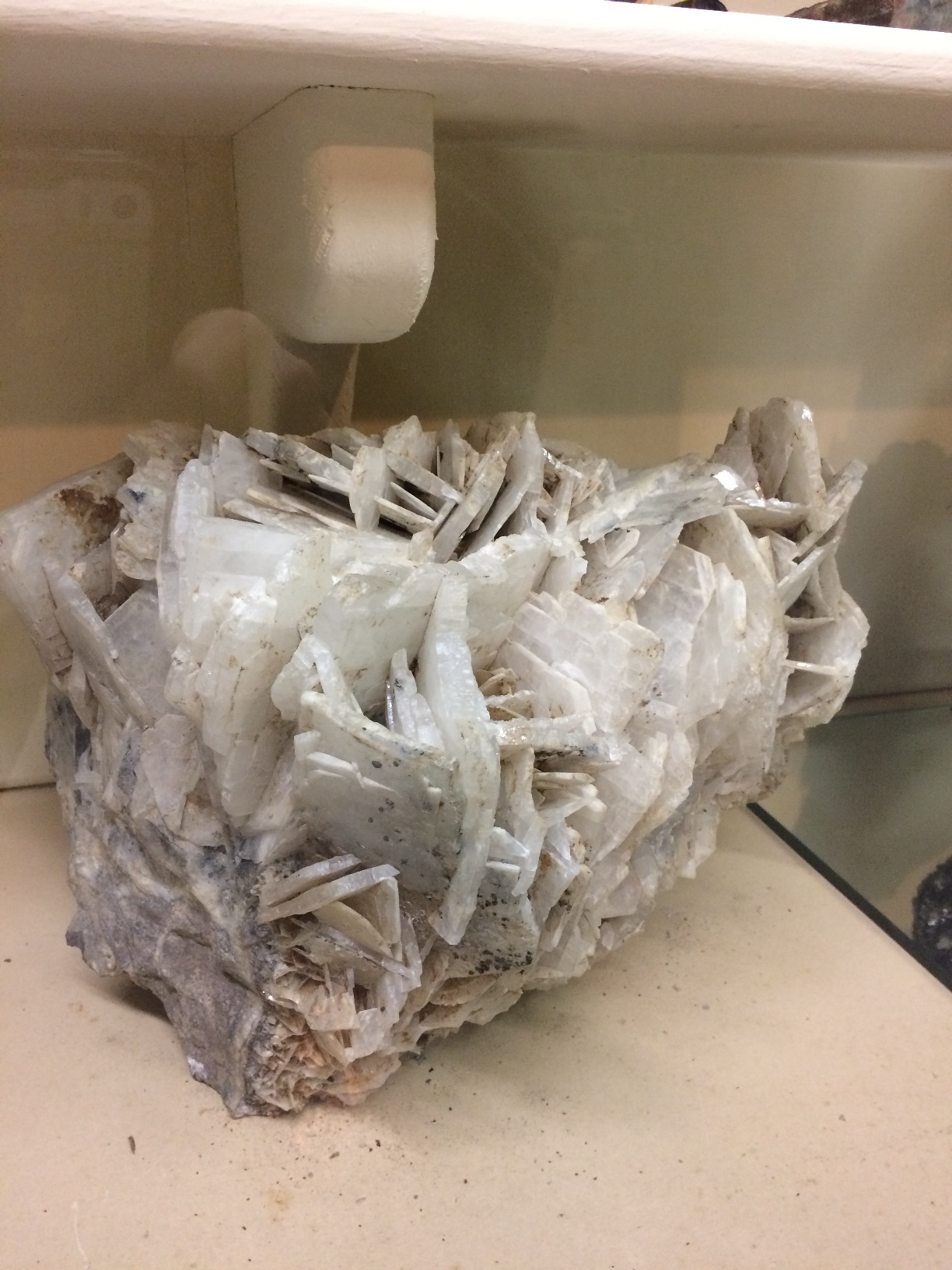
A large mineral sample on display at a mining museum in Creede, Colorado.

So many photos and so little time. This post could have been a mile long, so instead, you can expect a Part II, Part III and maybe even a Part IV of Whatchu Lookin At? Until next time — look, see and soak it all up!

Subscribe to our newsletter or find us on Bloglovin’ and you won’t miss a thing.
** all photos in this blog post are my own : )
-
DESIGNING WITH PASSION :: THE COLORS OF VALENTINE’S DAY
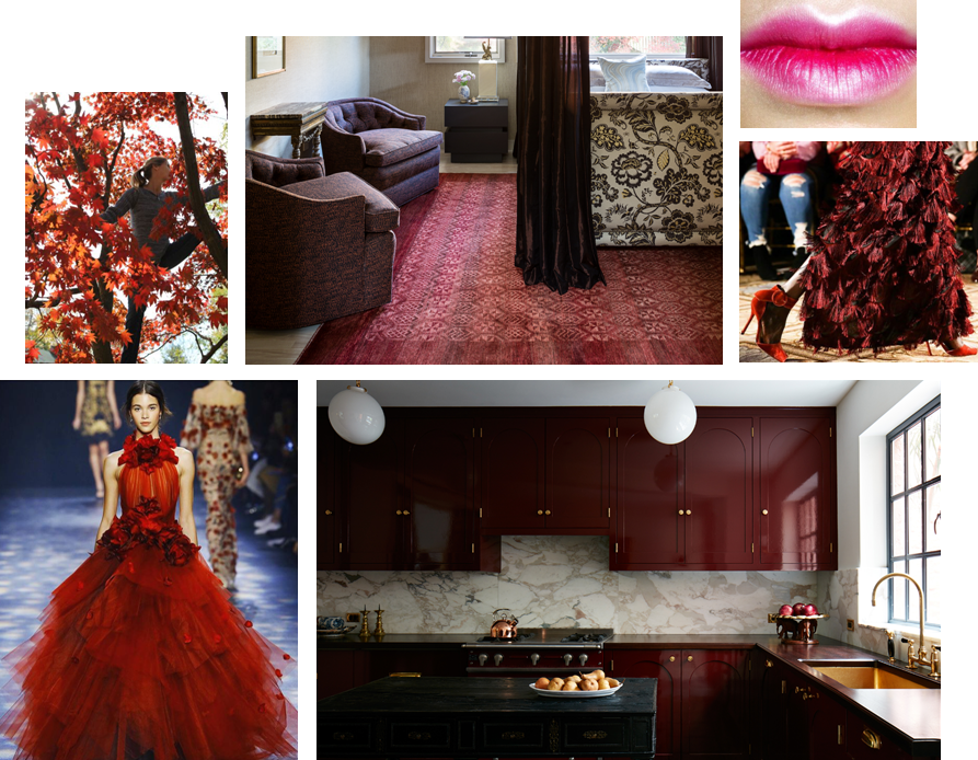
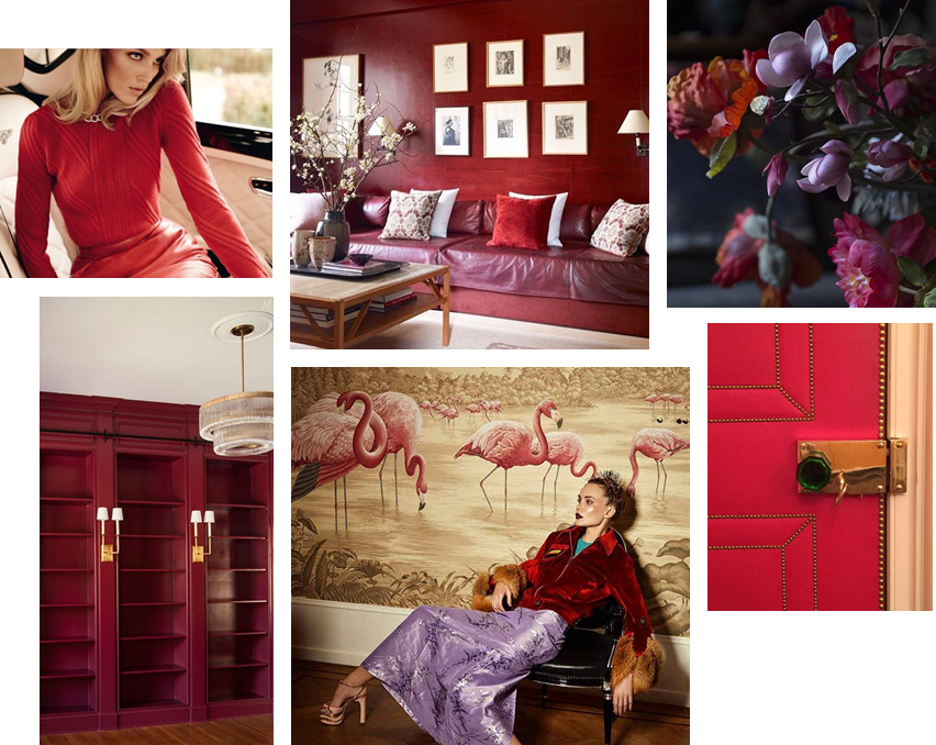
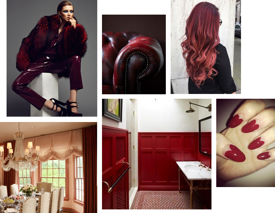
I love the colors associated with Valentine’s Day. Red, garnet, blush, pink, plum — they’re all so delicious and sexy. This is a palette that seduces in design, fashion, and even nature. I suggest that you soak in the gorgeous inspiration of our post today, especially if you are spending the holiday sans sig-other. There is no balm for the soul like beauty. Well, that and a really good bottle of pinot noir and dark chocolate.
HAPPY VALENTINE’S DAY!

** Sources/links for the photos above can be found on our Pinterest page … along with other Valentine’s Day inspiration.
-
EDGEMOOR SUNROOM :: THE REVEAL!
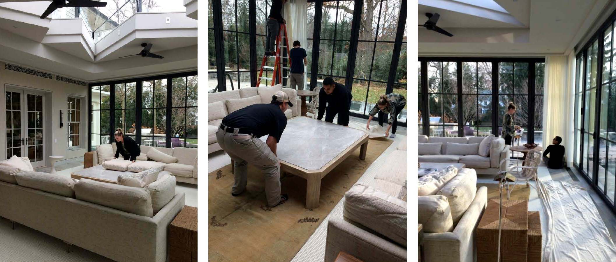
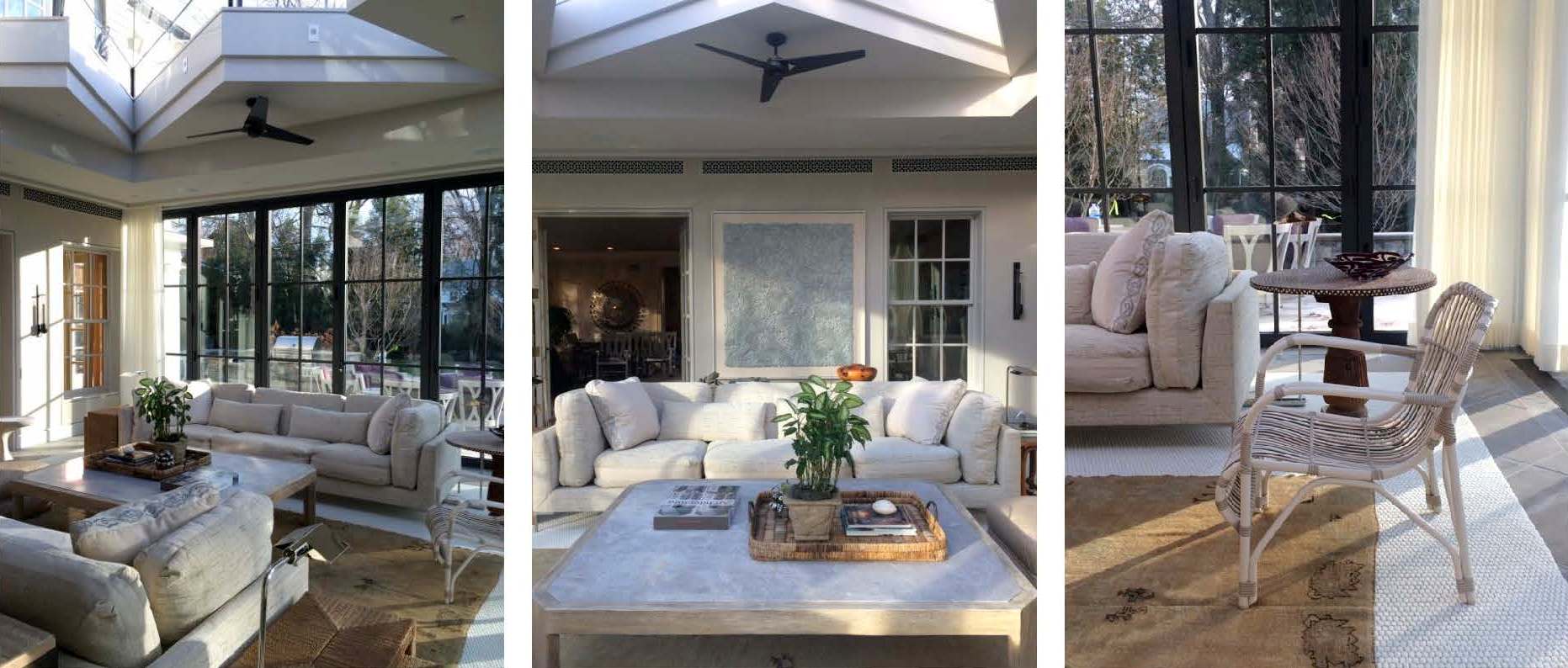
The Edgemoor sunroom has been installed! Installation days are such a highlight for interior designers. They represent the culmination of months of hard work, careful planning and patience. Considering this project started in the summer of 2015, we were thrilled to see the room finally come to life. So it is with great delight that we report that the room is even more beautiful than we expected. We always have an idea of how an interior will look, but we can’t necessarily anticipate how it will feel. Being in a space where the architecture, the decor and the surroundings truly sing makes all the trials and tribulations of the previous months disappear. We’re thrilled and our clients are thrilled. Santa couldn’t have brought us a better present for the holidays. Enjoy!

|| Pre-Install Site Review ||

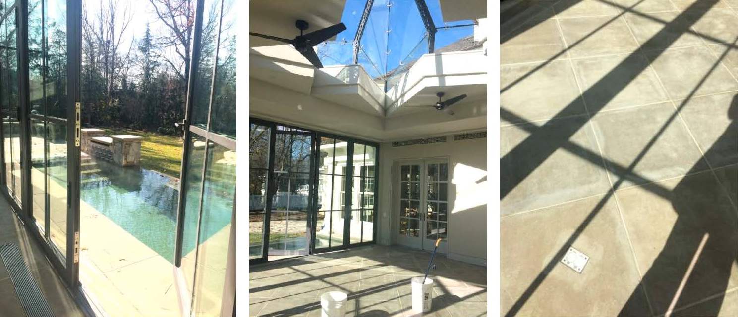
We scoped out the site the day before to ensure that there were no surprises on install day. Thanks to the contractor, all of the construction debris had been removed and the floors and glass were clean. This is a small, but important detail when delivering a room full of fresh, new [and valuable] furnishings. And with a blank slate before us, we were finally able to appreciate all of the beautiful architectural lines and the gracious volume of space.

|| Design is [not] glamorous ||

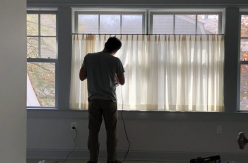
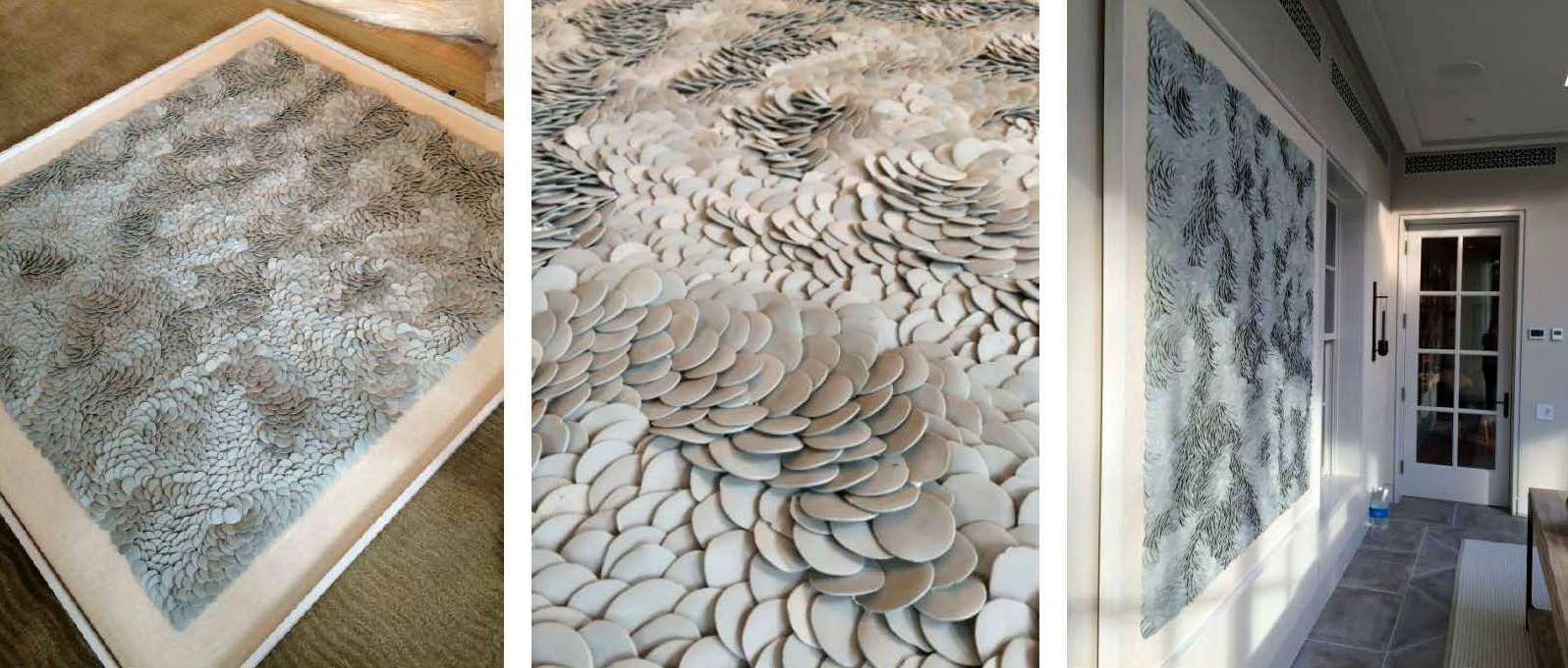
Installations requires a mix of muscle, troubleshooting and finesse. Pillows get fluffed, furniture placement tweaked, and motorized curtains programmed and dressed. One of the trickier exercises of the day was hanging the porcelain Fenella Elms artwork. Both delicate and heavy — and weighing in at well over 100 lbs — it took four men and two very nerve-wracking attempts to hang it on the wall. Needless to say, we all gave a cheer and a generous sigh of relief once it was in place.

|| A Beautiful Finish ||

Just as we were finishing the installation, the sun came out and cast an ethereal light into the room giving it a magical sparkle. The shadows danced off the porcelain artwork, the plaster walls, and the mother of pearl inlay on the pedestal table top. Simultaneously, the light saturated the drapery with warmth and illuminated the dramatic skylight overhead. Enveloped by so much natural beauty, it’s easy to envision spending hours in this space lounging, reading, socializing or napping.

|| Taking Care ||

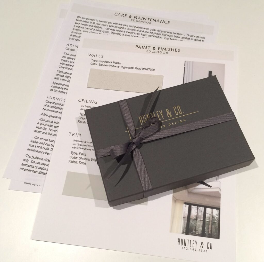
Our work here is done! Well, almost. Installations require guidance regarding the care and maintenance of the space. We strive to ensure our client’s satisfaction by giving them the tools they need to enjoy their homes for years to come. Our care packages vary depending on the scope of a project and specific needs of the client. However, they generally include care and maintenance instructions, mechanical specifications and a paint+finish schedule. In this particular case, we also included a separate artwork care package. The art we installed is fragile and valuable, so we provided our clients with handling instructions along with extra porcelain pieces. And of course, we packaged it beautifully in a Huntley & Co. box with ribbon – something befitting the showstopper art piece itself.

We hope you enjoyed following our Edgemoor series. In case you missed anything, check out each phase here, here, here and here. We will be signing off for the next few weeks to enjoy some R&R. We will post again in 2017 with new installations, discoveries and our behind-the-scenes adventures. Until then, Huntley & Co. — and our mascot Nina — wish you and yours the happiest of holidays!


Subscribe to our newsletter or find us on Bloglovin’ and you won’t miss a thing ; )
-
EDGEMOOR SUNROOM :: PART IV
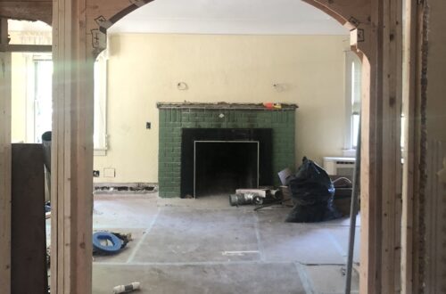
The Edgemoor sunroom has required patience, perseverance and plenty of blood, sweat and tears (and bones, but I’ll get to that later). After nearly a year of design and planning, construction finally began in early spring. Starting work was both a relief and a thrill.
With a schedule as protracted as this one, there are plenty of progress photos to share.

From start to finish there hasn’t been a dull moment!


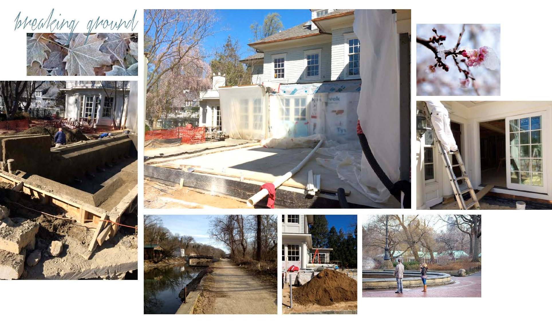
— Breaking Ground —
Construction crews arrived at the end of February to dig, set drainage lines and pour the slab for the sunroom. The most dramatic transformations start with a lot of dirt!

— Movin’ on Up! —
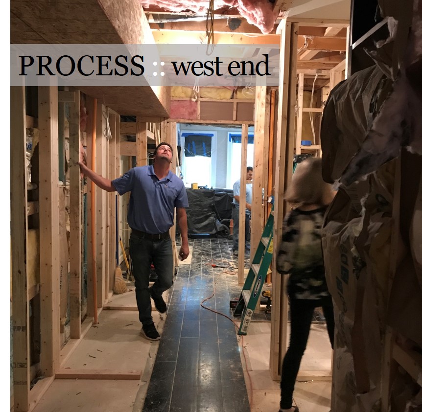
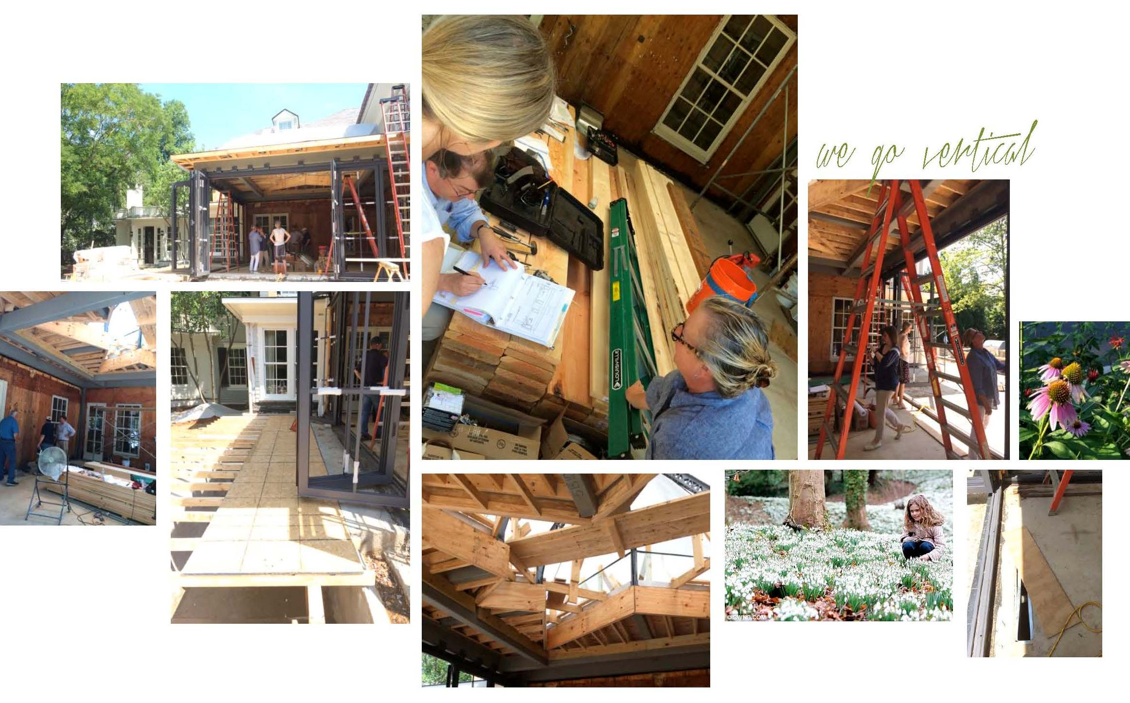
Once July arrived, the building finally started to take shape. Remember that patience we mentioned? This phase of the project is all about oversight and troubleshooting as needed. We made several site visits and met everyone from the tile installer to the drapery fabricator to review drawings and inspect details. It may seem unusual to discuss softgoods in a room without drywall, but spotting architectural modifications early allows us, and our workrooms, to modify plans accordingly.

— Finishing Touches —
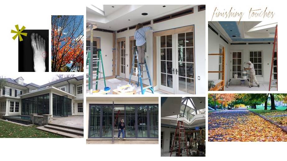
As you can see in the pictures below, work continued into the Fall. Still, we were happy to have a room with walls, trim, windows and doors — not to mention a massive, one-of-a-kind skylight overhead. With the space enclosed, we were ready for paint and decorative finishes. We enlisted Julia from Monkton Studios (below) to dress the room in a beautiful knockback plaster, adding warmth and subtle dimension to the envelope.

Interior design is often associated with drama. True, but we usually try to avoid it if we
can. Unfortunately, at one of the many site visits, Lindsey fell into an open floor vent
(ahem, a hidden open floor vent that is). Thanks to a broken fibula and fifth metatarsal,
the Edgemoor project is officially going out with a CRASH-BOOM-BANG!
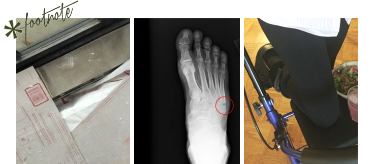
(L) the offending floor vent sans cover; (C) post site visit x-ray; (R) masterful use of the Rollator Walker

… Installation day is TODAY.

-
Edgemoor Sunroom :: Part III
-
Edgemoor Sunroom :: Part II
-
EDGEMOOR SUNROOM
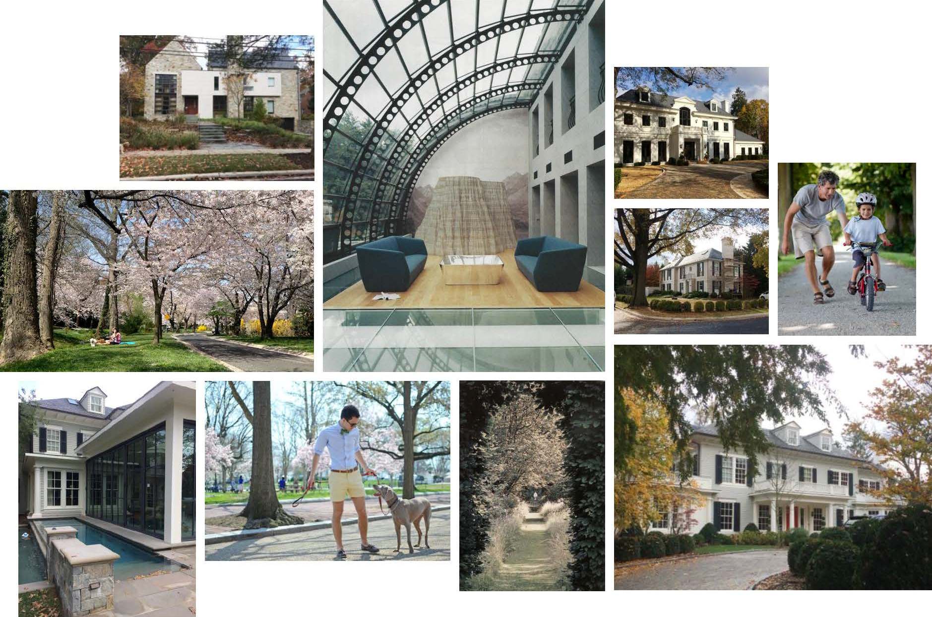
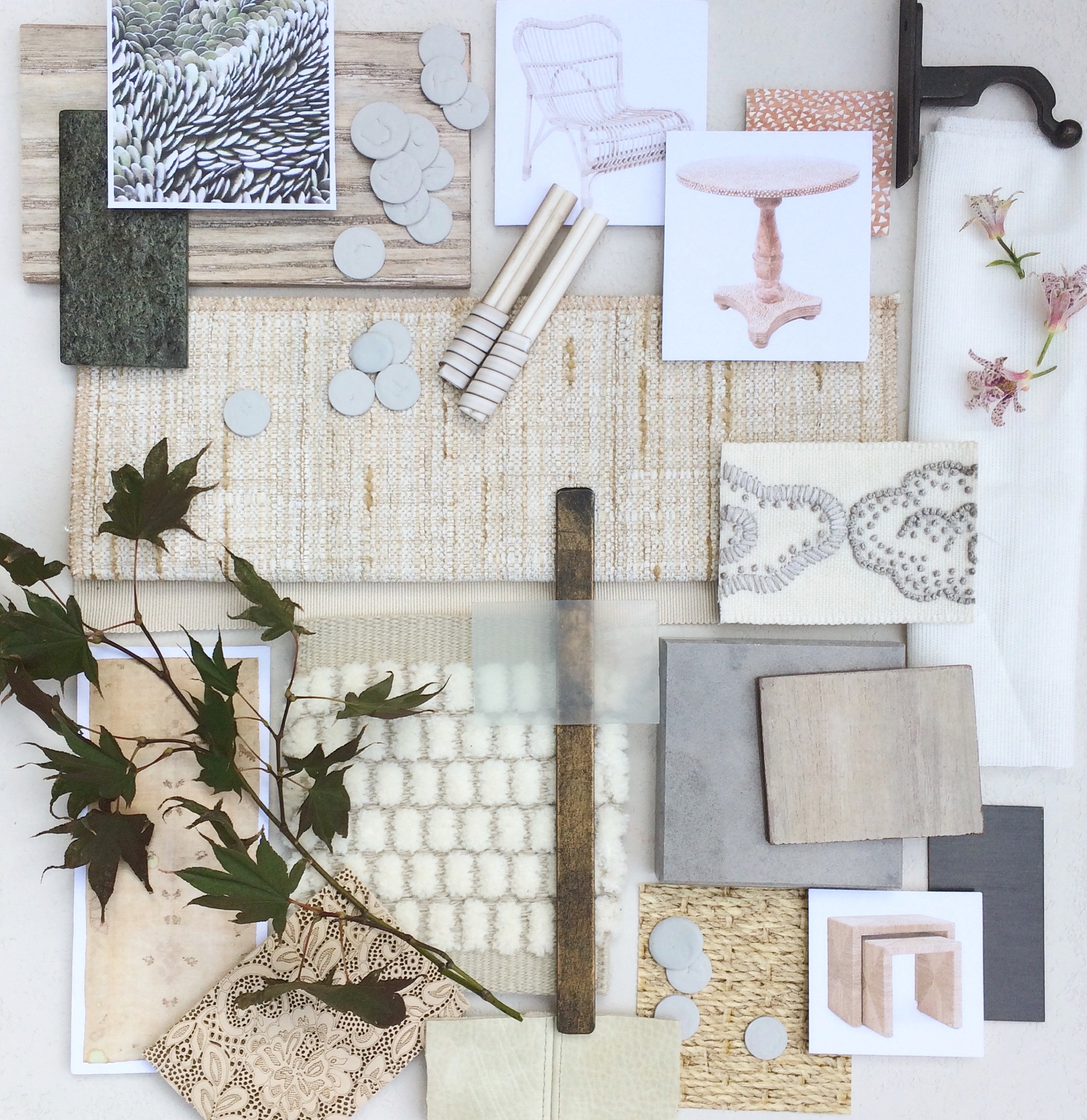
November is filled with anticipation as the holidays quickly approach and designers clamour to wrap up design projects. At Huntley & Co., we have labored long and hard for one Bethesda client in particular and are eager to put the finishing touches on their remarkable sunroom renovation. Our goal was to create a sculptural, textural space that elegantly captures the spirit of indoor/outdoor living. We will be featuring work product and site photos for this sunroom-cum-lounge in the next several posts. And we’ll reveal the installation around Thanksgiving, so just a little more patience! To give you an idea of the inspiration behind our design, we’ve shared the Edgemoor Sunroom concept board below. Wrap yourself up in the luxe imagery and escape.
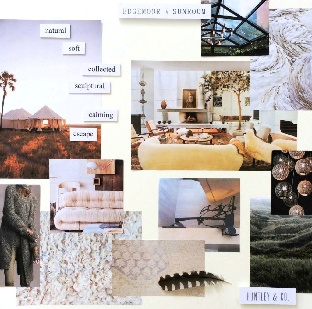
 xo, Huntley & Co.
* Subscribe to our newsletter or find us on Bloglovin’ and you wont miss a thing.

-
SHOW-HOUSE // FAUX-CLIENT :: PART III
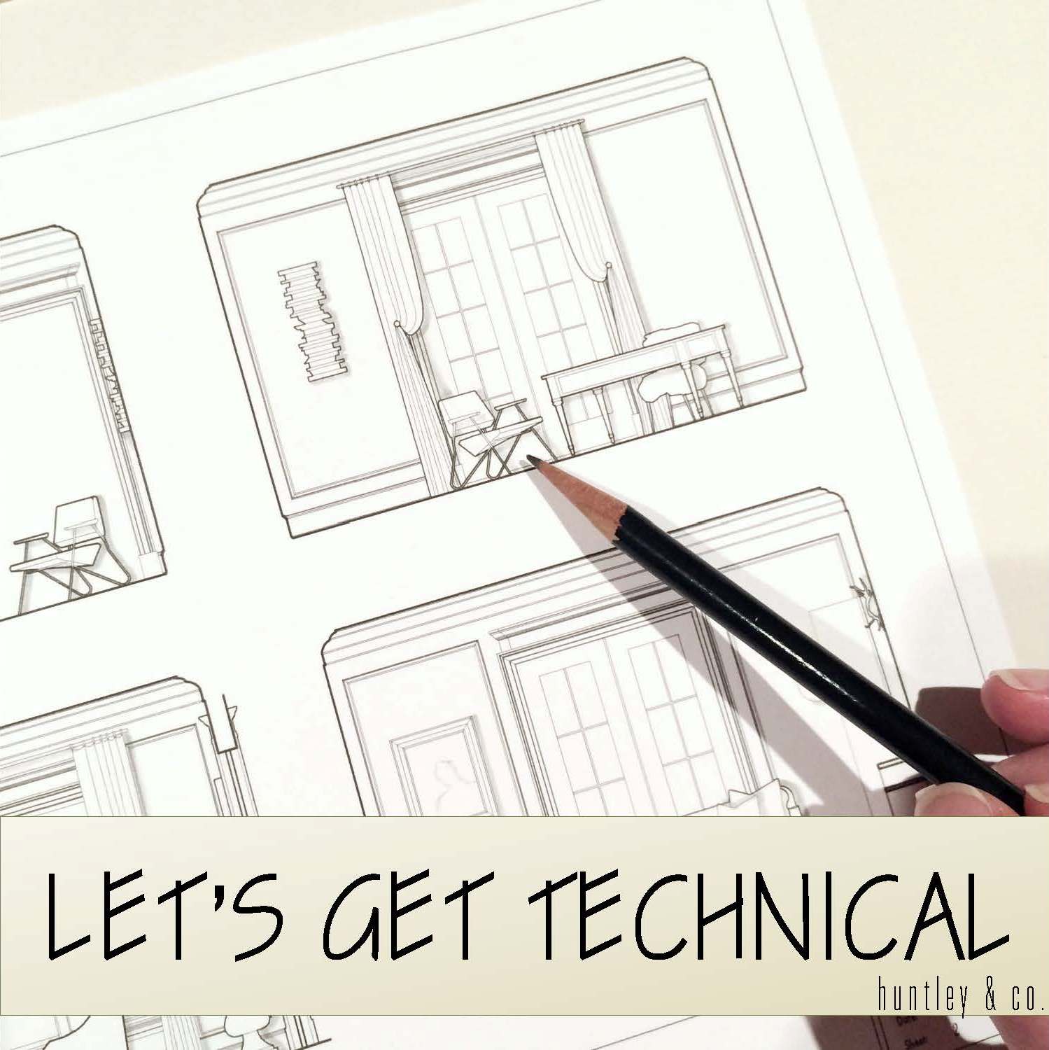
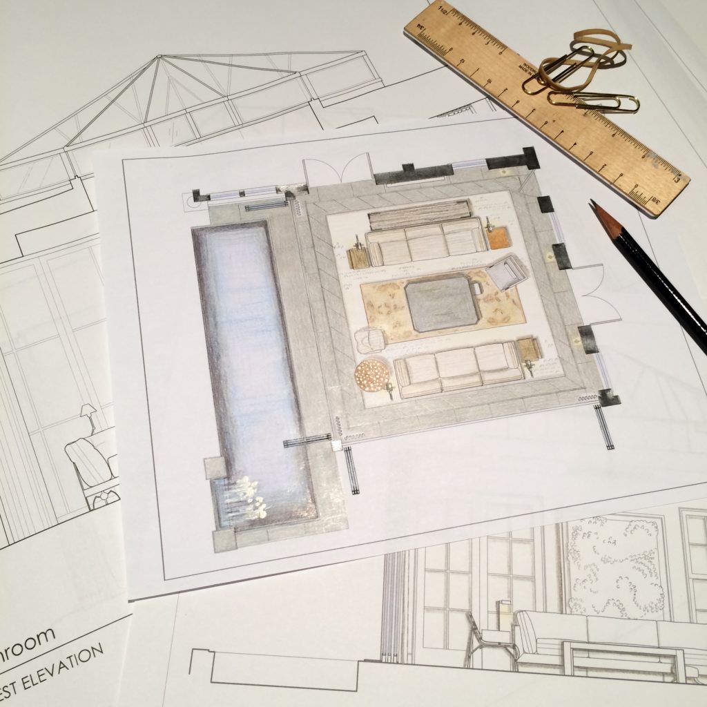
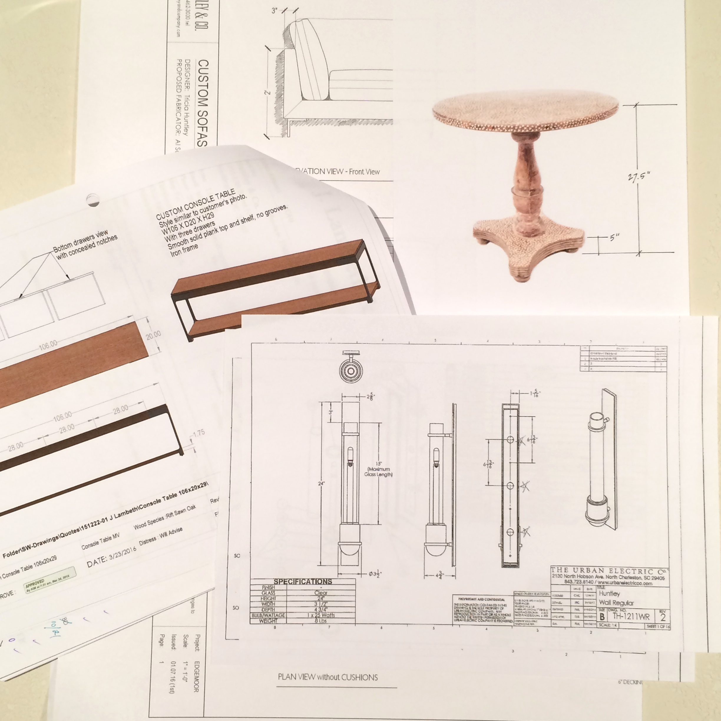
Sourcing goods and materials for our interior fuels our creativity, but drawings take the design to the next level. After all, a room is only as good as it is functional — we aren’t aiming for beauty just for beauty’s sake. Working out our ideas in AutoCAD ensures that we are on target with scale, proportion and spatial relationships. A well-trained designer can evaluate whether a piece will work in a room or not simply by looking at it. Still, transferring its dimensions to paper (or the computer as in our case) ensures down-to-the-1/8” accuracy. Huntley & Co. is a business built on mindfulness and our drawings are the technical backbone of our work.


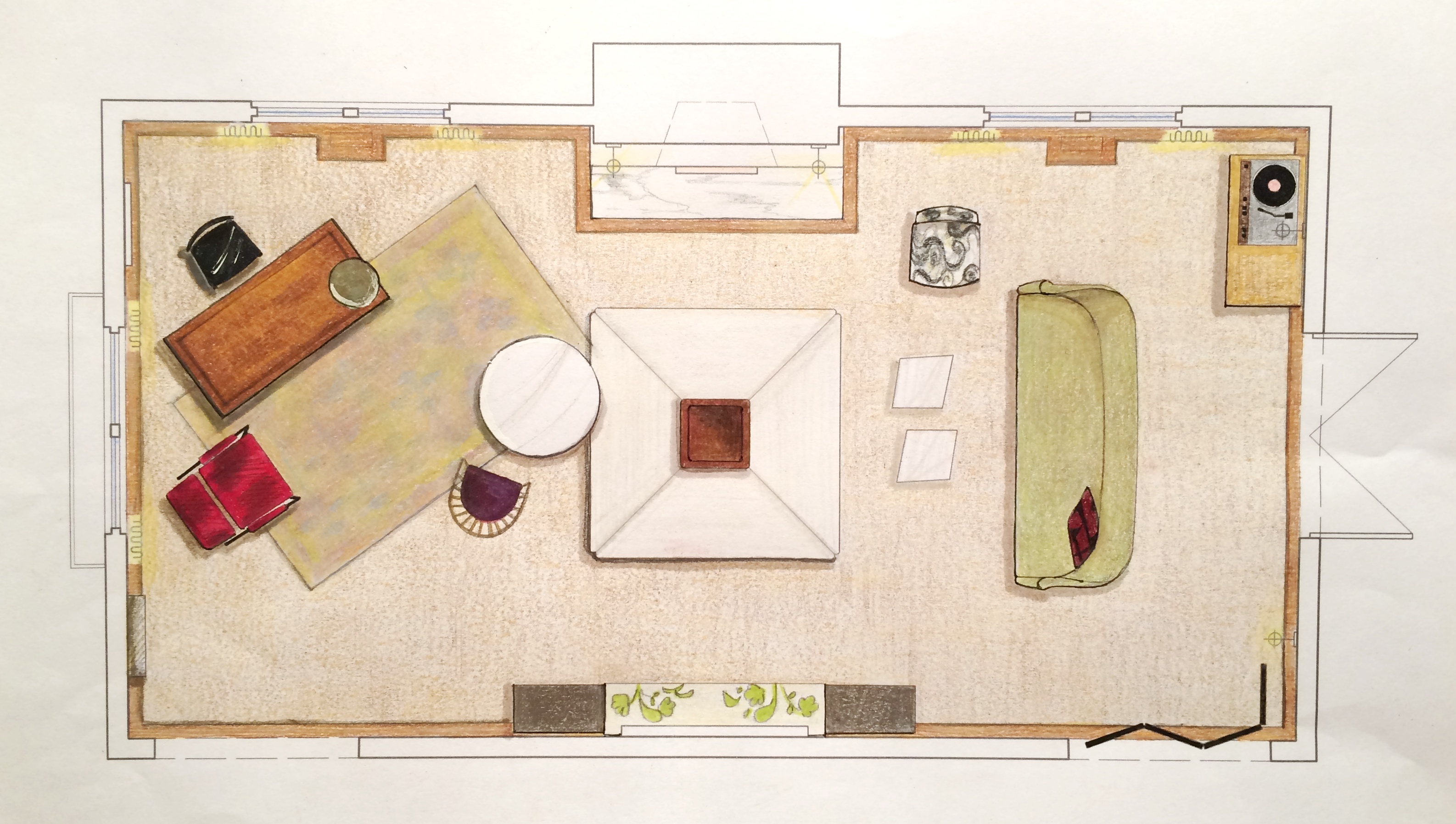
The Floorplan___________________________
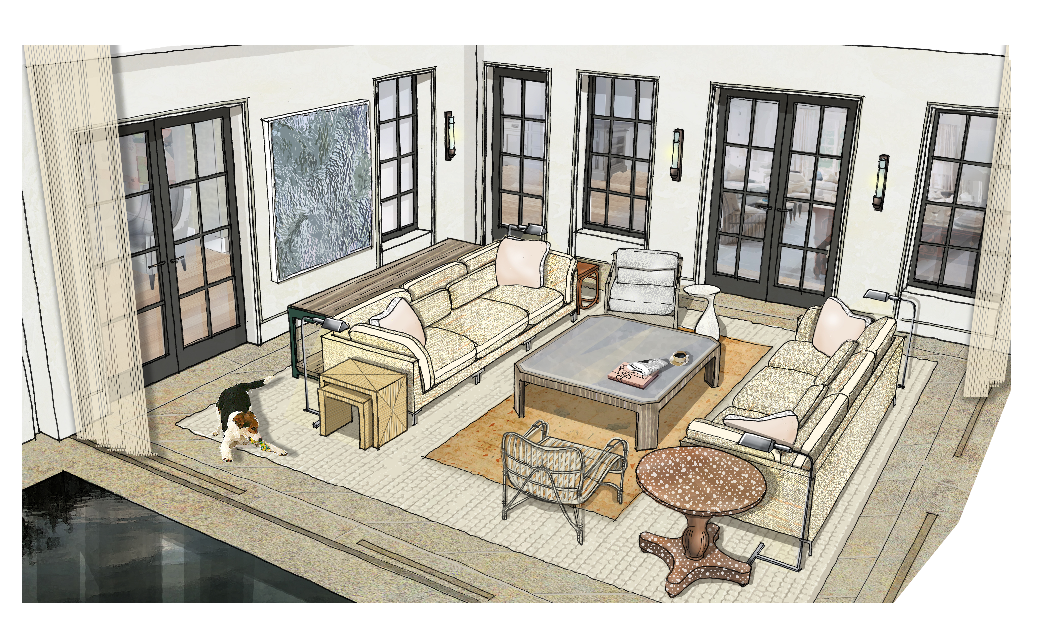
We start with a floor plan, which guides the flow and circulation of a space. With our clients’ penchant for entertaining, it was important to think outside the traditional box and get creative with furniture placement. Our ‘star’ is the four sided bench that beautifully anchors the room. Varied seating arrangements offer opportunities for independent conversations and debate for our clients’ guests who come from a wide range of cultures, professions and political views. The room is meant to be as warm, interesting and thoughtful as the clients are.


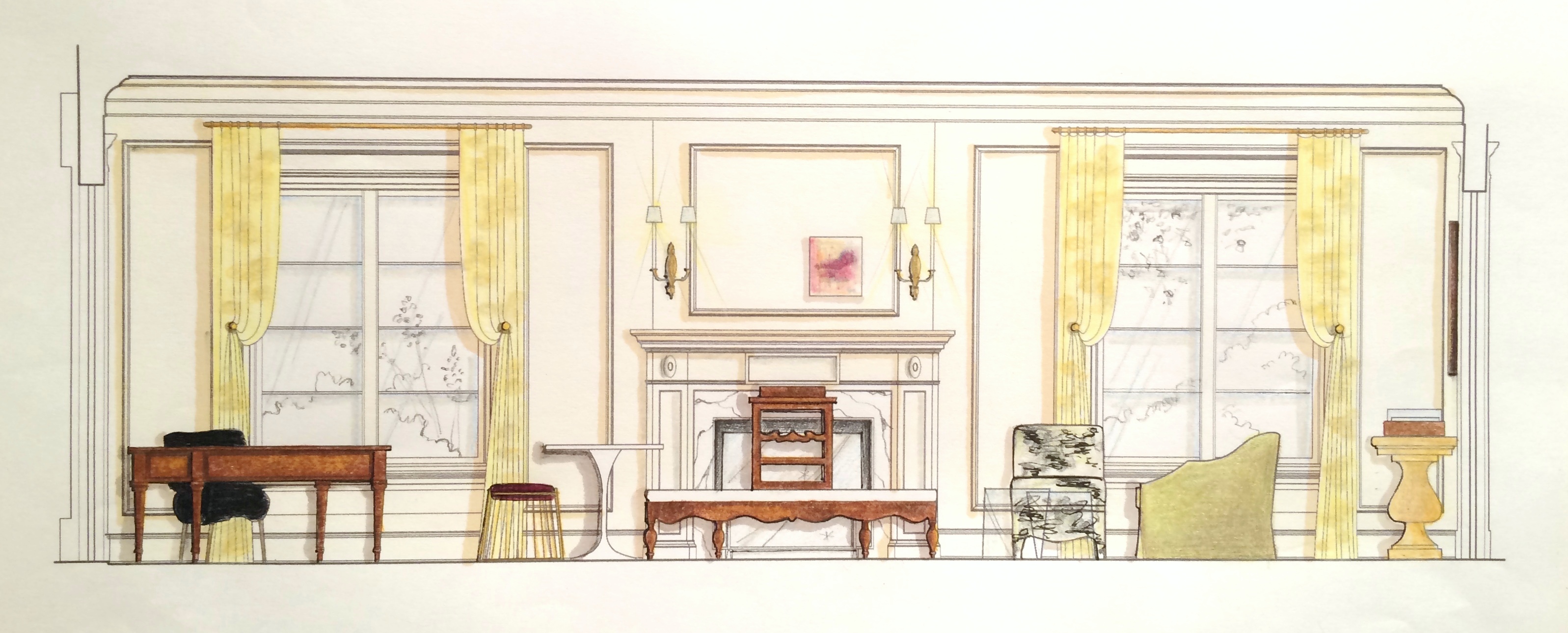
The Elevations___________________________
Elevations reveal how a room’s architecture, furnishings and art will work together. A space won’t look or feel good if there are too many masses, it’s too ‘leggy’, everything is at the same level or the values are off-balance. Deep-diving the millwork, fenestrations and other details gives us the platform we need to make good decisions. Not to mention that “pulling the design up” and seeing it come to life happens to be pretty exciting ; )


The Presentation Board____________________
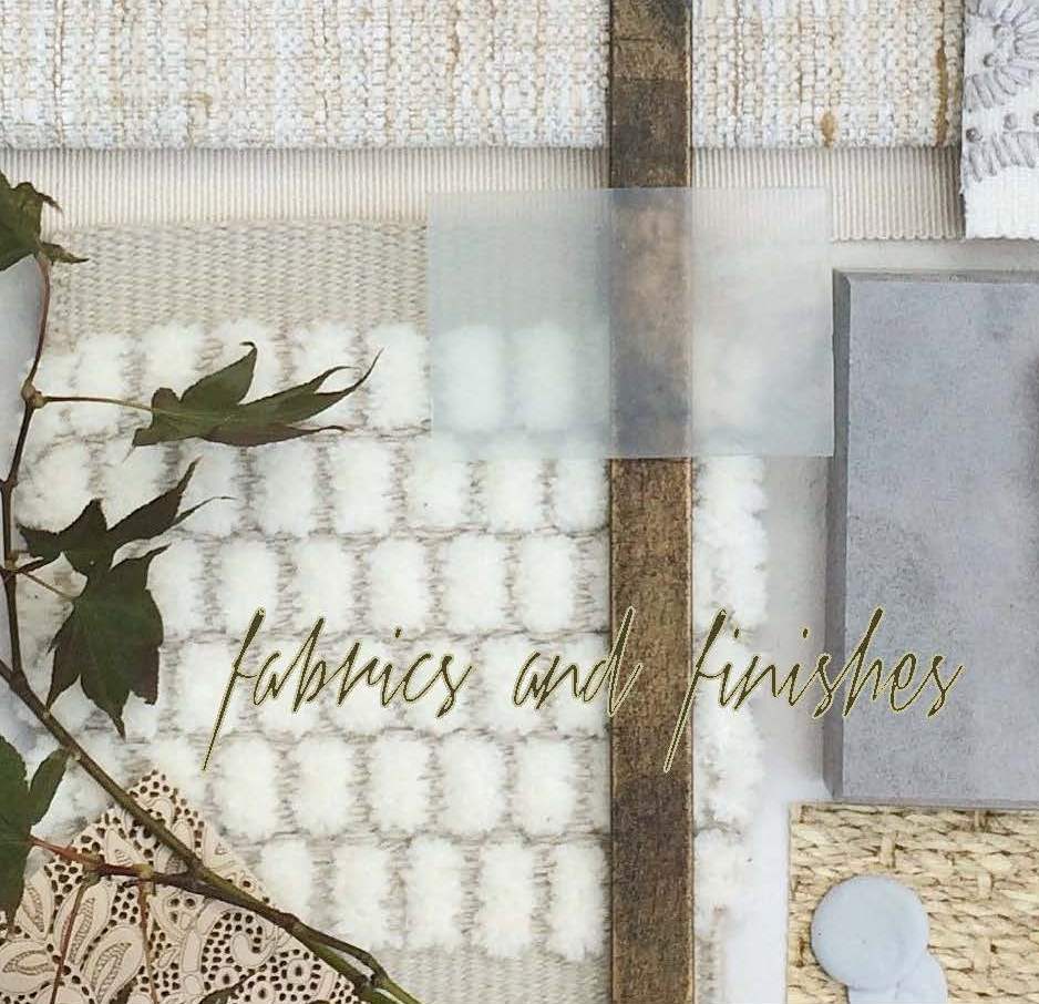
The presentation board is our opportunity to showcase the tactility of a room. Ambience is affected by the ratio of soft vs. coarse, understated vs. luminous and natural vs. refined materials and textures. We wanted this space to feel glamorous, but totally approachable with an air of intelligent wit. With that in mind we combined fibers like linen, seagrass and rushing with velvet and damask. Then we took it a step further by incorporating lacquered leather, eelskin and electric-colored cowhide. This is a luxurious space where you can kick up your feet and have fun!


The Response___________________________
And because these are the dreamiest of clients, they love everything and will TAKE IT ALL! Orders are placed and construction begins. This next phase is about site visits, management, coordination, follow-up and a lot of patience. But we’re getting our hands dirty and seeing our workrooms do their magic — so we love it!


______________________________________________________________________________
Tune in next week for a fun Q&A and the FINAL REVEAL! We will be sharing more insights about our process and the why’s and how’s of a successful design project.

Subscribe to our newsletter or find us on Bloglovin’ and you won’t miss a thing ; )
-
H&C a la Montreux
As mentioned in last week’s post, I have been in Switzerland installing a project.
And as many of you know, I’ve been working a lot lately. So even though no one
likes to spend their weekends at the office or pulling all-nighters, the magic of being an
interior designer is that you get to enjoy the tangible results of all your hardship …
THE APARTMENT IN MONTREUX IS STUNNING!
Beyond the fact that I love every single thing we installed – the wallcoverings,
the furniture, the lighting, the textiles, the accessories – the views and the town
of Montreux itself are extraordinary. The work was dirty and exhausting, but with
distractions like Lake Geneva out your window, who cares!

The apartment – day one. Umm, excuse me???
Yikes! Needless to say, this is not what we were expecting. So much for a move-in
ready apartment. This not-so-insignificant mess is a big detail for management to omit
from our conversations pre-departure. OK … take a deep breath and work the problem.
Because there is a truck full of furniture outside and it needs to be installed – somehow.

The silver lining? The view!!!

So instead of installing right away … We run errands, meet with management and vendors, clean and walk the property.
A trying and exhausting day, but it’s hard to complain in an environment like this.

At day’s end, we all need a nice dinner and a good night’s sleep.
Huntley & Co. stayed at the Suisse Majestic, so four of us had dinner in the hotel’s
restaurant – Restaurant 45 – and had a lovely time before crashing for the night.

Moving onwards and upwards on day two with deliveries.
Furnishings are in and floors are clean (for now).
Is there anything more satisfying than progress?!

In days three and four, wallpaper goes up and we unpack all the accessories.
It may be a mess, but it’s my favorite kind of mess … Christmas in September!

We often ran errands during the day because there was always something else we
or our installers needed. This day we stopped for lunch at the Hotel Eden du Lac.
Yep, just another day in Montreux.
After another couple of days of cleaning and styling, we have a finished apartment. Almost.
There were a few things (besides the original mess) that didn’t go as planned. The artwork
for the foyer was damaged in transit, one of the beds was missing from the delivery and the
Swiss team hired by the property didn’t finish all of their work. One of the workers literally
laughed in our faces when we told him to go buy the part he needed and to come back. So it
looks like I’ll have to go back to Switzerland in October to wrap up the final details.
Bummer ; )
Tricia
P.S. A huge thank you to our Swiss logistical team Kuehne + Nagel!

-
25 Signs You May Be Working Too Much
Greetings from Switzerland!
Huntley & Co. is in Montreux this week installing a residence on Lake Geneva. Yes, I’m a lucky girl. But as is often the case, leaving town for a week requires a lot of overtime at the office prior to departure. You have to get your ducks in a row (see item 4 below) for your employees, your other clients and your personal life. And there is never enough time. Rather than looking for sympathy, you might as well find a little humor in the situation. I started generating the list below on Friday thinking it would be ten items long. By Monday, I was up to twenty-five and completely delirious from a lack of sleep. It was all worth it though. All is going well here in Montreux and I know everything is running smoothly back home in DC as well. Now if I could just get some sleep!

1. Your to-do list is 4 pages long, has a table of contents and an addendum.
2. You don’t know what day (or month, or year) it is.
3. You can feel your eyeballs scraping the inside of your eyelids.
4. You use phrases like “ducks in a row” ad nauseum.
5. You are aware of DC’s disturbingly high nocturnal rat population.
6. Coffee has replaced one of the four main food groups.
7. At least 3 times a day you walk across a room and can’t remember why once you get there.
8. Your keyboard has developed a strange film on it.
9. You looked better when you had the flu last winter.
10. Your dog has abandonment issues.
11. Your laundry pile resembles Mount Everest.
12. Eating dinner at midnight seems reasonable.
13. Bathroom breaks are a nuisance.
14. Your communication skills have regressed to the first grade level.
15. Your significant other thinks there may be someone else.
16. Walking out of the house and leaving something behind incites tears.
17. The beautiful weather pisses you off.
18. Friends are mad at you because your emails of late have been “curt”.
19. You catch a little shut-eye by closing your eyes as you walk.
20. “Twitchy” is an understatement.
21. You would sell your soul for a few extra hours.
22. A sisal floor is surprisingly comfortable for napping.
23. You realize you have no business operating a motor vehicle.
24. You miss the good ol’ days of the recession.
25. You create entertaining lists like this so you can cope.
See you back in the states!
Tricia xo
