-
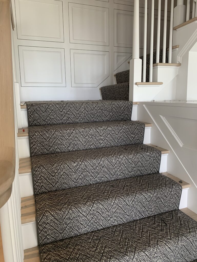
Installing Annapolis (ed. 3)
-
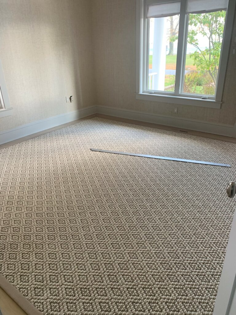
Installing Annapolis (ed. 2)
-
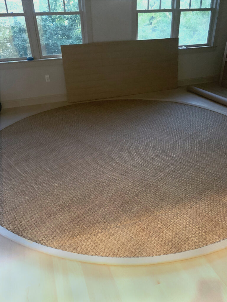
Installing Annapolis (ed. 1)
-
West End :: The Reveal

This reveal has been a long time coming. Not because it was only just installed, but because Luxe & Lucid was tied up in a parallel universe after we moved the Huntley & Co. website to another platform. The technical side of small business is the gift that keeps on giving. So we thank you for your patience, and without further ado, we reveal our West End project installation!
* * *

Making it Move-In Ready
———————————————————

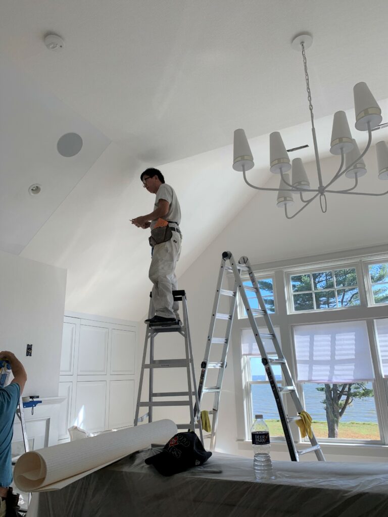
Obviously before our clients can move in, we have to install carpet, light fixtures, wallcovering and window treatments. Then, with our backdrop complete, our team is ready to bring in the furniture and accessories.


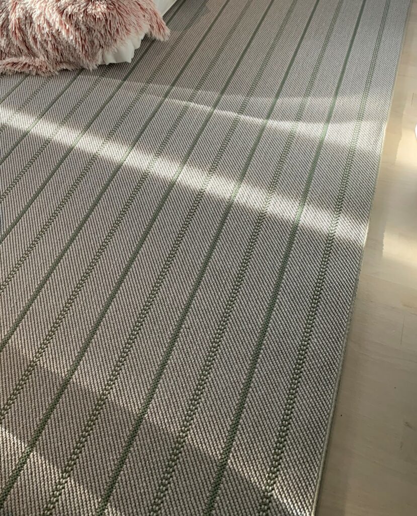
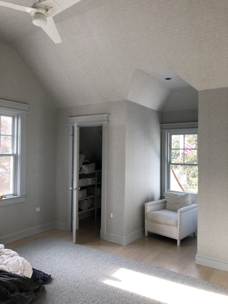
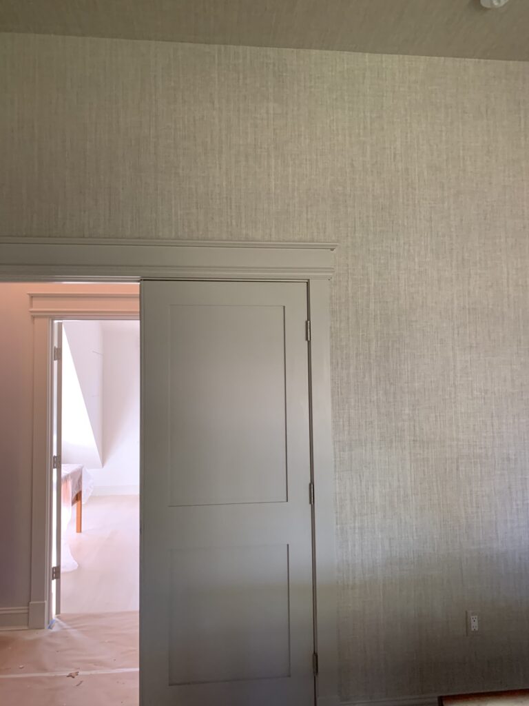
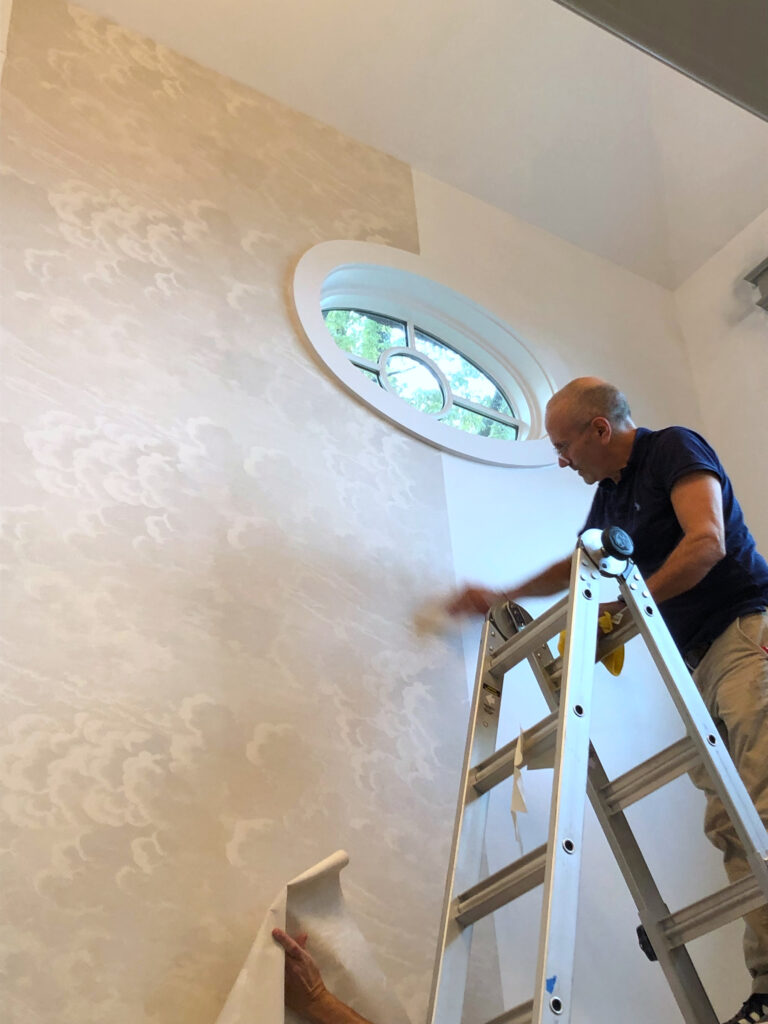
(top L to R) Living room chandelier install; Master bedroom carpeting in progress; Wallpaper in the third floor den; Installation of master bedroom roman shades.
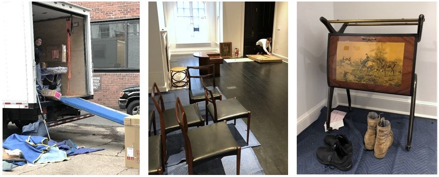
(bottom L to R) The crew unloading the truck; Opening artwork; Vintage Italian barcart.
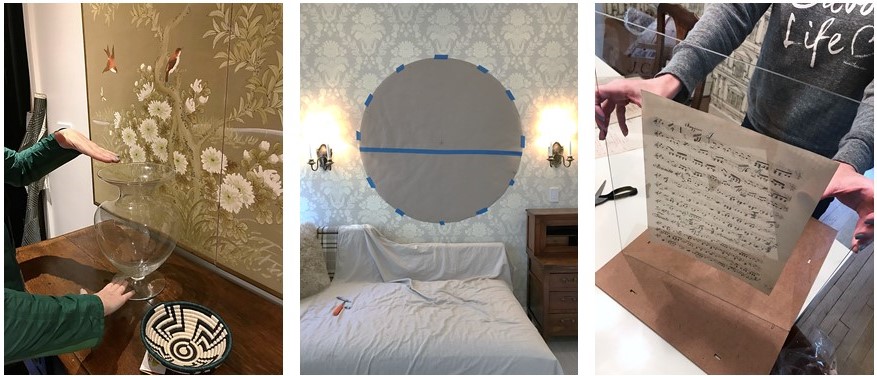
(L to R) Setting the stage with flowers and accessories; Paper template for a tricky mirror install; Preparing a vintage music montage for the dining room.

Welcome Home!
———————————————————
Alas, our vision for a classic interior full of cosmopolitan flair has come to life. This is, hands down, our favorite part of the process!

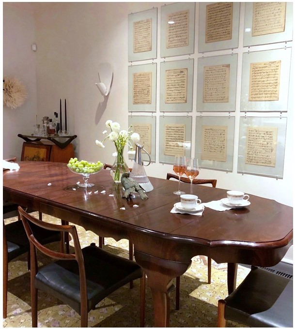
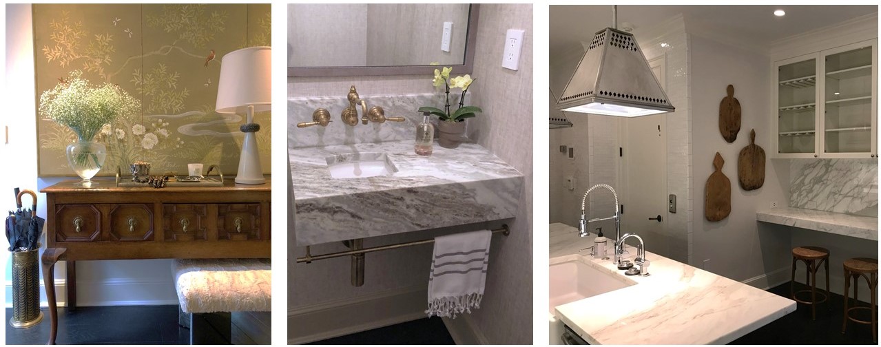
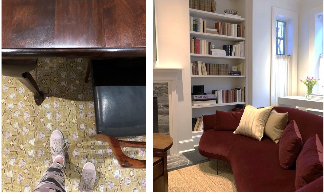
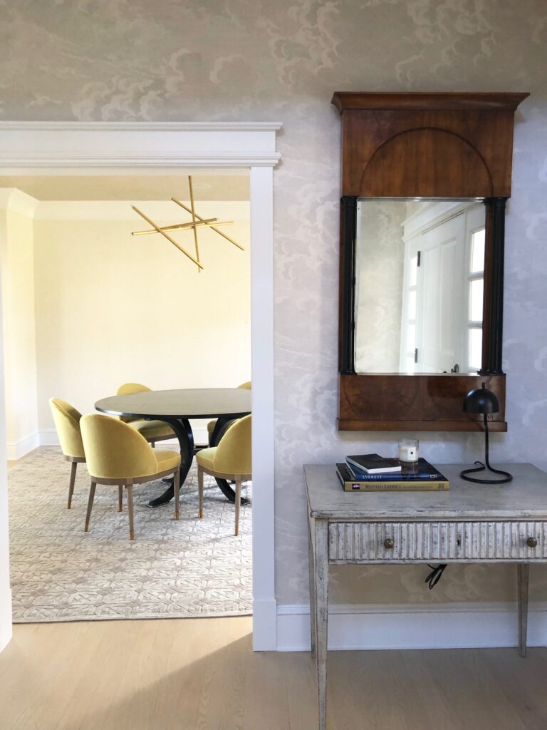
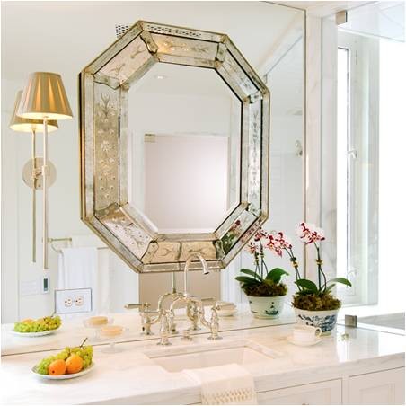
(top to bottom) A custom dining table paired with vintage chairs; Mixed materials in the entryway; A bespoke vanity in a teeny tiny powder room; Unexpected lighting in the kitchen; Dining room details; A chic Italian sofa with lyrical curves anchors the living room.
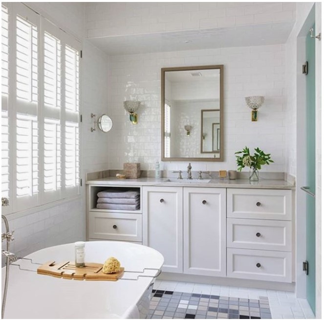
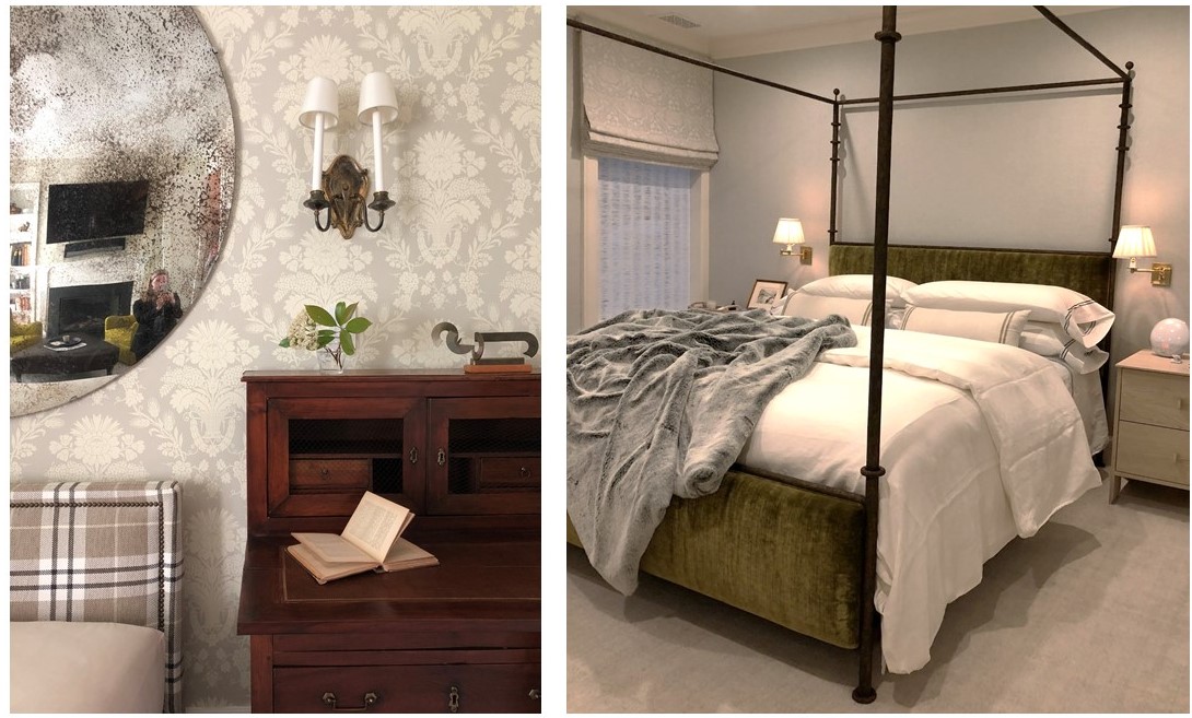
(top to bottom) Master bath wrapped in handmade tiles and featuring vintage lighting; An engaging mix of pattern and texture in the third floor den; Bespoke linens in the master bedroom – how luxe!

And That’s a Wrap
———————————————————
A big thank you to our wonderful West End collaborators. We hate to say goodbye, but we’re off to design more beautiful spaces …

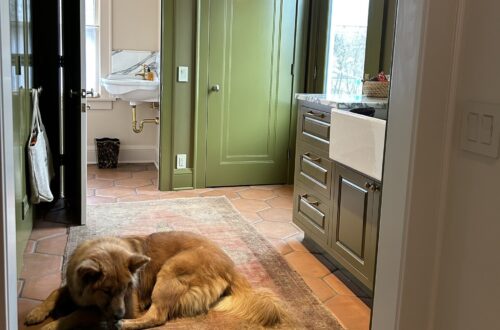
Tricia gives the resident pup, Barney, a tour of his new home.

To see the gorgeous professional photos of the West End project, visit the Huntley & Co. portfolio. Or take it one step further and help us win a Luxe RED award by voting for this project! Voting closes January 25.
xo huntleycodesign

-
West End Process :: Furnishings
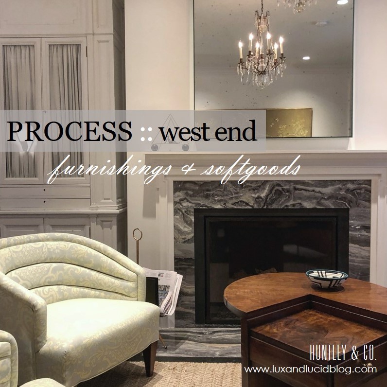
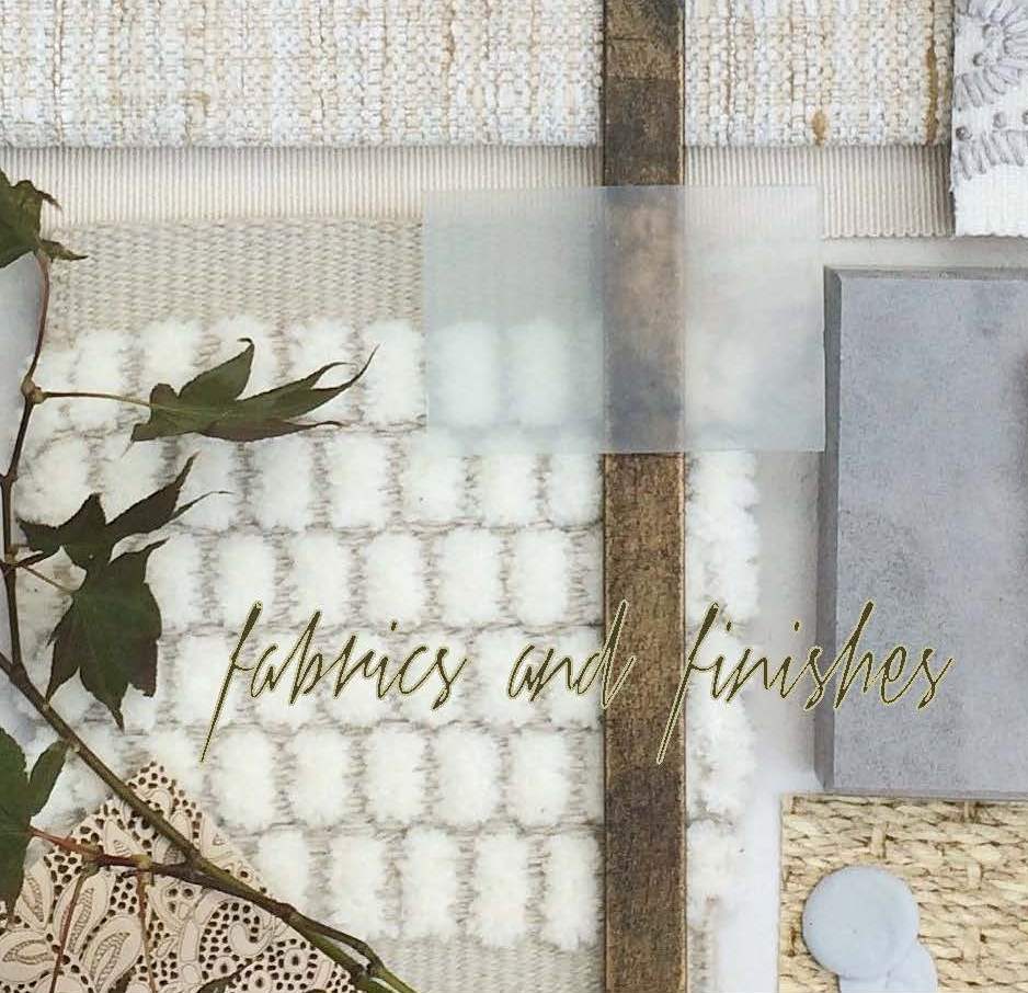
Bespoke, turn-key interiors are a signature of Huntley & Co. First, the architectural envelope and materials are perfected. Next, we turn our process to furnishings and softgoods that complement the space and the client and are unique to the project. Lots of love and labor goes into the design, drawing and specification of these goods.

| FURNISHINGS |
// Living Room channel-back chairs
We custom designed a pair of channel back lounge chairs to maximize flow, circulation and style. Visits to the workroom gave us the opportunity to make adjustments to the design, layout fabric and to monitor progress.
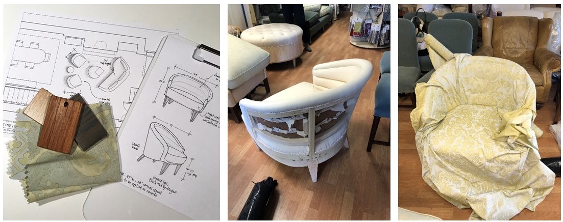
L to R: Leg finish selections; our chair frame gets mocked up in muslin; laying out the large scale fabric.
// Living Room armoire
We source a lot of antique and vintage furnishings for our projects. Sometimes, however, these pieces need modifications to “fit”. This armoire was the perfect scale for the open concept living area and provided much needed storage, but modification to the finish and interior were necessary. New hardware and shirred curtains turned this beauty into functional storage.
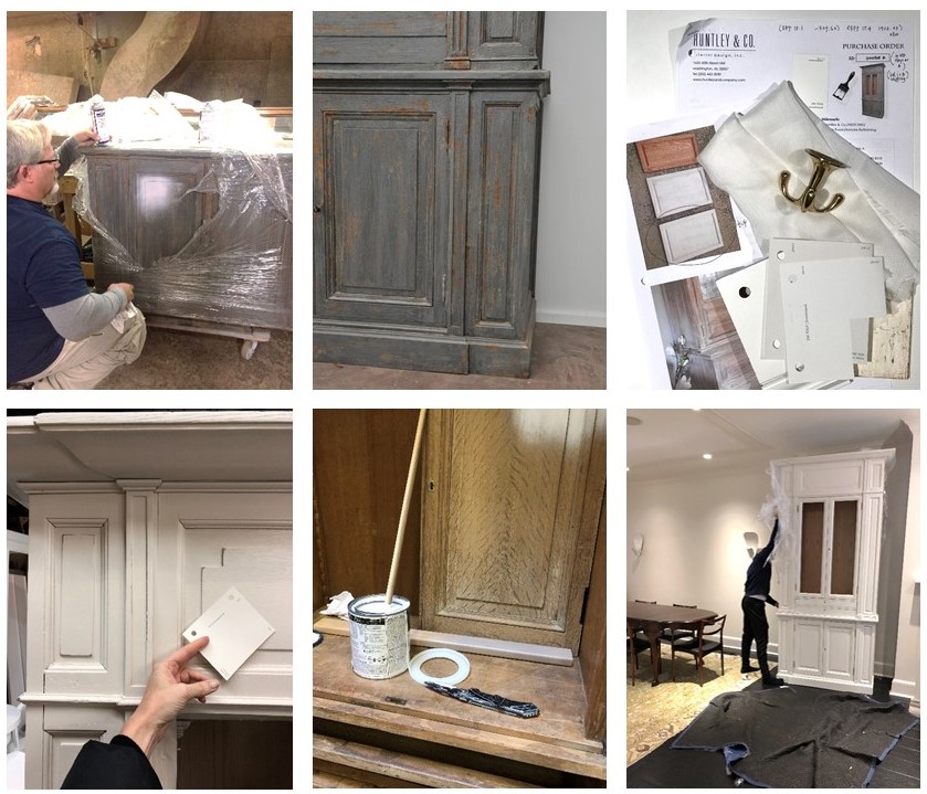
L to R: Removing the old finish; specifying all the new details; installation in progress.
// Master Bedroom canopy bed
Each project has its share of logistical challenges – and we love a good challenge because it inspires us to get extra creative. Our process never leaves things to guesswork. When we discovered that the bed, as originally designed, could not be brought up the stairs or through the windows, we had to go back to the drawing board (literally) to custom design a version that would fit.

L to R: Verifying stairwell and doorway dimensions; studio drawing of the custom pieces and parts; Ironware‘s workshop with assembly pre-shipment.
| SOFTGOODS |
// Master Bedroom roman shades & softgoods
Tailored, functional, bespoke. We designed the window treatments and pillows to complement the quietly sophisticated scheme in the master bedroom. Troubleshooting tricky corners and sourcing one-of-a-kind details makes all the difference.
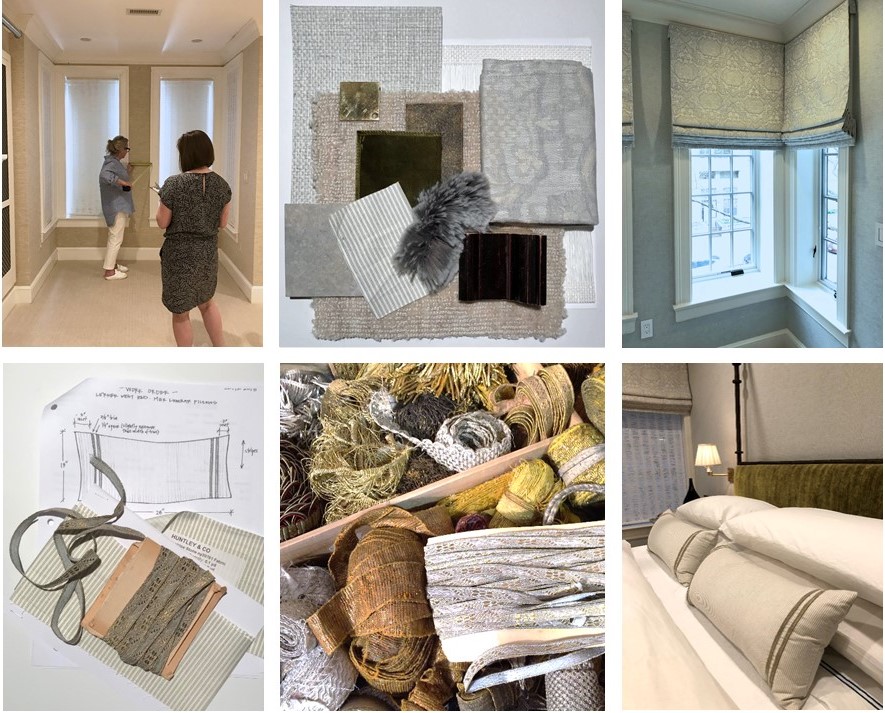
Top: Detailed site measures and schematic review; finished product! Bottom: A pillow workorder; a treasure chest of trim; a well-styled bed.
Stay tuned — Next week we’ll bring this project full circle and share our install with you! And in case you missed the other West End posts, check them out here and here.
xo, Huntley & Co.
Subscribe to our newsletter or find us on Bloglovin’ and you won’t miss a thing ; )
-
West End Process :: Envelope
For Huntley & Co., the first and foremost concern in design development is the “envelope”. TH can’t talk about it enough! Getting the envelope right – spacial relationships, interior architecture, materials and finishes – means a thoughtful, comfortable home that needs less stuff to look good.

| CONFIGURING THE SPACE |

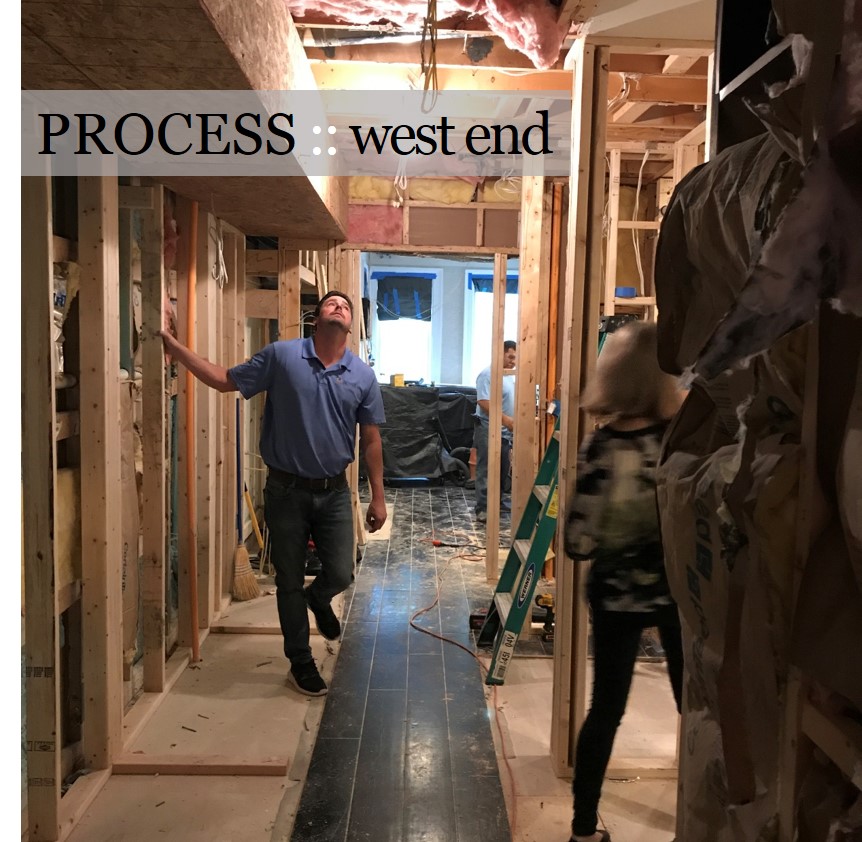
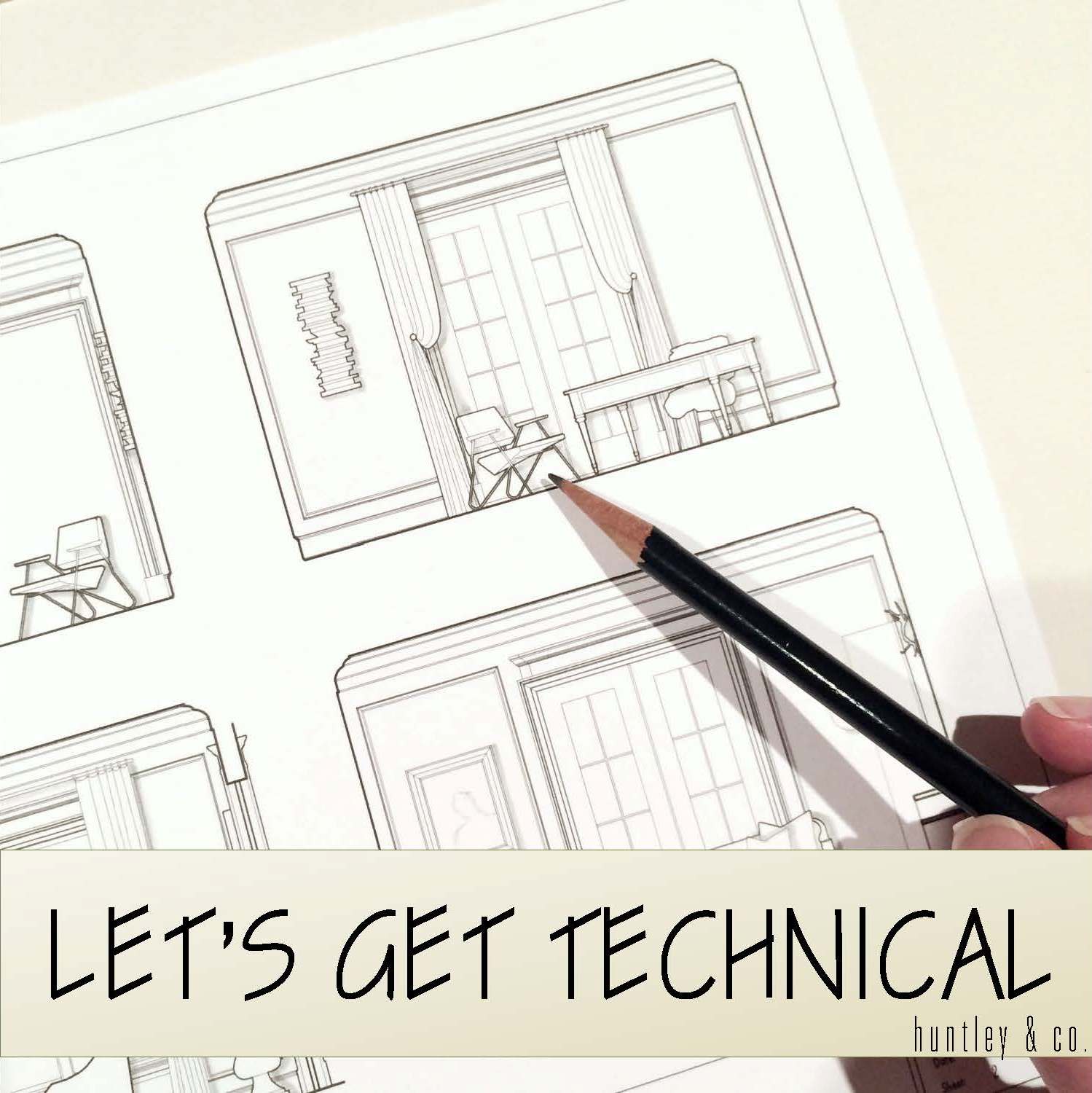
Reconfiguring an interior is a process – it requires a lot of drawings and plenty of site meetings. It’s important to be as technical and thorough as possible while understanding there will likely be a few surprises and adjustments along the way.
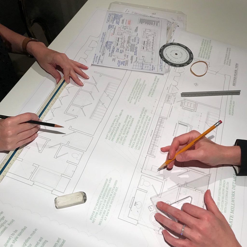
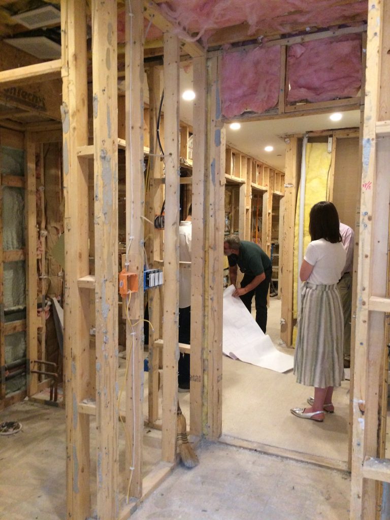
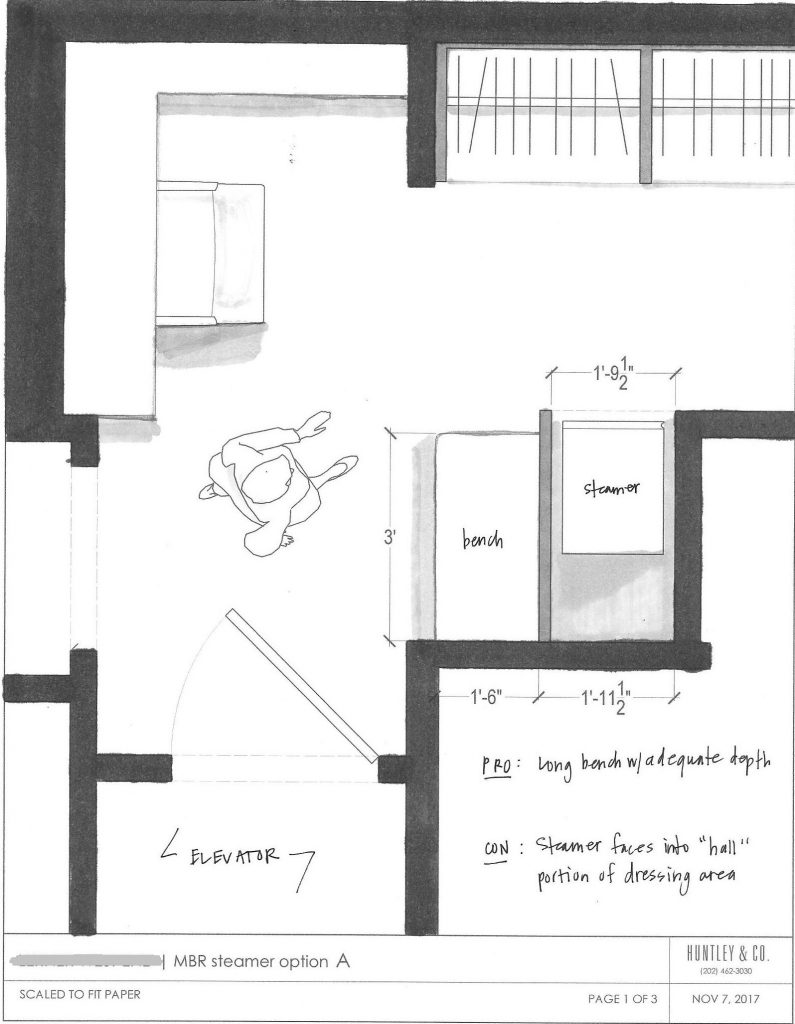
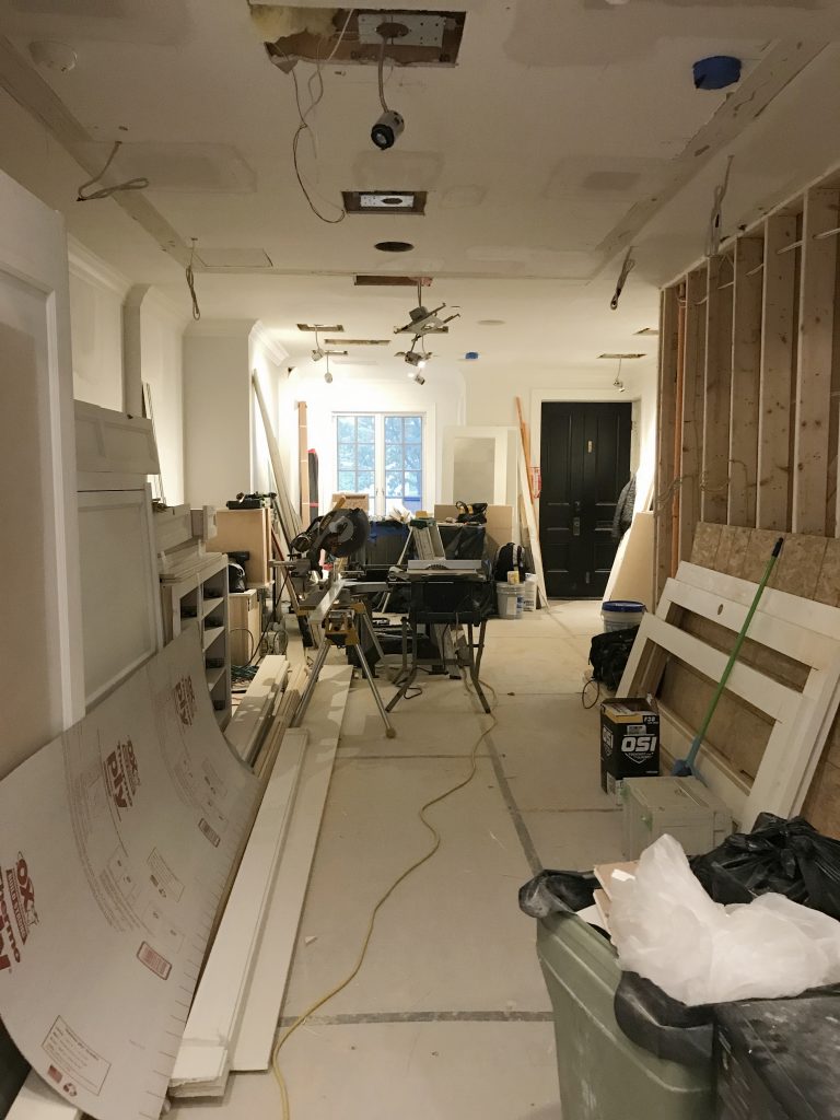
Top photo: One of the pages in the H&Co. drawing set. Bottom L to R: Meeting with the contractor; a study of the circulation in a tight area; drywall in progress.

| MILLWORK |

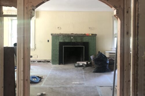
Millwork is one of the most impactful aspects of an interior. When it’s done well, it can make the house. When it’s done cheaply, it’s like bad teeth – it doesn’t matter how pretty the face is. With this project, our main focus was to reconcile the incongruous architectural details throughout the home and create a more finessed envelope. This included doors, crown, paneling and custom mantels as shown below.

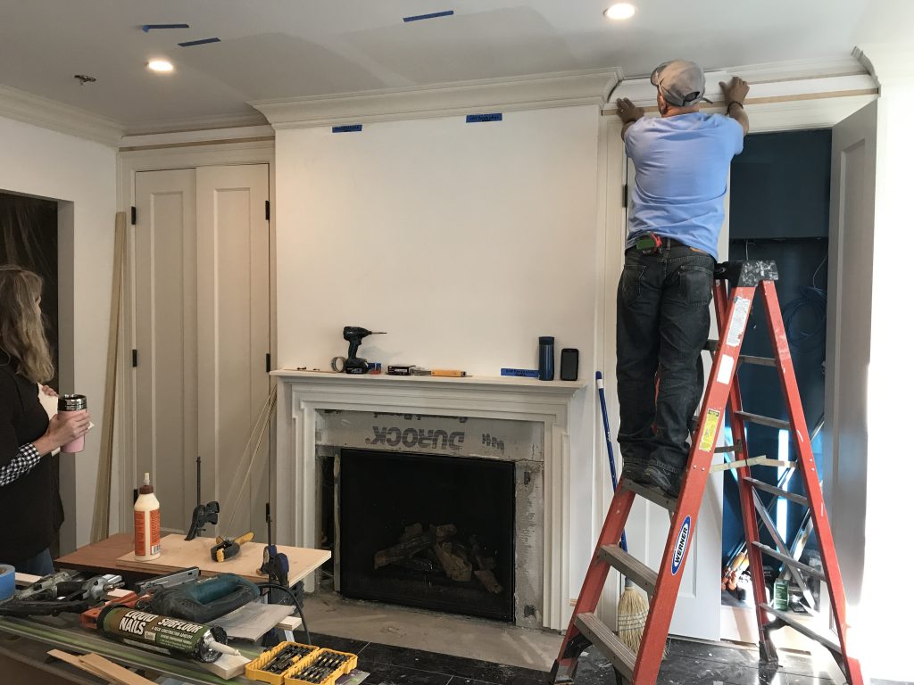
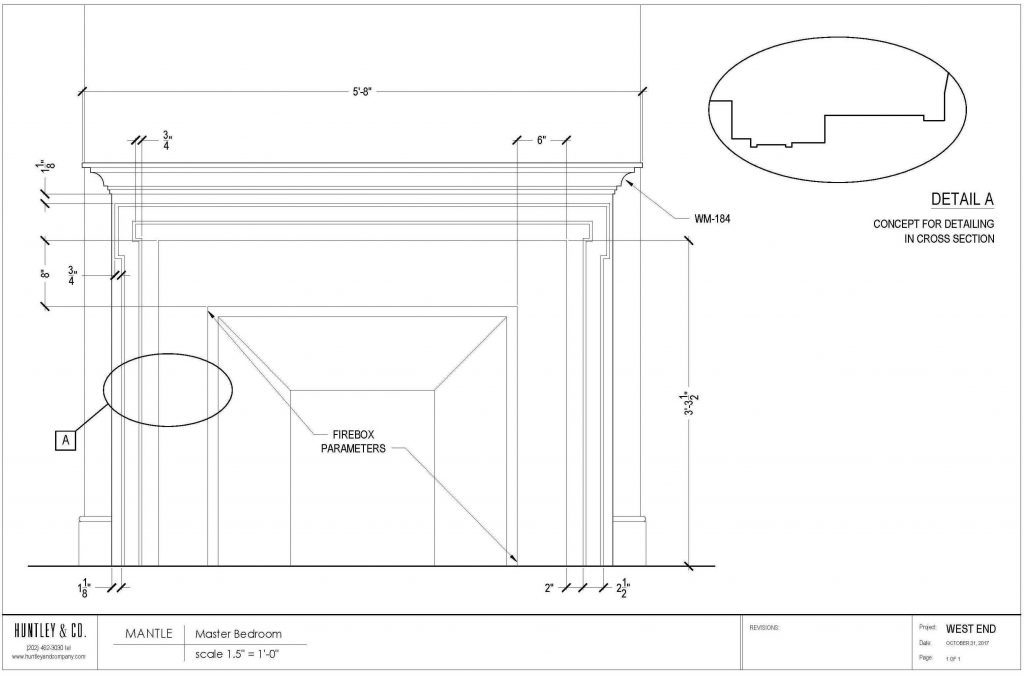
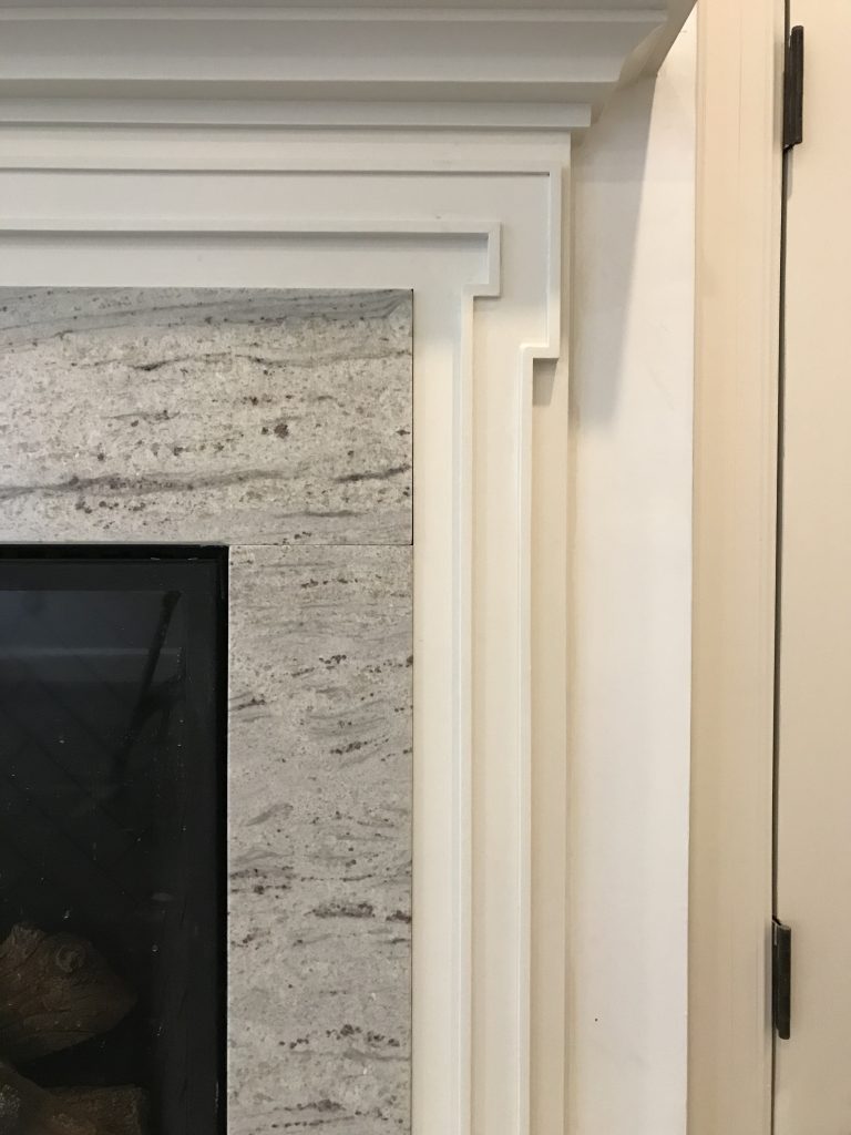
The mantels were designed to complement adjacent millwork for a quieter, more elegant presentation.

| MATERIALS |

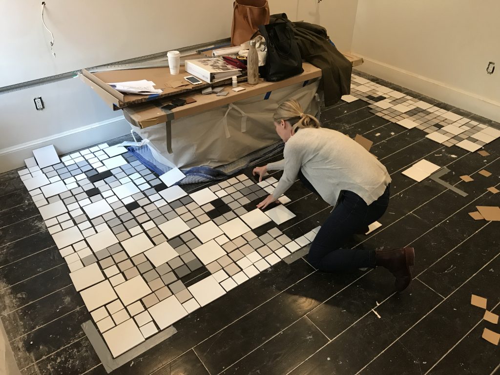
Material selection – wood, stone, tile, metal finishes – sets the tone for the home’s atmosphere and lays the groundwork for decorative elements. When selecting a material, we keep everything else in mind. In a bathroom for instance: Are the windows facing north? What type of glass do the vintage sconces have? How white is the tub? These details are part of the “conversation” and influence what marble slab I approve and tile colors I select.

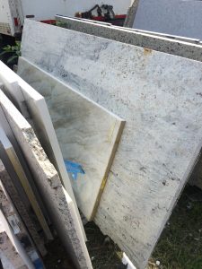
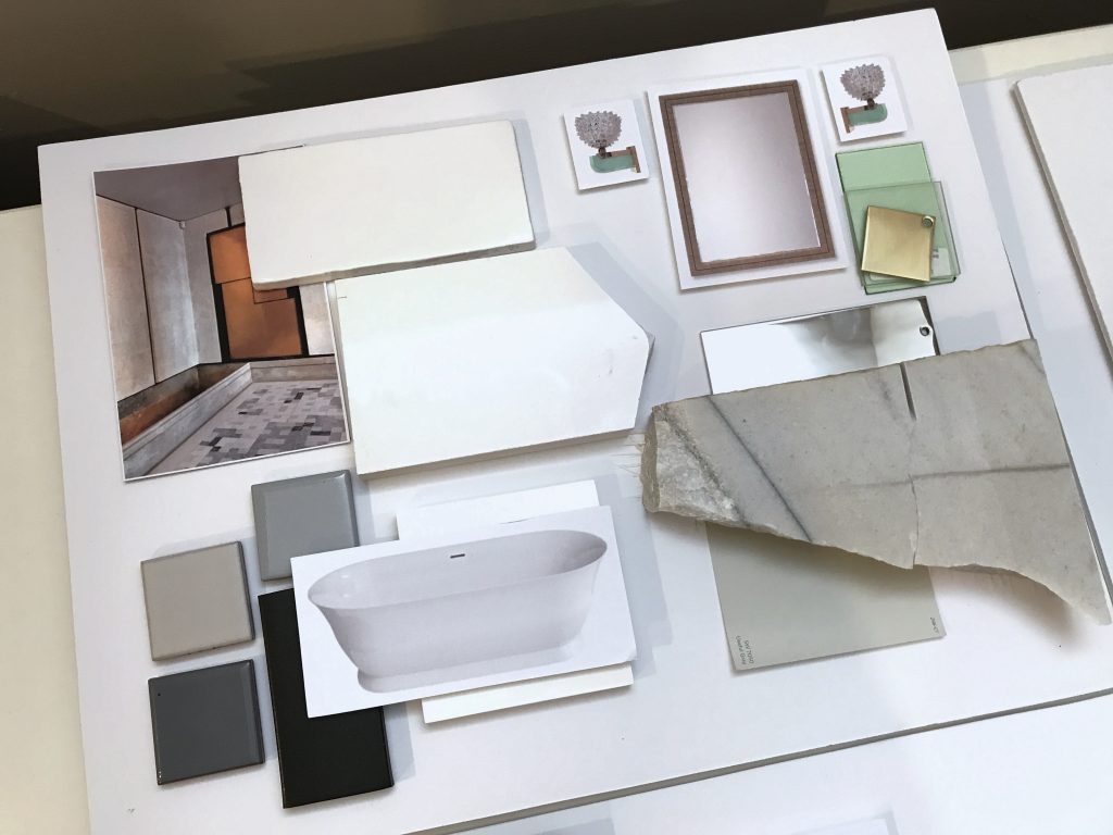
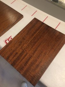
Top L to R: Slab for a fireplace surround; master bath materials, final wood selection for the library.
Bottom: The tile layout for the master bath was a hands-on (and ugh, thighs and knees) process that took several hours. Click photo for a video of the legendary H&Co. attention to detail.

* * *
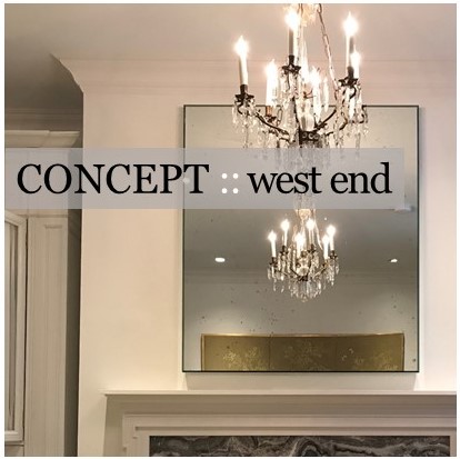
We hope you’ll join us next week when we’ll share more about the process of specifying furnishings and softgoods! Or take another look at our Concept: West End post to see how this project began.
xo Huntley & Co.

-
EDGEMOOR SUNROOM :: PART IV
The Edgemoor sunroom has required patience, perseverance and plenty of blood, sweat and tears (and bones, but I’ll get to that later). After nearly a year of design and planning, construction finally began in early spring. Starting work was both a relief and a thrill.
With a schedule as protracted as this one, there are plenty of progress photos to share.

From start to finish there hasn’t been a dull moment!


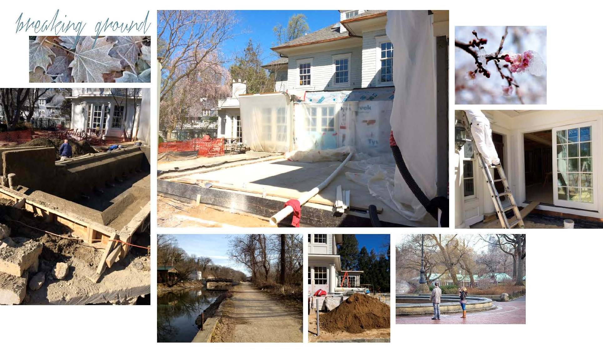
— Breaking Ground —
Construction crews arrived at the end of February to dig, set drainage lines and pour the slab for the sunroom. The most dramatic transformations start with a lot of dirt!

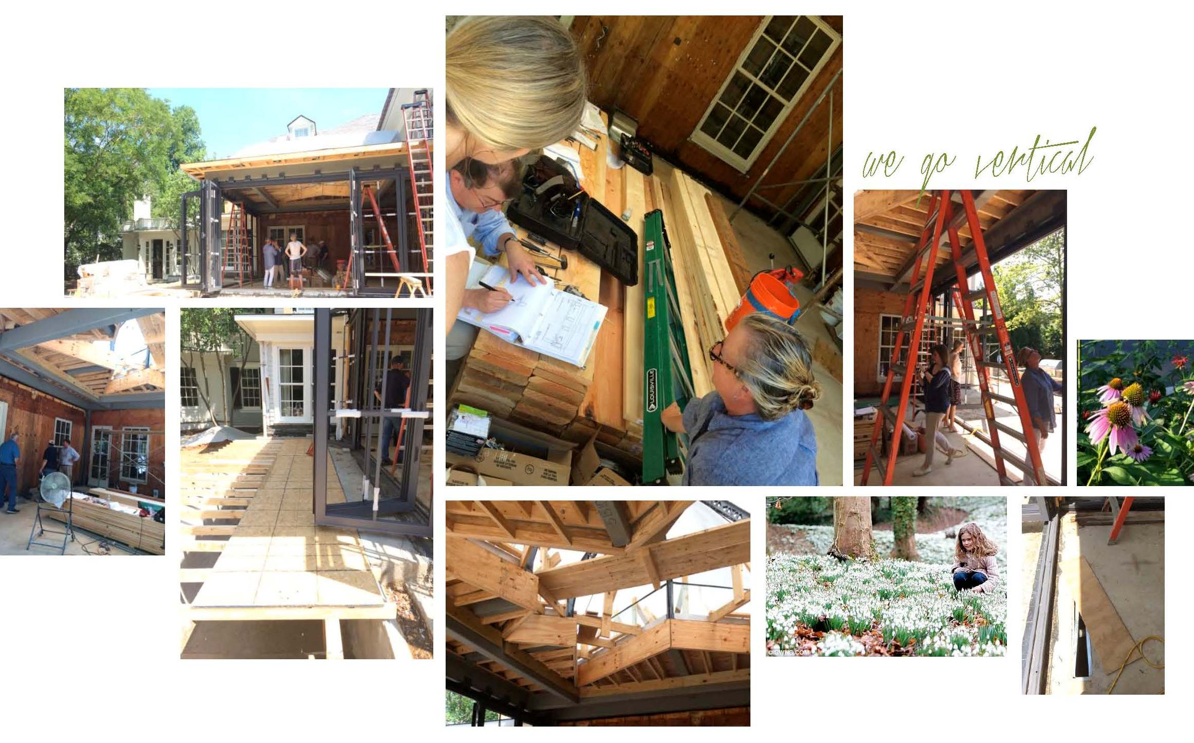
— Movin’ on Up! —
Once July arrived, the building finally started to take shape. Remember that patience we mentioned? This phase of the project is all about oversight and troubleshooting as needed. We made several site visits and met everyone from the tile installer to the drapery fabricator to review drawings and inspect details. It may seem unusual to discuss softgoods in a room without drywall, but spotting architectural modifications early allows us, and our workrooms, to modify plans accordingly.

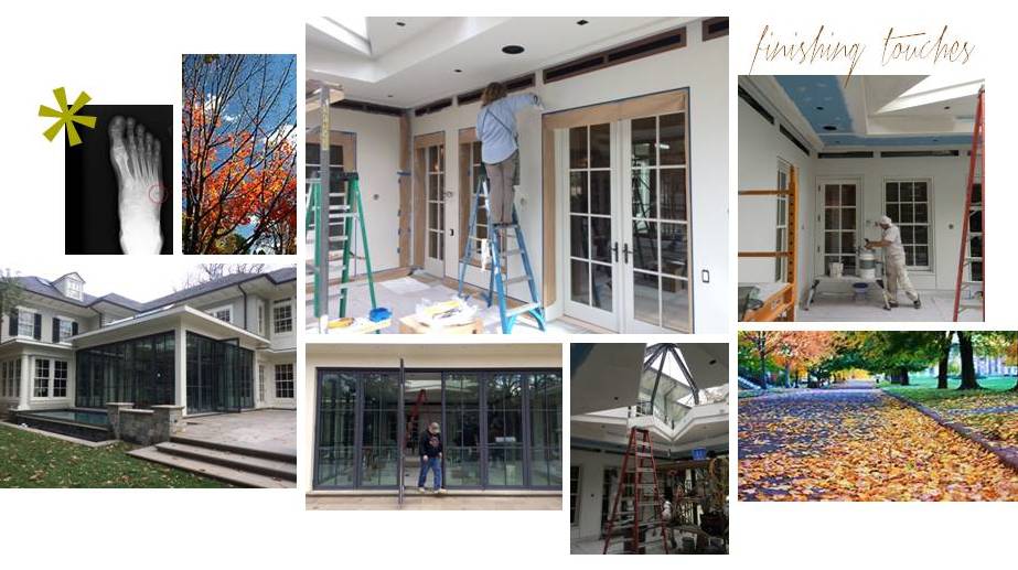
— Finishing Touches —
As you can see in the pictures below, work continued into the Fall. Still, we were happy to have a room with walls, trim, windows and doors — not to mention a massive, one-of-a-kind skylight overhead. With the space enclosed, we were ready for paint and decorative finishes. We enlisted Julia from Monkton Studios (below) to dress the room in a beautiful knockback plaster, adding warmth and subtle dimension to the envelope.

Interior design is often associated with drama. True, but we usually try to avoid it if we
can. Unfortunately, at one of the many site visits, Lindsey fell into an open floor vent
(ahem, a hidden open floor vent that is). Thanks to a broken fibula and fifth metatarsal,
the Edgemoor project is officially going out with a CRASH-BOOM-BANG!
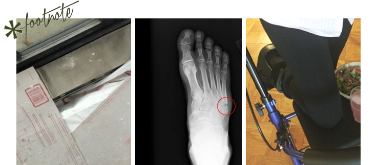
(L) the offending floor vent sans cover; (C) post site visit x-ray; (R) masterful use of the Rollator Walker

… Installation day is TODAY.

-
SHOW-HOUSE // FAUX-CLIENT :: PART III
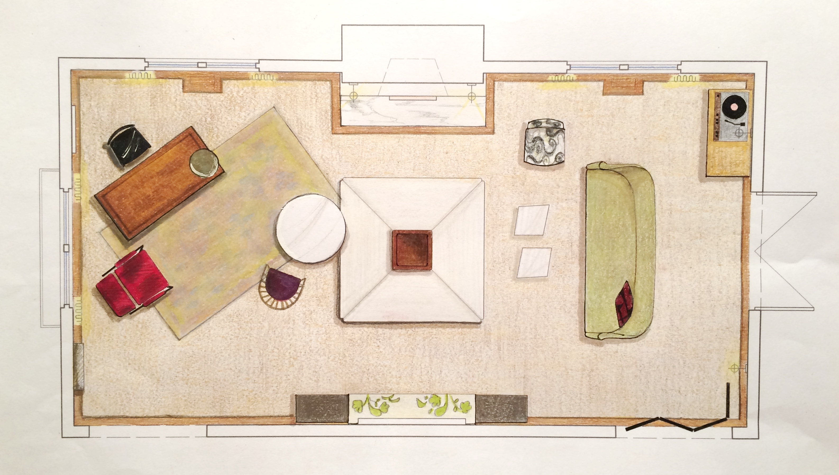
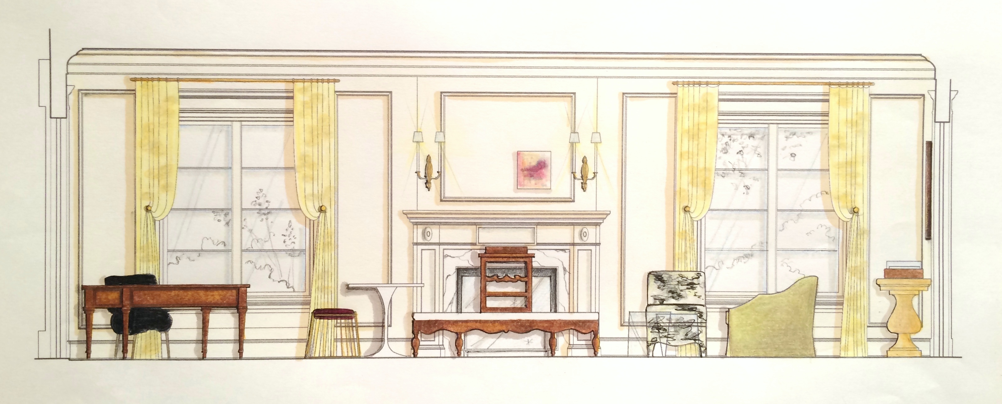
Sourcing goods and materials for our interior fuels our creativity, but drawings take the design to the next level. After all, a room is only as good as it is functional — we aren’t aiming for beauty just for beauty’s sake. Working out our ideas in AutoCAD ensures that we are on target with scale, proportion and spatial relationships. A well-trained designer can evaluate whether a piece will work in a room or not simply by looking at it. Still, transferring its dimensions to paper (or the computer as in our case) ensures down-to-the-1/8” accuracy. Huntley & Co. is a business built on mindfulness and our drawings are the technical backbone of our work.


The Floorplan___________________________
We start with a floor plan, which guides the flow and circulation of a space. With our clients’ penchant for entertaining, it was important to think outside the traditional box and get creative with furniture placement. Our ‘star’ is the four sided bench that beautifully anchors the room. Varied seating arrangements offer opportunities for independent conversations and debate for our clients’ guests who come from a wide range of cultures, professions and political views. The room is meant to be as warm, interesting and thoughtful as the clients are.


The Elevations___________________________
Elevations reveal how a room’s architecture, furnishings and art will work together. A space won’t look or feel good if there are too many masses, it’s too ‘leggy’, everything is at the same level or the values are off-balance. Deep-diving the millwork, fenestrations and other details gives us the platform we need to make good decisions. Not to mention that “pulling the design up” and seeing it come to life happens to be pretty exciting ; )


The Presentation Board____________________
The presentation board is our opportunity to showcase the tactility of a room. Ambience is affected by the ratio of soft vs. coarse, understated vs. luminous and natural vs. refined materials and textures. We wanted this space to feel glamorous, but totally approachable with an air of intelligent wit. With that in mind we combined fibers like linen, seagrass and rushing with velvet and damask. Then we took it a step further by incorporating lacquered leather, eelskin and electric-colored cowhide. This is a luxurious space where you can kick up your feet and have fun!


The Response___________________________
And because these are the dreamiest of clients, they love everything and will TAKE IT ALL! Orders are placed and construction begins. This next phase is about site visits, management, coordination, follow-up and a lot of patience. But we’re getting our hands dirty and seeing our workrooms do their magic — so we love it!


______________________________________________________________________________
Tune in next week for a fun Q&A and the FINAL REVEAL! We will be sharing more insights about our process and the why’s and how’s of a successful design project.

Subscribe to our newsletter or find us on Bloglovin’ and you won’t miss a thing ; )
-
H&C a la Montreux
As mentioned in last week’s post, I have been in Switzerland installing a project.
And as many of you know, I’ve been working a lot lately. So even though no one
likes to spend their weekends at the office or pulling all-nighters, the magic of being an
interior designer is that you get to enjoy the tangible results of all your hardship …
THE APARTMENT IN MONTREUX IS STUNNING!
Beyond the fact that I love every single thing we installed – the wallcoverings,
the furniture, the lighting, the textiles, the accessories – the views and the town
of Montreux itself are extraordinary. The work was dirty and exhausting, but with
distractions like Lake Geneva out your window, who cares!

The apartment – day one. Umm, excuse me???
Yikes! Needless to say, this is not what we were expecting. So much for a move-in
ready apartment. This not-so-insignificant mess is a big detail for management to omit
from our conversations pre-departure. OK … take a deep breath and work the problem.
Because there is a truck full of furniture outside and it needs to be installed – somehow.

The silver lining? The view!!!

So instead of installing right away … We run errands, meet with management and vendors, clean and walk the property.
A trying and exhausting day, but it’s hard to complain in an environment like this.

At day’s end, we all need a nice dinner and a good night’s sleep.
Huntley & Co. stayed at the Suisse Majestic, so four of us had dinner in the hotel’s
restaurant – Restaurant 45 – and had a lovely time before crashing for the night.

Moving onwards and upwards on day two with deliveries.
Furnishings are in and floors are clean (for now).
Is there anything more satisfying than progress?!

In days three and four, wallpaper goes up and we unpack all the accessories.
It may be a mess, but it’s my favorite kind of mess … Christmas in September!

We often ran errands during the day because there was always something else we
or our installers needed. This day we stopped for lunch at the Hotel Eden du Lac.
Yep, just another day in Montreux.
After another couple of days of cleaning and styling, we have a finished apartment. Almost.
There were a few things (besides the original mess) that didn’t go as planned. The artwork
for the foyer was damaged in transit, one of the beds was missing from the delivery and the
Swiss team hired by the property didn’t finish all of their work. One of the workers literally
laughed in our faces when we told him to go buy the part he needed and to come back. So it
looks like I’ll have to go back to Switzerland in October to wrap up the final details.
Bummer ; )
Tricia
P.S. A huge thank you to our Swiss logistical team Kuehne + Nagel!

