-
Scale Up / Scale Down
Symmetry, balance and proportion are key tenets of how I develop an interior; I was trained in classical architecture. Yet, when I get to the decorating portion of the design process, I throw Palladio’s rules out the window – especially scale. Playing with scale (blowing things up, sizing them down) is a way for me to change the vibe in a space, and therefore, how its experienced.


Go Big
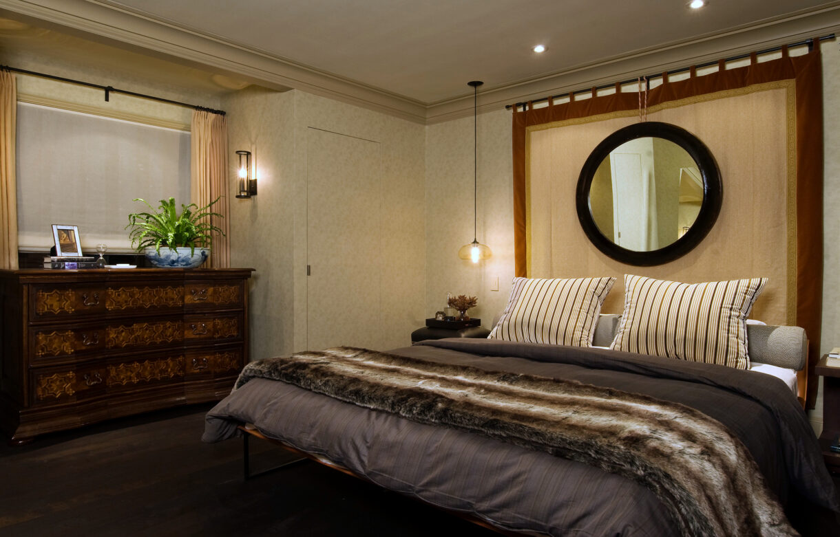
There are times when you just need to go big or go home. An oversized mirror can completely change a room. And a chandelier or pendant that outsizes a dining table is pure drama. Scaling up disrupts the status quo – it wakes us up and brings a room alive.

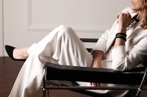
Featured image: Shinola Hotel by Gachot Studios; Middle 4 clockwise: Bjorn Wallender, Moooi, Steven Gambrel, Huntley & Co.; Bottom: Thom Filicia

Stay Small
Sometimes making a statement means staying small. A diminutive artwork on a large wall will draw you to it. A low sofa beside tall windows will create elegant volume. A tiny light fixture over a table creates intimacy. Design isn’t always about knocking someone’s socks off. At times, it’s about creating a serene environment or eliciting an emotion.


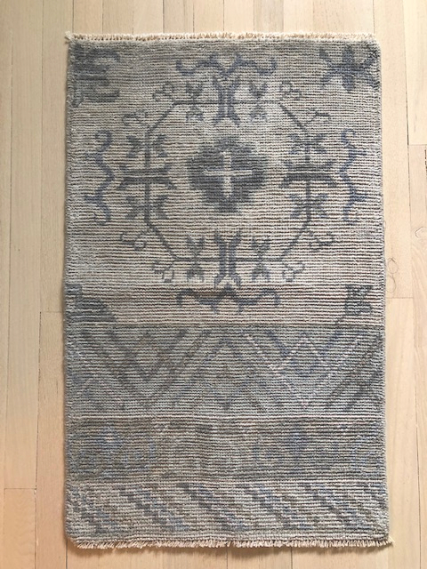
Top: Raji RM; Middle 4 clockwise: Workstead, Billy Cotton, Huntley & Co., Rose Uniacke (?); Bottom: Laura Santos


Happy election week America. See you on the other side!

-
Installing Annapolis (ed. 3)
-
Installing Annapolis (ed. 2)
-
Installing Annapolis (ed. 1)
-
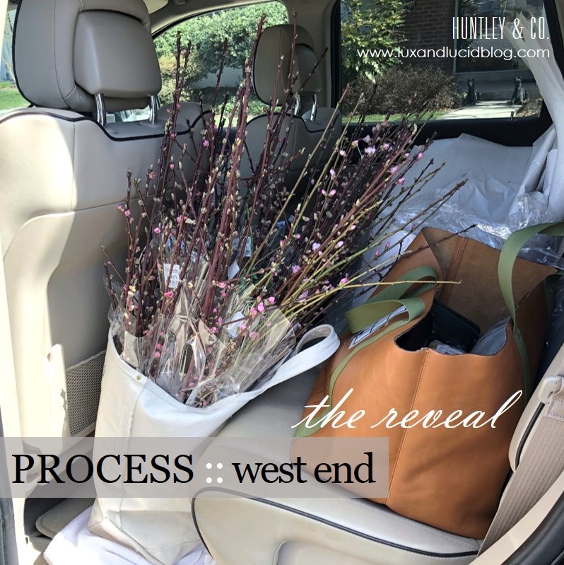
West End :: The Reveal

This reveal has been a long time coming. Not because it was only just installed, but because Luxe & Lucid was tied up in a parallel universe after we moved the Huntley & Co. website to another platform. The technical side of small business is the gift that keeps on giving. So we thank you for your patience, and without further ado, we reveal our West End project installation!
* * *

Making it Move-In Ready
———————————————————

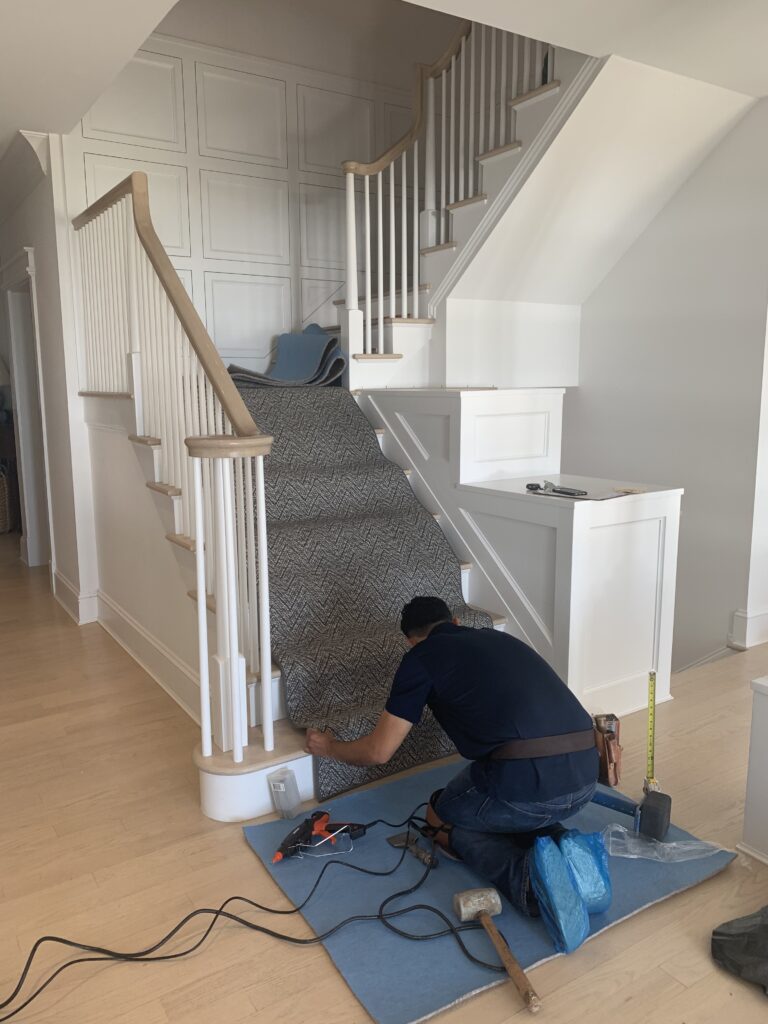
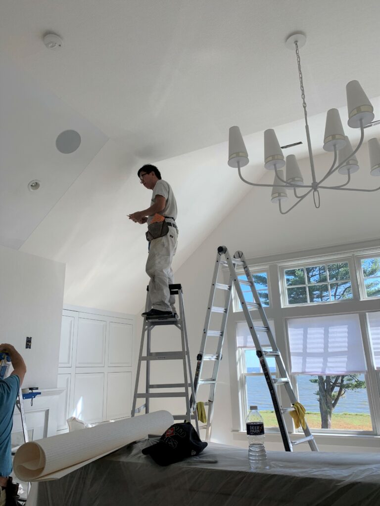
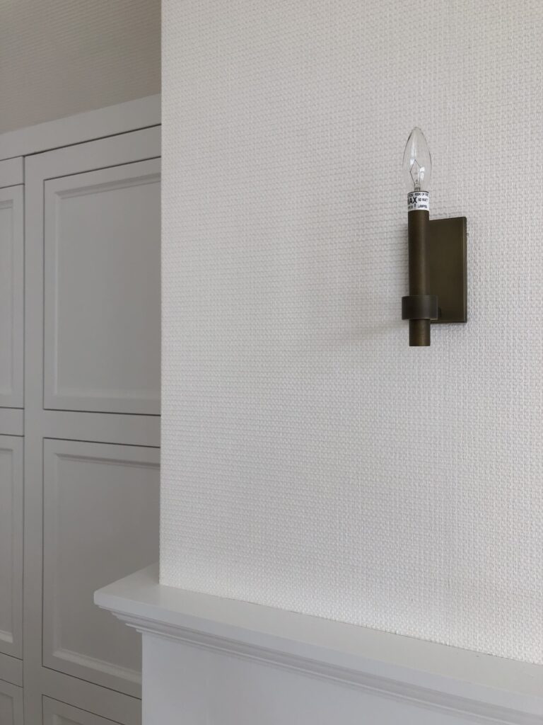
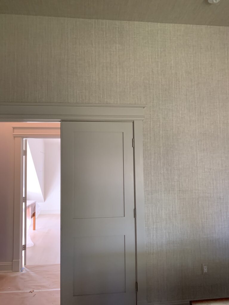
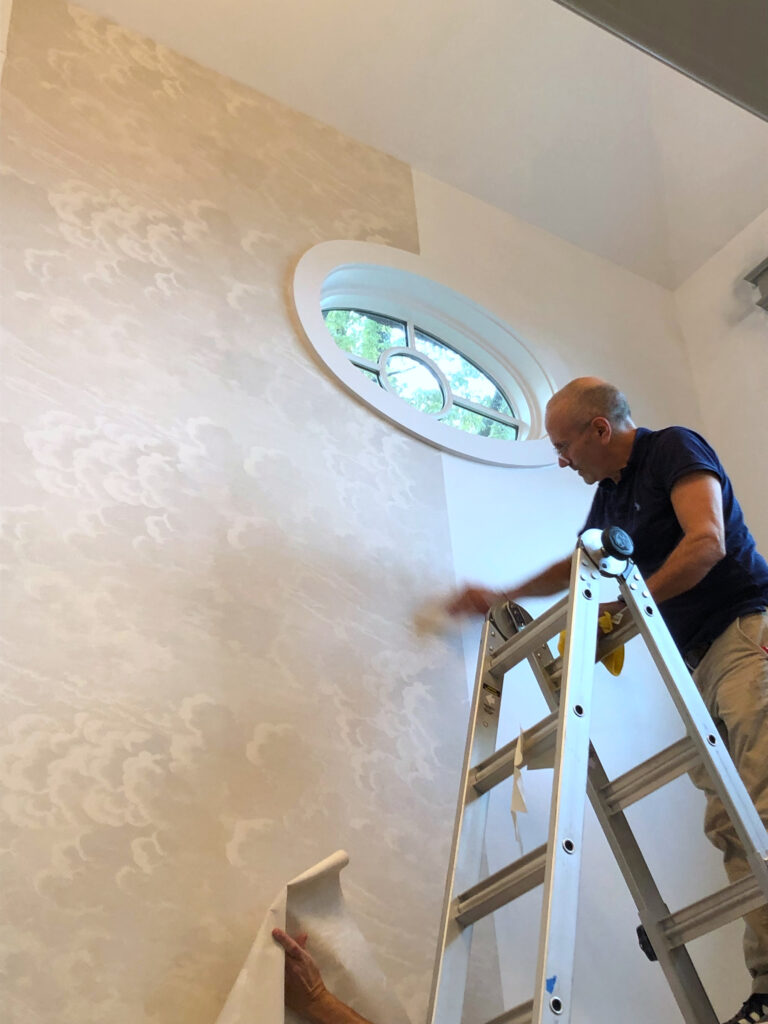
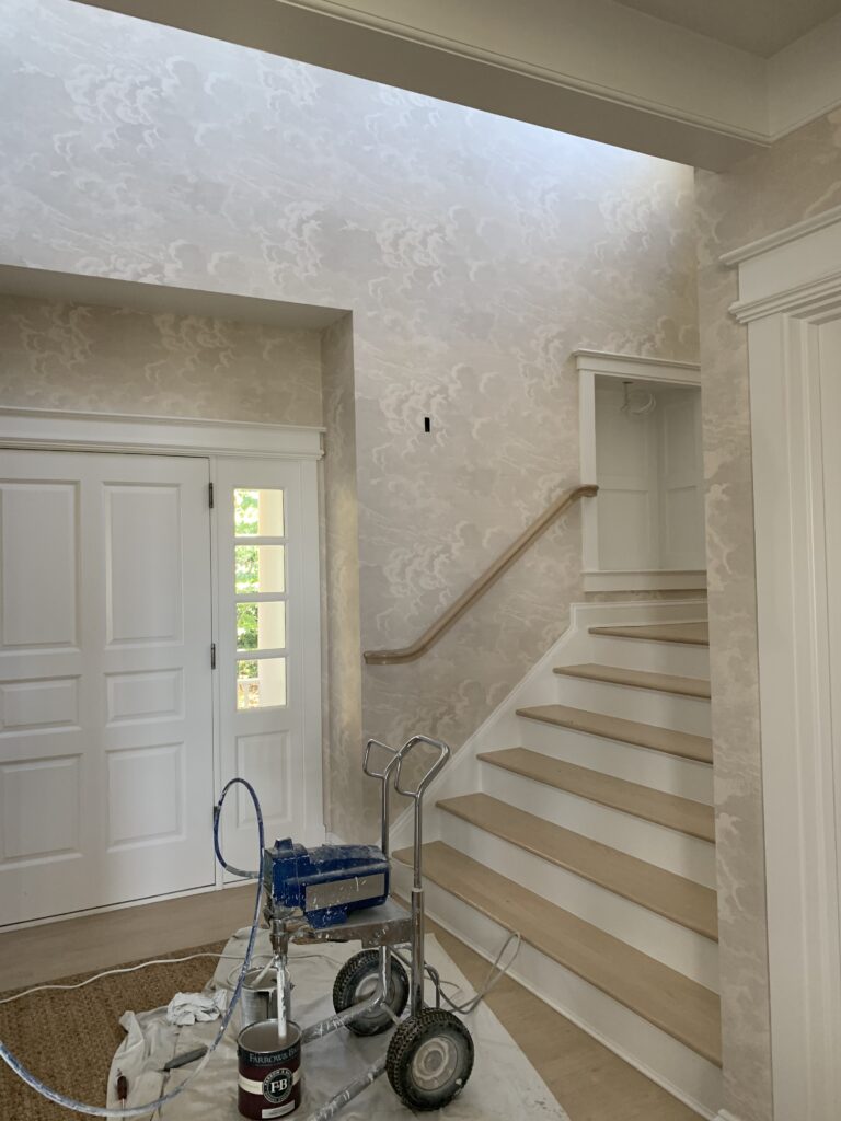
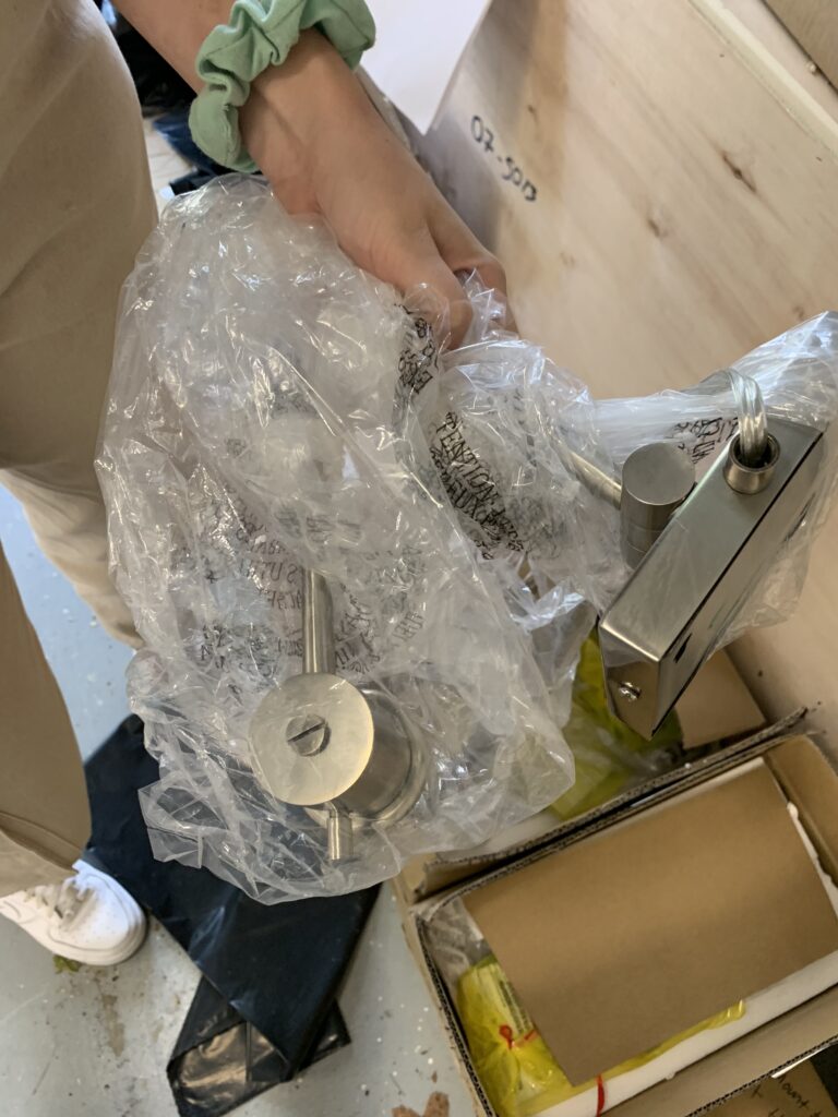
Obviously before our clients can move in, we have to install carpet, light fixtures, wallcovering and window treatments. Then, with our backdrop complete, our team is ready to bring in the furniture and accessories.


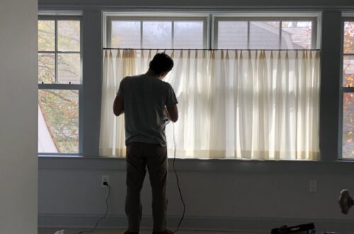
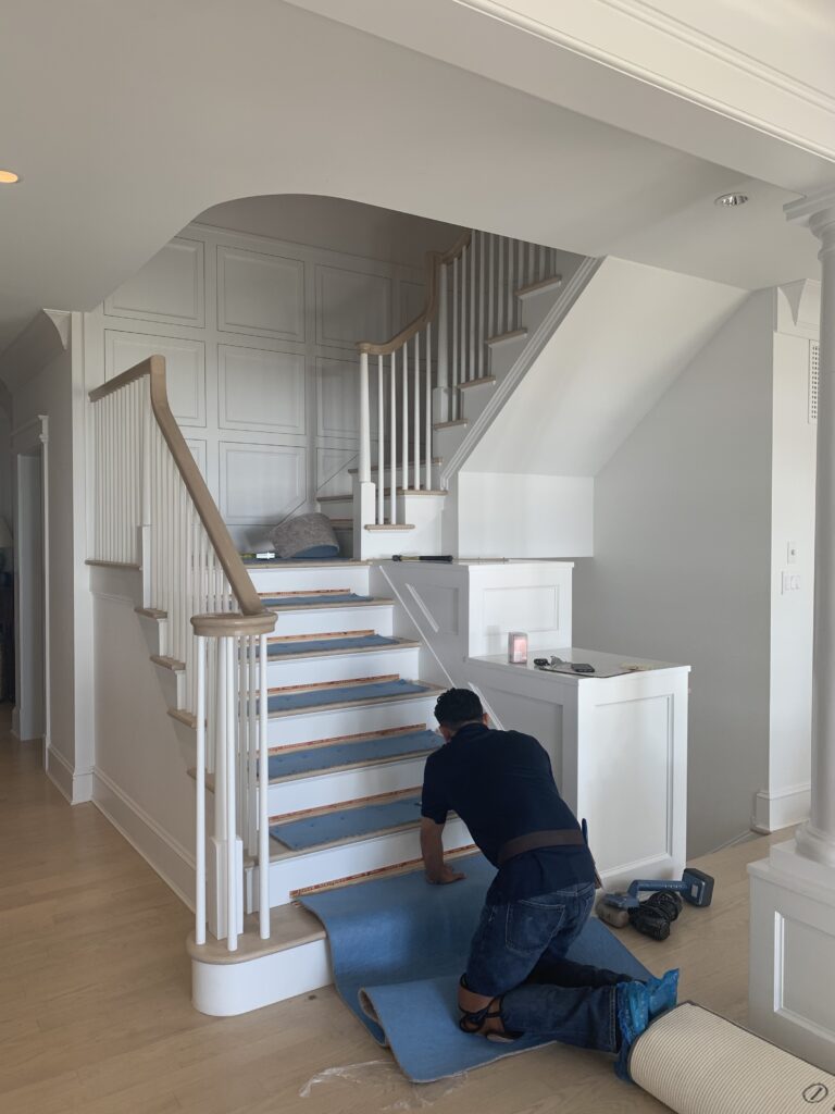
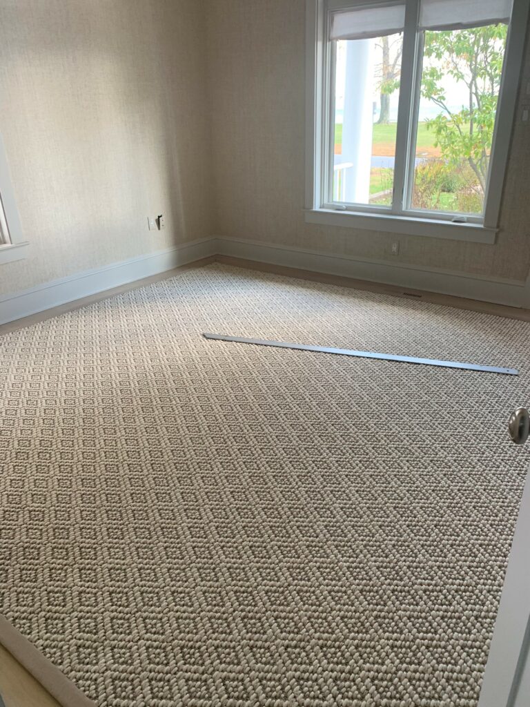
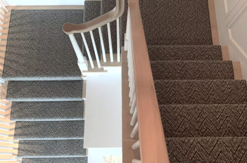
(top L to R) Living room chandelier install; Master bedroom carpeting in progress; Wallpaper in the third floor den; Installation of master bedroom roman shades.
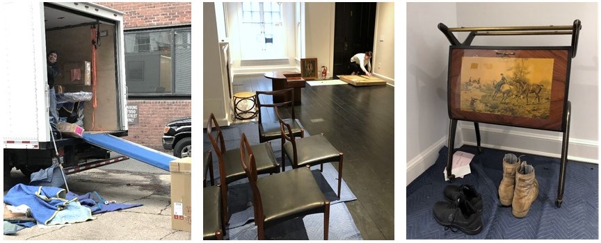
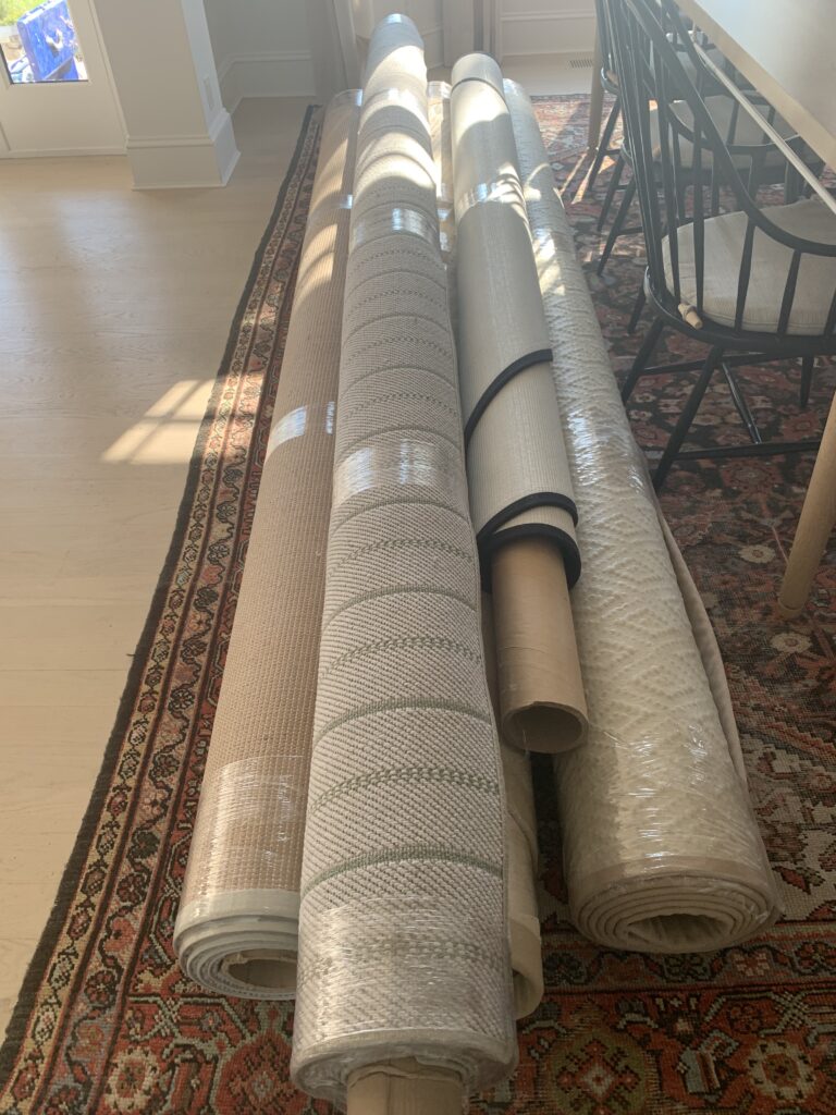
(bottom L to R) The crew unloading the truck; Opening artwork; Vintage Italian barcart.
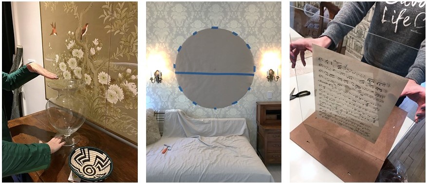
(L to R) Setting the stage with flowers and accessories; Paper template for a tricky mirror install; Preparing a vintage music montage for the dining room.

Welcome Home!
———————————————————
Alas, our vision for a classic interior full of cosmopolitan flair has come to life. This is, hands down, our favorite part of the process!

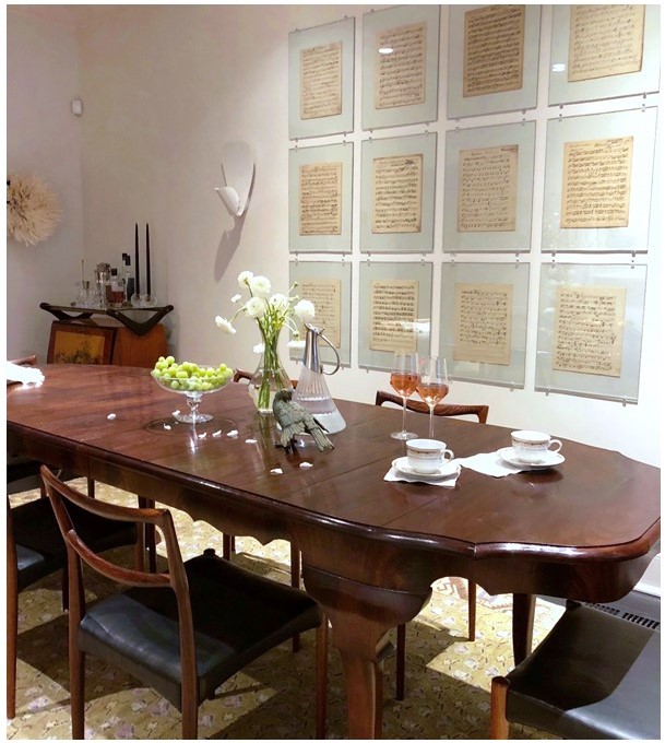
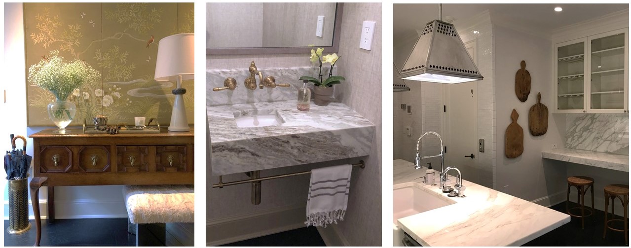
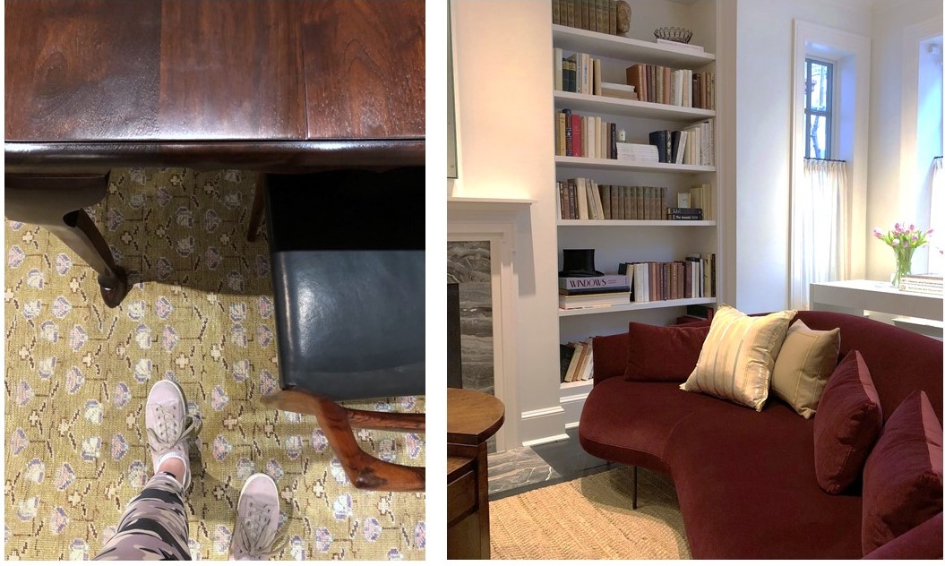
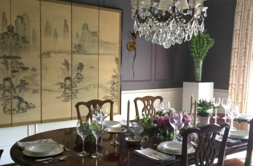
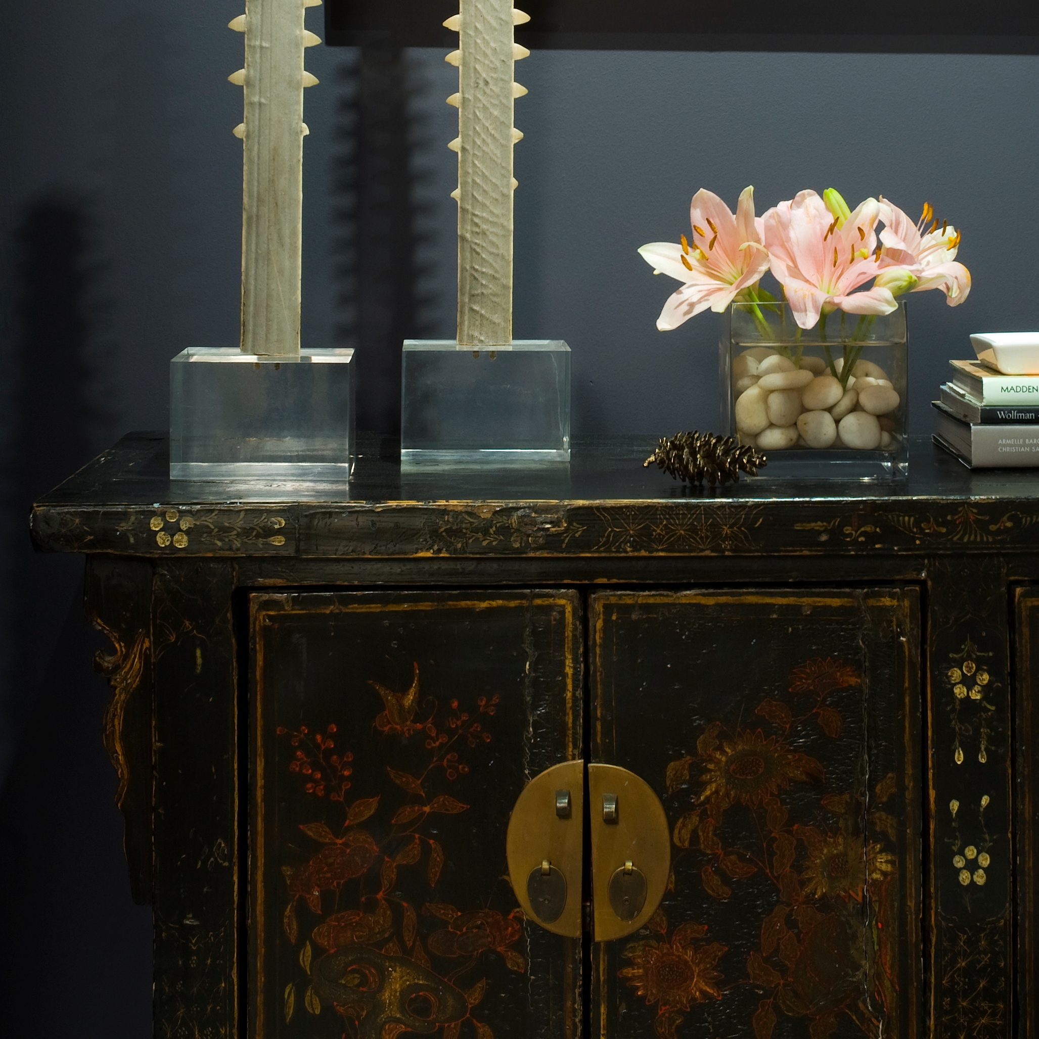
(top to bottom) A custom dining table paired with vintage chairs; Mixed materials in the entryway; A bespoke vanity in a teeny tiny powder room; Unexpected lighting in the kitchen; Dining room details; A chic Italian sofa with lyrical curves anchors the living room.
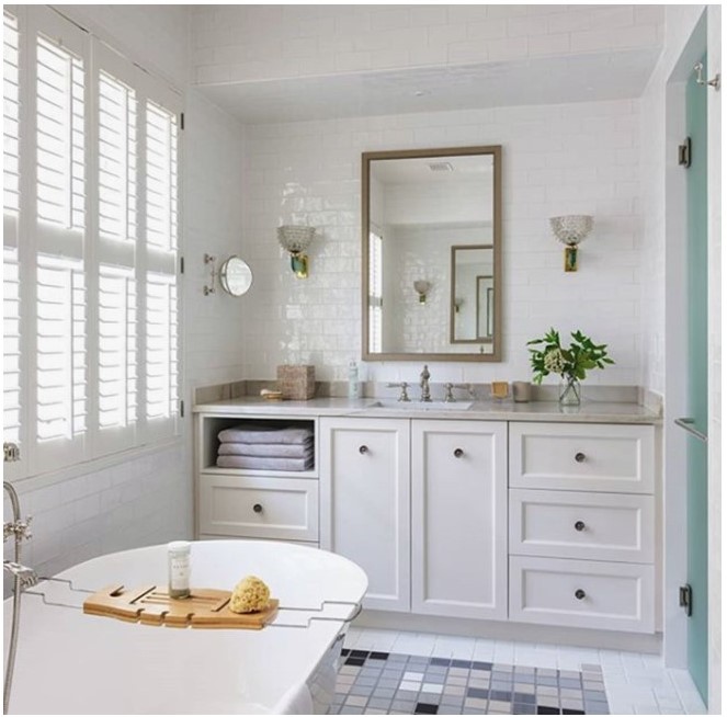
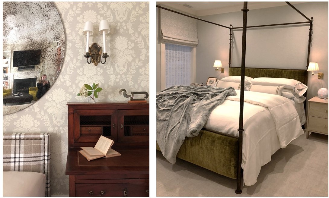
(top to bottom) Master bath wrapped in handmade tiles and featuring vintage lighting; An engaging mix of pattern and texture in the third floor den; Bespoke linens in the master bedroom – how luxe!

And That’s a Wrap
———————————————————
A big thank you to our wonderful West End collaborators. We hate to say goodbye, but we’re off to design more beautiful spaces …

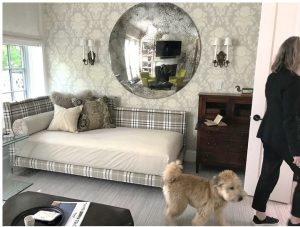
Tricia gives the resident pup, Barney, a tour of his new home.

To see the gorgeous professional photos of the West End project, visit the Huntley & Co. portfolio. Or take it one step further and help us win a Luxe RED award by voting for this project! Voting closes January 25.
xo huntleycodesign

-
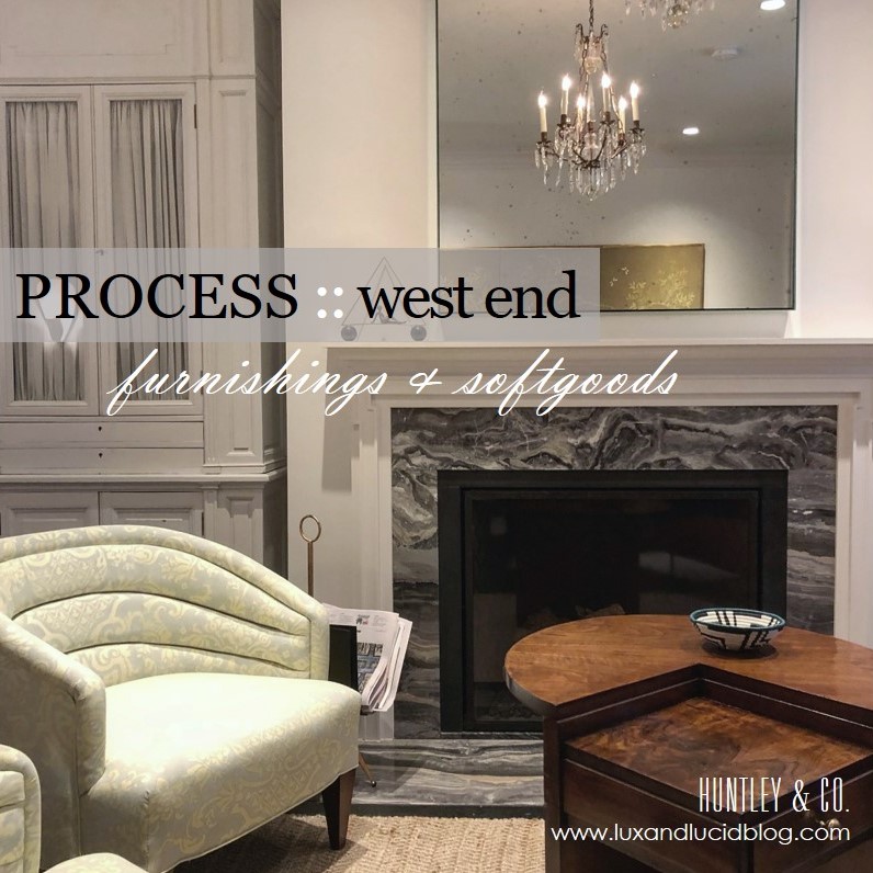
West End Process :: Furnishings
Bespoke, turn-key interiors are a signature of Huntley & Co. First, the architectural envelope and materials are perfected. Next, we turn our process to furnishings and softgoods that complement the space and the client and are unique to the project. Lots of love and labor goes into the design, drawing and specification of these goods.

| FURNISHINGS |
// Living Room channel-back chairs
We custom designed a pair of channel back lounge chairs to maximize flow, circulation and style. Visits to the workroom gave us the opportunity to make adjustments to the design, layout fabric and to monitor progress.
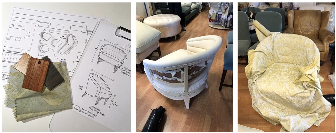
L to R: Leg finish selections; our chair frame gets mocked up in muslin; laying out the large scale fabric.
// Living Room armoire
We source a lot of antique and vintage furnishings for our projects. Sometimes, however, these pieces need modifications to “fit”. This armoire was the perfect scale for the open concept living area and provided much needed storage, but modification to the finish and interior were necessary. New hardware and shirred curtains turned this beauty into functional storage.
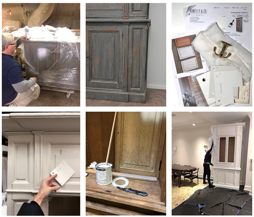
L to R: Removing the old finish; specifying all the new details; installation in progress.
// Master Bedroom canopy bed
Each project has its share of logistical challenges – and we love a good challenge because it inspires us to get extra creative. Our process never leaves things to guesswork. When we discovered that the bed, as originally designed, could not be brought up the stairs or through the windows, we had to go back to the drawing board (literally) to custom design a version that would fit.

L to R: Verifying stairwell and doorway dimensions; studio drawing of the custom pieces and parts; Ironware‘s workshop with assembly pre-shipment.
| SOFTGOODS |
// Master Bedroom roman shades & softgoods
Tailored, functional, bespoke. We designed the window treatments and pillows to complement the quietly sophisticated scheme in the master bedroom. Troubleshooting tricky corners and sourcing one-of-a-kind details makes all the difference.
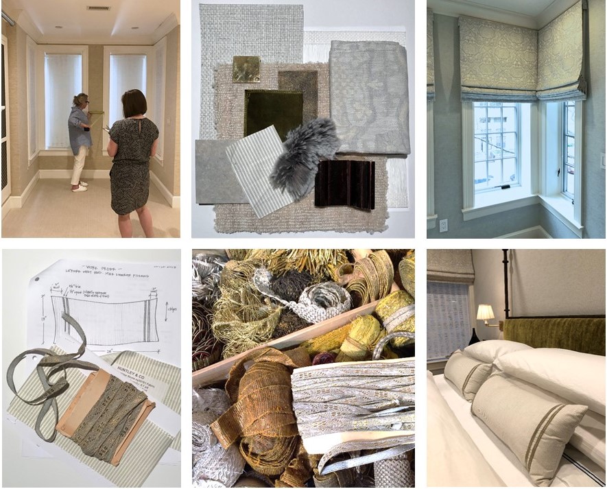
Top: Detailed site measures and schematic review; finished product! Bottom: A pillow workorder; a treasure chest of trim; a well-styled bed.
Stay tuned — Next week we’ll bring this project full circle and share our install with you! And in case you missed the other West End posts, check them out here and here.
xo, Huntley & Co.
Subscribe to our newsletter or find us on Bloglovin’ and you won’t miss a thing ; )
-
West End Process :: Envelope
For Huntley & Co., the first and foremost concern in design development is the “envelope”. TH can’t talk about it enough! Getting the envelope right – spacial relationships, interior architecture, materials and finishes – means a thoughtful, comfortable home that needs less stuff to look good.

| CONFIGURING THE SPACE |

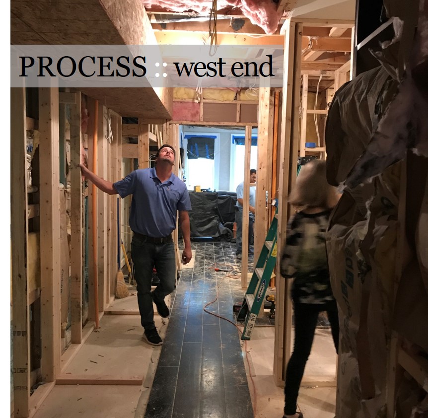
Reconfiguring an interior is a process – it requires a lot of drawings and plenty of site meetings. It’s important to be as technical and thorough as possible while understanding there will likely be a few surprises and adjustments along the way.
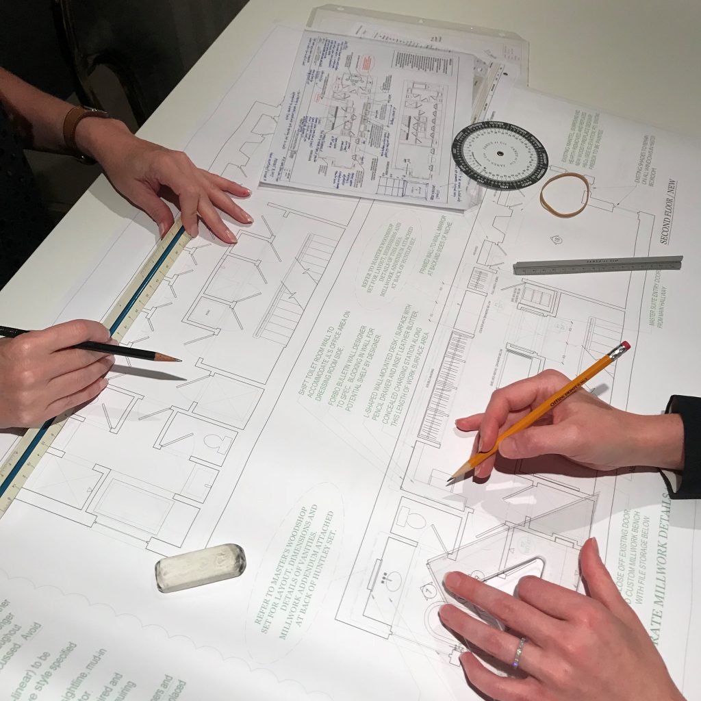
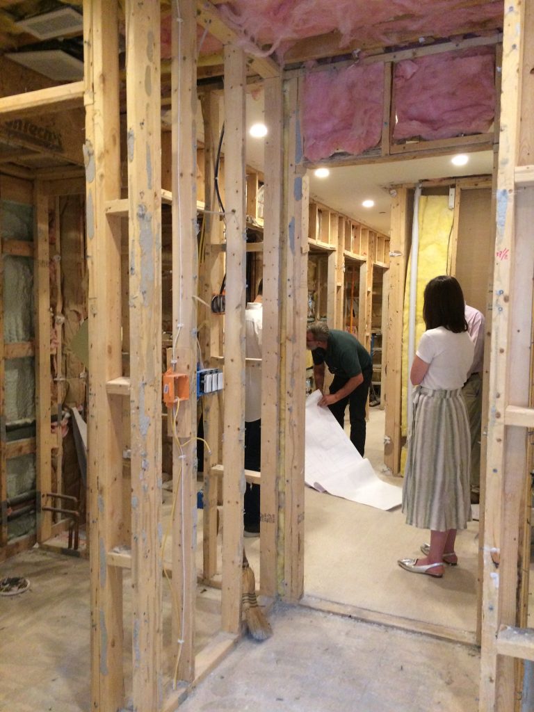
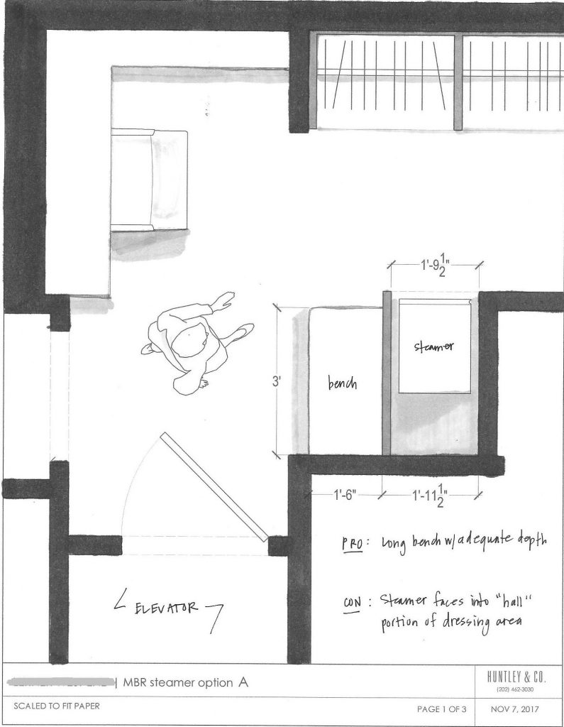
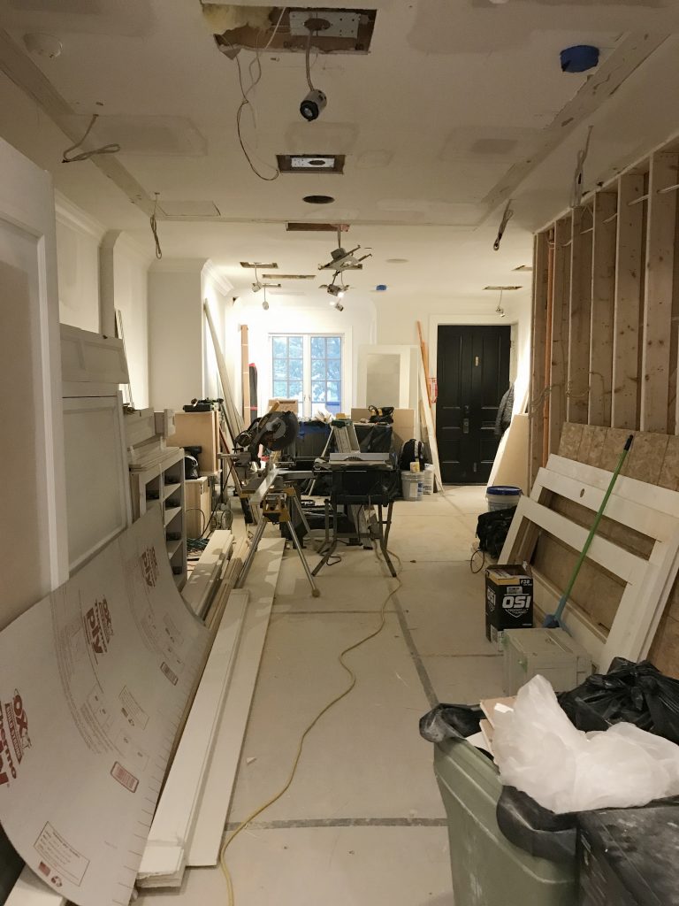
Top photo: One of the pages in the H&Co. drawing set. Bottom L to R: Meeting with the contractor; a study of the circulation in a tight area; drywall in progress.

| MILLWORK |

Millwork is one of the most impactful aspects of an interior. When it’s done well, it can make the house. When it’s done cheaply, it’s like bad teeth – it doesn’t matter how pretty the face is. With this project, our main focus was to reconcile the incongruous architectural details throughout the home and create a more finessed envelope. This included doors, crown, paneling and custom mantels as shown below.

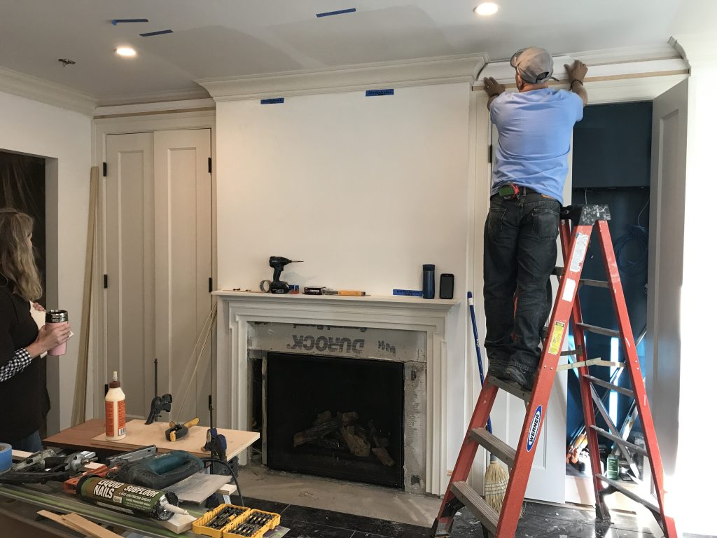
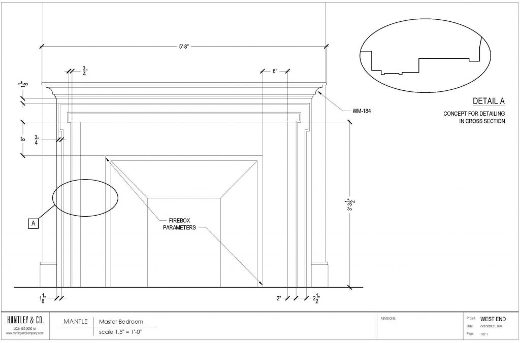
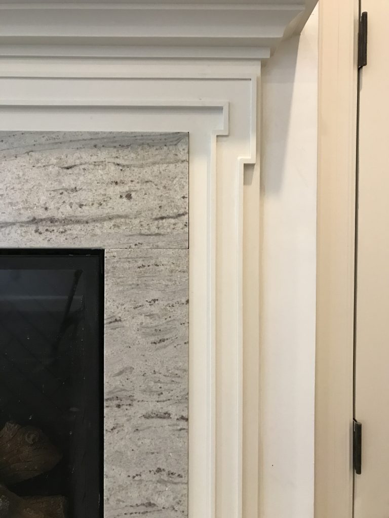
The mantels were designed to complement adjacent millwork for a quieter, more elegant presentation.

| MATERIALS |

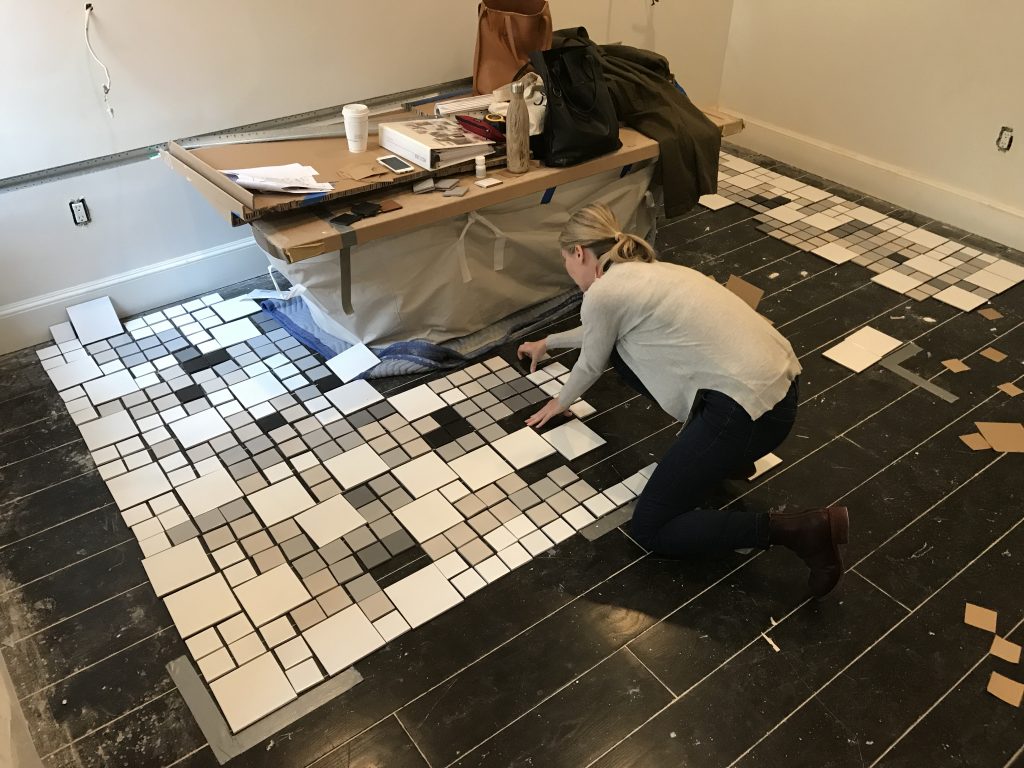
Material selection – wood, stone, tile, metal finishes – sets the tone for the home’s atmosphere and lays the groundwork for decorative elements. When selecting a material, we keep everything else in mind. In a bathroom for instance: Are the windows facing north? What type of glass do the vintage sconces have? How white is the tub? These details are part of the “conversation” and influence what marble slab I approve and tile colors I select.

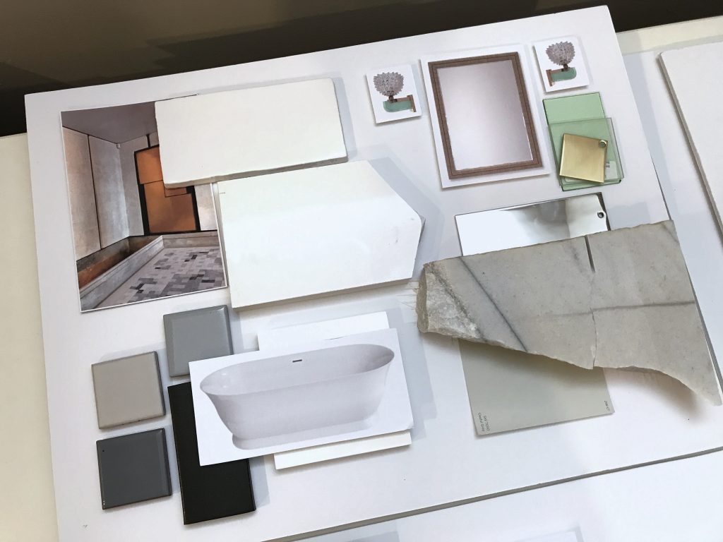
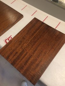
Top L to R: Slab for a fireplace surround; master bath materials, final wood selection for the library.
Bottom: The tile layout for the master bath was a hands-on (and ugh, thighs and knees) process that took several hours. Click photo for a video of the legendary H&Co. attention to detail.

* * *
We hope you’ll join us next week when we’ll share more about the process of specifying furnishings and softgoods! Or take another look at our Concept: West End post to see how this project began.
xo Huntley & Co.

-
West End Process :: Concept
One of our favorite Huntley & Co. projects this year was for a young couple who hired us to design and renovate their newly purchased townhouse in the West End neighborhood of Washington. Much to our delight, the duo brought a combination of sophistication and excitement to the endeavor. Translating that into a concept and then into a finished product was a multi-step process — and worth every minute.
* * *

| THE CONCEPT |

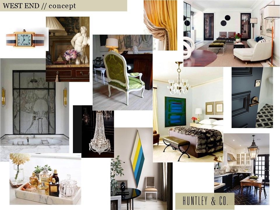
Our clients inspired a decidedly cosmopolitan aesthetic. Accordingly, we imagined an eclectic mix of vintage and antique furnishings, unexpected stone and tile, and layers of complex colors and tones. As shown below, the mood board we created conveyed our idea of an elevated yet spirited home – a true classic that’s never boring.

Selected photos clockwise from top left: Cartier Tank watch via Goop; Timothy Corrigan vignette; a crisp Madrid living room by Isabel Lopez-Quesada; a bedroom from Architectural Digest; a corner of Sandra Nunnerley’s home featuring “Diamond” artwork by Kenneth Noland; an austere and elegant marble bathroom.


| HOW WE GOT THERE |

The start of a project is full of excitement and potential. Before diving into design, we take time to fully understand both the space and the client. On the technical side, we site measure the building and generate CAD drawings for study and revision. On the conceptual side, we issue a questionnaire and cull images related to our clients’ answers. The questions range from pedestrian to abstract and are intended to give us practical information as well as insight into their lifestyle and aesthetic.
// Question & Answer
A two page questionnaire sheds light on what’s important.


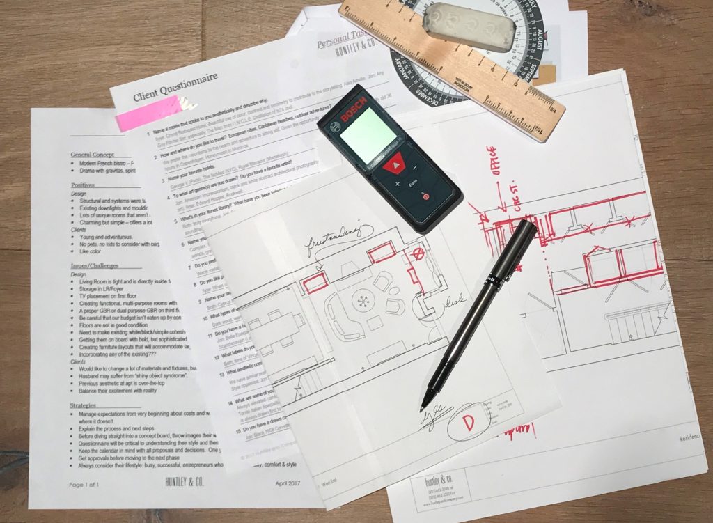
The client questionnaire is a key part of our initial survey and analysis.

// Pulling Together a Visual Story
We pull images that reference our clients’ feedback … and they share photos as well.


TRAVEL // From a honeymoon spot to favorites in Paris and NYC, these hotels topped our client’s list. L to R: Royal Mansour Marrakesh; George V in Paris; The NoMad Hotel in NYC.


FILM // Playful, witty and adventurous. L to R: Lock, Stock and Two Smoking Barrels; Amélie; The Man From U.N.C.L.E.

MUSIC // Eclectic and soulful music that bridges time and genres including the Hamilton soundtrack and Carla Bruni’s album, Quelqu’un m’a dit.

 FASHION // Classic, all-American cool c/o Vince, J. Crew and Celine.
INTERIORS // Rich and sleek. Warm and bright. Tailored and organic. L to R: Interior by Joseph Dirand includes works by Anish Kapoor, Pierre Jeanneret and Paavo Tynell; Patricia Urquiola collection for Georg Jensen; a sculptural Alvar Aalto chair; master suite cabinetry seen on Pinterest.

* * *

We love the conceptual stage of a project. Engaging in a thorough deep dive to excavate both the practical and the magical is the difference between a good project and a great one. Stay tuned for our next post where we transition into design development and project management — when we make the concept a reality.
xo, Huntley & Co.

-
Art to Interior
I love art. I considered curatorial studies for a time while in college. During my first exhibit installation, however, I broke two large glass plates protecting a famous photographer’s work. I concluded pretty quickly that “this is probably not for me”. Still, my love affair continued well into my interior design degree and career. There is almost no genre or medium that I don’t appreciate in some way. A 1982 kinetic sculpture and an oil portrait from the 19th century can both stir my senses. It follows then that artwork sometimes informs my designs.

THE STARTING POINT
Essie, Ruby and Ferdinand – Children of Asher Wertheimer, 1902
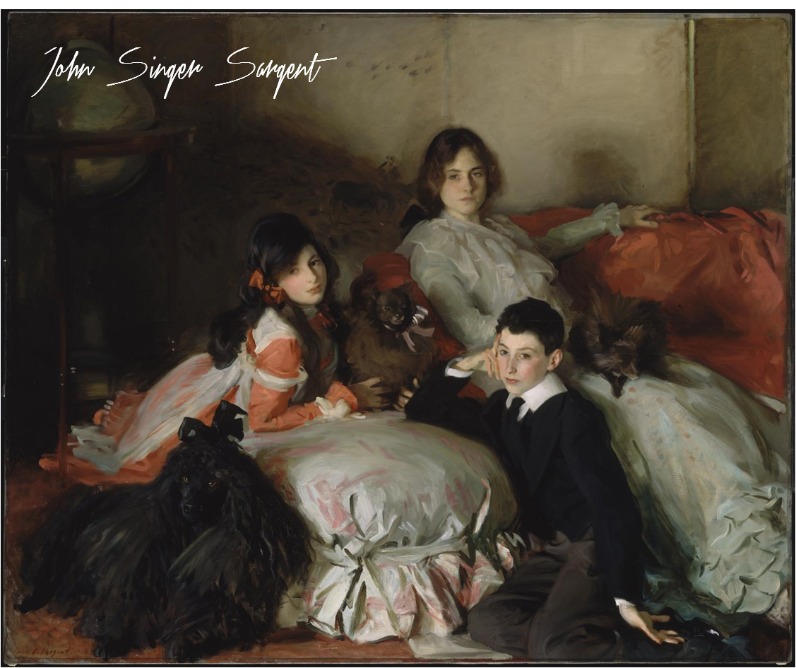
It’s hard to not love Sargent. His oil paintings are lush, moody and undeniably beautiful. I chose this work as a jumping off point for a media principal’s office for its sophistication and intimacy.

THE INTERPRETATION
The idea here is art as muse. I pulled what spoke to me – the colors, tones, textures and emotions. My design is an interpretation of the painting, not a copy of it.
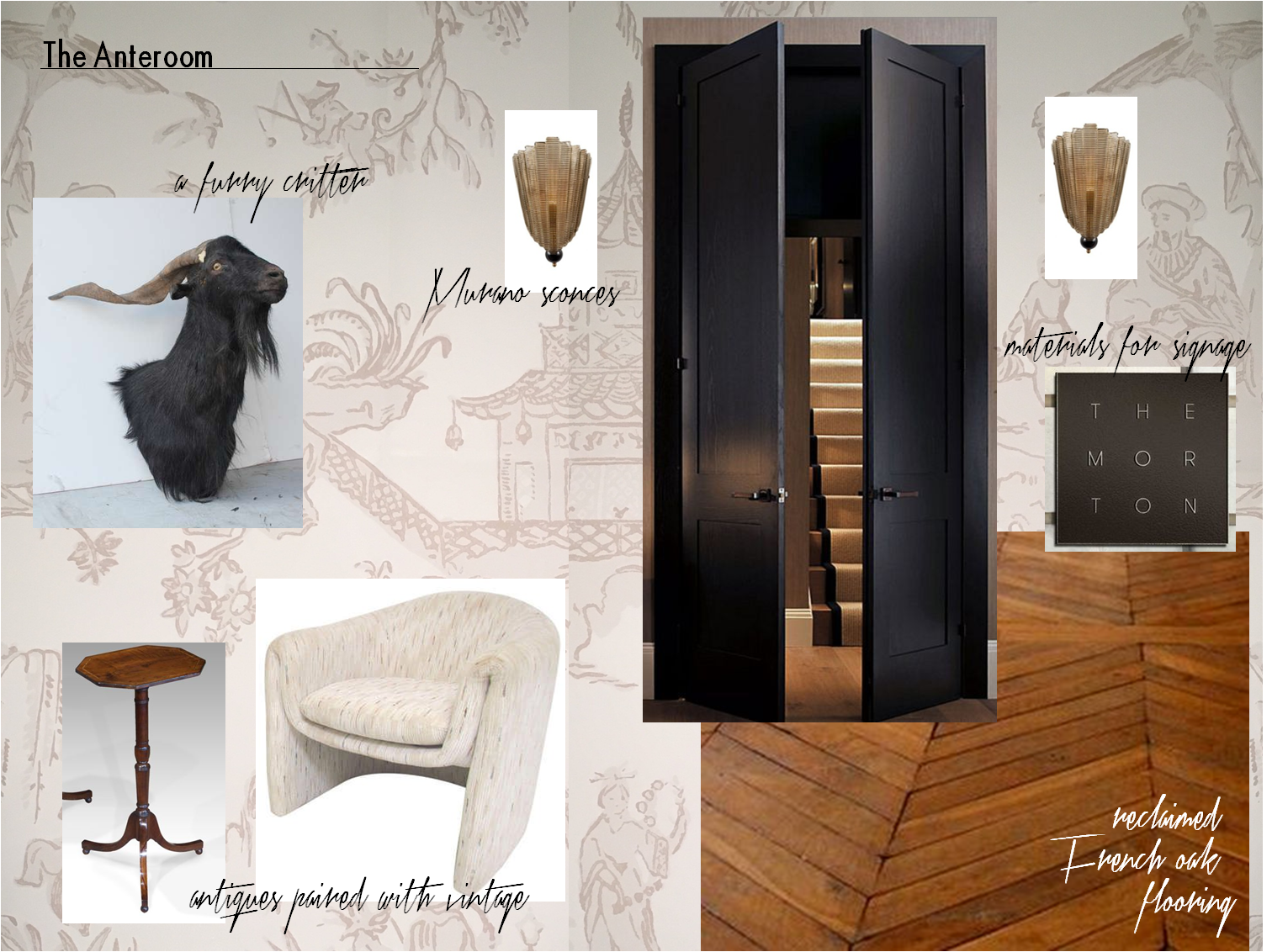
Our client’s office is entered by way of an anteroom. The space is a waiting area for visitors and serves as a buffer between her office and the staff workplace. The finish selections and air of elegance are derived from the Sergent painting. But as this is a modern woman’s office and a Huntley & Co. interior, we changed tack by mixing genres and funking up certain elements.

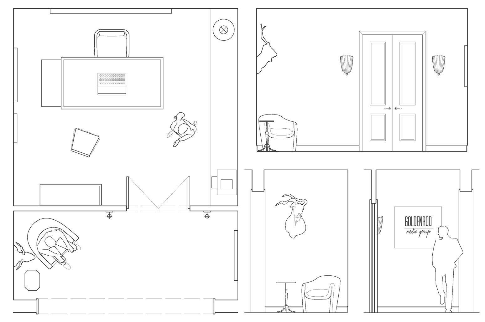
– plan & anteroom elevations –

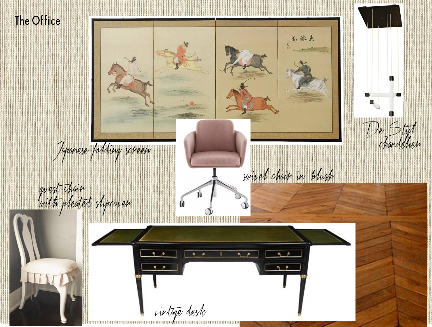
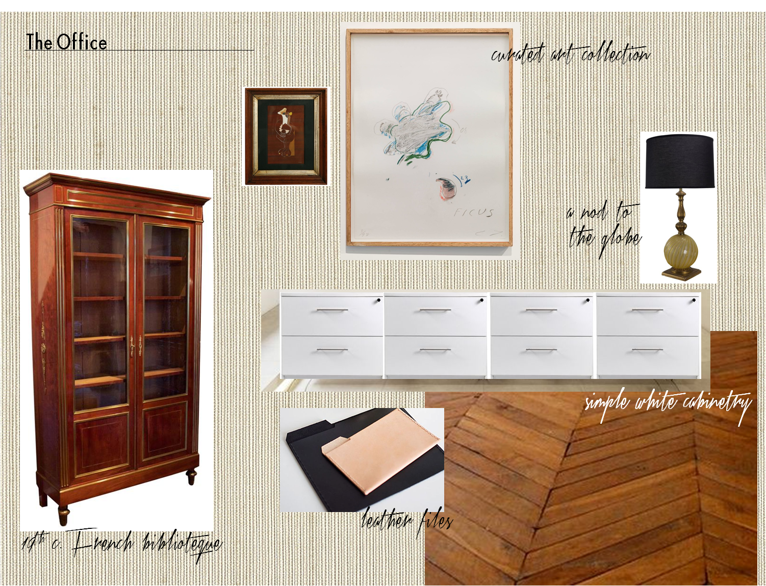

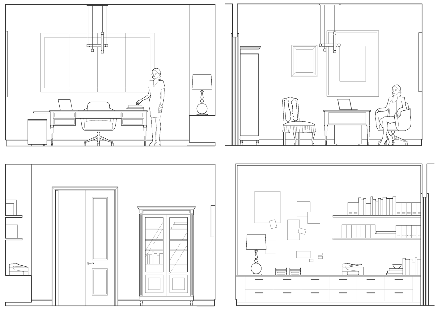
– office elevations –

Our client is a businesswoman and loving mother. She is worldly, feminine and capable – someone who is both interesting and interested. Her combination of sophistication, warmth and strength is part of what has made her a success in her field. With that in mind, we imbued her workspace with a similar sensibility and furnished it with antiques, modern European pieces and an impressive art collection. We think Mrs. Asher Wertheimer would have approved.


Subscribe to our newsletter or find us on Bloglovin’ and you won’t miss a thing.
-
DESIGNING WITH PASSION :: THE COLORS OF VALENTINE’S DAY
I love the colors associated with Valentine’s Day. Red, garnet, blush, pink, plum — they’re all so delicious and sexy. This is a palette that seduces in design, fashion, and even nature. I suggest that you soak in the gorgeous inspiration of our post today, especially if you are spending the holiday sans sig-other. There is no balm for the soul like beauty. Well, that and a really good bottle of pinot noir and dark chocolate.
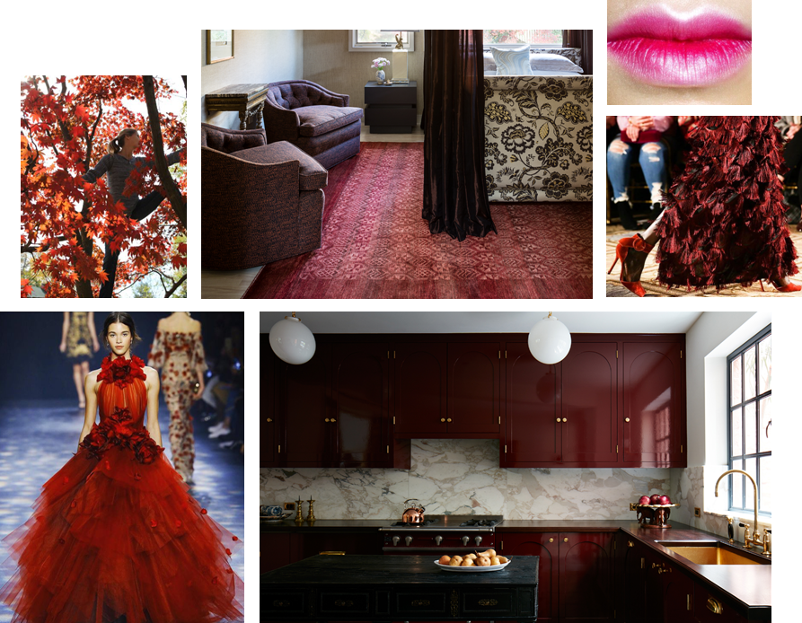
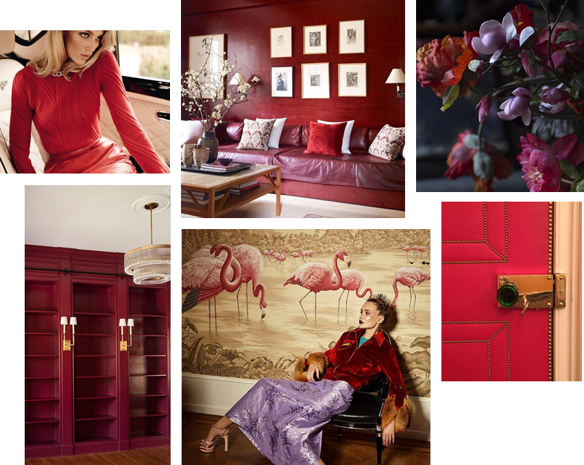
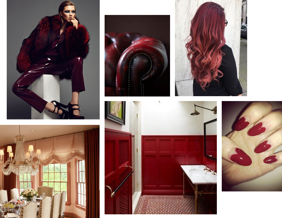
HAPPY VALENTINE’S DAY!

** Sources/links for the photos above can be found on our Pinterest page … along with other Valentine’s Day inspiration.
